Commerce
CURATED COLLECTION · 4 REFERENCES
Product details, empty and populated carts, and the first checkout step in one storefront.
Copy the reference notes below and paste them into Claude, ChatGPT, or your coding assistant. Add what you want to build.
Includes design notes, original sources, and preview links. An assistant that supports browsing can also read the public board link.
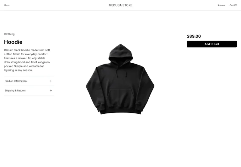
A product detail screen separates descriptive content, large photography, and the purchase action.
Useful for: Study a product layout that keeps photography prominent while separating explanation from purchase controls.
# Design reference: Medusa — Product details
Source: https://next.medusajs.com/us/products/hoodie
Swipefile reference: https://swipefile.design/ref/medusa-product/
Captured: 2026-09-05. This is a dated reference, not a claim about the current live product.
Capture scope: one viewport. Do not infer unseen page sections or a complete user flow.

## Objective
Adapt the interaction and layout patterns below to my project. Use my own content and identity. Do not reproduce logos, proprietary copy, or brand assets.

## Reference notes
- surface: Product details
- nav: The store header retains account and cart; expandable information rows sit under the description.
- layout: Three columns place product information at left, the main image in the middle, and price with purchase controls at right.
- density: Primary content has the most space; repeated rows and secondary navigation use a compact, consistent rhythm.
- color: White space, dark text, black purchase action, and neutral product photography.
- typography: A bold product heading and price anchor opposite sides of a quieter description.
- pattern: Study a product layout that keeps photography prominent while separating explanation from purchase controls.
- states: A single product with its price and add-to-cart action; no order is placed.
- dont: Adapt the interaction pattern to your own product. Do not copy brand assets, sample identities, proprietary text, or assume unseen states. Specify keyboard behavior, loading, empty, error, and narrow-screen layouts for your implementation.

Useful for: Study a product layout that keeps photography prominent while separating explanation from purchase controls.

## Acceptance criteria
- Existing project conventions, design tokens, working functionality, and unrelated changes are preserved.
- Two or three reference principles clearly support the user's task; conflicts are resolved in favor of usability and the existing product.
- Reusable components and semantic HTML express the interface. Available licensed assets are used; important UI text is never rendered as a bitmap.
- Every visible control has a defined behavior. Loading, empty, error, success, disabled, and long-content states are specified where relevant. Demo data is clearly labeled.
- Navigation and content adapt at 375px, 768px, and 1440px without horizontal page overflow. Keyboard use, visible focus, labeled inputs, at least 44px touch targets, readable contrast, and reduced motion are supported.
- Verification distinguishes rendered behavior from proposals and identifies anything still requiring a backend or external service.

## Quality bar
Clear hierarchy, consistent spacing, restrained surfaces, and purposeful motion. Avoid decorative gradients, excessive cards, placeholder buttons, and invented metrics unless the project calls for them. Do not claim a feature is connected or tested without evidence.
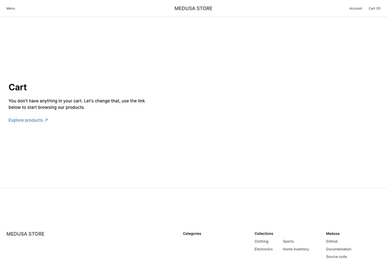
An empty shopping cart explains the state and links directly back to product discovery.
Useful for: Make an empty cart useful with a clear route back to shopping.
# Design reference: Medusa — Empty cart
Source: https://next.medusajs.com/us/cart
Swipefile reference: https://swipefile.design/ref/medusa-cart/
Captured: 2026-09-05. This is a dated reference, not a claim about the current live product.
Capture scope: one viewport. Do not infer unseen page sections or a complete user flow.

## Objective
Adapt the interaction and layout patterns below to my project. Use my own content and identity. Do not reproduce logos, proprietary copy, or brand assets.

## Reference notes
- surface: Empty cart
- nav: The store header retains account and a zero-count cart.
- layout: A brief message and browse link sit in a generous open content area above the store footer.
- density: Primary content has the most space; repeated rows and secondary navigation use a compact, consistent rhythm.
- color: White page, dark heading, gray helper text, and a blue browse link.
- typography: A strong cart heading and short explanatory sentence avoid overloading the empty state.
- pattern: Make an empty cart useful with a clear route back to shopping.
- states: Empty cart with no products or checkout action.
- dont: Adapt the interaction pattern to your own product. Do not copy brand assets, sample identities, proprietary text, or assume unseen states. Specify keyboard behavior, loading, empty, error, and narrow-screen layouts for your implementation.

Useful for: Make an empty cart useful with a clear route back to shopping.

## Acceptance criteria
- Existing project conventions, design tokens, working functionality, and unrelated changes are preserved.
- Two or three reference principles clearly support the user's task; conflicts are resolved in favor of usability and the existing product.
- Reusable components and semantic HTML express the interface. Available licensed assets are used; important UI text is never rendered as a bitmap.
- Every visible control has a defined behavior. Loading, empty, error, success, disabled, and long-content states are specified where relevant. Demo data is clearly labeled.
- Navigation and content adapt at 375px, 768px, and 1440px without horizontal page overflow. Keyboard use, visible focus, labeled inputs, at least 44px touch targets, readable contrast, and reduced motion are supported.
- Verification distinguishes rendered behavior from proposals and identifies anything still requiring a backend or external service.

## Quality bar
Clear hierarchy, consistent spacing, restrained surfaces, and purposeful motion. Avoid decorative gradients, excessive cards, placeholder buttons, and invented metrics unless the project calls for them. Do not claim a feature is connected or tested without evidence.
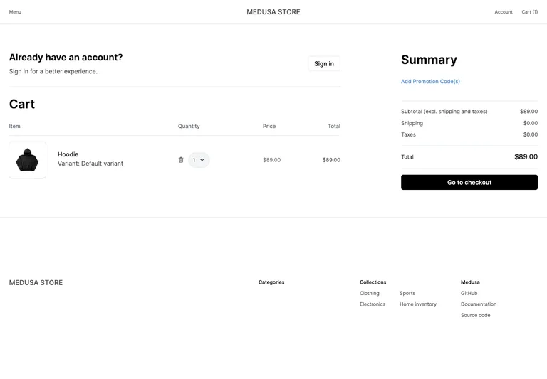
A populated cart aligns item details and quantity controls beside a concise order summary.
Useful for: Keep line-item editing and order totals visible together before checkout.
# Design reference: Medusa — Cart review
Source: https://next.medusajs.com/us/cart
Swipefile reference: https://swipefile.design/ref/medusa-filled-cart/
Captured: 2026-09-05. This is a dated reference, not a claim about the current live product.
Capture scope: one viewport. Do not infer unseen page sections or a complete user flow.

## Objective
Adapt the interaction and layout patterns below to my project. Use my own content and identity. Do not reproduce logos, proprietary copy, or brand assets.

## Reference notes
- surface: Cart review
- nav: The store header and a returning-customer sign-in option remain visible.
- layout: A wide item table occupies the left; promotions, totals, and checkout form a narrower right column.
- density: Primary content has the most space; repeated rows and secondary navigation use a compact, consistent rhythm.
- color: White surfaces, thin gray rules, blue promotion links, and a black checkout action.
- typography: Strong cart and summary headings frame aligned numeric values and compact item metadata.
- pattern: Keep line-item editing and order totals visible together before checkout.
- states: One demo product in a temporary cart with quantity, remove, and checkout controls.
- dont: Adapt the interaction pattern to your own product. Do not copy brand assets, sample identities, proprietary text, or assume unseen states. Specify keyboard behavior, loading, empty, error, and narrow-screen layouts for your implementation.

Useful for: Keep line-item editing and order totals visible together before checkout.

## Acceptance criteria
- Existing project conventions, design tokens, working functionality, and unrelated changes are preserved.
- Two or three reference principles clearly support the user's task; conflicts are resolved in favor of usability and the existing product.
- Reusable components and semantic HTML express the interface. Available licensed assets are used; important UI text is never rendered as a bitmap.
- Every visible control has a defined behavior. Loading, empty, error, success, disabled, and long-content states are specified where relevant. Demo data is clearly labeled.
- Navigation and content adapt at 375px, 768px, and 1440px without horizontal page overflow. Keyboard use, visible focus, labeled inputs, at least 44px touch targets, readable contrast, and reduced motion are supported.
- Verification distinguishes rendered behavior from proposals and identifies anything still requiring a backend or external service.

## Quality bar
Clear hierarchy, consistent spacing, restrained surfaces, and purposeful motion. Avoid decorative gradients, excessive cards, placeholder buttons, and invented metrics unless the project calls for them. Do not claim a feature is connected or tested without evidence.
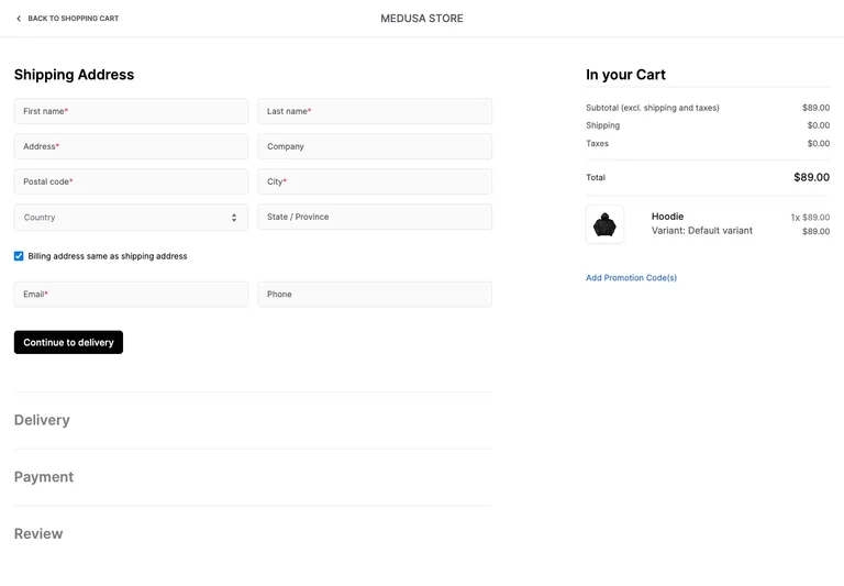
An address-first checkout preserves the order summary while showing later steps in a collapsed sequence.
Useful for: Use progressive checkout steps with persistent cart context and explicit required fields.
# Design reference: Medusa — Shipping address
Source: https://next.medusajs.com/us/checkout?step=address
Swipefile reference: https://swipefile.design/ref/medusa-checkout/
Captured: 2026-09-05. This is a dated reference, not a claim about the current live product.
Capture scope: one viewport. Do not infer unseen page sections or a complete user flow.

## Objective
Adapt the interaction and layout patterns below to my project. Use my own content and identity. Do not reproduce logos, proprietary copy, or brand assets.

## Reference notes
- surface: Shipping address
- nav: A back-to-cart link replaces browsing navigation; delivery, payment, and review appear below the active step.
- layout: A two-column address form fills the left area; totals and a product summary remain at right.
- density: Primary content has the most space; repeated rows and secondary navigation use a compact, consistent rhythm.
- color: White background, pale inputs, black continuation action, and muted inactive step headings.
- typography: Large step headings and aligned labels distinguish current work from upcoming stages.
- pattern: Use progressive checkout steps with persistent cart context and explicit required fields.
- states: Empty shipping-address step with billing-match selected; no personal information or order was submitted.
- dont: Adapt the interaction pattern to your own product. Do not copy brand assets, sample identities, proprietary text, or assume unseen states. Specify keyboard behavior, loading, empty, error, and narrow-screen layouts for your implementation.

Useful for: Use progressive checkout steps with persistent cart context and explicit required fields.

## Acceptance criteria
- Existing project conventions, design tokens, working functionality, and unrelated changes are preserved.
- Two or three reference principles clearly support the user's task; conflicts are resolved in favor of usability and the existing product.
- Reusable components and semantic HTML express the interface. Available licensed assets are used; important UI text is never rendered as a bitmap.
- Every visible control has a defined behavior. Loading, empty, error, success, disabled, and long-content states are specified where relevant. Demo data is clearly labeled.
- Navigation and content adapt at 375px, 768px, and 1440px without horizontal page overflow. Keyboard use, visible focus, labeled inputs, at least 44px touch targets, readable contrast, and reduced motion are supported.
- Verification distinguishes rendered behavior from proposals and identifies anything still requiring a backend or external service.

## Quality bar
Clear hierarchy, consistent spacing, restrained surfaces, and purposeful motion. Avoid decorative gradients, excessive cards, placeholder buttons, and invented metrics unless the project calls for them. Do not claim a feature is connected or tested without evidence.
Allow basic usage counts to help us understand what is useful. Your board contents stay out of analytics. Details
Your browser’s privacy preference keeps analytics off.