Productivity
CURATED COLLECTION · 100 REFERENCES
100 mobile apps across ten categories, with English-language publisher previews and notes on visible UI patterns.
Copy the reference notes below and paste them into Claude, ChatGPT, or your coding assistant. Add what you want to build.
Includes design notes, original sources, and preview links. An assistant that supports browsing can also read the public board link.
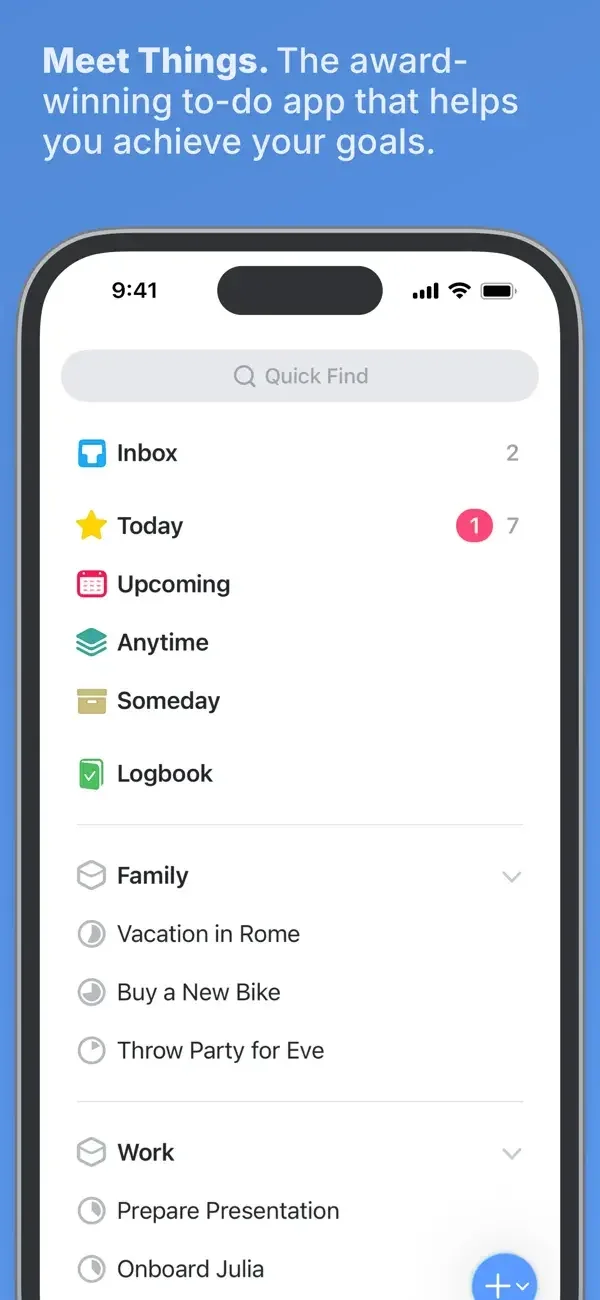
Colored list icons and restrained dividers organize an otherwise quiet white task interface.
Useful for: Study list navigation, today task list, upcoming schedule. Compare the hierarchy and controls shown in these publisher previews, then test the corresponding behavior in your own app.
# Design reference: Things 3
Source: https://apps.apple.com/us/app/id904237743
Swipefile reference: https://swipefile.design/ref/mobile-things-3/
Captured: 2026-09-09. This is a dated reference, not a claim about the current live product.
Source scope: publisher-provided App Store previews. Promotional framing is retained. These are static examples, not a tested or recorded user flow. Do not infer unseen interactions.

## Objective
Adapt the interaction and layout patterns below to my project. Use my own content and identity. Do not reproduce logos, proprietary copy, or brand assets.

## Reference notes
- surface: List navigation · Today task list · Upcoming schedule
- nav: Lists lead into Today and Upcoming views; circular add controls stay near the bottom.
- layout: Colored list icons and restrained dividers organize an otherwise quiet white task interface.
- density: Compare the space reserved for the primary task with secondary metadata. The previews retain promotional framing; evaluate target sizes in your implemented screen.
- color: Blue, white, and small semantic color accents.
- typography: Use clear heading, body, and metadata levels. Keep interface text scalable and verify readability with the device text-size settings.
- pattern: Tasks & checklists
- states: Static publisher previews only. Loading, empty, error, offline, permission, and keyboard behavior have not been tested. Specify and verify those states in your own implementation.
- dont: Do not copy the app identity, proprietary artwork, or promotional claims. Screenshot order is not a verified flow, and the listing version does not date every image.

Useful for: Study list navigation, today task list, upcoming schedule. Compare the hierarchy and controls shown in these publisher previews, then test the corresponding behavior in your own app.

## Acceptance criteria
- Existing project conventions, design tokens, working functionality, and unrelated changes are preserved.
- Two or three reference principles clearly support the user's task; conflicts are resolved in favor of usability and the existing product.
- Accessible platform-native components express the interface; use semantic HTML when the target is mobile web. Available licensed assets are used; important UI text is never rendered as a bitmap.
- Every visible control has a defined behavior. Loading, empty, error, success, disabled, and long-content states are specified where relevant. Demo data is clearly labeled.
- Navigation and content adapt at 375px, 768px, and 1440px without horizontal page overflow. Keyboard use, visible focus, labeled inputs, at least 44px touch targets, readable contrast, and reduced motion are supported.
- Verification distinguishes rendered behavior from proposals and identifies anything still requiring a backend or external service.

## Quality bar
Clear hierarchy, consistent spacing, restrained surfaces, and purposeful motion. Avoid decorative gradients, excessive cards, placeholder buttons, and invented metrics unless the project calls for them. Do not claim a feature is connected or tested without evidence.
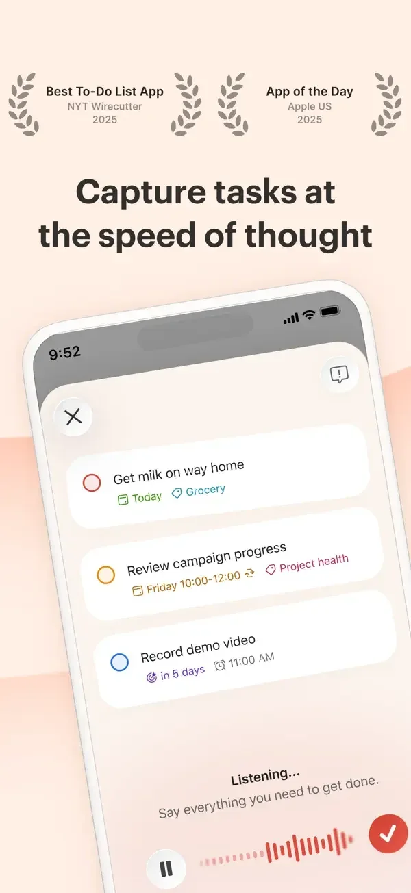
Task cards surface due dates and project metadata over a compact list and calendar interface.
Useful for: Study voice task capture, task details, project calendar. Compare the hierarchy and controls shown in these publisher previews, then test the corresponding behavior in your own app.
# Design reference: Todoist
Source: https://apps.apple.com/us/app/id572688855
Swipefile reference: https://swipefile.design/ref/mobile-todoist/
Captured: 2026-09-09. This is a dated reference, not a claim about the current live product.
Source scope: publisher-provided App Store previews. Promotional framing is retained. These are static examples, not a tested or recorded user flow. Do not infer unseen interactions.

## Objective
Adapt the interaction and layout patterns below to my project. Use my own content and identity. Do not reproduce logos, proprietary copy, or brand assets.

## Reference notes
- surface: Voice task capture · Task details · Project calendar
- nav: Capture controls lead into task details and a project calendar.
- layout: Task cards surface due dates and project metadata over a compact list and calendar interface.
- density: Compare the space reserved for the primary task with secondary metadata. The previews retain promotional framing; evaluate target sizes in your implemented screen.
- color: Warm pastel surrounds, white cards, and red task accents.
- typography: Use clear heading, body, and metadata levels. Keep interface text scalable and verify readability with the device text-size settings.
- pattern: Tasks & checklists
- states: Static publisher previews only. Loading, empty, error, offline, permission, and keyboard behavior have not been tested. Specify and verify those states in your own implementation.
- dont: Do not copy the app identity, proprietary artwork, or promotional claims. Screenshot order is not a verified flow, and the listing version does not date every image.

Useful for: Study voice task capture, task details, project calendar. Compare the hierarchy and controls shown in these publisher previews, then test the corresponding behavior in your own app.

## Acceptance criteria
- Existing project conventions, design tokens, working functionality, and unrelated changes are preserved.
- Two or three reference principles clearly support the user's task; conflicts are resolved in favor of usability and the existing product.
- Accessible platform-native components express the interface; use semantic HTML when the target is mobile web. Available licensed assets are used; important UI text is never rendered as a bitmap.
- Every visible control has a defined behavior. Loading, empty, error, success, disabled, and long-content states are specified where relevant. Demo data is clearly labeled.
- Navigation and content adapt at 375px, 768px, and 1440px without horizontal page overflow. Keyboard use, visible focus, labeled inputs, at least 44px touch targets, readable contrast, and reduced motion are supported.
- Verification distinguishes rendered behavior from proposals and identifies anything still requiring a backend or external service.

## Quality bar
Clear hierarchy, consistent spacing, restrained surfaces, and purposeful motion. Avoid decorative gradients, excessive cards, placeholder buttons, and invented metrics unless the project calls for them. Do not claim a feature is connected or tested without evidence.
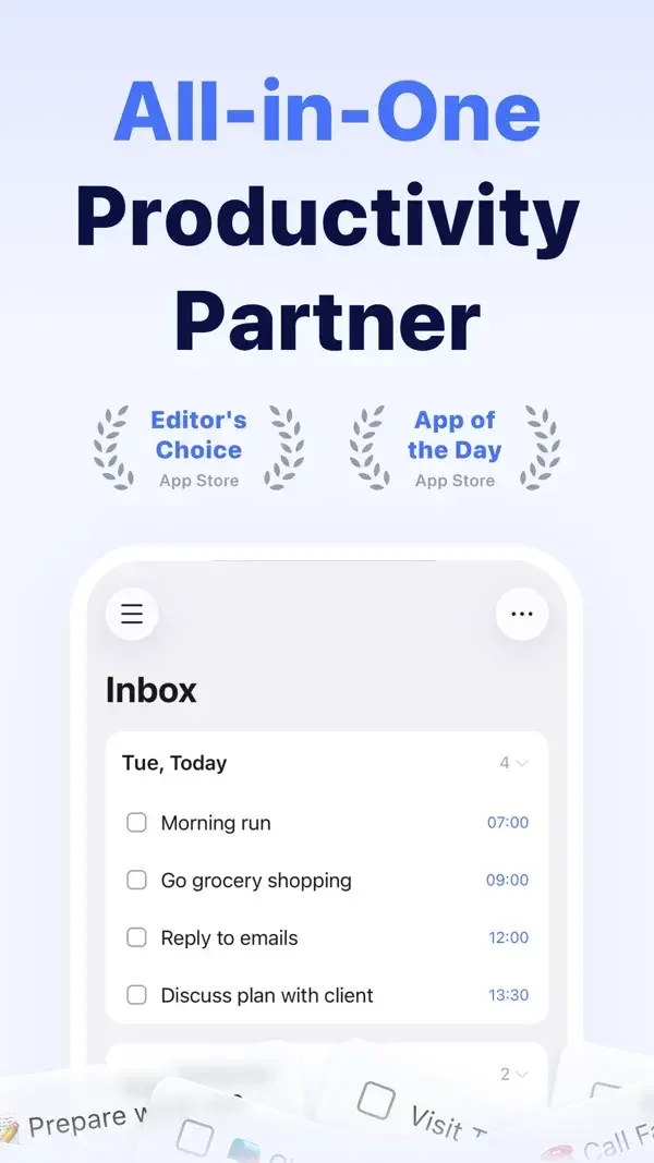
Checkbox lists share space with day and month calendars, while a raised card explains structured task capture.
Useful for: Study inbox task list, calendar views, voice-to-task preview. Compare the hierarchy and controls shown in these publisher previews, then test the corresponding behavior in your own app.
# Design reference: TickTick
Source: https://apps.apple.com/us/app/id626144601
Swipefile reference: https://swipefile.design/ref/mobile-ticktick/
Captured: 2026-09-09. This is a dated reference, not a claim about the current live product.
Source scope: publisher-provided App Store previews. Promotional framing is retained. These are static examples, not a tested or recorded user flow. Do not infer unseen interactions.

## Objective
Adapt the interaction and layout patterns below to my project. Use my own content and identity. Do not reproduce logos, proprietary copy, or brand assets.

## Reference notes
- surface: Inbox task list · Calendar views · Voice-to-task preview
- nav: Inbox, calendar, and task-entry surfaces provide distinct ways into the same workload.
- layout: Checkbox lists share space with day and month calendars, while a raised card explains structured task capture.
- density: Compare the space reserved for the primary task with secondary metadata. The previews retain promotional framing; evaluate target sizes in your implemented screen.
- color: White and pale blue with blue controls and colored calendar events.
- typography: Use clear heading, body, and metadata levels. Keep interface text scalable and verify readability with the device text-size settings.
- pattern: Tasks & checklists
- states: Static publisher previews only. Loading, empty, error, offline, permission, and keyboard behavior have not been tested. Specify and verify those states in your own implementation.
- dont: Do not copy the app identity, proprietary artwork, or promotional claims. Screenshot order is not a verified flow, and the listing version does not date every image.

Useful for: Study inbox task list, calendar views, voice-to-task preview. Compare the hierarchy and controls shown in these publisher previews, then test the corresponding behavior in your own app.

## Acceptance criteria
- Existing project conventions, design tokens, working functionality, and unrelated changes are preserved.
- Two or three reference principles clearly support the user's task; conflicts are resolved in favor of usability and the existing product.
- Accessible platform-native components express the interface; use semantic HTML when the target is mobile web. Available licensed assets are used; important UI text is never rendered as a bitmap.
- Every visible control has a defined behavior. Loading, empty, error, success, disabled, and long-content states are specified where relevant. Demo data is clearly labeled.
- Navigation and content adapt at 375px, 768px, and 1440px without horizontal page overflow. Keyboard use, visible focus, labeled inputs, at least 44px touch targets, readable contrast, and reduced motion are supported.
- Verification distinguishes rendered behavior from proposals and identifies anything still requiring a backend or external service.

## Quality bar
Clear hierarchy, consistent spacing, restrained surfaces, and purposeful motion. Avoid decorative gradients, excessive cards, placeholder buttons, and invented metrics unless the project calls for them. Do not claim a feature is connected or tested without evidence.
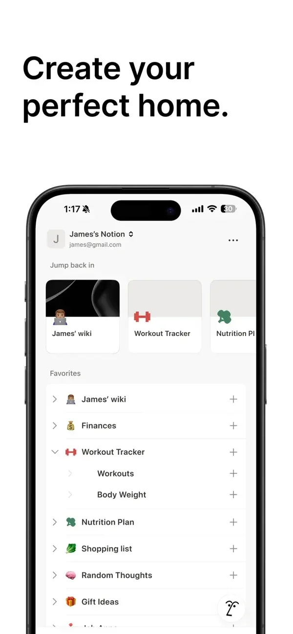
A compact page hierarchy uses small icons, generous row spacing, and cover imagery to distinguish personal documents.
Useful for: Study home page shortcuts, workspace page hierarchy, travel database. Compare the hierarchy and controls shown in these publisher previews, then test the corresponding behavior in your own app.
# Design reference: Notion
Source: https://apps.apple.com/us/app/id1232780281
Swipefile reference: https://swipefile.design/ref/mobile-notion/
Captured: 2026-09-09. This is a dated reference, not a claim about the current live product.
Source scope: publisher-provided App Store previews. Promotional framing is retained. These are static examples, not a tested or recorded user flow. Do not infer unseen interactions.

## Objective
Adapt the interaction and layout patterns below to my project. Use my own content and identity. Do not reproduce logos, proprietary copy, or brand assets.

## Reference notes
- surface: Home page shortcuts · Workspace page hierarchy · Travel database
- nav: Home shortcuts lead into nested pages and a document workspace.
- layout: A compact page hierarchy uses small icons, generous row spacing, and cover imagery to distinguish personal documents.
- density: Compare the space reserved for the primary task with secondary metadata. The previews retain promotional framing; evaluate target sizes in your implemented screen.
- color: Mostly white and black with small content-driven color accents.
- typography: Use clear heading, body, and metadata levels. Keep interface text scalable and verify readability with the device text-size settings.
- pattern: Notes & documents
- states: Static publisher previews only. Loading, empty, error, offline, permission, and keyboard behavior have not been tested. Specify and verify those states in your own implementation.
- dont: Do not copy the app identity, proprietary artwork, or promotional claims. Screenshot order is not a verified flow, and the listing version does not date every image.

Useful for: Study home page shortcuts, workspace page hierarchy, travel database. Compare the hierarchy and controls shown in these publisher previews, then test the corresponding behavior in your own app.

## Acceptance criteria
- Existing project conventions, design tokens, working functionality, and unrelated changes are preserved.
- Two or three reference principles clearly support the user's task; conflicts are resolved in favor of usability and the existing product.
- Accessible platform-native components express the interface; use semantic HTML when the target is mobile web. Available licensed assets are used; important UI text is never rendered as a bitmap.
- Every visible control has a defined behavior. Loading, empty, error, success, disabled, and long-content states are specified where relevant. Demo data is clearly labeled.
- Navigation and content adapt at 375px, 768px, and 1440px without horizontal page overflow. Keyboard use, visible focus, labeled inputs, at least 44px touch targets, readable contrast, and reduced motion are supported.
- Verification distinguishes rendered behavior from proposals and identifies anything still requiring a backend or external service.

## Quality bar
Clear hierarchy, consistent spacing, restrained surfaces, and purposeful motion. Avoid decorative gradients, excessive cards, placeholder buttons, and invented metrics unless the project calls for them. Do not claim a feature is connected or tested without evidence.
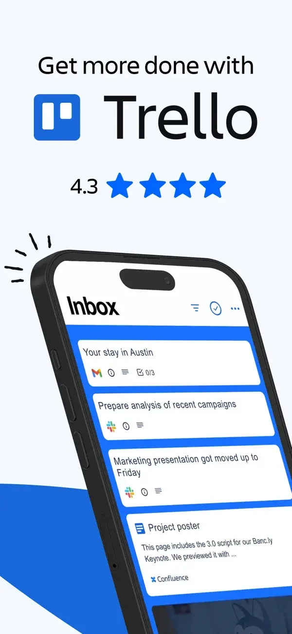
White task cards sit within blue board areas, while a separate schedule arranges work into time slots.
Useful for: Study inbox cards, calendar schedule, board to-do cards. Compare the hierarchy and controls shown in these publisher previews, then test the corresponding behavior in your own app.
# Design reference: Trello
Source: https://apps.apple.com/us/app/id461504587
Swipefile reference: https://swipefile.design/ref/mobile-trello/
Captured: 2026-09-09. This is a dated reference, not a claim about the current live product.
Source scope: publisher-provided App Store previews. Promotional framing is retained. These are static examples, not a tested or recorded user flow. Do not infer unseen interactions.

## Objective
Adapt the interaction and layout patterns below to my project. Use my own content and identity. Do not reproduce logos, proprietary copy, or brand assets.

## Reference notes
- surface: Inbox cards · Calendar schedule · Board to-do cards
- nav: Inbox, calendar, and board surfaces expose different arrangements of the same work.
- layout: White task cards sit within blue board areas, while a separate schedule arranges work into time slots.
- density: Compare the space reserved for the primary task with secondary metadata. The previews retain promotional framing; evaluate target sizes in your implemented screen.
- color: Blue, white, and colored calendar blocks.
- typography: Use clear heading, body, and metadata levels. Keep interface text scalable and verify readability with the device text-size settings.
- pattern: Tasks & checklists
- states: Static publisher previews only. Loading, empty, error, offline, permission, and keyboard behavior have not been tested. Specify and verify those states in your own implementation.
- dont: Do not copy the app identity, proprietary artwork, or promotional claims. Screenshot order is not a verified flow, and the listing version does not date every image.

Useful for: Study inbox cards, calendar schedule, board to-do cards. Compare the hierarchy and controls shown in these publisher previews, then test the corresponding behavior in your own app.

## Acceptance criteria
- Existing project conventions, design tokens, working functionality, and unrelated changes are preserved.
- Two or three reference principles clearly support the user's task; conflicts are resolved in favor of usability and the existing product.
- Accessible platform-native components express the interface; use semantic HTML when the target is mobile web. Available licensed assets are used; important UI text is never rendered as a bitmap.
- Every visible control has a defined behavior. Loading, empty, error, success, disabled, and long-content states are specified where relevant. Demo data is clearly labeled.
- Navigation and content adapt at 375px, 768px, and 1440px without horizontal page overflow. Keyboard use, visible focus, labeled inputs, at least 44px touch targets, readable contrast, and reduced motion are supported.
- Verification distinguishes rendered behavior from proposals and identifies anything still requiring a backend or external service.

## Quality bar
Clear hierarchy, consistent spacing, restrained surfaces, and purposeful motion. Avoid decorative gradients, excessive cards, placeholder buttons, and invented metrics unless the project calls for them. Do not claim a feature is connected or tested without evidence.
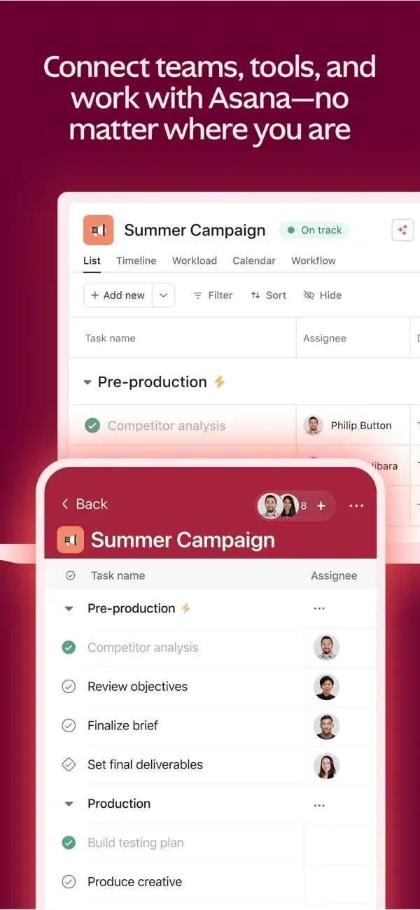
Task rows, project shortcuts, and activity updates use compact white panels with clear headings and small identity marks.
Useful for: Study project task list, home shortcuts, activity inbox. Compare the hierarchy and controls shown in these publisher previews, then test the corresponding behavior in your own app.
# Design reference: Asana
Source: https://apps.apple.com/us/app/id489969512
Swipefile reference: https://swipefile.design/ref/mobile-asana/
Captured: 2026-09-09. This is a dated reference, not a claim about the current live product.
Source scope: publisher-provided App Store previews. Promotional framing is retained. These are static examples, not a tested or recorded user flow. Do not infer unseen interactions.

## Objective
Adapt the interaction and layout patterns below to my project. Use my own content and identity. Do not reproduce logos, proprietary copy, or brand assets.

## Reference notes
- surface: Project task list · Home shortcuts · Activity inbox
- nav: Home, project, and inbox surfaces distinguish navigation from updates.
- layout: Task rows, project shortcuts, and activity updates use compact white panels with clear headings and small identity marks.
- density: Compare the space reserved for the primary task with secondary metadata. The previews retain promotional framing; evaluate target sizes in your implemented screen.
- color: White panels with burgundy, blue, and green promotional surrounds.
- typography: Use clear heading, body, and metadata levels. Keep interface text scalable and verify readability with the device text-size settings.
- pattern: Activity & notifications
- states: Static publisher previews only. Loading, empty, error, offline, permission, and keyboard behavior have not been tested. Specify and verify those states in your own implementation.
- dont: Do not copy the app identity, proprietary artwork, or promotional claims. Screenshot order is not a verified flow, and the listing version does not date every image.

Useful for: Study project task list, home shortcuts, activity inbox. Compare the hierarchy and controls shown in these publisher previews, then test the corresponding behavior in your own app.

## Acceptance criteria
- Existing project conventions, design tokens, working functionality, and unrelated changes are preserved.
- Two or three reference principles clearly support the user's task; conflicts are resolved in favor of usability and the existing product.
- Accessible platform-native components express the interface; use semantic HTML when the target is mobile web. Available licensed assets are used; important UI text is never rendered as a bitmap.
- Every visible control has a defined behavior. Loading, empty, error, success, disabled, and long-content states are specified where relevant. Demo data is clearly labeled.
- Navigation and content adapt at 375px, 768px, and 1440px without horizontal page overflow. Keyboard use, visible focus, labeled inputs, at least 44px touch targets, readable contrast, and reduced motion are supported.
- Verification distinguishes rendered behavior from proposals and identifies anything still requiring a backend or external service.

## Quality bar
Clear hierarchy, consistent spacing, restrained surfaces, and purposeful motion. Avoid decorative gradients, excessive cards, placeholder buttons, and invented metrics unless the project calls for them. Do not claim a feature is connected or tested without evidence.
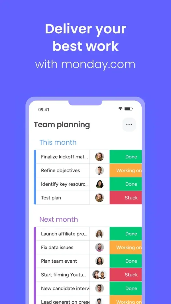
Status-colored cells, workload totals, and item-detail cards make the organization of work visible in a narrow format.
Useful for: Study team planning board, my work summary, notification list. Compare the hierarchy and controls shown in these publisher previews, then test the corresponding behavior in your own app.
# Design reference: monday.com
Source: https://apps.apple.com/us/app/id1290128888
Swipefile reference: https://swipefile.design/ref/mobile-monday-com/
Captured: 2026-09-09. This is a dated reference, not a claim about the current live product.
Source scope: publisher-provided App Store previews. Promotional framing is retained. These are static examples, not a tested or recorded user flow. Do not infer unseen interactions.

## Objective
Adapt the interaction and layout patterns below to my project. Use my own content and identity. Do not reproduce logos, proprietary copy, or brand assets.

## Reference notes
- surface: Team planning board · My work summary · Notification list
- nav: Planning, personal work, and notification surfaces have separate headings and controls.
- layout: Status-colored cells, workload totals, and item-detail cards make the organization of work visible in a narrow format.
- density: Compare the space reserved for the primary task with secondary metadata. The previews retain promotional framing; evaluate target sizes in your implemented screen.
- color: Purple surround, white panels, and green, amber, and red status colors.
- typography: Use clear heading, body, and metadata levels. Keep interface text scalable and verify readability with the device text-size settings.
- pattern: Tasks & checklists
- states: Static publisher previews only. Loading, empty, error, offline, permission, and keyboard behavior have not been tested. Specify and verify those states in your own implementation.
- dont: Do not copy the app identity, proprietary artwork, or promotional claims. Screenshot order is not a verified flow, and the listing version does not date every image.

Useful for: Study team planning board, my work summary, notification list. Compare the hierarchy and controls shown in these publisher previews, then test the corresponding behavior in your own app.

## Acceptance criteria
- Existing project conventions, design tokens, working functionality, and unrelated changes are preserved.
- Two or three reference principles clearly support the user's task; conflicts are resolved in favor of usability and the existing product.
- Accessible platform-native components express the interface; use semantic HTML when the target is mobile web. Available licensed assets are used; important UI text is never rendered as a bitmap.
- Every visible control has a defined behavior. Loading, empty, error, success, disabled, and long-content states are specified where relevant. Demo data is clearly labeled.
- Navigation and content adapt at 375px, 768px, and 1440px without horizontal page overflow. Keyboard use, visible focus, labeled inputs, at least 44px touch targets, readable contrast, and reduced motion are supported.
- Verification distinguishes rendered behavior from proposals and identifies anything still requiring a backend or external service.

## Quality bar
Clear hierarchy, consistent spacing, restrained surfaces, and purposeful motion. Avoid decorative gradients, excessive cards, placeholder buttons, and invented metrics unless the project calls for them. Do not claim a feature is connected or tested without evidence.
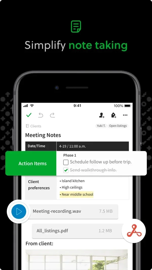
A note combines text, attachments, and checklists; highlighted search terms help explain how saved content is retrieved.
Useful for: Study rich meeting note, checklist inside a note, search results. Compare the hierarchy and controls shown in these publisher previews, then test the corresponding behavior in your own app.
# Design reference: Evernote
Source: https://apps.apple.com/us/app/id281796108
Swipefile reference: https://swipefile.design/ref/mobile-evernote/
Captured: 2026-09-09. This is a dated reference, not a claim about the current live product.
Source scope: publisher-provided App Store previews. Promotional framing is retained. These are static examples, not a tested or recorded user flow. Do not infer unseen interactions.

## Objective
Adapt the interaction and layout patterns below to my project. Use my own content and identity. Do not reproduce logos, proprietary copy, or brand assets.

## Reference notes
- surface: Rich meeting note · Checklist inside a note · Search results
- nav: Editor controls sit above the note, with a search surface for returning to content.
- layout: A note combines text, attachments, and checklists; highlighted search terms help explain how saved content is retrieved.
- density: Compare the space reserved for the primary task with secondary metadata. The previews retain promotional framing; evaluate target sizes in your implemented screen.
- color: White content on black promotional framing with bright green actions.
- typography: Use clear heading, body, and metadata levels. Keep interface text scalable and verify readability with the device text-size settings.
- pattern: Notes & documents
- states: Static publisher previews only. Loading, empty, error, offline, permission, and keyboard behavior have not been tested. Specify and verify those states in your own implementation.
- dont: Do not copy the app identity, proprietary artwork, or promotional claims. Screenshot order is not a verified flow, and the listing version does not date every image.

Useful for: Study rich meeting note, checklist inside a note, search results. Compare the hierarchy and controls shown in these publisher previews, then test the corresponding behavior in your own app.

## Acceptance criteria
- Existing project conventions, design tokens, working functionality, and unrelated changes are preserved.
- Two or three reference principles clearly support the user's task; conflicts are resolved in favor of usability and the existing product.
- Accessible platform-native components express the interface; use semantic HTML when the target is mobile web. Available licensed assets are used; important UI text is never rendered as a bitmap.
- Every visible control has a defined behavior. Loading, empty, error, success, disabled, and long-content states are specified where relevant. Demo data is clearly labeled.
- Navigation and content adapt at 375px, 768px, and 1440px without horizontal page overflow. Keyboard use, visible focus, labeled inputs, at least 44px touch targets, readable contrast, and reduced motion are supported.
- Verification distinguishes rendered behavior from proposals and identifies anything still requiring a backend or external service.

## Quality bar
Clear hierarchy, consistent spacing, restrained surfaces, and purposeful motion. Avoid decorative gradients, excessive cards, placeholder buttons, and invented metrics unless the project calls for them. Do not claim a feature is connected or tested without evidence.
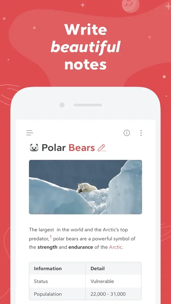
Rich text, imagery, and tables sit in a quiet editor beside a tag-based navigation surface.
Useful for: Study rich note and table, tag navigation, editor theme examples. Compare the hierarchy and controls shown in these publisher previews, then test the corresponding behavior in your own app.
# Design reference: Bear
Source: https://apps.apple.com/us/app/id1016366447
Swipefile reference: https://swipefile.design/ref/mobile-bear/
Captured: 2026-09-09. This is a dated reference, not a claim about the current live product.
Source scope: publisher-provided App Store previews. Promotional framing is retained. These are static examples, not a tested or recorded user flow. Do not infer unseen interactions.

## Objective
Adapt the interaction and layout patterns below to my project. Use my own content and identity. Do not reproduce logos, proprietary copy, or brand assets.

## Reference notes
- surface: Rich note and table · Tag navigation · Editor theme examples
- nav: A side panel groups notes by tags; the document remains the main reading surface.
- layout: Rich text, imagery, and tables sit in a quiet editor beside a tag-based navigation surface.
- density: Compare the space reserved for the primary task with secondary metadata. The previews retain promotional framing; evaluate target sizes in your implemented screen.
- color: White editor, dark purple sidebar, and red brand accents.
- typography: Use clear heading, body, and metadata levels. Keep interface text scalable and verify readability with the device text-size settings.
- pattern: Notes & documents
- states: Static publisher previews only. Loading, empty, error, offline, permission, and keyboard behavior have not been tested. Specify and verify those states in your own implementation.
- dont: Do not copy the app identity, proprietary artwork, or promotional claims. Screenshot order is not a verified flow, and the listing version does not date every image.

Useful for: Study rich note and table, tag navigation, editor theme examples. Compare the hierarchy and controls shown in these publisher previews, then test the corresponding behavior in your own app.

## Acceptance criteria
- Existing project conventions, design tokens, working functionality, and unrelated changes are preserved.
- Two or three reference principles clearly support the user's task; conflicts are resolved in favor of usability and the existing product.
- Accessible platform-native components express the interface; use semantic HTML when the target is mobile web. Available licensed assets are used; important UI text is never rendered as a bitmap.
- Every visible control has a defined behavior. Loading, empty, error, success, disabled, and long-content states are specified where relevant. Demo data is clearly labeled.
- Navigation and content adapt at 375px, 768px, and 1440px without horizontal page overflow. Keyboard use, visible focus, labeled inputs, at least 44px touch targets, readable contrast, and reduced motion are supported.
- Verification distinguishes rendered behavior from proposals and identifies anything still requiring a backend or external service.

## Quality bar
Clear hierarchy, consistent spacing, restrained surfaces, and purposeful motion. Avoid decorative gradients, excessive cards, placeholder buttons, and invented metrics unless the project calls for them. Do not claim a feature is connected or tested without evidence.
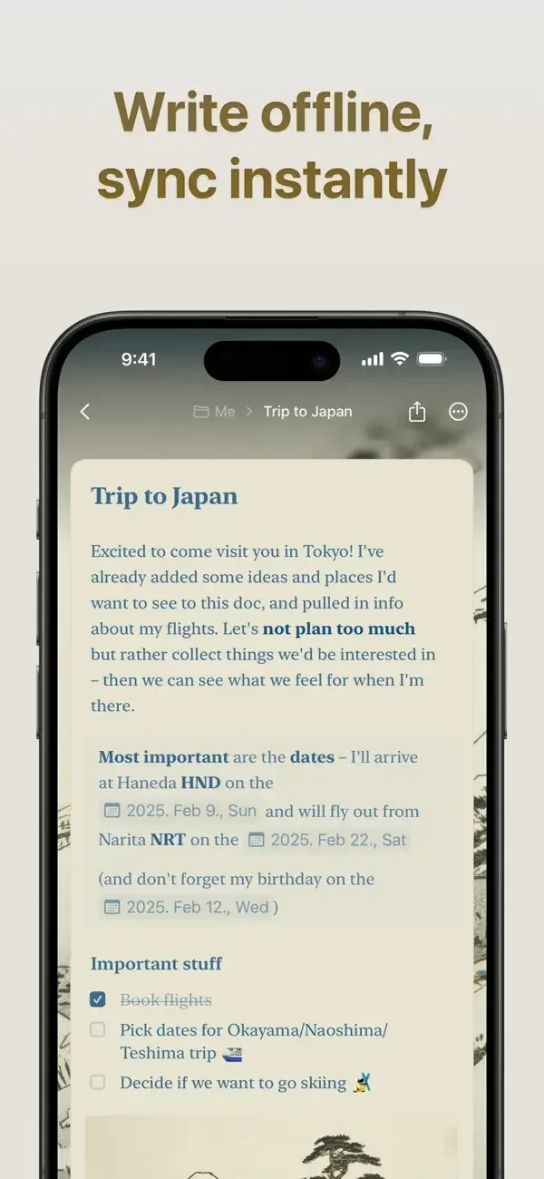
A document editor combines styled text with a separate task sheet and a familiar keyboard toolbar.
Useful for: Study document editing, task capture, document appearance. Compare the hierarchy and controls shown in these publisher previews, then test the corresponding behavior in your own app.
# Design reference: Craft
Source: https://apps.apple.com/us/app/id1487937127
Swipefile reference: https://swipefile.design/ref/mobile-craft/
Captured: 2026-09-09. This is a dated reference, not a claim about the current live product.
Source scope: publisher-provided App Store previews. Promotional framing is retained. These are static examples, not a tested or recorded user flow. Do not infer unseen interactions.

## Objective
Adapt the interaction and layout patterns below to my project. Use my own content and identity. Do not reproduce logos, proprietary copy, or brand assets.

## Reference notes
- surface: Document editing · Task capture · Document appearance
- nav: Document and task surfaces keep creation controls near the writing context.
- layout: A document editor combines styled text with a separate task sheet and a familiar keyboard toolbar.
- density: Compare the space reserved for the primary task with secondary metadata. The previews retain promotional framing; evaluate target sizes in your implemented screen.
- color: Warm neutrals, white sheets, and blue action accents.
- typography: Use clear heading, body, and metadata levels. Keep interface text scalable and verify readability with the device text-size settings.
- pattern: Notes & documents
- states: Static publisher previews only. Loading, empty, error, offline, permission, and keyboard behavior have not been tested. Specify and verify those states in your own implementation.
- dont: Do not copy the app identity, proprietary artwork, or promotional claims. Screenshot order is not a verified flow, and the listing version does not date every image.

Useful for: Study document editing, task capture, document appearance. Compare the hierarchy and controls shown in these publisher previews, then test the corresponding behavior in your own app.

## Acceptance criteria
- Existing project conventions, design tokens, working functionality, and unrelated changes are preserved.
- Two or three reference principles clearly support the user's task; conflicts are resolved in favor of usability and the existing product.
- Accessible platform-native components express the interface; use semantic HTML when the target is mobile web. Available licensed assets are used; important UI text is never rendered as a bitmap.
- Every visible control has a defined behavior. Loading, empty, error, success, disabled, and long-content states are specified where relevant. Demo data is clearly labeled.
- Navigation and content adapt at 375px, 768px, and 1440px without horizontal page overflow. Keyboard use, visible focus, labeled inputs, at least 44px touch targets, readable contrast, and reduced motion are supported.
- Verification distinguishes rendered behavior from proposals and identifies anything still requiring a backend or external service.

## Quality bar
Clear hierarchy, consistent spacing, restrained surfaces, and purposeful motion. Avoid decorative gradients, excessive cards, placeholder buttons, and invented metrics unless the project calls for them. Do not claim a feature is connected or tested without evidence.
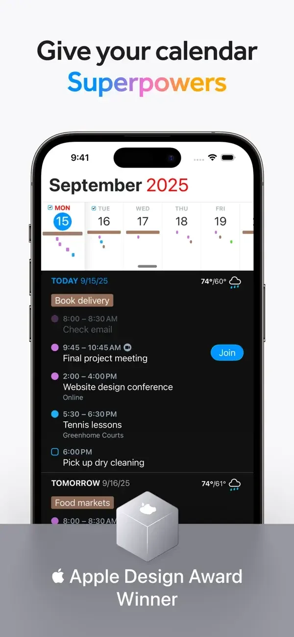
An agenda groups appointments beneath a compact date strip, with alternative month and year views and a prominent event card.
Useful for: Study day agenda, calendar view comparison, event creation preview. Compare the hierarchy and controls shown in these publisher previews, then test the corresponding behavior in your own app.
# Design reference: Fantastical
Source: https://apps.apple.com/us/app/id718043190
Swipefile reference: https://swipefile.design/ref/mobile-fantastical/
Captured: 2026-09-09. This is a dated reference, not a claim about the current live product.
Source scope: publisher-provided App Store previews. Promotional framing is retained. These are static examples, not a tested or recorded user flow. Do not infer unseen interactions.

## Objective
Adapt the interaction and layout patterns below to my project. Use my own content and identity. Do not reproduce logos, proprietary copy, or brand assets.

## Reference notes
- surface: Day agenda · Calendar view comparison · Event creation preview
- nav: Calendar views separate date navigation from individual event details.
- layout: An agenda groups appointments beneath a compact date strip, with alternative month and year views and a prominent event card.
- density: Compare the space reserved for the primary task with secondary metadata. The previews retain promotional framing; evaluate target sizes in your implemented screen.
- color: White and black calendar surfaces with colored event blocks.
- typography: Use clear heading, body, and metadata levels. Keep interface text scalable and verify readability with the device text-size settings.
- pattern: Calendars & scheduling
- states: Static publisher previews only. Loading, empty, error, offline, permission, and keyboard behavior have not been tested. Specify and verify those states in your own implementation.
- dont: Do not copy the app identity, proprietary artwork, or promotional claims. Screenshot order is not a verified flow, and the listing version does not date every image.

Useful for: Study day agenda, calendar view comparison, event creation preview. Compare the hierarchy and controls shown in these publisher previews, then test the corresponding behavior in your own app.

## Acceptance criteria
- Existing project conventions, design tokens, working functionality, and unrelated changes are preserved.
- Two or three reference principles clearly support the user's task; conflicts are resolved in favor of usability and the existing product.
- Accessible platform-native components express the interface; use semantic HTML when the target is mobile web. Available licensed assets are used; important UI text is never rendered as a bitmap.
- Every visible control has a defined behavior. Loading, empty, error, success, disabled, and long-content states are specified where relevant. Demo data is clearly labeled.
- Navigation and content adapt at 375px, 768px, and 1440px without horizontal page overflow. Keyboard use, visible focus, labeled inputs, at least 44px touch targets, readable contrast, and reduced motion are supported.
- Verification distinguishes rendered behavior from proposals and identifies anything still requiring a backend or external service.

## Quality bar
Clear hierarchy, consistent spacing, restrained surfaces, and purposeful motion. Avoid decorative gradients, excessive cards, placeholder buttons, and invented metrics unless the project calls for them. Do not claim a feature is connected or tested without evidence.
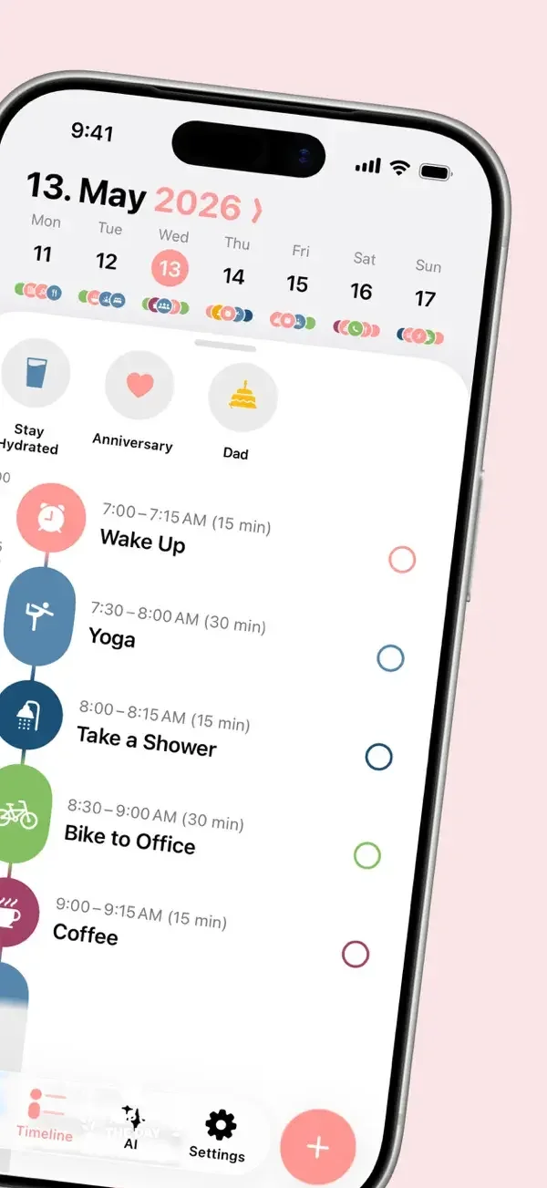
Colored time blocks run down a vertical timeline beside completion circles; recurrence options sit in a compact sheet.
Useful for: Study daily timeline, repeating routines, planning prompt. Compare the hierarchy and controls shown in these publisher previews, then test the corresponding behavior in your own app.
# Design reference: Structured
Source: https://apps.apple.com/us/app/id1499198946
Swipefile reference: https://swipefile.design/ref/mobile-structured/
Captured: 2026-09-09. This is a dated reference, not a claim about the current live product.
Source scope: publisher-provided App Store previews. Promotional framing is retained. These are static examples, not a tested or recorded user flow. Do not infer unseen interactions.

## Objective
Adapt the interaction and layout patterns below to my project. Use my own content and identity. Do not reproduce logos, proprietary copy, or brand assets.

## Reference notes
- surface: Daily timeline · Repeating routines · Planning prompt
- nav: A date strip and bottom destinations frame the daily plan, with an add control at the lower edge.
- layout: Colored time blocks run down a vertical timeline beside completion circles; recurrence options sit in a compact sheet.
- density: Compare the space reserved for the primary task with secondary metadata. The previews retain promotional framing; evaluate target sizes in your implemented screen.
- color: White, pink, and multicolored task blocks.
- typography: Use clear heading, body, and metadata levels. Keep interface text scalable and verify readability with the device text-size settings.
- pattern: Calendars & scheduling
- states: Static publisher previews only. Loading, empty, error, offline, permission, and keyboard behavior have not been tested. Specify and verify those states in your own implementation.
- dont: Do not copy the app identity, proprietary artwork, or promotional claims. Screenshot order is not a verified flow, and the listing version does not date every image.

Useful for: Study daily timeline, repeating routines, planning prompt. Compare the hierarchy and controls shown in these publisher previews, then test the corresponding behavior in your own app.

## Acceptance criteria
- Existing project conventions, design tokens, working functionality, and unrelated changes are preserved.
- Two or three reference principles clearly support the user's task; conflicts are resolved in favor of usability and the existing product.
- Accessible platform-native components express the interface; use semantic HTML when the target is mobile web. Available licensed assets are used; important UI text is never rendered as a bitmap.
- Every visible control has a defined behavior. Loading, empty, error, success, disabled, and long-content states are specified where relevant. Demo data is clearly labeled.
- Navigation and content adapt at 375px, 768px, and 1440px without horizontal page overflow. Keyboard use, visible focus, labeled inputs, at least 44px touch targets, readable contrast, and reduced motion are supported.
- Verification distinguishes rendered behavior from proposals and identifies anything still requiring a backend or external service.

## Quality bar
Clear hierarchy, consistent spacing, restrained surfaces, and purposeful motion. Avoid decorative gradients, excessive cards, placeholder buttons, and invented metrics unless the project calls for them. Do not claim a feature is connected or tested without evidence.
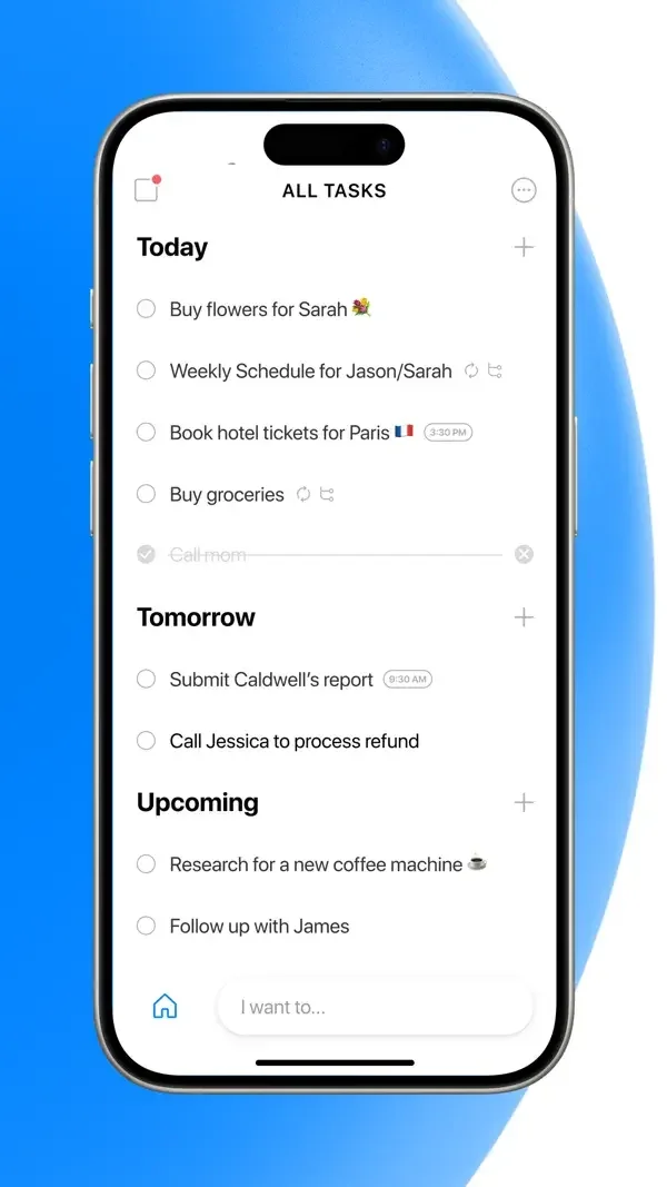
Tasks are grouped by date or status with small completion circles and optional assignee portraits.
Useful for: Study grouped task list, schedule widget, shared project tasks. Compare the hierarchy and controls shown in these publisher previews, then test the corresponding behavior in your own app.
# Design reference: Any.do
Source: https://apps.apple.com/us/app/id497328576
Swipefile reference: https://swipefile.design/ref/mobile-any-do/
Captured: 2026-09-09. This is a dated reference, not a claim about the current live product.
Source scope: publisher-provided App Store previews. Promotional framing is retained. These are static examples, not a tested or recorded user flow. Do not infer unseen interactions.

## Objective
Adapt the interaction and layout patterns below to my project. Use my own content and identity. Do not reproduce logos, proprietary copy, or brand assets.

## Reference notes
- surface: Grouped task list · Schedule widget · Shared project tasks
- nav: Today, Tomorrow, and Upcoming group personal tasks; shared work uses explicit status headings.
- layout: Tasks are grouped by date or status with small completion circles and optional assignee portraits.
- density: Compare the space reserved for the primary task with secondary metadata. The previews retain promotional framing; evaluate target sizes in your implemented screen.
- color: White lists with blue controls and restrained identity colors.
- typography: Use clear heading, body, and metadata levels. Keep interface text scalable and verify readability with the device text-size settings.
- pattern: Tasks & checklists
- states: Static publisher previews only. Loading, empty, error, offline, permission, and keyboard behavior have not been tested. Specify and verify those states in your own implementation.
- dont: Do not copy the app identity, proprietary artwork, or promotional claims. Screenshot order is not a verified flow, and the listing version does not date every image.

Useful for: Study grouped task list, schedule widget, shared project tasks. Compare the hierarchy and controls shown in these publisher previews, then test the corresponding behavior in your own app.

## Acceptance criteria
- Existing project conventions, design tokens, working functionality, and unrelated changes are preserved.
- Two or three reference principles clearly support the user's task; conflicts are resolved in favor of usability and the existing product.
- Accessible platform-native components express the interface; use semantic HTML when the target is mobile web. Available licensed assets are used; important UI text is never rendered as a bitmap.
- Every visible control has a defined behavior. Loading, empty, error, success, disabled, and long-content states are specified where relevant. Demo data is clearly labeled.
- Navigation and content adapt at 375px, 768px, and 1440px without horizontal page overflow. Keyboard use, visible focus, labeled inputs, at least 44px touch targets, readable contrast, and reduced motion are supported.
- Verification distinguishes rendered behavior from proposals and identifies anything still requiring a backend or external service.

## Quality bar
Clear hierarchy, consistent spacing, restrained surfaces, and purposeful motion. Avoid decorative gradients, excessive cards, placeholder buttons, and invented metrics unless the project calls for them. Do not claim a feature is connected or tested without evidence.
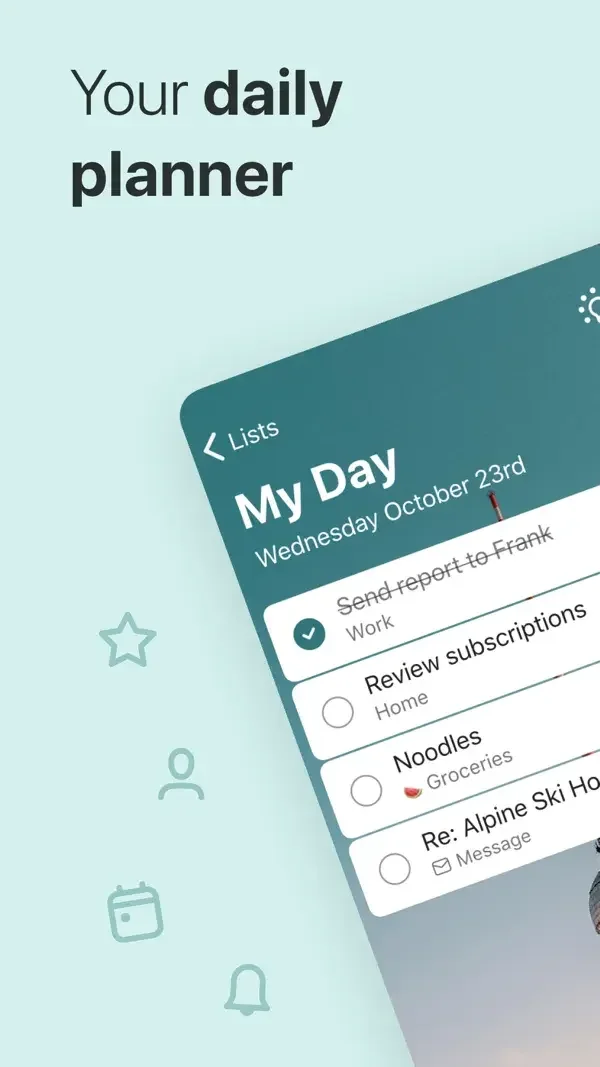
Simple checkbox rows remain consistent across daily planning, groceries, and flagged email lists.
Useful for: Study my day list, list personalization, flagged email tasks. Compare the hierarchy and controls shown in these publisher previews, then test the corresponding behavior in your own app.
# Design reference: Microsoft To Do
Source: https://apps.apple.com/us/app/id1212616790
Swipefile reference: https://swipefile.design/ref/mobile-microsoft-to-do/
Captured: 2026-09-09. This is a dated reference, not a claim about the current live product.
Source scope: publisher-provided App Store previews. Promotional framing is retained. These are static examples, not a tested or recorded user flow. Do not infer unseen interactions.

## Objective
Adapt the interaction and layout patterns below to my project. Use my own content and identity. Do not reproduce logos, proprietary copy, or brand assets.

## Reference notes
- surface: My Day list · List personalization · Flagged email tasks
- nav: List-level back controls and a clear heading identify the current task context.
- layout: Simple checkbox rows remain consistent across daily planning, groceries, and flagged email lists.
- density: Compare the space reserved for the primary task with secondary metadata. The previews retain promotional framing; evaluate target sizes in your implemented screen.
- color: Teal, green, and red list backgrounds with white task rows.
- typography: Use clear heading, body, and metadata levels. Keep interface text scalable and verify readability with the device text-size settings.
- pattern: Tasks & checklists
- states: Static publisher previews only. Loading, empty, error, offline, permission, and keyboard behavior have not been tested. Specify and verify those states in your own implementation.
- dont: Do not copy the app identity, proprietary artwork, or promotional claims. Screenshot order is not a verified flow, and the listing version does not date every image.

Useful for: Study my day list, list personalization, flagged email tasks. Compare the hierarchy and controls shown in these publisher previews, then test the corresponding behavior in your own app.

## Acceptance criteria
- Existing project conventions, design tokens, working functionality, and unrelated changes are preserved.
- Two or three reference principles clearly support the user's task; conflicts are resolved in favor of usability and the existing product.
- Accessible platform-native components express the interface; use semantic HTML when the target is mobile web. Available licensed assets are used; important UI text is never rendered as a bitmap.
- Every visible control has a defined behavior. Loading, empty, error, success, disabled, and long-content states are specified where relevant. Demo data is clearly labeled.
- Navigation and content adapt at 375px, 768px, and 1440px without horizontal page overflow. Keyboard use, visible focus, labeled inputs, at least 44px touch targets, readable contrast, and reduced motion are supported.
- Verification distinguishes rendered behavior from proposals and identifies anything still requiring a backend or external service.

## Quality bar
Clear hierarchy, consistent spacing, restrained surfaces, and purposeful motion. Avoid decorative gradients, excessive cards, placeholder buttons, and invented metrics unless the project calls for them. Do not claim a feature is connected or tested without evidence.
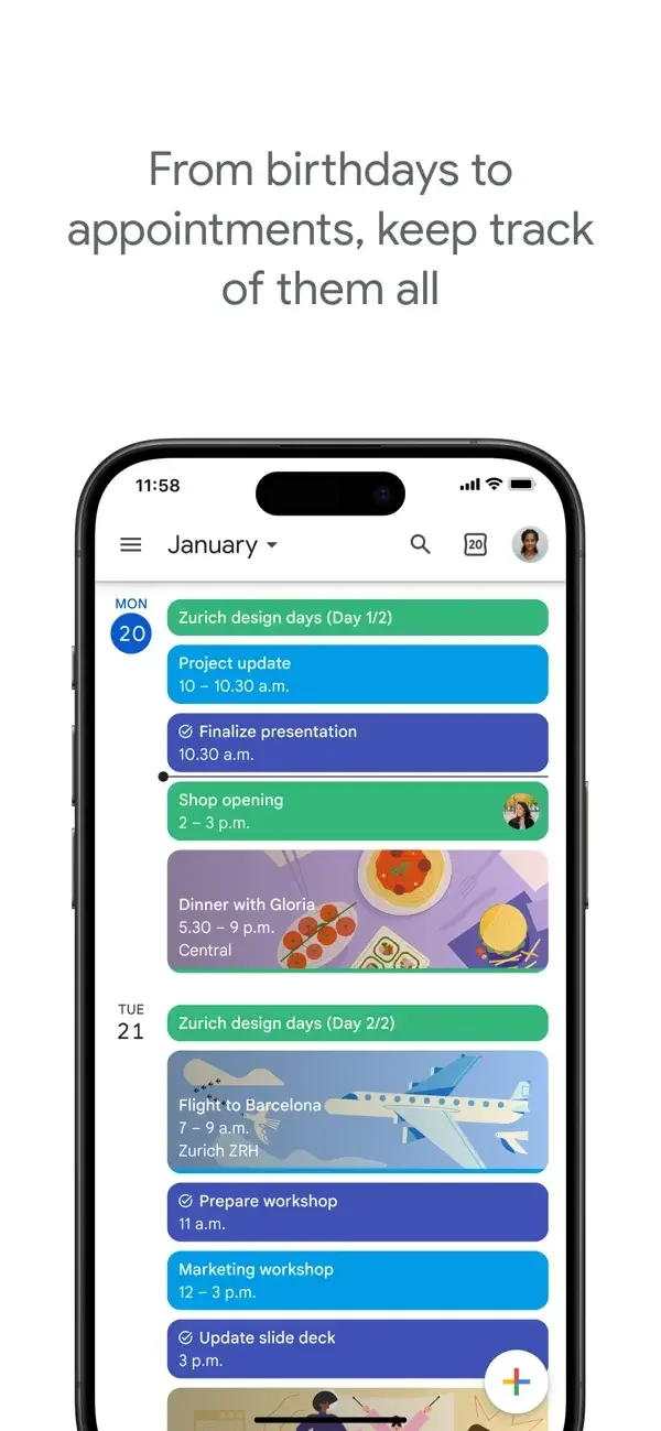
Colored event blocks and illustrations distinguish agenda items while a detail sheet groups location, meeting link, and guests.
Useful for: Study schedule overview, event creation, event details. Compare the hierarchy and controls shown in these publisher previews, then test the corresponding behavior in your own app.
# Design reference: Google Calendar
Source: https://apps.apple.com/us/app/id909319292
Swipefile reference: https://swipefile.design/ref/mobile-google-calendar/
Captured: 2026-09-09. This is a dated reference, not a claim about the current live product.
Source scope: publisher-provided App Store previews. Promotional framing is retained. These are static examples, not a tested or recorded user flow. Do not infer unseen interactions.

## Objective
Adapt the interaction and layout patterns below to my project. Use my own content and identity. Do not reproduce logos, proprietary copy, or brand assets.

## Reference notes
- surface: Schedule overview · Event creation · Event details
- nav: A compact date header leads into schedule entries and event details.
- layout: Colored event blocks and illustrations distinguish agenda items while a detail sheet groups location, meeting link, and guests.
- density: Compare the space reserved for the primary task with secondary metadata. The previews retain promotional framing; evaluate target sizes in your implemented screen.
- color: White canvas with multicolored calendars and blue actions.
- typography: Use clear heading, body, and metadata levels. Keep interface text scalable and verify readability with the device text-size settings.
- pattern: Calendars & scheduling
- states: Static publisher previews only. Loading, empty, error, offline, permission, and keyboard behavior have not been tested. Specify and verify those states in your own implementation.
- dont: Do not copy the app identity, proprietary artwork, or promotional claims. Screenshot order is not a verified flow, and the listing version does not date every image.

Useful for: Study schedule overview, event creation, event details. Compare the hierarchy and controls shown in these publisher previews, then test the corresponding behavior in your own app.

## Acceptance criteria
- Existing project conventions, design tokens, working functionality, and unrelated changes are preserved.
- Two or three reference principles clearly support the user's task; conflicts are resolved in favor of usability and the existing product.
- Accessible platform-native components express the interface; use semantic HTML when the target is mobile web. Available licensed assets are used; important UI text is never rendered as a bitmap.
- Every visible control has a defined behavior. Loading, empty, error, success, disabled, and long-content states are specified where relevant. Demo data is clearly labeled.
- Navigation and content adapt at 375px, 768px, and 1440px without horizontal page overflow. Keyboard use, visible focus, labeled inputs, at least 44px touch targets, readable contrast, and reduced motion are supported.
- Verification distinguishes rendered behavior from proposals and identifies anything still requiring a backend or external service.

## Quality bar
Clear hierarchy, consistent spacing, restrained surfaces, and purposeful motion. Avoid decorative gradients, excessive cards, placeholder buttons, and invented metrics unless the project calls for them. Do not claim a feature is connected or tested without evidence.
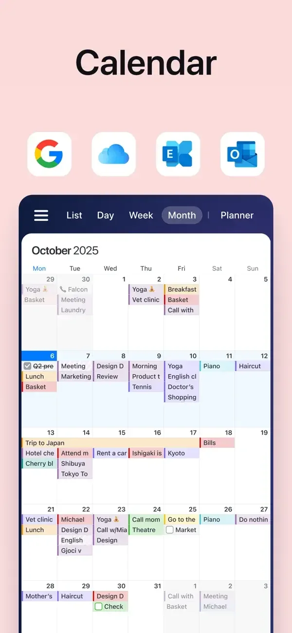
Dense calendar views use colored event blocks, while a task panel sits below the timed schedule.
Useful for: Study month calendar, day and week schedules, tasks alongside appointments. Compare the hierarchy and controls shown in these publisher previews, then test the corresponding behavior in your own app.
# Design reference: Calendars
Source: https://apps.apple.com/us/app/id608834326
Swipefile reference: https://swipefile.design/ref/mobile-calendars/
Captured: 2026-09-09. This is a dated reference, not a claim about the current live product.
Source scope: publisher-provided App Store previews. Promotional framing is retained. These are static examples, not a tested or recorded user flow. Do not infer unseen interactions.

## Objective
Adapt the interaction and layout patterns below to my project. Use my own content and identity. Do not reproduce logos, proprietary copy, or brand assets.

## Reference notes
- surface: Month calendar · Day and week schedules · Tasks alongside appointments
- nav: List, Day, Week, Month, and Planner labels make view switching explicit.
- layout: Dense calendar views use colored event blocks, while a task panel sits below the timed schedule.
- density: Compare the space reserved for the primary task with secondary metadata. The previews retain promotional framing; evaluate target sizes in your implemented screen.
- color: White surfaces, navy navigation, and pastel event colors.
- typography: Use clear heading, body, and metadata levels. Keep interface text scalable and verify readability with the device text-size settings.
- pattern: Calendars & scheduling
- states: Static publisher previews only. Loading, empty, error, offline, permission, and keyboard behavior have not been tested. Specify and verify those states in your own implementation.
- dont: Do not copy the app identity, proprietary artwork, or promotional claims. Screenshot order is not a verified flow, and the listing version does not date every image.

Useful for: Study month calendar, day and week schedules, tasks alongside appointments. Compare the hierarchy and controls shown in these publisher previews, then test the corresponding behavior in your own app.

## Acceptance criteria
- Existing project conventions, design tokens, working functionality, and unrelated changes are preserved.
- Two or three reference principles clearly support the user's task; conflicts are resolved in favor of usability and the existing product.
- Accessible platform-native components express the interface; use semantic HTML when the target is mobile web. Available licensed assets are used; important UI text is never rendered as a bitmap.
- Every visible control has a defined behavior. Loading, empty, error, success, disabled, and long-content states are specified where relevant. Demo data is clearly labeled.
- Navigation and content adapt at 375px, 768px, and 1440px without horizontal page overflow. Keyboard use, visible focus, labeled inputs, at least 44px touch targets, readable contrast, and reduced motion are supported.
- Verification distinguishes rendered behavior from proposals and identifies anything still requiring a backend or external service.

## Quality bar
Clear hierarchy, consistent spacing, restrained surfaces, and purposeful motion. Avoid decorative gradients, excessive cards, placeholder buttons, and invented metrics unless the project calls for them. Do not claim a feature is connected or tested without evidence.
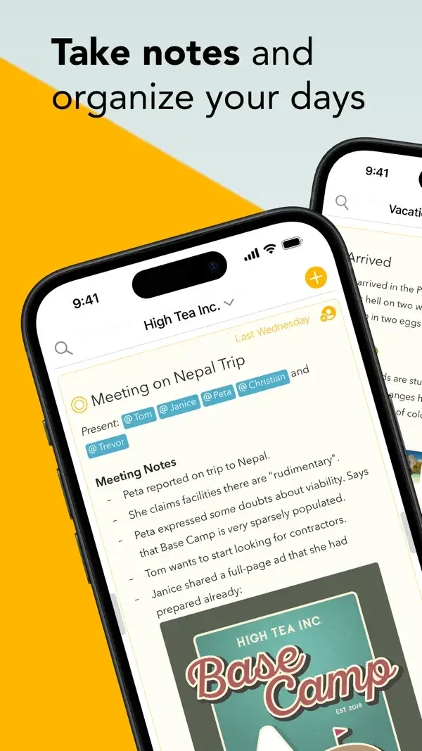
Notes combine dates, tags, rich text, and checklists within a narrow document layout.
Useful for: Study rich dated note, project note list, dated tasks and notes. Compare the hierarchy and controls shown in these publisher previews, then test the corresponding behavior in your own app.
# Design reference: Agenda
Source: https://apps.apple.com/us/app/id1370289240
Swipefile reference: https://swipefile.design/ref/mobile-agenda/
Captured: 2026-09-09. This is a dated reference, not a claim about the current live product.
Source scope: publisher-provided App Store previews. Promotional framing is retained. These are static examples, not a tested or recorded user flow. Do not infer unseen interactions.

## Objective
Adapt the interaction and layout patterns below to my project. Use my own content and identity. Do not reproduce logos, proprietary copy, or brand assets.

## Reference notes
- surface: Rich dated note · Project note list · Dated tasks and notes
- nav: Project headings and note-level dates help connect writing with scheduled work.
- layout: Notes combine dates, tags, rich text, and checklists within a narrow document layout.
- density: Compare the space reserved for the primary task with secondary metadata. The previews retain promotional framing; evaluate target sizes in your implemented screen.
- color: White pages with yellow controls and highlighted metadata.
- typography: Use clear heading, body, and metadata levels. Keep interface text scalable and verify readability with the device text-size settings.
- pattern: Notes & documents
- states: Static publisher previews only. Loading, empty, error, offline, permission, and keyboard behavior have not been tested. Specify and verify those states in your own implementation.
- dont: Do not copy the app identity, proprietary artwork, or promotional claims. Screenshot order is not a verified flow, and the listing version does not date every image.

Useful for: Study rich dated note, project note list, dated tasks and notes. Compare the hierarchy and controls shown in these publisher previews, then test the corresponding behavior in your own app.

## Acceptance criteria
- Existing project conventions, design tokens, working functionality, and unrelated changes are preserved.
- Two or three reference principles clearly support the user's task; conflicts are resolved in favor of usability and the existing product.
- Accessible platform-native components express the interface; use semantic HTML when the target is mobile web. Available licensed assets are used; important UI text is never rendered as a bitmap.
- Every visible control has a defined behavior. Loading, empty, error, success, disabled, and long-content states are specified where relevant. Demo data is clearly labeled.
- Navigation and content adapt at 375px, 768px, and 1440px without horizontal page overflow. Keyboard use, visible focus, labeled inputs, at least 44px touch targets, readable contrast, and reduced motion are supported.
- Verification distinguishes rendered behavior from proposals and identifies anything still requiring a backend or external service.

## Quality bar
Clear hierarchy, consistent spacing, restrained surfaces, and purposeful motion. Avoid decorative gradients, excessive cards, placeholder buttons, and invented metrics unless the project calls for them. Do not claim a feature is connected or tested without evidence.
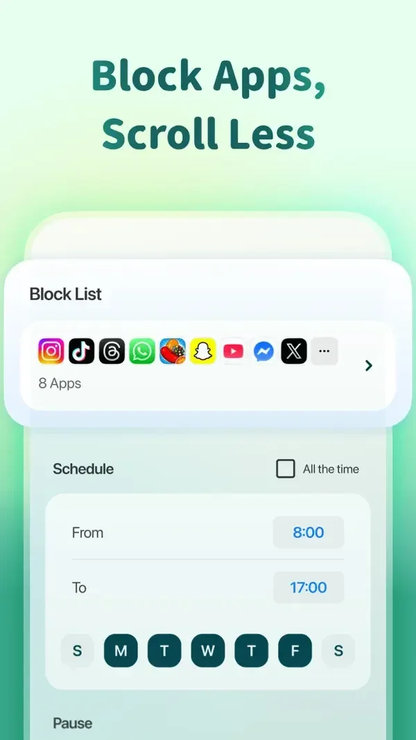
A schedule uses weekday buttons and time fields; separate illustrated surfaces visualize focus history and a breathing prompt.
Useful for: Study blocked-app schedule, focus achievement overview, breathing exercise. Compare the hierarchy and controls shown in these publisher previews, then test the corresponding behavior in your own app.
# Design reference: Forest
Source: https://apps.apple.com/us/app/id866450515
Swipefile reference: https://swipefile.design/ref/mobile-forest/
Captured: 2026-09-09. This is a dated reference, not a claim about the current live product.
Source scope: publisher-provided App Store previews. Promotional framing is retained. These are static examples, not a tested or recorded user flow. Do not infer unseen interactions.

## Objective
Adapt the interaction and layout patterns below to my project. Use my own content and identity. Do not reproduce logos, proprietary copy, or brand assets.

## Reference notes
- surface: Blocked-app schedule · Focus achievement overview · Breathing exercise
- nav: Schedule settings, achievement overview, and a focused exercise each use a distinct screen structure.
- layout: A schedule uses weekday buttons and time fields; separate illustrated surfaces visualize focus history and a breathing prompt.
- density: Compare the space reserved for the primary task with secondary metadata. The previews retain promotional framing; evaluate target sizes in your implemented screen.
- color: Green gradients, pale settings panels, and nature illustrations.
- typography: Use clear heading, body, and metadata levels. Keep interface text scalable and verify readability with the device text-size settings.
- pattern: Habits & progress
- states: Static publisher previews only. Loading, empty, error, offline, permission, and keyboard behavior have not been tested. Specify and verify those states in your own implementation.
- dont: Do not copy the app identity, proprietary artwork, or promotional claims. Screenshot order is not a verified flow, and the listing version does not date every image.

Useful for: Study blocked-app schedule, focus achievement overview, breathing exercise. Compare the hierarchy and controls shown in these publisher previews, then test the corresponding behavior in your own app.

## Acceptance criteria
- Existing project conventions, design tokens, working functionality, and unrelated changes are preserved.
- Two or three reference principles clearly support the user's task; conflicts are resolved in favor of usability and the existing product.
- Accessible platform-native components express the interface; use semantic HTML when the target is mobile web. Available licensed assets are used; important UI text is never rendered as a bitmap.
- Every visible control has a defined behavior. Loading, empty, error, success, disabled, and long-content states are specified where relevant. Demo data is clearly labeled.
- Navigation and content adapt at 375px, 768px, and 1440px without horizontal page overflow. Keyboard use, visible focus, labeled inputs, at least 44px touch targets, readable contrast, and reduced motion are supported.
- Verification distinguishes rendered behavior from proposals and identifies anything still requiring a backend or external service.

## Quality bar
Clear hierarchy, consistent spacing, restrained surfaces, and purposeful motion. Avoid decorative gradients, excessive cards, placeholder buttons, and invented metrics unless the project calls for them. Do not claim a feature is connected or tested without evidence.
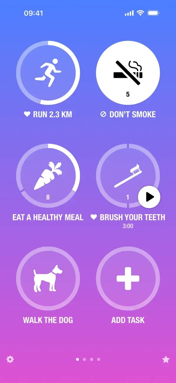
Large circular habit controls contrast with compact historical charts and a plain reflection editor.
Useful for: Study habit completion grid, history and charts, daily reflection entry. Compare the hierarchy and controls shown in these publisher previews, then test the corresponding behavior in your own app.
# Design reference: Streaks
Source: https://apps.apple.com/us/app/id963034692
Swipefile reference: https://swipefile.design/ref/mobile-streaks/
Captured: 2026-09-09. This is a dated reference, not a claim about the current live product.
Source scope: publisher-provided App Store previews. Promotional framing is retained. These are static examples, not a tested or recorded user flow. Do not infer unseen interactions.

## Objective
Adapt the interaction and layout patterns below to my project. Use my own content and identity. Do not reproduce logos, proprietary copy, or brand assets.

## Reference notes
- surface: Habit completion grid · History and charts · Daily reflection entry
- nav: Habit icons lead into period summaries and dated entries.
- layout: Large circular habit controls contrast with compact historical charts and a plain reflection editor.
- density: Compare the space reserved for the primary task with secondary metadata. The previews retain promotional framing; evaluate target sizes in your implemented screen.
- color: Violet, pink, and orange themes with white controls.
- typography: Use clear heading, body, and metadata levels. Keep interface text scalable and verify readability with the device text-size settings.
- pattern: Habits & progress
- states: Static publisher previews only. Loading, empty, error, offline, permission, and keyboard behavior have not been tested. Specify and verify those states in your own implementation.
- dont: Do not copy the app identity, proprietary artwork, or promotional claims. Screenshot order is not a verified flow, and the listing version does not date every image.

Useful for: Study habit completion grid, history and charts, daily reflection entry. Compare the hierarchy and controls shown in these publisher previews, then test the corresponding behavior in your own app.

## Acceptance criteria
- Existing project conventions, design tokens, working functionality, and unrelated changes are preserved.
- Two or three reference principles clearly support the user's task; conflicts are resolved in favor of usability and the existing product.
- Accessible platform-native components express the interface; use semantic HTML when the target is mobile web. Available licensed assets are used; important UI text is never rendered as a bitmap.
- Every visible control has a defined behavior. Loading, empty, error, success, disabled, and long-content states are specified where relevant. Demo data is clearly labeled.
- Navigation and content adapt at 375px, 768px, and 1440px without horizontal page overflow. Keyboard use, visible focus, labeled inputs, at least 44px touch targets, readable contrast, and reduced motion are supported.
- Verification distinguishes rendered behavior from proposals and identifies anything still requiring a backend or external service.

## Quality bar
Clear hierarchy, consistent spacing, restrained surfaces, and purposeful motion. Avoid decorative gradients, excessive cards, placeholder buttons, and invented metrics unless the project calls for them. Do not claim a feature is connected or tested without evidence.
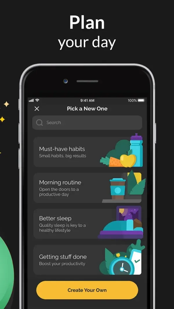
Illustrated habit templates, a daily checklist, and program cards share compact rounded containers.
Useful for: Study habit template picker, today habit list, program library. Compare the hierarchy and controls shown in these publisher previews, then test the corresponding behavior in your own app.
# Design reference: Productive
Source: https://apps.apple.com/us/app/id983826477
Swipefile reference: https://swipefile.design/ref/mobile-productive/
Captured: 2026-09-09. This is a dated reference, not a claim about the current live product.
Source scope: publisher-provided App Store previews. Promotional framing is retained. These are static examples, not a tested or recorded user flow. Do not infer unseen interactions.

## Objective
Adapt the interaction and layout patterns below to my project. Use my own content and identity. Do not reproduce logos, proprietary copy, or brand assets.

## Reference notes
- surface: Habit template picker · Today habit list · Program library
- nav: Today provides a daily anchor; template and program lists support choosing what to track.
- layout: Illustrated habit templates, a daily checklist, and program cards share compact rounded containers.
- density: Compare the space reserved for the primary task with secondary metadata. The previews retain promotional framing; evaluate target sizes in your implemented screen.
- color: Dark surfaces with yellow calls to action and blue add controls.
- typography: Use clear heading, body, and metadata levels. Keep interface text scalable and verify readability with the device text-size settings.
- pattern: Habits & progress
- states: Static publisher previews only. Loading, empty, error, offline, permission, and keyboard behavior have not been tested. Specify and verify those states in your own implementation.
- dont: Do not copy the app identity, proprietary artwork, or promotional claims. Screenshot order is not a verified flow, and the listing version does not date every image.

Useful for: Study habit template picker, today habit list, program library. Compare the hierarchy and controls shown in these publisher previews, then test the corresponding behavior in your own app.

## Acceptance criteria
- Existing project conventions, design tokens, working functionality, and unrelated changes are preserved.
- Two or three reference principles clearly support the user's task; conflicts are resolved in favor of usability and the existing product.
- Accessible platform-native components express the interface; use semantic HTML when the target is mobile web. Available licensed assets are used; important UI text is never rendered as a bitmap.
- Every visible control has a defined behavior. Loading, empty, error, success, disabled, and long-content states are specified where relevant. Demo data is clearly labeled.
- Navigation and content adapt at 375px, 768px, and 1440px without horizontal page overflow. Keyboard use, visible focus, labeled inputs, at least 44px touch targets, readable contrast, and reduced motion are supported.
- Verification distinguishes rendered behavior from proposals and identifies anything still requiring a backend or external service.

## Quality bar
Clear hierarchy, consistent spacing, restrained surfaces, and purposeful motion. Avoid decorative gradients, excessive cards, placeholder buttons, and invented metrics unless the project calls for them. Do not claim a feature is connected or tested without evidence.
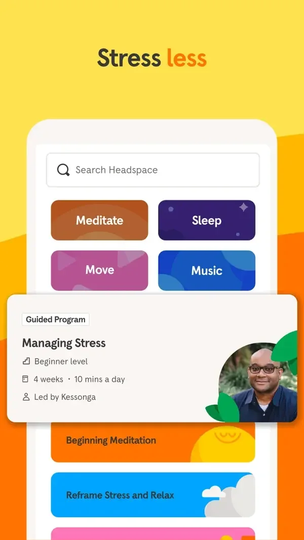
Category tiles and illustrated content cards lead into a course summary with teacher choices and a clear start control.
Useful for: Study category discovery, sleep content library, course and teacher selection. Compare the hierarchy and controls shown in these publisher previews, then test the corresponding behavior in your own app.
# Design reference: Headspace
Source: https://apps.apple.com/us/app/id493145008
Swipefile reference: https://swipefile.design/ref/mobile-headspace/
Captured: 2026-09-09. This is a dated reference, not a claim about the current live product.
Source scope: publisher-provided App Store previews. Promotional framing is retained. These are static examples, not a tested or recorded user flow. Do not infer unseen interactions.

## Objective
Adapt the interaction and layout patterns below to my project. Use my own content and identity. Do not reproduce logos, proprietary copy, or brand assets.

## Reference notes
- surface: Category discovery · Sleep content library · Course and teacher selection
- nav: Search and bottom destinations frame the library; a back control returns from course detail.
- layout: Category tiles and illustrated content cards lead into a course summary with teacher choices and a clear start control.
- density: Compare the space reserved for the primary task with secondary metadata. The previews retain promotional framing; evaluate target sizes in your implemented screen.
- color: Warm orange and yellow contrast with a deep purple sleep surface.
- typography: Use clear heading, body, and metadata levels. Keep interface text scalable and verify readability with the device text-size settings.
- pattern: Content discovery
- states: Static publisher previews only. Loading, empty, error, offline, permission, and keyboard behavior have not been tested. Specify and verify those states in your own implementation.
- dont: Do not copy the app identity, proprietary artwork, or promotional claims. Screenshot order is not a verified flow, and the listing version does not date every image.

Useful for: Study category discovery, sleep content library, course and teacher selection. Compare the hierarchy and controls shown in these publisher previews, then test the corresponding behavior in your own app.

## Acceptance criteria
- Existing project conventions, design tokens, working functionality, and unrelated changes are preserved.
- Two or three reference principles clearly support the user's task; conflicts are resolved in favor of usability and the existing product.
- Accessible platform-native components express the interface; use semantic HTML when the target is mobile web. Available licensed assets are used; important UI text is never rendered as a bitmap.
- Every visible control has a defined behavior. Loading, empty, error, success, disabled, and long-content states are specified where relevant. Demo data is clearly labeled.
- Navigation and content adapt at 375px, 768px, and 1440px without horizontal page overflow. Keyboard use, visible focus, labeled inputs, at least 44px touch targets, readable contrast, and reduced motion are supported.
- Verification distinguishes rendered behavior from proposals and identifies anything still requiring a backend or external service.

## Quality bar
Clear hierarchy, consistent spacing, restrained surfaces, and purposeful motion. Avoid decorative gradients, excessive cards, placeholder buttons, and invented metrics unless the project calls for them. Do not claim a feature is connected or tested without evidence.
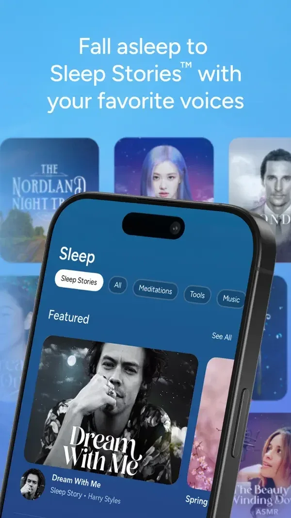
Large image cards are grouped by content type, with compact filter chips above the sleep library.
Useful for: Study sleep story library, daily practice library, soundscape browsing. Compare the hierarchy and controls shown in these publisher previews, then test the corresponding behavior in your own app.
# Design reference: Calm
Source: https://apps.apple.com/us/app/id571800810
Swipefile reference: https://swipefile.design/ref/mobile-calm/
Captured: 2026-09-09. This is a dated reference, not a claim about the current live product.
Source scope: publisher-provided App Store previews. Promotional framing is retained. These are static examples, not a tested or recorded user flow. Do not infer unseen interactions.

## Objective
Adapt the interaction and layout patterns below to my project. Use my own content and identity. Do not reproduce logos, proprietary copy, or brand assets.

## Reference notes
- surface: Sleep story library · Daily practice library · Soundscape browsing
- nav: Category labels and See All links offer both broad browsing and narrower collections.
- layout: Large image cards are grouped by content type, with compact filter chips above the sleep library.
- density: Compare the space reserved for the primary task with secondary metadata. The previews retain promotional framing; evaluate target sizes in your implemented screen.
- color: Blue backgrounds and soft photographic cover art.
- typography: Use clear heading, body, and metadata levels. Keep interface text scalable and verify readability with the device text-size settings.
- pattern: Content discovery
- states: Static publisher previews only. Loading, empty, error, offline, permission, and keyboard behavior have not been tested. Specify and verify those states in your own implementation.
- dont: Do not copy the app identity, proprietary artwork, or promotional claims. Screenshot order is not a verified flow, and the listing version does not date every image.

Useful for: Study sleep story library, daily practice library, soundscape browsing. Compare the hierarchy and controls shown in these publisher previews, then test the corresponding behavior in your own app.

## Acceptance criteria
- Existing project conventions, design tokens, working functionality, and unrelated changes are preserved.
- Two or three reference principles clearly support the user's task; conflicts are resolved in favor of usability and the existing product.
- Accessible platform-native components express the interface; use semantic HTML when the target is mobile web. Available licensed assets are used; important UI text is never rendered as a bitmap.
- Every visible control has a defined behavior. Loading, empty, error, success, disabled, and long-content states are specified where relevant. Demo data is clearly labeled.
- Navigation and content adapt at 375px, 768px, and 1440px without horizontal page overflow. Keyboard use, visible focus, labeled inputs, at least 44px touch targets, readable contrast, and reduced motion are supported.
- Verification distinguishes rendered behavior from proposals and identifies anything still requiring a backend or external service.

## Quality bar
Clear hierarchy, consistent spacing, restrained surfaces, and purposeful motion. Avoid decorative gradients, excessive cards, placeholder buttons, and invented metrics unless the project calls for them. Do not claim a feature is connected or tested without evidence.
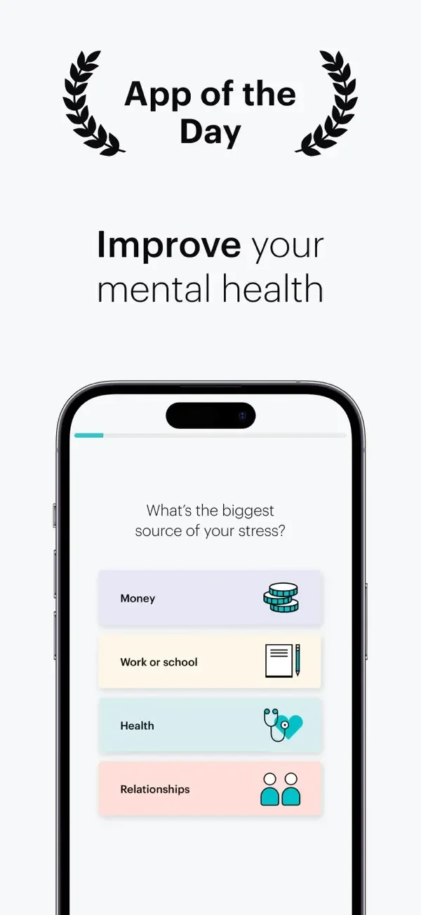
A short multiple-choice question contrasts with a recommendation card and an illustrated plan grid.
Useful for: Study personalization question, today recommendations, meditation plan grid. Compare the hierarchy and controls shown in these publisher previews, then test the corresponding behavior in your own app.
# Design reference: Balance
Source: https://apps.apple.com/us/app/id1361356590
Swipefile reference: https://swipefile.design/ref/mobile-balance/
Captured: 2026-09-09. This is a dated reference, not a claim about the current live product.
Source scope: publisher-provided App Store previews. Promotional framing is retained. These are static examples, not a tested or recorded user flow. Do not infer unseen interactions.

## Objective
Adapt the interaction and layout patterns below to my project. Use my own content and identity. Do not reproduce logos, proprietary copy, or brand assets.

## Reference notes
- surface: Personalization question · Today recommendations · Meditation plan grid
- nav: Bottom destinations separate Today, plans, sleep, and profile-related areas.
- layout: A short multiple-choice question contrasts with a recommendation card and an illustrated plan grid.
- density: Compare the space reserved for the primary task with secondary metadata. The previews retain promotional framing; evaluate target sizes in your implemented screen.
- color: White space, turquoise controls, and light pastel choice rows.
- typography: Use clear heading, body, and metadata levels. Keep interface text scalable and verify readability with the device text-size settings.
- pattern: Onboarding & personalization
- states: Static publisher previews only. Loading, empty, error, offline, permission, and keyboard behavior have not been tested. Specify and verify those states in your own implementation.
- dont: Do not copy the app identity, proprietary artwork, or promotional claims. Screenshot order is not a verified flow, and the listing version does not date every image.

Useful for: Study personalization question, today recommendations, meditation plan grid. Compare the hierarchy and controls shown in these publisher previews, then test the corresponding behavior in your own app.

## Acceptance criteria
- Existing project conventions, design tokens, working functionality, and unrelated changes are preserved.
- Two or three reference principles clearly support the user's task; conflicts are resolved in favor of usability and the existing product.
- Accessible platform-native components express the interface; use semantic HTML when the target is mobile web. Available licensed assets are used; important UI text is never rendered as a bitmap.
- Every visible control has a defined behavior. Loading, empty, error, success, disabled, and long-content states are specified where relevant. Demo data is clearly labeled.
- Navigation and content adapt at 375px, 768px, and 1440px without horizontal page overflow. Keyboard use, visible focus, labeled inputs, at least 44px touch targets, readable contrast, and reduced motion are supported.
- Verification distinguishes rendered behavior from proposals and identifies anything still requiring a backend or external service.

## Quality bar
Clear hierarchy, consistent spacing, restrained surfaces, and purposeful motion. Avoid decorative gradients, excessive cards, placeholder buttons, and invented metrics unless the project calls for them. Do not claim a feature is connected or tested without evidence.
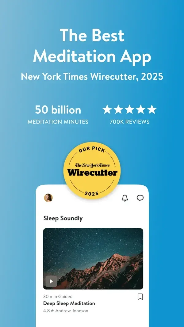
Small category shortcuts sit above large meditation cards with duration and teacher metadata.
Useful for: Study featured meditation, home category shortcuts, content library. Compare the hierarchy and controls shown in these publisher previews, then test the corresponding behavior in your own app.
# Design reference: Insight Timer
Source: https://apps.apple.com/us/app/id337472899
Swipefile reference: https://swipefile.design/ref/mobile-insight-timer/
Captured: 2026-09-09. This is a dated reference, not a claim about the current live product.
Source scope: publisher-provided App Store previews. Promotional framing is retained. These are static examples, not a tested or recorded user flow. Do not infer unseen interactions.

## Objective
Adapt the interaction and layout patterns below to my project. Use my own content and identity. Do not reproduce logos, proprietary copy, or brand assets.

## Reference notes
- surface: Featured meditation · Home category shortcuts · Content library
- nav: A home greeting, category grid, and content cards establish multiple routes into the library.
- layout: Small category shortcuts sit above large meditation cards with duration and teacher metadata.
- density: Compare the space reserved for the primary task with secondary metadata. The previews retain promotional framing; evaluate target sizes in your implemented screen.
- color: White panels with blue promotional framing and photographic covers.
- typography: Use clear heading, body, and metadata levels. Keep interface text scalable and verify readability with the device text-size settings.
- pattern: Content discovery
- states: Static publisher previews only. Loading, empty, error, offline, permission, and keyboard behavior have not been tested. Specify and verify those states in your own implementation.
- dont: Do not copy the app identity, proprietary artwork, or promotional claims. Screenshot order is not a verified flow, and the listing version does not date every image.

Useful for: Study featured meditation, home category shortcuts, content library. Compare the hierarchy and controls shown in these publisher previews, then test the corresponding behavior in your own app.

## Acceptance criteria
- Existing project conventions, design tokens, working functionality, and unrelated changes are preserved.
- Two or three reference principles clearly support the user's task; conflicts are resolved in favor of usability and the existing product.
- Accessible platform-native components express the interface; use semantic HTML when the target is mobile web. Available licensed assets are used; important UI text is never rendered as a bitmap.
- Every visible control has a defined behavior. Loading, empty, error, success, disabled, and long-content states are specified where relevant. Demo data is clearly labeled.
- Navigation and content adapt at 375px, 768px, and 1440px without horizontal page overflow. Keyboard use, visible focus, labeled inputs, at least 44px touch targets, readable contrast, and reduced motion are supported.
- Verification distinguishes rendered behavior from proposals and identifies anything still requiring a backend or external service.

## Quality bar
Clear hierarchy, consistent spacing, restrained surfaces, and purposeful motion. Avoid decorative gradients, excessive cards, placeholder buttons, and invented metrics unless the project calls for them. Do not claim a feature is connected or tested without evidence.
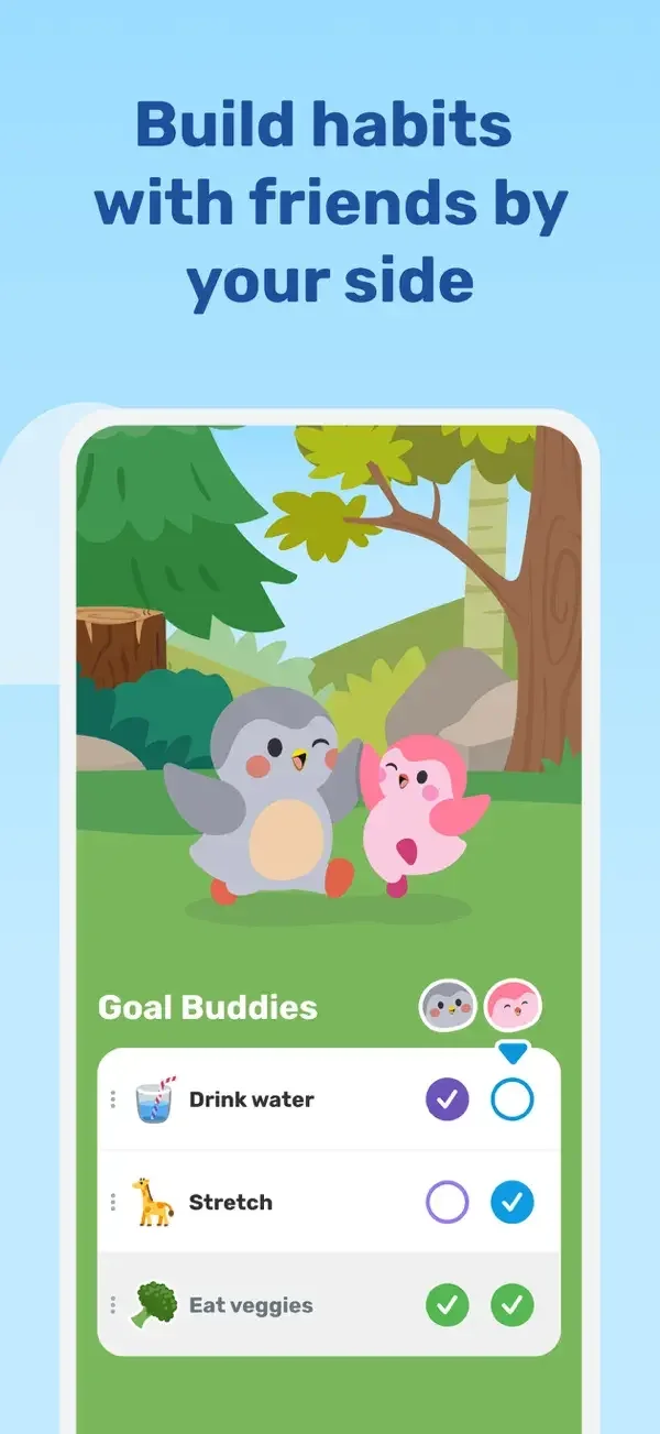
A character scene sits above approachable checklists, while a support picker presents friendly illustrated reactions.
Useful for: Study shared goal checklist, support message picker, adventure and daily goals. Compare the hierarchy and controls shown in these publisher previews, then test the corresponding behavior in your own app.
# Design reference: Finch
Source: https://apps.apple.com/us/app/id1528595748
Swipefile reference: https://swipefile.design/ref/mobile-finch/
Captured: 2026-09-09. This is a dated reference, not a claim about the current live product.
Source scope: publisher-provided App Store previews. Promotional framing is retained. These are static examples, not a tested or recorded user flow. Do not infer unseen interactions.

## Objective
Adapt the interaction and layout patterns below to my project. Use my own content and identity. Do not reproduce logos, proprietary copy, or brand assets.

## Reference notes
- surface: Shared goal checklist · Support message picker · Adventure and daily goals
- nav: Goal lists and a dedicated message-selection surface separate personal progress from social encouragement.
- layout: A character scene sits above approachable checklists, while a support picker presents friendly illustrated reactions.
- density: Compare the space reserved for the primary task with secondary metadata. The previews retain promotional framing; evaluate target sizes in your implemented screen.
- color: Bright green and pink panels with soft character illustrations.
- typography: Use clear heading, body, and metadata levels. Keep interface text scalable and verify readability with the device text-size settings.
- pattern: Habits & progress
- states: Static publisher previews only. Loading, empty, error, offline, permission, and keyboard behavior have not been tested. Specify and verify those states in your own implementation.
- dont: Do not copy the app identity, proprietary artwork, or promotional claims. Screenshot order is not a verified flow, and the listing version does not date every image.

Useful for: Study shared goal checklist, support message picker, adventure and daily goals. Compare the hierarchy and controls shown in these publisher previews, then test the corresponding behavior in your own app.

## Acceptance criteria
- Existing project conventions, design tokens, working functionality, and unrelated changes are preserved.
- Two or three reference principles clearly support the user's task; conflicts are resolved in favor of usability and the existing product.
- Accessible platform-native components express the interface; use semantic HTML when the target is mobile web. Available licensed assets are used; important UI text is never rendered as a bitmap.
- Every visible control has a defined behavior. Loading, empty, error, success, disabled, and long-content states are specified where relevant. Demo data is clearly labeled.
- Navigation and content adapt at 375px, 768px, and 1440px without horizontal page overflow. Keyboard use, visible focus, labeled inputs, at least 44px touch targets, readable contrast, and reduced motion are supported.
- Verification distinguishes rendered behavior from proposals and identifies anything still requiring a backend or external service.

## Quality bar
Clear hierarchy, consistent spacing, restrained surfaces, and purposeful motion. Avoid decorative gradients, excessive cards, placeholder buttons, and invented metrics unless the project calls for them. Do not claim a feature is connected or tested without evidence.
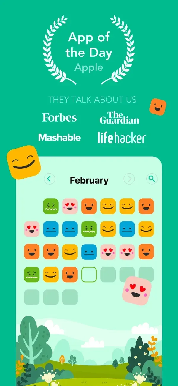
A calendar of mood icons summarizes previous entries; new entries use a short emotion scale and labeled activity groups.
Useful for: Study mood calendar, mood selection, activity selection. Compare the hierarchy and controls shown in these publisher previews, then test the corresponding behavior in your own app.
# Design reference: Daylio
Source: https://apps.apple.com/us/app/id1194023242
Swipefile reference: https://swipefile.design/ref/mobile-daylio/
Captured: 2026-09-09. This is a dated reference, not a claim about the current live product.
Source scope: publisher-provided App Store previews. Promotional framing is retained. These are static examples, not a tested or recorded user flow. Do not infer unseen interactions.

## Objective
Adapt the interaction and layout patterns below to my project. Use my own content and identity. Do not reproduce logos, proprietary copy, or brand assets.

## Reference notes
- surface: Mood calendar · Mood selection · Activity selection
- nav: The entry screens use clear close and save controls around a focused question.
- layout: A calendar of mood icons summarizes previous entries; new entries use a short emotion scale and labeled activity groups.
- density: Compare the space reserved for the primary task with secondary metadata. The previews retain promotional framing; evaluate target sizes in your implemented screen.
- color: White space with green controls and multicolored mood icons.
- typography: Use clear heading, body, and metadata levels. Keep interface text scalable and verify readability with the device text-size settings.
- pattern: Check-ins & journaling
- states: Static publisher previews only. Loading, empty, error, offline, permission, and keyboard behavior have not been tested. Specify and verify those states in your own implementation.
- dont: Do not copy the app identity, proprietary artwork, or promotional claims. Screenshot order is not a verified flow, and the listing version does not date every image.

Useful for: Study mood calendar, mood selection, activity selection. Compare the hierarchy and controls shown in these publisher previews, then test the corresponding behavior in your own app.

## Acceptance criteria
- Existing project conventions, design tokens, working functionality, and unrelated changes are preserved.
- Two or three reference principles clearly support the user's task; conflicts are resolved in favor of usability and the existing product.
- Accessible platform-native components express the interface; use semantic HTML when the target is mobile web. Available licensed assets are used; important UI text is never rendered as a bitmap.
- Every visible control has a defined behavior. Loading, empty, error, success, disabled, and long-content states are specified where relevant. Demo data is clearly labeled.
- Navigation and content adapt at 375px, 768px, and 1440px without horizontal page overflow. Keyboard use, visible focus, labeled inputs, at least 44px touch targets, readable contrast, and reduced motion are supported.
- Verification distinguishes rendered behavior from proposals and identifies anything still requiring a backend or external service.

## Quality bar
Clear hierarchy, consistent spacing, restrained surfaces, and purposeful motion. Avoid decorative gradients, excessive cards, placeholder buttons, and invented metrics unless the project calls for them. Do not claim a feature is connected or tested without evidence.
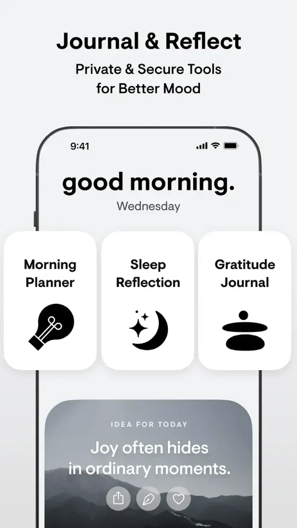
Large monochrome cards group reflective activities and writing prompts with restrained supporting text.
Useful for: Study morning reflection choices, sleep content grid, writing prompt selection. Compare the hierarchy and controls shown in these publisher previews, then test the corresponding behavior in your own app.
# Design reference: Stoic
Source: https://apps.apple.com/us/app/id1312926037
Swipefile reference: https://swipefile.design/ref/mobile-stoic/
Captured: 2026-09-09. This is a dated reference, not a claim about the current live product.
Source scope: publisher-provided App Store previews. Promotional framing is retained. These are static examples, not a tested or recorded user flow. Do not infer unseen interactions.

## Objective
Adapt the interaction and layout patterns below to my project. Use my own content and identity. Do not reproduce logos, proprietary copy, or brand assets.

## Reference notes
- surface: Morning reflection choices · Sleep content grid · Writing prompt selection
- nav: Named activity cards and writing shortcuts provide distinct starting points.
- layout: Large monochrome cards group reflective activities and writing prompts with restrained supporting text.
- density: Compare the space reserved for the primary task with secondary metadata. The previews retain promotional framing; evaluate target sizes in your implemented screen.
- color: Black, white, and soft gray with simple symbolic illustrations.
- typography: Use clear heading, body, and metadata levels. Keep interface text scalable and verify readability with the device text-size settings.
- pattern: Check-ins & journaling
- states: Static publisher previews only. Loading, empty, error, offline, permission, and keyboard behavior have not been tested. Specify and verify those states in your own implementation.
- dont: Do not copy the app identity, proprietary artwork, or promotional claims. Screenshot order is not a verified flow, and the listing version does not date every image.

Useful for: Study morning reflection choices, sleep content grid, writing prompt selection. Compare the hierarchy and controls shown in these publisher previews, then test the corresponding behavior in your own app.

## Acceptance criteria
- Existing project conventions, design tokens, working functionality, and unrelated changes are preserved.
- Two or three reference principles clearly support the user's task; conflicts are resolved in favor of usability and the existing product.
- Accessible platform-native components express the interface; use semantic HTML when the target is mobile web. Available licensed assets are used; important UI text is never rendered as a bitmap.
- Every visible control has a defined behavior. Loading, empty, error, success, disabled, and long-content states are specified where relevant. Demo data is clearly labeled.
- Navigation and content adapt at 375px, 768px, and 1440px without horizontal page overflow. Keyboard use, visible focus, labeled inputs, at least 44px touch targets, readable contrast, and reduced motion are supported.
- Verification distinguishes rendered behavior from proposals and identifies anything still requiring a backend or external service.

## Quality bar
Clear hierarchy, consistent spacing, restrained surfaces, and purposeful motion. Avoid decorative gradients, excessive cards, placeholder buttons, and invented metrics unless the project calls for them. Do not claim a feature is connected or tested without evidence.
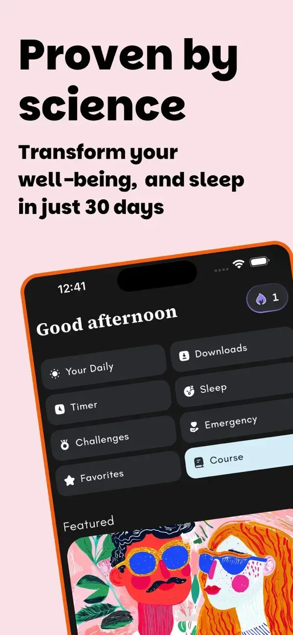
A dark home surface places compact shortcuts above colorful course art, then simplifies into a text list on a category page.
Useful for: Study home shortcuts, course library, sleep content categories. Compare the hierarchy and controls shown in these publisher previews, then test the corresponding behavior in your own app.
# Design reference: Medito
Source: https://apps.apple.com/us/app/id1500780518
Swipefile reference: https://swipefile.design/ref/mobile-medito/
Captured: 2026-09-09. This is a dated reference, not a claim about the current live product.
Source scope: publisher-provided App Store previews. Promotional framing is retained. These are static examples, not a tested or recorded user flow. Do not infer unseen interactions.

## Objective
Adapt the interaction and layout patterns below to my project. Use my own content and identity. Do not reproduce logos, proprietary copy, or brand assets.

## Reference notes
- surface: Home shortcuts · Course library · Sleep content categories
- nav: Home shortcuts lead into course and sleep categories, each with a clear title.
- layout: A dark home surface places compact shortcuts above colorful course art, then simplifies into a text list on a category page.
- density: Compare the space reserved for the primary task with secondary metadata. The previews retain promotional framing; evaluate target sizes in your implemented screen.
- color: Charcoal surfaces, pale blue selection, and vibrant illustrated covers.
- typography: Use clear heading, body, and metadata levels. Keep interface text scalable and verify readability with the device text-size settings.
- pattern: Content discovery
- states: Static publisher previews only. Loading, empty, error, offline, permission, and keyboard behavior have not been tested. Specify and verify those states in your own implementation.
- dont: Do not copy the app identity, proprietary artwork, or promotional claims. Screenshot order is not a verified flow, and the listing version does not date every image.

Useful for: Study home shortcuts, course library, sleep content categories. Compare the hierarchy and controls shown in these publisher previews, then test the corresponding behavior in your own app.

## Acceptance criteria
- Existing project conventions, design tokens, working functionality, and unrelated changes are preserved.
- Two or three reference principles clearly support the user's task; conflicts are resolved in favor of usability and the existing product.
- Accessible platform-native components express the interface; use semantic HTML when the target is mobile web. Available licensed assets are used; important UI text is never rendered as a bitmap.
- Every visible control has a defined behavior. Loading, empty, error, success, disabled, and long-content states are specified where relevant. Demo data is clearly labeled.
- Navigation and content adapt at 375px, 768px, and 1440px without horizontal page overflow. Keyboard use, visible focus, labeled inputs, at least 44px touch targets, readable contrast, and reduced motion are supported.
- Verification distinguishes rendered behavior from proposals and identifies anything still requiring a backend or external service.

## Quality bar
Clear hierarchy, consistent spacing, restrained surfaces, and purposeful motion. Avoid decorative gradients, excessive cards, placeholder buttons, and invented metrics unless the project calls for them. Do not claim a feature is connected or tested without evidence.
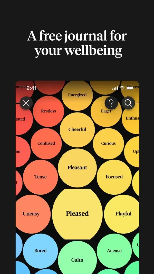
Large colored emotion labels lead into image-led journal cards and a compact calendar of previous check-ins.
Useful for: Study emotion word map, journal entries, monthly history. Compare the hierarchy and controls shown in these publisher previews, then test the corresponding behavior in your own app.
# Design reference: How We Feel
Source: https://apps.apple.com/us/app/id1562706384
Swipefile reference: https://swipefile.design/ref/mobile-how-we-feel/
Captured: 2026-09-09. This is a dated reference, not a claim about the current live product.
Source scope: publisher-provided App Store previews. Promotional framing is retained. These are static examples, not a tested or recorded user flow. Do not infer unseen interactions.

## Objective
Adapt the interaction and layout patterns below to my project. Use my own content and identity. Do not reproduce logos, proprietary copy, or brand assets.

## Reference notes
- surface: Emotion word map · Journal entries · Monthly history
- nav: The entry list exposes a plus control; the monthly view provides a separate historical overview.
- layout: Large colored emotion labels lead into image-led journal cards and a compact calendar of previous check-ins.
- density: Compare the space reserved for the primary task with secondary metadata. The previews retain promotional framing; evaluate target sizes in your implemented screen.
- color: Black backgrounds with yellow, red, blue, and green emotion accents.
- typography: Use clear heading, body, and metadata levels. Keep interface text scalable and verify readability with the device text-size settings.
- pattern: Check-ins & journaling
- states: Static publisher previews only. Loading, empty, error, offline, permission, and keyboard behavior have not been tested. Specify and verify those states in your own implementation.
- dont: Do not copy the app identity, proprietary artwork, or promotional claims. Screenshot order is not a verified flow, and the listing version does not date every image.

Useful for: Study emotion word map, journal entries, monthly history. Compare the hierarchy and controls shown in these publisher previews, then test the corresponding behavior in your own app.

## Acceptance criteria
- Existing project conventions, design tokens, working functionality, and unrelated changes are preserved.
- Two or three reference principles clearly support the user's task; conflicts are resolved in favor of usability and the existing product.
- Accessible platform-native components express the interface; use semantic HTML when the target is mobile web. Available licensed assets are used; important UI text is never rendered as a bitmap.
- Every visible control has a defined behavior. Loading, empty, error, success, disabled, and long-content states are specified where relevant. Demo data is clearly labeled.
- Navigation and content adapt at 375px, 768px, and 1440px without horizontal page overflow. Keyboard use, visible focus, labeled inputs, at least 44px touch targets, readable contrast, and reduced motion are supported.
- Verification distinguishes rendered behavior from proposals and identifies anything still requiring a backend or external service.

## Quality bar
Clear hierarchy, consistent spacing, restrained surfaces, and purposeful motion. Avoid decorative gradients, excessive cards, placeholder buttons, and invented metrics unless the project calls for them. Do not claim a feature is connected or tested without evidence.
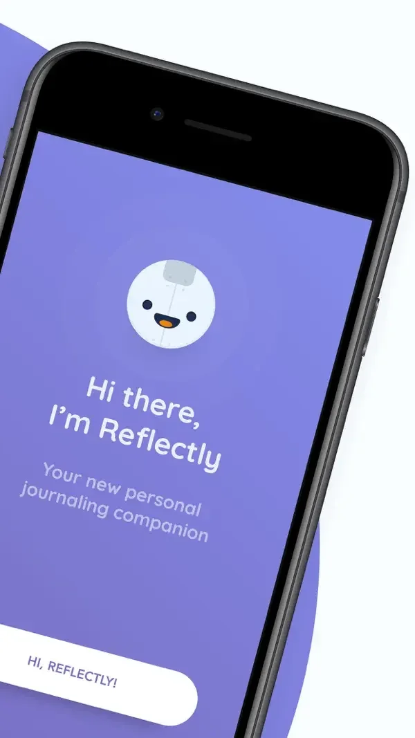
A friendly character, a short prompt, and a simple slider keep each screen focused on one response.
Useful for: Study welcome screen, daily journaling card, mood question. Compare the hierarchy and controls shown in these publisher previews, then test the corresponding behavior in your own app.
# Design reference: Reflectly
Source: https://apps.apple.com/us/app/id1241229134
Swipefile reference: https://swipefile.design/ref/mobile-reflectly/
Captured: 2026-09-09. This is a dated reference, not a claim about the current live product.
Source scope: publisher-provided App Store previews. Promotional framing is retained. These are static examples, not a tested or recorded user flow. Do not infer unseen interactions.

## Objective
Adapt the interaction and layout patterns below to my project. Use my own content and identity. Do not reproduce logos, proprietary copy, or brand assets.

## Reference notes
- surface: Welcome screen · Daily journaling card · Mood question
- nav: Welcome and daily-entry surfaces use a prominent lower action and limited secondary controls.
- layout: A friendly character, a short prompt, and a simple slider keep each screen focused on one response.
- density: Compare the space reserved for the primary task with secondary metadata. The previews retain promotional framing; evaluate target sizes in your implemented screen.
- color: Purple gradients and rounded white cards.
- typography: Use clear heading, body, and metadata levels. Keep interface text scalable and verify readability with the device text-size settings.
- pattern: Check-ins & journaling
- states: Static publisher previews only. Loading, empty, error, offline, permission, and keyboard behavior have not been tested. Specify and verify those states in your own implementation.
- dont: Do not copy the app identity, proprietary artwork, or promotional claims. Screenshot order is not a verified flow, and the listing version does not date every image.

Useful for: Study welcome screen, daily journaling card, mood question. Compare the hierarchy and controls shown in these publisher previews, then test the corresponding behavior in your own app.

## Acceptance criteria
- Existing project conventions, design tokens, working functionality, and unrelated changes are preserved.
- Two or three reference principles clearly support the user's task; conflicts are resolved in favor of usability and the existing product.
- Accessible platform-native components express the interface; use semantic HTML when the target is mobile web. Available licensed assets are used; important UI text is never rendered as a bitmap.
- Every visible control has a defined behavior. Loading, empty, error, success, disabled, and long-content states are specified where relevant. Demo data is clearly labeled.
- Navigation and content adapt at 375px, 768px, and 1440px without horizontal page overflow. Keyboard use, visible focus, labeled inputs, at least 44px touch targets, readable contrast, and reduced motion are supported.
- Verification distinguishes rendered behavior from proposals and identifies anything still requiring a backend or external service.

## Quality bar
Clear hierarchy, consistent spacing, restrained surfaces, and purposeful motion. Avoid decorative gradients, excessive cards, placeholder buttons, and invented metrics unless the project calls for them. Do not claim a feature is connected or tested without evidence.
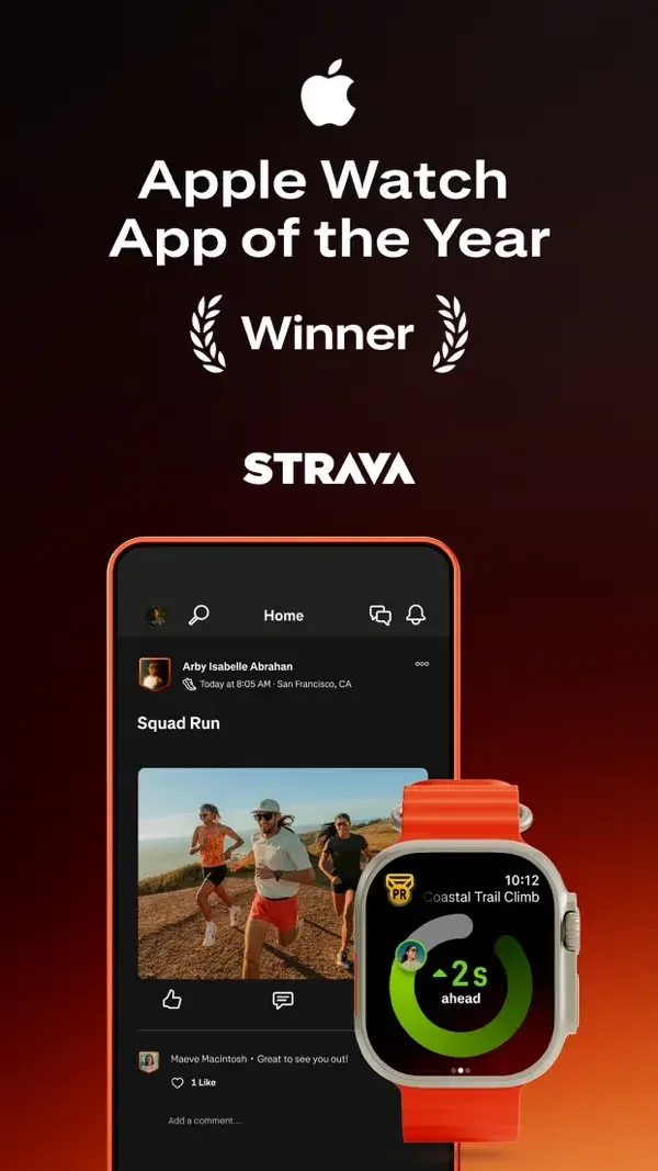
Activity cards combine photography and social feedback, while a recording screen gives the route map most of the space.
Useful for: Study activity feed, club discussion, workout recording. Compare the hierarchy and controls shown in these publisher previews, then test the corresponding behavior in your own app.
# Design reference: Strava
Source: https://apps.apple.com/us/app/id426826309
Swipefile reference: https://swipefile.design/ref/mobile-strava/
Captured: 2026-09-09. This is a dated reference, not a claim about the current live product.
Source scope: publisher-provided App Store previews. Promotional framing is retained. These are static examples, not a tested or recorded user flow. Do not infer unseen interactions.

## Objective
Adapt the interaction and layout patterns below to my project. Use my own content and identity. Do not reproduce logos, proprietary copy, or brand assets.

## Reference notes
- surface: Activity feed · Club discussion · Workout recording
- nav: Bottom navigation separates feed, mapping, recording, groups, and personal activity.
- layout: Activity cards combine photography and social feedback, while a recording screen gives the route map most of the space.
- density: Compare the space reserved for the primary task with secondary metadata. The previews retain promotional framing; evaluate target sizes in your implemented screen.
- color: Charcoal surfaces with orange route and action accents.
- typography: Use clear heading, body, and metadata levels. Keep interface text scalable and verify readability with the device text-size settings.
- pattern: Activity & notifications
- states: Static publisher previews only. Loading, empty, error, offline, permission, and keyboard behavior have not been tested. Specify and verify those states in your own implementation.
- dont: Do not copy the app identity, proprietary artwork, or promotional claims. Screenshot order is not a verified flow, and the listing version does not date every image.

Useful for: Study activity feed, club discussion, workout recording. Compare the hierarchy and controls shown in these publisher previews, then test the corresponding behavior in your own app.

## Acceptance criteria
- Existing project conventions, design tokens, working functionality, and unrelated changes are preserved.
- Two or three reference principles clearly support the user's task; conflicts are resolved in favor of usability and the existing product.
- Accessible platform-native components express the interface; use semantic HTML when the target is mobile web. Available licensed assets are used; important UI text is never rendered as a bitmap.
- Every visible control has a defined behavior. Loading, empty, error, success, disabled, and long-content states are specified where relevant. Demo data is clearly labeled.
- Navigation and content adapt at 375px, 768px, and 1440px without horizontal page overflow. Keyboard use, visible focus, labeled inputs, at least 44px touch targets, readable contrast, and reduced motion are supported.
- Verification distinguishes rendered behavior from proposals and identifies anything still requiring a backend or external service.

## Quality bar
Clear hierarchy, consistent spacing, restrained surfaces, and purposeful motion. Avoid decorative gradients, excessive cards, placeholder buttons, and invented metrics unless the project calls for them. Do not claim a feature is connected or tested without evidence.
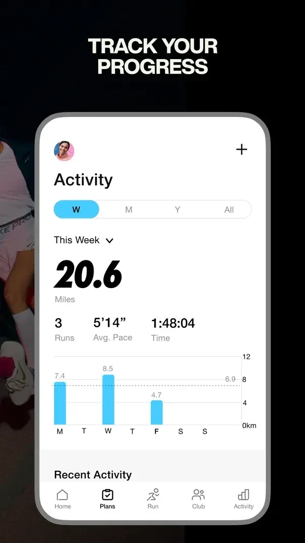
Large distance totals and a small bar chart summarize progress; vivid artwork distinguishes a guided run from a plan card.
Useful for: Study running activity summary, guided run detail, training plan. Compare the hierarchy and controls shown in these publisher previews, then test the corresponding behavior in your own app.
# Design reference: Nike Run Club
Source: https://apps.apple.com/us/app/id387771637
Swipefile reference: https://swipefile.design/ref/mobile-nike-run-club/
Captured: 2026-09-09. This is a dated reference, not a claim about the current live product.
Source scope: publisher-provided App Store previews. Promotional framing is retained. These are static examples, not a tested or recorded user flow. Do not infer unseen interactions.

## Objective
Adapt the interaction and layout patterns below to my project. Use my own content and identity. Do not reproduce logos, proprietary copy, or brand assets.

## Reference notes
- surface: Running activity summary · Guided run detail · Training plan
- nav: Bottom destinations expose activity and plans, while the run detail centers a Start control.
- layout: Large distance totals and a small bar chart summarize progress; vivid artwork distinguishes a guided run from a plan card.
- density: Compare the space reserved for the primary task with secondary metadata. The previews retain promotional framing; evaluate target sizes in your implemented screen.
- color: White reporting surfaces and bold orange running artwork.
- typography: Use clear heading, body, and metadata levels. Keep interface text scalable and verify readability with the device text-size settings.
- pattern: Habits & progress
- states: Static publisher previews only. Loading, empty, error, offline, permission, and keyboard behavior have not been tested. Specify and verify those states in your own implementation.
- dont: Do not copy the app identity, proprietary artwork, or promotional claims. Screenshot order is not a verified flow, and the listing version does not date every image.

Useful for: Study running activity summary, guided run detail, training plan. Compare the hierarchy and controls shown in these publisher previews, then test the corresponding behavior in your own app.

## Acceptance criteria
- Existing project conventions, design tokens, working functionality, and unrelated changes are preserved.
- Two or three reference principles clearly support the user's task; conflicts are resolved in favor of usability and the existing product.
- Accessible platform-native components express the interface; use semantic HTML when the target is mobile web. Available licensed assets are used; important UI text is never rendered as a bitmap.
- Every visible control has a defined behavior. Loading, empty, error, success, disabled, and long-content states are specified where relevant. Demo data is clearly labeled.
- Navigation and content adapt at 375px, 768px, and 1440px without horizontal page overflow. Keyboard use, visible focus, labeled inputs, at least 44px touch targets, readable contrast, and reduced motion are supported.
- Verification distinguishes rendered behavior from proposals and identifies anything still requiring a backend or external service.

## Quality bar
Clear hierarchy, consistent spacing, restrained surfaces, and purposeful motion. Avoid decorative gradients, excessive cards, placeholder buttons, and invented metrics unless the project calls for them. Do not claim a feature is connected or tested without evidence.
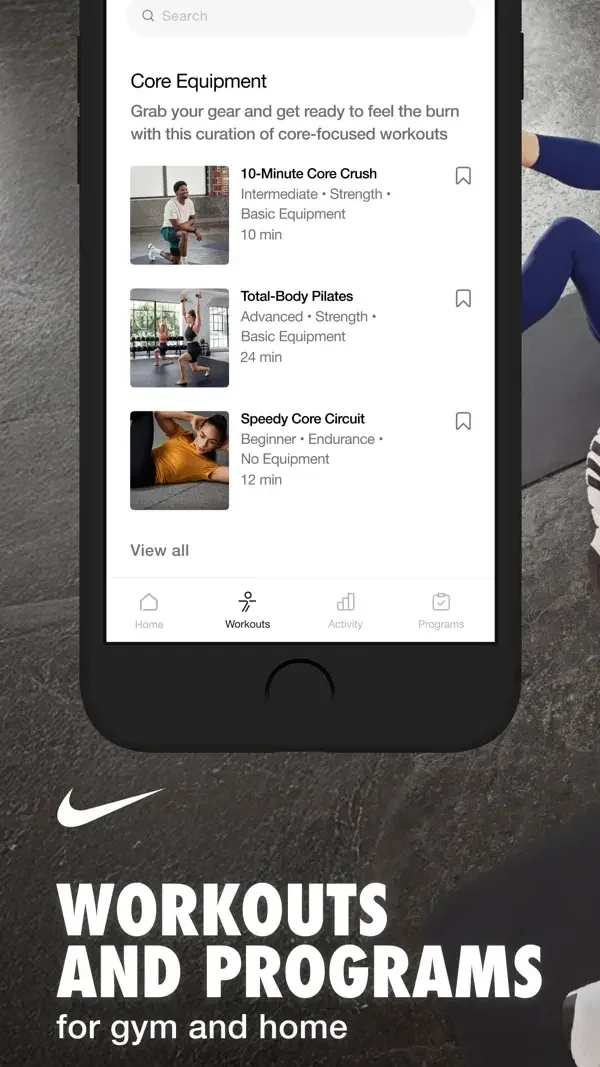
Workout rows use thumbnail imagery and brief metadata; broad categories use larger photographic cards.
Useful for: Study workout list, workout categories, activity history. Compare the hierarchy and controls shown in these publisher previews, then test the corresponding behavior in your own app.
# Design reference: Nike Training Club
Source: https://apps.apple.com/us/app/id301521403
Swipefile reference: https://swipefile.design/ref/mobile-nike-training-club/
Captured: 2026-09-09. This is a dated reference, not a claim about the current live product.
Source scope: publisher-provided App Store previews. Promotional framing is retained. These are static examples, not a tested or recorded user flow. Do not infer unseen interactions.

## Objective
Adapt the interaction and layout patterns below to my project. Use my own content and identity. Do not reproduce logos, proprietary copy, or brand assets.

## Reference notes
- surface: Workout list · Workout categories · Activity history
- nav: Bottom tabs distinguish discovery, workouts, and recorded activity.
- layout: Workout rows use thumbnail imagery and brief metadata; broad categories use larger photographic cards.
- density: Compare the space reserved for the primary task with secondary metadata. The previews retain promotional framing; evaluate target sizes in your implemented screen.
- color: White content surfaces, black text, and photographic covers.
- typography: Use clear heading, body, and metadata levels. Keep interface text scalable and verify readability with the device text-size settings.
- pattern: Content discovery
- states: Static publisher previews only. Loading, empty, error, offline, permission, and keyboard behavior have not been tested. Specify and verify those states in your own implementation.
- dont: Do not copy the app identity, proprietary artwork, or promotional claims. Screenshot order is not a verified flow, and the listing version does not date every image.

Useful for: Study workout list, workout categories, activity history. Compare the hierarchy and controls shown in these publisher previews, then test the corresponding behavior in your own app.

## Acceptance criteria
- Existing project conventions, design tokens, working functionality, and unrelated changes are preserved.
- Two or three reference principles clearly support the user's task; conflicts are resolved in favor of usability and the existing product.
- Accessible platform-native components express the interface; use semantic HTML when the target is mobile web. Available licensed assets are used; important UI text is never rendered as a bitmap.
- Every visible control has a defined behavior. Loading, empty, error, success, disabled, and long-content states are specified where relevant. Demo data is clearly labeled.
- Navigation and content adapt at 375px, 768px, and 1440px without horizontal page overflow. Keyboard use, visible focus, labeled inputs, at least 44px touch targets, readable contrast, and reduced motion are supported.
- Verification distinguishes rendered behavior from proposals and identifies anything still requiring a backend or external service.

## Quality bar
Clear hierarchy, consistent spacing, restrained surfaces, and purposeful motion. Avoid decorative gradients, excessive cards, placeholder buttons, and invented metrics unless the project calls for them. Do not claim a feature is connected or tested without evidence.
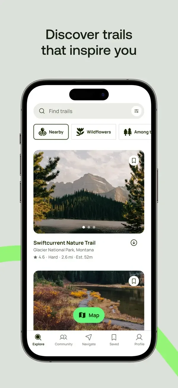
Photographic trail cards lead into a detail sheet with route statistics, then a larger photo view with an elevation graph.
Useful for: Study trail discovery, trail detail, photo tour and elevation. Compare the hierarchy and controls shown in these publisher previews, then test the corresponding behavior in your own app.
# Design reference: AllTrails
Source: https://apps.apple.com/us/app/id405075943
Swipefile reference: https://swipefile.design/ref/mobile-alltrails/
Captured: 2026-09-09. This is a dated reference, not a claim about the current live product.
Source scope: publisher-provided App Store previews. Promotional framing is retained. These are static examples, not a tested or recorded user flow. Do not infer unseen interactions.

## Objective
Adapt the interaction and layout patterns below to my project. Use my own content and identity. Do not reproduce logos, proprietary copy, or brand assets.

## Reference notes
- surface: Trail discovery · Trail detail · Photo tour and elevation
- nav: Search, category chips, and a Map control provide clear ways to narrow exploration.
- layout: Photographic trail cards lead into a detail sheet with route statistics, then a larger photo view with an elevation graph.
- density: Compare the space reserved for the primary task with secondary metadata. The previews retain promotional framing; evaluate target sizes in your implemented screen.
- color: White panels, green actions, and outdoor photography.
- typography: Use clear heading, body, and metadata levels. Keep interface text scalable and verify readability with the device text-size settings.
- pattern: Maps & navigation
- states: Static publisher previews only. Loading, empty, error, offline, permission, and keyboard behavior have not been tested. Specify and verify those states in your own implementation.
- dont: Do not copy the app identity, proprietary artwork, or promotional claims. Screenshot order is not a verified flow, and the listing version does not date every image.

Useful for: Study trail discovery, trail detail, photo tour and elevation. Compare the hierarchy and controls shown in these publisher previews, then test the corresponding behavior in your own app.

## Acceptance criteria
- Existing project conventions, design tokens, working functionality, and unrelated changes are preserved.
- Two or three reference principles clearly support the user's task; conflicts are resolved in favor of usability and the existing product.
- Accessible platform-native components express the interface; use semantic HTML when the target is mobile web. Available licensed assets are used; important UI text is never rendered as a bitmap.
- Every visible control has a defined behavior. Loading, empty, error, success, disabled, and long-content states are specified where relevant. Demo data is clearly labeled.
- Navigation and content adapt at 375px, 768px, and 1440px without horizontal page overflow. Keyboard use, visible focus, labeled inputs, at least 44px touch targets, readable contrast, and reduced motion are supported.
- Verification distinguishes rendered behavior from proposals and identifies anything still requiring a backend or external service.

## Quality bar
Clear hierarchy, consistent spacing, restrained surfaces, and purposeful motion. Avoid decorative gradients, excessive cards, placeholder buttons, and invented metrics unless the project calls for them. Do not claim a feature is connected or tested without evidence.
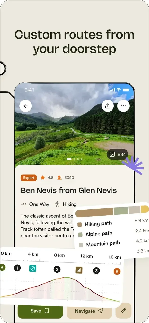
A route map shares space with terrain, elevation, waypoint, and weather information in layered panels.
Useful for: Study route detail and terrain, route navigation, route information. Compare the hierarchy and controls shown in these publisher previews, then test the corresponding behavior in your own app.
# Design reference: Komoot
Source: https://apps.apple.com/us/app/id447374873
Swipefile reference: https://swipefile.design/ref/mobile-komoot/
Captured: 2026-09-09. This is a dated reference, not a claim about the current live product.
Source scope: publisher-provided App Store previews. Promotional framing is retained. These are static examples, not a tested or recorded user flow. Do not infer unseen interactions.

## Objective
Adapt the interaction and layout patterns below to my project. Use my own content and identity. Do not reproduce logos, proprietary copy, or brand assets.

## Reference notes
- surface: Route detail and terrain · Route navigation · Route information
- nav: Named detail tabs and lower Save or Navigate controls separate inspection from following a route.
- layout: A route map shares space with terrain, elevation, waypoint, and weather information in layered panels.
- density: Compare the space reserved for the primary task with secondary metadata. The previews retain promotional framing; evaluate target sizes in your implemented screen.
- color: Muted green maps, cream surfaces, and olive controls.
- typography: Use clear heading, body, and metadata levels. Keep interface text scalable and verify readability with the device text-size settings.
- pattern: Maps & navigation
- states: Static publisher previews only. Loading, empty, error, offline, permission, and keyboard behavior have not been tested. Specify and verify those states in your own implementation.
- dont: Do not copy the app identity, proprietary artwork, or promotional claims. Screenshot order is not a verified flow, and the listing version does not date every image.

Useful for: Study route detail and terrain, route navigation, route information. Compare the hierarchy and controls shown in these publisher previews, then test the corresponding behavior in your own app.

## Acceptance criteria
- Existing project conventions, design tokens, working functionality, and unrelated changes are preserved.
- Two or three reference principles clearly support the user's task; conflicts are resolved in favor of usability and the existing product.
- Accessible platform-native components express the interface; use semantic HTML when the target is mobile web. Available licensed assets are used; important UI text is never rendered as a bitmap.
- Every visible control has a defined behavior. Loading, empty, error, success, disabled, and long-content states are specified where relevant. Demo data is clearly labeled.
- Navigation and content adapt at 375px, 768px, and 1440px without horizontal page overflow. Keyboard use, visible focus, labeled inputs, at least 44px touch targets, readable contrast, and reduced motion are supported.
- Verification distinguishes rendered behavior from proposals and identifies anything still requiring a backend or external service.

## Quality bar
Clear hierarchy, consistent spacing, restrained surfaces, and purposeful motion. Avoid decorative gradients, excessive cards, placeholder buttons, and invented metrics unless the project calls for them. Do not claim a feature is connected or tested without evidence.
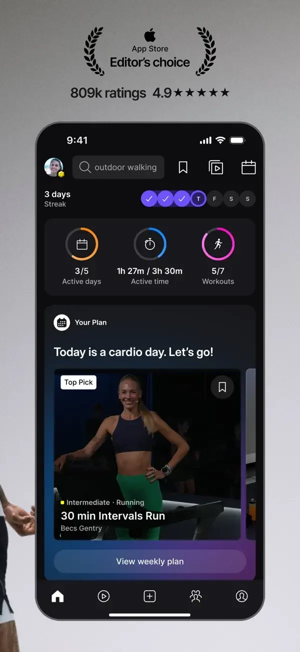
Progress rings and a featured class introduce the day; a separate list uses filters and a plan summary groups days by activity.
Useful for: Study daily workout recommendation, workout discovery, weekly plan preview. Compare the hierarchy and controls shown in these publisher previews, then test the corresponding behavior in your own app.
# Design reference: Peloton
Source: https://apps.apple.com/us/app/id792750948
Swipefile reference: https://swipefile.design/ref/mobile-peloton/
Captured: 2026-09-09. This is a dated reference, not a claim about the current live product.
Source scope: publisher-provided App Store previews. Promotional framing is retained. These are static examples, not a tested or recorded user flow. Do not infer unseen interactions.

## Objective
Adapt the interaction and layout patterns below to my project. Use my own content and identity. Do not reproduce logos, proprietary copy, or brand assets.

## Reference notes
- surface: Daily workout recommendation · Workout discovery · Weekly plan preview
- nav: Bottom destinations and top category chips support browsing without losing the main workout context.
- layout: Progress rings and a featured class introduce the day; a separate list uses filters and a plan summary groups days by activity.
- density: Compare the space reserved for the primary task with secondary metadata. The previews retain promotional framing; evaluate target sizes in your implemented screen.
- color: Near-black panels, violet accents, and trainer photography.
- typography: Use clear heading, body, and metadata levels. Keep interface text scalable and verify readability with the device text-size settings.
- pattern: Content discovery
- states: Static publisher previews only. Loading, empty, error, offline, permission, and keyboard behavior have not been tested. Specify and verify those states in your own implementation.
- dont: Do not copy the app identity, proprietary artwork, or promotional claims. Screenshot order is not a verified flow, and the listing version does not date every image.

Useful for: Study daily workout recommendation, workout discovery, weekly plan preview. Compare the hierarchy and controls shown in these publisher previews, then test the corresponding behavior in your own app.

## Acceptance criteria
- Existing project conventions, design tokens, working functionality, and unrelated changes are preserved.
- Two or three reference principles clearly support the user's task; conflicts are resolved in favor of usability and the existing product.
- Accessible platform-native components express the interface; use semantic HTML when the target is mobile web. Available licensed assets are used; important UI text is never rendered as a bitmap.
- Every visible control has a defined behavior. Loading, empty, error, success, disabled, and long-content states are specified where relevant. Demo data is clearly labeled.
- Navigation and content adapt at 375px, 768px, and 1440px without horizontal page overflow. Keyboard use, visible focus, labeled inputs, at least 44px touch targets, readable contrast, and reduced motion are supported.
- Verification distinguishes rendered behavior from proposals and identifies anything still requiring a backend or external service.

## Quality bar
Clear hierarchy, consistent spacing, restrained surfaces, and purposeful motion. Avoid decorative gradients, excessive cards, placeholder buttons, and invented metrics unless the project calls for them. Do not claim a feature is connected or tested without evidence.
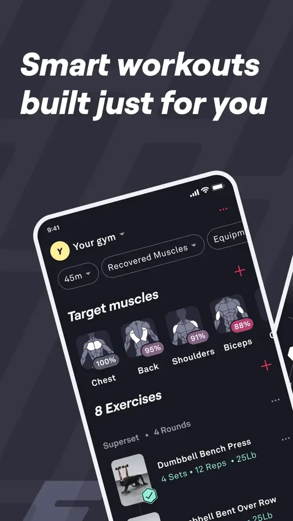
Exercise rows and a set table make entry compact, while a body diagram summarizes which muscle groups were recently trained.
Useful for: Study workout exercise list, exercise sets, muscle recovery visualization. Compare the hierarchy and controls shown in these publisher previews, then test the corresponding behavior in your own app.
# Design reference: Fitbod
Source: https://apps.apple.com/us/app/id1041517543
Swipefile reference: https://swipefile.design/ref/mobile-fitbod/
Captured: 2026-09-09. This is a dated reference, not a claim about the current live product.
Source scope: publisher-provided App Store previews. Promotional framing is retained. These are static examples, not a tested or recorded user flow. Do not infer unseen interactions.

## Objective
Adapt the interaction and layout patterns below to my project. Use my own content and identity. Do not reproduce logos, proprietary copy, or brand assets.

## Reference notes
- surface: Workout exercise list · Exercise sets · Muscle recovery visualization
- nav: Workout controls lead into exercise details with contextual set editing.
- layout: Exercise rows and a set table make entry compact, while a body diagram summarizes which muscle groups were recently trained.
- density: Compare the space reserved for the primary task with secondary metadata. The previews retain promotional framing; evaluate target sizes in your implemented screen.
- color: Dark blue-gray surfaces with pink muscle highlights and small colored controls.
- typography: Use clear heading, body, and metadata levels. Keep interface text scalable and verify readability with the device text-size settings.
- pattern: Logging & tracking
- states: Static publisher previews only. Loading, empty, error, offline, permission, and keyboard behavior have not been tested. Specify and verify those states in your own implementation.
- dont: Do not copy the app identity, proprietary artwork, or promotional claims. Screenshot order is not a verified flow, and the listing version does not date every image.

Useful for: Study workout exercise list, exercise sets, muscle recovery visualization. Compare the hierarchy and controls shown in these publisher previews, then test the corresponding behavior in your own app.

## Acceptance criteria
- Existing project conventions, design tokens, working functionality, and unrelated changes are preserved.
- Two or three reference principles clearly support the user's task; conflicts are resolved in favor of usability and the existing product.
- Accessible platform-native components express the interface; use semantic HTML when the target is mobile web. Available licensed assets are used; important UI text is never rendered as a bitmap.
- Every visible control has a defined behavior. Loading, empty, error, success, disabled, and long-content states are specified where relevant. Demo data is clearly labeled.
- Navigation and content adapt at 375px, 768px, and 1440px without horizontal page overflow. Keyboard use, visible focus, labeled inputs, at least 44px touch targets, readable contrast, and reduced motion are supported.
- Verification distinguishes rendered behavior from proposals and identifies anything still requiring a backend or external service.

## Quality bar
Clear hierarchy, consistent spacing, restrained surfaces, and purposeful motion. Avoid decorative gradients, excessive cards, placeholder buttons, and invented metrics unless the project calls for them. Do not claim a feature is connected or tested without evidence.
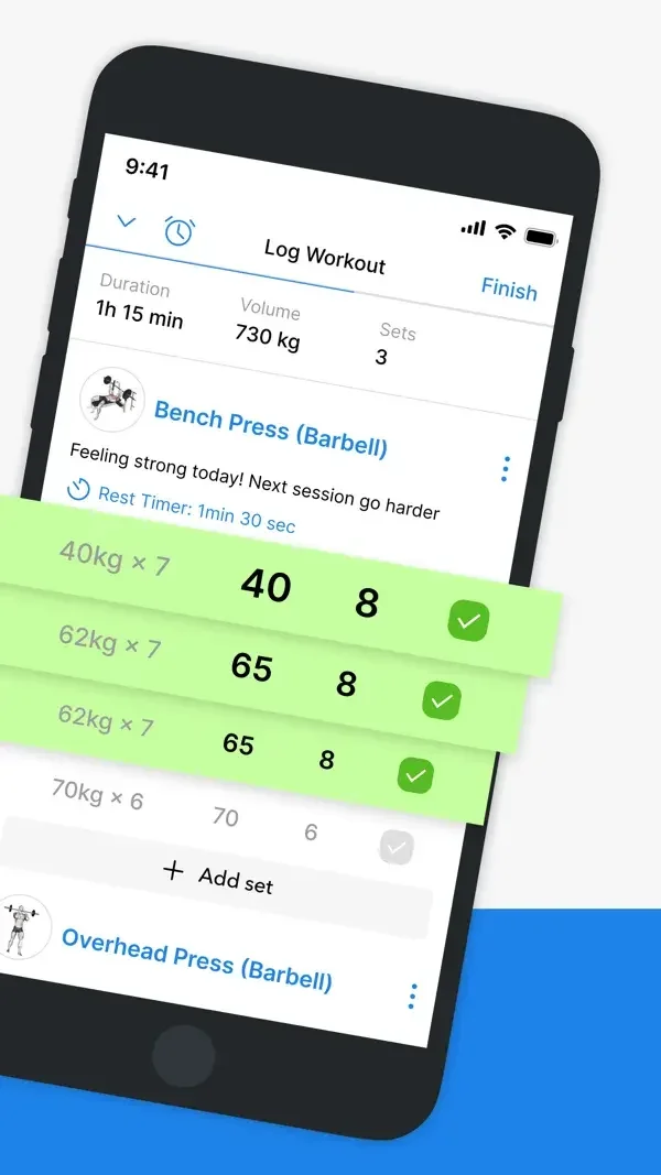
A compact sets table uses completion marks, a progress view emphasizes one chart, and routine cards expose a Start action.
Useful for: Study workout set logging, exercise progress chart, routine selection. Compare the hierarchy and controls shown in these publisher previews, then test the corresponding behavior in your own app.
# Design reference: Hevy
Source: https://apps.apple.com/us/app/id1458862350
Swipefile reference: https://swipefile.design/ref/mobile-hevy/
Captured: 2026-09-09. This is a dated reference, not a claim about the current live product.
Source scope: publisher-provided App Store previews. Promotional framing is retained. These are static examples, not a tested or recorded user flow. Do not infer unseen interactions.

## Objective
Adapt the interaction and layout patterns below to my project. Use my own content and identity. Do not reproduce logos, proprietary copy, or brand assets.

## Reference notes
- surface: Workout set logging · Exercise progress chart · Routine selection
- nav: Workout, exercise analysis, and routine surfaces separate logging from planning.
- layout: A compact sets table uses completion marks, a progress view emphasizes one chart, and routine cards expose a Start action.
- density: Compare the space reserved for the primary task with secondary metadata. The previews retain promotional framing; evaluate target sizes in your implemented screen.
- color: White panels, blue controls, and green completion highlights.
- typography: Use clear heading, body, and metadata levels. Keep interface text scalable and verify readability with the device text-size settings.
- pattern: Logging & tracking
- states: Static publisher previews only. Loading, empty, error, offline, permission, and keyboard behavior have not been tested. Specify and verify those states in your own implementation.
- dont: Do not copy the app identity, proprietary artwork, or promotional claims. Screenshot order is not a verified flow, and the listing version does not date every image.

Useful for: Study workout set logging, exercise progress chart, routine selection. Compare the hierarchy and controls shown in these publisher previews, then test the corresponding behavior in your own app.

## Acceptance criteria
- Existing project conventions, design tokens, working functionality, and unrelated changes are preserved.
- Two or three reference principles clearly support the user's task; conflicts are resolved in favor of usability and the existing product.
- Accessible platform-native components express the interface; use semantic HTML when the target is mobile web. Available licensed assets are used; important UI text is never rendered as a bitmap.
- Every visible control has a defined behavior. Loading, empty, error, success, disabled, and long-content states are specified where relevant. Demo data is clearly labeled.
- Navigation and content adapt at 375px, 768px, and 1440px without horizontal page overflow. Keyboard use, visible focus, labeled inputs, at least 44px touch targets, readable contrast, and reduced motion are supported.
- Verification distinguishes rendered behavior from proposals and identifies anything still requiring a backend or external service.

## Quality bar
Clear hierarchy, consistent spacing, restrained surfaces, and purposeful motion. Avoid decorative gradients, excessive cards, placeholder buttons, and invented metrics unless the project calls for them. Do not claim a feature is connected or tested without evidence.
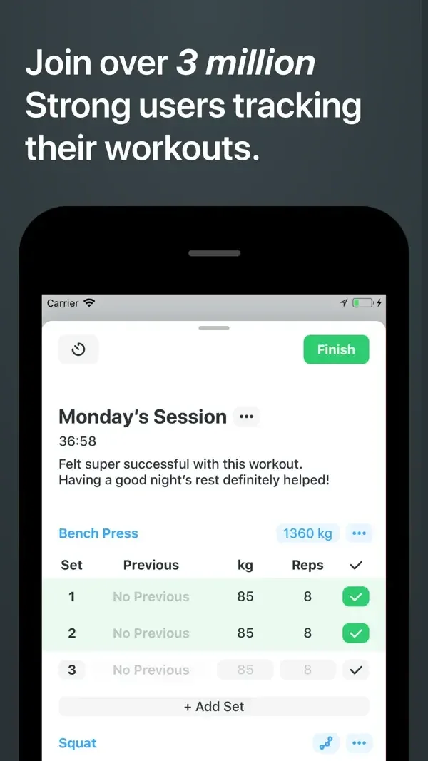
Set rows expose weight, repetitions, and completion; an exercise page adds instructions, while a calculator appears in a sheet.
Useful for: Study workout logging, exercise instructions, plate calculator. Compare the hierarchy and controls shown in these publisher previews, then test the corresponding behavior in your own app.
# Design reference: Strong
Source: https://apps.apple.com/us/app/id464254577
Swipefile reference: https://swipefile.design/ref/mobile-strong/
Captured: 2026-09-09. This is a dated reference, not a claim about the current live product.
Source scope: publisher-provided App Store previews. Promotional framing is retained. These are static examples, not a tested or recorded user flow. Do not infer unseen interactions.

## Objective
Adapt the interaction and layout patterns below to my project. Use my own content and identity. Do not reproduce logos, proprietary copy, or brand assets.

## Reference notes
- surface: Workout logging · Exercise instructions · Plate calculator
- nav: Exercise detail tabs distinguish instructions, history, charts, and records.
- layout: Set rows expose weight, repetitions, and completion; an exercise page adds instructions, while a calculator appears in a sheet.
- density: Compare the space reserved for the primary task with secondary metadata. The previews retain promotional framing; evaluate target sizes in your implemented screen.
- color: White surfaces with blue navigation and green completion controls.
- typography: Use clear heading, body, and metadata levels. Keep interface text scalable and verify readability with the device text-size settings.
- pattern: Logging & tracking
- states: Static publisher previews only. Loading, empty, error, offline, permission, and keyboard behavior have not been tested. Specify and verify those states in your own implementation.
- dont: Do not copy the app identity, proprietary artwork, or promotional claims. Screenshot order is not a verified flow, and the listing version does not date every image.

Useful for: Study workout logging, exercise instructions, plate calculator. Compare the hierarchy and controls shown in these publisher previews, then test the corresponding behavior in your own app.

## Acceptance criteria
- Existing project conventions, design tokens, working functionality, and unrelated changes are preserved.
- Two or three reference principles clearly support the user's task; conflicts are resolved in favor of usability and the existing product.
- Accessible platform-native components express the interface; use semantic HTML when the target is mobile web. Available licensed assets are used; important UI text is never rendered as a bitmap.
- Every visible control has a defined behavior. Loading, empty, error, success, disabled, and long-content states are specified where relevant. Demo data is clearly labeled.
- Navigation and content adapt at 375px, 768px, and 1440px without horizontal page overflow. Keyboard use, visible focus, labeled inputs, at least 44px touch targets, readable contrast, and reduced motion are supported.
- Verification distinguishes rendered behavior from proposals and identifies anything still requiring a backend or external service.

## Quality bar
Clear hierarchy, consistent spacing, restrained surfaces, and purposeful motion. Avoid decorative gradients, excessive cards, placeholder buttons, and invented metrics unless the project calls for them. Do not claim a feature is connected or tested without evidence.
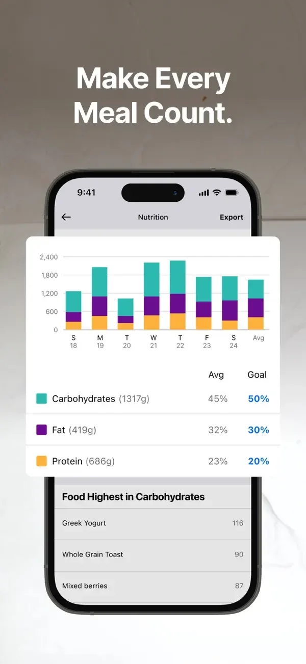
Stacked nutrient bars summarize a period, while food capture presents an editable list before a logging action.
Useful for: Study nutrition chart, food scan results, voice logging. Compare the hierarchy and controls shown in these publisher previews, then test the corresponding behavior in your own app.
# Design reference: MyFitnessPal
Source: https://apps.apple.com/us/app/id341232718
Swipefile reference: https://swipefile.design/ref/mobile-myfitnesspal/
Captured: 2026-09-09. This is a dated reference, not a claim about the current live product.
Source scope: publisher-provided App Store previews. Promotional framing is retained. These are static examples, not a tested or recorded user flow. Do not infer unseen interactions.

## Objective
Adapt the interaction and layout patterns below to my project. Use my own content and identity. Do not reproduce logos, proprietary copy, or brand assets.

## Reference notes
- surface: Nutrition chart · Food scan results · Voice logging
- nav: Report tabs, capture controls, and a focused voice sheet separate overview from adding data.
- layout: Stacked nutrient bars summarize a period, while food capture presents an editable list before a logging action.
- density: Compare the space reserved for the primary task with secondary metadata. The previews retain promotional framing; evaluate target sizes in your implemented screen.
- color: White surfaces with blue actions and multicolored chart segments.
- typography: Use clear heading, body, and metadata levels. Keep interface text scalable and verify readability with the device text-size settings.
- pattern: Logging & tracking
- states: Static publisher previews only. Loading, empty, error, offline, permission, and keyboard behavior have not been tested. Specify and verify those states in your own implementation.
- dont: Do not copy the app identity, proprietary artwork, or promotional claims. Screenshot order is not a verified flow, and the listing version does not date every image.

Useful for: Study nutrition chart, food scan results, voice logging. Compare the hierarchy and controls shown in these publisher previews, then test the corresponding behavior in your own app.

## Acceptance criteria
- Existing project conventions, design tokens, working functionality, and unrelated changes are preserved.
- Two or three reference principles clearly support the user's task; conflicts are resolved in favor of usability and the existing product.
- Accessible platform-native components express the interface; use semantic HTML when the target is mobile web. Available licensed assets are used; important UI text is never rendered as a bitmap.
- Every visible control has a defined behavior. Loading, empty, error, success, disabled, and long-content states are specified where relevant. Demo data is clearly labeled.
- Navigation and content adapt at 375px, 768px, and 1440px without horizontal page overflow. Keyboard use, visible focus, labeled inputs, at least 44px touch targets, readable contrast, and reduced motion are supported.
- Verification distinguishes rendered behavior from proposals and identifies anything still requiring a backend or external service.

## Quality bar
Clear hierarchy, consistent spacing, restrained surfaces, and purposeful motion. Avoid decorative gradients, excessive cards, placeholder buttons, and invented metrics unless the project calls for them. Do not claim a feature is connected or tested without evidence.
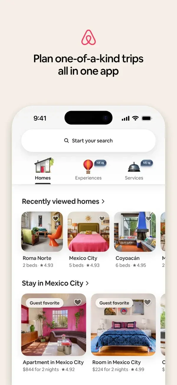
Large rounded photos, compact ratings, and small category illustrations make different travel offerings easy to scan.
Useful for: Study home discovery, stay search results, experience discovery. Compare the hierarchy and controls shown in these publisher previews, then test the corresponding behavior in your own app.
# Design reference: Airbnb
Source: https://apps.apple.com/us/app/id401626263
Swipefile reference: https://swipefile.design/ref/mobile-airbnb/
Captured: 2026-09-09. This is a dated reference, not a claim about the current live product.
Source scope: publisher-provided App Store previews. Promotional framing is retained. These are static examples, not a tested or recorded user flow. Do not infer unseen interactions.

## Objective
Adapt the interaction and layout patterns below to my project. Use my own content and identity. Do not reproduce logos, proprietary copy, or brand assets.

## Reference notes
- surface: Home discovery · Stay search results · Experience discovery
- nav: A prominent search pill and named Homes, Experiences, and Services destinations orient browsing.
- layout: Large rounded photos, compact ratings, and small category illustrations make different travel offerings easy to scan.
- density: Compare the space reserved for the primary task with secondary metadata. The previews retain promotional framing; evaluate target sizes in your implemented screen.
- color: Warm white surfaces with content-driven photography and small pink accents.
- typography: Use clear heading, body, and metadata levels. Keep interface text scalable and verify readability with the device text-size settings.
- pattern: Search & discovery
- states: Static publisher previews only. Loading, empty, error, offline, permission, and keyboard behavior have not been tested. Specify and verify those states in your own implementation.
- dont: Do not copy the app identity, proprietary artwork, or promotional claims. Screenshot order is not a verified flow, and the listing version does not date every image.

Useful for: Study home discovery, stay search results, experience discovery. Compare the hierarchy and controls shown in these publisher previews, then test the corresponding behavior in your own app.

## Acceptance criteria
- Existing project conventions, design tokens, working functionality, and unrelated changes are preserved.
- Two or three reference principles clearly support the user's task; conflicts are resolved in favor of usability and the existing product.
- Accessible platform-native components express the interface; use semantic HTML when the target is mobile web. Available licensed assets are used; important UI text is never rendered as a bitmap.
- Every visible control has a defined behavior. Loading, empty, error, success, disabled, and long-content states are specified where relevant. Demo data is clearly labeled.
- Navigation and content adapt at 375px, 768px, and 1440px without horizontal page overflow. Keyboard use, visible focus, labeled inputs, at least 44px touch targets, readable contrast, and reduced motion are supported.
- Verification distinguishes rendered behavior from proposals and identifies anything still requiring a backend or external service.

## Quality bar
Clear hierarchy, consistent spacing, restrained surfaces, and purposeful motion. Avoid decorative gradients, excessive cards, placeholder buttons, and invented metrics unless the project calls for them. Do not claim a feature is connected or tested without evidence.
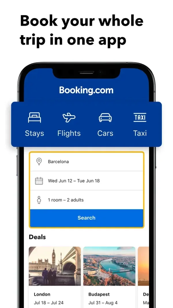
Destination, dates, and guests form a compact search panel; result rows expose ratings before a property detail adds price and room selection.
Useful for: Study trip search form, hotel results, hotel detail. Compare the hierarchy and controls shown in these publisher previews, then test the corresponding behavior in your own app.
# Design reference: Booking.com
Source: https://apps.apple.com/us/app/id367003839
Swipefile reference: https://swipefile.design/ref/mobile-booking-com/
Captured: 2026-09-09. This is a dated reference, not a claim about the current live product.
Source scope: publisher-provided App Store previews. Promotional framing is retained. These are static examples, not a tested or recorded user flow. Do not infer unseen interactions.

## Objective
Adapt the interaction and layout patterns below to my project. Use my own content and identity. Do not reproduce logos, proprietary copy, or brand assets.

## Reference notes
- surface: Trip search form · Hotel results · Hotel detail
- nav: Travel-type tabs precede search, with sort and filter controls above results.
- layout: Destination, dates, and guests form a compact search panel; result rows expose ratings before a property detail adds price and room selection.
- density: Compare the space reserved for the primary task with secondary metadata. The previews retain promotional framing; evaluate target sizes in your implemented screen.
- color: Blue headers, yellow field emphasis, and white content.
- typography: Use clear heading, body, and metadata levels. Keep interface text scalable and verify readability with the device text-size settings.
- pattern: Search & discovery
- states: Static publisher previews only. Loading, empty, error, offline, permission, and keyboard behavior have not been tested. Specify and verify those states in your own implementation.
- dont: Do not copy the app identity, proprietary artwork, or promotional claims. Screenshot order is not a verified flow, and the listing version does not date every image.

Useful for: Study trip search form, hotel results, hotel detail. Compare the hierarchy and controls shown in these publisher previews, then test the corresponding behavior in your own app.

## Acceptance criteria
- Existing project conventions, design tokens, working functionality, and unrelated changes are preserved.
- Two or three reference principles clearly support the user's task; conflicts are resolved in favor of usability and the existing product.
- Accessible platform-native components express the interface; use semantic HTML when the target is mobile web. Available licensed assets are used; important UI text is never rendered as a bitmap.
- Every visible control has a defined behavior. Loading, empty, error, success, disabled, and long-content states are specified where relevant. Demo data is clearly labeled.
- Navigation and content adapt at 375px, 768px, and 1440px without horizontal page overflow. Keyboard use, visible focus, labeled inputs, at least 44px touch targets, readable contrast, and reduced motion are supported.
- Verification distinguishes rendered behavior from proposals and identifies anything still requiring a backend or external service.

## Quality bar
Clear hierarchy, consistent spacing, restrained surfaces, and purposeful motion. Avoid decorative gradients, excessive cards, placeholder buttons, and invented metrics unless the project calls for them. Do not claim a feature is connected or tested without evidence.
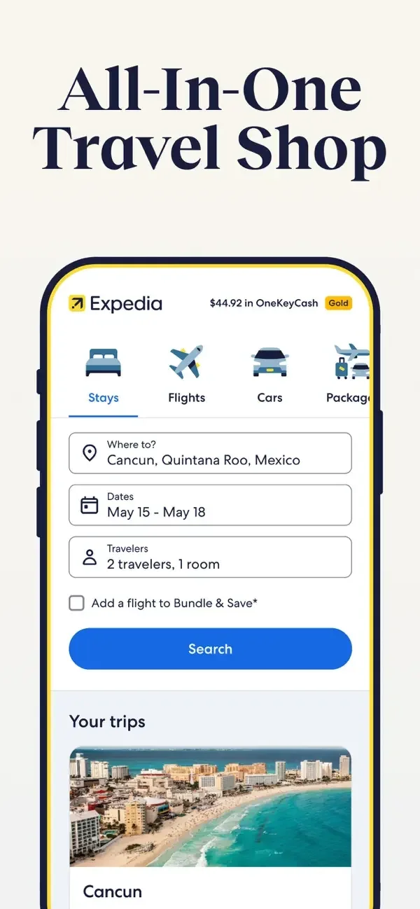
Structured search fields lead into image-led listings, then a property page groups dates, travelers, and room options.
Useful for: Study trip search, stay results, stay detail and room selection. Compare the hierarchy and controls shown in these publisher previews, then test the corresponding behavior in your own app.
# Design reference: Expedia
Source: https://apps.apple.com/us/app/id427916203
Swipefile reference: https://swipefile.design/ref/mobile-expedia/
Captured: 2026-09-09. This is a dated reference, not a claim about the current live product.
Source scope: publisher-provided App Store previews. Promotional framing is retained. These are static examples, not a tested or recorded user flow. Do not infer unseen interactions.

## Objective
Adapt the interaction and layout patterns below to my project. Use my own content and identity. Do not reproduce logos, proprietary copy, or brand assets.

## Reference notes
- surface: Trip search · Stay results · Stay detail and room selection
- nav: Named travel modes and filter chips keep the selected search context visible.
- layout: Structured search fields lead into image-led listings, then a property page groups dates, travelers, and room options.
- density: Compare the space reserved for the primary task with secondary metadata. The previews retain promotional framing; evaluate target sizes in your implemented screen.
- color: White and cream surfaces with blue actions and yellow accents.
- typography: Use clear heading, body, and metadata levels. Keep interface text scalable and verify readability with the device text-size settings.
- pattern: Search & discovery
- states: Static publisher previews only. Loading, empty, error, offline, permission, and keyboard behavior have not been tested. Specify and verify those states in your own implementation.
- dont: Do not copy the app identity, proprietary artwork, or promotional claims. Screenshot order is not a verified flow, and the listing version does not date every image.

Useful for: Study trip search, stay results, stay detail and room selection. Compare the hierarchy and controls shown in these publisher previews, then test the corresponding behavior in your own app.

## Acceptance criteria
- Existing project conventions, design tokens, working functionality, and unrelated changes are preserved.
- Two or three reference principles clearly support the user's task; conflicts are resolved in favor of usability and the existing product.
- Accessible platform-native components express the interface; use semantic HTML when the target is mobile web. Available licensed assets are used; important UI text is never rendered as a bitmap.
- Every visible control has a defined behavior. Loading, empty, error, success, disabled, and long-content states are specified where relevant. Demo data is clearly labeled.
- Navigation and content adapt at 375px, 768px, and 1440px without horizontal page overflow. Keyboard use, visible focus, labeled inputs, at least 44px touch targets, readable contrast, and reduced motion are supported.
- Verification distinguishes rendered behavior from proposals and identifies anything still requiring a backend or external service.

## Quality bar
Clear hierarchy, consistent spacing, restrained surfaces, and purposeful motion. Avoid decorative gradients, excessive cards, placeholder buttons, and invented metrics unless the project calls for them. Do not claim a feature is connected or tested without evidence.
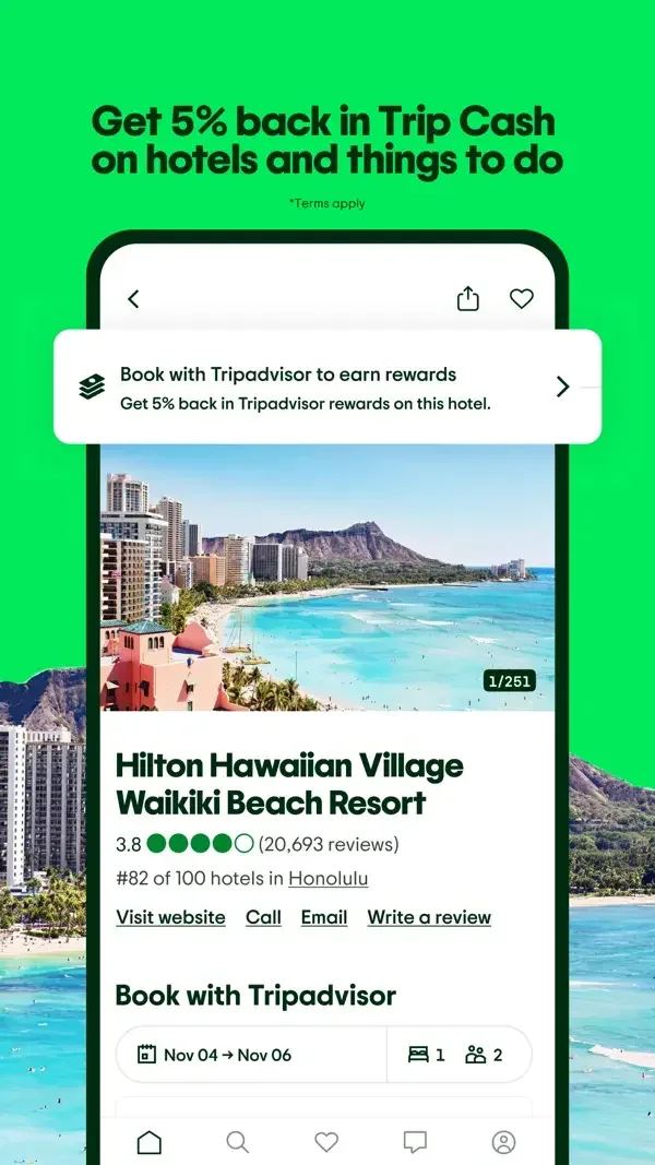
Property imagery leads into a review distribution, while a nearby map uses category chips and cards below the map.
Useful for: Study hotel detail, review breakdown, nearby map discovery. Compare the hierarchy and controls shown in these publisher previews, then test the corresponding behavior in your own app.
# Design reference: Tripadvisor
Source: https://apps.apple.com/us/app/id284876795
Swipefile reference: https://swipefile.design/ref/mobile-tripadvisor/
Captured: 2026-09-09. This is a dated reference, not a claim about the current live product.
Source scope: publisher-provided App Store previews. Promotional framing is retained. These are static examples, not a tested or recorded user flow. Do not infer unseen interactions.

## Objective
Adapt the interaction and layout patterns below to my project. Use my own content and identity. Do not reproduce logos, proprietary copy, or brand assets.

## Reference notes
- surface: Hotel detail · Review breakdown · Nearby map discovery
- nav: Bottom destinations and explicit Discover, Saves, and Restaurants chips distinguish browsing routes.
- layout: Property imagery leads into a review distribution, while a nearby map uses category chips and cards below the map.
- density: Compare the space reserved for the primary task with secondary metadata. The previews retain promotional framing; evaluate target sizes in your implemented screen.
- color: White panels, deep green controls, and bright green promotional framing.
- typography: Use clear heading, body, and metadata levels. Keep interface text scalable and verify readability with the device text-size settings.
- pattern: Ratings & reviews
- states: Static publisher previews only. Loading, empty, error, offline, permission, and keyboard behavior have not been tested. Specify and verify those states in your own implementation.
- dont: Do not copy the app identity, proprietary artwork, or promotional claims. Screenshot order is not a verified flow, and the listing version does not date every image.

Useful for: Study hotel detail, review breakdown, nearby map discovery. Compare the hierarchy and controls shown in these publisher previews, then test the corresponding behavior in your own app.

## Acceptance criteria
- Existing project conventions, design tokens, working functionality, and unrelated changes are preserved.
- Two or three reference principles clearly support the user's task; conflicts are resolved in favor of usability and the existing product.
- Accessible platform-native components express the interface; use semantic HTML when the target is mobile web. Available licensed assets are used; important UI text is never rendered as a bitmap.
- Every visible control has a defined behavior. Loading, empty, error, success, disabled, and long-content states are specified where relevant. Demo data is clearly labeled.
- Navigation and content adapt at 375px, 768px, and 1440px without horizontal page overflow. Keyboard use, visible focus, labeled inputs, at least 44px touch targets, readable contrast, and reduced motion are supported.
- Verification distinguishes rendered behavior from proposals and identifies anything still requiring a backend or external service.

## Quality bar
Clear hierarchy, consistent spacing, restrained surfaces, and purposeful motion. Avoid decorative gradients, excessive cards, placeholder buttons, and invented metrics unless the project calls for them. Do not claim a feature is connected or tested without evidence.

A calendar uses a color legend to compare dates; a raised explanation card presents a watch action above the trip details.
Useful for: Study travel discovery, date price calendar, price-watch prompt. Compare the hierarchy and controls shown in these publisher previews, then test the corresponding behavior in your own app.
# Design reference: Hopper
Source: https://apps.apple.com/us/app/id904052407
Swipefile reference: https://swipefile.design/ref/mobile-hopper/
Captured: 2026-09-09. This is a dated reference, not a claim about the current live product.
Source scope: publisher-provided App Store previews. Promotional framing is retained. These are static examples, not a tested or recorded user flow. Do not infer unseen interactions.

## Objective
Adapt the interaction and layout patterns below to my project. Use my own content and identity. Do not reproduce logos, proprietary copy, or brand assets.

## Reference notes
- surface: Travel discovery · Date price calendar · Price-watch prompt
- nav: Travel categories and a dedicated date-selection surface separate destination browsing from timing.
- layout: A calendar uses a color legend to compare dates; a raised explanation card presents a watch action above the trip details.
- density: Compare the space reserved for the primary task with secondary metadata. The previews retain promotional framing; evaluate target sizes in your implemented screen.
- color: White content with coral controls and multicolored date cells.
- typography: Use clear heading, body, and metadata levels. Keep interface text scalable and verify readability with the device text-size settings.
- pattern: Calendars & scheduling
- states: Static publisher previews only. Loading, empty, error, offline, permission, and keyboard behavior have not been tested. Specify and verify those states in your own implementation.
- dont: Do not copy the app identity, proprietary artwork, or promotional claims. Screenshot order is not a verified flow, and the listing version does not date every image.

Useful for: Study travel discovery, date price calendar, price-watch prompt. Compare the hierarchy and controls shown in these publisher previews, then test the corresponding behavior in your own app.

## Acceptance criteria
- Existing project conventions, design tokens, working functionality, and unrelated changes are preserved.
- Two or three reference principles clearly support the user's task; conflicts are resolved in favor of usability and the existing product.
- Accessible platform-native components express the interface; use semantic HTML when the target is mobile web. Available licensed assets are used; important UI text is never rendered as a bitmap.
- Every visible control has a defined behavior. Loading, empty, error, success, disabled, and long-content states are specified where relevant. Demo data is clearly labeled.
- Navigation and content adapt at 375px, 768px, and 1440px without horizontal page overflow. Keyboard use, visible focus, labeled inputs, at least 44px touch targets, readable contrast, and reduced motion are supported.
- Verification distinguishes rendered behavior from proposals and identifies anything still requiring a backend or external service.

## Quality bar
Clear hierarchy, consistent spacing, restrained surfaces, and purposeful motion. Avoid decorative gradients, excessive cards, placeholder buttons, and invented metrics unless the project calls for them. Do not claim a feature is connected or tested without evidence.
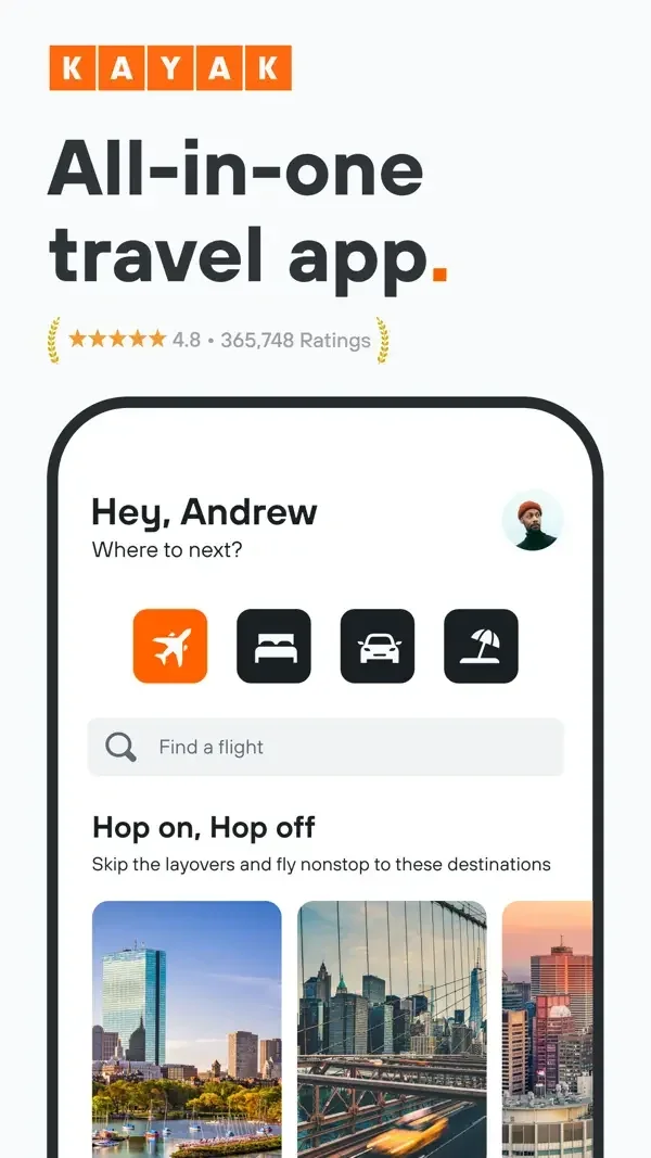
A compact travel home leads into a date grid and dense flight rows with times, stops, prices, and a clear action.
Useful for: Study travel home, date price comparison, flight results. Compare the hierarchy and controls shown in these publisher previews, then test the corresponding behavior in your own app.
# Design reference: KAYAK
Source: https://apps.apple.com/us/app/id305204535
Swipefile reference: https://swipefile.design/ref/mobile-kayak/
Captured: 2026-09-09. This is a dated reference, not a claim about the current live product.
Source scope: publisher-provided App Store previews. Promotional framing is retained. These are static examples, not a tested or recorded user flow. Do not infer unseen interactions.

## Objective
Adapt the interaction and layout patterns below to my project. Use my own content and identity. Do not reproduce logos, proprietary copy, or brand assets.

## Reference notes
- surface: Travel home · Date price comparison · Flight results
- nav: Travel-mode icons, result sorting, and filter chips keep comparisons organized.
- layout: A compact travel home leads into a date grid and dense flight rows with times, stops, prices, and a clear action.
- density: Compare the space reserved for the primary task with secondary metadata. The previews retain promotional framing; evaluate target sizes in your implemented screen.
- color: White and pale gray surfaces with orange actions.
- typography: Use clear heading, body, and metadata levels. Keep interface text scalable and verify readability with the device text-size settings.
- pattern: Search & discovery
- states: Static publisher previews only. Loading, empty, error, offline, permission, and keyboard behavior have not been tested. Specify and verify those states in your own implementation.
- dont: Do not copy the app identity, proprietary artwork, or promotional claims. Screenshot order is not a verified flow, and the listing version does not date every image.

Useful for: Study travel home, date price comparison, flight results. Compare the hierarchy and controls shown in these publisher previews, then test the corresponding behavior in your own app.

## Acceptance criteria
- Existing project conventions, design tokens, working functionality, and unrelated changes are preserved.
- Two or three reference principles clearly support the user's task; conflicts are resolved in favor of usability and the existing product.
- Accessible platform-native components express the interface; use semantic HTML when the target is mobile web. Available licensed assets are used; important UI text is never rendered as a bitmap.
- Every visible control has a defined behavior. Loading, empty, error, success, disabled, and long-content states are specified where relevant. Demo data is clearly labeled.
- Navigation and content adapt at 375px, 768px, and 1440px without horizontal page overflow. Keyboard use, visible focus, labeled inputs, at least 44px touch targets, readable contrast, and reduced motion are supported.
- Verification distinguishes rendered behavior from proposals and identifies anything still requiring a backend or external service.

## Quality bar
Clear hierarchy, consistent spacing, restrained surfaces, and purposeful motion. Avoid decorative gradients, excessive cards, placeholder buttons, and invented metrics unless the project calls for them. Do not claim a feature is connected or tested without evidence.
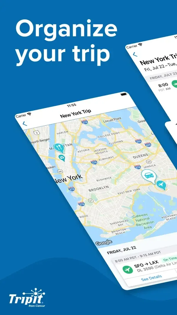
A map and chronological itinerary organize the journey, while a separate list groups saved trips.
Useful for: Study trip map, itinerary timeline, saved trip list. Compare the hierarchy and controls shown in these publisher previews, then test the corresponding behavior in your own app.
# Design reference: TripIt
Source: https://apps.apple.com/us/app/id311035142
Swipefile reference: https://swipefile.design/ref/mobile-tripit/
Captured: 2026-09-09. This is a dated reference, not a claim about the current live product.
Source scope: publisher-provided App Store previews. Promotional framing is retained. These are static examples, not a tested or recorded user flow. Do not infer unseen interactions.

## Objective
Adapt the interaction and layout patterns below to my project. Use my own content and identity. Do not reproduce logos, proprietary copy, or brand assets.

## Reference notes
- surface: Trip map · Itinerary timeline · Saved trip list
- nav: Trip-level views keep location context distinct from the sequence of booked activities.
- layout: A map and chronological itinerary organize the journey, while a separate list groups saved trips.
- density: Compare the space reserved for the primary task with secondary metadata. The previews retain promotional framing; evaluate target sizes in your implemented screen.
- color: White panels, blue framing, and green itinerary accents.
- typography: Use clear heading, body, and metadata levels. Keep interface text scalable and verify readability with the device text-size settings.
- pattern: Calendars & scheduling
- states: Static publisher previews only. Loading, empty, error, offline, permission, and keyboard behavior have not been tested. Specify and verify those states in your own implementation.
- dont: Do not copy the app identity, proprietary artwork, or promotional claims. Screenshot order is not a verified flow, and the listing version does not date every image.

Useful for: Study trip map, itinerary timeline, saved trip list. Compare the hierarchy and controls shown in these publisher previews, then test the corresponding behavior in your own app.

## Acceptance criteria
- Existing project conventions, design tokens, working functionality, and unrelated changes are preserved.
- Two or three reference principles clearly support the user's task; conflicts are resolved in favor of usability and the existing product.
- Accessible platform-native components express the interface; use semantic HTML when the target is mobile web. Available licensed assets are used; important UI text is never rendered as a bitmap.
- Every visible control has a defined behavior. Loading, empty, error, success, disabled, and long-content states are specified where relevant. Demo data is clearly labeled.
- Navigation and content adapt at 375px, 768px, and 1440px without horizontal page overflow. Keyboard use, visible focus, labeled inputs, at least 44px touch targets, readable contrast, and reduced motion are supported.
- Verification distinguishes rendered behavior from proposals and identifies anything still requiring a backend or external service.

## Quality bar
Clear hierarchy, consistent spacing, restrained surfaces, and purposeful motion. Avoid decorative gradients, excessive cards, placeholder buttons, and invented metrics unless the project calls for them. Do not claim a feature is connected or tested without evidence.
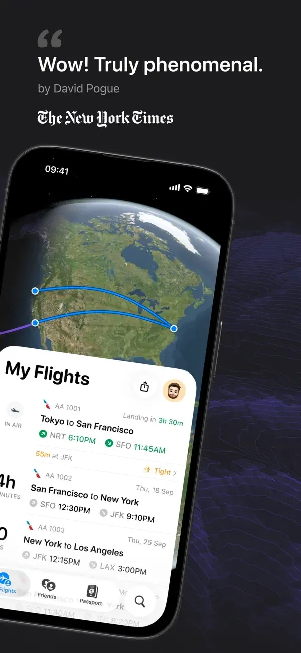
A globe and compact flight rows provide the overview; a status card condenses flight progress for the lock screen.
Useful for: Study upcoming flight list, live activity previews, inbound aircraft detail. Compare the hierarchy and controls shown in these publisher previews, then test the corresponding behavior in your own app.
# Design reference: Flighty
Source: https://apps.apple.com/us/app/id1358823008
Swipefile reference: https://swipefile.design/ref/mobile-flighty/
Captured: 2026-09-09. This is a dated reference, not a claim about the current live product.
Source scope: publisher-provided App Store previews. Promotional framing is retained. These are static examples, not a tested or recorded user flow. Do not infer unseen interactions.

## Objective
Adapt the interaction and layout patterns below to my project. Use my own content and identity. Do not reproduce logos, proprietary copy, or brand assets.

## Reference notes
- surface: Upcoming flight list · Live Activity previews · Inbound aircraft detail
- nav: Flight rows lead into aircraft and status details with a map above the supporting information.
- layout: A globe and compact flight rows provide the overview; a status card condenses flight progress for the lock screen.
- density: Compare the space reserved for the primary task with secondary metadata. The previews retain promotional framing; evaluate target sizes in your implemented screen.
- color: White flight lists, dark maps, and green or red status accents.
- typography: Use clear heading, body, and metadata levels. Keep interface text scalable and verify readability with the device text-size settings.
- pattern: Status & progress
- states: Static publisher previews only. Loading, empty, error, offline, permission, and keyboard behavior have not been tested. Specify and verify those states in your own implementation.
- dont: Do not copy the app identity, proprietary artwork, or promotional claims. Screenshot order is not a verified flow, and the listing version does not date every image.

Useful for: Study upcoming flight list, live activity previews, inbound aircraft detail. Compare the hierarchy and controls shown in these publisher previews, then test the corresponding behavior in your own app.

## Acceptance criteria
- Existing project conventions, design tokens, working functionality, and unrelated changes are preserved.
- Two or three reference principles clearly support the user's task; conflicts are resolved in favor of usability and the existing product.
- Accessible platform-native components express the interface; use semantic HTML when the target is mobile web. Available licensed assets are used; important UI text is never rendered as a bitmap.
- Every visible control has a defined behavior. Loading, empty, error, success, disabled, and long-content states are specified where relevant. Demo data is clearly labeled.
- Navigation and content adapt at 375px, 768px, and 1440px without horizontal page overflow. Keyboard use, visible focus, labeled inputs, at least 44px touch targets, readable contrast, and reduced motion are supported.
- Verification distinguishes rendered behavior from proposals and identifies anything still requiring a backend or external service.

## Quality bar
Clear hierarchy, consistent spacing, restrained surfaces, and purposeful motion. Avoid decorative gradients, excessive cards, placeholder buttons, and invented metrics unless the project calls for them. Do not claim a feature is connected or tested without evidence.
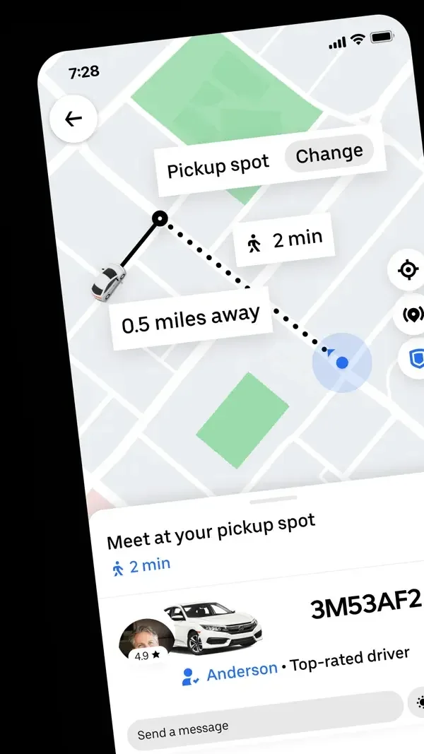
A map labels the pickup point, a search form collects the destination, and a compact vehicle list compares ride options.
Useful for: Study pickup guidance, destination entry, ride selection. Compare the hierarchy and controls shown in these publisher previews, then test the corresponding behavior in your own app.
# Design reference: Uber
Source: https://apps.apple.com/us/app/id368677368
Swipefile reference: https://swipefile.design/ref/mobile-uber/
Captured: 2026-09-09. This is a dated reference, not a claim about the current live product.
Source scope: publisher-provided App Store previews. Promotional framing is retained. These are static examples, not a tested or recorded user flow. Do not infer unseen interactions.

## Objective
Adapt the interaction and layout patterns below to my project. Use my own content and identity. Do not reproduce logos, proprietary copy, or brand assets.

## Reference notes
- surface: Pickup guidance · Destination entry · Ride selection
- nav: Back controls and explicit destination fields keep the trip context visible across the shown surfaces.
- layout: A map labels the pickup point, a search form collects the destination, and a compact vehicle list compares ride options.
- density: Compare the space reserved for the primary task with secondary metadata. The previews retain promotional framing; evaluate target sizes in your implemented screen.
- color: White and black controls with subdued map colors.
- typography: Use clear heading, body, and metadata levels. Keep interface text scalable and verify readability with the device text-size settings.
- pattern: Maps & navigation
- states: Static publisher previews only. Loading, empty, error, offline, permission, and keyboard behavior have not been tested. Specify and verify those states in your own implementation.
- dont: Do not copy the app identity, proprietary artwork, or promotional claims. Screenshot order is not a verified flow, and the listing version does not date every image.

Useful for: Study pickup guidance, destination entry, ride selection. Compare the hierarchy and controls shown in these publisher previews, then test the corresponding behavior in your own app.

## Acceptance criteria
- Existing project conventions, design tokens, working functionality, and unrelated changes are preserved.
- Two or three reference principles clearly support the user's task; conflicts are resolved in favor of usability and the existing product.
- Accessible platform-native components express the interface; use semantic HTML when the target is mobile web. Available licensed assets are used; important UI text is never rendered as a bitmap.
- Every visible control has a defined behavior. Loading, empty, error, success, disabled, and long-content states are specified where relevant. Demo data is clearly labeled.
- Navigation and content adapt at 375px, 768px, and 1440px without horizontal page overflow. Keyboard use, visible focus, labeled inputs, at least 44px touch targets, readable contrast, and reduced motion are supported.
- Verification distinguishes rendered behavior from proposals and identifies anything still requiring a backend or external service.

## Quality bar
Clear hierarchy, consistent spacing, restrained surfaces, and purposeful motion. Avoid decorative gradients, excessive cards, placeholder buttons, and invented metrics unless the project calls for them. Do not claim a feature is connected or tested without evidence.
A route map sits above ride options, while bike reservation combines the nearby vehicle location with a lower detail sheet.
Useful for: Study ride choices, expanded ride choices, bike reservation. Compare the hierarchy and controls shown in these publisher previews, then test the corresponding behavior in your own app.
# Design reference: Lyft
Source: https://apps.apple.com/us/app/id529379082
Swipefile reference: https://swipefile.design/ref/mobile-lyft/
Captured: 2026-09-09. This is a dated reference, not a claim about the current live product.
Source scope: publisher-provided App Store previews. Promotional framing is retained. These are static examples, not a tested or recorded user flow. Do not infer unseen interactions.

## Objective
Adapt the interaction and layout patterns below to my project. Use my own content and identity. Do not reproduce logos, proprietary copy, or brand assets.

## Reference notes
- surface: Ride choices · Expanded ride choices · Bike reservation
- nav: Search and map controls remain above selection cards with a clear reservation action.
- layout: A route map sits above ride options, while bike reservation combines the nearby vehicle location with a lower detail sheet.
- density: Compare the space reserved for the primary task with secondary metadata. The previews retain promotional framing; evaluate target sizes in your implemented screen.
- color: White surfaces with purple routes and actions.
- typography: Use clear heading, body, and metadata levels. Keep interface text scalable and verify readability with the device text-size settings.
- pattern: Maps & navigation
- states: Static publisher previews only. Loading, empty, error, offline, permission, and keyboard behavior have not been tested. Specify and verify those states in your own implementation.
- dont: Do not copy the app identity, proprietary artwork, or promotional claims. Screenshot order is not a verified flow, and the listing version does not date every image.

Useful for: Study ride choices, expanded ride choices, bike reservation. Compare the hierarchy and controls shown in these publisher previews, then test the corresponding behavior in your own app.

## Acceptance criteria
- Existing project conventions, design tokens, working functionality, and unrelated changes are preserved.
- Two or three reference principles clearly support the user's task; conflicts are resolved in favor of usability and the existing product.
- Accessible platform-native components express the interface; use semantic HTML when the target is mobile web. Available licensed assets are used; important UI text is never rendered as a bitmap.
- Every visible control has a defined behavior. Loading, empty, error, success, disabled, and long-content states are specified where relevant. Demo data is clearly labeled.
- Navigation and content adapt at 375px, 768px, and 1440px without horizontal page overflow. Keyboard use, visible focus, labeled inputs, at least 44px touch targets, readable contrast, and reduced motion are supported.
- Verification distinguishes rendered behavior from proposals and identifies anything still requiring a backend or external service.

## Quality bar
Clear hierarchy, consistent spacing, restrained surfaces, and purposeful motion. Avoid decorative gradients, excessive cards, placeholder buttons, and invented metrics unless the project calls for them. Do not claim a feature is connected or tested without evidence.
A large map keeps the route visible behind maneuver instructions and a compact lower trip summary.
Useful for: Study turn-by-turn navigation, route question and options, traffic-aware route. Compare the hierarchy and controls shown in these publisher previews, then test the corresponding behavior in your own app.
# Design reference: Google Maps
Source: https://apps.apple.com/us/app/id585027354
Swipefile reference: https://swipefile.design/ref/mobile-google-maps/
Captured: 2026-09-09. This is a dated reference, not a claim about the current live product.
Source scope: publisher-provided App Store previews. Promotional framing is retained. These are static examples, not a tested or recorded user flow. Do not infer unseen interactions.

## Objective
Adapt the interaction and layout patterns below to my project. Use my own content and identity. Do not reproduce logos, proprietary copy, or brand assets.

## Reference notes
- surface: Turn-by-turn navigation · Route question and options · Traffic-aware route
- nav: Floating map controls and a bottom information sheet separate map manipulation from trip details.
- layout: A large map keeps the route visible behind maneuver instructions and a compact lower trip summary.
- density: Compare the space reserved for the primary task with secondary metadata. The previews retain promotional framing; evaluate target sizes in your implemented screen.
- color: Pale maps, blue routes, green instructions, and red traffic accents.
- typography: Use clear heading, body, and metadata levels. Keep interface text scalable and verify readability with the device text-size settings.
- pattern: Maps & navigation
- states: Static publisher previews only. Loading, empty, error, offline, permission, and keyboard behavior have not been tested. Specify and verify those states in your own implementation.
- dont: Do not copy the app identity, proprietary artwork, or promotional claims. Screenshot order is not a verified flow, and the listing version does not date every image.

Useful for: Study turn-by-turn navigation, route question and options, traffic-aware route. Compare the hierarchy and controls shown in these publisher previews, then test the corresponding behavior in your own app.

## Acceptance criteria
- Existing project conventions, design tokens, working functionality, and unrelated changes are preserved.
- Two or three reference principles clearly support the user's task; conflicts are resolved in favor of usability and the existing product.
- Accessible platform-native components express the interface; use semantic HTML when the target is mobile web. Available licensed assets are used; important UI text is never rendered as a bitmap.
- Every visible control has a defined behavior. Loading, empty, error, success, disabled, and long-content states are specified where relevant. Demo data is clearly labeled.
- Navigation and content adapt at 375px, 768px, and 1440px without horizontal page overflow. Keyboard use, visible focus, labeled inputs, at least 44px touch targets, readable contrast, and reduced motion are supported.
- Verification distinguishes rendered behavior from proposals and identifies anything still requiring a backend or external service.

## Quality bar
Clear hierarchy, consistent spacing, restrained surfaces, and purposeful motion. Avoid decorative gradients, excessive cards, placeholder buttons, and invented metrics unless the project calls for them. Do not claim a feature is connected or tested without evidence.
A maneuver banner sits above the route while a lower card reports an incident and offers simple feedback choices.
Useful for: Study route guidance, road incident alert, night navigation alert. Compare the hierarchy and controls shown in these publisher previews, then test the corresponding behavior in your own app.
# Design reference: Waze
Source: https://apps.apple.com/us/app/id323229106
Swipefile reference: https://swipefile.design/ref/mobile-waze/
Captured: 2026-09-09. This is a dated reference, not a claim about the current live product.
Source scope: publisher-provided App Store previews. Promotional framing is retained. These are static examples, not a tested or recorded user flow. Do not infer unseen interactions.

## Objective
Adapt the interaction and layout patterns below to my project. Use my own content and identity. Do not reproduce logos, proprietary copy, or brand assets.

## Reference notes
- surface: Route guidance · Road incident alert · Night navigation alert
- nav: Map controls remain secondary to the next turn and trip timing.
- layout: A maneuver banner sits above the route while a lower card reports an incident and offers simple feedback choices.
- density: Compare the space reserved for the primary task with secondary metadata. The previews retain promotional framing; evaluate target sizes in your implemented screen.
- color: White or dark maps with purple routes and blue feedback controls.
- typography: Use clear heading, body, and metadata levels. Keep interface text scalable and verify readability with the device text-size settings.
- pattern: Maps & navigation
- states: Static publisher previews only. Loading, empty, error, offline, permission, and keyboard behavior have not been tested. Specify and verify those states in your own implementation.
- dont: Do not copy the app identity, proprietary artwork, or promotional claims. Screenshot order is not a verified flow, and the listing version does not date every image.

Useful for: Study route guidance, road incident alert, night navigation alert. Compare the hierarchy and controls shown in these publisher previews, then test the corresponding behavior in your own app.

## Acceptance criteria
- Existing project conventions, design tokens, working functionality, and unrelated changes are preserved.
- Two or three reference principles clearly support the user's task; conflicts are resolved in favor of usability and the existing product.
- Accessible platform-native components express the interface; use semantic HTML when the target is mobile web. Available licensed assets are used; important UI text is never rendered as a bitmap.
- Every visible control has a defined behavior. Loading, empty, error, success, disabled, and long-content states are specified where relevant. Demo data is clearly labeled.
- Navigation and content adapt at 375px, 768px, and 1440px without horizontal page overflow. Keyboard use, visible focus, labeled inputs, at least 44px touch targets, readable contrast, and reduced motion are supported.
- Verification distinguishes rendered behavior from proposals and identifies anything still requiring a backend or external service.

## Quality bar
Clear hierarchy, consistent spacing, restrained surfaces, and purposeful motion. Avoid decorative gradients, excessive cards, placeholder buttons, and invented metrics unless the project calls for them. Do not claim a feature is connected or tested without evidence.
A transit map and route choices combine transport icons with duration information.
Useful for: Study transit home, route comparison, journey instructions. Compare the hierarchy and controls shown in these publisher previews, then test the corresponding behavior in your own app.
# Design reference: Citymapper
Source: https://apps.apple.com/us/app/id469463298
Swipefile reference: https://swipefile.design/ref/mobile-citymapper/
Captured: 2026-09-09. This is a dated reference, not a claim about the current live product.
Source scope: publisher-provided App Store previews. Promotional framing is retained. These are static examples, not a tested or recorded user flow. Do not infer unseen interactions.

## Objective
Adapt the interaction and layout patterns below to my project. Use my own content and identity. Do not reproduce logos, proprietary copy, or brand assets.

## Reference notes
- surface: Transit home · Route comparison · Journey instructions
- nav: Search and transport-mode controls lead into route comparisons.
- layout: A transit map and route choices combine transport icons with duration information.
- density: Compare the space reserved for the primary task with secondary metadata. The previews retain promotional framing; evaluate target sizes in your implemented screen.
- color: Green accents, white panels, and multicolored transport markers.
- typography: Use clear heading, body, and metadata levels. Keep interface text scalable and verify readability with the device text-size settings.
- pattern: Maps & navigation
- states: Static publisher previews only. Loading, empty, error, offline, permission, and keyboard behavior have not been tested. Specify and verify those states in your own implementation.
- dont: Do not copy the app identity, proprietary artwork, or promotional claims. Screenshot order is not a verified flow, and the listing version does not date every image.

Useful for: Study transit home, route comparison, journey instructions. Compare the hierarchy and controls shown in these publisher previews, then test the corresponding behavior in your own app.

## Acceptance criteria
- Existing project conventions, design tokens, working functionality, and unrelated changes are preserved.
- Two or three reference principles clearly support the user's task; conflicts are resolved in favor of usability and the existing product.
- Accessible platform-native components express the interface; use semantic HTML when the target is mobile web. Available licensed assets are used; important UI text is never rendered as a bitmap.
- Every visible control has a defined behavior. Loading, empty, error, success, disabled, and long-content states are specified where relevant. Demo data is clearly labeled.
- Navigation and content adapt at 375px, 768px, and 1440px without horizontal page overflow. Keyboard use, visible focus, labeled inputs, at least 44px touch targets, readable contrast, and reduced motion are supported.
- Verification distinguishes rendered behavior from proposals and identifies anything still requiring a backend or external service.

## Quality bar
Clear hierarchy, consistent spacing, restrained surfaces, and purposeful motion. Avoid decorative gradients, excessive cards, placeholder buttons, and invented metrics unless the project calls for them. Do not claim a feature is connected or tested without evidence.
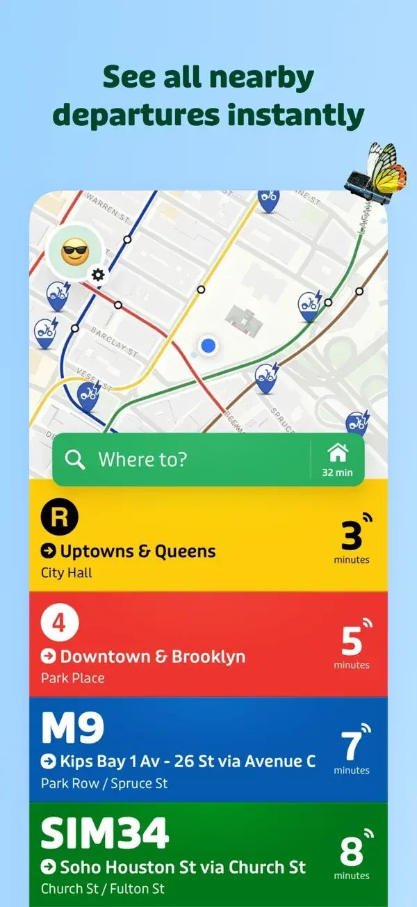
Bold route-colored rows emphasize the next departure, while a detail view combines a map with arrival estimates and disruption notices.
Useful for: Study nearby departures, vehicle arrivals, service disruption. Compare the hierarchy and controls shown in these publisher previews, then test the corresponding behavior in your own app.
# Design reference: Transit
Source: https://apps.apple.com/us/app/id498151501
Swipefile reference: https://swipefile.design/ref/mobile-transit/
Captured: 2026-09-09. This is a dated reference, not a claim about the current live product.
Source scope: publisher-provided App Store previews. Promotional framing is retained. These are static examples, not a tested or recorded user flow. Do not infer unseen interactions.

## Objective
Adapt the interaction and layout patterns below to my project. Use my own content and identity. Do not reproduce logos, proprietary copy, or brand assets.

## Reference notes
- surface: Nearby departures · Vehicle arrivals · Service disruption
- nav: A destination field sits between map and route list; route details expose a clear close control.
- layout: Bold route-colored rows emphasize the next departure, while a detail view combines a map with arrival estimates and disruption notices.
- density: Compare the space reserved for the primary task with secondary metadata. The previews retain promotional framing; evaluate target sizes in your implemented screen.
- color: Yellow, red, blue, and green route colors on white or map surfaces.
- typography: Use clear heading, body, and metadata levels. Keep interface text scalable and verify readability with the device text-size settings.
- pattern: Status & progress
- states: Static publisher previews only. Loading, empty, error, offline, permission, and keyboard behavior have not been tested. Specify and verify those states in your own implementation.
- dont: Do not copy the app identity, proprietary artwork, or promotional claims. Screenshot order is not a verified flow, and the listing version does not date every image.

Useful for: Study nearby departures, vehicle arrivals, service disruption. Compare the hierarchy and controls shown in these publisher previews, then test the corresponding behavior in your own app.

## Acceptance criteria
- Existing project conventions, design tokens, working functionality, and unrelated changes are preserved.
- Two or three reference principles clearly support the user's task; conflicts are resolved in favor of usability and the existing product.
- Accessible platform-native components express the interface; use semantic HTML when the target is mobile web. Available licensed assets are used; important UI text is never rendered as a bitmap.
- Every visible control has a defined behavior. Loading, empty, error, success, disabled, and long-content states are specified where relevant. Demo data is clearly labeled.
- Navigation and content adapt at 375px, 768px, and 1440px without horizontal page overflow. Keyboard use, visible focus, labeled inputs, at least 44px touch targets, readable contrast, and reduced motion are supported.
- Verification distinguishes rendered behavior from proposals and identifies anything still requiring a backend or external service.

## Quality bar
Clear hierarchy, consistent spacing, restrained surfaces, and purposeful motion. Avoid decorative gradients, excessive cards, placeholder buttons, and invented metrics unless the project calls for them. Do not claim a feature is connected or tested without evidence.
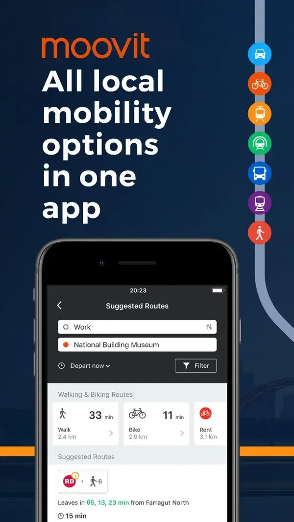
Origin and destination fields lead into route summaries with transport icons, durations, and a nearby map.
Useful for: Study route search, transit route options, nearby lines. Compare the hierarchy and controls shown in these publisher previews, then test the corresponding behavior in your own app.
# Design reference: Moovit
Source: https://apps.apple.com/us/app/id498477945
Swipefile reference: https://swipefile.design/ref/mobile-moovit/
Captured: 2026-09-09. This is a dated reference, not a claim about the current live product.
Source scope: publisher-provided App Store previews. Promotional framing is retained. These are static examples, not a tested or recorded user flow. Do not infer unseen interactions.

## Objective
Adapt the interaction and layout patterns below to my project. Use my own content and identity. Do not reproduce logos, proprietary copy, or brand assets.

## Reference notes
- surface: Route search · Transit route options · Nearby lines
- nav: Search and route-selection surfaces preserve the trip endpoints above the options.
- layout: Origin and destination fields lead into route summaries with transport icons, durations, and a nearby map.
- density: Compare the space reserved for the primary task with secondary metadata. The previews retain promotional framing; evaluate target sizes in your implemented screen.
- color: White panels, dark blue framing, and varied transport colors.
- typography: Use clear heading, body, and metadata levels. Keep interface text scalable and verify readability with the device text-size settings.
- pattern: Maps & navigation
- states: Static publisher previews only. Loading, empty, error, offline, permission, and keyboard behavior have not been tested. Specify and verify those states in your own implementation.
- dont: Do not copy the app identity, proprietary artwork, or promotional claims. Screenshot order is not a verified flow, and the listing version does not date every image.

Useful for: Study route search, transit route options, nearby lines. Compare the hierarchy and controls shown in these publisher previews, then test the corresponding behavior in your own app.

## Acceptance criteria
- Existing project conventions, design tokens, working functionality, and unrelated changes are preserved.
- Two or three reference principles clearly support the user's task; conflicts are resolved in favor of usability and the existing product.
- Accessible platform-native components express the interface; use semantic HTML when the target is mobile web. Available licensed assets are used; important UI text is never rendered as a bitmap.
- Every visible control has a defined behavior. Loading, empty, error, success, disabled, and long-content states are specified where relevant. Demo data is clearly labeled.
- Navigation and content adapt at 375px, 768px, and 1440px without horizontal page overflow. Keyboard use, visible focus, labeled inputs, at least 44px touch targets, readable contrast, and reduced motion are supported.
- Verification distinguishes rendered behavior from proposals and identifies anything still requiring a backend or external service.

## Quality bar
Clear hierarchy, consistent spacing, restrained surfaces, and purposeful motion. Avoid decorative gradients, excessive cards, placeholder buttons, and invented metrics unless the project calls for them. Do not claim a feature is connected or tested without evidence.
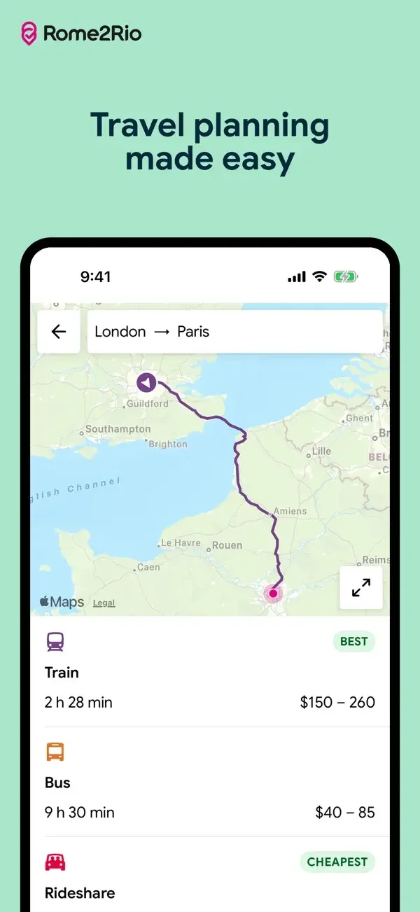
A map and plain transport rows compare modes by time and price, while a search panel collects endpoints and date.
Useful for: Study route overview, transport comparison, trip search. Compare the hierarchy and controls shown in these publisher previews, then test the corresponding behavior in your own app.
# Design reference: Rome2Rio
Source: https://apps.apple.com/us/app/id569793256
Swipefile reference: https://swipefile.design/ref/mobile-rome2rio/
Captured: 2026-09-09. This is a dated reference, not a claim about the current live product.
Source scope: publisher-provided App Store previews. Promotional framing is retained. These are static examples, not a tested or recorded user flow. Do not infer unseen interactions.

## Objective
Adapt the interaction and layout patterns below to my project. Use my own content and identity. Do not reproduce logos, proprietary copy, or brand assets.

## Reference notes
- surface: Route overview · Transport comparison · Trip search
- nav: Back navigation and a swap control make the origin-destination relationship explicit.
- layout: A map and plain transport rows compare modes by time and price, while a search panel collects endpoints and date.
- density: Compare the space reserved for the primary task with secondary metadata. The previews retain promotional framing; evaluate target sizes in your implemented screen.
- color: White panels, mint framing, and magenta search actions.
- typography: Use clear heading, body, and metadata levels. Keep interface text scalable and verify readability with the device text-size settings.
- pattern: Maps & navigation
- states: Static publisher previews only. Loading, empty, error, offline, permission, and keyboard behavior have not been tested. Specify and verify those states in your own implementation.
- dont: Do not copy the app identity, proprietary artwork, or promotional claims. Screenshot order is not a verified flow, and the listing version does not date every image.

Useful for: Study route overview, transport comparison, trip search. Compare the hierarchy and controls shown in these publisher previews, then test the corresponding behavior in your own app.

## Acceptance criteria
- Existing project conventions, design tokens, working functionality, and unrelated changes are preserved.
- Two or three reference principles clearly support the user's task; conflicts are resolved in favor of usability and the existing product.
- Accessible platform-native components express the interface; use semantic HTML when the target is mobile web. Available licensed assets are used; important UI text is never rendered as a bitmap.
- Every visible control has a defined behavior. Loading, empty, error, success, disabled, and long-content states are specified where relevant. Demo data is clearly labeled.
- Navigation and content adapt at 375px, 768px, and 1440px without horizontal page overflow. Keyboard use, visible focus, labeled inputs, at least 44px touch targets, readable contrast, and reduced motion are supported.
- Verification distinguishes rendered behavior from proposals and identifies anything still requiring a backend or external service.

## Quality bar
Clear hierarchy, consistent spacing, restrained surfaces, and purposeful motion. Avoid decorative gradients, excessive cards, placeholder buttons, and invented metrics unless the project calls for them. Do not claim a feature is connected or tested without evidence.
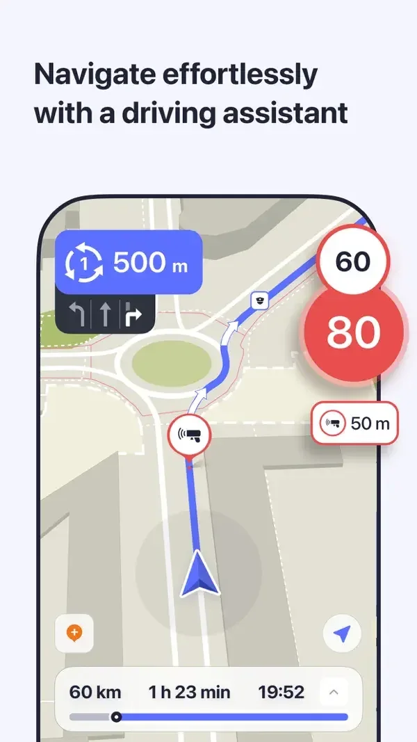
Large maneuver cues sit over the route, while the hiking surface pairs a map with elevation and distance information.
Useful for: Study driving guidance, hiking route and elevation, map style comparison. Compare the hierarchy and controls shown in these publisher previews, then test the corresponding behavior in your own app.
# Design reference: MAPS.ME
Source: https://apps.apple.com/us/app/id510623322
Swipefile reference: https://swipefile.design/ref/mobile-maps-me/
Captured: 2026-09-09. This is a dated reference, not a claim about the current live product.
Source scope: publisher-provided App Store previews. Promotional framing is retained. These are static examples, not a tested or recorded user flow. Do not infer unseen interactions.

## Objective
Adapt the interaction and layout patterns below to my project. Use my own content and identity. Do not reproduce logos, proprietary copy, or brand assets.

## Reference notes
- surface: Driving guidance · Hiking route and elevation · Map style comparison
- nav: Floating map controls leave most of the screen available for location context.
- layout: Large maneuver cues sit over the route, while the hiking surface pairs a map with elevation and distance information.
- density: Compare the space reserved for the primary task with secondary metadata. The previews retain promotional framing; evaluate target sizes in your implemented screen.
- color: Pale green terrain, blue route highlights, and high-contrast maneuver badges.
- typography: Use clear heading, body, and metadata levels. Keep interface text scalable and verify readability with the device text-size settings.
- pattern: Maps & navigation
- states: Static publisher previews only. Loading, empty, error, offline, permission, and keyboard behavior have not been tested. Specify and verify those states in your own implementation.
- dont: Do not copy the app identity, proprietary artwork, or promotional claims. Screenshot order is not a verified flow, and the listing version does not date every image.

Useful for: Study driving guidance, hiking route and elevation, map style comparison. Compare the hierarchy and controls shown in these publisher previews, then test the corresponding behavior in your own app.

## Acceptance criteria
- Existing project conventions, design tokens, working functionality, and unrelated changes are preserved.
- Two or three reference principles clearly support the user's task; conflicts are resolved in favor of usability and the existing product.
- Accessible platform-native components express the interface; use semantic HTML when the target is mobile web. Available licensed assets are used; important UI text is never rendered as a bitmap.
- Every visible control has a defined behavior. Loading, empty, error, success, disabled, and long-content states are specified where relevant. Demo data is clearly labeled.
- Navigation and content adapt at 375px, 768px, and 1440px without horizontal page overflow. Keyboard use, visible focus, labeled inputs, at least 44px touch targets, readable contrast, and reduced motion are supported.
- Verification distinguishes rendered behavior from proposals and identifies anything still requiring a backend or external service.

## Quality bar
Clear hierarchy, consistent spacing, restrained surfaces, and purposeful motion. Avoid decorative gradients, excessive cards, placeholder buttons, and invented metrics unless the project calls for them. Do not claim a feature is connected or tested without evidence.
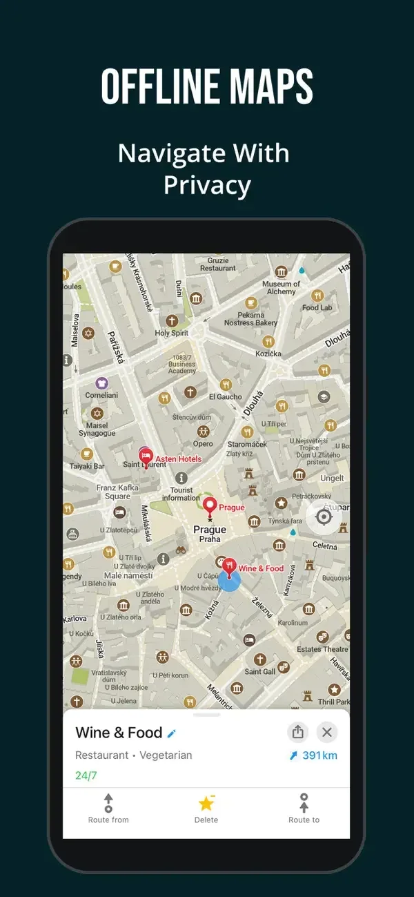
A place sheet, an elevation chart, and a maneuver banner each add relevant detail without replacing the map.
Useful for: Study place detail, trail elevation profile, night route guidance. Compare the hierarchy and controls shown in these publisher previews, then test the corresponding behavior in your own app.
# Design reference: Organic Maps
Source: https://apps.apple.com/us/app/id1567437057
Swipefile reference: https://swipefile.design/ref/mobile-organic-maps/
Captured: 2026-09-09. This is a dated reference, not a claim about the current live product.
Source scope: publisher-provided App Store previews. Promotional framing is retained. These are static examples, not a tested or recorded user flow. Do not infer unseen interactions.

## Objective
Adapt the interaction and layout patterns below to my project. Use my own content and identity. Do not reproduce logos, proprietary copy, or brand assets.

## Reference notes
- surface: Place detail · Trail elevation profile · Night route guidance
- nav: Compact lower actions cover routing, saving, and place-level tasks.
- layout: A place sheet, an elevation chart, and a maneuver banner each add relevant detail without replacing the map.
- density: Compare the space reserved for the primary task with secondary metadata. The previews retain promotional framing; evaluate target sizes in your implemented screen.
- color: Muted maps, blue route highlights, and a dark navigation theme.
- typography: Use clear heading, body, and metadata levels. Keep interface text scalable and verify readability with the device text-size settings.
- pattern: Maps & navigation
- states: Static publisher previews only. Loading, empty, error, offline, permission, and keyboard behavior have not been tested. Specify and verify those states in your own implementation.
- dont: Do not copy the app identity, proprietary artwork, or promotional claims. Screenshot order is not a verified flow, and the listing version does not date every image.

Useful for: Study place detail, trail elevation profile, night route guidance. Compare the hierarchy and controls shown in these publisher previews, then test the corresponding behavior in your own app.

## Acceptance criteria
- Existing project conventions, design tokens, working functionality, and unrelated changes are preserved.
- Two or three reference principles clearly support the user's task; conflicts are resolved in favor of usability and the existing product.
- Accessible platform-native components express the interface; use semantic HTML when the target is mobile web. Available licensed assets are used; important UI text is never rendered as a bitmap.
- Every visible control has a defined behavior. Loading, empty, error, success, disabled, and long-content states are specified where relevant. Demo data is clearly labeled.
- Navigation and content adapt at 375px, 768px, and 1440px without horizontal page overflow. Keyboard use, visible focus, labeled inputs, at least 44px touch targets, readable contrast, and reduced motion are supported.
- Verification distinguishes rendered behavior from proposals and identifies anything still requiring a backend or external service.

## Quality bar
Clear hierarchy, consistent spacing, restrained surfaces, and purposeful motion. Avoid decorative gradients, excessive cards, placeholder buttons, and invented metrics unless the project calls for them. Do not claim a feature is connected or tested without evidence.
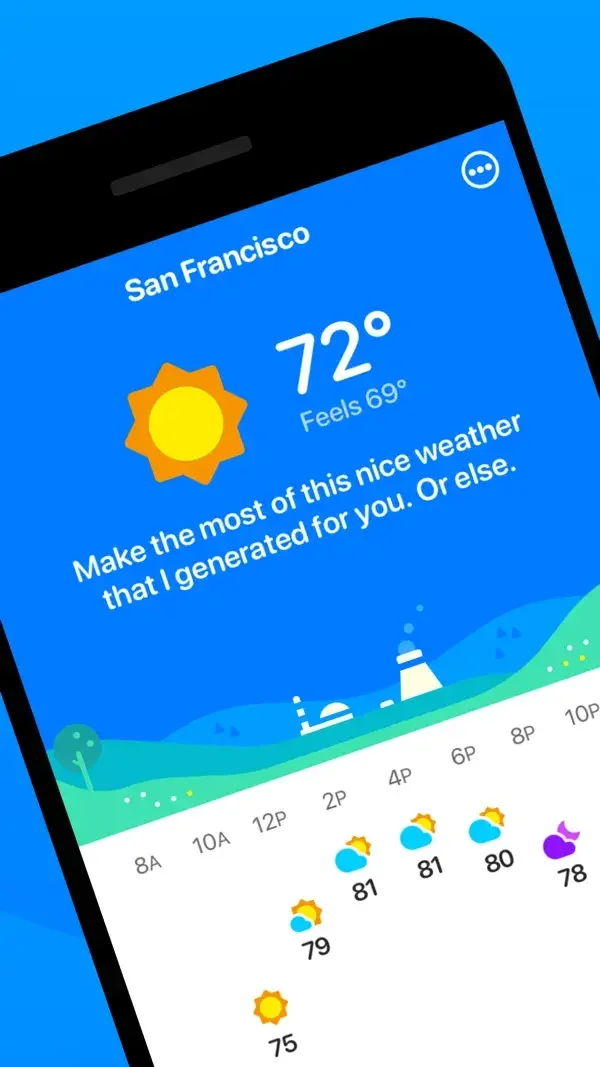
Large temperature typography and a horizontal forecast contrast with a radar map and its color scale.
Useful for: Study current weather, weather radar, home-screen widgets. Compare the hierarchy and controls shown in these publisher previews, then test the corresponding behavior in your own app.
# Design reference: CARROT Weather
Source: https://apps.apple.com/us/app/id961390574
Swipefile reference: https://swipefile.design/ref/mobile-carrot-weather/
Captured: 2026-09-09. This is a dated reference, not a claim about the current live product.
Source scope: publisher-provided App Store previews. Promotional framing is retained. These are static examples, not a tested or recorded user flow. Do not infer unseen interactions.

## Objective
Adapt the interaction and layout patterns below to my project. Use my own content and identity. Do not reproduce logos, proprietary copy, or brand assets.

## Reference notes
- surface: Current weather · Weather radar · Home-screen widgets
- nav: Location and weather-view controls keep the current place identifiable.
- layout: Large temperature typography and a horizontal forecast contrast with a radar map and its color scale.
- density: Compare the space reserved for the primary task with secondary metadata. The previews retain promotional framing; evaluate target sizes in your implemented screen.
- color: Bright blue forecast surfaces and a dark multicolored radar map.
- typography: Use clear heading, body, and metadata levels. Keep interface text scalable and verify readability with the device text-size settings.
- pattern: Data visualization
- states: Static publisher previews only. Loading, empty, error, offline, permission, and keyboard behavior have not been tested. Specify and verify those states in your own implementation.
- dont: Do not copy the app identity, proprietary artwork, or promotional claims. Screenshot order is not a verified flow, and the listing version does not date every image.

Useful for: Study current weather, weather radar, home-screen widgets. Compare the hierarchy and controls shown in these publisher previews, then test the corresponding behavior in your own app.

## Acceptance criteria
- Existing project conventions, design tokens, working functionality, and unrelated changes are preserved.
- Two or three reference principles clearly support the user's task; conflicts are resolved in favor of usability and the existing product.
- Accessible platform-native components express the interface; use semantic HTML when the target is mobile web. Available licensed assets are used; important UI text is never rendered as a bitmap.
- Every visible control has a defined behavior. Loading, empty, error, success, disabled, and long-content states are specified where relevant. Demo data is clearly labeled.
- Navigation and content adapt at 375px, 768px, and 1440px without horizontal page overflow. Keyboard use, visible focus, labeled inputs, at least 44px touch targets, readable contrast, and reduced motion are supported.
- Verification distinguishes rendered behavior from proposals and identifies anything still requiring a backend or external service.

## Quality bar
Clear hierarchy, consistent spacing, restrained surfaces, and purposeful motion. Avoid decorative gradients, excessive cards, placeholder buttons, and invented metrics unless the project calls for them. Do not claim a feature is connected or tested without evidence.
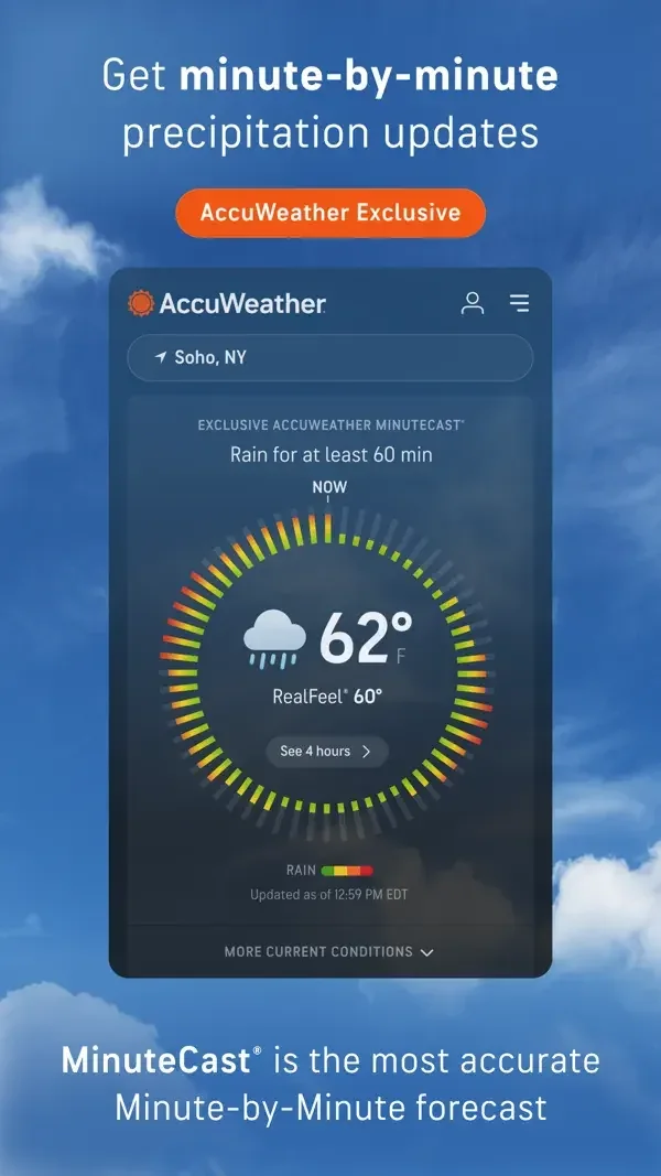
A circular precipitation display emphasizes the current reading, while a separate list uses labeled scales for environmental indices.
Useful for: Study minute precipitation forecast, health-related weather indices, severe weather alerts. Compare the hierarchy and controls shown in these publisher previews, then test the corresponding behavior in your own app.
# Design reference: AccuWeather
Source: https://apps.apple.com/us/app/id300048137
Swipefile reference: https://swipefile.design/ref/mobile-accuweather/
Captured: 2026-09-09. This is a dated reference, not a claim about the current live product.
Source scope: publisher-provided App Store previews. Promotional framing is retained. These are static examples, not a tested or recorded user flow. Do not infer unseen interactions.

## Objective
Adapt the interaction and layout patterns below to my project. Use my own content and identity. Do not reproduce logos, proprietary copy, or brand assets.

## Reference notes
- surface: Minute precipitation forecast · Health-related weather indices · Severe weather alerts
- nav: Location stays at the top of each view, above the detailed conditions.
- layout: A circular precipitation display emphasizes the current reading, while a separate list uses labeled scales for environmental indices.
- density: Compare the space reserved for the primary task with secondary metadata. The previews retain promotional framing; evaluate target sizes in your implemented screen.
- color: Dark blue surfaces with orange branding and colored condition scales.
- typography: Use clear heading, body, and metadata levels. Keep interface text scalable and verify readability with the device text-size settings.
- pattern: Data visualization
- states: Static publisher previews only. Loading, empty, error, offline, permission, and keyboard behavior have not been tested. Specify and verify those states in your own implementation.
- dont: Do not copy the app identity, proprietary artwork, or promotional claims. Screenshot order is not a verified flow, and the listing version does not date every image.

Useful for: Study minute precipitation forecast, health-related weather indices, severe weather alerts. Compare the hierarchy and controls shown in these publisher previews, then test the corresponding behavior in your own app.

## Acceptance criteria
- Existing project conventions, design tokens, working functionality, and unrelated changes are preserved.
- Two or three reference principles clearly support the user's task; conflicts are resolved in favor of usability and the existing product.
- Accessible platform-native components express the interface; use semantic HTML when the target is mobile web. Available licensed assets are used; important UI text is never rendered as a bitmap.
- Every visible control has a defined behavior. Loading, empty, error, success, disabled, and long-content states are specified where relevant. Demo data is clearly labeled.
- Navigation and content adapt at 375px, 768px, and 1440px without horizontal page overflow. Keyboard use, visible focus, labeled inputs, at least 44px touch targets, readable contrast, and reduced motion are supported.
- Verification distinguishes rendered behavior from proposals and identifies anything still requiring a backend or external service.

## Quality bar
Clear hierarchy, consistent spacing, restrained surfaces, and purposeful motion. Avoid decorative gradients, excessive cards, placeholder buttons, and invented metrics unless the project calls for them. Do not claim a feature is connected or tested without evidence.
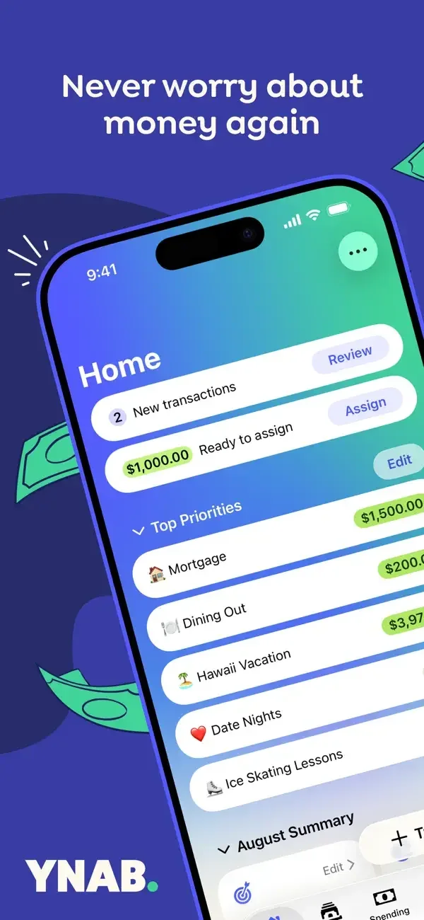
Priority rows, a plan total, and category funding bars create three levels of budget detail.
Useful for: Study budget home, plan editor, category funding. Compare the hierarchy and controls shown in these publisher previews, then test the corresponding behavior in your own app.
# Design reference: YNAB
Source: https://apps.apple.com/us/app/id1010865877
Swipefile reference: https://swipefile.design/ref/mobile-ynab/
Captured: 2026-09-09. This is a dated reference, not a claim about the current live product.
Source scope: publisher-provided App Store previews. Promotional framing is retained. These are static examples, not a tested or recorded user flow. Do not infer unseen interactions.

## Objective
Adapt the interaction and layout patterns below to my project. Use my own content and identity. Do not reproduce logos, proprietary copy, or brand assets.

## Reference notes
- surface: Budget home · Plan editor · Category funding
- nav: Home and plan surfaces separate the overview from assigning amounts to categories.
- layout: Priority rows, a plan total, and category funding bars create three levels of budget detail.
- density: Compare the space reserved for the primary task with secondary metadata. The previews retain promotional framing; evaluate target sizes in your implemented screen.
- color: White and dark blue surfaces with bright green allocation highlights.
- typography: Use clear heading, body, and metadata levels. Keep interface text scalable and verify readability with the device text-size settings.
- pattern: Data visualization
- states: Static publisher previews only. Loading, empty, error, offline, permission, and keyboard behavior have not been tested. Specify and verify those states in your own implementation.
- dont: Do not copy the app identity, proprietary artwork, or promotional claims. Screenshot order is not a verified flow, and the listing version does not date every image.

Useful for: Study budget home, plan editor, category funding. Compare the hierarchy and controls shown in these publisher previews, then test the corresponding behavior in your own app.

## Acceptance criteria
- Existing project conventions, design tokens, working functionality, and unrelated changes are preserved.
- Two or three reference principles clearly support the user's task; conflicts are resolved in favor of usability and the existing product.
- Accessible platform-native components express the interface; use semantic HTML when the target is mobile web. Available licensed assets are used; important UI text is never rendered as a bitmap.
- Every visible control has a defined behavior. Loading, empty, error, success, disabled, and long-content states are specified where relevant. Demo data is clearly labeled.
- Navigation and content adapt at 375px, 768px, and 1440px without horizontal page overflow. Keyboard use, visible focus, labeled inputs, at least 44px touch targets, readable contrast, and reduced motion are supported.
- Verification distinguishes rendered behavior from proposals and identifies anything still requiring a backend or external service.

## Quality bar
Clear hierarchy, consistent spacing, restrained surfaces, and purposeful motion. Avoid decorative gradients, excessive cards, placeholder buttons, and invented metrics unless the project calls for them. Do not claim a feature is connected or tested without evidence.
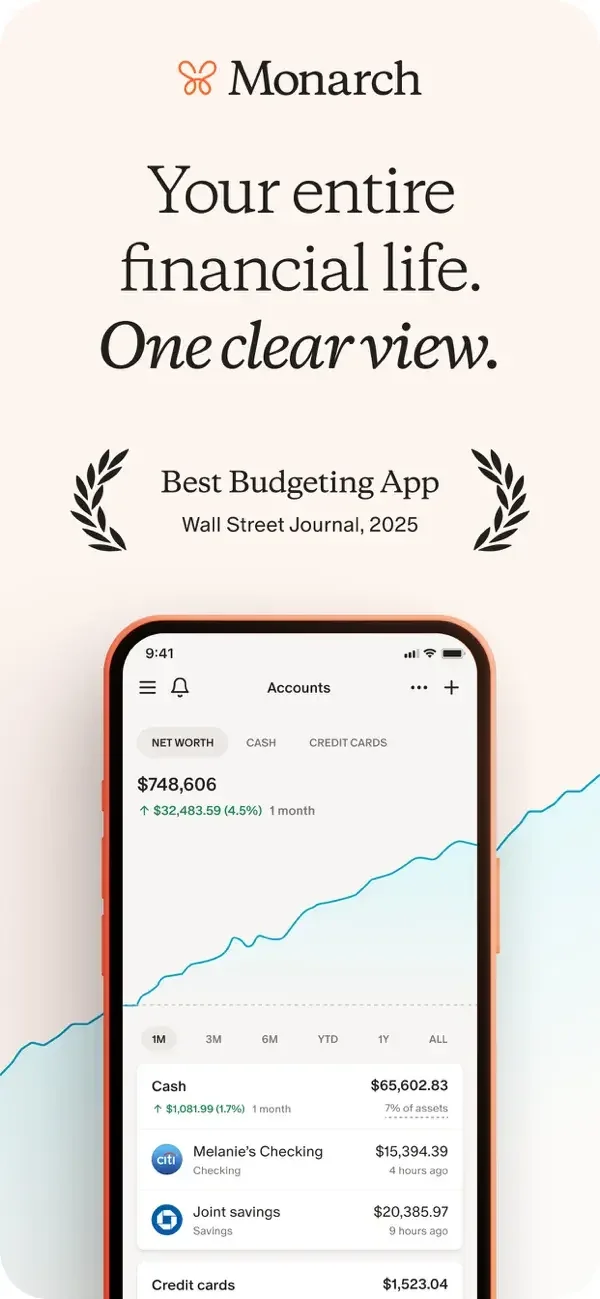
An account trend, a flow diagram, and category progress bars each explain a different scale of financial information.
Useful for: Study account overview, cash-flow diagram, budget categories. Compare the hierarchy and controls shown in these publisher previews, then test the corresponding behavior in your own app.
# Design reference: Monarch Money
Source: https://apps.apple.com/us/app/id1459319842
Swipefile reference: https://swipefile.design/ref/mobile-monarch-money/
Captured: 2026-09-09. This is a dated reference, not a claim about the current live product.
Source scope: publisher-provided App Store previews. Promotional framing is retained. These are static examples, not a tested or recorded user flow. Do not infer unseen interactions.

## Objective
Adapt the interaction and layout patterns below to my project. Use my own content and identity. Do not reproduce logos, proprietary copy, or brand assets.

## Reference notes
- surface: Account overview · Cash-flow diagram · Budget categories
- nav: Report and budget headings clarify the purpose of each view.
- layout: An account trend, a flow diagram, and category progress bars each explain a different scale of financial information.
- density: Compare the space reserved for the primary task with secondary metadata. The previews retain promotional framing; evaluate target sizes in your implemented screen.
- color: Warm white surfaces with green, coral, and category-colored charts.
- typography: Use clear heading, body, and metadata levels. Keep interface text scalable and verify readability with the device text-size settings.
- pattern: Data visualization
- states: Static publisher previews only. Loading, empty, error, offline, permission, and keyboard behavior have not been tested. Specify and verify those states in your own implementation.
- dont: Do not copy the app identity, proprietary artwork, or promotional claims. Screenshot order is not a verified flow, and the listing version does not date every image.

Useful for: Study account overview, cash-flow diagram, budget categories. Compare the hierarchy and controls shown in these publisher previews, then test the corresponding behavior in your own app.

## Acceptance criteria
- Existing project conventions, design tokens, working functionality, and unrelated changes are preserved.
- Two or three reference principles clearly support the user's task; conflicts are resolved in favor of usability and the existing product.
- Accessible platform-native components express the interface; use semantic HTML when the target is mobile web. Available licensed assets are used; important UI text is never rendered as a bitmap.
- Every visible control has a defined behavior. Loading, empty, error, success, disabled, and long-content states are specified where relevant. Demo data is clearly labeled.
- Navigation and content adapt at 375px, 768px, and 1440px without horizontal page overflow. Keyboard use, visible focus, labeled inputs, at least 44px touch targets, readable contrast, and reduced motion are supported.
- Verification distinguishes rendered behavior from proposals and identifies anything still requiring a backend or external service.

## Quality bar
Clear hierarchy, consistent spacing, restrained surfaces, and purposeful motion. Avoid decorative gradients, excessive cards, placeholder buttons, and invented metrics unless the project calls for them. Do not claim a feature is connected or tested without evidence.
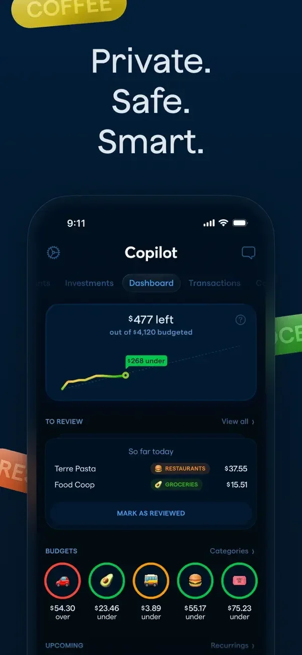
A dashboard combines small charts and category rings; dedicated views enlarge cash flow and spending history.
Useful for: Study spending dashboard, cash-flow charts, transaction category detail. Compare the hierarchy and controls shown in these publisher previews, then test the corresponding behavior in your own app.
# Design reference: Copilot Money
Source: https://apps.apple.com/us/app/id1447330651
Swipefile reference: https://swipefile.design/ref/mobile-copilot-money/
Captured: 2026-09-09. This is a dated reference, not a claim about the current live product.
Source scope: publisher-provided App Store previews. Promotional framing is retained. These are static examples, not a tested or recorded user flow. Do not infer unseen interactions.

## Objective
Adapt the interaction and layout patterns below to my project. Use my own content and identity. Do not reproduce logos, proprietary copy, or brand assets.

## Reference notes
- surface: Spending dashboard · Cash-flow charts · Transaction category detail
- nav: Dashboard, cash-flow, and transaction surfaces move from overview to detail.
- layout: A dashboard combines small charts and category rings; dedicated views enlarge cash flow and spending history.
- density: Compare the space reserved for the primary task with secondary metadata. The previews retain promotional framing; evaluate target sizes in your implemented screen.
- color: Deep navy backgrounds with green charts and bright category colors.
- typography: Use clear heading, body, and metadata levels. Keep interface text scalable and verify readability with the device text-size settings.
- pattern: Data visualization
- states: Static publisher previews only. Loading, empty, error, offline, permission, and keyboard behavior have not been tested. Specify and verify those states in your own implementation.
- dont: Do not copy the app identity, proprietary artwork, or promotional claims. Screenshot order is not a verified flow, and the listing version does not date every image.

Useful for: Study spending dashboard, cash-flow charts, transaction category detail. Compare the hierarchy and controls shown in these publisher previews, then test the corresponding behavior in your own app.

## Acceptance criteria
- Existing project conventions, design tokens, working functionality, and unrelated changes are preserved.
- Two or three reference principles clearly support the user's task; conflicts are resolved in favor of usability and the existing product.
- Accessible platform-native components express the interface; use semantic HTML when the target is mobile web. Available licensed assets are used; important UI text is never rendered as a bitmap.
- Every visible control has a defined behavior. Loading, empty, error, success, disabled, and long-content states are specified where relevant. Demo data is clearly labeled.
- Navigation and content adapt at 375px, 768px, and 1440px without horizontal page overflow. Keyboard use, visible focus, labeled inputs, at least 44px touch targets, readable contrast, and reduced motion are supported.
- Verification distinguishes rendered behavior from proposals and identifies anything still requiring a backend or external service.

## Quality bar
Clear hierarchy, consistent spacing, restrained surfaces, and purposeful motion. Avoid decorative gradients, excessive cards, placeholder buttons, and invented metrics unless the project calls for them. Do not claim a feature is connected or tested without evidence.
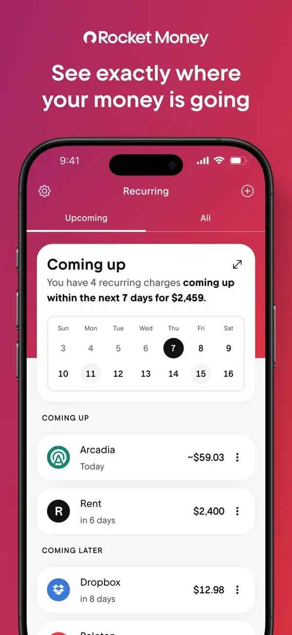
A small calendar and upcoming-charge list organize recurring activity; other screens use conversation and a focused next-step explanation.
Useful for: Study recurring bills, assistant conversation, cancellation introduction. Compare the hierarchy and controls shown in these publisher previews, then test the corresponding behavior in your own app.
# Design reference: Rocket Money
Source: https://apps.apple.com/us/app/id1130616675
Swipefile reference: https://swipefile.design/ref/mobile-rocket-money/
Captured: 2026-09-09. This is a dated reference, not a claim about the current live product.
Source scope: publisher-provided App Store previews. Promotional framing is retained. These are static examples, not a tested or recorded user flow. Do not infer unseen interactions.

## Objective
Adapt the interaction and layout patterns below to my project. Use my own content and identity. Do not reproduce logos, proprietary copy, or brand assets.

## Reference notes
- surface: Recurring bills · Assistant conversation · Cancellation introduction
- nav: Recurring tabs distinguish upcoming items, while the cancellation screen presents one clear starting action.
- layout: A small calendar and upcoming-charge list organize recurring activity; other screens use conversation and a focused next-step explanation.
- density: Compare the space reserved for the primary task with secondary metadata. The previews retain promotional framing; evaluate target sizes in your implemented screen.
- color: White panels, red section color, and black primary buttons.
- typography: Use clear heading, body, and metadata levels. Keep interface text scalable and verify readability with the device text-size settings.
- pattern: Activity & notifications
- states: Static publisher previews only. Loading, empty, error, offline, permission, and keyboard behavior have not been tested. Specify and verify those states in your own implementation.
- dont: Do not copy the app identity, proprietary artwork, or promotional claims. Screenshot order is not a verified flow, and the listing version does not date every image.

Useful for: Study recurring bills, assistant conversation, cancellation introduction. Compare the hierarchy and controls shown in these publisher previews, then test the corresponding behavior in your own app.

## Acceptance criteria
- Existing project conventions, design tokens, working functionality, and unrelated changes are preserved.
- Two or three reference principles clearly support the user's task; conflicts are resolved in favor of usability and the existing product.
- Accessible platform-native components express the interface; use semantic HTML when the target is mobile web. Available licensed assets are used; important UI text is never rendered as a bitmap.
- Every visible control has a defined behavior. Loading, empty, error, success, disabled, and long-content states are specified where relevant. Demo data is clearly labeled.
- Navigation and content adapt at 375px, 768px, and 1440px without horizontal page overflow. Keyboard use, visible focus, labeled inputs, at least 44px touch targets, readable contrast, and reduced motion are supported.
- Verification distinguishes rendered behavior from proposals and identifies anything still requiring a backend or external service.

## Quality bar
Clear hierarchy, consistent spacing, restrained surfaces, and purposeful motion. Avoid decorative gradients, excessive cards, placeholder buttons, and invented metrics unless the project calls for them. Do not claim a feature is connected or tested without evidence.
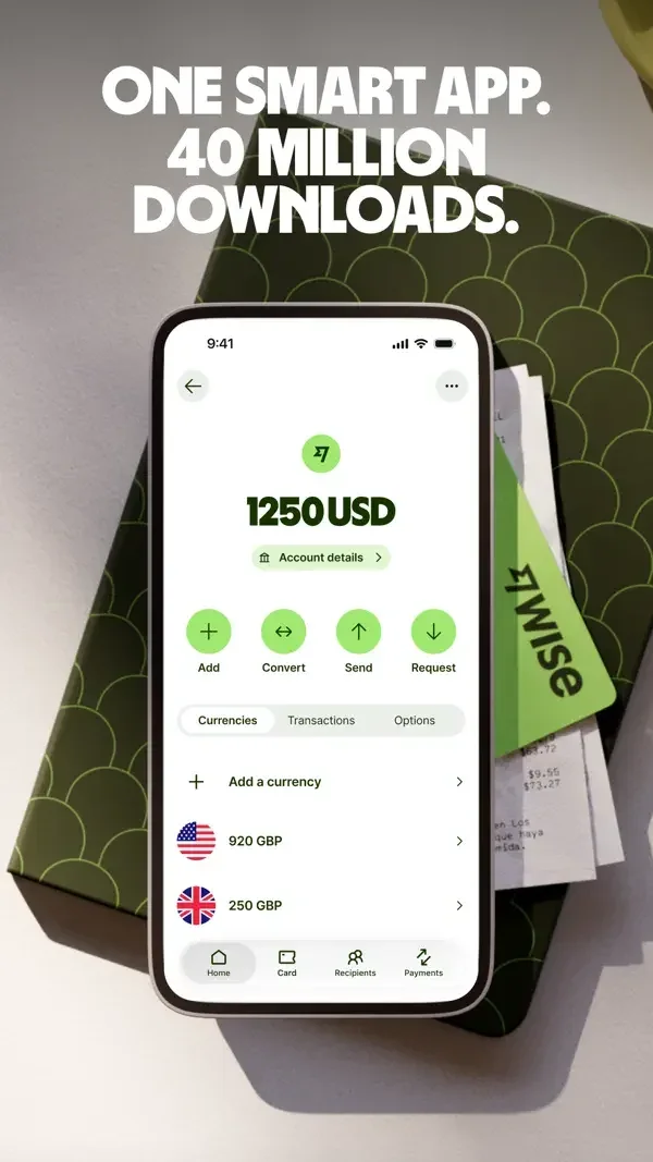
Balances and quick actions form a compact account page; the transfer quote makes currencies, amounts, and fees visible together.
Useful for: Study account balances, transfer quote, explore information card. Compare the hierarchy and controls shown in these publisher previews, then test the corresponding behavior in your own app.
# Design reference: Wise
Source: https://apps.apple.com/us/app/id612261027
Swipefile reference: https://swipefile.design/ref/mobile-wise/
Captured: 2026-09-09. This is a dated reference, not a claim about the current live product.
Source scope: publisher-provided App Store previews. Promotional framing is retained. These are static examples, not a tested or recorded user flow. Do not infer unseen interactions.

## Objective
Adapt the interaction and layout patterns below to my project. Use my own content and identity. Do not reproduce logos, proprietary copy, or brand assets.

## Reference notes
- surface: Account balances · Transfer quote · Explore information card
- nav: Account actions and bottom destinations are separated from the transfer confirmation control.
- layout: Balances and quick actions form a compact account page; the transfer quote makes currencies, amounts, and fees visible together.
- density: Compare the space reserved for the primary task with secondary metadata. The previews retain promotional framing; evaluate target sizes in your implemented screen.
- color: White surfaces, vivid green controls, and strong amount typography.
- typography: Use clear heading, body, and metadata levels. Keep interface text scalable and verify readability with the device text-size settings.
- pattern: Payments & transfers
- states: Static publisher previews only. Loading, empty, error, offline, permission, and keyboard behavior have not been tested. Specify and verify those states in your own implementation.
- dont: Do not copy the app identity, proprietary artwork, or promotional claims. Screenshot order is not a verified flow, and the listing version does not date every image.

Useful for: Study account balances, transfer quote, explore information card. Compare the hierarchy and controls shown in these publisher previews, then test the corresponding behavior in your own app.

## Acceptance criteria
- Existing project conventions, design tokens, working functionality, and unrelated changes are preserved.
- Two or three reference principles clearly support the user's task; conflicts are resolved in favor of usability and the existing product.
- Accessible platform-native components express the interface; use semantic HTML when the target is mobile web. Available licensed assets are used; important UI text is never rendered as a bitmap.
- Every visible control has a defined behavior. Loading, empty, error, success, disabled, and long-content states are specified where relevant. Demo data is clearly labeled.
- Navigation and content adapt at 375px, 768px, and 1440px without horizontal page overflow. Keyboard use, visible focus, labeled inputs, at least 44px touch targets, readable contrast, and reduced motion are supported.
- Verification distinguishes rendered behavior from proposals and identifies anything still requiring a backend or external service.

## Quality bar
Clear hierarchy, consistent spacing, restrained surfaces, and purposeful motion. Avoid decorative gradients, excessive cards, placeholder buttons, and invented metrics unless the project calls for them. Do not claim a feature is connected or tested without evidence.
A prominent balance and lower action tiles contrast with a person-centered payment conversation.
Useful for: Study savings overview, payment conversation, card personalization. Compare the hierarchy and controls shown in these publisher previews, then test the corresponding behavior in your own app.
# Design reference: Revolut
Source: https://apps.apple.com/us/app/id932493382
Swipefile reference: https://swipefile.design/ref/mobile-revolut/
Captured: 2026-09-09. This is a dated reference, not a claim about the current live product.
Source scope: publisher-provided App Store previews. Promotional framing is retained. These are static examples, not a tested or recorded user flow. Do not infer unseen interactions.

## Objective
Adapt the interaction and layout patterns below to my project. Use my own content and identity. Do not reproduce logos, proprietary copy, or brand assets.

## Reference notes
- surface: Savings overview · Payment conversation · Card personalization
- nav: Account controls and a dedicated send surface distinguish managing money from paying a contact.
- layout: A prominent balance and lower action tiles contrast with a person-centered payment conversation.
- density: Compare the space reserved for the primary task with secondary metadata. The previews retain promotional framing; evaluate target sizes in your implemented screen.
- color: Dark surfaces, white controls, and bright payment-card accents.
- typography: Use clear heading, body, and metadata levels. Keep interface text scalable and verify readability with the device text-size settings.
- pattern: Payments & transfers
- states: Static publisher previews only. Loading, empty, error, offline, permission, and keyboard behavior have not been tested. Specify and verify those states in your own implementation.
- dont: Do not copy the app identity, proprietary artwork, or promotional claims. Screenshot order is not a verified flow, and the listing version does not date every image.

Useful for: Study savings overview, payment conversation, card personalization. Compare the hierarchy and controls shown in these publisher previews, then test the corresponding behavior in your own app.

## Acceptance criteria
- Existing project conventions, design tokens, working functionality, and unrelated changes are preserved.
- Two or three reference principles clearly support the user's task; conflicts are resolved in favor of usability and the existing product.
- Accessible platform-native components express the interface; use semantic HTML when the target is mobile web. Available licensed assets are used; important UI text is never rendered as a bitmap.
- Every visible control has a defined behavior. Loading, empty, error, success, disabled, and long-content states are specified where relevant. Demo data is clearly labeled.
- Navigation and content adapt at 375px, 768px, and 1440px without horizontal page overflow. Keyboard use, visible focus, labeled inputs, at least 44px touch targets, readable contrast, and reduced motion are supported.
- Verification distinguishes rendered behavior from proposals and identifies anything still requiring a backend or external service.

## Quality bar
Clear hierarchy, consistent spacing, restrained surfaces, and purposeful motion. Avoid decorative gradients, excessive cards, placeholder buttons, and invented metrics unless the project calls for them. Do not claim a feature is connected or tested without evidence.
A large amount, recipient identity, and short note precede clearly separated Request and Pay actions.
Useful for: Study payment amount entry, card balance, direct deposit details. Compare the hierarchy and controls shown in these publisher previews, then test the corresponding behavior in your own app.
# Design reference: Venmo
Source: https://apps.apple.com/us/app/id351727428
Swipefile reference: https://swipefile.design/ref/mobile-venmo/
Captured: 2026-09-09. This is a dated reference, not a claim about the current live product.
Source scope: publisher-provided App Store previews. Promotional framing is retained. These are static examples, not a tested or recorded user flow. Do not infer unseen interactions.

## Objective
Adapt the interaction and layout patterns below to my project. Use my own content and identity. Do not reproduce logos, proprietary copy, or brand assets.

## Reference notes
- surface: Payment amount entry · Card balance · Direct deposit details
- nav: The payment sheet keeps its keypad below the decision controls.
- layout: A large amount, recipient identity, and short note precede clearly separated Request and Pay actions.
- density: Compare the space reserved for the primary task with secondary metadata. The previews retain promotional framing; evaluate target sizes in your implemented screen.
- color: White panels with blue actions and restrained gray metadata.
- typography: Use clear heading, body, and metadata levels. Keep interface text scalable and verify readability with the device text-size settings.
- pattern: Payments & transfers
- states: Static publisher previews only. Loading, empty, error, offline, permission, and keyboard behavior have not been tested. Specify and verify those states in your own implementation.
- dont: Do not copy the app identity, proprietary artwork, or promotional claims. Screenshot order is not a verified flow, and the listing version does not date every image.

Useful for: Study payment amount entry, card balance, direct deposit details. Compare the hierarchy and controls shown in these publisher previews, then test the corresponding behavior in your own app.

## Acceptance criteria
- Existing project conventions, design tokens, working functionality, and unrelated changes are preserved.
- Two or three reference principles clearly support the user's task; conflicts are resolved in favor of usability and the existing product.
- Accessible platform-native components express the interface; use semantic HTML when the target is mobile web. Available licensed assets are used; important UI text is never rendered as a bitmap.
- Every visible control has a defined behavior. Loading, empty, error, success, disabled, and long-content states are specified where relevant. Demo data is clearly labeled.
- Navigation and content adapt at 375px, 768px, and 1440px without horizontal page overflow. Keyboard use, visible focus, labeled inputs, at least 44px touch targets, readable contrast, and reduced motion are supported.
- Verification distinguishes rendered behavior from proposals and identifies anything still requiring a backend or external service.

## Quality bar
Clear hierarchy, consistent spacing, restrained surfaces, and purposeful motion. Avoid decorative gradients, excessive cards, placeholder buttons, and invented metrics unless the project calls for them. Do not claim a feature is connected or tested without evidence.
A product discovery view contrasts with a focused payment amount and a grid of spending categories.
Useful for: Study shopping destinations, payment amount entry, card and reward categories. Compare the hierarchy and controls shown in these publisher previews, then test the corresponding behavior in your own app.
# Design reference: PayPal
Source: https://apps.apple.com/us/app/id283646709
Swipefile reference: https://swipefile.design/ref/mobile-paypal/
Captured: 2026-09-09. This is a dated reference, not a claim about the current live product.
Source scope: publisher-provided App Store previews. Promotional framing is retained. These are static examples, not a tested or recorded user flow. Do not infer unseen interactions.

## Objective
Adapt the interaction and layout patterns below to my project. Use my own content and identity. Do not reproduce logos, proprietary copy, or brand assets.

## Reference notes
- surface: Shopping destinations · Payment amount entry · Card and reward categories
- nav: Named destinations and paired Request and Send controls explain the main choices.
- layout: A product discovery view contrasts with a focused payment amount and a grid of spending categories.
- density: Compare the space reserved for the primary task with secondary metadata. The previews retain promotional framing; evaluate target sizes in your implemented screen.
- color: Black and white surfaces with deep blue branding.
- typography: Use clear heading, body, and metadata levels. Keep interface text scalable and verify readability with the device text-size settings.
- pattern: Payments & transfers
- states: Static publisher previews only. Loading, empty, error, offline, permission, and keyboard behavior have not been tested. Specify and verify those states in your own implementation.
- dont: Do not copy the app identity, proprietary artwork, or promotional claims. Screenshot order is not a verified flow, and the listing version does not date every image.

Useful for: Study shopping destinations, payment amount entry, card and reward categories. Compare the hierarchy and controls shown in these publisher previews, then test the corresponding behavior in your own app.

## Acceptance criteria
- Existing project conventions, design tokens, working functionality, and unrelated changes are preserved.
- Two or three reference principles clearly support the user's task; conflicts are resolved in favor of usability and the existing product.
- Accessible platform-native components express the interface; use semantic HTML when the target is mobile web. Available licensed assets are used; important UI text is never rendered as a bitmap.
- Every visible control has a defined behavior. Loading, empty, error, success, disabled, and long-content states are specified where relevant. Demo data is clearly labeled.
- Navigation and content adapt at 375px, 768px, and 1440px without horizontal page overflow. Keyboard use, visible focus, labeled inputs, at least 44px touch targets, readable contrast, and reduced motion are supported.
- Verification distinguishes rendered behavior from proposals and identifies anything still requiring a backend or external service.

## Quality bar
Clear hierarchy, consistent spacing, restrained surfaces, and purposeful motion. Avoid decorative gradients, excessive cards, placeholder buttons, and invented metrics unless the project calls for them. Do not claim a feature is connected or tested without evidence.
A compact account overview gives way to a large amount keypad, while a circular goal display summarizes savings progress.
Useful for: Study money overview, payment keypad, savings goal. Compare the hierarchy and controls shown in these publisher previews, then test the corresponding behavior in your own app.
# Design reference: Cash App
Source: https://apps.apple.com/us/app/id711923939
Swipefile reference: https://swipefile.design/ref/mobile-cash-app/
Captured: 2026-09-09. This is a dated reference, not a claim about the current live product.
Source scope: publisher-provided App Store previews. Promotional framing is retained. These are static examples, not a tested or recorded user flow. Do not infer unseen interactions.

## Objective
Adapt the interaction and layout patterns below to my project. Use my own content and identity. Do not reproduce logos, proprietary copy, or brand assets.

## Reference notes
- surface: Money overview · Payment keypad · Savings goal
- nav: Lower account destinations and explicit transfer controls separate overview from moving funds.
- layout: A compact account overview gives way to a large amount keypad, while a circular goal display summarizes savings progress.
- density: Compare the space reserved for the primary task with secondary metadata. The previews retain promotional framing; evaluate target sizes in your implemented screen.
- color: Black, white, and bright green with prominent amount typography.
- typography: Use clear heading, body, and metadata levels. Keep interface text scalable and verify readability with the device text-size settings.
- pattern: Payments & transfers
- states: Static publisher previews only. Loading, empty, error, offline, permission, and keyboard behavior have not been tested. Specify and verify those states in your own implementation.
- dont: Do not copy the app identity, proprietary artwork, or promotional claims. Screenshot order is not a verified flow, and the listing version does not date every image.

Useful for: Study money overview, payment keypad, savings goal. Compare the hierarchy and controls shown in these publisher previews, then test the corresponding behavior in your own app.

## Acceptance criteria
- Existing project conventions, design tokens, working functionality, and unrelated changes are preserved.
- Two or three reference principles clearly support the user's task; conflicts are resolved in favor of usability and the existing product.
- Accessible platform-native components express the interface; use semantic HTML when the target is mobile web. Available licensed assets are used; important UI text is never rendered as a bitmap.
- Every visible control has a defined behavior. Loading, empty, error, success, disabled, and long-content states are specified where relevant. Demo data is clearly labeled.
- Navigation and content adapt at 375px, 768px, and 1440px without horizontal page overflow. Keyboard use, visible focus, labeled inputs, at least 44px touch targets, readable contrast, and reduced motion are supported.
- Verification distinguishes rendered behavior from proposals and identifies anything still requiring a backend or external service.

## Quality bar
Clear hierarchy, consistent spacing, restrained surfaces, and purposeful motion. Avoid decorative gradients, excessive cards, placeholder buttons, and invented metrics unless the project calls for them. Do not claim a feature is connected or tested without evidence.

Asset rows use small trend lines; an account overview groups frequent actions, and a success card confirms a completed transaction.
Useful for: Study asset list, account dashboard, transaction success. Compare the hierarchy and controls shown in these publisher previews, then test the corresponding behavior in your own app.
# Design reference: Coinbase
Source: https://apps.apple.com/us/app/id886427730
Swipefile reference: https://swipefile.design/ref/mobile-coinbase/
Captured: 2026-09-09. This is a dated reference, not a claim about the current live product.
Source scope: publisher-provided App Store previews. Promotional framing is retained. These are static examples, not a tested or recorded user flow. Do not infer unseen interactions.

## Objective
Adapt the interaction and layout patterns below to my project. Use my own content and identity. Do not reproduce logos, proprietary copy, or brand assets.

## Reference notes
- surface: Asset list · Account dashboard · Transaction success
- nav: Search and quick actions provide access to assets without hiding the account balance.
- layout: Asset rows use small trend lines; an account overview groups frequent actions, and a success card confirms a completed transaction.
- density: Compare the space reserved for the primary task with secondary metadata. The previews retain promotional framing; evaluate target sizes in your implemented screen.
- color: White surfaces, blue actions, and a high-contrast confirmation mark.
- typography: Use clear heading, body, and metadata levels. Keep interface text scalable and verify readability with the device text-size settings.
- pattern: Status & progress
- states: Static publisher previews only. Loading, empty, error, offline, permission, and keyboard behavior have not been tested. Specify and verify those states in your own implementation.
- dont: Do not copy the app identity, proprietary artwork, or promotional claims. Screenshot order is not a verified flow, and the listing version does not date every image.

Useful for: Study asset list, account dashboard, transaction success. Compare the hierarchy and controls shown in these publisher previews, then test the corresponding behavior in your own app.

## Acceptance criteria
- Existing project conventions, design tokens, working functionality, and unrelated changes are preserved.
- Two or three reference principles clearly support the user's task; conflicts are resolved in favor of usability and the existing product.
- Accessible platform-native components express the interface; use semantic HTML when the target is mobile web. Available licensed assets are used; important UI text is never rendered as a bitmap.
- Every visible control has a defined behavior. Loading, empty, error, success, disabled, and long-content states are specified where relevant. Demo data is clearly labeled.
- Navigation and content adapt at 375px, 768px, and 1440px without horizontal page overflow. Keyboard use, visible focus, labeled inputs, at least 44px touch targets, readable contrast, and reduced motion are supported.
- Verification distinguishes rendered behavior from proposals and identifies anything still requiring a backend or external service.

## Quality bar
Clear hierarchy, consistent spacing, restrained surfaces, and purposeful motion. Avoid decorative gradients, excessive cards, placeholder buttons, and invented metrics unless the project calls for them. Do not claim a feature is connected or tested without evidence.
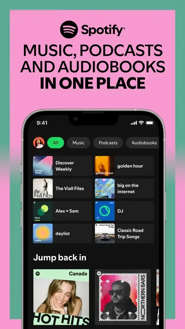
A dark library mixes compact shortcuts with larger cover art; a player emphasizes playback, while a playlist becomes a scannable track list.
Useful for: Study library discovery, podcast player, playlist detail. Compare the hierarchy and controls shown in these publisher previews, then test the corresponding behavior in your own app.
# Design reference: Spotify
Source: https://apps.apple.com/us/app/id324684580
Swipefile reference: https://swipefile.design/ref/mobile-spotify/
Captured: 2026-09-09. This is a dated reference, not a claim about the current live product.
Source scope: publisher-provided App Store previews. Promotional framing is retained. These are static examples, not a tested or recorded user flow. Do not infer unseen interactions.

## Objective
Adapt the interaction and layout patterns below to my project. Use my own content and identity. Do not reproduce logos, proprietary copy, or brand assets.

## Reference notes
- surface: Library discovery · Podcast player · Playlist detail
- nav: Category chips and back controls distinguish discovery from the current listening context.
- layout: A dark library mixes compact shortcuts with larger cover art; a player emphasizes playback, while a playlist becomes a scannable track list.
- density: Compare the space reserved for the primary task with secondary metadata. The previews retain promotional framing; evaluate target sizes in your implemented screen.
- color: Near-black surfaces, green playback accents, and colorful cover art.
- typography: Use clear heading, body, and metadata levels. Keep interface text scalable and verify readability with the device text-size settings.
- pattern: Media playback
- states: Static publisher previews only. Loading, empty, error, offline, permission, and keyboard behavior have not been tested. Specify and verify those states in your own implementation.
- dont: Do not copy the app identity, proprietary artwork, or promotional claims. Screenshot order is not a verified flow, and the listing version does not date every image.

Useful for: Study library discovery, podcast player, playlist detail. Compare the hierarchy and controls shown in these publisher previews, then test the corresponding behavior in your own app.

## Acceptance criteria
- Existing project conventions, design tokens, working functionality, and unrelated changes are preserved.
- Two or three reference principles clearly support the user's task; conflicts are resolved in favor of usability and the existing product.
- Accessible platform-native components express the interface; use semantic HTML when the target is mobile web. Available licensed assets are used; important UI text is never rendered as a bitmap.
- Every visible control has a defined behavior. Loading, empty, error, success, disabled, and long-content states are specified where relevant. Demo data is clearly labeled.
- Navigation and content adapt at 375px, 768px, and 1440px without horizontal page overflow. Keyboard use, visible focus, labeled inputs, at least 44px touch targets, readable contrast, and reduced motion are supported.
- Verification distinguishes rendered behavior from proposals and identifies anything still requiring a backend or external service.

## Quality bar
Clear hierarchy, consistent spacing, restrained surfaces, and purposeful motion. Avoid decorative gradients, excessive cards, placeholder buttons, and invented metrics unless the project calls for them. Do not claim a feature is connected or tested without evidence.
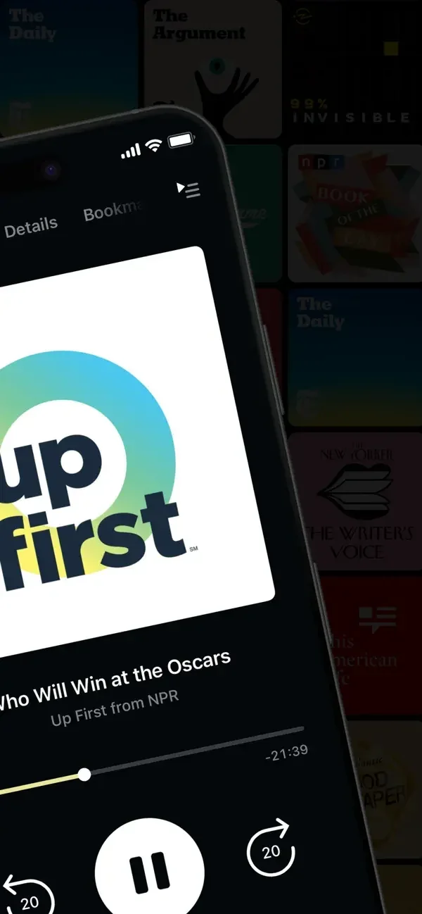
Large episode artwork gives way to a grid of subscriptions and a compact sheet for speed and audio settings.
Useful for: Study now playing, podcast library, playback effects. Compare the hierarchy and controls shown in these publisher previews, then test the corresponding behavior in your own app.
# Design reference: Pocket Casts
Source: https://apps.apple.com/us/app/id414834813
Swipefile reference: https://swipefile.design/ref/mobile-pocket-casts/
Captured: 2026-09-09. This is a dated reference, not a claim about the current live product.
Source scope: publisher-provided App Store previews. Promotional framing is retained. These are static examples, not a tested or recorded user flow. Do not infer unseen interactions.

## Objective
Adapt the interaction and layout patterns below to my project. Use my own content and identity. Do not reproduce logos, proprietary copy, or brand assets.

## Reference notes
- surface: Now playing · Podcast library · Playback effects
- nav: Bottom destinations separate library and discovery, while playback settings stay within the player.
- layout: Large episode artwork gives way to a grid of subscriptions and a compact sheet for speed and audio settings.
- density: Compare the space reserved for the primary task with secondary metadata. The previews retain promotional framing; evaluate target sizes in your implemented screen.
- color: Dark playback surfaces, a white library, and restrained teal accents.
- typography: Use clear heading, body, and metadata levels. Keep interface text scalable and verify readability with the device text-size settings.
- pattern: Media playback
- states: Static publisher previews only. Loading, empty, error, offline, permission, and keyboard behavior have not been tested. Specify and verify those states in your own implementation.
- dont: Do not copy the app identity, proprietary artwork, or promotional claims. Screenshot order is not a verified flow, and the listing version does not date every image.

Useful for: Study now playing, podcast library, playback effects. Compare the hierarchy and controls shown in these publisher previews, then test the corresponding behavior in your own app.

## Acceptance criteria
- Existing project conventions, design tokens, working functionality, and unrelated changes are preserved.
- Two or three reference principles clearly support the user's task; conflicts are resolved in favor of usability and the existing product.
- Accessible platform-native components express the interface; use semantic HTML when the target is mobile web. Available licensed assets are used; important UI text is never rendered as a bitmap.
- Every visible control has a defined behavior. Loading, empty, error, success, disabled, and long-content states are specified where relevant. Demo data is clearly labeled.
- Navigation and content adapt at 375px, 768px, and 1440px without horizontal page overflow. Keyboard use, visible focus, labeled inputs, at least 44px touch targets, readable contrast, and reduced motion are supported.
- Verification distinguishes rendered behavior from proposals and identifies anything still requiring a backend or external service.

## Quality bar
Clear hierarchy, consistent spacing, restrained surfaces, and purposeful motion. Avoid decorative gradients, excessive cards, placeholder buttons, and invented metrics unless the project calls for them. Do not claim a feature is connected or tested without evidence.
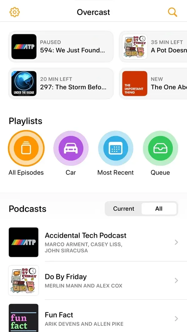
Recent episodes, circular playlist shortcuts, and a plain podcast list provide three ways to resume listening on one screen.
Useful for: Study podcast home. Compare the hierarchy and controls shown in these publisher previews, then test the corresponding behavior in your own app.
# Design reference: Overcast
Source: https://apps.apple.com/us/app/id888422857
Swipefile reference: https://swipefile.design/ref/mobile-overcast/
Captured: 2026-09-09. This is a dated reference, not a claim about the current live product.
Source scope: publisher-provided App Store previews. Promotional framing is retained. These are static examples, not a tested or recorded user flow. Do not infer unseen interactions.

## Objective
Adapt the interaction and layout patterns below to my project. Use my own content and identity. Do not reproduce logos, proprietary copy, or brand assets.

## Reference notes
- surface: Podcast home
- nav: Settings and search sit at the top; named playlists and a Current/All switch organize the library.
- layout: Recent episodes, circular playlist shortcuts, and a plain podcast list provide three ways to resume listening on one screen.
- density: Compare the space reserved for the primary task with secondary metadata. The previews retain promotional framing; evaluate target sizes in your implemented screen.
- color: White background with orange, purple, blue, and green playlist icons.
- typography: Use clear heading, body, and metadata levels. Keep interface text scalable and verify readability with the device text-size settings.
- pattern: Content discovery
- states: Static publisher previews only. Loading, empty, error, offline, permission, and keyboard behavior have not been tested. Specify and verify those states in your own implementation.
- dont: Do not copy the app identity, proprietary artwork, or promotional claims. Screenshot order is not a verified flow, and the listing version does not date every image.

Useful for: Study podcast home. Compare the hierarchy and controls shown in these publisher previews, then test the corresponding behavior in your own app.

## Acceptance criteria
- Existing project conventions, design tokens, working functionality, and unrelated changes are preserved.
- Two or three reference principles clearly support the user's task; conflicts are resolved in favor of usability and the existing product.
- Accessible platform-native components express the interface; use semantic HTML when the target is mobile web. Available licensed assets are used; important UI text is never rendered as a bitmap.
- Every visible control has a defined behavior. Loading, empty, error, success, disabled, and long-content states are specified where relevant. Demo data is clearly labeled.
- Navigation and content adapt at 375px, 768px, and 1440px without horizontal page overflow. Keyboard use, visible focus, labeled inputs, at least 44px touch targets, readable contrast, and reduced motion are supported.
- Verification distinguishes rendered behavior from proposals and identifies anything still requiring a backend or external service.

## Quality bar
Clear hierarchy, consistent spacing, restrained surfaces, and purposeful motion. Avoid decorative gradients, excessive cards, placeholder buttons, and invented metrics unless the project calls for them. Do not claim a feature is connected or tested without evidence.
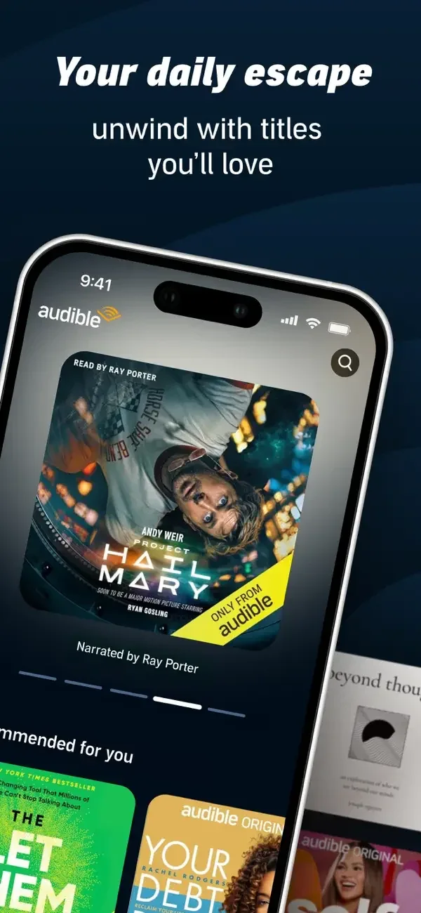
Large covers introduce recommendations; a contextual item menu exposes sharing, and the player prioritizes a progress bar and transport controls.
Useful for: Study audiobook discovery, library item actions, audiobook player. Compare the hierarchy and controls shown in these publisher previews, then test the corresponding behavior in your own app.
# Design reference: Audible
Source: https://apps.apple.com/us/app/id379693831
Swipefile reference: https://swipefile.design/ref/mobile-audible/
Captured: 2026-09-09. This is a dated reference, not a claim about the current live product.
Source scope: publisher-provided App Store previews. Promotional framing is retained. These are static examples, not a tested or recorded user flow. Do not infer unseen interactions.

## Objective
Adapt the interaction and layout patterns below to my project. Use my own content and identity. Do not reproduce logos, proprietary copy, or brand assets.

## Reference notes
- surface: Audiobook discovery · Library item actions · Audiobook player
- nav: Library search and item-level actions keep collection management separate from playback.
- layout: Large covers introduce recommendations; a contextual item menu exposes sharing, and the player prioritizes a progress bar and transport controls.
- density: Compare the space reserved for the primary task with secondary metadata. The previews retain promotional framing; evaluate target sizes in your implemented screen.
- color: Deep blue and black surfaces with white text and cover-driven color.
- typography: Use clear heading, body, and metadata levels. Keep interface text scalable and verify readability with the device text-size settings.
- pattern: Media playback
- states: Static publisher previews only. Loading, empty, error, offline, permission, and keyboard behavior have not been tested. Specify and verify those states in your own implementation.
- dont: Do not copy the app identity, proprietary artwork, or promotional claims. Screenshot order is not a verified flow, and the listing version does not date every image.

Useful for: Study audiobook discovery, library item actions, audiobook player. Compare the hierarchy and controls shown in these publisher previews, then test the corresponding behavior in your own app.

## Acceptance criteria
- Existing project conventions, design tokens, working functionality, and unrelated changes are preserved.
- Two or three reference principles clearly support the user's task; conflicts are resolved in favor of usability and the existing product.
- Accessible platform-native components express the interface; use semantic HTML when the target is mobile web. Available licensed assets are used; important UI text is never rendered as a bitmap.
- Every visible control has a defined behavior. Loading, empty, error, success, disabled, and long-content states are specified where relevant. Demo data is clearly labeled.
- Navigation and content adapt at 375px, 768px, and 1440px without horizontal page overflow. Keyboard use, visible focus, labeled inputs, at least 44px touch targets, readable contrast, and reduced motion are supported.
- Verification distinguishes rendered behavior from proposals and identifies anything still requiring a backend or external service.

## Quality bar
Clear hierarchy, consistent spacing, restrained surfaces, and purposeful motion. Avoid decorative gradients, excessive cards, placeholder buttons, and invented metrics unless the project calls for them. Do not claim a feature is connected or tested without evidence.
A cover grid, a reading-history calendar, and a typography settings sheet present collection, progress, and reading preferences separately.
Useful for: Study book library, reading challenges, reading appearance settings. Compare the hierarchy and controls shown in these publisher previews, then test the corresponding behavior in your own app.
# Design reference: Kindle
Source: https://apps.apple.com/us/app/id302584613
Swipefile reference: https://swipefile.design/ref/mobile-kindle/
Captured: 2026-09-09. This is a dated reference, not a claim about the current live product.
Source scope: publisher-provided App Store previews. Promotional framing is retained. These are static examples, not a tested or recorded user flow. Do not infer unseen interactions.

## Objective
Adapt the interaction and layout patterns below to my project. Use my own content and identity. Do not reproduce logos, proprietary copy, or brand assets.

## Reference notes
- surface: Book library · Reading challenges · Reading appearance settings
- nav: Library search and reading-setting tabs provide direct access to content and appearance.
- layout: A cover grid, a reading-history calendar, and a typography settings sheet present collection, progress, and reading preferences separately.
- density: Compare the space reserved for the primary task with secondary metadata. The previews retain promotional framing; evaluate target sizes in your implemented screen.
- color: Dark reading surfaces, white progress cards, and colorful book covers.
- typography: Use clear heading, body, and metadata levels. Keep interface text scalable and verify readability with the device text-size settings.
- pattern: Reading & typography
- states: Static publisher previews only. Loading, empty, error, offline, permission, and keyboard behavior have not been tested. Specify and verify those states in your own implementation.
- dont: Do not copy the app identity, proprietary artwork, or promotional claims. Screenshot order is not a verified flow, and the listing version does not date every image.

Useful for: Study book library, reading challenges, reading appearance settings. Compare the hierarchy and controls shown in these publisher previews, then test the corresponding behavior in your own app.

## Acceptance criteria
- Existing project conventions, design tokens, working functionality, and unrelated changes are preserved.
- Two or three reference principles clearly support the user's task; conflicts are resolved in favor of usability and the existing product.
- Accessible platform-native components express the interface; use semantic HTML when the target is mobile web. Available licensed assets are used; important UI text is never rendered as a bitmap.
- Every visible control has a defined behavior. Loading, empty, error, success, disabled, and long-content states are specified where relevant. Demo data is clearly labeled.
- Navigation and content adapt at 375px, 768px, and 1440px without horizontal page overflow. Keyboard use, visible focus, labeled inputs, at least 44px touch targets, readable contrast, and reduced motion are supported.
- Verification distinguishes rendered behavior from proposals and identifies anything still requiring a backend or external service.

## Quality bar
Clear hierarchy, consistent spacing, restrained surfaces, and purposeful motion. Avoid decorative gradients, excessive cards, placeholder buttons, and invented metrics unless the project calls for them. Do not claim a feature is connected or tested without evidence.

A welcoming message leads into a local library page with sorting chips, then a book list with availability and hold information.
Useful for: Study library welcome, library discovery, curated book list. Compare the hierarchy and controls shown in these publisher previews, then test the corresponding behavior in your own app.
# Design reference: Libby
Source: https://apps.apple.com/us/app/id1076402606
Swipefile reference: https://swipefile.design/ref/mobile-libby/
Captured: 2026-09-09. This is a dated reference, not a claim about the current live product.
Source scope: publisher-provided App Store previews. Promotional framing is retained. These are static examples, not a tested or recorded user flow. Do not infer unseen interactions.

## Objective
Adapt the interaction and layout patterns below to my project. Use my own content and identity. Do not reproduce logos, proprietary copy, or brand assets.

## Reference notes
- surface: Library welcome · Library discovery · Curated book list
- nav: Library-level back navigation and clear list controls preserve the selected library context.
- layout: A welcoming message leads into a local library page with sorting chips, then a book list with availability and hold information.
- density: Compare the space reserved for the primary task with secondary metadata. The previews retain promotional framing; evaluate target sizes in your implemented screen.
- color: Warm cream, burgundy, and turquoise surfaces with book-cover imagery.
- typography: Use clear heading, body, and metadata levels. Keep interface text scalable and verify readability with the device text-size settings.
- pattern: Content discovery
- states: Static publisher previews only. Loading, empty, error, offline, permission, and keyboard behavior have not been tested. Specify and verify those states in your own implementation.
- dont: Do not copy the app identity, proprietary artwork, or promotional claims. Screenshot order is not a verified flow, and the listing version does not date every image.

Useful for: Study library welcome, library discovery, curated book list. Compare the hierarchy and controls shown in these publisher previews, then test the corresponding behavior in your own app.

## Acceptance criteria
- Existing project conventions, design tokens, working functionality, and unrelated changes are preserved.
- Two or three reference principles clearly support the user's task; conflicts are resolved in favor of usability and the existing product.
- Accessible platform-native components express the interface; use semantic HTML when the target is mobile web. Available licensed assets are used; important UI text is never rendered as a bitmap.
- Every visible control has a defined behavior. Loading, empty, error, success, disabled, and long-content states are specified where relevant. Demo data is clearly labeled.
- Navigation and content adapt at 375px, 768px, and 1440px without horizontal page overflow. Keyboard use, visible focus, labeled inputs, at least 44px touch targets, readable contrast, and reduced motion are supported.
- Verification distinguishes rendered behavior from proposals and identifies anything still requiring a backend or external service.

## Quality bar
Clear hierarchy, consistent spacing, restrained surfaces, and purposeful motion. Avoid decorative gradients, excessive cards, placeholder buttons, and invented metrics unless the project calls for them. Do not claim a feature is connected or tested without evidence.
Book rows expose reading status, while bar and line charts summarize patterns over time.
Useful for: Study reading list, reading mood chart, reading history charts. Compare the hierarchy and controls shown in these publisher previews, then test the corresponding behavior in your own app.
# Design reference: The StoryGraph
Source: https://apps.apple.com/us/app/id1570489264
Swipefile reference: https://swipefile.design/ref/mobile-the-storygraph/
Captured: 2026-09-09. This is a dated reference, not a claim about the current live product.
Source scope: publisher-provided App Store previews. Promotional framing is retained. These are static examples, not a tested or recorded user flow. Do not infer unseen interactions.

## Objective
Adapt the interaction and layout patterns below to my project. Use my own content and identity. Do not reproduce logos, proprietary copy, or brand assets.

## Reference notes
- surface: Reading list · Reading mood chart · Reading history charts
- nav: A search field and persistent lower destinations distinguish book management from statistics.
- layout: Book rows expose reading status, while bar and line charts summarize patterns over time.
- density: Compare the space reserved for the primary task with secondary metadata. The previews retain promotional framing; evaluate target sizes in your implemented screen.
- color: White space, teal controls, and multicolored chart series.
- typography: Use clear heading, body, and metadata levels. Keep interface text scalable and verify readability with the device text-size settings.
- pattern: Data visualization
- states: Static publisher previews only. Loading, empty, error, offline, permission, and keyboard behavior have not been tested. Specify and verify those states in your own implementation.
- dont: Do not copy the app identity, proprietary artwork, or promotional claims. Screenshot order is not a verified flow, and the listing version does not date every image.

Useful for: Study reading list, reading mood chart, reading history charts. Compare the hierarchy and controls shown in these publisher previews, then test the corresponding behavior in your own app.

## Acceptance criteria
- Existing project conventions, design tokens, working functionality, and unrelated changes are preserved.
- Two or three reference principles clearly support the user's task; conflicts are resolved in favor of usability and the existing product.
- Accessible platform-native components express the interface; use semantic HTML when the target is mobile web. Available licensed assets are used; important UI text is never rendered as a bitmap.
- Every visible control has a defined behavior. Loading, empty, error, success, disabled, and long-content states are specified where relevant. Demo data is clearly labeled.
- Navigation and content adapt at 375px, 768px, and 1440px without horizontal page overflow. Keyboard use, visible focus, labeled inputs, at least 44px touch targets, readable contrast, and reduced motion are supported.
- Verification distinguishes rendered behavior from proposals and identifies anything still requiring a backend or external service.

## Quality bar
Clear hierarchy, consistent spacing, restrained surfaces, and purposeful motion. Avoid decorative gradients, excessive cards, placeholder buttons, and invented metrics unless the project calls for them. Do not claim a feature is connected or tested without evidence.
Shelf rows summarize reading progress, recommendation cards emphasize covers, and review rows expose stars and community feedback.
Useful for: Study reading shelves, book recommendations, reader reviews. Compare the hierarchy and controls shown in these publisher previews, then test the corresponding behavior in your own app.
# Design reference: Goodreads
Source: https://apps.apple.com/us/app/id355833469
Swipefile reference: https://swipefile.design/ref/mobile-goodreads/
Captured: 2026-09-09. This is a dated reference, not a claim about the current live product.
Source scope: publisher-provided App Store previews. Promotional framing is retained. These are static examples, not a tested or recorded user flow. Do not infer unseen interactions.

## Objective
Adapt the interaction and layout patterns below to my project. Use my own content and identity. Do not reproduce logos, proprietary copy, or brand assets.

## Reference notes
- surface: Reading shelves · Book recommendations · Reader reviews
- nav: Search stays prominent above shelves and recommendations.
- layout: Shelf rows summarize reading progress, recommendation cards emphasize covers, and review rows expose stars and community feedback.
- density: Compare the space reserved for the primary task with secondary metadata. The previews retain promotional framing; evaluate target sizes in your implemented screen.
- color: White and cream panels with green reading controls and book-cover color.
- typography: Use clear heading, body, and metadata levels. Keep interface text scalable and verify readability with the device text-size settings.
- pattern: Ratings & reviews
- states: Static publisher previews only. Loading, empty, error, offline, permission, and keyboard behavior have not been tested. Specify and verify those states in your own implementation.
- dont: Do not copy the app identity, proprietary artwork, or promotional claims. Screenshot order is not a verified flow, and the listing version does not date every image.

Useful for: Study reading shelves, book recommendations, reader reviews. Compare the hierarchy and controls shown in these publisher previews, then test the corresponding behavior in your own app.

## Acceptance criteria
- Existing project conventions, design tokens, working functionality, and unrelated changes are preserved.
- Two or three reference principles clearly support the user's task; conflicts are resolved in favor of usability and the existing product.
- Accessible platform-native components express the interface; use semantic HTML when the target is mobile web. Available licensed assets are used; important UI text is never rendered as a bitmap.
- Every visible control has a defined behavior. Loading, empty, error, success, disabled, and long-content states are specified where relevant. Demo data is clearly labeled.
- Navigation and content adapt at 375px, 768px, and 1440px without horizontal page overflow. Keyboard use, visible focus, labeled inputs, at least 44px touch targets, readable contrast, and reduced motion are supported.
- Verification distinguishes rendered behavior from proposals and identifies anything still requiring a backend or external service.

## Quality bar
Clear hierarchy, consistent spacing, restrained surfaces, and purposeful motion. Avoid decorative gradients, excessive cards, placeholder buttons, and invented metrics unless the project calls for them. Do not claim a feature is connected or tested without evidence.
A narrow article column contrasts with editorial cards and compact topic chips in a personalization screen.
Useful for: Study article reading, story discovery, topic selection. Compare the hierarchy and controls shown in these publisher previews, then test the corresponding behavior in your own app.
# Design reference: Medium
Source: https://apps.apple.com/us/app/id828256236
Swipefile reference: https://swipefile.design/ref/mobile-medium/
Captured: 2026-09-09. This is a dated reference, not a claim about the current live product.
Source scope: publisher-provided App Store previews. Promotional framing is retained. These are static examples, not a tested or recorded user flow. Do not infer unseen interactions.

## Objective
Adapt the interaction and layout patterns below to my project. Use my own content and identity. Do not reproduce logos, proprietary copy, or brand assets.

## Reference notes
- surface: Article reading · Story discovery · Topic selection
- nav: Story controls sit near the reading context; topic selection ends with a clear Continue action.
- layout: A narrow article column contrasts with editorial cards and compact topic chips in a personalization screen.
- density: Compare the space reserved for the primary task with secondary metadata. The previews retain promotional framing; evaluate target sizes in your implemented screen.
- color: Warm white pages, black typography, and restrained green accents.
- typography: Use clear heading, body, and metadata levels. Keep interface text scalable and verify readability with the device text-size settings.
- pattern: Reading & typography
- states: Static publisher previews only. Loading, empty, error, offline, permission, and keyboard behavior have not been tested. Specify and verify those states in your own implementation.
- dont: Do not copy the app identity, proprietary artwork, or promotional claims. Screenshot order is not a verified flow, and the listing version does not date every image.

Useful for: Study article reading, story discovery, topic selection. Compare the hierarchy and controls shown in these publisher previews, then test the corresponding behavior in your own app.

## Acceptance criteria
- Existing project conventions, design tokens, working functionality, and unrelated changes are preserved.
- Two or three reference principles clearly support the user's task; conflicts are resolved in favor of usability and the existing product.
- Accessible platform-native components express the interface; use semantic HTML when the target is mobile web. Available licensed assets are used; important UI text is never rendered as a bitmap.
- Every visible control has a defined behavior. Loading, empty, error, success, disabled, and long-content states are specified where relevant. Demo data is clearly labeled.
- Navigation and content adapt at 375px, 768px, and 1440px without horizontal page overflow. Keyboard use, visible focus, labeled inputs, at least 44px touch targets, readable contrast, and reduced motion are supported.
- Verification distinguishes rendered behavior from proposals and identifies anything still requiring a backend or external service.

## Quality bar
Clear hierarchy, consistent spacing, restrained surfaces, and purposeful motion. Avoid decorative gradients, excessive cards, placeholder buttons, and invented metrics unless the project calls for them. Do not claim a feature is connected or tested without evidence.
Serif headlines establish article hierarchy, an image grid supports lifestyle discovery, and a separate player reduces an audio story to cover and controls.
Useful for: Study news article, lifestyle discovery, audio story player. Compare the hierarchy and controls shown in these publisher previews, then test the corresponding behavior in your own app.
# Design reference: The New York Times
Source: https://apps.apple.com/us/app/id284862083
Swipefile reference: https://swipefile.design/ref/mobile-the-new-york-times/
Captured: 2026-09-09. This is a dated reference, not a claim about the current live product.
Source scope: publisher-provided App Store previews. Promotional framing is retained. These are static examples, not a tested or recorded user flow. Do not infer unseen interactions.

## Objective
Adapt the interaction and layout patterns below to my project. Use my own content and identity. Do not reproduce logos, proprietary copy, or brand assets.

## Reference notes
- surface: News article · Lifestyle discovery · Audio story player
- nav: Section labels organize editorial content, while the player gives transport controls clear priority.
- layout: Serif headlines establish article hierarchy, an image grid supports lifestyle discovery, and a separate player reduces an audio story to cover and controls.
- density: Compare the space reserved for the primary task with secondary metadata. The previews retain promotional framing; evaluate target sizes in your implemented screen.
- color: Black and white editorial surfaces with photography and podcast artwork.
- typography: Use clear heading, body, and metadata levels. Keep interface text scalable and verify readability with the device text-size settings.
- pattern: Reading & typography
- states: Static publisher previews only. Loading, empty, error, offline, permission, and keyboard behavior have not been tested. Specify and verify those states in your own implementation.
- dont: Do not copy the app identity, proprietary artwork, or promotional claims. Screenshot order is not a verified flow, and the listing version does not date every image.

Useful for: Study news article, lifestyle discovery, audio story player. Compare the hierarchy and controls shown in these publisher previews, then test the corresponding behavior in your own app.

## Acceptance criteria
- Existing project conventions, design tokens, working functionality, and unrelated changes are preserved.
- Two or three reference principles clearly support the user's task; conflicts are resolved in favor of usability and the existing product.
- Accessible platform-native components express the interface; use semantic HTML when the target is mobile web. Available licensed assets are used; important UI text is never rendered as a bitmap.
- Every visible control has a defined behavior. Loading, empty, error, success, disabled, and long-content states are specified where relevant. Demo data is clearly labeled.
- Navigation and content adapt at 375px, 768px, and 1440px without horizontal page overflow. Keyboard use, visible focus, labeled inputs, at least 44px touch targets, readable contrast, and reduced motion are supported.
- Verification distinguishes rendered behavior from proposals and identifies anything still requiring a backend or external service.

## Quality bar
Clear hierarchy, consistent spacing, restrained surfaces, and purposeful motion. Avoid decorative gradients, excessive cards, placeholder buttons, and invented metrics unless the project calls for them. Do not claim a feature is connected or tested without evidence.
A plain course list leads into exercises with a progress bar, large answer targets, and an illustrated task area.
Useful for: Study course selection, image-choice lesson, chess exercise. Compare the hierarchy and controls shown in these publisher previews, then test the corresponding behavior in your own app.
# Design reference: Duolingo
Source: https://apps.apple.com/us/app/id570060128
Swipefile reference: https://swipefile.design/ref/mobile-duolingo/
Captured: 2026-09-09. This is a dated reference, not a claim about the current live product.
Source scope: publisher-provided App Store previews. Promotional framing is retained. These are static examples, not a tested or recorded user flow. Do not infer unseen interactions.

## Objective
Adapt the interaction and layout patterns below to my project. Use my own content and identity. Do not reproduce logos, proprietary copy, or brand assets.

## Reference notes
- surface: Course selection · Image-choice lesson · Chess exercise
- nav: A close control and visible lesson progress frame the task without adding competing destinations.
- layout: A plain course list leads into exercises with a progress bar, large answer targets, and an illustrated task area.
- density: Compare the space reserved for the primary task with secondary metadata. The previews retain promotional framing; evaluate target sizes in your implemented screen.
- color: White space, green progress, pastel answer cards, and playful illustrations.
- typography: Use clear heading, body, and metadata levels. Keep interface text scalable and verify readability with the device text-size settings.
- pattern: Learning & feedback
- states: Static publisher previews only. Loading, empty, error, offline, permission, and keyboard behavior have not been tested. Specify and verify those states in your own implementation.
- dont: Do not copy the app identity, proprietary artwork, or promotional claims. Screenshot order is not a verified flow, and the listing version does not date every image.

Useful for: Study course selection, image-choice lesson, chess exercise. Compare the hierarchy and controls shown in these publisher previews, then test the corresponding behavior in your own app.

## Acceptance criteria
- Existing project conventions, design tokens, working functionality, and unrelated changes are preserved.
- Two or three reference principles clearly support the user's task; conflicts are resolved in favor of usability and the existing product.
- Accessible platform-native components express the interface; use semantic HTML when the target is mobile web. Available licensed assets are used; important UI text is never rendered as a bitmap.
- Every visible control has a defined behavior. Loading, empty, error, success, disabled, and long-content states are specified where relevant. Demo data is clearly labeled.
- Navigation and content adapt at 375px, 768px, and 1440px without horizontal page overflow. Keyboard use, visible focus, labeled inputs, at least 44px touch targets, readable contrast, and reduced motion are supported.
- Verification distinguishes rendered behavior from proposals and identifies anything still requiring a backend or external service.

## Quality bar
Clear hierarchy, consistent spacing, restrained surfaces, and purposeful motion. Avoid decorative gradients, excessive cards, placeholder buttons, and invented metrics unless the project calls for them. Do not claim a feature is connected or tested without evidence.
Short prompts combine audio controls with a large microphone action, while the plan uses compact lesson tiles and progress marks.
Useful for: Study speaking exercise, learning plan, dialogue practice. Compare the hierarchy and controls shown in these publisher previews, then test the corresponding behavior in your own app.
# Design reference: Babbel
Source: https://apps.apple.com/us/app/id829587759
Swipefile reference: https://swipefile.design/ref/mobile-babbel/
Captured: 2026-09-09. This is a dated reference, not a claim about the current live product.
Source scope: publisher-provided App Store previews. Promotional framing is retained. These are static examples, not a tested or recorded user flow. Do not infer unseen interactions.

## Objective
Adapt the interaction and layout patterns below to my project. Use my own content and identity. Do not reproduce logos, proprietary copy, or brand assets.

## Reference notes
- surface: Speaking exercise · Learning plan · Dialogue practice
- nav: Back and next controls guide exercises; the plan provides a separate overview.
- layout: Short prompts combine audio controls with a large microphone action, while the plan uses compact lesson tiles and progress marks.
- density: Compare the space reserved for the primary task with secondary metadata. The previews retain promotional framing; evaluate target sizes in your implemented screen.
- color: White and cream surfaces, orange speech controls, and pale green lesson cards.
- typography: Use clear heading, body, and metadata levels. Keep interface text scalable and verify readability with the device text-size settings.
- pattern: Learning & feedback
- states: Static publisher previews only. Loading, empty, error, offline, permission, and keyboard behavior have not been tested. Specify and verify those states in your own implementation.
- dont: Do not copy the app identity, proprietary artwork, or promotional claims. Screenshot order is not a verified flow, and the listing version does not date every image.

Useful for: Study speaking exercise, learning plan, dialogue practice. Compare the hierarchy and controls shown in these publisher previews, then test the corresponding behavior in your own app.

## Acceptance criteria
- Existing project conventions, design tokens, working functionality, and unrelated changes are preserved.
- Two or three reference principles clearly support the user's task; conflicts are resolved in favor of usability and the existing product.
- Accessible platform-native components express the interface; use semantic HTML when the target is mobile web. Available licensed assets are used; important UI text is never rendered as a bitmap.
- Every visible control has a defined behavior. Loading, empty, error, success, disabled, and long-content states are specified where relevant. Demo data is clearly labeled.
- Navigation and content adapt at 375px, 768px, and 1440px without horizontal page overflow. Keyboard use, visible focus, labeled inputs, at least 44px touch targets, readable contrast, and reduced motion are supported.
- Verification distinguishes rendered behavior from proposals and identifies anything still requiring a backend or external service.

## Quality bar
Clear hierarchy, consistent spacing, restrained surfaces, and purposeful motion. Avoid decorative gradients, excessive cards, placeholder buttons, and invented metrics unless the project calls for them. Do not claim a feature is connected or tested without evidence.

A language list becomes a video-backed question with two answers, followed by an illustrated completion summary.
Useful for: Study language choice, video question, lesson completion. Compare the hierarchy and controls shown in these publisher previews, then test the corresponding behavior in your own app.
# Design reference: Busuu
Source: https://apps.apple.com/us/app/id379968583
Swipefile reference: https://swipefile.design/ref/mobile-busuu/
Captured: 2026-09-09. This is a dated reference, not a claim about the current live product.
Source scope: publisher-provided App Store previews. Promotional framing is retained. These are static examples, not a tested or recorded user flow. Do not infer unseen interactions.

## Objective
Adapt the interaction and layout patterns below to my project. Use my own content and identity. Do not reproduce logos, proprietary copy, or brand assets.

## Reference notes
- surface: Language choice · Video question · Lesson completion
- nav: A progress bar and close control bound the lesson; the result surface summarizes the outcome.
- layout: A language list becomes a video-backed question with two answers, followed by an illustrated completion summary.
- density: Compare the space reserved for the primary task with secondary metadata. The previews retain promotional framing; evaluate target sizes in your implemented screen.
- color: Blue and white surfaces with green progress and colorful success illustration.
- typography: Use clear heading, body, and metadata levels. Keep interface text scalable and verify readability with the device text-size settings.
- pattern: Learning & feedback
- states: Static publisher previews only. Loading, empty, error, offline, permission, and keyboard behavior have not been tested. Specify and verify those states in your own implementation.
- dont: Do not copy the app identity, proprietary artwork, or promotional claims. Screenshot order is not a verified flow, and the listing version does not date every image.

Useful for: Study language choice, video question, lesson completion. Compare the hierarchy and controls shown in these publisher previews, then test the corresponding behavior in your own app.

## Acceptance criteria
- Existing project conventions, design tokens, working functionality, and unrelated changes are preserved.
- Two or three reference principles clearly support the user's task; conflicts are resolved in favor of usability and the existing product.
- Accessible platform-native components express the interface; use semantic HTML when the target is mobile web. Available licensed assets are used; important UI text is never rendered as a bitmap.
- Every visible control has a defined behavior. Loading, empty, error, success, disabled, and long-content states are specified where relevant. Demo data is clearly labeled.
- Navigation and content adapt at 375px, 768px, and 1440px without horizontal page overflow. Keyboard use, visible focus, labeled inputs, at least 44px touch targets, readable contrast, and reduced motion are supported.
- Verification distinguishes rendered behavior from proposals and identifies anything still requiring a backend or external service.

## Quality bar
Clear hierarchy, consistent spacing, restrained surfaces, and purposeful motion. Avoid decorative gradients, excessive cards, placeholder buttons, and invented metrics unless the project calls for them. Do not claim a feature is connected or tested without evidence.
Topic cards connect learning to situations, video questions place answers beneath a speaker, and a word list supports revisiting material.
Useful for: Study topic selection, video vocabulary exercise, saved vocabulary. Compare the hierarchy and controls shown in these publisher previews, then test the corresponding behavior in your own app.
# Design reference: Memrise
Source: https://apps.apple.com/us/app/id635966718
Swipefile reference: https://swipefile.design/ref/mobile-memrise/
Captured: 2026-09-09. This is a dated reference, not a claim about the current live product.
Source scope: publisher-provided App Store previews. Promotional framing is retained. These are static examples, not a tested or recorded user flow. Do not infer unseen interactions.

## Objective
Adapt the interaction and layout patterns below to my project. Use my own content and identity. Do not reproduce logos, proprietary copy, or brand assets.

## Reference notes
- surface: Topic selection · Video vocabulary exercise · Saved vocabulary
- nav: Learn and Practice tabs, topic search, and audio controls separate discovery from review.
- layout: Topic cards connect learning to situations, video questions place answers beneath a speaker, and a word list supports revisiting material.
- density: Compare the space reserved for the primary task with secondary metadata. The previews retain promotional framing; evaluate target sizes in your implemented screen.
- color: White panels with yellow topic cards and green video framing.
- typography: Use clear heading, body, and metadata levels. Keep interface text scalable and verify readability with the device text-size settings.
- pattern: Learning & feedback
- states: Static publisher previews only. Loading, empty, error, offline, permission, and keyboard behavior have not been tested. Specify and verify those states in your own implementation.
- dont: Do not copy the app identity, proprietary artwork, or promotional claims. Screenshot order is not a verified flow, and the listing version does not date every image.

Useful for: Study topic selection, video vocabulary exercise, saved vocabulary. Compare the hierarchy and controls shown in these publisher previews, then test the corresponding behavior in your own app.

## Acceptance criteria
- Existing project conventions, design tokens, working functionality, and unrelated changes are preserved.
- Two or three reference principles clearly support the user's task; conflicts are resolved in favor of usability and the existing product.
- Accessible platform-native components express the interface; use semantic HTML when the target is mobile web. Available licensed assets are used; important UI text is never rendered as a bitmap.
- Every visible control has a defined behavior. Loading, empty, error, success, disabled, and long-content states are specified where relevant. Demo data is clearly labeled.
- Navigation and content adapt at 375px, 768px, and 1440px without horizontal page overflow. Keyboard use, visible focus, labeled inputs, at least 44px touch targets, readable contrast, and reduced motion are supported.
- Verification distinguishes rendered behavior from proposals and identifies anything still requiring a backend or external service.

## Quality bar
Clear hierarchy, consistent spacing, restrained surfaces, and purposeful motion. Avoid decorative gradients, excessive cards, placeholder buttons, and invented metrics unless the project calls for them. Do not claim a feature is connected or tested without evidence.
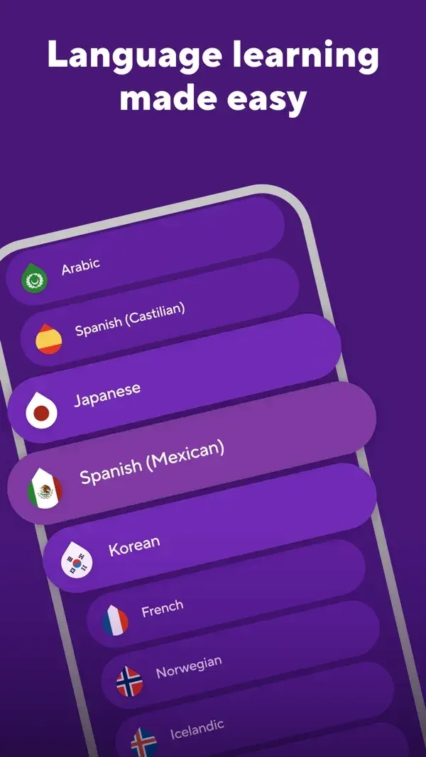
Language rows, an illustrated vocabulary card, and circular letter choices keep each activity focused on a small unit.
Useful for: Study language list, vocabulary detail, word-building exercise. Compare the hierarchy and controls shown in these publisher previews, then test the corresponding behavior in your own app.
# Design reference: Drops
Source: https://apps.apple.com/us/app/id939540371
Swipefile reference: https://swipefile.design/ref/mobile-drops/
Captured: 2026-09-09. This is a dated reference, not a claim about the current live product.
Source scope: publisher-provided App Store previews. Promotional framing is retained. These are static examples, not a tested or recorded user flow. Do not infer unseen interactions.

## Objective
Adapt the interaction and layout patterns below to my project. Use my own content and identity. Do not reproduce logos, proprietary copy, or brand assets.

## Reference notes
- surface: Language list · Vocabulary detail · Word-building exercise
- nav: Back and audio controls provide context around a word or exercise.
- layout: Language rows, an illustrated vocabulary card, and circular letter choices keep each activity focused on a small unit.
- density: Compare the space reserved for the primary task with secondary metadata. The previews retain promotional framing; evaluate target sizes in your implemented screen.
- color: Purple and blue surfaces with soft pink letter controls.
- typography: Use clear heading, body, and metadata levels. Keep interface text scalable and verify readability with the device text-size settings.
- pattern: Learning & feedback
- states: Static publisher previews only. Loading, empty, error, offline, permission, and keyboard behavior have not been tested. Specify and verify those states in your own implementation.
- dont: Do not copy the app identity, proprietary artwork, or promotional claims. Screenshot order is not a verified flow, and the listing version does not date every image.

Useful for: Study language list, vocabulary detail, word-building exercise. Compare the hierarchy and controls shown in these publisher previews, then test the corresponding behavior in your own app.

## Acceptance criteria
- Existing project conventions, design tokens, working functionality, and unrelated changes are preserved.
- Two or three reference principles clearly support the user's task; conflicts are resolved in favor of usability and the existing product.
- Accessible platform-native components express the interface; use semantic HTML when the target is mobile web. Available licensed assets are used; important UI text is never rendered as a bitmap.
- Every visible control has a defined behavior. Loading, empty, error, success, disabled, and long-content states are specified where relevant. Demo data is clearly labeled.
- Navigation and content adapt at 375px, 768px, and 1440px without horizontal page overflow. Keyboard use, visible focus, labeled inputs, at least 44px touch targets, readable contrast, and reduced motion are supported.
- Verification distinguishes rendered behavior from proposals and identifies anything still requiring a backend or external service.

## Quality bar
Clear hierarchy, consistent spacing, restrained surfaces, and purposeful motion. Avoid decorative gradients, excessive cards, placeholder buttons, and invented metrics unless the project calls for them. Do not claim a feature is connected or tested without evidence.
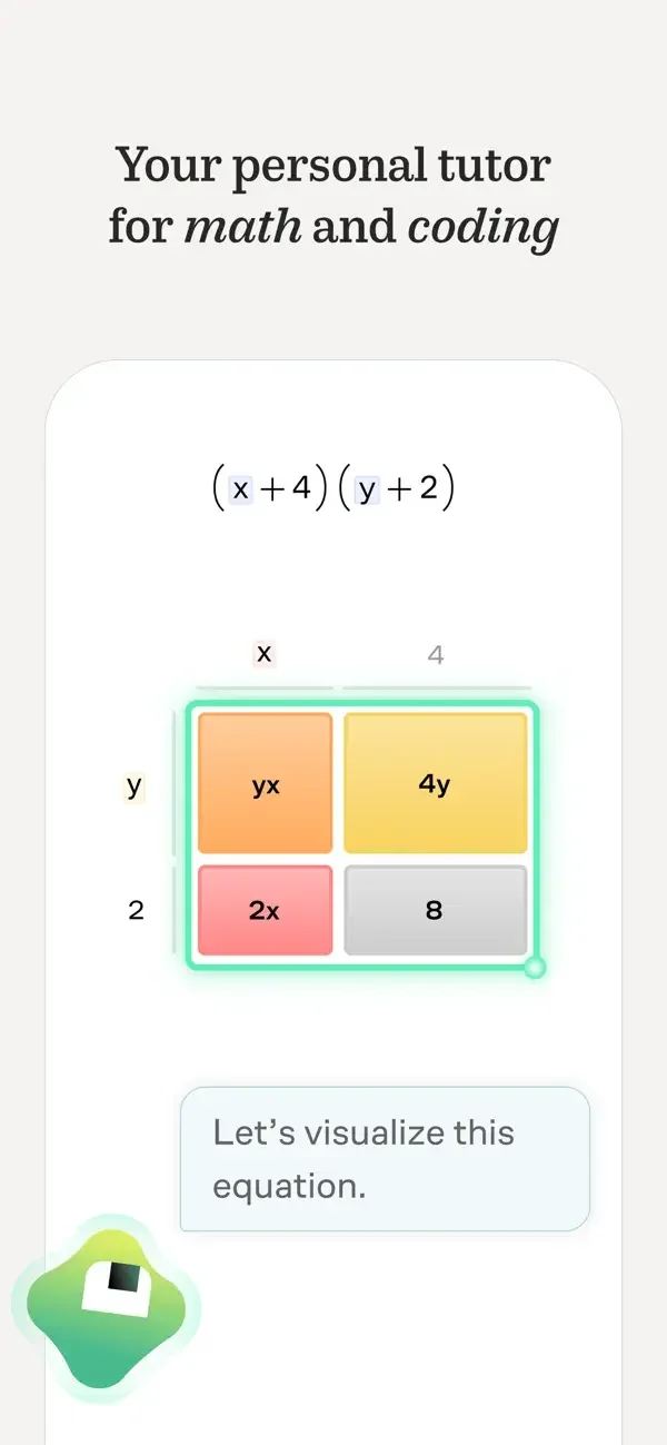
Diagrams carry the mathematical explanation, with short conversational hints and a visible answer outcome.
Useful for: Study visual algebra prompt, geometry exercise feedback, graph exercise success. Compare the hierarchy and controls shown in these publisher previews, then test the corresponding behavior in your own app.
# Design reference: Brilliant
Source: https://apps.apple.com/us/app/id913335252
Swipefile reference: https://swipefile.design/ref/mobile-brilliant/
Captured: 2026-09-09. This is a dated reference, not a claim about the current live product.
Source scope: publisher-provided App Store previews. Promotional framing is retained. These are static examples, not a tested or recorded user flow. Do not infer unseen interactions.

## Objective
Adapt the interaction and layout patterns below to my project. Use my own content and identity. Do not reproduce logos, proprietary copy, or brand assets.

## Reference notes
- surface: Visual algebra prompt · Geometry exercise feedback · Graph exercise success
- nav: The exercise stays central while feedback appears close to the diagram.
- layout: Diagrams carry the mathematical explanation, with short conversational hints and a visible answer outcome.
- density: Compare the space reserved for the primary task with secondary metadata. The previews retain promotional framing; evaluate target sizes in your implemented screen.
- color: White space, green feedback, and purple or orange diagram regions.
- typography: Use clear heading, body, and metadata levels. Keep interface text scalable and verify readability with the device text-size settings.
- pattern: Learning & feedback
- states: Static publisher previews only. Loading, empty, error, offline, permission, and keyboard behavior have not been tested. Specify and verify those states in your own implementation.
- dont: Do not copy the app identity, proprietary artwork, or promotional claims. Screenshot order is not a verified flow, and the listing version does not date every image.

Useful for: Study visual algebra prompt, geometry exercise feedback, graph exercise success. Compare the hierarchy and controls shown in these publisher previews, then test the corresponding behavior in your own app.

## Acceptance criteria
- Existing project conventions, design tokens, working functionality, and unrelated changes are preserved.
- Two or three reference principles clearly support the user's task; conflicts are resolved in favor of usability and the existing product.
- Accessible platform-native components express the interface; use semantic HTML when the target is mobile web. Available licensed assets are used; important UI text is never rendered as a bitmap.
- Every visible control has a defined behavior. Loading, empty, error, success, disabled, and long-content states are specified where relevant. Demo data is clearly labeled.
- Navigation and content adapt at 375px, 768px, and 1440px without horizontal page overflow. Keyboard use, visible focus, labeled inputs, at least 44px touch targets, readable contrast, and reduced motion are supported.
- Verification distinguishes rendered behavior from proposals and identifies anything still requiring a backend or external service.

## Quality bar
Clear hierarchy, consistent spacing, restrained surfaces, and purposeful motion. Avoid decorative gradients, excessive cards, placeholder buttons, and invented metrics unless the project calls for them. Do not claim a feature is connected or tested without evidence.
A plain subject list leads into course mastery and a multiple-choice exercise with hint and check controls.
Useful for: Study subject browsing, course progress, practice question. Compare the hierarchy and controls shown in these publisher previews, then test the corresponding behavior in your own app.
# Design reference: Khan Academy
Source: https://apps.apple.com/us/app/id469863705
Swipefile reference: https://swipefile.design/ref/mobile-khan-academy/
Captured: 2026-09-09. This is a dated reference, not a claim about the current live product.
Source scope: publisher-provided App Store previews. Promotional framing is retained. These are static examples, not a tested or recorded user flow. Do not infer unseen interactions.

## Objective
Adapt the interaction and layout patterns below to my project. Use my own content and identity. Do not reproduce logos, proprietary copy, or brand assets.

## Reference notes
- surface: Subject browsing · Course progress · Practice question
- nav: Search and bottom destinations organize discovery; exercise controls remain at the lower edge.
- layout: A plain subject list leads into course mastery and a multiple-choice exercise with hint and check controls.
- density: Compare the space reserved for the primary task with secondary metadata. The previews retain promotional framing; evaluate target sizes in your implemented screen.
- color: White content, navy headers, and blue or green progress accents.
- typography: Use clear heading, body, and metadata levels. Keep interface text scalable and verify readability with the device text-size settings.
- pattern: Learning & feedback
- states: Static publisher previews only. Loading, empty, error, offline, permission, and keyboard behavior have not been tested. Specify and verify those states in your own implementation.
- dont: Do not copy the app identity, proprietary artwork, or promotional claims. Screenshot order is not a verified flow, and the listing version does not date every image.

Useful for: Study subject browsing, course progress, practice question. Compare the hierarchy and controls shown in these publisher previews, then test the corresponding behavior in your own app.

## Acceptance criteria
- Existing project conventions, design tokens, working functionality, and unrelated changes are preserved.
- Two or three reference principles clearly support the user's task; conflicts are resolved in favor of usability and the existing product.
- Accessible platform-native components express the interface; use semantic HTML when the target is mobile web. Available licensed assets are used; important UI text is never rendered as a bitmap.
- Every visible control has a defined behavior. Loading, empty, error, success, disabled, and long-content states are specified where relevant. Demo data is clearly labeled.
- Navigation and content adapt at 375px, 768px, and 1440px without horizontal page overflow. Keyboard use, visible focus, labeled inputs, at least 44px touch targets, readable contrast, and reduced motion are supported.
- Verification distinguishes rendered behavior from proposals and identifies anything still requiring a backend or external service.

## Quality bar
Clear hierarchy, consistent spacing, restrained surfaces, and purposeful motion. Avoid decorative gradients, excessive cards, placeholder buttons, and invented metrics unless the project calls for them. Do not claim a feature is connected or tested without evidence.
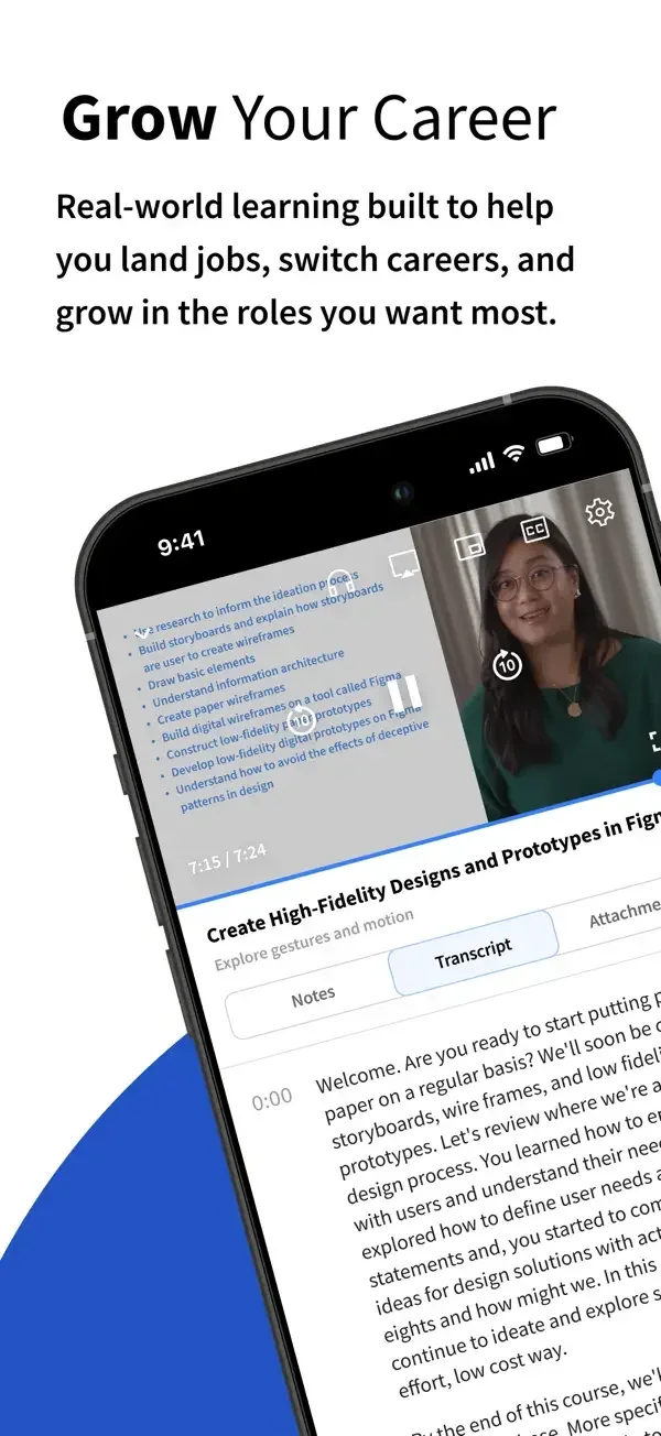
A lesson pairs video with a transcript, while a career path groups courses into labeled learning stages.
Useful for: Study lesson video and transcript, career learning path. Compare the hierarchy and controls shown in these publisher previews, then test the corresponding behavior in your own app.
# Design reference: Coursera
Source: https://apps.apple.com/us/app/id736535961
Swipefile reference: https://swipefile.design/ref/mobile-coursera/
Captured: 2026-09-09. This is a dated reference, not a claim about the current live product.
Source scope: publisher-provided App Store previews. Promotional framing is retained. These are static examples, not a tested or recorded user flow. Do not infer unseen interactions.

## Objective
Adapt the interaction and layout patterns below to my project. Use my own content and identity. Do not reproduce logos, proprietary copy, or brand assets.

## Reference notes
- surface: Lesson video and transcript · Career learning path
- nav: Lesson tabs separate overview, notes, and transcript; a back control returns from a path.
- layout: A lesson pairs video with a transcript, while a career path groups courses into labeled learning stages.
- density: Compare the space reserved for the primary task with secondary metadata. The previews retain promotional framing; evaluate target sizes in your implemented screen.
- color: White surfaces with blue navigation and colored learning-path bands.
- typography: Use clear heading, body, and metadata levels. Keep interface text scalable and verify readability with the device text-size settings.
- pattern: Learning & feedback
- states: Static publisher previews only. Loading, empty, error, offline, permission, and keyboard behavior have not been tested. Specify and verify those states in your own implementation.
- dont: Do not copy the app identity, proprietary artwork, or promotional claims. Screenshot order is not a verified flow, and the listing version does not date every image.

Useful for: Study lesson video and transcript, career learning path. Compare the hierarchy and controls shown in these publisher previews, then test the corresponding behavior in your own app.

## Acceptance criteria
- Existing project conventions, design tokens, working functionality, and unrelated changes are preserved.
- Two or three reference principles clearly support the user's task; conflicts are resolved in favor of usability and the existing product.
- Accessible platform-native components express the interface; use semantic HTML when the target is mobile web. Available licensed assets are used; important UI text is never rendered as a bitmap.
- Every visible control has a defined behavior. Loading, empty, error, success, disabled, and long-content states are specified where relevant. Demo data is clearly labeled.
- Navigation and content adapt at 375px, 768px, and 1440px without horizontal page overflow. Keyboard use, visible focus, labeled inputs, at least 44px touch targets, readable contrast, and reduced motion are supported.
- Verification distinguishes rendered behavior from proposals and identifies anything still requiring a backend or external service.

## Quality bar
Clear hierarchy, consistent spacing, restrained surfaces, and purposeful motion. Avoid decorative gradients, excessive cards, placeholder buttons, and invented metrics unless the project calls for them. Do not claim a feature is connected or tested without evidence.
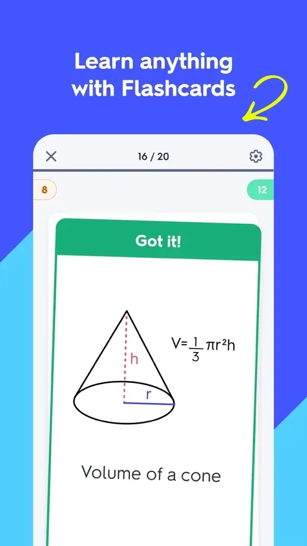
A large flashcard, a compact concept guide, and numbered solution steps show different levels of learning detail.
Useful for: Study flashcard feedback, study guide, worked solution. Compare the hierarchy and controls shown in these publisher previews, then test the corresponding behavior in your own app.
# Design reference: Quizlet
Source: https://apps.apple.com/us/app/id546473125
Swipefile reference: https://swipefile.design/ref/mobile-quizlet/
Captured: 2026-09-09. This is a dated reference, not a claim about the current live product.
Source scope: publisher-provided App Store previews. Promotional framing is retained. These are static examples, not a tested or recorded user flow. Do not infer unseen interactions.

## Objective
Adapt the interaction and layout patterns below to my project. Use my own content and identity. Do not reproduce logos, proprietary copy, or brand assets.

## Reference notes
- surface: Flashcard feedback · Study guide · Worked solution
- nav: Progress and close controls frame cards, while a back control returns from a solution.
- layout: A large flashcard, a compact concept guide, and numbered solution steps show different levels of learning detail.
- density: Compare the space reserved for the primary task with secondary metadata. The previews retain promotional framing; evaluate target sizes in your implemented screen.
- color: White study surfaces with green feedback and blue-purple framing.
- typography: Use clear heading, body, and metadata levels. Keep interface text scalable and verify readability with the device text-size settings.
- pattern: Learning & feedback
- states: Static publisher previews only. Loading, empty, error, offline, permission, and keyboard behavior have not been tested. Specify and verify those states in your own implementation.
- dont: Do not copy the app identity, proprietary artwork, or promotional claims. Screenshot order is not a verified flow, and the listing version does not date every image.

Useful for: Study flashcard feedback, study guide, worked solution. Compare the hierarchy and controls shown in these publisher previews, then test the corresponding behavior in your own app.

## Acceptance criteria
- Existing project conventions, design tokens, working functionality, and unrelated changes are preserved.
- Two or three reference principles clearly support the user's task; conflicts are resolved in favor of usability and the existing product.
- Accessible platform-native components express the interface; use semantic HTML when the target is mobile web. Available licensed assets are used; important UI text is never rendered as a bitmap.
- Every visible control has a defined behavior. Loading, empty, error, success, disabled, and long-content states are specified where relevant. Demo data is clearly labeled.
- Navigation and content adapt at 375px, 768px, and 1440px without horizontal page overflow. Keyboard use, visible focus, labeled inputs, at least 44px touch targets, readable contrast, and reduced motion are supported.
- Verification distinguishes rendered behavior from proposals and identifies anything still requiring a backend or external service.

## Quality bar
Clear hierarchy, consistent spacing, restrained surfaces, and purposeful motion. Avoid decorative gradients, excessive cards, placeholder buttons, and invented metrics unless the project calls for them. Do not claim a feature is connected or tested without evidence.
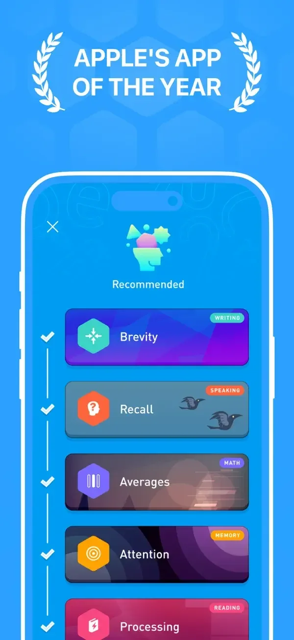
Color-coded training rows lead into simple exercises with a small number of large choices.
Useful for: Study training activity list, vocabulary exercise, writing exercise. Compare the hierarchy and controls shown in these publisher previews, then test the corresponding behavior in your own app.
# Design reference: Elevate
Source: https://apps.apple.com/us/app/id875063456
Swipefile reference: https://swipefile.design/ref/mobile-elevate/
Captured: 2026-09-09. This is a dated reference, not a claim about the current live product.
Source scope: publisher-provided App Store previews. Promotional framing is retained. These are static examples, not a tested or recorded user flow. Do not infer unseen interactions.

## Objective
Adapt the interaction and layout patterns below to my project. Use my own content and identity. Do not reproduce logos, proprietary copy, or brand assets.

## Reference notes
- surface: Training activity list · Vocabulary exercise · Writing exercise
- nav: An activity overview and focused exercise surfaces separate choosing practice from completing it.
- layout: Color-coded training rows lead into simple exercises with a small number of large choices.
- density: Compare the space reserved for the primary task with secondary metadata. The previews retain promotional framing; evaluate target sizes in your implemented screen.
- color: Bright blue and orange framing with colorful task tiles.
- typography: Use clear heading, body, and metadata levels. Keep interface text scalable and verify readability with the device text-size settings.
- pattern: Learning & feedback
- states: Static publisher previews only. Loading, empty, error, offline, permission, and keyboard behavior have not been tested. Specify and verify those states in your own implementation.
- dont: Do not copy the app identity, proprietary artwork, or promotional claims. Screenshot order is not a verified flow, and the listing version does not date every image.

Useful for: Study training activity list, vocabulary exercise, writing exercise. Compare the hierarchy and controls shown in these publisher previews, then test the corresponding behavior in your own app.

## Acceptance criteria
- Existing project conventions, design tokens, working functionality, and unrelated changes are preserved.
- Two or three reference principles clearly support the user's task; conflicts are resolved in favor of usability and the existing product.
- Accessible platform-native components express the interface; use semantic HTML when the target is mobile web. Available licensed assets are used; important UI text is never rendered as a bitmap.
- Every visible control has a defined behavior. Loading, empty, error, success, disabled, and long-content states are specified where relevant. Demo data is clearly labeled.
- Navigation and content adapt at 375px, 768px, and 1440px without horizontal page overflow. Keyboard use, visible focus, labeled inputs, at least 44px touch targets, readable contrast, and reduced motion are supported.
- Verification distinguishes rendered behavior from proposals and identifies anything still requiring a backend or external service.

## Quality bar
Clear hierarchy, consistent spacing, restrained surfaces, and purposeful motion. Avoid decorative gradients, excessive cards, placeholder buttons, and invented metrics unless the project calls for them. Do not claim a feature is connected or tested without evidence.
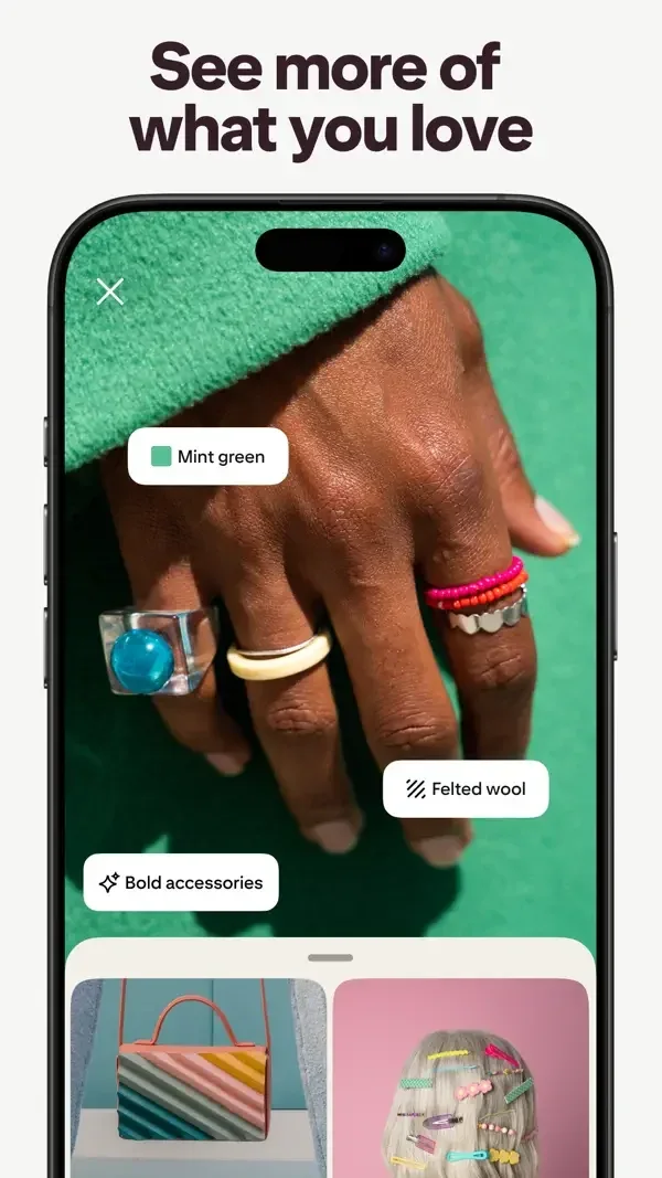
Labels over an image identify visual attributes, while related-image grids and filter chips narrow the next choice.
Useful for: Study visual search details, similar product discovery, filtered inspiration results. Compare the hierarchy and controls shown in these publisher previews, then test the corresponding behavior in your own app.
# Design reference: Pinterest
Source: https://apps.apple.com/us/app/id429047995
Swipefile reference: https://swipefile.design/ref/mobile-pinterest/
Captured: 2026-09-09. This is a dated reference, not a claim about the current live product.
Source scope: publisher-provided App Store previews. Promotional framing is retained. These are static examples, not a tested or recorded user flow. Do not infer unseen interactions.

## Objective
Adapt the interaction and layout patterns below to my project. Use my own content and identity. Do not reproduce logos, proprietary copy, or brand assets.

## Reference notes
- surface: Visual search details · Similar product discovery · Filtered inspiration results
- nav: Search, close/back controls, and a lower related-results panel keep the original visual context available.
- layout: Labels over an image identify visual attributes, while related-image grids and filter chips narrow the next choice.
- density: Compare the space reserved for the primary task with secondary metadata. The previews retain promotional framing; evaluate target sizes in your implemented screen.
- color: White controls over photography with subtle pastel filter chips.
- typography: Use clear heading, body, and metadata levels. Keep interface text scalable and verify readability with the device text-size settings.
- pattern: Search & discovery
- states: Static publisher previews only. Loading, empty, error, offline, permission, and keyboard behavior have not been tested. Specify and verify those states in your own implementation.
- dont: Do not copy the app identity, proprietary artwork, or promotional claims. Screenshot order is not a verified flow, and the listing version does not date every image.

Useful for: Study visual search details, similar product discovery, filtered inspiration results. Compare the hierarchy and controls shown in these publisher previews, then test the corresponding behavior in your own app.

## Acceptance criteria
- Existing project conventions, design tokens, working functionality, and unrelated changes are preserved.
- Two or three reference principles clearly support the user's task; conflicts are resolved in favor of usability and the existing product.
- Accessible platform-native components express the interface; use semantic HTML when the target is mobile web. Available licensed assets are used; important UI text is never rendered as a bitmap.
- Every visible control has a defined behavior. Loading, empty, error, success, disabled, and long-content states are specified where relevant. Demo data is clearly labeled.
- Navigation and content adapt at 375px, 768px, and 1440px without horizontal page overflow. Keyboard use, visible focus, labeled inputs, at least 44px touch targets, readable contrast, and reduced motion are supported.
- Verification distinguishes rendered behavior from proposals and identifies anything still requiring a backend or external service.

## Quality bar
Clear hierarchy, consistent spacing, restrained surfaces, and purposeful motion. Avoid decorative gradients, excessive cards, placeholder buttons, and invented metrics unless the project calls for them. Do not claim a feature is connected or tested without evidence.
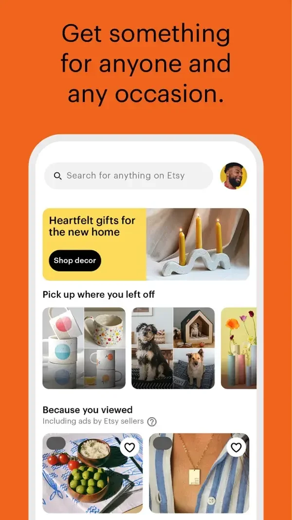
Rounded product photos combine with search and themed gift cards to support browsing by recipient or interest.
Useful for: Study personalized shopping home, gift discovery, gift collection. Compare the hierarchy and controls shown in these publisher previews, then test the corresponding behavior in your own app.
# Design reference: Etsy
Source: https://apps.apple.com/us/app/id477128284
Swipefile reference: https://swipefile.design/ref/mobile-etsy/
Captured: 2026-09-09. This is a dated reference, not a claim about the current live product.
Source scope: publisher-provided App Store previews. Promotional framing is retained. These are static examples, not a tested or recorded user flow. Do not infer unseen interactions.

## Objective
Adapt the interaction and layout patterns below to my project. Use my own content and identity. Do not reproduce logos, proprietary copy, or brand assets.

## Reference notes
- surface: Personalized shopping home · Gift discovery · Gift collection
- nav: A prominent search field leads into gift topics and a specific collection.
- layout: Rounded product photos combine with search and themed gift cards to support browsing by recipient or interest.
- density: Compare the space reserved for the primary task with secondary metadata. The previews retain promotional framing; evaluate target sizes in your implemented screen.
- color: Warm white content with orange branding and colorful gift tiles.
- typography: Use clear heading, body, and metadata levels. Keep interface text scalable and verify readability with the device text-size settings.
- pattern: Search & discovery
- states: Static publisher previews only. Loading, empty, error, offline, permission, and keyboard behavior have not been tested. Specify and verify those states in your own implementation.
- dont: Do not copy the app identity, proprietary artwork, or promotional claims. Screenshot order is not a verified flow, and the listing version does not date every image.

Useful for: Study personalized shopping home, gift discovery, gift collection. Compare the hierarchy and controls shown in these publisher previews, then test the corresponding behavior in your own app.

## Acceptance criteria
- Existing project conventions, design tokens, working functionality, and unrelated changes are preserved.
- Two or three reference principles clearly support the user's task; conflicts are resolved in favor of usability and the existing product.
- Accessible platform-native components express the interface; use semantic HTML when the target is mobile web. Available licensed assets are used; important UI text is never rendered as a bitmap.
- Every visible control has a defined behavior. Loading, empty, error, success, disabled, and long-content states are specified where relevant. Demo data is clearly labeled.
- Navigation and content adapt at 375px, 768px, and 1440px without horizontal page overflow. Keyboard use, visible focus, labeled inputs, at least 44px touch targets, readable contrast, and reduced motion are supported.
- Verification distinguishes rendered behavior from proposals and identifies anything still requiring a backend or external service.

## Quality bar
Clear hierarchy, consistent spacing, restrained surfaces, and purposeful motion. Avoid decorative gradients, excessive cards, placeholder buttons, and invented metrics unless the project calls for them. Do not claim a feature is connected or tested without evidence.
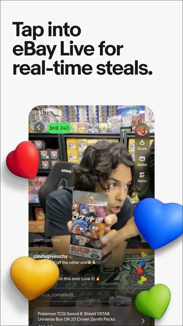
A live video surface, a focused photo prompt, and a two-column product grid expose distinct shopping and selling tasks.
Useful for: Study live shopping, photo-based listing prompt, product collection. Compare the hierarchy and controls shown in these publisher previews, then test the corresponding behavior in your own app.
# Design reference: eBay
Source: https://apps.apple.com/us/app/id282614216
Swipefile reference: https://swipefile.design/ref/mobile-ebay/
Captured: 2026-09-09. This is a dated reference, not a claim about the current live product.
Source scope: publisher-provided App Store previews. Promotional framing is retained. These are static examples, not a tested or recorded user flow. Do not infer unseen interactions.

## Objective
Adapt the interaction and layout patterns below to my project. Use my own content and identity. Do not reproduce logos, proprietary copy, or brand assets.

## Reference notes
- surface: Live shopping · Photo-based listing prompt · Product collection
- nav: Close/back controls and item-level save buttons give the shown surfaces clear exits and actions.
- layout: A live video surface, a focused photo prompt, and a two-column product grid expose distinct shopping and selling tasks.
- density: Compare the space reserved for the primary task with secondary metadata. The previews retain promotional framing; evaluate target sizes in your implemented screen.
- color: White product grids, dark camera framing, and image-led content.
- typography: Use clear heading, body, and metadata levels. Keep interface text scalable and verify readability with the device text-size settings.
- pattern: Shopping & checkout
- states: Static publisher previews only. Loading, empty, error, offline, permission, and keyboard behavior have not been tested. Specify and verify those states in your own implementation.
- dont: Do not copy the app identity, proprietary artwork, or promotional claims. Screenshot order is not a verified flow, and the listing version does not date every image.

Useful for: Study live shopping, photo-based listing prompt, product collection. Compare the hierarchy and controls shown in these publisher previews, then test the corresponding behavior in your own app.

## Acceptance criteria
- Existing project conventions, design tokens, working functionality, and unrelated changes are preserved.
- Two or three reference principles clearly support the user's task; conflicts are resolved in favor of usability and the existing product.
- Accessible platform-native components express the interface; use semantic HTML when the target is mobile web. Available licensed assets are used; important UI text is never rendered as a bitmap.
- Every visible control has a defined behavior. Loading, empty, error, success, disabled, and long-content states are specified where relevant. Demo data is clearly labeled.
- Navigation and content adapt at 375px, 768px, and 1440px without horizontal page overflow. Keyboard use, visible focus, labeled inputs, at least 44px touch targets, readable contrast, and reduced motion are supported.
- Verification distinguishes rendered behavior from proposals and identifies anything still requiring a backend or external service.

## Quality bar
Clear hierarchy, consistent spacing, restrained surfaces, and purposeful motion. Avoid decorative gradients, excessive cards, placeholder buttons, and invented metrics unless the project calls for them. Do not claim a feature is connected or tested without evidence.
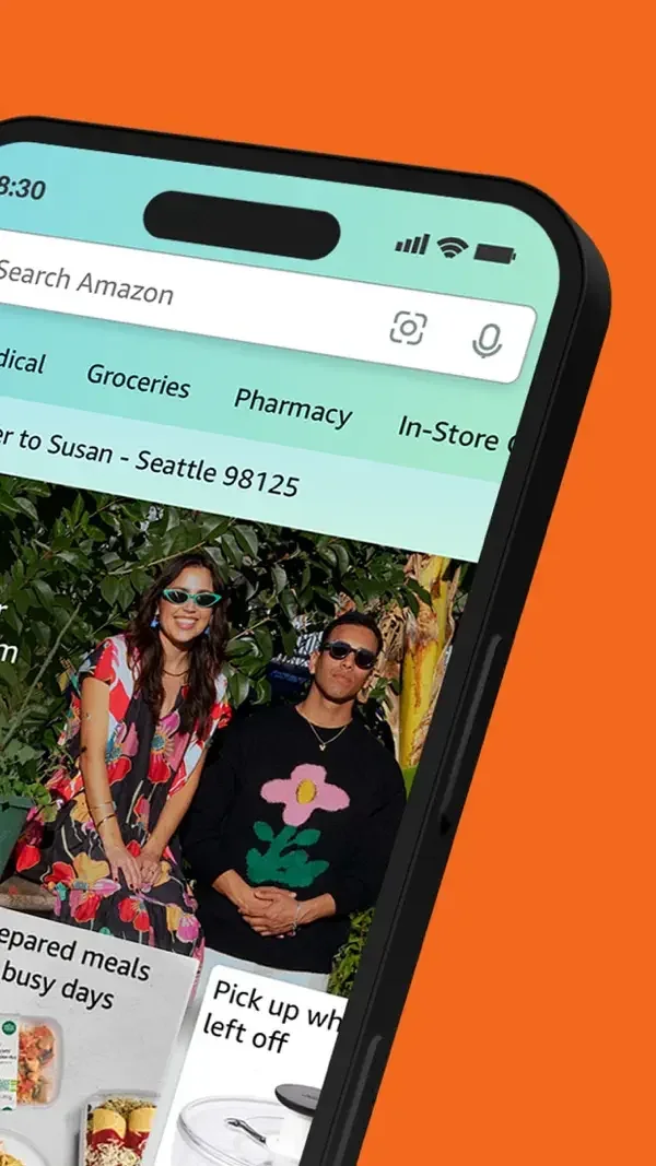
Dense shopping modules sit below persistent search, with a product grid for comparison and a sheet explaining voice controls.
Useful for: Study shopping home, product results, voice feature introduction. Compare the hierarchy and controls shown in these publisher previews, then test the corresponding behavior in your own app.
# Design reference: Amazon Shopping
Source: https://apps.apple.com/us/app/id297606951
Swipefile reference: https://swipefile.design/ref/mobile-amazon-shopping/
Captured: 2026-09-09. This is a dated reference, not a claim about the current live product.
Source scope: publisher-provided App Store previews. Promotional framing is retained. These are static examples, not a tested or recorded user flow. Do not infer unseen interactions.

## Objective
Adapt the interaction and layout patterns below to my project. Use my own content and identity. Do not reproduce logos, proprietary copy, or brand assets.

## Reference notes
- surface: Shopping home · Product results · Voice feature introduction
- nav: Top search and lower account/cart destinations remain separate from a temporary explanatory sheet.
- layout: Dense shopping modules sit below persistent search, with a product grid for comparison and a sheet explaining voice controls.
- density: Compare the space reserved for the primary task with secondary metadata. The previews retain promotional framing; evaluate target sizes in your implemented screen.
- color: White surfaces, pale teal navigation, and blue actions.
- typography: Use clear heading, body, and metadata levels. Keep interface text scalable and verify readability with the device text-size settings.
- pattern: Shopping & checkout
- states: Static publisher previews only. Loading, empty, error, offline, permission, and keyboard behavior have not been tested. Specify and verify those states in your own implementation.
- dont: Do not copy the app identity, proprietary artwork, or promotional claims. Screenshot order is not a verified flow, and the listing version does not date every image.

Useful for: Study shopping home, product results, voice feature introduction. Compare the hierarchy and controls shown in these publisher previews, then test the corresponding behavior in your own app.

## Acceptance criteria
- Existing project conventions, design tokens, working functionality, and unrelated changes are preserved.
- Two or three reference principles clearly support the user's task; conflicts are resolved in favor of usability and the existing product.
- Accessible platform-native components express the interface; use semantic HTML when the target is mobile web. Available licensed assets are used; important UI text is never rendered as a bitmap.
- Every visible control has a defined behavior. Loading, empty, error, success, disabled, and long-content states are specified where relevant. Demo data is clearly labeled.
- Navigation and content adapt at 375px, 768px, and 1440px without horizontal page overflow. Keyboard use, visible focus, labeled inputs, at least 44px touch targets, readable contrast, and reduced motion are supported.
- Verification distinguishes rendered behavior from proposals and identifies anything still requiring a backend or external service.

## Quality bar
Clear hierarchy, consistent spacing, restrained surfaces, and purposeful motion. Avoid decorative gradients, excessive cards, placeholder buttons, and invented metrics unless the project calls for them. Do not claim a feature is connected or tested without evidence.
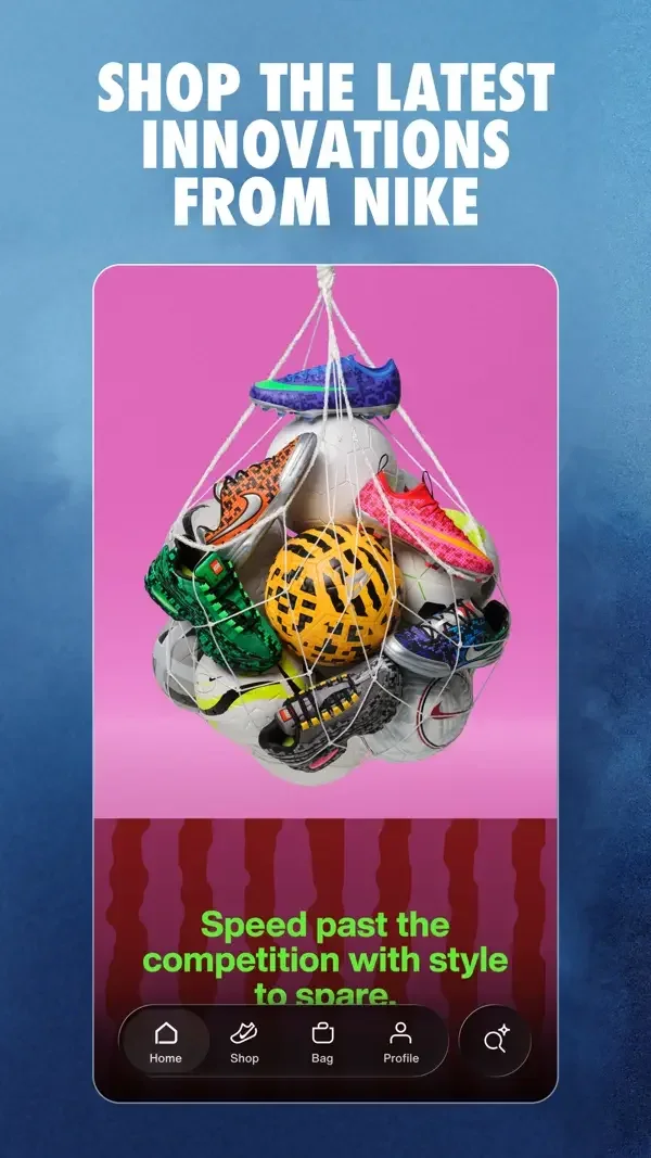
Campaign artwork leads into category tiles and a restrained product grid with short names and prices.
Useful for: Study campaign discovery, shopping categories, new product grid. Compare the hierarchy and controls shown in these publisher previews, then test the corresponding behavior in your own app.
# Design reference: Nike
Source: https://apps.apple.com/us/app/id1095459556
Swipefile reference: https://swipefile.design/ref/mobile-nike/
Captured: 2026-09-09. This is a dated reference, not a claim about the current live product.
Source scope: publisher-provided App Store previews. Promotional framing is retained. These are static examples, not a tested or recorded user flow. Do not infer unseen interactions.

## Objective
Adapt the interaction and layout patterns below to my project. Use my own content and identity. Do not reproduce logos, proprietary copy, or brand assets.

## Reference notes
- surface: Campaign discovery · Shopping categories · New product grid
- nav: Persistent bottom destinations and category filters give editorial browsing a conventional shopping structure.
- layout: Campaign artwork leads into category tiles and a restrained product grid with short names and prices.
- density: Compare the space reserved for the primary task with secondary metadata. The previews retain promotional framing; evaluate target sizes in your implemented screen.
- color: Black and white controls with vivid campaign and product imagery.
- typography: Use clear heading, body, and metadata levels. Keep interface text scalable and verify readability with the device text-size settings.
- pattern: Shopping & checkout
- states: Static publisher previews only. Loading, empty, error, offline, permission, and keyboard behavior have not been tested. Specify and verify those states in your own implementation.
- dont: Do not copy the app identity, proprietary artwork, or promotional claims. Screenshot order is not a verified flow, and the listing version does not date every image.

Useful for: Study campaign discovery, shopping categories, new product grid. Compare the hierarchy and controls shown in these publisher previews, then test the corresponding behavior in your own app.

## Acceptance criteria
- Existing project conventions, design tokens, working functionality, and unrelated changes are preserved.
- Two or three reference principles clearly support the user's task; conflicts are resolved in favor of usability and the existing product.
- Accessible platform-native components express the interface; use semantic HTML when the target is mobile web. Available licensed assets are used; important UI text is never rendered as a bitmap.
- Every visible control has a defined behavior. Loading, empty, error, success, disabled, and long-content states are specified where relevant. Demo data is clearly labeled.
- Navigation and content adapt at 375px, 768px, and 1440px without horizontal page overflow. Keyboard use, visible focus, labeled inputs, at least 44px touch targets, readable contrast, and reduced motion are supported.
- Verification distinguishes rendered behavior from proposals and identifies anything still requiring a backend or external service.

## Quality bar
Clear hierarchy, consistent spacing, restrained surfaces, and purposeful motion. Avoid decorative gradients, excessive cards, placeholder buttons, and invented metrics unless the project calls for them. Do not claim a feature is connected or tested without evidence.
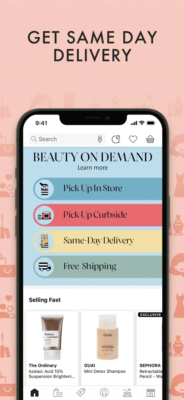
Colored fulfillment rows precede product cards; a detail page places delivery choices above an Add to Basket action.
Useful for: Study fulfillment choices, product discovery, product and delivery options. Compare the hierarchy and controls shown in these publisher previews, then test the corresponding behavior in your own app.
# Design reference: Sephora
Source: https://apps.apple.com/us/app/id393328150
Swipefile reference: https://swipefile.design/ref/mobile-sephora/
Captured: 2026-09-09. This is a dated reference, not a claim about the current live product.
Source scope: publisher-provided App Store previews. Promotional framing is retained. These are static examples, not a tested or recorded user flow. Do not infer unseen interactions.

## Objective
Adapt the interaction and layout patterns below to my project. Use my own content and identity. Do not reproduce logos, proprietary copy, or brand assets.

## Reference notes
- surface: Fulfillment choices · Product discovery · Product and delivery options
- nav: Top search and lower shopping destinations remain visible around the product content.
- layout: Colored fulfillment rows precede product cards; a detail page places delivery choices above an Add to Basket action.
- density: Compare the space reserved for the primary task with secondary metadata. The previews retain promotional framing; evaluate target sizes in your implemented screen.
- color: White panels, pastel service rows, and a red purchase action.
- typography: Use clear heading, body, and metadata levels. Keep interface text scalable and verify readability with the device text-size settings.
- pattern: Shopping & checkout
- states: Static publisher previews only. Loading, empty, error, offline, permission, and keyboard behavior have not been tested. Specify and verify those states in your own implementation.
- dont: Do not copy the app identity, proprietary artwork, or promotional claims. Screenshot order is not a verified flow, and the listing version does not date every image.

Useful for: Study fulfillment choices, product discovery, product and delivery options. Compare the hierarchy and controls shown in these publisher previews, then test the corresponding behavior in your own app.

## Acceptance criteria
- Existing project conventions, design tokens, working functionality, and unrelated changes are preserved.
- Two or three reference principles clearly support the user's task; conflicts are resolved in favor of usability and the existing product.
- Accessible platform-native components express the interface; use semantic HTML when the target is mobile web. Available licensed assets are used; important UI text is never rendered as a bitmap.
- Every visible control has a defined behavior. Loading, empty, error, success, disabled, and long-content states are specified where relevant. Demo data is clearly labeled.
- Navigation and content adapt at 375px, 768px, and 1440px without horizontal page overflow. Keyboard use, visible focus, labeled inputs, at least 44px touch targets, readable contrast, and reduced motion are supported.
- Verification distinguishes rendered behavior from proposals and identifies anything still requiring a backend or external service.

## Quality bar
Clear hierarchy, consistent spacing, restrained surfaces, and purposeful motion. Avoid decorative gradients, excessive cards, placeholder buttons, and invented metrics unless the project calls for them. Do not claim a feature is connected or tested without evidence.
Image-led offers, category shortcuts, and a member summary organize shopping at different levels of detail.
Useful for: Study shopping home, deals browsing, membership overview. Compare the hierarchy and controls shown in these publisher previews, then test the corresponding behavior in your own app.
# Design reference: Target
Source: https://apps.apple.com/us/app/id297430070
Swipefile reference: https://swipefile.design/ref/mobile-target/
Captured: 2026-09-09. This is a dated reference, not a claim about the current live product.
Source scope: publisher-provided App Store previews. Promotional framing is retained. These are static examples, not a tested or recorded user flow. Do not infer unseen interactions.

## Objective
Adapt the interaction and layout patterns below to my project. Use my own content and identity. Do not reproduce logos, proprietary copy, or brand assets.

## Reference notes
- surface: Shopping home · Deals browsing · Membership overview
- nav: Bottom destinations and deal categories provide consistent routes through the promotional content.
- layout: Image-led offers, category shortcuts, and a member summary organize shopping at different levels of detail.
- density: Compare the space reserved for the primary task with secondary metadata. The previews retain promotional framing; evaluate target sizes in your implemented screen.
- color: White panels with red actions and colorful merchandise imagery.
- typography: Use clear heading, body, and metadata levels. Keep interface text scalable and verify readability with the device text-size settings.
- pattern: Shopping & checkout
- states: Static publisher previews only. Loading, empty, error, offline, permission, and keyboard behavior have not been tested. Specify and verify those states in your own implementation.
- dont: Do not copy the app identity, proprietary artwork, or promotional claims. Screenshot order is not a verified flow, and the listing version does not date every image.

Useful for: Study shopping home, deals browsing, membership overview. Compare the hierarchy and controls shown in these publisher previews, then test the corresponding behavior in your own app.

## Acceptance criteria
- Existing project conventions, design tokens, working functionality, and unrelated changes are preserved.
- Two or three reference principles clearly support the user's task; conflicts are resolved in favor of usability and the existing product.
- Accessible platform-native components express the interface; use semantic HTML when the target is mobile web. Available licensed assets are used; important UI text is never rendered as a bitmap.
- Every visible control has a defined behavior. Loading, empty, error, success, disabled, and long-content states are specified where relevant. Demo data is clearly labeled.
- Navigation and content adapt at 375px, 768px, and 1440px without horizontal page overflow. Keyboard use, visible focus, labeled inputs, at least 44px touch targets, readable contrast, and reduced motion are supported.
- Verification distinguishes rendered behavior from proposals and identifies anything still requiring a backend or external service.

## Quality bar
Clear hierarchy, consistent spacing, restrained surfaces, and purposeful motion. Avoid decorative gradients, excessive cards, placeholder buttons, and invented metrics unless the project calls for them. Do not claim a feature is connected or tested without evidence.
Store categories and promotional cards lead into a status panel that shows order progress above additional shopping options.
Useful for: Study store discovery, order confirmation status, offer discovery. Compare the hierarchy and controls shown in these publisher previews, then test the corresponding behavior in your own app.
# Design reference: DoorDash
Source: https://apps.apple.com/us/app/id719972451
Swipefile reference: https://swipefile.design/ref/mobile-doordash/
Captured: 2026-09-09. This is a dated reference, not a claim about the current live product.
Source scope: publisher-provided App Store previews. Promotional framing is retained. These are static examples, not a tested or recorded user flow. Do not infer unseen interactions.

## Objective
Adapt the interaction and layout patterns below to my project. Use my own content and identity. Do not reproduce logos, proprietary copy, or brand assets.

## Reference notes
- surface: Store discovery · Order confirmation status · Offer discovery
- nav: Search, category icons, and persistent lower destinations keep discovery accessible.
- layout: Store categories and promotional cards lead into a status panel that shows order progress above additional shopping options.
- density: Compare the space reserved for the primary task with secondary metadata. The previews retain promotional framing; evaluate target sizes in your implemented screen.
- color: White surfaces, black text, and red brand accents.
- typography: Use clear heading, body, and metadata levels. Keep interface text scalable and verify readability with the device text-size settings.
- pattern: Shopping & checkout
- states: Static publisher previews only. Loading, empty, error, offline, permission, and keyboard behavior have not been tested. Specify and verify those states in your own implementation.
- dont: Do not copy the app identity, proprietary artwork, or promotional claims. Screenshot order is not a verified flow, and the listing version does not date every image.

Useful for: Study store discovery, order confirmation status, offer discovery. Compare the hierarchy and controls shown in these publisher previews, then test the corresponding behavior in your own app.

## Acceptance criteria
- Existing project conventions, design tokens, working functionality, and unrelated changes are preserved.
- Two or three reference principles clearly support the user's task; conflicts are resolved in favor of usability and the existing product.
- Accessible platform-native components express the interface; use semantic HTML when the target is mobile web. Available licensed assets are used; important UI text is never rendered as a bitmap.
- Every visible control has a defined behavior. Loading, empty, error, success, disabled, and long-content states are specified where relevant. Demo data is clearly labeled.
- Navigation and content adapt at 375px, 768px, and 1440px without horizontal page overflow. Keyboard use, visible focus, labeled inputs, at least 44px touch targets, readable contrast, and reduced motion are supported.
- Verification distinguishes rendered behavior from proposals and identifies anything still requiring a backend or external service.

## Quality bar
Clear hierarchy, consistent spacing, restrained surfaces, and purposeful motion. Avoid decorative gradients, excessive cards, placeholder buttons, and invented metrics unless the project calls for them. Do not claim a feature is connected or tested without evidence.
Category chips and offer cards lead into a grouped cart with editable items, a savings summary, and a clear checkout action.
Useful for: Study store discovery, restaurant offers, bundled cart. Compare the hierarchy and controls shown in these publisher previews, then test the corresponding behavior in your own app.
# Design reference: Uber Eats
Source: https://apps.apple.com/us/app/id1058959277
Swipefile reference: https://swipefile.design/ref/mobile-uber-eats/
Captured: 2026-09-09. This is a dated reference, not a claim about the current live product.
Source scope: publisher-provided App Store previews. Promotional framing is retained. These are static examples, not a tested or recorded user flow. Do not infer unseen interactions.

## Objective
Adapt the interaction and layout patterns below to my project. Use my own content and identity. Do not reproduce logos, proprietary copy, or brand assets.

## Reference notes
- surface: Store discovery · Restaurant offers · Bundled cart
- nav: Search and bottom destinations support browsing; the cart has a separate close control and primary action.
- layout: Category chips and offer cards lead into a grouped cart with editable items, a savings summary, and a clear checkout action.
- density: Compare the space reserved for the primary task with secondary metadata. The previews retain promotional framing; evaluate target sizes in your implemented screen.
- color: White content, black actions, and green offer accents.
- typography: Use clear heading, body, and metadata levels. Keep interface text scalable and verify readability with the device text-size settings.
- pattern: Shopping & checkout
- states: Static publisher previews only. Loading, empty, error, offline, permission, and keyboard behavior have not been tested. Specify and verify those states in your own implementation.
- dont: Do not copy the app identity, proprietary artwork, or promotional claims. Screenshot order is not a verified flow, and the listing version does not date every image.

Useful for: Study store discovery, restaurant offers, bundled cart. Compare the hierarchy and controls shown in these publisher previews, then test the corresponding behavior in your own app.

## Acceptance criteria
- Existing project conventions, design tokens, working functionality, and unrelated changes are preserved.
- Two or three reference principles clearly support the user's task; conflicts are resolved in favor of usability and the existing product.
- Accessible platform-native components express the interface; use semantic HTML when the target is mobile web. Available licensed assets are used; important UI text is never rendered as a bitmap.
- Every visible control has a defined behavior. Loading, empty, error, success, disabled, and long-content states are specified where relevant. Demo data is clearly labeled.
- Navigation and content adapt at 375px, 768px, and 1440px without horizontal page overflow. Keyboard use, visible focus, labeled inputs, at least 44px touch targets, readable contrast, and reduced motion are supported.
- Verification distinguishes rendered behavior from proposals and identifies anything still requiring a backend or external service.

## Quality bar
Clear hierarchy, consistent spacing, restrained surfaces, and purposeful motion. Avoid decorative gradients, excessive cards, placeholder buttons, and invented metrics unless the project calls for them. Do not claim a feature is connected or tested without evidence.
Nearby cards show pickup information; a detail surface adds ratings and a Reserve action, followed by a clear thank-you state.
Useful for: Study nearby food offers, offer detail and reservation, collection confirmation. Compare the hierarchy and controls shown in these publisher previews, then test the corresponding behavior in your own app.
# Design reference: Too Good To Go
Source: https://apps.apple.com/us/app/id1060683933
Swipefile reference: https://swipefile.design/ref/mobile-too-good-to-go/
Captured: 2026-09-09. This is a dated reference, not a claim about the current live product.
Source scope: publisher-provided App Store previews. Promotional framing is retained. These are static examples, not a tested or recorded user flow. Do not infer unseen interactions.

## Objective
Adapt the interaction and layout patterns below to my project. Use my own content and identity. Do not reproduce logos, proprietary copy, or brand assets.

## Reference notes
- surface: Nearby food offers · Offer detail and reservation · Collection confirmation
- nav: Bottom discovery destinations give way to a focused reservation and confirmation surface.
- layout: Nearby cards show pickup information; a detail surface adds ratings and a Reserve action, followed by a clear thank-you state.
- density: Compare the space reserved for the primary task with secondary metadata. The previews retain promotional framing; evaluate target sizes in your implemented screen.
- color: White cards with deep teal actions and warm food photography.
- typography: Use clear heading, body, and metadata levels. Keep interface text scalable and verify readability with the device text-size settings.
- pattern: Status & progress
- states: Static publisher previews only. Loading, empty, error, offline, permission, and keyboard behavior have not been tested. Specify and verify those states in your own implementation.
- dont: Do not copy the app identity, proprietary artwork, or promotional claims. Screenshot order is not a verified flow, and the listing version does not date every image.

Useful for: Study nearby food offers, offer detail and reservation, collection confirmation. Compare the hierarchy and controls shown in these publisher previews, then test the corresponding behavior in your own app.

## Acceptance criteria
- Existing project conventions, design tokens, working functionality, and unrelated changes are preserved.
- Two or three reference principles clearly support the user's task; conflicts are resolved in favor of usability and the existing product.
- Accessible platform-native components express the interface; use semantic HTML when the target is mobile web. Available licensed assets are used; important UI text is never rendered as a bitmap.
- Every visible control has a defined behavior. Loading, empty, error, success, disabled, and long-content states are specified where relevant. Demo data is clearly labeled.
- Navigation and content adapt at 375px, 768px, and 1440px without horizontal page overflow. Keyboard use, visible focus, labeled inputs, at least 44px touch targets, readable contrast, and reduced motion are supported.
- Verification distinguishes rendered behavior from proposals and identifies anything still requiring a backend or external service.

## Quality bar
Clear hierarchy, consistent spacing, restrained surfaces, and purposeful motion. Avoid decorative gradients, excessive cards, placeholder buttons, and invented metrics unless the project calls for them. Do not claim a feature is connected or tested without evidence.
Allow basic usage counts to help us understand what is useful. Your board contents stay out of analytics. Details
Your browser’s privacy preference keeps analytics off.