Docs & Notebooks
CURATED COLLECTION · 3 REFERENCES
Markdown editors that keep source, formatting, and document navigation within reach.
Copy the reference notes below and paste them into Claude, ChatGPT, or your coding assistant. Add what you want to build.
Includes design notes, original sources, and preview links. An assistant that supports browsing can also read the public board link.
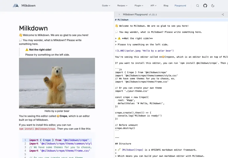
A Markdown playground pairs a rendered document with its editable source.
Useful for: Help users compare source syntax with the formatted result while keeping both in view.
# Design reference: Milkdown — Markdown editor
Source: https://milkdown.dev/playground
Swipefile reference: https://swipefile.design/ref/milkdown-editor/
Captured: 2026-09-05. This is a dated reference, not a claim about the current live product.
Capture scope: one viewport. Do not infer unseen page sections or a complete user flow.

## Objective
Adapt the interaction and layout patterns below to my project. Use my own content and identity. Do not reproduce logos, proprietary copy, or brand assets.

## Reference notes
- surface: Markdown editor
- nav: The product header and playground selector sit above the working panes.
- layout: Two tall panes place the formatted article on the left and Markdown on the right.
- density: Primary content has the most space; repeated rows and secondary navigation use a compact, consistent rhythm.
- color: Pale neutral surfaces, dark text, syntax colors, and a sample document image.
- typography: Rendered headings and body text contrast with the source pane's monospace syntax.
- pattern: Help users compare source syntax with the formatted result while keeping both in view.
- states: Public editor playground displaying its supplied starter document.
- dont: Adapt the interaction pattern to your own product. Do not copy brand assets, sample identities, proprietary text, or assume unseen states. Specify keyboard behavior, loading, empty, error, and narrow-screen layouts for your implementation.

Useful for: Help users compare source syntax with the formatted result while keeping both in view.

## Acceptance criteria
- Existing project conventions, design tokens, working functionality, and unrelated changes are preserved.
- Two or three reference principles clearly support the user's task; conflicts are resolved in favor of usability and the existing product.
- Reusable components and semantic HTML express the interface. Available licensed assets are used; important UI text is never rendered as a bitmap.
- Every visible control has a defined behavior. Loading, empty, error, success, disabled, and long-content states are specified where relevant. Demo data is clearly labeled.
- Navigation and content adapt at 375px, 768px, and 1440px without horizontal page overflow. Keyboard use, visible focus, labeled inputs, at least 44px touch targets, readable contrast, and reduced motion are supported.
- Verification distinguishes rendered behavior from proposals and identifies anything still requiring a backend or external service.

## Quality bar
Clear hierarchy, consistent spacing, restrained surfaces, and purposeful motion. Avoid decorative gradients, excessive cards, placeholder buttons, and invented metrics unless the project calls for them. Do not claim a feature is connected or tested without evidence.
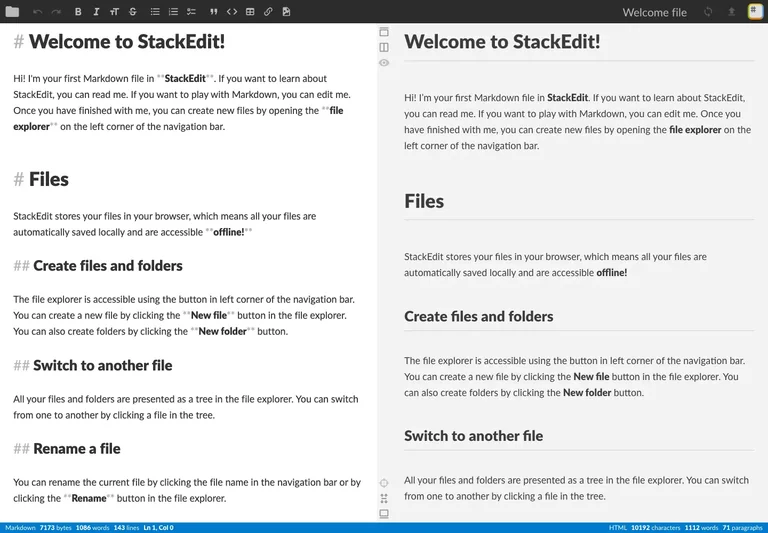
A writing workspace shows Markdown and a formatted preview side by side beneath a compact toolbar.
Useful for: Keep source editing and preview together without letting surrounding controls dominate the writing area.
# Design reference: StackEdit — Markdown workspace
Source: https://stackedit.io/app#
Swipefile reference: https://swipefile.design/ref/stackedit-editor/
Captured: 2026-09-05. This is a dated reference, not a claim about the current live product.
Capture scope: one viewport. Do not infer unseen page sections or a complete user flow.

## Objective
Adapt the interaction and layout patterns below to my project. Use my own content and identity. Do not reproduce logos, proprietary copy, or brand assets.

## Reference notes
- surface: Markdown workspace
- nav: File navigation, formatting tools, preview controls, and workspace menu are separated in the top bar.
- layout: Two equal document panes occupy the screen, with file identity and editing controls across the top.
- density: Primary content has the most space; repeated rows and secondary navigation use a compact, consistent rhythm.
- color: Dark toolbar over white and pale-gray document surfaces.
- typography: Readable document headings and body text appear alongside the corresponding Markdown source.
- pattern: Keep source editing and preview together without letting surrounding controls dominate the writing area.
- states: Public app with its built-in welcome document; tutorial and installation prompts dismissed.
- dont: Adapt the interaction pattern to your own product. Do not copy brand assets, sample identities, proprietary text, or assume unseen states. Specify keyboard behavior, loading, empty, error, and narrow-screen layouts for your implementation.

Useful for: Keep source editing and preview together without letting surrounding controls dominate the writing area.

## Acceptance criteria
- Existing project conventions, design tokens, working functionality, and unrelated changes are preserved.
- Two or three reference principles clearly support the user's task; conflicts are resolved in favor of usability and the existing product.
- Reusable components and semantic HTML express the interface. Available licensed assets are used; important UI text is never rendered as a bitmap.
- Every visible control has a defined behavior. Loading, empty, error, success, disabled, and long-content states are specified where relevant. Demo data is clearly labeled.
- Navigation and content adapt at 375px, 768px, and 1440px without horizontal page overflow. Keyboard use, visible focus, labeled inputs, at least 44px touch targets, readable contrast, and reduced motion are supported.
- Verification distinguishes rendered behavior from proposals and identifies anything still requiring a backend or external service.

## Quality bar
Clear hierarchy, consistent spacing, restrained surfaces, and purposeful motion. Avoid decorative gradients, excessive cards, placeholder buttons, and invented metrics unless the project calls for them. Do not claim a feature is connected or tested without evidence.
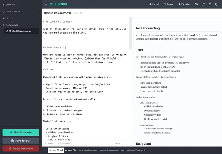
A Markdown editor keeps document navigation beside source and rendered-preview panes.
Useful for: Separate document management from editing and keep import/export near the workspace boundary.
# Design reference: Dillinger — Markdown editor
Source: https://dillinger.io/
Swipefile reference: https://swipefile.design/ref/dillinger-editor/
Captured: 2026-09-05. This is a dated reference, not a claim about the current live product.
Capture scope: one viewport. Do not infer unseen page sections or a complete user flow.

## Objective
Adapt the interaction and layout patterns below to my project. Use my own content and identity. Do not reproduce logos, proprietary copy, or brand assets.

## Reference notes
- surface: Markdown editor
- nav: Import, export, and configuration actions share the top bar; document actions stay in the rail.
- layout: A dark left rail holds document actions; the main area splits source from formatted output.
- density: Primary content has the most space; repeated rows and secondary navigation use a compact, consistent rhythm.
- color: Dark slate navigation, white editing surfaces, and a teal new-document action.
- typography: Monospaced source contrasts with proportional preview typography and compact navigation labels.
- pattern: Separate document management from editing and keep import/export near the workspace boundary.
- states: Public editor with its supplied welcome document and preview.
- dont: Adapt the interaction pattern to your own product. Do not copy brand assets, sample identities, proprietary text, or assume unseen states. Specify keyboard behavior, loading, empty, error, and narrow-screen layouts for your implementation.

Useful for: Separate document management from editing and keep import/export near the workspace boundary.

## Acceptance criteria
- Existing project conventions, design tokens, working functionality, and unrelated changes are preserved.
- Two or three reference principles clearly support the user's task; conflicts are resolved in favor of usability and the existing product.
- Reusable components and semantic HTML express the interface. Available licensed assets are used; important UI text is never rendered as a bitmap.
- Every visible control has a defined behavior. Loading, empty, error, success, disabled, and long-content states are specified where relevant. Demo data is clearly labeled.
- Navigation and content adapt at 375px, 768px, and 1440px without horizontal page overflow. Keyboard use, visible focus, labeled inputs, at least 44px touch targets, readable contrast, and reduced motion are supported.
- Verification distinguishes rendered behavior from proposals and identifies anything still requiring a backend or external service.

## Quality bar
Clear hierarchy, consistent spacing, restrained surfaces, and purposeful motion. Avoid decorative gradients, excessive cards, placeholder buttons, and invented metrics unless the project calls for them. Do not claim a feature is connected or tested without evidence.
Allow basic usage counts to help us understand what is useful. Your board contents stay out of analytics. Details
Your browser’s privacy preference keeps analytics off.