3 Search and Filter UI Examples for Different Kinds of Results
Search results should expose the information that helps someone choose a result. Books, jobs, and images need different comparison details even when all three use a search field and filters. These examples show why the result object should shape the layout before you choose between cards and rows.
Key takeaways
- Choose result metadata according to the decision being made.
- Keep the current query and refinements visible.
- Explain how to recover when a useful search becomes too narrow.
Editorial observations of dated captures, not measured performance rankings. Original sites may have changed. Our approach.
1. Open Library: keep descriptive metadata with each result
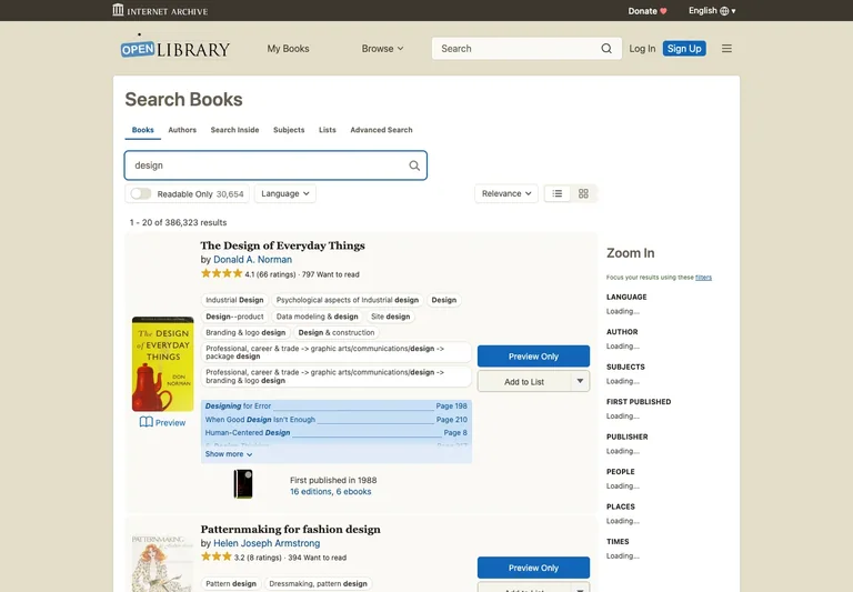
The book-search capture combines covers with titles, authors, publication details, and availability-related actions. The list makes it possible to inspect more than the image before opening a result.
Adapt it: For records with meaningful editions or attributes, keep those distinctions attached to the item. Use the thumbnail as recognition support while the text does the precise identification.
Watch for: A result with a long title must still expose the facts needed to distinguish it from similar records. Avoid making every card the height of the shortest title.
2. Tabler: use consistent rows for comparison
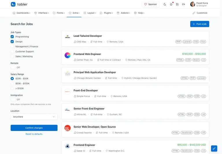
The public job-listing demo places employment filters beside concise vacancy rows. Repeated positions for the role, organization, location, and other metadata create a stable scanning pattern.
Adapt it: Use rows when people repeatedly compare the same attributes. Decide which facts belong in the result and which can wait for the detail view.
Watch for: Small tags can quickly become a second paragraph. Prioritize the labels that change a decision and explain unfamiliar terms rather than adding every possible attribute.
3. Wikimedia Commons: let visual results stay visual
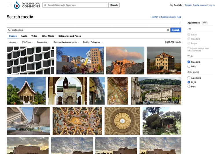
The media-search capture gives most of the surface to image thumbnails, with content-type choices and refinement controls above. The result type is visible before the visitor opens an individual image.
Adapt it: Use a visual grid when appearance is central to the choice. Keep a clear route from the preview to the source and the metadata needed for the intended use.
Watch for: A thumbnail is not permission to reuse an image. Preserve access to source and rights information, and verify the individual asset’s terms before using it.
Define the result object first
Write the minimum useful description of one result. For a job, that could include the role, location, and employment arrangement. For a book, author and edition may matter. For an image, the preview may dominate, but source details still need a reachable destination.
Use those requirements to choose the presentation. A grid is not inherently more modern than a list. A list that supports comparison can be the clearer interface, especially when the user is searching for a specific record rather than exploring visually.
Separate sorting from filtering
A filter changes which results qualify; sorting changes their order. Keep those ideas distinguishable in labels and placement. If a choice changes both, explain the effect rather than relying on an ambiguous control name.
Show active refinements and make individual ones removable. A reset action should have an understandable scope: all filters, one group, or the entire query. Avoid clearing the search text unexpectedly when someone only meant to remove a category.
Design the zero-result branch
A search can return no matches because of the query, a combination of filters, or a service problem. These are different conditions. An empty result set should preserve the current choices and suggest a relevant way to broaden the search.
For a network failure, do not claim there are no matching items. Show that the result could not be retrieved and offer a retry when appropriate. The state-design guide explains how to separate these conditions.
Keep context when a result opens
Decide whether returning from a detail page restores the previous query, refinements, and useful scroll position. That behavior can matter more than the exact shape of the search field. A visitor comparing several results should not have to reconstruct the search after each inspection.
On mobile, a filter panel can move into a disclosure or separate surface, but the active state still needs to be visible near the results. For a commerce-specific application, compare the ecommerce discovery examples. Build the search around the decision, then use a reference to refine its visual rhythm.
Common questions
Should search results use cards or a table?
Choose the format that exposes the facts people need to compare. Visual exploration often benefits from a grid; records with repeated comparable attributes may be clearer in rows or a table.