AI Chat
CURATED COLLECTION · 4 REFERENCES
Search, chat, model pickers, and prompts.
Copy the reference notes below and paste them into Claude, ChatGPT, or your coding assistant. Add what you want to build.
Includes design notes, original sources, and preview links. An assistant that supports browsing can also read the public board link.
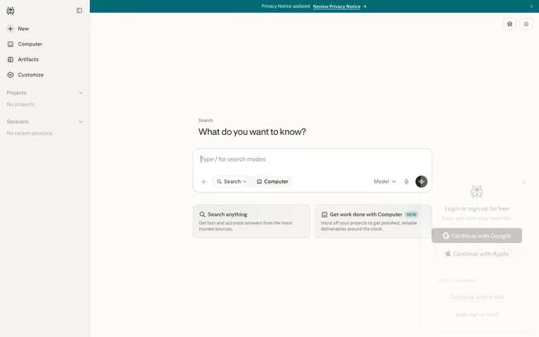
An answer-engine home where the composer is the entire product: one question as the headline, one oversized input carrying its own mode chips and model picker, and two cards that teach the modes.
Useful for: Mode chips inside the composer. Instead of tabs or a nav switch, Perplexity puts the product's two modes — 'Search' (with a dropdown chevron) and 'Computer' — as toggle chips INSIDE the input card's bottom row, next to the + attach button, the Model picker, and the mic. Switching what the app does is part of composing the request, not a navigation act, and the input becomes a self-documenting command surface. The two suggestion cards below ('Search anything' / 'Get work done with Computer', the second wearing a NEW badge) each explain one mode in a title plus two grey lines, so the empty state doubles as the feature tour. Steal this for any multi-mode AI product: modes live in the composer, and the empty state's suggestions map one-to-one onto those modes.
# Design reference: Perplexity — Home
Source: https://www.perplexity.ai
Swipefile reference: https://swipefile.design/ref/perplexity-chat/
Captured: 2026-08-09. This is a dated reference, not a claim about the current live product.
Capture scope: a page excerpt. Do not infer unseen sections or interactions.

## Objective
Adapt the interaction and layout patterns below to my project. Use my own content and identity. Do not reproduce logos, proprietary copy, or brand assets.

## Reference notes
- surface: Logged-out home: notice banner, left sidebar, and the centred ask-anything hero with suggestion cards
- nav: A ~240px light sidebar: logomark and collapse icon up top, then icon+label items at ~15px — New (with a + in a dark circle), Computer, Artifacts, Customize — followed by two collapsible sections, 'Projects' and 'Sessions', each showing a quiet grey empty line ('No projects', 'No recent sessions'). Two icon buttons float top-right of the main pane.
- layout: Sidebar plus one centred column. The hero stack — eyebrow, headline, input card, suggestion-card pair — sits slightly above vertical centre; everything else is off-white breathing room. A full-width teal notice banner runs across the very top.
- density: Extremely sparse. One headline, one input, two cards. The sidebar holds six items and two empty sections. The screen bets everything on the composer.
- color: Warm off-white canvas with a paper feel, near-black text, grey secondary text. The accent is a deep teal, spent on the top banner, the submit button in the input, and small highlights; the active 'Computer' chip gets a light tint. No other colour anywhere.
- typography: A quiet serif-inflected face for the headline — 'What do you want to know?' at ~32px regular, warm not shouty — over a tiny grey 'Search' eyebrow at ~13px. Sidebar and chips at ~14-15px; card titles ~15px medium with ~13px grey body lines.
- pattern: The composer as command surface: a large rounded input card (~640px wide) whose bottom row is a toolbar — + attach, a 'Search ⌄' chip, a 'Computer' chip, then right-aligned Model ⌄ picker, mic icon, and a round teal submit button. Every capability of the product is physically attached to the box where you type.
- states: A fresh-account state that stays composed: Projects and Sessions sections render with grey one-line empties instead of hiding, the input shows a teaching placeholder ('Type / for search modes'), and the suggestion cards stand in for history. The NEW badge marks the newer mode without redesigning anything.
- dont: Don't move the mode switch out of the composer into tabs or the sidebar — the input stops being the product. And don't add a second accent: the page's calm depends on teal being the only saturated thing on an off-white field.

Useful for: Mode chips inside the composer. Instead of tabs or a nav switch, Perplexity puts the product's two modes — 'Search' (with a dropdown chevron) and 'Computer' — as toggle chips INSIDE the input card's bottom row, next to the + attach button, the Model picker, and the mic. Switching what the app does is part of composing the request, not a navigation act, and the input becomes a self-documenting command surface. The two suggestion cards below ('Search anything' / 'Get work done with Computer', the second wearing a NEW badge) each explain one mode in a title plus two grey lines, so the empty state doubles as the feature tour. Steal this for any multi-mode AI product: modes live in the composer, and the empty state's suggestions map one-to-one onto those modes.

## Acceptance criteria
- Existing project conventions, design tokens, working functionality, and unrelated changes are preserved.
- Two or three reference principles clearly support the user's task; conflicts are resolved in favor of usability and the existing product.
- Reusable components and semantic HTML express the interface. Available licensed assets are used; important UI text is never rendered as a bitmap.
- Every visible control has a defined behavior. Loading, empty, error, success, disabled, and long-content states are specified where relevant. Demo data is clearly labeled.
- Navigation and content adapt at 375px, 768px, and 1440px without horizontal page overflow. Keyboard use, visible focus, labeled inputs, at least 44px touch targets, readable contrast, and reduced motion are supported.
- Verification distinguishes rendered behavior from proposals and identifies anything still requiring a backend or external service.

## Quality bar
Clear hierarchy, consistent spacing, restrained surfaces, and purposeful motion. Avoid decorative gradients, excessive cards, placeholder buttons, and invented metrics unless the project calls for them. Do not claim a feature is connected or tested without evidence.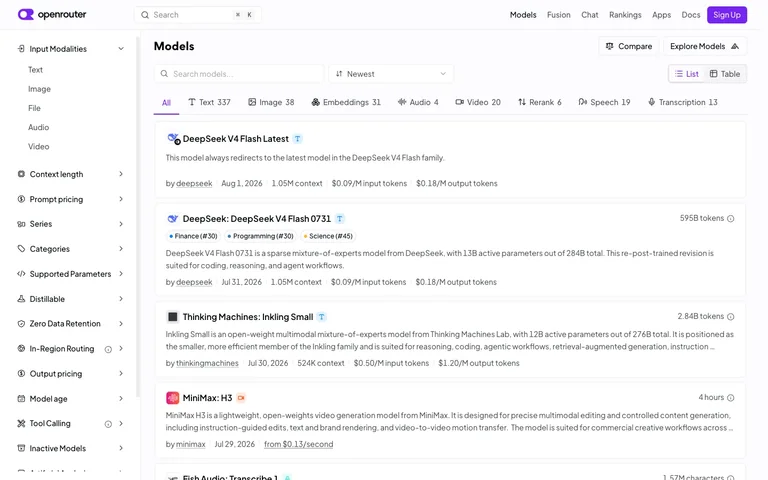
An enormous filter surface — 13+ collapsible facet sections at a fixed 240px — sits permanently open on the left, and the payoff is one pipe-separated meta line per card that answers author, recency and three price points without opening anything.
Useful for: The pipe-separated meta line — 'by author | date | context length | input price | output price' — as a way to pack five hard numbers into one scannable row per result card. Pair it with the modality tab strip (All, Text 337, Image 38, Embeddings 31...) as a lighter, always-visible alternative to burying the single most common filter inside the sidebar.
# Design reference: OpenRouter — Model directory
Source: https://openrouter.ai/models
Swipefile reference: https://swipefile.design/ref/openrouter-models/
Captured: 2026-08-01. This is a dated reference, not a claim about the current live product.
Capture scope: a page excerpt. Do not infer unseen sections or interactions.

## Objective
Adapt the interaction and layout patterns below to my project. Use my own content and identity. Do not reproduce logos, proprietary copy, or brand assets.

## Reference notes
- surface: Model directory / browse list, logged out
- nav: Two tiers: a top bar (logo, search, primary nav links, Sign Up) and a left facet sidebar that functions as the real navigation — 13+ collapsible sections stacked vertically, only the top one expanded by default.
- layout: Fixed ~240px left sidebar with its own scroll, fluid main column. Inside the main column, a secondary horizontal facet — the modality tab strip — sits above a vertical stack of full-width bordered result cards.
- density: Tight sidebar rows (~36px) built for scanning many filters fast; roomier result cards (~110px+, 2-3 lines of description each) built for reading. The two densities coexist without feeling mismatched because the sidebar stays monochrome.
- color: Almost entirely grayscale — white surfaces, grey borders and meta text, black headings. The one accent color (violet) is spent only on the logo mark and the Sign Up button; category tag pills use muted low-saturation dot colors and stay small.
- typography: One sans. Model names are the largest text on a card (~16px semibold); everything else — description, meta line, sidebar labels — sits at 13-14px regular. Hierarchy comes from the meta line's pipe structure, not from type size.
- pattern: A five-field pipe-separated meta line per result card (author | date | context | input price | output price) that turns a plain list row into a comparison table without ever drawing a grid.
- states: Logged out: Sign Up button top right, no empty or loading state visible — the list is fully populated with live pricing, token counts and recency data on every card.
- dont: Don't let the sidebar's 13+ sections all render expanded at once. The pattern only works because most stay collapsed to a single row — expand them all and the 240px column becomes longer than the result list it's supposed to filter.

Useful for: The pipe-separated meta line — 'by author | date | context length | input price | output price' — as a way to pack five hard numbers into one scannable row per result card. Pair it with the modality tab strip (All, Text 337, Image 38, Embeddings 31...) as a lighter, always-visible alternative to burying the single most common filter inside the sidebar.

## Acceptance criteria
- Existing project conventions, design tokens, working functionality, and unrelated changes are preserved.
- Two or three reference principles clearly support the user's task; conflicts are resolved in favor of usability and the existing product.
- Reusable components and semantic HTML express the interface. Available licensed assets are used; important UI text is never rendered as a bitmap.
- Every visible control has a defined behavior. Loading, empty, error, success, disabled, and long-content states are specified where relevant. Demo data is clearly labeled.
- Navigation and content adapt at 375px, 768px, and 1440px without horizontal page overflow. Keyboard use, visible focus, labeled inputs, at least 44px touch targets, readable contrast, and reduced motion are supported.
- Verification distinguishes rendered behavior from proposals and identifies anything still requiring a backend or external service.

## Quality bar
Clear hierarchy, consistent spacing, restrained surfaces, and purposeful motion. Avoid decorative gradients, excessive cards, placeholder buttons, and invented metrics unless the project calls for them. Do not claim a feature is connected or tested without evidence.
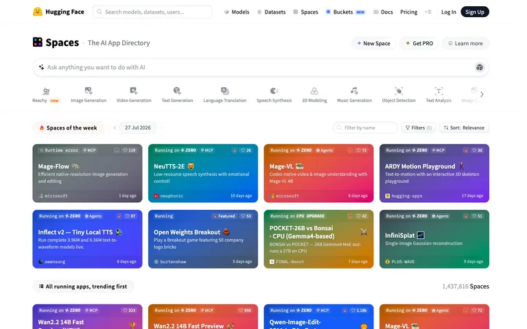
Every card is a colour field first and a screenshot never — status, likes and org are all overlaid badges sitting directly on a full-bleed gradient, so the grid reads as a wall of mood rather than a wall of screenshots.
Useful for: The badge stack overlaid directly on a full-bleed gradient card: a status pill top-left (Running on ZERO / Runtime error / Running) plus tag pills (MCP, Agents), an engagement count top-right, and an org avatar plus relative-time footer baked into the bottom of the same coloured surface — no screenshot asset required at all. Also worth lifting: the horizontally-scrollable category icon rail sitting between global nav and the results grid, a content-specific third nav tier that never competes with primary nav.
# Design reference: Hugging Face — Spaces directory
Source: https://huggingface.co/spaces
Swipefile reference: https://swipefile.design/ref/huggingface-spaces/
Captured: 2026-08-01. This is a dated reference, not a claim about the current live product.
Capture scope: a page excerpt. Do not infer unseen sections or interactions.

## Objective
Adapt the interaction and layout patterns below to my project. Use my own content and identity. Do not reproduce logos, proprietary copy, or brand assets.

## Reference notes
- surface: Spaces directory homepage — the AI App Directory index
- nav: Two tiers plus a content-level filter rail. Global top nav (logo, search, Models/Datasets/Spaces/Buckets/Docs/Pricing, Log In/Sign Up) is one thin white bar. Below it a page header (Spaces title + New Space/Get PRO/Learn more actions), then a full-width AI prompt bar, then a horizontally scrollable row of category icons (Image Generation, Video Generation, and so on) acting as a third, content-specific nav tier.
- layout: Fluid single column down to a 4-column card grid. Nothing is pinned or fixed; the whole page scrolls as one document. The category icon row scrolls its own horizontal axis independent of page scroll.
- density: Loose. Cards run roughly 4:3, gutters are generous, and each card has exactly one focal point. Built for browsing, not scanning a dataset.
- color: White chrome everywhere except the cards. Every card thumbnail is a distinct saturated gradient (teal, red-orange, purple, indigo, green) that IS the visual identity of that Space — there's no product screenshot, the colour itself is the branding. Status badges sit on dark translucent chips rather than their own hue, so they stay legible over any gradient.
- typography: One grotesque sans throughout. The page title 'Spaces' is boldest and largest; card titles are white semibold sitting on the gradient for contrast; descriptions drop to a lighter white/grey on the same surface; footer metadata is the smallest size on the card.
- pattern: The gradient-card-as-full-metadata-surface: status pill, tag pills, like count, emoji plus title, description, org avatar and timestamp are all badges layered on one colour field, so a card is legible and scannable with zero screenshot or thumbnail asset required.
- states: Live cards show 'Running on ZERO' in a status-coloured chip; a broken one shows 'Runtime error' in the same position and size, so the eye scans status across the whole grid without reading. A trophy icon appears on the highest-liked card as an implicit rank signal.
- dont: Don't build these as image thumbnails with badges glued on afterward. The gradient has to BE the card background — a generated colour field, not a screenshot with a status strip bolted underneath — or every card needs custom art and the wall stops being uniform.

Useful for: The badge stack overlaid directly on a full-bleed gradient card: a status pill top-left (Running on ZERO / Runtime error / Running) plus tag pills (MCP, Agents), an engagement count top-right, and an org avatar plus relative-time footer baked into the bottom of the same coloured surface — no screenshot asset required at all. Also worth lifting: the horizontally-scrollable category icon rail sitting between global nav and the results grid, a content-specific third nav tier that never competes with primary nav.

## Acceptance criteria
- Existing project conventions, design tokens, working functionality, and unrelated changes are preserved.
- Two or three reference principles clearly support the user's task; conflicts are resolved in favor of usability and the existing product.
- Reusable components and semantic HTML express the interface. Available licensed assets are used; important UI text is never rendered as a bitmap.
- Every visible control has a defined behavior. Loading, empty, error, success, disabled, and long-content states are specified where relevant. Demo data is clearly labeled.
- Navigation and content adapt at 375px, 768px, and 1440px without horizontal page overflow. Keyboard use, visible focus, labeled inputs, at least 44px touch targets, readable contrast, and reduced motion are supported.
- Verification distinguishes rendered behavior from proposals and identifies anything still requiring a backend or external service.

## Quality bar
Clear hierarchy, consistent spacing, restrained surfaces, and purposeful motion. Avoid decorative gradients, excessive cards, placeholder buttons, and invented metrics unless the project calls for them. Do not claim a feature is connected or tested without evidence.
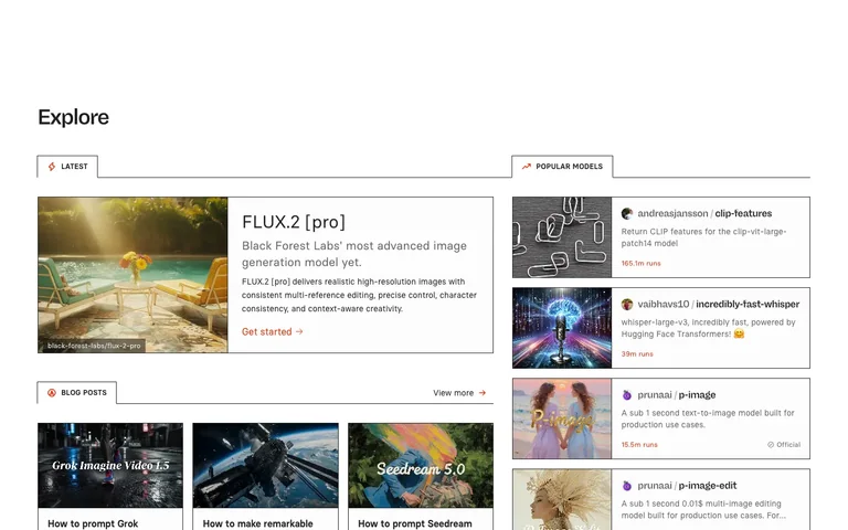
Two unrelated feeds run side by side, each owning its own tab strip, and the active tab in both is drawn as a bordered box with no bottom edge — so it visually fuses into the panel it controls instead of sitting above it.
Useful for: The open-bottomed active tab: a 1px-bordered box around the tab label with the border removed on the bottom edge, so the tab and the content panel below it read as one continuous shape, like a folder tab. Steal this for any module where the active-state indicator should feel structurally attached to its content rather than just a color change. Also take the twin-panel layout — two independently-tabbed regions side by side (Latest/Blog Posts on the left, Popular Models on the right) — so one page can serve two unrelated content types without a shared filter bar trying to do both jobs.
# Design reference: Replicate — Explore
Source: https://replicate.com/explore
Swipefile reference: https://swipefile.design/ref/replicate-explore/
Captured: 2026-08-01. This is a dated reference, not a claim about the current live product.
Capture scope: a page excerpt. Do not infer unseen sections or interactions.

## Objective
Adapt the interaction and layout patterns below to my project. Use my own content and identity. Do not reproduce logos, proprietary copy, or brand assets.

## Reference notes
- surface: Replicate /explore page, logged out, default view
- nav: No global nav visible in this crop — the page opens directly on a bold 'Explore' heading with heavy top whitespace, then splits into two independent content panels, each with its own local tab strip and no shared top-level tabs.
- layout: Two-column layout below the heading: a wider left panel (~775px) and a narrower right panel (~500px) with a gutter between them. Each panel scrolls its own content vertically; there's no fixed sidebar in the crop.
- density: Comfortable list rows (~90-100px) with generous line-height on descriptions; thumbnails are small and secondary (~90px square or a ~320px banner) so each row reads primarily as text, with the image as an anchor rather than the focus.
- color: White canvas, near-black headings, mid-grey body text. One accent — a red-orange (~#f15f31) — is reserved entirely for run counts, 'Get started'/'View more' links, and the tab icons. Nothing else on the page uses color.
- typography: The page heading is bold at ~40px; tab labels are small (~13px), uppercase, bold, letter-spaced so they read as section labels rather than buttons; model and post titles are ~16-24px bold; run counts are bold and colored — the only colored numerals on the page.
- pattern: The fused tab-to-panel border: the active tab is drawn with a top and side border but no bottom border, sitting flush against a full-width rule that continues from where its missing edge would be — so the tab reads as a flap opening directly into its content.
- states: No loading or empty state visible — both panels are fully populated on load. Officially-verified model rows carry a small checkmark 'Official' badge next to the run count, a trust signal shown inline rather than as a separate filter.
- dont: Don't give both panels a shared tab row at the top of the page — the whole value is that Latest/Blog Posts and Popular Models are unrelated feeds with independent state, and merging their tabs into one strip would force them to share a selection they don't share content for.

Useful for: The open-bottomed active tab: a 1px-bordered box around the tab label with the border removed on the bottom edge, so the tab and the content panel below it read as one continuous shape, like a folder tab. Steal this for any module where the active-state indicator should feel structurally attached to its content rather than just a color change. Also take the twin-panel layout — two independently-tabbed regions side by side (Latest/Blog Posts on the left, Popular Models on the right) — so one page can serve two unrelated content types without a shared filter bar trying to do both jobs.

## Acceptance criteria
- Existing project conventions, design tokens, working functionality, and unrelated changes are preserved.
- Two or three reference principles clearly support the user's task; conflicts are resolved in favor of usability and the existing product.
- Reusable components and semantic HTML express the interface. Available licensed assets are used; important UI text is never rendered as a bitmap.
- Every visible control has a defined behavior. Loading, empty, error, success, disabled, and long-content states are specified where relevant. Demo data is clearly labeled.
- Navigation and content adapt at 375px, 768px, and 1440px without horizontal page overflow. Keyboard use, visible focus, labeled inputs, at least 44px touch targets, readable contrast, and reduced motion are supported.
- Verification distinguishes rendered behavior from proposals and identifies anything still requiring a backend or external service.

## Quality bar
Clear hierarchy, consistent spacing, restrained surfaces, and purposeful motion. Avoid decorative gradients, excessive cards, placeholder buttons, and invented metrics unless the project calls for them. Do not claim a feature is connected or tested without evidence.
Allow basic usage counts to help us understand what is useful. Your board contents stay out of analytics. Details
Your browser’s privacy preference keeps analytics off.