Docs & Notebooks
CURATED COLLECTION · 6 REFERENCES
Document chat, video prompts, private-chat entry, project onboarding and interactive machine-learning tools. Captured states and built-in demos are identified.
Copy the reference notes below and paste them into Claude, ChatGPT, or your coding assistant. Add what you want to build.
Includes design notes, original sources, and preview links. An assistant that supports browsing can also read the public board link.
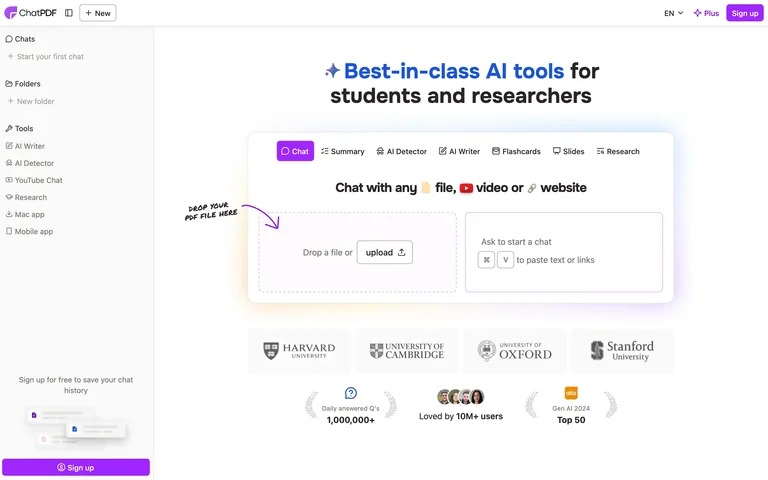
A signed-out document-chat home with upload and text-entry options.
Useful for: Offer upload and pasted-content starts together, while keeping chat history visible in the sidebar.
# Design reference: ChatPDF — Document chat start
Source: https://www.chatpdf.com/
Swipefile reference: https://swipefile.design/ref/ai-chatpdf-upload/
Captured: 2026-09-05. This is a dated reference, not a claim about the current live product.
Capture scope: one viewport. Do not infer unseen page sections or a complete user flow.

## Objective
Adapt the interaction and layout patterns below to my project. Use my own content and identity. Do not reproduce logos, proprietary copy, or brand assets.

## Reference notes
- surface: A signed-out document-chat home with upload and text-entry options.
- nav: A left sidebar contains chats, folders and related tools.
- layout: A central tabbed tool panel offers a file drop zone beside a text-or-link entry area.
- density: Open main canvas with a compact utility sidebar.
- color: White and pale grey with purple accents.
- typography: Bold introductory text and small sans-serif control labels.
- pattern: Offer upload and pasted-content starts together, while keeping chat history visible in the sidebar.
- states: Empty public starting state; no files uploaded or questions submitted.
- dont: Adapt the layout to your own product and supported capabilities; write your own examples and keep important actions clearly labeled.

Useful for: Offer upload and pasted-content starts together, while keeping chat history visible in the sidebar.

## Acceptance criteria
- Existing project conventions, design tokens, working functionality, and unrelated changes are preserved.
- Two or three reference principles clearly support the user's task; conflicts are resolved in favor of usability and the existing product.
- Reusable components and semantic HTML express the interface. Available licensed assets are used; important UI text is never rendered as a bitmap.
- Every visible control has a defined behavior. Loading, empty, error, success, disabled, and long-content states are specified where relevant. Demo data is clearly labeled.
- Navigation and content adapt at 375px, 768px, and 1440px without horizontal page overflow. Keyboard use, visible focus, labeled inputs, at least 44px touch targets, readable contrast, and reduced motion are supported.
- Verification distinguishes rendered behavior from proposals and identifies anything still requiring a backend or external service.

## Quality bar
Clear hierarchy, consistent spacing, restrained surfaces, and purposeful motion. Avoid decorative gradients, excessive cards, placeholder buttons, and invented metrics unless the project calls for them. Do not claim a feature is connected or tested without evidence.
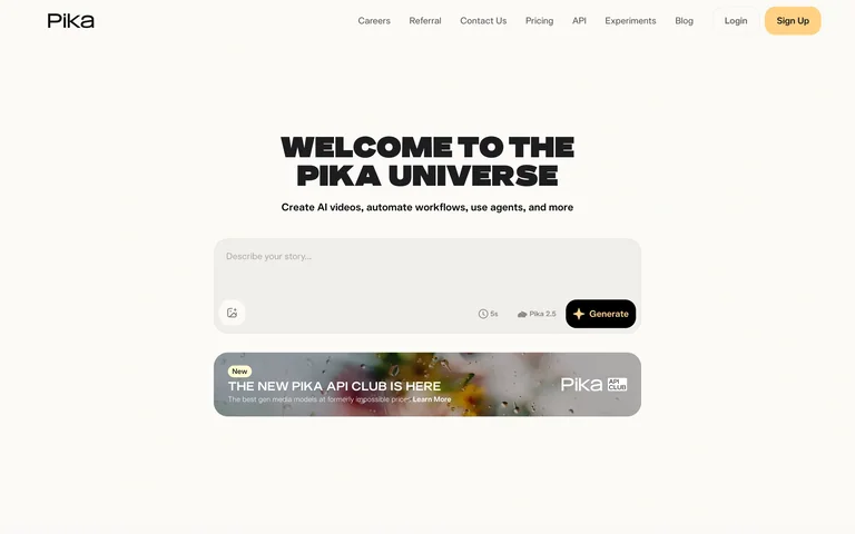
A public video-generation entry screen with a prompt, duration control and model selector.
Useful for: Keep duration, model and generation controls attached to the prompt field.
# Design reference: Pika — Video prompt entry
Source: https://pika.art/
Swipefile reference: https://swipefile.design/ref/ai-pika/
Captured: 2026-09-05. This is a dated reference, not a claim about the current live product.
Capture scope: one viewport. Do not infer unseen page sections or a complete user flow.

## Objective
Adapt the interaction and layout patterns below to my project. Use my own content and identity. Do not reproduce logos, proprietary copy, or brand assets.

## Reference notes
- surface: A public video-generation entry screen with a prompt, duration control and model selector.
- nav: Slim navigation covers pricing, experiments and account entry.
- layout: A compact centered prompt area sits below the main heading and above an announcement card.
- density: Low density around the primary input.
- color: Warm off-white, black type and pale yellow accents.
- typography: Heavy playful headline with small functional controls.
- pattern: Keep duration, model and generation controls attached to the prompt field.
- states: Signed-out starting state; no generation submitted.
- dont: Adapt the layout to your own product and supported capabilities; write your own examples and keep important actions clearly labeled.

Useful for: Keep duration, model and generation controls attached to the prompt field.

## Acceptance criteria
- Existing project conventions, design tokens, working functionality, and unrelated changes are preserved.
- Two or three reference principles clearly support the user's task; conflicts are resolved in favor of usability and the existing product.
- Reusable components and semantic HTML express the interface. Available licensed assets are used; important UI text is never rendered as a bitmap.
- Every visible control has a defined behavior. Loading, empty, error, success, disabled, and long-content states are specified where relevant. Demo data is clearly labeled.
- Navigation and content adapt at 375px, 768px, and 1440px without horizontal page overflow. Keyboard use, visible focus, labeled inputs, at least 44px touch targets, readable contrast, and reduced motion are supported.
- Verification distinguishes rendered behavior from proposals and identifies anything still requiring a backend or external service.

## Quality bar
Clear hierarchy, consistent spacing, restrained surfaces, and purposeful motion. Avoid decorative gradients, excessive cards, placeholder buttons, and invented metrics unless the project calls for them. Do not claim a feature is connected or tested without evidence.
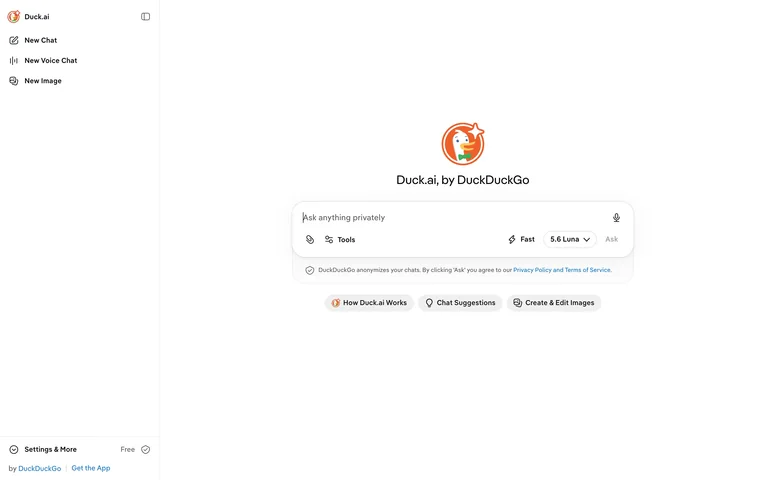
A public assistant starting screen with a central composer and a small persistent sidebar.
Useful for: Expose alternate input modes through a quiet sidebar while keeping the main composer focused.
# Design reference: Duck.ai — New chat
Source: https://duck.ai/
Swipefile reference: https://swipefile.design/ref/ai-duck-ai/
Captured: 2026-09-05. This is a dated reference, not a claim about the current live product.
Capture scope: one viewport. Do not infer unseen page sections or a complete user flow.

## Objective
Adapt the interaction and layout patterns below to my project. Use my own content and identity. Do not reproduce logos, proprietary copy, or brand assets.

## Reference notes
- surface: A public assistant starting screen with a central composer and a small persistent sidebar.
- nav: The sidebar groups new chat, voice and image entry points, with settings below.
- layout: An open central canvas places the brand above the composer and suggested help actions.
- density: Low density with one dominant input.
- color: White and light grey with an orange brand icon.
- typography: Simple sans-serif interface labels.
- pattern: Expose alternate input modes through a quiet sidebar while keeping the main composer focused.
- states: Empty new conversation; no message sent or image generated.
- dont: Adapt the layout to your own product and supported capabilities; write your own examples and keep important actions clearly labeled.

Useful for: Expose alternate input modes through a quiet sidebar while keeping the main composer focused.

## Acceptance criteria
- Existing project conventions, design tokens, working functionality, and unrelated changes are preserved.
- Two or three reference principles clearly support the user's task; conflicts are resolved in favor of usability and the existing product.
- Reusable components and semantic HTML express the interface. Available licensed assets are used; important UI text is never rendered as a bitmap.
- Every visible control has a defined behavior. Loading, empty, error, success, disabled, and long-content states are specified where relevant. Demo data is clearly labeled.
- Navigation and content adapt at 375px, 768px, and 1440px without horizontal page overflow. Keyboard use, visible focus, labeled inputs, at least 44px touch targets, readable contrast, and reduced motion are supported.
- Verification distinguishes rendered behavior from proposals and identifies anything still requiring a backend or external service.

## Quality bar
Clear hierarchy, consistent spacing, restrained surfaces, and purposeful motion. Avoid decorative gradients, excessive cards, placeholder buttons, and invented metrics unless the project calls for them. Do not claim a feature is connected or tested without evidence.
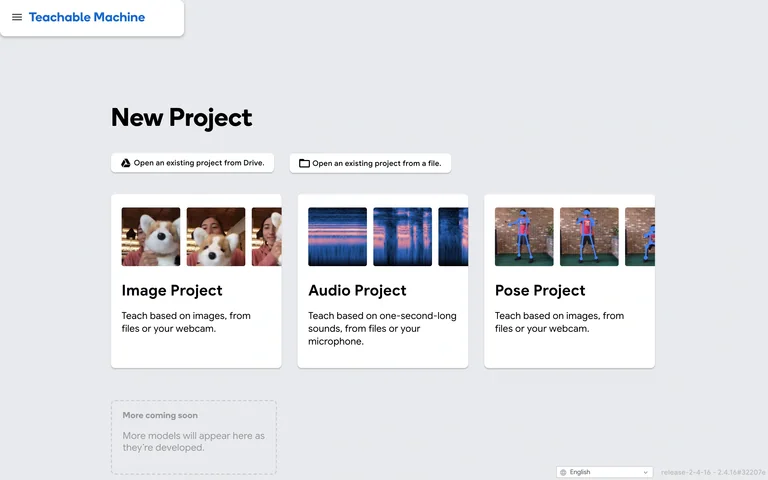
A machine-learning tool starts with a choice of image, audio or pose project.
Useful for: Help users choose a workflow by input type, using concrete images and short explanations.
# Design reference: Teachable Machine — Project chooser
Source: https://teachablemachine.withgoogle.com/train
Swipefile reference: https://swipefile.design/ref/ai-teachable-machine/
Captured: 2026-09-05. This is a dated reference, not a claim about the current live product.
Capture scope: one viewport. Do not infer unseen page sections or a complete user flow.

## Objective
Adapt the interaction and layout patterns below to my project. Use my own content and identity. Do not reproduce logos, proprietary copy, or brand assets.

## Reference notes
- surface: A machine-learning tool starts with a choice of image, audio or pose project.
- nav: A compact brand bar sits above the project chooser.
- layout: Three visual cards describe project types; existing-project options appear above them.
- density: Low density with one clear decision.
- color: Light grey canvas, white cards and blue accents.
- typography: Bold section and card headings with short plain-language descriptions.
- pattern: Help users choose a workflow by input type, using concrete images and short explanations.
- states: Initial project chooser; no camera, microphone or file access requested.
- dont: Adapt the layout to your own product and supported capabilities; write your own examples and keep important actions clearly labeled.

Useful for: Help users choose a workflow by input type, using concrete images and short explanations.

## Acceptance criteria
- Existing project conventions, design tokens, working functionality, and unrelated changes are preserved.
- Two or three reference principles clearly support the user's task; conflicts are resolved in favor of usability and the existing product.
- Reusable components and semantic HTML express the interface. Available licensed assets are used; important UI text is never rendered as a bitmap.
- Every visible control has a defined behavior. Loading, empty, error, success, disabled, and long-content states are specified where relevant. Demo data is clearly labeled.
- Navigation and content adapt at 375px, 768px, and 1440px without horizontal page overflow. Keyboard use, visible focus, labeled inputs, at least 44px touch targets, readable contrast, and reduced motion are supported.
- Verification distinguishes rendered behavior from proposals and identifies anything still requiring a backend or external service.

## Quality bar
Clear hierarchy, consistent spacing, restrained surfaces, and purposeful motion. Avoid decorative gradients, excessive cards, placeholder buttons, and invented metrics unless the project calls for them. Do not claim a feature is connected or tested without evidence.
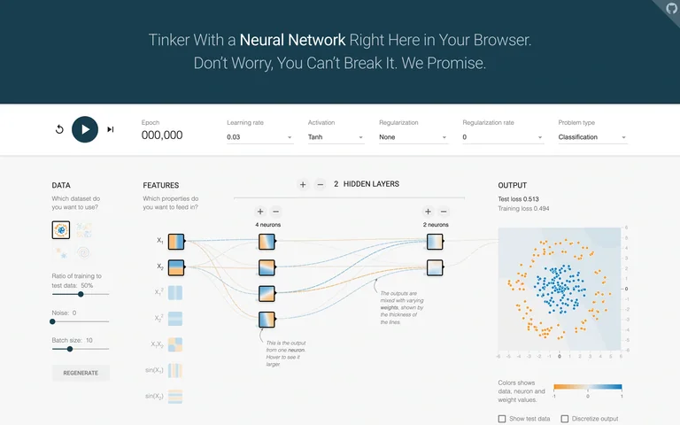
A neural-network playground exposes data, features, hidden layers and output in one view.
Useful for: Make the relationship between input data, model structure and output visible on one canvas.
# Design reference: TensorFlow Playground — Network controls Source: https://playground.tensorflow.org/#activation=tanh&batchSize=10&dataset=circle®Dataset=reg-plane&learningRate=0.03®ularizationRate=0&noise=0&networkShape=4,2&seed=0.47142&showTestData=false&discretize=false&percTrainData=50&x=true&y=true&xTimesY=false&xSquared=false&ySquared=false&cosX=false&sinX=false&cosY=false&sinY=false&collectStats=false&problem=classification&initZero=false&hideText=false Swipefile reference: https://swipefile.design/ref/ai-tensorflow-playground/ Captured: 2026-09-05. This is a dated reference, not a claim about the current live product. Capture scope: one viewport. Do not infer unseen page sections or a complete user flow. ## Objective Adapt the interaction and layout patterns below to my project. Use my own content and identity. Do not reproduce logos, proprietary copy, or brand assets. ## Reference notes - surface: A neural-network playground exposes data, features, hidden layers and output in one view. - nav: A top control strip holds playback and training parameters. - layout: A left-to-right pipeline connects dataset controls, feature nodes, hidden layers and an output chart. - density: High information density with aligned controls and a visual network. - color: White, teal, blue and orange. - typography: Small labels and numerical controls, grouped under uppercase section headings. - pattern: Make the relationship between input data, model structure and output visible on one canvas. - states: Built-in synthetic dataset before training, with the epoch counter at zero. - dont: Adapt the layout to your own product and supported capabilities; write your own examples and keep important actions clearly labeled. Useful for: Make the relationship between input data, model structure and output visible on one canvas. ## Acceptance criteria - Existing project conventions, design tokens, working functionality, and unrelated changes are preserved. - Two or three reference principles clearly support the user's task; conflicts are resolved in favor of usability and the existing product. - Reusable components and semantic HTML express the interface. Available licensed assets are used; important UI text is never rendered as a bitmap. - Every visible control has a defined behavior. Loading, empty, error, success, disabled, and long-content states are specified where relevant. Demo data is clearly labeled. - Navigation and content adapt at 375px, 768px, and 1440px without horizontal page overflow. Keyboard use, visible focus, labeled inputs, at least 44px touch targets, readable contrast, and reduced motion are supported. - Verification distinguishes rendered behavior from proposals and identifies anything still requiring a backend or external service. ## Quality bar Clear hierarchy, consistent spacing, restrained surfaces, and purposeful motion. Avoid decorative gradients, excessive cards, placeholder buttons, and invented metrics unless the project calls for them. Do not claim a feature is connected or tested without evidence.
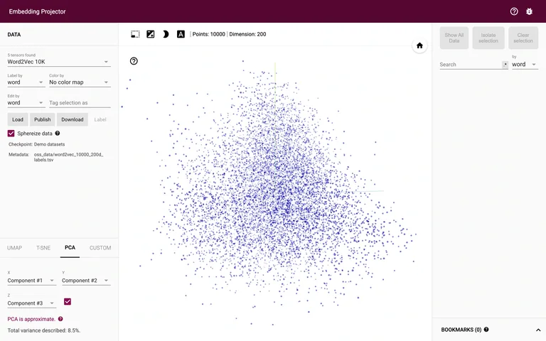
An embedding explorer displays a built-in word-vector dataset as a three-dimensional point cloud.
Useful for: Keep data and projection controls beside a large explorable visualization, with search separate on the right.
# Design reference: Embedding Projector — Vector exploration
Source: https://projector.tensorflow.org/
Swipefile reference: https://swipefile.design/ref/ai-embedding-projector/
Captured: 2026-09-05. This is a dated reference, not a claim about the current live product.
Capture scope: one viewport. Do not infer unseen page sections or a complete user flow.

## Objective
Adapt the interaction and layout patterns below to my project. Use my own content and identity. Do not reproduce logos, proprietary copy, or brand assets.

## Reference notes
- surface: An embedding explorer displays a built-in word-vector dataset as a three-dimensional point cloud.
- nav: A left panel selects data and projection methods; a right panel provides search and selection tools.
- layout: The central point cloud dominates the viewport between narrow control panels.
- density: Dense controls around a large visual analysis surface.
- color: White canvas, purple points and a dark burgundy header.
- typography: Compact technical labels and numerical metadata.
- pattern: Keep data and projection controls beside a large explorable visualization, with search separate on the right.
- states: Built-in word-vector demo dataset; no private data loaded or published.
- dont: Adapt the layout to your own product and supported capabilities; write your own examples and keep important actions clearly labeled.

Useful for: Keep data and projection controls beside a large explorable visualization, with search separate on the right.

## Acceptance criteria
- Existing project conventions, design tokens, working functionality, and unrelated changes are preserved.
- Two or three reference principles clearly support the user's task; conflicts are resolved in favor of usability and the existing product.
- Reusable components and semantic HTML express the interface. Available licensed assets are used; important UI text is never rendered as a bitmap.
- Every visible control has a defined behavior. Loading, empty, error, success, disabled, and long-content states are specified where relevant. Demo data is clearly labeled.
- Navigation and content adapt at 375px, 768px, and 1440px without horizontal page overflow. Keyboard use, visible focus, labeled inputs, at least 44px touch targets, readable contrast, and reduced motion are supported.
- Verification distinguishes rendered behavior from proposals and identifies anything still requiring a backend or external service.

## Quality bar
Clear hierarchy, consistent spacing, restrained surfaces, and purposeful motion. Avoid decorative gradients, excessive cards, placeholder buttons, and invented metrics unless the project calls for them. Do not claim a feature is connected or tested without evidence.
Allow basic usage counts to help us understand what is useful. Your board contents stay out of analytics. Details
Your browser’s privacy preference keeps analytics off.