Canvas & Whiteboard
CURATED COLLECTION · 4 REFERENCES
Canvases, editors, and contextual controls.
Copy the reference notes below and paste them into Claude, ChatGPT, or your coding assistant. Add what you want to build.
Includes design notes, original sources, and preview links. An assistant that supports browsing can also read the public board link.
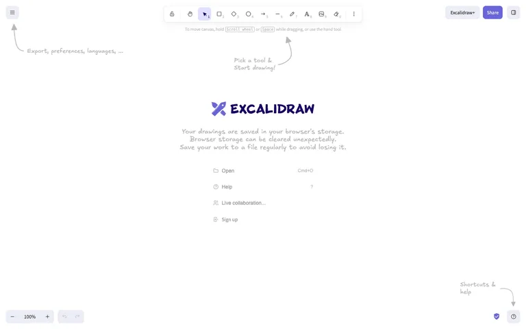
The first-run empty state is drawn in the product's own hand-sketched visual language — literal sketched arrows point at real toolbar chrome instead of a generic tooltip overlay.
Useful for: This shot is entirely about the first-run onboarding, not the canvas itself. Two hand-drawn SVG arrows point from empty space directly at real UI elements (the hamburger menu, the shortcuts/help buttons) with a one-line hand-lettered caption at each arrowhead — no modal, no spotlight overlay, no 'skip tour' button. It works because the annotation style matches the product's own drawing tool, so the tutorial never looks bolted on. Steal this for any canvas or creative tool: teach the chrome by drawing on top of it in the app's native voice instead of a generic coachmark library.
# Design reference: Excalidraw — Empty canvas
Source: https://excalidraw.com
Swipefile reference: https://swipefile.design/ref/excalidraw-canvas/
Captured: 2026-08-01. This is a dated reference, not a claim about the current live product.
Capture scope: a page excerpt. Do not infer unseen sections or interactions.

## Objective
Adapt the interaction and layout patterns below to my project. Use my own content and identity. Do not reproduce logos, proprietary copy, or brand assets.

## Reference notes
- surface: Excalidraw's default canvas, first load, before any shape has been drawn
- nav: Effectively one tier: a floating rounded toolbar centred at the top holds every tool (lock, hand, select, rectangle, diamond, ellipse, arrow, line, draw, text, image, eraser, overflow), each numbered 1-0 for its keyboard shortcut. A hamburger button floats independently top-left; zoom and undo/redo float bottom-left; Share and a panel toggle float top-right. Nothing is docked to a bar — every control is its own island.
- layout: Full-bleed canvas, no fixed panels. All chrome floats in rounded pill or card containers positioned over the canvas, so the drawing surface is the entire viewport.
- density: Extremely sparse. Large click targets on the toolbar, a huge open canvas, wide gaps between every floating element.
- color: Pure white canvas. The only saturated colour is the indigo/purple of the Excalidraw logo, the active-tool highlight, and the Share button. Every hint, warning and menu label is a light warm grey.
- typography: Two typefaces doing two jobs: a normal UI sans for real interface labels (menu list, keyboard-shortcut digits, Excalidraw+ pill) and a hand-drawn script font for the wordmark, the onboarding captions, and the arrow labels — the second one signals 'this is guidance, not a control.'
- pattern: In-brand annotation: hand-drawn arrows and captions overlaid directly on the canvas, in the same sketch style as the product's own output, pointing at real toolbar elements instead of opening a tour modal.
- states: First-run empty state only. No drawing exists yet, so the centre of the canvas holds the logo, a storage-warning notice ('saved in your browser's storage... save to a file regularly'), and a quick-action menu (Open, Help, Live collaboration, Sign up) standing in for content. This entire block disappears the moment a shape is drawn.
- dont: Don't leave the hand-drawn annotations on screen past first use — this is a first-run-only layer. Baking it permanently into the canvas would clutter every future session for a returning user.

Useful for: This shot is entirely about the first-run onboarding, not the canvas itself. Two hand-drawn SVG arrows point from empty space directly at real UI elements (the hamburger menu, the shortcuts/help buttons) with a one-line hand-lettered caption at each arrowhead — no modal, no spotlight overlay, no 'skip tour' button. It works because the annotation style matches the product's own drawing tool, so the tutorial never looks bolted on. Steal this for any canvas or creative tool: teach the chrome by drawing on top of it in the app's native voice instead of a generic coachmark library.

## Acceptance criteria
- Existing project conventions, design tokens, working functionality, and unrelated changes are preserved.
- Two or three reference principles clearly support the user's task; conflicts are resolved in favor of usability and the existing product.
- Reusable components and semantic HTML express the interface. Available licensed assets are used; important UI text is never rendered as a bitmap.
- Every visible control has a defined behavior. Loading, empty, error, success, disabled, and long-content states are specified where relevant. Demo data is clearly labeled.
- Navigation and content adapt at 375px, 768px, and 1440px without horizontal page overflow. Keyboard use, visible focus, labeled inputs, at least 44px touch targets, readable contrast, and reduced motion are supported.
- Verification distinguishes rendered behavior from proposals and identifies anything still requiring a backend or external service.

## Quality bar
Clear hierarchy, consistent spacing, restrained surfaces, and purposeful motion. Avoid decorative gradients, excessive cards, placeholder buttons, and invented metrics unless the project calls for them. Do not claim a feature is connected or tested without evidence.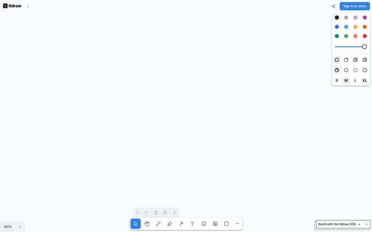
An infinite whiteboard where the app has almost no chrome: every control floats in small rounded white islands over an edge-to-edge canvas, and the workspace itself is the interface.
Useful for: The floating-island chrome system. There is no header bar, no sidebar, no panel column — the canvas runs edge to edge and every piece of UI is a self-contained rounded white card with a soft shadow, pinned to an edge or corner: style panel top-right, tool dock bottom-centre with a smaller undo/redo mini-bar floating just above it, zoom pill bottom-left, brand and share top corners. Each island holds exactly one job and can appear or vanish without any layout reflow. Steal this for any canvas-first tool (whiteboards, maps, diagram editors, image editors): define the canvas as the only layout, then attach controls as shadowed islands with ~8px corner radii and consistent edge margins. Also worth taking: the style panel's picker grammar — a 4-wide swatch grid, a slider, icon-only fill/dash rows, and S/M/L/XL text buttons, all in one narrow card.
# Design reference: tldraw — Canvas
Source: https://www.tldraw.com
Swipefile reference: https://swipefile.design/ref/tldraw-canvas/
Captured: 2026-08-09. This is a dated reference, not a claim about the current live product.
Capture scope: a page excerpt. Do not infer unseen sections or interactions.

## Objective
Adapt the interaction and layout patterns below to my project. Use my own content and identity. Do not reproduce logos, proprietary copy, or brand assets.

## Reference notes
- surface: Empty whiteboard: blank canvas with the default floating panels and an SDK toast
- nav: None in the traditional sense. Top-left holds the wordmark plus an overflow menu icon; top-right holds a share icon and a black 'Sign in to share' pill. Everything else is tool chrome, not navigation.
- layout: One layer of pure white canvas, edge to edge, with five floating islands: style panel (top-right), undo/redo mini-bar + main tool dock (bottom-centre, stacked), zoom control (bottom-left), and a dashed-border toast (bottom-right). Consistent ~12-16px margins from the viewport edges.
- density: The canvas is 95% empty; the islands are compact and tightly packed inside — the style panel fits a 12-swatch grid, a slider, 8 style pickers, and 4 size buttons in roughly 150x270px.
- color: White on white, separated by shadow. Canvas #fff, islands #fff with soft drop shadows and faint borders. Colour lives only in the swatch grid (12 saturated dots: blacks, greys, violets, blues, yellows, orange, greens, reds), the blue slider track, and a light-blue tint behind the active tool. The one filled button is the black sign-in pill.
- typography: Almost no text. S/M/L/XL size buttons at ~13px bold, the zoom readout '100%' at ~13px, the toast at ~13px medium. The interface is icons; type only appears where a symbol would be ambiguous.
- pattern: The bottom-centre tool dock: a single rounded island of ~40px icon-only buttons (select, hand, draw, eraser, arrow, text, note, image, shape, more-chevron) where the active tool gets a light-blue rounded fill — with the secondary actions (undo, redo, delete, duplicate, overflow) split into a separate, visually lighter mini-bar floating above it, so history actions never crowd the tools.
- states: Active states are quiet tints: the select tool sits on a pale-blue square, the current colour swatch and the M size button get light-grey backings. The SDK toast is styled as a dashed-border island with a close ×, clearly marked as removable. The empty canvas needs no empty-state copy at all — the dock is the invitation.
- dont: Don't give the canvas a header bar or dock the panels into fixed sidebars — the moment chrome touches two screen edges the infinite-canvas feel dies. And don't colour the tool icons; colour is data (the swatches), never chrome.

Useful for: The floating-island chrome system. There is no header bar, no sidebar, no panel column — the canvas runs edge to edge and every piece of UI is a self-contained rounded white card with a soft shadow, pinned to an edge or corner: style panel top-right, tool dock bottom-centre with a smaller undo/redo mini-bar floating just above it, zoom pill bottom-left, brand and share top corners. Each island holds exactly one job and can appear or vanish without any layout reflow. Steal this for any canvas-first tool (whiteboards, maps, diagram editors, image editors): define the canvas as the only layout, then attach controls as shadowed islands with ~8px corner radii and consistent edge margins. Also worth taking: the style panel's picker grammar — a 4-wide swatch grid, a slider, icon-only fill/dash rows, and S/M/L/XL text buttons, all in one narrow card.

## Acceptance criteria
- Existing project conventions, design tokens, working functionality, and unrelated changes are preserved.
- Two or three reference principles clearly support the user's task; conflicts are resolved in favor of usability and the existing product.
- Reusable components and semantic HTML express the interface. Available licensed assets are used; important UI text is never rendered as a bitmap.
- Every visible control has a defined behavior. Loading, empty, error, success, disabled, and long-content states are specified where relevant. Demo data is clearly labeled.
- Navigation and content adapt at 375px, 768px, and 1440px without horizontal page overflow. Keyboard use, visible focus, labeled inputs, at least 44px touch targets, readable contrast, and reduced motion are supported.
- Verification distinguishes rendered behavior from proposals and identifies anything still requiring a backend or external service.

## Quality bar
Clear hierarchy, consistent spacing, restrained surfaces, and purposeful motion. Avoid decorative gradients, excessive cards, placeholder buttons, and invented metrics unless the project calls for them. Do not claim a feature is connected or tested without evidence.
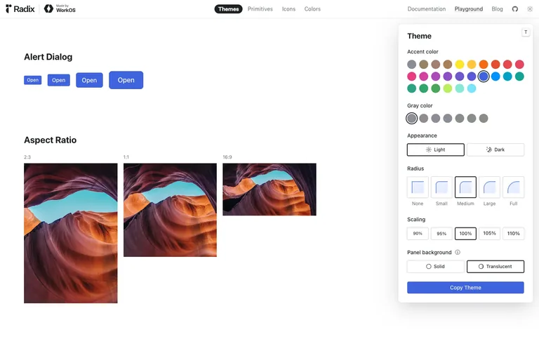
A floating theme-control panel sits on top of a live component canvas, not beside it — nudge one token and the entire canvas re-renders in place, so the panel and the canvas read as one continuously synced object rather than settings-plus-preview.
Useful for: The floating (not docked) control panel over a live canvas: every field in the panel is a real design token, and the canvas is the actual rendered component tree, not a screenshot — so changing Radius or Accent color restyles real buttons a few hundred pixels away in real time. Worth stealing wholesale for any settings/theme-builder or config UI: float the controls so the eye can hold both the lever and its effect in one glance, and close the panel with an explicit export action ('Copy Theme') instead of an implicit 'it autosaves'.
# Design reference: Radix Themes — Playground
Source: https://www.radix-ui.com/themes/playground
Swipefile reference: https://swipefile.design/ref/radix-playground/
Captured: 2026-08-01. This is a dated reference, not a claim about the current live product.
Capture scope: a page excerpt. Do not infer unseen sections or interactions.

## Objective
Adapt the interaction and layout patterns below to my project. Use my own content and identity. Do not reproduce logos, proprietary copy, or brand assets.

## Reference notes
- surface: Radix Themes marketing site, Playground page — live component canvas with the Themes tab active
- nav: One shallow tier: a top bar mixing two nav systems in one row — product tabs on the left (Themes as a solid black pill, then Primitives / Icons / Colors as plain text) and site-level links on the right (Documentation, Playground, Blog, GitHub, theme toggle). No sidebar, no breadcrumb — this is a single flat page.
- layout: Fluid canvas underneath a floating, fixed-width control panel. The panel is not a docked sidebar — it overlaps the canvas in the top-right corner with a drop shadow, so the canvas keeps its full width and the panel visually sits a layer above it.
- density: Loose on the canvas (large components, lots of whitespace, one example per row) and tight in the panel (seven stacked control groups in ~340px), because the canvas is the showroom and the panel is the workbench.
- color: White canvas and white panel, both neutral. The only saturated colour on the entire screen is the accent-swatch grid inside the panel — roughly two dozen colour dots spanning the full hue wheel — plus whatever accent colour is currently selected showing up faithfully in the canvas's solid button.
- typography: Plain black sans throughout, no serif or monospace anywhere. Hierarchy comes entirely from weight and size: bold ~20px section headings on the canvas, bold ~18px panel title, ~13-14px labels for every control group.
- pattern: Tokens, not settings: every control in the floating panel (accent colour, gray colour, radius, scaling, panel background, appearance) maps 1:1 to a real design token, and the canvas is live rendered output — so touching a swatch restyles real buttons a few hundred pixels away in the same frame, with no save step, no reload, no separate preview mode.
- states: Every control opens on a sane, complete default (Medium radius, 100% scaling, Light appearance, Translucent panel, a blue accent already applied to the canvas buttons) — there is no blank or unstyled first-paint state; the demo is always mid-story.
- dont: Don't dock this panel as a sidebar that resizes the canvas. The moment it stops floating over the content and starts pushing it aside, it reads as a settings screen instead of a live 'watch the product restyle itself' demo — the overlap and the shadow are doing real work, not just decoration.

Useful for: The floating (not docked) control panel over a live canvas: every field in the panel is a real design token, and the canvas is the actual rendered component tree, not a screenshot — so changing Radius or Accent color restyles real buttons a few hundred pixels away in real time. Worth stealing wholesale for any settings/theme-builder or config UI: float the controls so the eye can hold both the lever and its effect in one glance, and close the panel with an explicit export action ('Copy Theme') instead of an implicit 'it autosaves'.

## Acceptance criteria
- Existing project conventions, design tokens, working functionality, and unrelated changes are preserved.
- Two or three reference principles clearly support the user's task; conflicts are resolved in favor of usability and the existing product.
- Reusable components and semantic HTML express the interface. Available licensed assets are used; important UI text is never rendered as a bitmap.
- Every visible control has a defined behavior. Loading, empty, error, success, disabled, and long-content states are specified where relevant. Demo data is clearly labeled.
- Navigation and content adapt at 375px, 768px, and 1440px without horizontal page overflow. Keyboard use, visible focus, labeled inputs, at least 44px touch targets, readable contrast, and reduced motion are supported.
- Verification distinguishes rendered behavior from proposals and identifies anything still requiring a backend or external service.

## Quality bar
Clear hierarchy, consistent spacing, restrained surfaces, and purposeful motion. Avoid decorative gradients, excessive cards, placeholder buttons, and invented metrics unless the project calls for them. Do not claim a feature is connected or tested without evidence.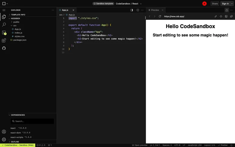
A full VS Code clone squeezed into a browser tab, and the live preview pane wears real browser chrome — URL bar, back/forward, refresh — instead of looking like a sandboxed iframe.
Useful for: The three-pane split (file tree, editor with tabs, preview) where the preview pane carries actual browser chrome around the rendered output, so it reads as 'a real site' rather than 'a code demo.' Also worth lifting: the extremely dense bottom status bar that crams error/warning counts, cursor position, encoding, line-ending, language mode and formatter into one 22px strip with zero visual weight.
# Design reference: CodeSandbox — Browser IDE
Source: https://codesandbox.io/p/sandbox/react-new
Swipefile reference: https://swipefile.design/ref/codesandbox-ide/
Captured: 2026-08-01. This is a dated reference, not a claim about the current live product.
Capture scope: a page excerpt. Do not infer unseen sections or interactions.

## Objective
Adapt the interaction and layout patterns below to my project. Use my own content and identity. Do not reproduce logos, proprietary copy, or brand assets.

## Reference notes
- surface: The main editor view of a React sandbox — file explorer, code editor, and live preview open side by side
- nav: Two tiers. A ~48px icon-only rail on the far left (Explorer, Search, Source Control with a badge count, Extensions, GitHub, Account, Settings) with no text labels at all, then the file explorer panel it toggles. Tabs live inside each pane — App.js in the editor, Preview on the right — rather than a single global tab bar.
- layout: Three fixed-width columns: icon rail (~48px), file explorer (~300px), then the editor and preview panes splitting the remainder roughly 50/50 across a resizable divider. Only the code and preview panes scroll independently; the explorer scrolls its own tree.
- density: Compact. Explorer rows sit around 22px, code runs 13-14px monospace with generous line height, and the bottom status bar packs a dozen items into a single 22px strip.
- color: Near-black editor surface with syntax colour doing all the work — purple keywords, orange/yellow strings, default-white identifiers. Icon rail, panels and status bar stay flat dark grey. The only non-code saturation is the red avatar circle top right.
- typography: A small UI sans for chrome (tabs, panel headers, status bar) and a monospace for code. Panel labels (EXPLORER, NODEBOX, DEPENDENCIES) are uppercase, tiny and grey — quiet section dividers, not headings.
- pattern: The preview pane wears real browser chrome — back, forward, refresh, and an actual-looking URL bar — inside a tool panel, not a separate window. It reframes 'preview' as 'this is a live page,' not 'this is a sandboxed iframe.'
- states: Fresh-sandbox state: default boilerplate code and its matching rendered output are already in place (Hello CodeSandbox), the status bar shows zero errors and zero warnings, and exactly one file tab is open. A new sandbox never opens empty — it opens pre-populated.
- dont: Don't fake the preview's URL bar as a static label. If you borrow this pattern the address bar has to look editable and the nav buttons have to look live, or the whole 'this is a real site' illusion collapses into a screenshot.

Useful for: The three-pane split (file tree, editor with tabs, preview) where the preview pane carries actual browser chrome around the rendered output, so it reads as 'a real site' rather than 'a code demo.' Also worth lifting: the extremely dense bottom status bar that crams error/warning counts, cursor position, encoding, line-ending, language mode and formatter into one 22px strip with zero visual weight.

## Acceptance criteria
- Existing project conventions, design tokens, working functionality, and unrelated changes are preserved.
- Two or three reference principles clearly support the user's task; conflicts are resolved in favor of usability and the existing product.
- Reusable components and semantic HTML express the interface. Available licensed assets are used; important UI text is never rendered as a bitmap.
- Every visible control has a defined behavior. Loading, empty, error, success, disabled, and long-content states are specified where relevant. Demo data is clearly labeled.
- Navigation and content adapt at 375px, 768px, and 1440px without horizontal page overflow. Keyboard use, visible focus, labeled inputs, at least 44px touch targets, readable contrast, and reduced motion are supported.
- Verification distinguishes rendered behavior from proposals and identifies anything still requiring a backend or external service.

## Quality bar
Clear hierarchy, consistent spacing, restrained surfaces, and purposeful motion. Avoid decorative gradients, excessive cards, placeholder buttons, and invented metrics unless the project calls for them. Do not claim a feature is connected or tested without evidence.
Allow basic usage counts to help us understand what is useful. Your board contents stay out of analytics. Details
Your browser’s privacy preference keeps analytics off.