Search & Discovery
CURATED COLLECTION · 50 REFERENCES
Fifty more app references: 27 public tool, discovery and onboarding screens (including three training demos), plus 23 clearly labeled account-entry screens.
Copy the reference notes below and paste them into Claude, ChatGPT, or your coding assistant. Add what you want to build.
Includes design notes, original sources, and preview links. An assistant that supports browsing can also read the public board link.
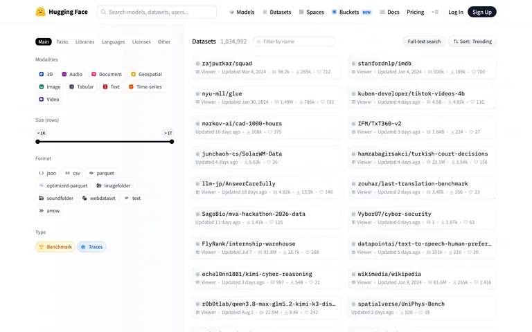
A public dataset catalog pairs task and language filters with compact repository rows.
Useful for: Keep filters persistent while results expose tags and update metadata.
# Design reference: Hugging Face — Dataset library
Source: https://huggingface.co/datasets
Swipefile reference: https://swipefile.design/ref/ai-next-huggingface-datasets/
Captured: 2026-09-06. This is a dated reference, not a claim about the current live product.
Capture scope: one viewport. Do not infer unseen page sections or a complete user flow.

## Objective
Adapt the interaction and layout patterns below to my project. Use my own content and identity. Do not reproduce logos, proprietary copy, or brand assets.

## Reference notes
- surface: A public dataset catalog pairs task and language filters with compact repository rows.
- nav: Global platform header and a filter sidebar.
- layout: Narrow filters beside a wide searchable list.
- density: High
- color: White, gray and small multicolor badges
- typography: Compact labels and repository titles.
- pattern: Keep filters persistent while results expose tags and update metadata.
- states: Public browse state; no dataset opened or downloaded.
- dont: Adapt the layout to your own product and supported capabilities; write your own examples and keep important actions clearly labeled.

Useful for: Keep filters persistent while results expose tags and update metadata.

## Acceptance criteria
- Existing project conventions, design tokens, working functionality, and unrelated changes are preserved.
- Two or three reference principles clearly support the user's task; conflicts are resolved in favor of usability and the existing product.
- Reusable components and semantic HTML express the interface. Available licensed assets are used; important UI text is never rendered as a bitmap.
- Every visible control has a defined behavior. Loading, empty, error, success, disabled, and long-content states are specified where relevant. Demo data is clearly labeled.
- Navigation and content adapt at 375px, 768px, and 1440px without horizontal page overflow. Keyboard use, visible focus, labeled inputs, at least 44px touch targets, readable contrast, and reduced motion are supported.
- Verification distinguishes rendered behavior from proposals and identifies anything still requiring a backend or external service.

## Quality bar
Clear hierarchy, consistent spacing, restrained surfaces, and purposeful motion. Avoid decorative gradients, excessive cards, placeholder buttons, and invented metrics unless the project calls for them. Do not claim a feature is connected or tested without evidence.
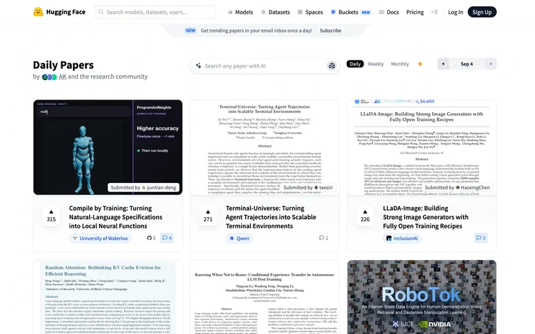
A public daily-paper feed arranges research previews into a multi-column card grid.
Useful for: Use document previews to make a research feed easier to scan.
# Design reference: Hugging Face — Daily papers
Source: https://huggingface.co/papers/date/2026-09-04
Swipefile reference: https://swipefile.design/ref/ai-next-huggingface-papers/
Captured: 2026-09-06. This is a dated reference, not a claim about the current live product.
Capture scope: one viewport. Do not infer unseen page sections or a complete user flow.

## Objective
Adapt the interaction and layout patterns below to my project. Use my own content and identity. Do not reproduce logos, proprietary copy, or brand assets.

## Reference notes
- surface: A public daily-paper feed arranges research previews into a multi-column card grid.
- nav: Global header, date controls and feed tabs.
- layout: Paper cards with preview figures, titles and compact engagement counts.
- density: Medium-high
- color: White, gray and paper-figure colors
- typography: Bold short titles and compact metadata.
- pattern: Use document previews to make a research feed easier to scan.
- states: Public daily feed; no voting or submission performed.
- dont: Adapt the layout to your own product and supported capabilities; write your own examples and keep important actions clearly labeled.

Useful for: Use document previews to make a research feed easier to scan.

## Acceptance criteria
- Existing project conventions, design tokens, working functionality, and unrelated changes are preserved.
- Two or three reference principles clearly support the user's task; conflicts are resolved in favor of usability and the existing product.
- Reusable components and semantic HTML express the interface. Available licensed assets are used; important UI text is never rendered as a bitmap.
- Every visible control has a defined behavior. Loading, empty, error, success, disabled, and long-content states are specified where relevant. Demo data is clearly labeled.
- Navigation and content adapt at 375px, 768px, and 1440px without horizontal page overflow. Keyboard use, visible focus, labeled inputs, at least 44px touch targets, readable contrast, and reduced motion are supported.
- Verification distinguishes rendered behavior from proposals and identifies anything still requiring a backend or external service.

## Quality bar
Clear hierarchy, consistent spacing, restrained surfaces, and purposeful motion. Avoid decorative gradients, excessive cards, placeholder buttons, and invented metrics unless the project calls for them. Do not claim a feature is connected or tested without evidence.
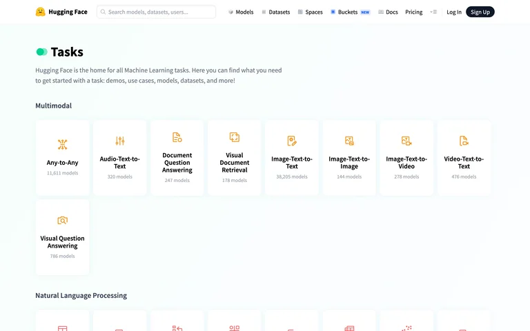
A public task directory groups model capabilities into illustrated category tiles.
Useful for: Organize a complex model ecosystem by the job a visitor wants to do.
# Design reference: Hugging Face — Task browser
Source: https://huggingface.co/tasks
Swipefile reference: https://swipefile.design/ref/ai-next-huggingface-tasks/
Captured: 2026-09-06. This is a dated reference, not a claim about the current live product.
Capture scope: one viewport. Do not infer unseen page sections or a complete user flow.

## Objective
Adapt the interaction and layout patterns below to my project. Use my own content and identity. Do not reproduce logos, proprietary copy, or brand assets.

## Reference notes
- surface: A public task directory groups model capabilities into illustrated category tiles.
- nav: Global platform header above grouped task sections.
- layout: Open grid grouped by modality with small icons.
- density: Medium
- color: White and restrained category colors
- typography: Small tile labels and clear section headings.
- pattern: Organize a complex model ecosystem by the job a visitor wants to do.
- states: Public task directory.
- dont: Adapt the layout to your own product and supported capabilities; write your own examples and keep important actions clearly labeled.

Useful for: Organize a complex model ecosystem by the job a visitor wants to do.

## Acceptance criteria
- Existing project conventions, design tokens, working functionality, and unrelated changes are preserved.
- Two or three reference principles clearly support the user's task; conflicts are resolved in favor of usability and the existing product.
- Reusable components and semantic HTML express the interface. Available licensed assets are used; important UI text is never rendered as a bitmap.
- Every visible control has a defined behavior. Loading, empty, error, success, disabled, and long-content states are specified where relevant. Demo data is clearly labeled.
- Navigation and content adapt at 375px, 768px, and 1440px without horizontal page overflow. Keyboard use, visible focus, labeled inputs, at least 44px touch targets, readable contrast, and reduced motion are supported.
- Verification distinguishes rendered behavior from proposals and identifies anything still requiring a backend or external service.

## Quality bar
Clear hierarchy, consistent spacing, restrained surfaces, and purposeful motion. Avoid decorative gradients, excessive cards, placeholder buttons, and invented metrics unless the project calls for them. Do not claim a feature is connected or tested without evidence.
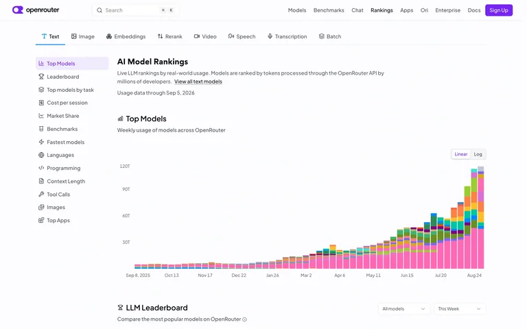
A public model-ranking page places provider filters beside a stacked usage chart.
Useful for: Pair comparison filters with a shared visualization and methodology context.
# Design reference: OpenRouter — Model rankings
Source: https://openrouter.ai/rankings
Swipefile reference: https://swipefile.design/ref/ai-next-openrouter-rankings/
Captured: 2026-09-06. This is a dated reference, not a claim about the current live product.
Capture scope: one viewport. Do not infer unseen page sections or a complete user flow.

## Objective
Adapt the interaction and layout patterns below to my project. Use my own content and identity. Do not reproduce logos, proprietary copy, or brand assets.

## Reference notes
- surface: A public model-ranking page places provider filters beside a stacked usage chart.
- nav: Global navigation, modality tabs and a left ranking index.
- layout: Sidebar plus a broad time-series visualization.
- density: High
- color: White with multicolor chart segments
- typography: Compact navigation and readable chart labels.
- pattern: Pair comparison filters with a shared visualization and methodology context.
- states: Public rankings at capture time; no performance claim is inferred from the chart.
- dont: Adapt the layout to your own product and supported capabilities; write your own examples and keep important actions clearly labeled.

Useful for: Pair comparison filters with a shared visualization and methodology context.

## Acceptance criteria
- Existing project conventions, design tokens, working functionality, and unrelated changes are preserved.
- Two or three reference principles clearly support the user's task; conflicts are resolved in favor of usability and the existing product.
- Reusable components and semantic HTML express the interface. Available licensed assets are used; important UI text is never rendered as a bitmap.
- Every visible control has a defined behavior. Loading, empty, error, success, disabled, and long-content states are specified where relevant. Demo data is clearly labeled.
- Navigation and content adapt at 375px, 768px, and 1440px without horizontal page overflow. Keyboard use, visible focus, labeled inputs, at least 44px touch targets, readable contrast, and reduced motion are supported.
- Verification distinguishes rendered behavior from proposals and identifies anything still requiring a backend or external service.

## Quality bar
Clear hierarchy, consistent spacing, restrained surfaces, and purposeful motion. Avoid decorative gradients, excessive cards, placeholder buttons, and invented metrics unless the project calls for them. Do not claim a feature is connected or tested without evidence.
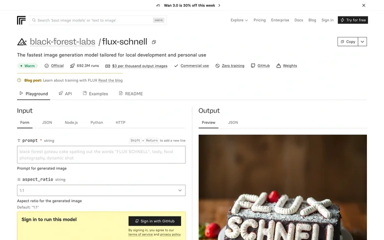
A public model page shows an input form beside a built-in output example and a sign-in notice.
Useful for: Keep model parameters alongside an example output and make access requirements explicit.
# Design reference: Replicate — FLUX model playground
Source: https://replicate.com/black-forest-labs/flux-schnell
Swipefile reference: https://swipefile.design/ref/ai-next-replicate-flux/
Captured: 2026-09-06. This is a dated reference, not a claim about the current live product.
Capture scope: one viewport. Do not infer unseen page sections or a complete user flow.

## Objective
Adapt the interaction and layout patterns below to my project. Use my own content and identity. Do not reproduce logos, proprietary copy, or brand assets.

## Reference notes
- surface: A public model page shows an input form beside a built-in output example and a sign-in notice.
- nav: Platform header, model identity and playground/API tabs.
- layout: Two-column input/output workspace.
- density: Medium-high
- color: White, black and pale yellow access notice
- typography: Compact developer labels with a clear model title.
- pattern: Keep model parameters alongside an example output and make access requirements explicit.
- states: Built-in example visible; running this model requires sign-in. No generation performed.
- dont: Adapt the layout to your own product and supported capabilities; write your own examples and keep important actions clearly labeled.

Useful for: Keep model parameters alongside an example output and make access requirements explicit.

## Acceptance criteria
- Existing project conventions, design tokens, working functionality, and unrelated changes are preserved.
- Two or three reference principles clearly support the user's task; conflicts are resolved in favor of usability and the existing product.
- Reusable components and semantic HTML express the interface. Available licensed assets are used; important UI text is never rendered as a bitmap.
- Every visible control has a defined behavior. Loading, empty, error, success, disabled, and long-content states are specified where relevant. Demo data is clearly labeled.
- Navigation and content adapt at 375px, 768px, and 1440px without horizontal page overflow. Keyboard use, visible focus, labeled inputs, at least 44px touch targets, readable contrast, and reduced motion are supported.
- Verification distinguishes rendered behavior from proposals and identifies anything still requiring a backend or external service.

## Quality bar
Clear hierarchy, consistent spacing, restrained surfaces, and purposeful motion. Avoid decorative gradients, excessive cards, placeholder buttons, and invented metrics unless the project calls for them. Do not claim a feature is connected or tested without evidence.
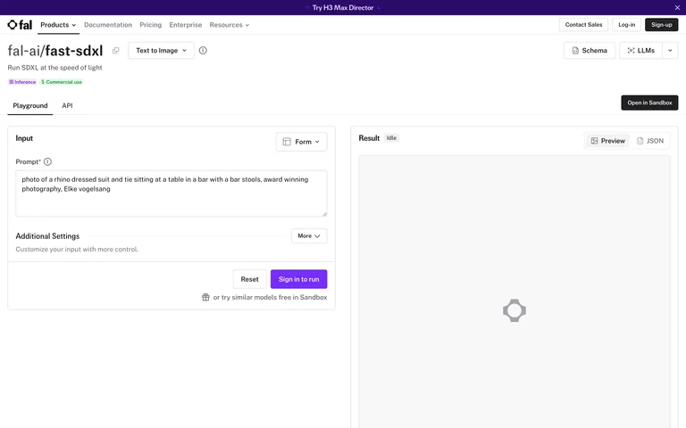
An image-model playground exposes a prompt form and settings beside an empty result panel.
Useful for: Separate configuration from results while keeping the primary run action close to inputs.
# Design reference: fal — SDXL playground
Source: https://fal.ai/models/fal-ai/fast-sdxl
Swipefile reference: https://swipefile.design/ref/ai-next-fal-sdxl/
Captured: 2026-09-06. This is a dated reference, not a claim about the current live product.
Capture scope: one viewport. Do not infer unseen page sections or a complete user flow.

## Objective
Adapt the interaction and layout patterns below to my project. Use my own content and identity. Do not reproduce logos, proprietary copy, or brand assets.

## Reference notes
- surface: An image-model playground exposes a prompt form and settings beside an empty result panel.
- nav: Provider header and model-page tabs.
- layout: Split input and result panels with a narrow divider.
- density: Medium
- color: White, gray and violet
- typography: Small field labels with a compact model title.
- pattern: Separate configuration from results while keeping the primary run action close to inputs.
- states: Public initial playground with an empty output area; no model run.
- dont: Adapt the layout to your own product and supported capabilities; write your own examples and keep important actions clearly labeled.

Useful for: Separate configuration from results while keeping the primary run action close to inputs.

## Acceptance criteria
- Existing project conventions, design tokens, working functionality, and unrelated changes are preserved.
- Two or three reference principles clearly support the user's task; conflicts are resolved in favor of usability and the existing product.
- Reusable components and semantic HTML express the interface. Available licensed assets are used; important UI text is never rendered as a bitmap.
- Every visible control has a defined behavior. Loading, empty, error, success, disabled, and long-content states are specified where relevant. Demo data is clearly labeled.
- Navigation and content adapt at 375px, 768px, and 1440px without horizontal page overflow. Keyboard use, visible focus, labeled inputs, at least 44px touch targets, readable contrast, and reduced motion are supported.
- Verification distinguishes rendered behavior from proposals and identifies anything still requiring a backend or external service.

## Quality bar
Clear hierarchy, consistent spacing, restrained surfaces, and purposeful motion. Avoid decorative gradients, excessive cards, placeholder buttons, and invented metrics unless the project calls for them. Do not claim a feature is connected or tested without evidence.
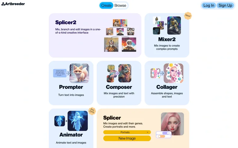
A public creation launcher presents image-mixing tools as illustrated tiles.
Useful for: Use examples inside tool cards to explain unfamiliar creative operations.
# Design reference: Artbreeder — Creation tools
Source: https://www.artbreeder.com/tools
Swipefile reference: https://swipefile.design/ref/ai-next-artbreeder/
Captured: 2026-09-06. This is a dated reference, not a claim about the current live product.
Capture scope: one viewport. Do not infer unseen page sections or a complete user flow.

## Objective
Adapt the interaction and layout patterns below to my project. Use my own content and identity. Do not reproduce logos, proprietary copy, or brand assets.

## Reference notes
- surface: A public creation launcher presents image-mixing tools as illustrated tiles.
- nav: Compact logo, Create/Browse tabs and account links.
- layout: Small centered grid of differently sized tool cards.
- density: Medium
- color: White, pale lavender, blue and yellow
- typography: Short bold tool names with concise explanations.
- pattern: Use examples inside tool cards to explain unfamiliar creative operations.
- states: Public tool chooser before selecting a generator.
- dont: Adapt the layout to your own product and supported capabilities; write your own examples and keep important actions clearly labeled.

Useful for: Use examples inside tool cards to explain unfamiliar creative operations.

## Acceptance criteria
- Existing project conventions, design tokens, working functionality, and unrelated changes are preserved.
- Two or three reference principles clearly support the user's task; conflicts are resolved in favor of usability and the existing product.
- Reusable components and semantic HTML express the interface. Available licensed assets are used; important UI text is never rendered as a bitmap.
- Every visible control has a defined behavior. Loading, empty, error, success, disabled, and long-content states are specified where relevant. Demo data is clearly labeled.
- Navigation and content adapt at 375px, 768px, and 1440px without horizontal page overflow. Keyboard use, visible focus, labeled inputs, at least 44px touch targets, readable contrast, and reduced motion are supported.
- Verification distinguishes rendered behavior from proposals and identifies anything still requiring a backend or external service.

## Quality bar
Clear hierarchy, consistent spacing, restrained surfaces, and purposeful motion. Avoid decorative gradients, excessive cards, placeholder buttons, and invented metrics unless the project calls for them. Do not claim a feature is connected or tested without evidence.
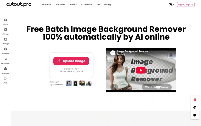
An image-removal utility places an upload panel beside an explanatory preview.
Useful for: Place sample imagery next to the upload action to explain the expected transformation.
# Design reference: Cutout.Pro — Background remover
Source: https://www.cutout.pro/remove-background
Swipefile reference: https://swipefile.design/ref/ai-next-cutout/
Captured: 2026-09-06. This is a dated reference, not a claim about the current live product.
Capture scope: one viewport. Do not infer unseen page sections or a complete user flow.

## Objective
Adapt the interaction and layout patterns below to my project. Use my own content and identity. Do not reproduce logos, proprietary copy, or brand assets.

## Reference notes
- surface: An image-removal utility places an upload panel beside an explanatory preview.
- nav: Site header plus a slim vertical tool rail.
- layout: Centered title above paired input and example panels.
- density: Medium
- color: White, gray and pink
- typography: Bold utility title and concise upload labels.
- pattern: Place sample imagery next to the upload action to explain the expected transformation.
- states: Public upload state with source-provided examples; no image uploaded.
- dont: Adapt the layout to your own product and supported capabilities; write your own examples and keep important actions clearly labeled.

Useful for: Place sample imagery next to the upload action to explain the expected transformation.

## Acceptance criteria
- Existing project conventions, design tokens, working functionality, and unrelated changes are preserved.
- Two or three reference principles clearly support the user's task; conflicts are resolved in favor of usability and the existing product.
- Reusable components and semantic HTML express the interface. Available licensed assets are used; important UI text is never rendered as a bitmap.
- Every visible control has a defined behavior. Loading, empty, error, success, disabled, and long-content states are specified where relevant. Demo data is clearly labeled.
- Navigation and content adapt at 375px, 768px, and 1440px without horizontal page overflow. Keyboard use, visible focus, labeled inputs, at least 44px touch targets, readable contrast, and reduced motion are supported.
- Verification distinguishes rendered behavior from proposals and identifies anything still requiring a backend or external service.

## Quality bar
Clear hierarchy, consistent spacing, restrained surfaces, and purposeful motion. Avoid decorative gradients, excessive cards, placeholder buttons, and invented metrics unless the project calls for them. Do not claim a feature is connected or tested without evidence.
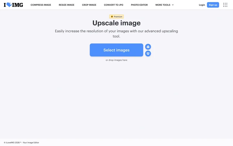
A minimal upscaling tool centers one large image-selection action on a pale background.
Useful for: Make the required first input unambiguous and keep secondary import sources nearby.
# Design reference: iLoveIMG — Image upscaler
Source: https://www.iloveimg.com/upscale-image
Swipefile reference: https://swipefile.design/ref/ai-next-iloveimg-upscale/
Captured: 2026-09-06. This is a dated reference, not a claim about the current live product.
Capture scope: one viewport. Do not infer unseen page sections or a complete user flow.

## Objective
Adapt the interaction and layout patterns below to my project. Use my own content and identity. Do not reproduce logos, proprietary copy, or brand assets.

## Reference notes
- surface: A minimal upscaling tool centers one large image-selection action on a pale background.
- nav: Compact utility navigation across the top.
- layout: Sparse centered task title, helper line and upload button.
- density: Low
- color: Pale gray, blue and white
- typography: Simple sans-serif title and prominent button label.
- pattern: Make the required first input unambiguous and keep secondary import sources nearby.
- states: Empty upload state; no files selected.
- dont: Adapt the layout to your own product and supported capabilities; write your own examples and keep important actions clearly labeled.

Useful for: Make the required first input unambiguous and keep secondary import sources nearby.

## Acceptance criteria
- Existing project conventions, design tokens, working functionality, and unrelated changes are preserved.
- Two or three reference principles clearly support the user's task; conflicts are resolved in favor of usability and the existing product.
- Reusable components and semantic HTML express the interface. Available licensed assets are used; important UI text is never rendered as a bitmap.
- Every visible control has a defined behavior. Loading, empty, error, success, disabled, and long-content states are specified where relevant. Demo data is clearly labeled.
- Navigation and content adapt at 375px, 768px, and 1440px without horizontal page overflow. Keyboard use, visible focus, labeled inputs, at least 44px touch targets, readable contrast, and reduced motion are supported.
- Verification distinguishes rendered behavior from proposals and identifies anything still requiring a backend or external service.

## Quality bar
Clear hierarchy, consistent spacing, restrained surfaces, and purposeful motion. Avoid decorative gradients, excessive cards, placeholder buttons, and invented metrics unless the project calls for them. Do not claim a feature is connected or tested without evidence.
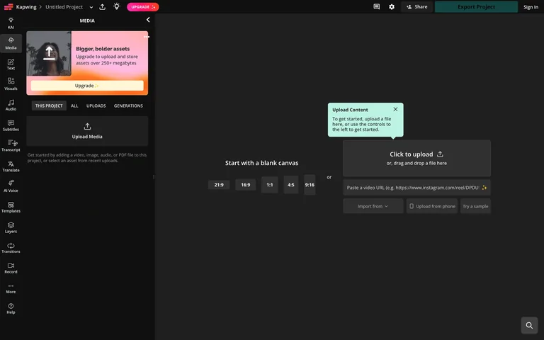
A dark browser editor opens to media tools and blank-canvas choices with contextual onboarding tips.
Useful for: Explain an empty editor through clear starting choices and contextual tips.
# Design reference: Kapwing — Empty video editor
Source: https://www.kapwing.com/studio/editor
Swipefile reference: https://swipefile.design/ref/ai-next-kapwing-studio/
Captured: 2026-09-06. This is a dated reference, not a claim about the current live product.
Capture scope: one viewport. Do not infer unseen page sections or a complete user flow.

## Objective
Adapt the interaction and layout patterns below to my project. Use my own content and identity. Do not reproduce logos, proprietary copy, or brand assets.

## Reference notes
- surface: A dark browser editor opens to media tools and blank-canvas choices with contextual onboarding tips.
- nav: Left tool rail, top project controls and export area.
- layout: Media sidebar beside a large empty stage.
- density: High
- color: Charcoal with orange and mint guidance
- typography: Compact editor labels and small onboarding callouts.
- pattern: Explain an empty editor through clear starting choices and contextual tips.
- states: Public empty editor with built-in guidance; no media uploaded or export created.
- dont: Adapt the layout to your own product and supported capabilities; write your own examples and keep important actions clearly labeled.

Useful for: Explain an empty editor through clear starting choices and contextual tips.

## Acceptance criteria
- Existing project conventions, design tokens, working functionality, and unrelated changes are preserved.
- Two or three reference principles clearly support the user's task; conflicts are resolved in favor of usability and the existing product.
- Reusable components and semantic HTML express the interface. Available licensed assets are used; important UI text is never rendered as a bitmap.
- Every visible control has a defined behavior. Loading, empty, error, success, disabled, and long-content states are specified where relevant. Demo data is clearly labeled.
- Navigation and content adapt at 375px, 768px, and 1440px without horizontal page overflow. Keyboard use, visible focus, labeled inputs, at least 44px touch targets, readable contrast, and reduced motion are supported.
- Verification distinguishes rendered behavior from proposals and identifies anything still requiring a backend or external service.

## Quality bar
Clear hierarchy, consistent spacing, restrained surfaces, and purposeful motion. Avoid decorative gradients, excessive cards, placeholder buttons, and invented metrics unless the project calls for them. Do not claim a feature is connected or tested without evidence.
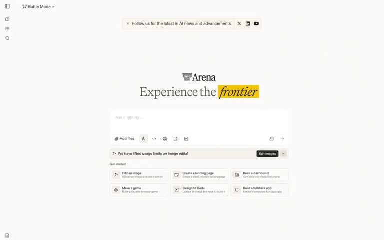
A sparse model-comparison chat start centers a composer beneath an editorial headline.
Useful for: Use prompt suggestions to explain the breadth of an otherwise empty conversation.
# Design reference: Arena — Chat start
Source: https://arena.ai/
Swipefile reference: https://swipefile.design/ref/ai-next-lmarena/
Captured: 2026-09-06. This is a dated reference, not a claim about the current live product.
Capture scope: one viewport. Do not infer unseen page sections or a complete user flow.

## Objective
Adapt the interaction and layout patterns below to my project. Use my own content and identity. Do not reproduce logos, proprietary copy, or brand assets.

## Reference notes
- surface: A sparse model-comparison chat start centers a composer beneath an editorial headline.
- nav: Small left tool rail and mode selector.
- layout: Centered composer and example prompt chips in open space.
- density: Low-medium
- color: Warm white, black and yellow
- typography: Serif headline with compact sans-serif controls.
- pattern: Use prompt suggestions to explain the breadth of an otherwise empty conversation.
- states: Public empty chat composer; no prompt submitted.
- dont: Adapt the layout to your own product and supported capabilities; write your own examples and keep important actions clearly labeled.

Useful for: Use prompt suggestions to explain the breadth of an otherwise empty conversation.

## Acceptance criteria
- Existing project conventions, design tokens, working functionality, and unrelated changes are preserved.
- Two or three reference principles clearly support the user's task; conflicts are resolved in favor of usability and the existing product.
- Reusable components and semantic HTML express the interface. Available licensed assets are used; important UI text is never rendered as a bitmap.
- Every visible control has a defined behavior. Loading, empty, error, success, disabled, and long-content states are specified where relevant. Demo data is clearly labeled.
- Navigation and content adapt at 375px, 768px, and 1440px without horizontal page overflow. Keyboard use, visible focus, labeled inputs, at least 44px touch targets, readable contrast, and reduced motion are supported.
- Verification distinguishes rendered behavior from proposals and identifies anything still requiring a backend or external service.

## Quality bar
Clear hierarchy, consistent spacing, restrained surfaces, and purposeful motion. Avoid decorative gradients, excessive cards, placeholder buttons, and invented metrics unless the project calls for them. Do not claim a feature is connected or tested without evidence.
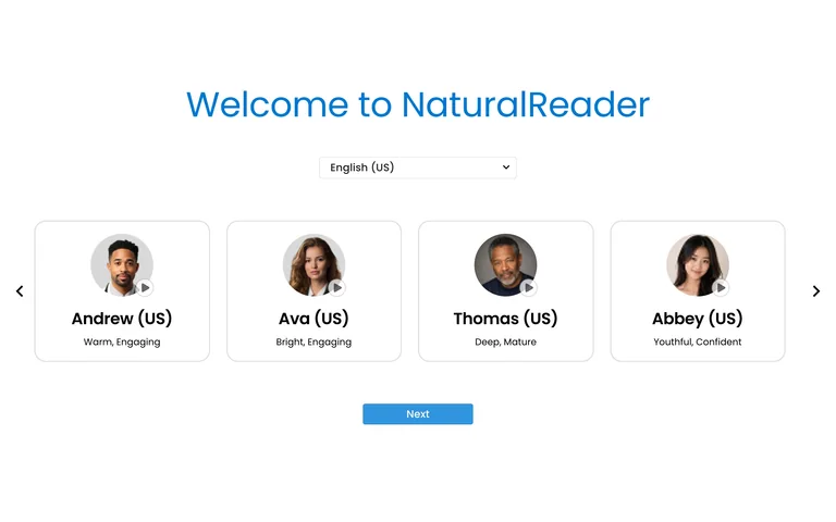
A first-run voice chooser offers four portrait cards and a language selector before continuing.
Useful for: Let users choose a meaningful preference before entering a complex workspace.
# Design reference: NaturalReader — Voice onboarding
Source: https://www.naturalreaders.com/online/
Swipefile reference: https://swipefile.design/ref/ai-next-naturalreader-app/
Captured: 2026-09-06. This is a dated reference, not a claim about the current live product.
Capture scope: one viewport. Do not infer unseen page sections or a complete user flow.

## Objective
Adapt the interaction and layout patterns below to my project. Use my own content and identity. Do not reproduce logos, proprietary copy, or brand assets.

## Reference notes
- surface: A first-run voice chooser offers four portrait cards and a language selector before continuing.
- nav: Minimal onboarding controls with carousel arrows.
- layout: Centered title, language selector, horizontal voice cards and Next action.
- density: Low
- color: White, gray and blue
- typography: Large clear welcome heading and readable voice names.
- pattern: Let users choose a meaningful preference before entering a complex workspace.
- states: Initial voice-selection step; no audio generated or account created.
- dont: Adapt the layout to your own product and supported capabilities; write your own examples and keep important actions clearly labeled.

Useful for: Let users choose a meaningful preference before entering a complex workspace.

## Acceptance criteria
- Existing project conventions, design tokens, working functionality, and unrelated changes are preserved.
- Two or three reference principles clearly support the user's task; conflicts are resolved in favor of usability and the existing product.
- Reusable components and semantic HTML express the interface. Available licensed assets are used; important UI text is never rendered as a bitmap.
- Every visible control has a defined behavior. Loading, empty, error, success, disabled, and long-content states are specified where relevant. Demo data is clearly labeled.
- Navigation and content adapt at 375px, 768px, and 1440px without horizontal page overflow. Keyboard use, visible focus, labeled inputs, at least 44px touch targets, readable contrast, and reduced motion are supported.
- Verification distinguishes rendered behavior from proposals and identifies anything still requiring a backend or external service.

## Quality bar
Clear hierarchy, consistent spacing, restrained surfaces, and purposeful motion. Avoid decorative gradients, excessive cards, placeholder buttons, and invented metrics unless the project calls for them. Do not claim a feature is connected or tested without evidence.
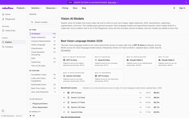
A public vision-model catalog uses task filters and capability sections to organize compact model cards.
Useful for: Distinguish platform navigation from filters within a specialized model catalog.
# Design reference: Roboflow — Vision model catalog
Source: https://playground.roboflow.com/models
Swipefile reference: https://swipefile.design/ref/ai-next-roboflow-models/
Captured: 2026-09-06. This is a dated reference, not a claim about the current live product.
Capture scope: one viewport. Do not infer unseen page sections or a complete user flow.

## Objective
Adapt the interaction and layout patterns below to my project. Use my own content and identity. Do not reproduce logos, proprietary copy, or brand assets.

## Reference notes
- surface: A public vision-model catalog uses task filters and capability sections to organize compact model cards.
- nav: Persistent left platform rail plus model filters.
- layout: Three zones: navigation, task filters and grouped model results.
- density: High
- color: White, gray and violet
- typography: Compact card titles and explanatory section labels.
- pattern: Distinguish platform navigation from filters within a specialized model catalog.
- states: Public catalog with model descriptions.
- dont: Adapt the layout to your own product and supported capabilities; write your own examples and keep important actions clearly labeled.

Useful for: Distinguish platform navigation from filters within a specialized model catalog.

## Acceptance criteria
- Existing project conventions, design tokens, working functionality, and unrelated changes are preserved.
- Two or three reference principles clearly support the user's task; conflicts are resolved in favor of usability and the existing product.
- Reusable components and semantic HTML express the interface. Available licensed assets are used; important UI text is never rendered as a bitmap.
- Every visible control has a defined behavior. Loading, empty, error, success, disabled, and long-content states are specified where relevant. Demo data is clearly labeled.
- Navigation and content adapt at 375px, 768px, and 1440px without horizontal page overflow. Keyboard use, visible focus, labeled inputs, at least 44px touch targets, readable contrast, and reduced motion are supported.
- Verification distinguishes rendered behavior from proposals and identifies anything still requiring a backend or external service.

## Quality bar
Clear hierarchy, consistent spacing, restrained surfaces, and purposeful motion. Avoid decorative gradients, excessive cards, placeholder buttons, and invented metrics unless the project calls for them. Do not claim a feature is connected or tested without evidence.
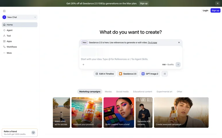
A public creative workspace start shows a prompt composer, creation modes and featured workflow cards.
Useful for: Introduce generation modes beside the composer and offer visual starting points below.
# Design reference: Runway — Creative workspace start
Source: https://app.runwayml.com/video-tools/teams/guest/ai-tools/generate
Swipefile reference: https://swipefile.design/ref/ai-next-runway-app/
Captured: 2026-09-06. This is a dated reference, not a claim about the current live product.
Capture scope: one viewport. Do not infer unseen page sections or a complete user flow.

## Objective
Adapt the interaction and layout patterns below to my project. Use my own content and identity. Do not reproduce logos, proprietary copy, or brand assets.

## Reference notes
- surface: A public creative workspace start shows a prompt composer, creation modes and featured workflow cards.
- nav: Left rail for chat, assets and tools with account actions at the top.
- layout: Centered composer above a horizontal row of visual examples.
- density: Medium
- color: White, pale gray and muted accent colors
- typography: Concise question heading and small control labels.
- pattern: Introduce generation modes beside the composer and offer visual starting points below.
- states: Signed-out initial workspace; no prompt, generation or upload performed.
- dont: Adapt the layout to your own product and supported capabilities; write your own examples and keep important actions clearly labeled.

Useful for: Introduce generation modes beside the composer and offer visual starting points below.

## Acceptance criteria
- Existing project conventions, design tokens, working functionality, and unrelated changes are preserved.
- Two or three reference principles clearly support the user's task; conflicts are resolved in favor of usability and the existing product.
- Reusable components and semantic HTML express the interface. Available licensed assets are used; important UI text is never rendered as a bitmap.
- Every visible control has a defined behavior. Loading, empty, error, success, disabled, and long-content states are specified where relevant. Demo data is clearly labeled.
- Navigation and content adapt at 375px, 768px, and 1440px without horizontal page overflow. Keyboard use, visible focus, labeled inputs, at least 44px touch targets, readable contrast, and reduced motion are supported.
- Verification distinguishes rendered behavior from proposals and identifies anything still requiring a backend or external service.

## Quality bar
Clear hierarchy, consistent spacing, restrained surfaces, and purposeful motion. Avoid decorative gradients, excessive cards, placeholder buttons, and invented metrics unless the project calls for them. Do not claim a feature is connected or tested without evidence.
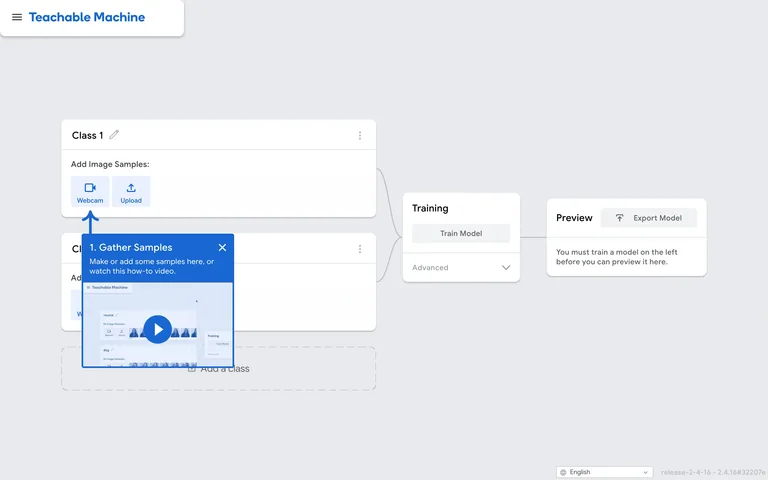
An image-training demo lays out sample classes, training and preview as a left-to-right workflow.
Useful for: Make the sequence from example collection to training to preview visible in one canvas.
# Design reference: Teachable Machine — Image project
Source: https://teachablemachine.withgoogle.com/train/image
Swipefile reference: https://swipefile.design/ref/ai-next-teachable-image/
Captured: 2026-09-06. This is a dated reference, not a claim about the current live product.
Capture scope: one viewport. Do not infer unseen page sections or a complete user flow.

## Objective
Adapt the interaction and layout patterns below to my project. Use my own content and identity. Do not reproduce logos, proprietary copy, or brand assets.

## Reference notes
- surface: An image-training demo lays out sample classes, training and preview as a left-to-right workflow.
- nav: Small project header with utility controls at the bottom.
- layout: Class cards connected to training and output panels.
- density: Medium
- color: Pale gray, white and blue
- typography: Small explicit step and input labels.
- pattern: Make the sequence from example collection to training to preview visible in one canvas.
- states: Empty image-project demo with a built-in tutorial tip; no webcam, upload or training used.
- dont: Adapt the layout to your own product and supported capabilities; write your own examples and keep important actions clearly labeled.

Useful for: Make the sequence from example collection to training to preview visible in one canvas.

## Acceptance criteria
- Existing project conventions, design tokens, working functionality, and unrelated changes are preserved.
- Two or three reference principles clearly support the user's task; conflicts are resolved in favor of usability and the existing product.
- Reusable components and semantic HTML express the interface. Available licensed assets are used; important UI text is never rendered as a bitmap.
- Every visible control has a defined behavior. Loading, empty, error, success, disabled, and long-content states are specified where relevant. Demo data is clearly labeled.
- Navigation and content adapt at 375px, 768px, and 1440px without horizontal page overflow. Keyboard use, visible focus, labeled inputs, at least 44px touch targets, readable contrast, and reduced motion are supported.
- Verification distinguishes rendered behavior from proposals and identifies anything still requiring a backend or external service.

## Quality bar
Clear hierarchy, consistent spacing, restrained surfaces, and purposeful motion. Avoid decorative gradients, excessive cards, placeholder buttons, and invented metrics unless the project calls for them. Do not claim a feature is connected or tested without evidence.
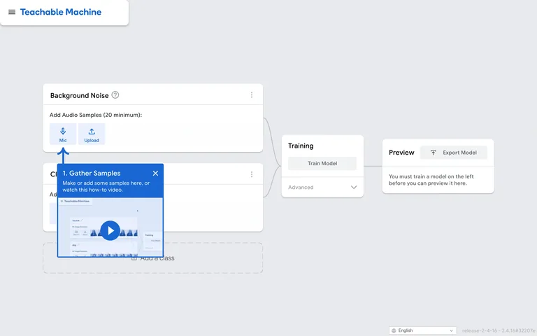
An audio-training demo adds a background-noise class before the regular sample class.
Useful for: Expose prerequisite data collection as part of the same visible workflow.
# Design reference: Teachable Machine — Audio project
Source: https://teachablemachine.withgoogle.com/train/audio
Swipefile reference: https://swipefile.design/ref/ai-next-teachable-audio/
Captured: 2026-09-06. This is a dated reference, not a claim about the current live product.
Capture scope: one viewport. Do not infer unseen page sections or a complete user flow.

## Objective
Adapt the interaction and layout patterns below to my project. Use my own content and identity. Do not reproduce logos, proprietary copy, or brand assets.

## Reference notes
- surface: An audio-training demo adds a background-noise class before the regular sample class.
- nav: Minimal project header and lower utility controls.
- layout: Stacked sound classes flow into training and preview cards.
- density: Medium
- color: Pale gray, white and blue
- typography: Compact technical labels and plain step headings.
- pattern: Expose prerequisite data collection as part of the same visible workflow.
- states: Empty audio-project demo; no microphone or model training used.
- dont: Adapt the layout to your own product and supported capabilities; write your own examples and keep important actions clearly labeled.

Useful for: Expose prerequisite data collection as part of the same visible workflow.

## Acceptance criteria
- Existing project conventions, design tokens, working functionality, and unrelated changes are preserved.
- Two or three reference principles clearly support the user's task; conflicts are resolved in favor of usability and the existing product.
- Reusable components and semantic HTML express the interface. Available licensed assets are used; important UI text is never rendered as a bitmap.
- Every visible control has a defined behavior. Loading, empty, error, success, disabled, and long-content states are specified where relevant. Demo data is clearly labeled.
- Navigation and content adapt at 375px, 768px, and 1440px without horizontal page overflow. Keyboard use, visible focus, labeled inputs, at least 44px touch targets, readable contrast, and reduced motion are supported.
- Verification distinguishes rendered behavior from proposals and identifies anything still requiring a backend or external service.

## Quality bar
Clear hierarchy, consistent spacing, restrained surfaces, and purposeful motion. Avoid decorative gradients, excessive cards, placeholder buttons, and invented metrics unless the project calls for them. Do not claim a feature is connected or tested without evidence.
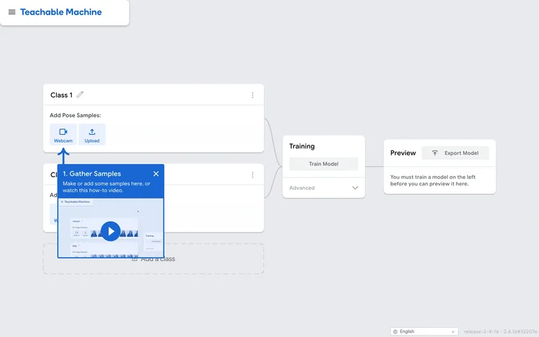
A pose-training demo shows sample-class cards beside training and preview controls.
Useful for: Use a consistent training canvas across different input modalities.
# Design reference: Teachable Machine — Pose project
Source: https://teachablemachine.withgoogle.com/train/pose
Swipefile reference: https://swipefile.design/ref/ai-next-teachable-pose/
Captured: 2026-09-06. This is a dated reference, not a claim about the current live product.
Capture scope: one viewport. Do not infer unseen page sections or a complete user flow.

## Objective
Adapt the interaction and layout patterns below to my project. Use my own content and identity. Do not reproduce logos, proprietary copy, or brand assets.

## Reference notes
- surface: A pose-training demo shows sample-class cards beside training and preview controls.
- nav: Minimal project header with sparse utility navigation.
- layout: Left class stack, middle training card and right output card.
- density: Medium
- color: Pale gray, white and blue
- typography: Compact labels and explicit action text.
- pattern: Use a consistent training canvas across different input modalities.
- states: Empty pose-project demo; no webcam, uploads or training used.
- dont: Adapt the layout to your own product and supported capabilities; write your own examples and keep important actions clearly labeled.

Useful for: Use a consistent training canvas across different input modalities.

## Acceptance criteria
- Existing project conventions, design tokens, working functionality, and unrelated changes are preserved.
- Two or three reference principles clearly support the user's task; conflicts are resolved in favor of usability and the existing product.
- Reusable components and semantic HTML express the interface. Available licensed assets are used; important UI text is never rendered as a bitmap.
- Every visible control has a defined behavior. Loading, empty, error, success, disabled, and long-content states are specified where relevant. Demo data is clearly labeled.
- Navigation and content adapt at 375px, 768px, and 1440px without horizontal page overflow. Keyboard use, visible focus, labeled inputs, at least 44px touch targets, readable contrast, and reduced motion are supported.
- Verification distinguishes rendered behavior from proposals and identifies anything still requiring a backend or external service.

## Quality bar
Clear hierarchy, consistent spacing, restrained surfaces, and purposeful motion. Avoid decorative gradients, excessive cards, placeholder buttons, and invented metrics unless the project calls for them. Do not claim a feature is connected or tested without evidence.
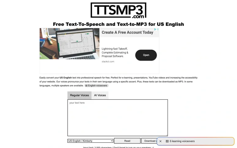
A compact speech tool presents regular and AI-voice tabs above a large text area and voice controls.
Useful for: Keep text input, voice choice and output controls together in one short form.
# Design reference: TTSMP3 — Speech form
Source: https://ttsmp3.com/
Swipefile reference: https://swipefile.design/ref/ai-next-ttsmp3/
Captured: 2026-09-06. This is a dated reference, not a claim about the current live product.
Capture scope: one viewport. Do not infer unseen page sections or a complete user flow.

## Objective
Adapt the interaction and layout patterns below to my project. Use my own content and identity. Do not reproduce logos, proprietary copy, or brand assets.

## Reference notes
- surface: A compact speech tool presents regular and AI-voice tabs above a large text area and voice controls.
- nav: Simple tab switcher above the input.
- layout: Narrow single-column form with voice selection and playback/download controls.
- density: Medium
- color: White, black and pale gray
- typography: Plain compact labels and strong tool title.
- pattern: Keep text input, voice choice and output controls together in one short form.
- states: Empty text-to-speech form; no audio requested.
- dont: Adapt the layout to your own product and supported capabilities; write your own examples and keep important actions clearly labeled.

Useful for: Keep text input, voice choice and output controls together in one short form.

## Acceptance criteria
- Existing project conventions, design tokens, working functionality, and unrelated changes are preserved.
- Two or three reference principles clearly support the user's task; conflicts are resolved in favor of usability and the existing product.
- Reusable components and semantic HTML express the interface. Available licensed assets are used; important UI text is never rendered as a bitmap.
- Every visible control has a defined behavior. Loading, empty, error, success, disabled, and long-content states are specified where relevant. Demo data is clearly labeled.
- Navigation and content adapt at 375px, 768px, and 1440px without horizontal page overflow. Keyboard use, visible focus, labeled inputs, at least 44px touch targets, readable contrast, and reduced motion are supported.
- Verification distinguishes rendered behavior from proposals and identifies anything still requiring a backend or external service.

## Quality bar
Clear hierarchy, consistent spacing, restrained surfaces, and purposeful motion. Avoid decorative gradients, excessive cards, placeholder buttons, and invented metrics unless the project calls for them. Do not claim a feature is connected or tested without evidence.
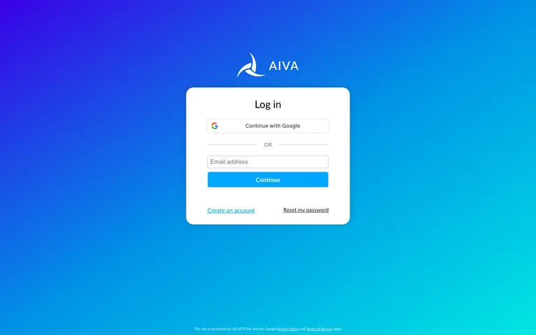
A white login card floats on a saturated violet-to-cyan gradient.
Useful for: Keep the required account step concise while explaining the product through the surrounding composition.
# Design reference: AIVA — Account entry
Source: https://creators.aiva.ai/login
Swipefile reference: https://swipefile.design/ref/ai-next-aiva/
Captured: 2026-09-06. This is a dated reference, not a claim about the current live product.
Capture scope: one viewport. Do not infer unseen page sections or a complete user flow.

## Objective
Adapt the interaction and layout patterns below to my project. Use my own content and identity. Do not reproduce logos, proprietary copy, or brand assets.

## Reference notes
- surface: A white login card floats on a saturated violet-to-cyan gradient.
- nav: Product identity and account-entry controls.
- layout: Centered card with social login above email entry.
- density: Low-medium
- color: Violet, cyan and white
- typography: Compact field labels and clear provider names.
- pattern: Keep the required account step concise while explaining the product through the surrounding composition.
- states: Signed-out account entry only; no authenticated workspace is shown and no account was created.
- dont: Adapt the layout to your own product and supported capabilities; write your own examples and keep important actions clearly labeled.

Useful for: Keep the required account step concise while explaining the product through the surrounding composition.

## Acceptance criteria
- Existing project conventions, design tokens, working functionality, and unrelated changes are preserved.
- Two or three reference principles clearly support the user's task; conflicts are resolved in favor of usability and the existing product.
- Reusable components and semantic HTML express the interface. Available licensed assets are used; important UI text is never rendered as a bitmap.
- Every visible control has a defined behavior. Loading, empty, error, success, disabled, and long-content states are specified where relevant. Demo data is clearly labeled.
- Navigation and content adapt at 375px, 768px, and 1440px without horizontal page overflow. Keyboard use, visible focus, labeled inputs, at least 44px touch targets, readable contrast, and reduced motion are supported.
- Verification distinguishes rendered behavior from proposals and identifies anything still requiring a backend or external service.

## Quality bar
Clear hierarchy, consistent spacing, restrained surfaces, and purposeful motion. Avoid decorative gradients, excessive cards, placeholder buttons, and invented metrics unless the project calls for them. Do not claim a feature is connected or tested without evidence.
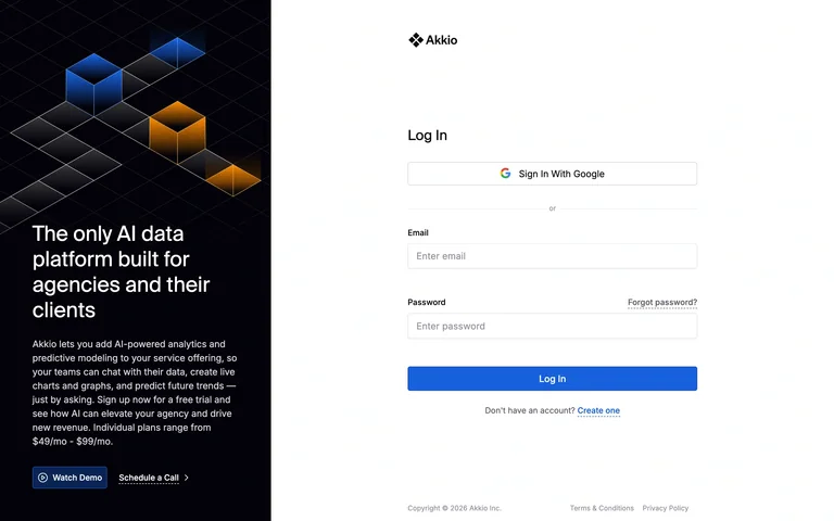
A crisp login form shares the page with a dark geometric product statement.
Useful for: Keep the required account step concise while explaining the product through the surrounding composition.
# Design reference: Akkio — Account entry
Source: https://app.akkio.com/login
Swipefile reference: https://swipefile.design/ref/ai-next-akkio-app/
Captured: 2026-09-06. This is a dated reference, not a claim about the current live product.
Capture scope: one viewport. Do not infer unseen page sections or a complete user flow.

## Objective
Adapt the interaction and layout patterns below to my project. Use my own content and identity. Do not reproduce logos, proprietary copy, or brand assets.

## Reference notes
- surface: A crisp login form shares the page with a dark geometric product statement.
- nav: Product identity and account-entry controls.
- layout: Dark promotional third beside a spacious white authentication column.
- density: Low-medium
- color: White, black and blue
- typography: Compact field labels and clear provider names.
- pattern: Keep the required account step concise while explaining the product through the surrounding composition.
- states: Signed-out account entry only; no authenticated workspace is shown and no account was created.
- dont: Adapt the layout to your own product and supported capabilities; write your own examples and keep important actions clearly labeled.

Useful for: Keep the required account step concise while explaining the product through the surrounding composition.

## Acceptance criteria
- Existing project conventions, design tokens, working functionality, and unrelated changes are preserved.
- Two or three reference principles clearly support the user's task; conflicts are resolved in favor of usability and the existing product.
- Reusable components and semantic HTML express the interface. Available licensed assets are used; important UI text is never rendered as a bitmap.
- Every visible control has a defined behavior. Loading, empty, error, success, disabled, and long-content states are specified where relevant. Demo data is clearly labeled.
- Navigation and content adapt at 375px, 768px, and 1440px without horizontal page overflow. Keyboard use, visible focus, labeled inputs, at least 44px touch targets, readable contrast, and reduced motion are supported.
- Verification distinguishes rendered behavior from proposals and identifies anything still requiring a backend or external service.

## Quality bar
Clear hierarchy, consistent spacing, restrained surfaces, and purposeful motion. Avoid decorative gradients, excessive cards, placeholder buttons, and invented metrics unless the project calls for them. Do not claim a feature is connected or tested without evidence.
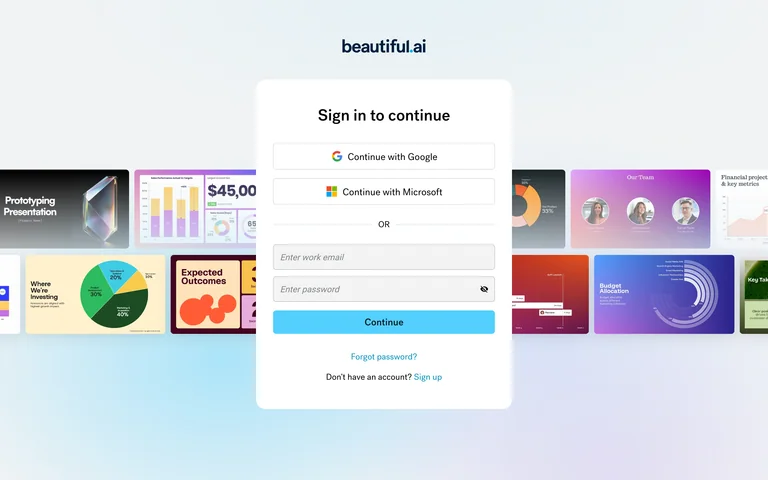
A compact sign-in card overlaps a row of colorful presentation examples.
Useful for: Keep the required account step concise while explaining the product through the surrounding composition.
# Design reference: Beautiful.ai — Account entry
Source: https://www.beautiful.ai/login
Swipefile reference: https://swipefile.design/ref/ai-next-beautiful-app/
Captured: 2026-09-06. This is a dated reference, not a claim about the current live product.
Capture scope: one viewport. Do not infer unseen page sections or a complete user flow.

## Objective
Adapt the interaction and layout patterns below to my project. Use my own content and identity. Do not reproduce logos, proprietary copy, or brand assets.

## Reference notes
- surface: A compact sign-in card overlaps a row of colorful presentation examples.
- nav: Product identity and account-entry controls.
- layout: Centered form over a soft gradient with slide previews behind it.
- density: Low-medium
- color: Pale blue, white and multicolor thumbnails
- typography: Compact field labels and clear provider names.
- pattern: Keep the required account step concise while explaining the product through the surrounding composition.
- states: Signed-out account entry only; no authenticated workspace is shown and no account was created.
- dont: Adapt the layout to your own product and supported capabilities; write your own examples and keep important actions clearly labeled.

Useful for: Keep the required account step concise while explaining the product through the surrounding composition.

## Acceptance criteria
- Existing project conventions, design tokens, working functionality, and unrelated changes are preserved.
- Two or three reference principles clearly support the user's task; conflicts are resolved in favor of usability and the existing product.
- Reusable components and semantic HTML express the interface. Available licensed assets are used; important UI text is never rendered as a bitmap.
- Every visible control has a defined behavior. Loading, empty, error, success, disabled, and long-content states are specified where relevant. Demo data is clearly labeled.
- Navigation and content adapt at 375px, 768px, and 1440px without horizontal page overflow. Keyboard use, visible focus, labeled inputs, at least 44px touch targets, readable contrast, and reduced motion are supported.
- Verification distinguishes rendered behavior from proposals and identifies anything still requiring a backend or external service.

## Quality bar
Clear hierarchy, consistent spacing, restrained surfaces, and purposeful motion. Avoid decorative gradients, excessive cards, placeholder buttons, and invented metrics unless the project calls for them. Do not claim a feature is connected or tested without evidence.
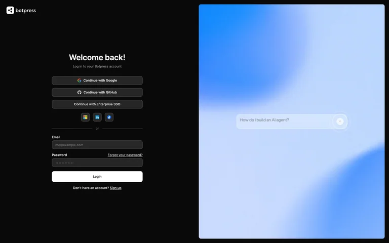
A dark login form sits beside a luminous blue panel with a subtle assistant input.
Useful for: Keep the required account step concise while explaining the product through the surrounding composition.
# Design reference: Botpress — Account entry
Source: https://sso.botpress.cloud/login
Swipefile reference: https://swipefile.design/ref/ai-next-botpress/
Captured: 2026-09-06. This is a dated reference, not a claim about the current live product.
Capture scope: one viewport. Do not infer unseen page sections or a complete user flow.

## Objective
Adapt the interaction and layout patterns below to my project. Use my own content and identity. Do not reproduce logos, proprietary copy, or brand assets.

## Reference notes
- surface: A dark login form sits beside a luminous blue panel with a subtle assistant input.
- nav: Product identity and account-entry controls.
- layout: Balanced split layout with authentication left and product motif right.
- density: Low-medium
- color: Black, white and blue
- typography: Compact field labels and clear provider names.
- pattern: Keep the required account step concise while explaining the product through the surrounding composition.
- states: Signed-out account entry only; no authenticated workspace is shown and no account was created.
- dont: Adapt the layout to your own product and supported capabilities; write your own examples and keep important actions clearly labeled.

Useful for: Keep the required account step concise while explaining the product through the surrounding composition.

## Acceptance criteria
- Existing project conventions, design tokens, working functionality, and unrelated changes are preserved.
- Two or three reference principles clearly support the user's task; conflicts are resolved in favor of usability and the existing product.
- Reusable components and semantic HTML express the interface. Available licensed assets are used; important UI text is never rendered as a bitmap.
- Every visible control has a defined behavior. Loading, empty, error, success, disabled, and long-content states are specified where relevant. Demo data is clearly labeled.
- Navigation and content adapt at 375px, 768px, and 1440px without horizontal page overflow. Keyboard use, visible focus, labeled inputs, at least 44px touch targets, readable contrast, and reduced motion are supported.
- Verification distinguishes rendered behavior from proposals and identifies anything still requiring a backend or external service.

## Quality bar
Clear hierarchy, consistent spacing, restrained surfaces, and purposeful motion. Avoid decorative gradients, excessive cards, placeholder buttons, and invented metrics unless the project calls for them. Do not claim a feature is connected or tested without evidence.
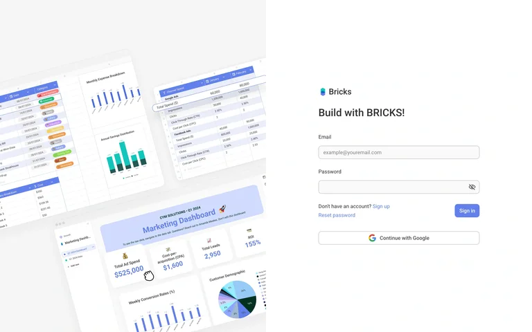
An AI spreadsheet sign-up form sits beside a tilted collage of chart and table previews.
Useful for: Keep the required account step concise while explaining the product through the surrounding composition.
# Design reference: Bricks — Account entry
Source: https://app.thebricks.com/sign-in?redirect=/home/-/-
Swipefile reference: https://swipefile.design/ref/ai-next-bricks-app/
Captured: 2026-09-06. This is a dated reference, not a claim about the current live product.
Capture scope: one viewport. Do not infer unseen page sections or a complete user flow.

## Objective
Adapt the interaction and layout patterns below to my project. Use my own content and identity. Do not reproduce logos, proprietary copy, or brand assets.

## Reference notes
- surface: An AI spreadsheet sign-up form sits beside a tilted collage of chart and table previews.
- nav: Product identity and account-entry controls.
- layout: Visual product collage on the left with a compact form on the right.
- density: Low-medium
- color: White, gray and blue
- typography: Compact field labels and clear provider names.
- pattern: Keep the required account step concise while explaining the product through the surrounding composition.
- states: Signed-out account entry only; no authenticated workspace is shown and no account was created.
- dont: Adapt the layout to your own product and supported capabilities; write your own examples and keep important actions clearly labeled.

Useful for: Keep the required account step concise while explaining the product through the surrounding composition.

## Acceptance criteria
- Existing project conventions, design tokens, working functionality, and unrelated changes are preserved.
- Two or three reference principles clearly support the user's task; conflicts are resolved in favor of usability and the existing product.
- Reusable components and semantic HTML express the interface. Available licensed assets are used; important UI text is never rendered as a bitmap.
- Every visible control has a defined behavior. Loading, empty, error, success, disabled, and long-content states are specified where relevant. Demo data is clearly labeled.
- Navigation and content adapt at 375px, 768px, and 1440px without horizontal page overflow. Keyboard use, visible focus, labeled inputs, at least 44px touch targets, readable contrast, and reduced motion are supported.
- Verification distinguishes rendered behavior from proposals and identifies anything still requiring a backend or external service.

## Quality bar
Clear hierarchy, consistent spacing, restrained surfaces, and purposeful motion. Avoid decorative gradients, excessive cards, placeholder buttons, and invented metrics unless the project calls for them. Do not claim a feature is connected or tested without evidence.
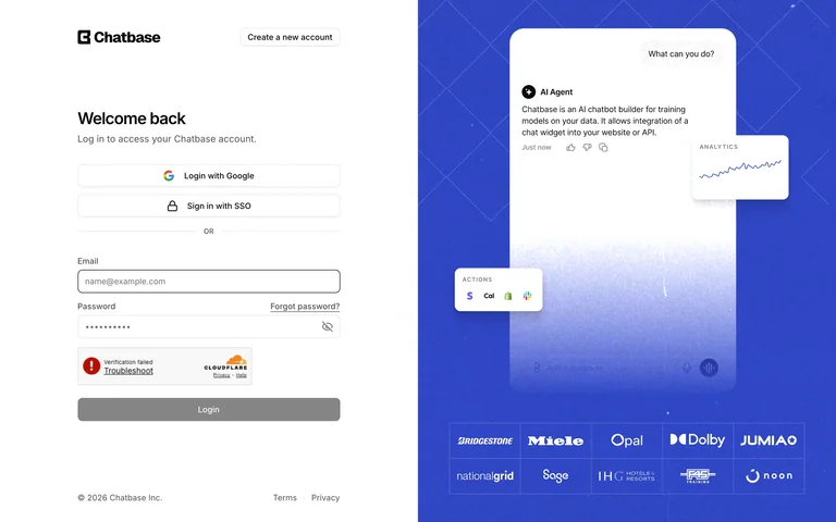
An agent-platform login form is paired with a blue product-message panel and customer logos.
Useful for: Keep the required account step concise while explaining the product through the surrounding composition.
# Design reference: Chatbase — Account entry
Source: https://www.chatbase.co/auth/signin
Swipefile reference: https://swipefile.design/ref/ai-next-chatbase/
Captured: 2026-09-06. This is a dated reference, not a claim about the current live product.
Capture scope: one viewport. Do not infer unseen page sections or a complete user flow.

## Objective
Adapt the interaction and layout patterns below to my project. Use my own content and identity. Do not reproduce logos, proprietary copy, or brand assets.

## Reference notes
- surface: An agent-platform login form is paired with a blue product-message panel and customer logos.
- nav: Product identity and account-entry controls.
- layout: Two-column layout with white form area and large illustrated proof panel.
- density: Low-medium
- color: White, charcoal and blue
- typography: Compact field labels and clear provider names.
- pattern: Keep the required account step concise while explaining the product through the surrounding composition.
- states: Signed-out account entry only; no authenticated workspace is shown and no account was created.
- dont: Adapt the layout to your own product and supported capabilities; write your own examples and keep important actions clearly labeled.

Useful for: Keep the required account step concise while explaining the product through the surrounding composition.

## Acceptance criteria
- Existing project conventions, design tokens, working functionality, and unrelated changes are preserved.
- Two or three reference principles clearly support the user's task; conflicts are resolved in favor of usability and the existing product.
- Reusable components and semantic HTML express the interface. Available licensed assets are used; important UI text is never rendered as a bitmap.
- Every visible control has a defined behavior. Loading, empty, error, success, disabled, and long-content states are specified where relevant. Demo data is clearly labeled.
- Navigation and content adapt at 375px, 768px, and 1440px without horizontal page overflow. Keyboard use, visible focus, labeled inputs, at least 44px touch targets, readable contrast, and reduced motion are supported.
- Verification distinguishes rendered behavior from proposals and identifies anything still requiring a backend or external service.

## Quality bar
Clear hierarchy, consistent spacing, restrained surfaces, and purposeful motion. Avoid decorative gradients, excessive cards, placeholder buttons, and invented metrics unless the project calls for them. Do not claim a feature is connected or tested without evidence.
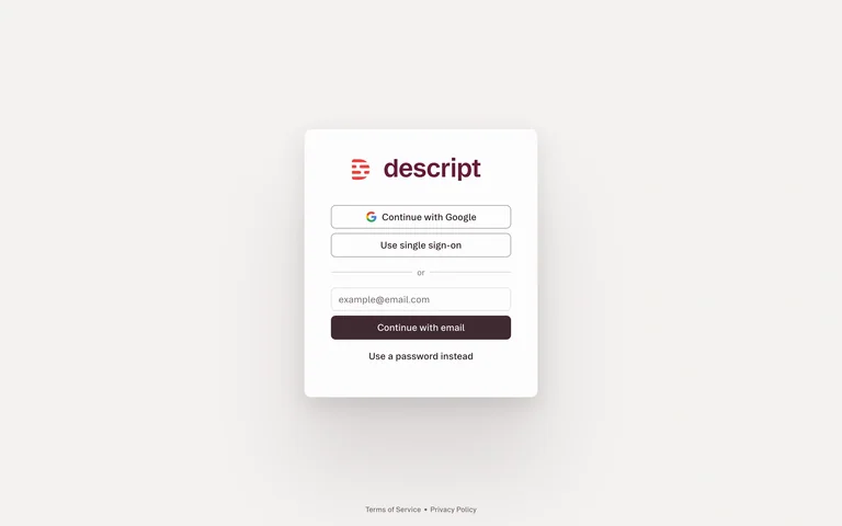
A small login card sits on a warm empty canvas with social and email options.
Useful for: Keep the required account step concise while explaining the product through the surrounding composition.
# Design reference: Descript — Account entry
Source: https://web.descript.com/authenticate
Swipefile reference: https://swipefile.design/ref/ai-next-descript-app/
Captured: 2026-09-06. This is a dated reference, not a claim about the current live product.
Capture scope: one viewport. Do not infer unseen page sections or a complete user flow.

## Objective
Adapt the interaction and layout patterns below to my project. Use my own content and identity. Do not reproduce logos, proprietary copy, or brand assets.

## Reference notes
- surface: A small login card sits on a warm empty canvas with social and email options.
- nav: Product identity and account-entry controls.
- layout: Centered narrow card with restrained shadow and generous whitespace.
- density: Low-medium
- color: Warm gray, white and dark burgundy
- typography: Compact field labels and clear provider names.
- pattern: Keep the required account step concise while explaining the product through the surrounding composition.
- states: Signed-out account entry only; no authenticated workspace is shown and no account was created.
- dont: Adapt the layout to your own product and supported capabilities; write your own examples and keep important actions clearly labeled.

Useful for: Keep the required account step concise while explaining the product through the surrounding composition.

## Acceptance criteria
- Existing project conventions, design tokens, working functionality, and unrelated changes are preserved.
- Two or three reference principles clearly support the user's task; conflicts are resolved in favor of usability and the existing product.
- Reusable components and semantic HTML express the interface. Available licensed assets are used; important UI text is never rendered as a bitmap.
- Every visible control has a defined behavior. Loading, empty, error, success, disabled, and long-content states are specified where relevant. Demo data is clearly labeled.
- Navigation and content adapt at 375px, 768px, and 1440px without horizontal page overflow. Keyboard use, visible focus, labeled inputs, at least 44px touch targets, readable contrast, and reduced motion are supported.
- Verification distinguishes rendered behavior from proposals and identifies anything still requiring a backend or external service.

## Quality bar
Clear hierarchy, consistent spacing, restrained surfaces, and purposeful motion. Avoid decorative gradients, excessive cards, placeholder buttons, and invented metrics unless the project calls for them. Do not claim a feature is connected or tested without evidence.
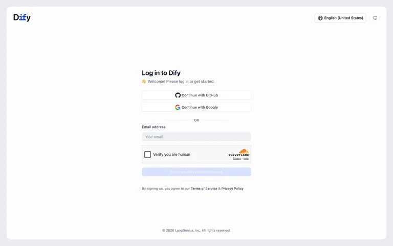
A centered authentication panel presents SSO providers above email verification.
Useful for: Keep the required account step concise while explaining the product through the surrounding composition.
# Design reference: Dify — Account entry
Source: https://cloud.dify.ai/signin?redirect_url=%2F
Swipefile reference: https://swipefile.design/ref/ai-next-dify-cloud/
Captured: 2026-09-06. This is a dated reference, not a claim about the current live product.
Capture scope: one viewport. Do not infer unseen page sections or a complete user flow.

## Objective
Adapt the interaction and layout patterns below to my project. Use my own content and identity. Do not reproduce logos, proprietary copy, or brand assets.

## Reference notes
- surface: A centered authentication panel presents SSO providers above email verification.
- nav: Product identity and account-entry controls.
- layout: Single small login column inside a broad pale page.
- density: Low-medium
- color: White, pale gray and blue
- typography: Compact field labels and clear provider names.
- pattern: Keep the required account step concise while explaining the product through the surrounding composition.
- states: Signed-out account entry only; no authenticated workspace is shown and no account was created.
- dont: Adapt the layout to your own product and supported capabilities; write your own examples and keep important actions clearly labeled.

Useful for: Keep the required account step concise while explaining the product through the surrounding composition.

## Acceptance criteria
- Existing project conventions, design tokens, working functionality, and unrelated changes are preserved.
- Two or three reference principles clearly support the user's task; conflicts are resolved in favor of usability and the existing product.
- Reusable components and semantic HTML express the interface. Available licensed assets are used; important UI text is never rendered as a bitmap.
- Every visible control has a defined behavior. Loading, empty, error, success, disabled, and long-content states are specified where relevant. Demo data is clearly labeled.
- Navigation and content adapt at 375px, 768px, and 1440px without horizontal page overflow. Keyboard use, visible focus, labeled inputs, at least 44px touch targets, readable contrast, and reduced motion are supported.
- Verification distinguishes rendered behavior from proposals and identifies anything still requiring a backend or external service.

## Quality bar
Clear hierarchy, consistent spacing, restrained surfaces, and purposeful motion. Avoid decorative gradients, excessive cards, placeholder buttons, and invented metrics unless the project calls for them. Do not claim a feature is connected or tested without evidence.
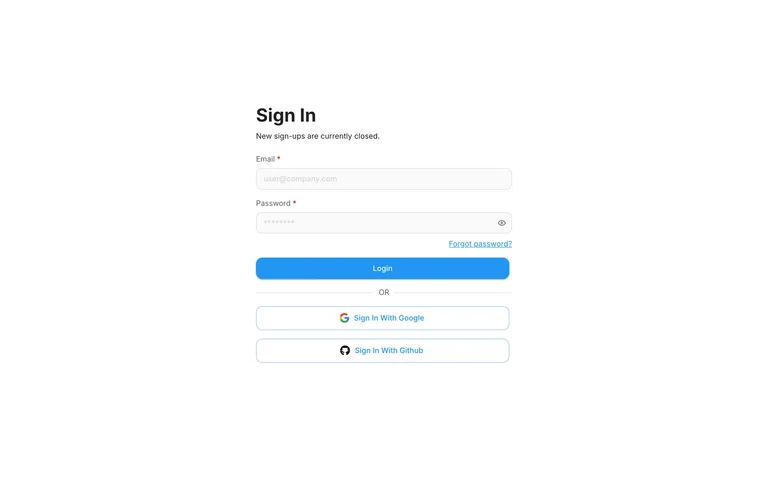
A simple sign-in form groups email/password and provider options in one narrow column.
Useful for: Keep the required account step concise while explaining the product through the surrounding composition.
# Design reference: Flowise — Account entry
Source: https://cloud.flowiseai.com/signin
Swipefile reference: https://swipefile.design/ref/ai-next-flowise-demo/
Captured: 2026-09-06. This is a dated reference, not a claim about the current live product.
Capture scope: one viewport. Do not infer unseen page sections or a complete user flow.

## Objective
Adapt the interaction and layout patterns below to my project. Use my own content and identity. Do not reproduce logos, proprietary copy, or brand assets.

## Reference notes
- surface: A simple sign-in form groups email/password and provider options in one narrow column.
- nav: Product identity and account-entry controls.
- layout: Unframed centered form with one blue primary action.
- density: Low-medium
- color: White, gray and cyan
- typography: Compact field labels and clear provider names.
- pattern: Keep the required account step concise while explaining the product through the surrounding composition.
- states: Signed-out account entry only; no authenticated workspace is shown and no account was created.
- dont: Adapt the layout to your own product and supported capabilities; write your own examples and keep important actions clearly labeled.

Useful for: Keep the required account step concise while explaining the product through the surrounding composition.

## Acceptance criteria
- Existing project conventions, design tokens, working functionality, and unrelated changes are preserved.
- Two or three reference principles clearly support the user's task; conflicts are resolved in favor of usability and the existing product.
- Reusable components and semantic HTML express the interface. Available licensed assets are used; important UI text is never rendered as a bitmap.
- Every visible control has a defined behavior. Loading, empty, error, success, disabled, and long-content states are specified where relevant. Demo data is clearly labeled.
- Navigation and content adapt at 375px, 768px, and 1440px without horizontal page overflow. Keyboard use, visible focus, labeled inputs, at least 44px touch targets, readable contrast, and reduced motion are supported.
- Verification distinguishes rendered behavior from proposals and identifies anything still requiring a backend or external service.

## Quality bar
Clear hierarchy, consistent spacing, restrained surfaces, and purposeful motion. Avoid decorative gradients, excessive cards, placeholder buttons, and invented metrics unless the project calls for them. Do not claim a feature is connected or tested without evidence.
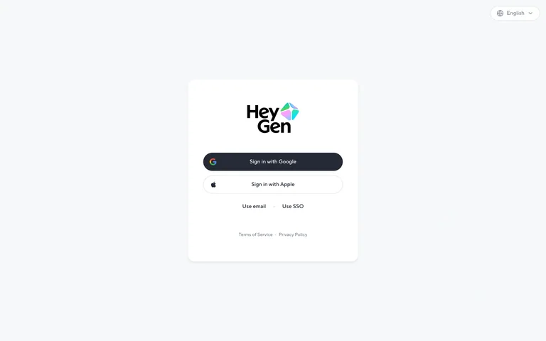
A compact account entry panel puts Google and Apple options above email and SSO.
Useful for: Keep the required account step concise while explaining the product through the surrounding composition.
# Design reference: HeyGen — Account entry
Source: https://auth.heygen.com/
Swipefile reference: https://swipefile.design/ref/ai-next-heygen-app/
Captured: 2026-09-06. This is a dated reference, not a claim about the current live product.
Capture scope: one viewport. Do not infer unseen page sections or a complete user flow.

## Objective
Adapt the interaction and layout patterns below to my project. Use my own content and identity. Do not reproduce logos, proprietary copy, or brand assets.

## Reference notes
- surface: A compact account entry panel puts Google and Apple options above email and SSO.
- nav: Product identity and account-entry controls.
- layout: Small white card on a nearly white canvas.
- density: Low-medium
- color: White, charcoal and a multicolor brand mark
- typography: Compact field labels and clear provider names.
- pattern: Keep the required account step concise while explaining the product through the surrounding composition.
- states: Signed-out account entry only; no authenticated workspace is shown and no account was created.
- dont: Adapt the layout to your own product and supported capabilities; write your own examples and keep important actions clearly labeled.

Useful for: Keep the required account step concise while explaining the product through the surrounding composition.

## Acceptance criteria
- Existing project conventions, design tokens, working functionality, and unrelated changes are preserved.
- Two or three reference principles clearly support the user's task; conflicts are resolved in favor of usability and the existing product.
- Reusable components and semantic HTML express the interface. Available licensed assets are used; important UI text is never rendered as a bitmap.
- Every visible control has a defined behavior. Loading, empty, error, success, disabled, and long-content states are specified where relevant. Demo data is clearly labeled.
- Navigation and content adapt at 375px, 768px, and 1440px without horizontal page overflow. Keyboard use, visible focus, labeled inputs, at least 44px touch targets, readable contrast, and reduced motion are supported.
- Verification distinguishes rendered behavior from proposals and identifies anything still requiring a backend or external service.

## Quality bar
Clear hierarchy, consistent spacing, restrained surfaces, and purposeful motion. Avoid decorative gradients, excessive cards, placeholder buttons, and invented metrics unless the project calls for them. Do not claim a feature is connected or tested without evidence.
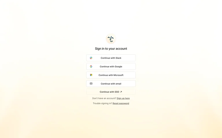
An assistant login screen offers a short stack of provider options on a warm pale gradient.
Useful for: Keep the required account step concise while explaining the product through the surrounding composition.
# Design reference: Lindy — Account entry
Source: https://chat.lindy.ai/login
Swipefile reference: https://swipefile.design/ref/ai-next-lindy-app/
Captured: 2026-09-06. This is a dated reference, not a claim about the current live product.
Capture scope: one viewport. Do not infer unseen page sections or a complete user flow.

## Objective
Adapt the interaction and layout patterns below to my project. Use my own content and identity. Do not reproduce logos, proprietary copy, or brand assets.

## Reference notes
- surface: An assistant login screen offers a short stack of provider options on a warm pale gradient.
- nav: Product identity and account-entry controls.
- layout: Centered logo and provider buttons with abundant open space.
- density: Low-medium
- color: Cream, white and charcoal
- typography: Compact field labels and clear provider names.
- pattern: Keep the required account step concise while explaining the product through the surrounding composition.
- states: Signed-out account entry only; no authenticated workspace is shown and no account was created.
- dont: Adapt the layout to your own product and supported capabilities; write your own examples and keep important actions clearly labeled.

Useful for: Keep the required account step concise while explaining the product through the surrounding composition.

## Acceptance criteria
- Existing project conventions, design tokens, working functionality, and unrelated changes are preserved.
- Two or three reference principles clearly support the user's task; conflicts are resolved in favor of usability and the existing product.
- Reusable components and semantic HTML express the interface. Available licensed assets are used; important UI text is never rendered as a bitmap.
- Every visible control has a defined behavior. Loading, empty, error, success, disabled, and long-content states are specified where relevant. Demo data is clearly labeled.
- Navigation and content adapt at 375px, 768px, and 1440px without horizontal page overflow. Keyboard use, visible focus, labeled inputs, at least 44px touch targets, readable contrast, and reduced motion are supported.
- Verification distinguishes rendered behavior from proposals and identifies anything still requiring a backend or external service.

## Quality bar
Clear hierarchy, consistent spacing, restrained surfaces, and purposeful motion. Avoid decorative gradients, excessive cards, placeholder buttons, and invented metrics unless the project calls for them. Do not claim a feature is connected or tested without evidence.
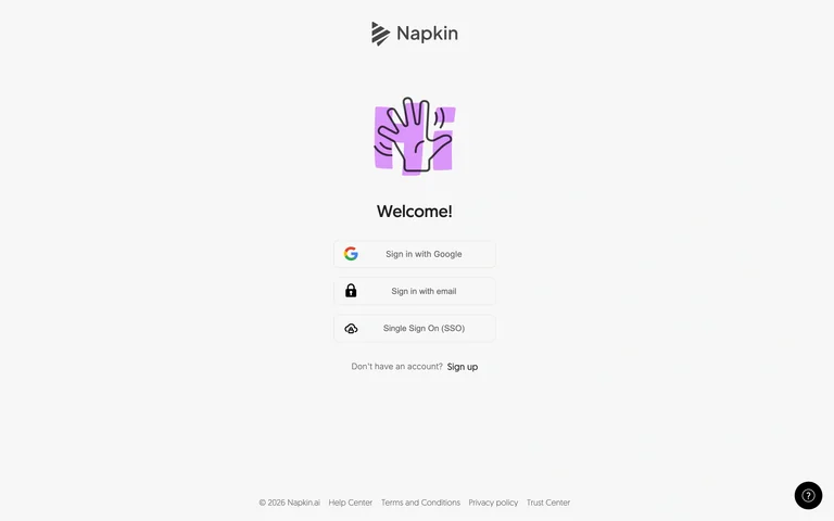
A playful hand illustration introduces a minimal set of account-entry choices.
Useful for: Keep the required account step concise while explaining the product through the surrounding composition.
# Design reference: Napkin — Account entry
Source: https://app.napkin.ai/signin
Swipefile reference: https://swipefile.design/ref/ai-next-napkin-entry/
Captured: 2026-09-06. This is a dated reference, not a claim about the current live product.
Capture scope: one viewport. Do not infer unseen page sections or a complete user flow.

## Objective
Adapt the interaction and layout patterns below to my project. Use my own content and identity. Do not reproduce logos, proprietary copy, or brand assets.

## Reference notes
- surface: A playful hand illustration introduces a minimal set of account-entry choices.
- nav: Product identity and account-entry controls.
- layout: Small centered column with a visual welcome marker.
- density: Low-medium
- color: White, black and lavender
- typography: Compact field labels and clear provider names.
- pattern: Keep the required account step concise while explaining the product through the surrounding composition.
- states: Signed-out account entry only; no authenticated workspace is shown and no account was created.
- dont: Adapt the layout to your own product and supported capabilities; write your own examples and keep important actions clearly labeled.

Useful for: Keep the required account step concise while explaining the product through the surrounding composition.

## Acceptance criteria
- Existing project conventions, design tokens, working functionality, and unrelated changes are preserved.
- Two or three reference principles clearly support the user's task; conflicts are resolved in favor of usability and the existing product.
- Reusable components and semantic HTML express the interface. Available licensed assets are used; important UI text is never rendered as a bitmap.
- Every visible control has a defined behavior. Loading, empty, error, success, disabled, and long-content states are specified where relevant. Demo data is clearly labeled.
- Navigation and content adapt at 375px, 768px, and 1440px without horizontal page overflow. Keyboard use, visible focus, labeled inputs, at least 44px touch targets, readable contrast, and reduced motion are supported.
- Verification distinguishes rendered behavior from proposals and identifies anything still requiring a backend or external service.

## Quality bar
Clear hierarchy, consistent spacing, restrained surfaces, and purposeful motion. Avoid decorative gradients, excessive cards, placeholder buttons, and invented metrics unless the project calls for them. Do not claim a feature is connected or tested without evidence.
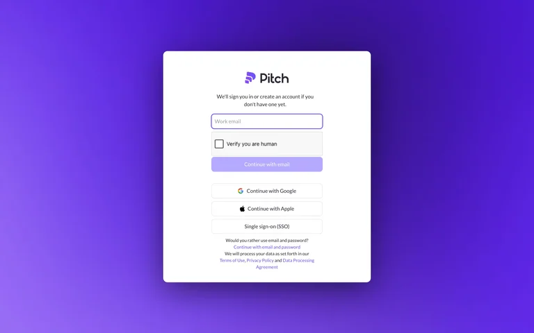
A white account form stands against an intense purple radial gradient.
Useful for: Keep the required account step concise while explaining the product through the surrounding composition.
# Design reference: Pitch — Account entry
Source: https://auth.pitch.com/login?state=hKFo2SBJcGtWYnBMQ2lBejVkQ3NocGFuWXpOSFlWMFVTWF80daFupWxvZ2luo3RpZNkgcTZmYUFhZVI2b0NPc045b1VpelZpeW5ENmV0WE40ZHOjY2lk2SBUQVpVbDhEOE9LNTNsWUJJUTVtWm8wenUwN2VkQ3dQMA&client=TAZUl8D8OK53lYBIQ5mZo0zu07edCwP0&protocol=oauth2&prompt=select_account&scope=openid%20profile%20email%20offline_access&redirect_uri=https%3A%2F%2Fapp.pitch.com%2Fapp%2Flogin%2Fcallback&audience=document-sync-1&response_type=code&response_mode=query&nonce=fk5SbzgwcURURlZvOFlhTElOazRxaWVFUEJkXzBEbzZnOEZ4dUJGNHZOdQ%3D%3D&code_challenge=ZW7yMZ7jIZ8ZLt5JVQQnQDfo6lBOnbn-hwC8j0HqHZg&code_challenge_method=S256&auth0Client=eyJuYW1lIjoiYXV0aDAtc3BhLWpzIiwidmVyc2lvbiI6IjIuMTguMCJ9#/
Swipefile reference: https://swipefile.design/ref/ai-next-pitch-app/
Captured: 2026-09-06. This is a dated reference, not a claim about the current live product.
Capture scope: one viewport. Do not infer unseen page sections or a complete user flow.

## Objective
Adapt the interaction and layout patterns below to my project. Use my own content and identity. Do not reproduce logos, proprietary copy, or brand assets.

## Reference notes
- surface: A white account form stands against an intense purple radial gradient.
- nav: Product identity and account-entry controls.
- layout: Tall centered authentication card on a full-bleed color field.
- density: Low-medium
- color: Violet, white and dark gray
- typography: Compact field labels and clear provider names.
- pattern: Keep the required account step concise while explaining the product through the surrounding composition.
- states: Signed-out account entry only; no authenticated workspace is shown and no account was created.
- dont: Adapt the layout to your own product and supported capabilities; write your own examples and keep important actions clearly labeled.

Useful for: Keep the required account step concise while explaining the product through the surrounding composition.

## Acceptance criteria
- Existing project conventions, design tokens, working functionality, and unrelated changes are preserved.
- Two or three reference principles clearly support the user's task; conflicts are resolved in favor of usability and the existing product.
- Reusable components and semantic HTML express the interface. Available licensed assets are used; important UI text is never rendered as a bitmap.
- Every visible control has a defined behavior. Loading, empty, error, success, disabled, and long-content states are specified where relevant. Demo data is clearly labeled.
- Navigation and content adapt at 375px, 768px, and 1440px without horizontal page overflow. Keyboard use, visible focus, labeled inputs, at least 44px touch targets, readable contrast, and reduced motion are supported.
- Verification distinguishes rendered behavior from proposals and identifies anything still requiring a backend or external service.

## Quality bar
Clear hierarchy, consistent spacing, restrained surfaces, and purposeful motion. Avoid decorative gradients, excessive cards, placeholder buttons, and invented metrics unless the project calls for them. Do not claim a feature is connected or tested without evidence.
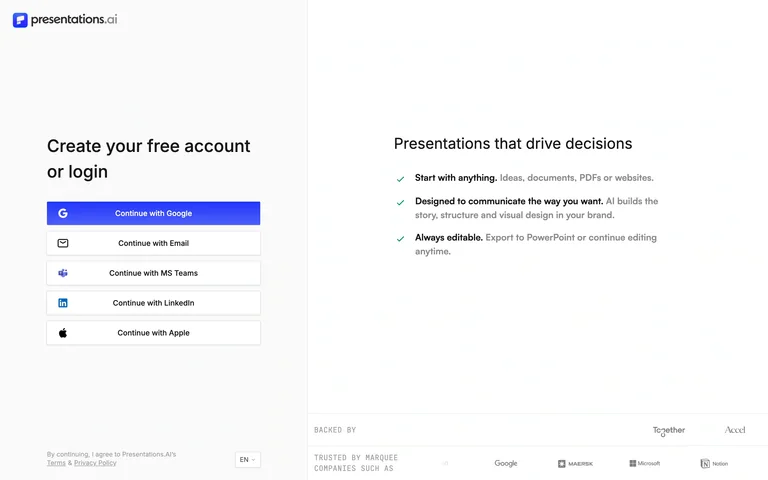
A stack of provider sign-in buttons is paired with a short list of presentation benefits.
Useful for: Keep the required account step concise while explaining the product through the surrounding composition.
# Design reference: Presentations.AI — Account entry
Source: https://app.presentations.ai/docs/login?
Swipefile reference: https://swipefile.design/ref/ai-next-presentations-app/
Captured: 2026-09-06. This is a dated reference, not a claim about the current live product.
Capture scope: one viewport. Do not infer unseen page sections or a complete user flow.

## Objective
Adapt the interaction and layout patterns below to my project. Use my own content and identity. Do not reproduce logos, proprietary copy, or brand assets.

## Reference notes
- surface: A stack of provider sign-in buttons is paired with a short list of presentation benefits.
- nav: Product identity and account-entry controls.
- layout: Two open columns separated by whitespace rather than heavy borders.
- density: Low-medium
- color: White, black and blue
- typography: Compact field labels and clear provider names.
- pattern: Keep the required account step concise while explaining the product through the surrounding composition.
- states: Signed-out account entry only; no authenticated workspace is shown and no account was created.
- dont: Adapt the layout to your own product and supported capabilities; write your own examples and keep important actions clearly labeled.

Useful for: Keep the required account step concise while explaining the product through the surrounding composition.

## Acceptance criteria
- Existing project conventions, design tokens, working functionality, and unrelated changes are preserved.
- Two or three reference principles clearly support the user's task; conflicts are resolved in favor of usability and the existing product.
- Reusable components and semantic HTML express the interface. Available licensed assets are used; important UI text is never rendered as a bitmap.
- Every visible control has a defined behavior. Loading, empty, error, success, disabled, and long-content states are specified where relevant. Demo data is clearly labeled.
- Navigation and content adapt at 375px, 768px, and 1440px without horizontal page overflow. Keyboard use, visible focus, labeled inputs, at least 44px touch targets, readable contrast, and reduced motion are supported.
- Verification distinguishes rendered behavior from proposals and identifies anything still requiring a backend or external service.

## Quality bar
Clear hierarchy, consistent spacing, restrained surfaces, and purposeful motion. Avoid decorative gradients, excessive cards, placeholder buttons, and invented metrics unless the project calls for them. Do not claim a feature is connected or tested without evidence.
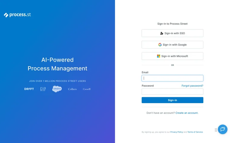
A blue product statement and customer logos balance a plain sign-in form.
Useful for: Keep the required account step concise while explaining the product through the surrounding composition.
# Design reference: Process Street — Account entry
Source: https://app.process.st/login
Swipefile reference: https://swipefile.design/ref/ai-next-process-street/
Captured: 2026-09-06. This is a dated reference, not a claim about the current live product.
Capture scope: one viewport. Do not infer unseen page sections or a complete user flow.

## Objective
Adapt the interaction and layout patterns below to my project. Use my own content and identity. Do not reproduce logos, proprietary copy, or brand assets.

## Reference notes
- surface: A blue product statement and customer logos balance a plain sign-in form.
- nav: Product identity and account-entry controls.
- layout: Large colored left panel beside a centered white form.
- density: Low-medium
- color: Blue, violet and white
- typography: Compact field labels and clear provider names.
- pattern: Keep the required account step concise while explaining the product through the surrounding composition.
- states: Signed-out account entry only; no authenticated workspace is shown and no account was created.
- dont: Adapt the layout to your own product and supported capabilities; write your own examples and keep important actions clearly labeled.

Useful for: Keep the required account step concise while explaining the product through the surrounding composition.

## Acceptance criteria
- Existing project conventions, design tokens, working functionality, and unrelated changes are preserved.
- Two or three reference principles clearly support the user's task; conflicts are resolved in favor of usability and the existing product.
- Reusable components and semantic HTML express the interface. Available licensed assets are used; important UI text is never rendered as a bitmap.
- Every visible control has a defined behavior. Loading, empty, error, success, disabled, and long-content states are specified where relevant. Demo data is clearly labeled.
- Navigation and content adapt at 375px, 768px, and 1440px without horizontal page overflow. Keyboard use, visible focus, labeled inputs, at least 44px touch targets, readable contrast, and reduced motion are supported.
- Verification distinguishes rendered behavior from proposals and identifies anything still requiring a backend or external service.

## Quality bar
Clear hierarchy, consistent spacing, restrained surfaces, and purposeful motion. Avoid decorative gradients, excessive cards, placeholder buttons, and invented metrics unless the project calls for them. Do not claim a feature is connected or tested without evidence.
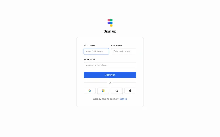
An AI spreadsheet sign-up form starts with first and last name fields above email and password.
Useful for: Keep the required account step concise while explaining the product through the surrounding composition.
# Design reference: Quadratic — Account entry
Source: https://signin.quadratichq.com/sign-up?client_id=client_01JXWR78WNK63WC2WXH8CP3XSQ&redirect_uri=https%3A%2F%2Fapp.quadratichq.com%2Flogin-result&state=%7B%22redirectTo%22%3A%22https%3A%2F%2Fapp.quadratichq.com%2F%22%7D&authorization_session_id=01M1VNT9HYG2JFGDWS58ZK8QM8
Swipefile reference: https://swipefile.design/ref/ai-next-quadratic-app/
Captured: 2026-09-06. This is a dated reference, not a claim about the current live product.
Capture scope: one viewport. Do not infer unseen page sections or a complete user flow.

## Objective
Adapt the interaction and layout patterns below to my project. Use my own content and identity. Do not reproduce logos, proprietary copy, or brand assets.

## Reference notes
- surface: An AI spreadsheet sign-up form starts with first and last name fields above email and password.
- nav: Product identity and account-entry controls.
- layout: Narrow centered form with paired name inputs and alternative provider icons.
- density: Low-medium
- color: White, light gray and blue
- typography: Compact field labels and clear provider names.
- pattern: Keep the required account step concise while explaining the product through the surrounding composition.
- states: Signed-out account entry only; no authenticated workspace is shown and no account was created.
- dont: Adapt the layout to your own product and supported capabilities; write your own examples and keep important actions clearly labeled.

Useful for: Keep the required account step concise while explaining the product through the surrounding composition.

## Acceptance criteria
- Existing project conventions, design tokens, working functionality, and unrelated changes are preserved.
- Two or three reference principles clearly support the user's task; conflicts are resolved in favor of usability and the existing product.
- Reusable components and semantic HTML express the interface. Available licensed assets are used; important UI text is never rendered as a bitmap.
- Every visible control has a defined behavior. Loading, empty, error, success, disabled, and long-content states are specified where relevant. Demo data is clearly labeled.
- Navigation and content adapt at 375px, 768px, and 1440px without horizontal page overflow. Keyboard use, visible focus, labeled inputs, at least 44px touch targets, readable contrast, and reduced motion are supported.
- Verification distinguishes rendered behavior from proposals and identifies anything still requiring a backend or external service.

## Quality bar
Clear hierarchy, consistent spacing, restrained surfaces, and purposeful motion. Avoid decorative gradients, excessive cards, placeholder buttons, and invented metrics unless the project calls for them. Do not claim a feature is connected or tested without evidence.
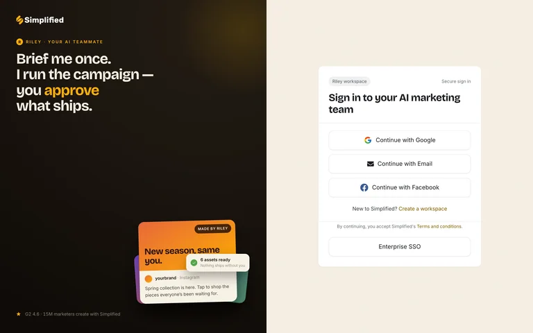
A campaign-focused message and sample card share an ivory sign-in page.
Useful for: Keep the required account step concise while explaining the product through the surrounding composition.
# Design reference: Simplified — Account entry
Source: https://app.simplified.com/login?redirect=/
Swipefile reference: https://swipefile.design/ref/ai-next-simplified/
Captured: 2026-09-06. This is a dated reference, not a claim about the current live product.
Capture scope: one viewport. Do not infer unseen page sections or a complete user flow.

## Objective
Adapt the interaction and layout patterns below to my project. Use my own content and identity. Do not reproduce logos, proprietary copy, or brand assets.

## Reference notes
- surface: A campaign-focused message and sample card share an ivory sign-in page.
- nav: Product identity and account-entry controls.
- layout: Dark promotional panel left and compact account card right.
- density: Low-medium
- color: Dark brown, cream and orange
- typography: Compact field labels and clear provider names.
- pattern: Keep the required account step concise while explaining the product through the surrounding composition.
- states: Signed-out account entry only; no authenticated workspace is shown and no account was created.
- dont: Adapt the layout to your own product and supported capabilities; write your own examples and keep important actions clearly labeled.

Useful for: Keep the required account step concise while explaining the product through the surrounding composition.

## Acceptance criteria
- Existing project conventions, design tokens, working functionality, and unrelated changes are preserved.
- Two or three reference principles clearly support the user's task; conflicts are resolved in favor of usability and the existing product.
- Reusable components and semantic HTML express the interface. Available licensed assets are used; important UI text is never rendered as a bitmap.
- Every visible control has a defined behavior. Loading, empty, error, success, disabled, and long-content states are specified where relevant. Demo data is clearly labeled.
- Navigation and content adapt at 375px, 768px, and 1440px without horizontal page overflow. Keyboard use, visible focus, labeled inputs, at least 44px touch targets, readable contrast, and reduced motion are supported.
- Verification distinguishes rendered behavior from proposals and identifies anything still requiring a backend or external service.

## Quality bar
Clear hierarchy, consistent spacing, restrained surfaces, and purposeful motion. Avoid decorative gradients, excessive cards, placeholder buttons, and invented metrics unless the project calls for them. Do not claim a feature is connected or tested without evidence.
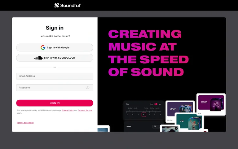
A music account form is paired with bold magenta copy and a dark product preview.
Useful for: Keep the required account step concise while explaining the product through the surrounding composition.
# Design reference: Soundful — Account entry
Source: https://my.soundful.com/signin
Swipefile reference: https://swipefile.design/ref/ai-next-soundful/
Captured: 2026-09-06. This is a dated reference, not a claim about the current live product.
Capture scope: one viewport. Do not infer unseen page sections or a complete user flow.

## Objective
Adapt the interaction and layout patterns below to my project. Use my own content and identity. Do not reproduce logos, proprietary copy, or brand assets.

## Reference notes
- surface: A music account form is paired with bold magenta copy and a dark product preview.
- nav: Product identity and account-entry controls.
- layout: White form column inside a large dark split panel.
- density: Low-medium
- color: Black, white and vivid magenta
- typography: Compact field labels and clear provider names.
- pattern: Keep the required account step concise while explaining the product through the surrounding composition.
- states: Signed-out account entry only; no authenticated workspace is shown and no account was created.
- dont: Adapt the layout to your own product and supported capabilities; write your own examples and keep important actions clearly labeled.

Useful for: Keep the required account step concise while explaining the product through the surrounding composition.

## Acceptance criteria
- Existing project conventions, design tokens, working functionality, and unrelated changes are preserved.
- Two or three reference principles clearly support the user's task; conflicts are resolved in favor of usability and the existing product.
- Reusable components and semantic HTML express the interface. Available licensed assets are used; important UI text is never rendered as a bitmap.
- Every visible control has a defined behavior. Loading, empty, error, success, disabled, and long-content states are specified where relevant. Demo data is clearly labeled.
- Navigation and content adapt at 375px, 768px, and 1440px without horizontal page overflow. Keyboard use, visible focus, labeled inputs, at least 44px touch targets, readable contrast, and reduced motion are supported.
- Verification distinguishes rendered behavior from proposals and identifies anything still requiring a backend or external service.

## Quality bar
Clear hierarchy, consistent spacing, restrained surfaces, and purposeful motion. Avoid decorative gradients, excessive cards, placeholder buttons, and invented metrics unless the project calls for them. Do not claim a feature is connected or tested without evidence.
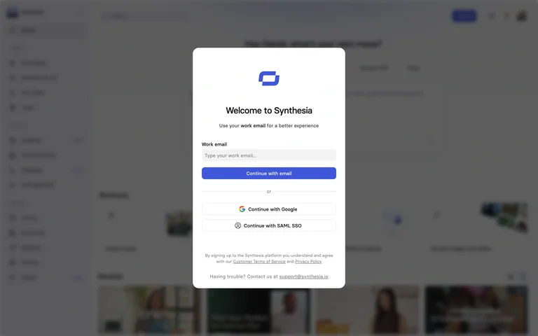
A welcome dialog offers email and provider entry over a dimmed product background.
Useful for: Keep the required account step concise while explaining the product through the surrounding composition.
# Design reference: Synthesia — Account entry
Source: https://app.synthesia.io/#/welcome
Swipefile reference: https://swipefile.design/ref/ai-next-synthesia-app/
Captured: 2026-09-06. This is a dated reference, not a claim about the current live product.
Capture scope: one viewport. Do not infer unseen page sections or a complete user flow.

## Objective
Adapt the interaction and layout patterns below to my project. Use my own content and identity. Do not reproduce logos, proprietary copy, or brand assets.

## Reference notes
- surface: A welcome dialog offers email and provider entry over a dimmed product background.
- nav: Product identity and account-entry controls.
- layout: Centered modal with blurred workspace context behind it.
- density: Low-medium
- color: White, gray and violet
- typography: Compact field labels and clear provider names.
- pattern: Keep the required account step concise while explaining the product through the surrounding composition.
- states: Signed-out account entry only; no authenticated workspace is shown and no account was created.
- dont: Adapt the layout to your own product and supported capabilities; write your own examples and keep important actions clearly labeled.

Useful for: Keep the required account step concise while explaining the product through the surrounding composition.

## Acceptance criteria
- Existing project conventions, design tokens, working functionality, and unrelated changes are preserved.
- Two or three reference principles clearly support the user's task; conflicts are resolved in favor of usability and the existing product.
- Reusable components and semantic HTML express the interface. Available licensed assets are used; important UI text is never rendered as a bitmap.
- Every visible control has a defined behavior. Loading, empty, error, success, disabled, and long-content states are specified where relevant. Demo data is clearly labeled.
- Navigation and content adapt at 375px, 768px, and 1440px without horizontal page overflow. Keyboard use, visible focus, labeled inputs, at least 44px touch targets, readable contrast, and reduced motion are supported.
- Verification distinguishes rendered behavior from proposals and identifies anything still requiring a backend or external service.

## Quality bar
Clear hierarchy, consistent spacing, restrained surfaces, and purposeful motion. Avoid decorative gradients, excessive cards, placeholder buttons, and invented metrics unless the project calls for them. Do not claim a feature is connected or tested without evidence.
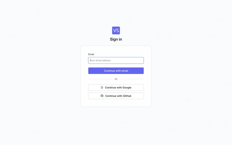
A small email-first sign-in card includes GitHub and Google alternatives.
Useful for: Keep the required account step concise while explaining the product through the surrounding composition.
# Design reference: VectorShift — Account entry
Source: https://login.vectorshift.ai/?client_id=client_01JWATY99B2FZYNEE9H72YG4J5&redirect_uri=https%3A%2F%2Fapp.vectorshift.ai&state=%7B%22returnTo%22%3A%22%22%7D&authorization_session_id=01M1VNVDRXKP6X35890YYCGFFM
Swipefile reference: https://swipefile.design/ref/ai-next-vectorshift-app/
Captured: 2026-09-06. This is a dated reference, not a claim about the current live product.
Capture scope: one viewport. Do not infer unseen page sections or a complete user flow.

## Objective
Adapt the interaction and layout patterns below to my project. Use my own content and identity. Do not reproduce logos, proprietary copy, or brand assets.

## Reference notes
- surface: A small email-first sign-in card includes GitHub and Google alternatives.
- nav: Product identity and account-entry controls.
- layout: Centered compact card on a pale gray canvas.
- density: Low-medium
- color: White, gray and violet
- typography: Compact field labels and clear provider names.
- pattern: Keep the required account step concise while explaining the product through the surrounding composition.
- states: Signed-out account entry only; no authenticated workspace is shown and no account was created.
- dont: Adapt the layout to your own product and supported capabilities; write your own examples and keep important actions clearly labeled.

Useful for: Keep the required account step concise while explaining the product through the surrounding composition.

## Acceptance criteria
- Existing project conventions, design tokens, working functionality, and unrelated changes are preserved.
- Two or three reference principles clearly support the user's task; conflicts are resolved in favor of usability and the existing product.
- Reusable components and semantic HTML express the interface. Available licensed assets are used; important UI text is never rendered as a bitmap.
- Every visible control has a defined behavior. Loading, empty, error, success, disabled, and long-content states are specified where relevant. Demo data is clearly labeled.
- Navigation and content adapt at 375px, 768px, and 1440px without horizontal page overflow. Keyboard use, visible focus, labeled inputs, at least 44px touch targets, readable contrast, and reduced motion are supported.
- Verification distinguishes rendered behavior from proposals and identifies anything still requiring a backend or external service.

## Quality bar
Clear hierarchy, consistent spacing, restrained surfaces, and purposeful motion. Avoid decorative gradients, excessive cards, placeholder buttons, and invented metrics unless the project calls for them. Do not claim a feature is connected or tested without evidence.
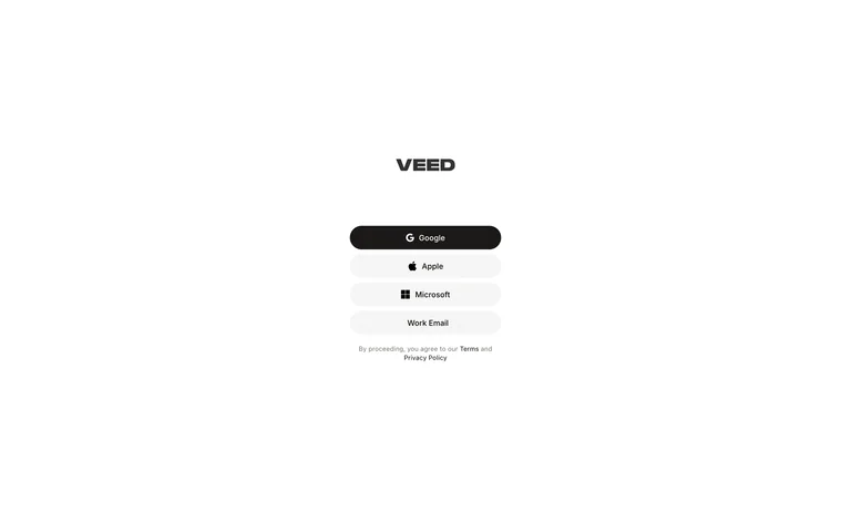
A minimal video-editor entry screen groups provider buttons beneath a small wordmark.
Useful for: Keep the required account step concise while explaining the product through the surrounding composition.
# Design reference: VEED — Account entry
Source: https://www.veed.io/login
Swipefile reference: https://swipefile.design/ref/ai-next-veed-studio/
Captured: 2026-09-06. This is a dated reference, not a claim about the current live product.
Capture scope: one viewport. Do not infer unseen page sections or a complete user flow.

## Objective
Adapt the interaction and layout patterns below to my project. Use my own content and identity. Do not reproduce logos, proprietary copy, or brand assets.

## Reference notes
- surface: A minimal video-editor entry screen groups provider buttons beneath a small wordmark.
- nav: Product identity and account-entry controls.
- layout: Unframed narrow account column with generous whitespace.
- density: Low-medium
- color: White, black and light gray
- typography: Compact field labels and clear provider names.
- pattern: Keep the required account step concise while explaining the product through the surrounding composition.
- states: Signed-out account entry only; no authenticated workspace is shown and no account was created.
- dont: Adapt the layout to your own product and supported capabilities; write your own examples and keep important actions clearly labeled.

Useful for: Keep the required account step concise while explaining the product through the surrounding composition.

## Acceptance criteria
- Existing project conventions, design tokens, working functionality, and unrelated changes are preserved.
- Two or three reference principles clearly support the user's task; conflicts are resolved in favor of usability and the existing product.
- Reusable components and semantic HTML express the interface. Available licensed assets are used; important UI text is never rendered as a bitmap.
- Every visible control has a defined behavior. Loading, empty, error, success, disabled, and long-content states are specified where relevant. Demo data is clearly labeled.
- Navigation and content adapt at 375px, 768px, and 1440px without horizontal page overflow. Keyboard use, visible focus, labeled inputs, at least 44px touch targets, readable contrast, and reduced motion are supported.
- Verification distinguishes rendered behavior from proposals and identifies anything still requiring a backend or external service.

## Quality bar
Clear hierarchy, consistent spacing, restrained surfaces, and purposeful motion. Avoid decorative gradients, excessive cards, placeholder buttons, and invented metrics unless the project calls for them. Do not claim a feature is connected or tested without evidence.
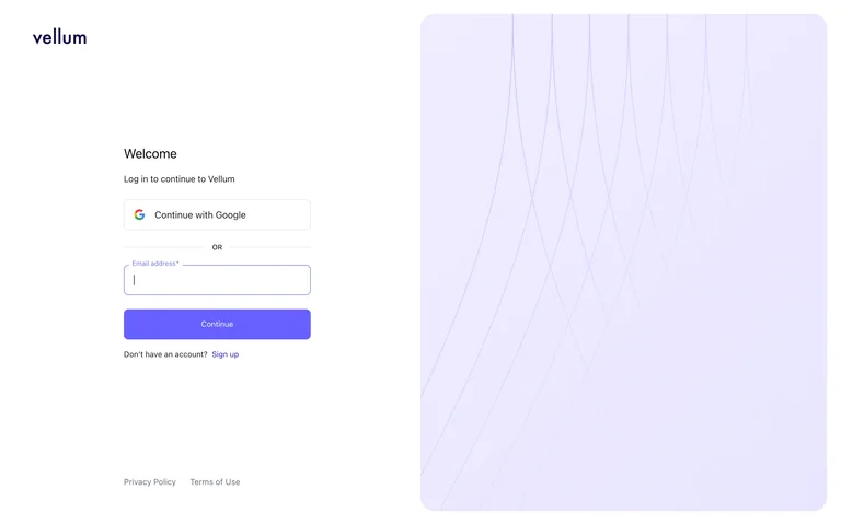
An agent-platform sign-in panel uses a fine line illustration as a calm companion surface.
Useful for: Keep the required account step concise while explaining the product through the surrounding composition.
# Design reference: Vellum — Account entry
Source: https://auth.vellum.ai/u/login/identifier?state=hKFo2SBkUEdxUkJjNlBlbUtxUEZyRC04eWJBRTBJeEpMZTNRWKFur3VuaXZlcnNhbC1sb2dpbqN0aWTZIDhLejRUbWZvWHQ5WnVlRE52bTNzNWFjX1N6RVhZanZBo2NpZNkgYkx0dnNZOFBneVlYbTdBZ3A5MGNDUEdHdVlXV3dmTkE
Swipefile reference: https://swipefile.design/ref/ai-next-vellum-app/
Captured: 2026-09-06. This is a dated reference, not a claim about the current live product.
Capture scope: one viewport. Do not infer unseen page sections or a complete user flow.

## Objective
Adapt the interaction and layout patterns below to my project. Use my own content and identity. Do not reproduce logos, proprietary copy, or brand assets.

## Reference notes
- surface: An agent-platform sign-in panel uses a fine line illustration as a calm companion surface.
- nav: Product identity and account-entry controls.
- layout: Two spacious columns with form left and pale illustrated panel right.
- density: Low-medium
- color: White, charcoal and lavender
- typography: Compact field labels and clear provider names.
- pattern: Keep the required account step concise while explaining the product through the surrounding composition.
- states: Signed-out account entry only; no authenticated workspace is shown and no account was created.
- dont: Adapt the layout to your own product and supported capabilities; write your own examples and keep important actions clearly labeled.

Useful for: Keep the required account step concise while explaining the product through the surrounding composition.

## Acceptance criteria
- Existing project conventions, design tokens, working functionality, and unrelated changes are preserved.
- Two or three reference principles clearly support the user's task; conflicts are resolved in favor of usability and the existing product.
- Reusable components and semantic HTML express the interface. Available licensed assets are used; important UI text is never rendered as a bitmap.
- Every visible control has a defined behavior. Loading, empty, error, success, disabled, and long-content states are specified where relevant. Demo data is clearly labeled.
- Navigation and content adapt at 375px, 768px, and 1440px without horizontal page overflow. Keyboard use, visible focus, labeled inputs, at least 44px touch targets, readable contrast, and reduced motion are supported.
- Verification distinguishes rendered behavior from proposals and identifies anything still requiring a backend or external service.

## Quality bar
Clear hierarchy, consistent spacing, restrained surfaces, and purposeful motion. Avoid decorative gradients, excessive cards, placeholder buttons, and invented metrics unless the project calls for them. Do not claim a feature is connected or tested without evidence.
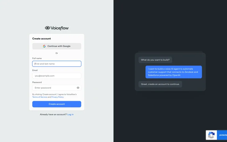
An account-creation form shares the screen with a small conversation preview on a dark panel.
Useful for: Keep the required account step concise while explaining the product through the surrounding composition.
# Design reference: Voiceflow — Account entry
Source: https://creator.voiceflow.com/signup
Swipefile reference: https://swipefile.design/ref/ai-next-voiceflow/
Captured: 2026-09-06. This is a dated reference, not a claim about the current live product.
Capture scope: one viewport. Do not infer unseen page sections or a complete user flow.

## Objective
Adapt the interaction and layout patterns below to my project. Use my own content and identity. Do not reproduce logos, proprietary copy, or brand assets.

## Reference notes
- surface: An account-creation form shares the screen with a small conversation preview on a dark panel.
- nav: Product identity and account-entry controls.
- layout: Light form column paired with a dark assistant sample.
- density: Low-medium
- color: White, blue and deep slate
- typography: Compact field labels and clear provider names.
- pattern: Keep the required account step concise while explaining the product through the surrounding composition.
- states: Signed-out account entry only; no authenticated workspace is shown and no account was created.
- dont: Adapt the layout to your own product and supported capabilities; write your own examples and keep important actions clearly labeled.

Useful for: Keep the required account step concise while explaining the product through the surrounding composition.

## Acceptance criteria
- Existing project conventions, design tokens, working functionality, and unrelated changes are preserved.
- Two or three reference principles clearly support the user's task; conflicts are resolved in favor of usability and the existing product.
- Reusable components and semantic HTML express the interface. Available licensed assets are used; important UI text is never rendered as a bitmap.
- Every visible control has a defined behavior. Loading, empty, error, success, disabled, and long-content states are specified where relevant. Demo data is clearly labeled.
- Navigation and content adapt at 375px, 768px, and 1440px without horizontal page overflow. Keyboard use, visible focus, labeled inputs, at least 44px touch targets, readable contrast, and reduced motion are supported.
- Verification distinguishes rendered behavior from proposals and identifies anything still requiring a backend or external service.

## Quality bar
Clear hierarchy, consistent spacing, restrained surfaces, and purposeful motion. Avoid decorative gradients, excessive cards, placeholder buttons, and invented metrics unless the project calls for them. Do not claim a feature is connected or tested without evidence.
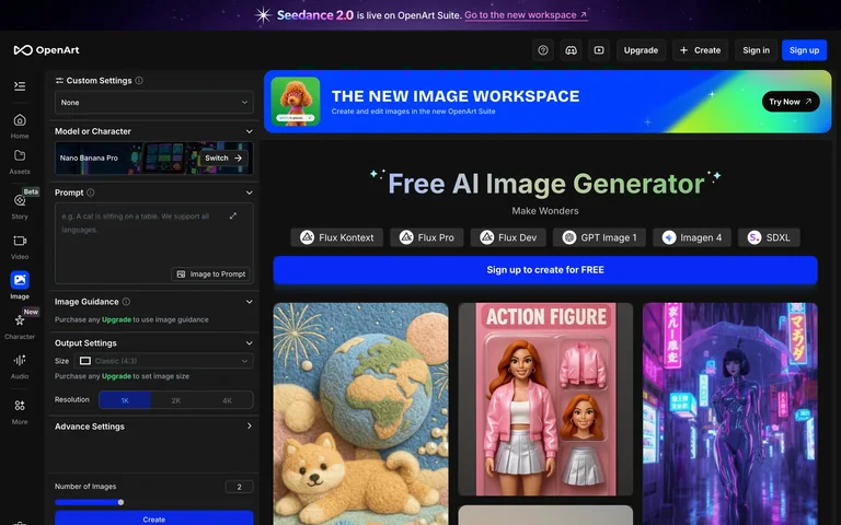
A dark image workspace combines a dense parameter sidebar with model tabs and example artwork.
Useful for: Keep detailed model configuration accessible without hiding visual examples.
# Design reference: OpenArt — Image workspace
Source: https://openart.ai/image/create
Swipefile reference: https://swipefile.design/ref/ai-next-openart-create/
Captured: 2026-09-06. This is a dated reference, not a claim about the current live product.
Capture scope: one viewport. Do not infer unseen page sections or a complete user flow.

## Objective
Adapt the interaction and layout patterns below to my project. Use my own content and identity. Do not reproduce logos, proprietary copy, or brand assets.

## Reference notes
- surface: A dark image workspace combines a dense parameter sidebar with model tabs and example artwork.
- nav: Left tool rail and nested creation sidebar.
- layout: Narrow settings panel beside a wide examples and workspace area.
- density: High
- color: Charcoal, violet and multicolor artwork
- typography: Small technical labels and a larger central title.
- pattern: Keep detailed model configuration accessible without hiding visual examples.
- states: Signed-out image workspace with source-provided examples; no model run.
- dont: Adapt the layout to your own product and supported capabilities; write your own examples and keep important actions clearly labeled.

Useful for: Keep detailed model configuration accessible without hiding visual examples.

## Acceptance criteria
- Existing project conventions, design tokens, working functionality, and unrelated changes are preserved.
- Two or three reference principles clearly support the user's task; conflicts are resolved in favor of usability and the existing product.
- Reusable components and semantic HTML express the interface. Available licensed assets are used; important UI text is never rendered as a bitmap.
- Every visible control has a defined behavior. Loading, empty, error, success, disabled, and long-content states are specified where relevant. Demo data is clearly labeled.
- Navigation and content adapt at 375px, 768px, and 1440px without horizontal page overflow. Keyboard use, visible focus, labeled inputs, at least 44px touch targets, readable contrast, and reduced motion are supported.
- Verification distinguishes rendered behavior from proposals and identifies anything still requiring a backend or external service.

## Quality bar
Clear hierarchy, consistent spacing, restrained surfaces, and purposeful motion. Avoid decorative gradients, excessive cards, placeholder buttons, and invented metrics unless the project calls for them. Do not claim a feature is connected or tested without evidence.
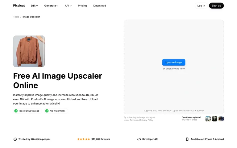
An upscaling utility pairs a short explanation with a large empty drop zone and sample thumbnails.
Useful for: Give the upload area most of the working space and offer examples beneath it.
# Design reference: Pixelcut — Upscaler
Source: https://www.pixelcut.ai/image-upscaler
Swipefile reference: https://swipefile.design/ref/ai-next-pixelcut-upscale/
Captured: 2026-09-06. This is a dated reference, not a claim about the current live product.
Capture scope: one viewport. Do not infer unseen page sections or a complete user flow.

## Objective
Adapt the interaction and layout patterns below to my project. Use my own content and identity. Do not reproduce logos, proprietary copy, or brand assets.

## Reference notes
- surface: An upscaling utility pairs a short explanation with a large empty drop zone and sample thumbnails.
- nav: Compact website header and tool breadcrumb.
- layout: Two-column task explanation and upload panel.
- density: Low-medium
- color: White, gray and blue
- typography: Bold task heading with compact helper copy.
- pattern: Give the upload area most of the working space and offer examples beneath it.
- states: Public empty upload state; no files selected.
- dont: Adapt the layout to your own product and supported capabilities; write your own examples and keep important actions clearly labeled.

Useful for: Give the upload area most of the working space and offer examples beneath it.

## Acceptance criteria
- Existing project conventions, design tokens, working functionality, and unrelated changes are preserved.
- Two or three reference principles clearly support the user's task; conflicts are resolved in favor of usability and the existing product.
- Reusable components and semantic HTML express the interface. Available licensed assets are used; important UI text is never rendered as a bitmap.
- Every visible control has a defined behavior. Loading, empty, error, success, disabled, and long-content states are specified where relevant. Demo data is clearly labeled.
- Navigation and content adapt at 375px, 768px, and 1440px without horizontal page overflow. Keyboard use, visible focus, labeled inputs, at least 44px touch targets, readable contrast, and reduced motion are supported.
- Verification distinguishes rendered behavior from proposals and identifies anything still requiring a backend or external service.

## Quality bar
Clear hierarchy, consistent spacing, restrained surfaces, and purposeful motion. Avoid decorative gradients, excessive cards, placeholder buttons, and invented metrics unless the project calls for them. Do not claim a feature is connected or tested without evidence.
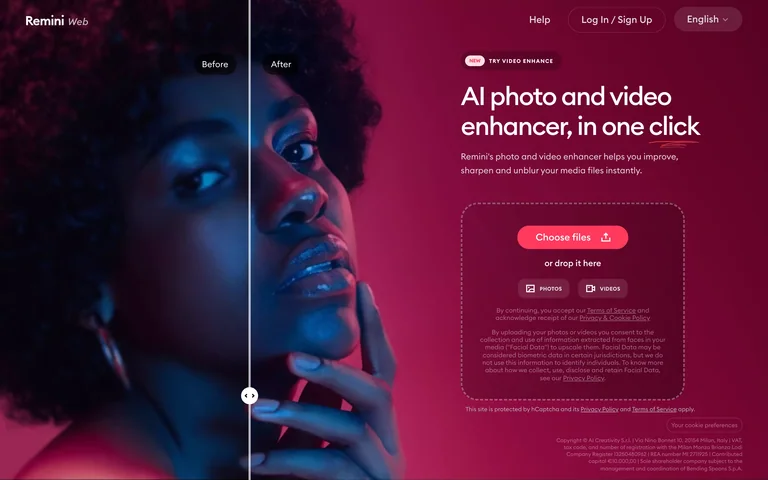
A photo-enhancement upload screen pairs a large before-and-after portrait with a prominent file-selection area.
Useful for: Demonstrate the transformation beside the input required to start it.
# Design reference: Remini — Enhancement upload
Source: https://app.remini.ai/?v=449a9d75-87bd-459a-a2b8-6b2b4dc8a1ec-1788709661885
Swipefile reference: https://swipefile.design/ref/ai-next-remini-app/
Captured: 2026-09-06. This is a dated reference, not a claim about the current live product.
Capture scope: one viewport. Do not infer unseen page sections or a complete user flow.

## Objective
Adapt the interaction and layout patterns below to my project. Use my own content and identity. Do not reproduce logos, proprietary copy, or brand assets.

## Reference notes
- surface: A photo-enhancement upload screen pairs a large before-and-after portrait with a prominent file-selection area.
- nav: Small help, language and account controls.
- layout: Full-height comparison image left with upload choices right.
- density: Medium
- color: Black, burgundy, pink and white
- typography: Large clear task headline and small explanatory labels.
- pattern: Demonstrate the transformation beside the input required to start it.
- states: Public upload screen with a source-provided comparison; no media uploaded.
- dont: Adapt the layout to your own product and supported capabilities; write your own examples and keep important actions clearly labeled.

Useful for: Demonstrate the transformation beside the input required to start it.

## Acceptance criteria
- Existing project conventions, design tokens, working functionality, and unrelated changes are preserved.
- Two or three reference principles clearly support the user's task; conflicts are resolved in favor of usability and the existing product.
- Reusable components and semantic HTML express the interface. Available licensed assets are used; important UI text is never rendered as a bitmap.
- Every visible control has a defined behavior. Loading, empty, error, success, disabled, and long-content states are specified where relevant. Demo data is clearly labeled.
- Navigation and content adapt at 375px, 768px, and 1440px without horizontal page overflow. Keyboard use, visible focus, labeled inputs, at least 44px touch targets, readable contrast, and reduced motion are supported.
- Verification distinguishes rendered behavior from proposals and identifies anything still requiring a backend or external service.

## Quality bar
Clear hierarchy, consistent spacing, restrained surfaces, and purposeful motion. Avoid decorative gradients, excessive cards, placeholder buttons, and invented metrics unless the project calls for them. Do not claim a feature is connected or tested without evidence.
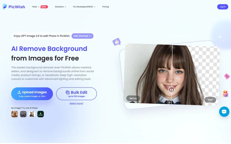
A background-removal utility places upload and bulk-edit choices beside a before-and-after portrait.
Useful for: Offer single-image and batch paths together while showing their shared result.
# Design reference: PicWish — Background upload
Source: https://picwish.com/remove-background
Swipefile reference: https://swipefile.design/ref/ai-next-picwish/
Captured: 2026-09-06. This is a dated reference, not a claim about the current live product.
Capture scope: one viewport. Do not infer unseen page sections or a complete user flow.

## Objective
Adapt the interaction and layout patterns below to my project. Use my own content and identity. Do not reproduce logos, proprietary copy, or brand assets.

## Reference notes
- surface: A background-removal utility places upload and bulk-edit choices beside a before-and-after portrait.
- nav: Light website header with tool navigation.
- layout: Split task actions and large visual comparison.
- density: Medium
- color: White, pale blue and violet
- typography: Large task title and prominent rounded action labels.
- pattern: Offer single-image and batch paths together while showing their shared result.
- states: Public upload state with built-in example imagery; no upload or edit performed.
- dont: Adapt the layout to your own product and supported capabilities; write your own examples and keep important actions clearly labeled.

Useful for: Offer single-image and batch paths together while showing their shared result.

## Acceptance criteria
- Existing project conventions, design tokens, working functionality, and unrelated changes are preserved.
- Two or three reference principles clearly support the user's task; conflicts are resolved in favor of usability and the existing product.
- Reusable components and semantic HTML express the interface. Available licensed assets are used; important UI text is never rendered as a bitmap.
- Every visible control has a defined behavior. Loading, empty, error, success, disabled, and long-content states are specified where relevant. Demo data is clearly labeled.
- Navigation and content adapt at 375px, 768px, and 1440px without horizontal page overflow. Keyboard use, visible focus, labeled inputs, at least 44px touch targets, readable contrast, and reduced motion are supported.
- Verification distinguishes rendered behavior from proposals and identifies anything still requiring a backend or external service.

## Quality bar
Clear hierarchy, consistent spacing, restrained surfaces, and purposeful motion. Avoid decorative gradients, excessive cards, placeholder buttons, and invented metrics unless the project calls for them. Do not claim a feature is connected or tested without evidence.
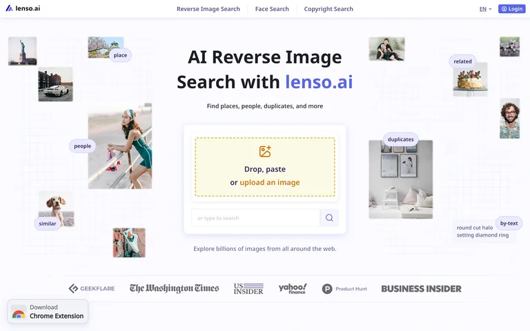
An image-search start screen centers an upload target among small examples of searchable visual categories.
Useful for: Explain input options directly in the drop zone while examples show the search scope.
# Design reference: Lenso — Image search upload
Source: https://lenso.ai/en
Swipefile reference: https://swipefile.design/ref/ai-next-lenso/
Captured: 2026-09-06. This is a dated reference, not a claim about the current live product.
Capture scope: one viewport. Do not infer unseen page sections or a complete user flow.

## Objective
Adapt the interaction and layout patterns below to my project. Use my own content and identity. Do not reproduce logos, proprietary copy, or brand assets.

## Reference notes
- surface: An image-search start screen centers an upload target among small examples of searchable visual categories.
- nav: Compact top navigation with language and account controls.
- layout: Centered upload panel surrounded by a loose image collage.
- density: Low-medium
- color: White, gray, violet and pale yellow
- typography: Bold two-line headline and short upload instructions.
- pattern: Explain input options directly in the drop zone while examples show the search scope.
- states: Public empty reverse-image-search screen; no image or person searched.
- dont: Adapt the layout to your own product and supported capabilities; write your own examples and keep important actions clearly labeled.

Useful for: Explain input options directly in the drop zone while examples show the search scope.

## Acceptance criteria
- Existing project conventions, design tokens, working functionality, and unrelated changes are preserved.
- Two or three reference principles clearly support the user's task; conflicts are resolved in favor of usability and the existing product.
- Reusable components and semantic HTML express the interface. Available licensed assets are used; important UI text is never rendered as a bitmap.
- Every visible control has a defined behavior. Loading, empty, error, success, disabled, and long-content states are specified where relevant. Demo data is clearly labeled.
- Navigation and content adapt at 375px, 768px, and 1440px without horizontal page overflow. Keyboard use, visible focus, labeled inputs, at least 44px touch targets, readable contrast, and reduced motion are supported.
- Verification distinguishes rendered behavior from proposals and identifies anything still requiring a backend or external service.

## Quality bar
Clear hierarchy, consistent spacing, restrained surfaces, and purposeful motion. Avoid decorative gradients, excessive cards, placeholder buttons, and invented metrics unless the project calls for them. Do not claim a feature is connected or tested without evidence.
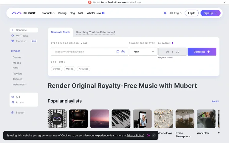
A music-creation workspace combines a prompt and track settings with browsable playlists below.
Useful for: Connect a creation form to a browseable library of styles and examples.
# Design reference: Mubert Render — Music workspace
Source: https://mubert.com/render
Swipefile reference: https://swipefile.design/ref/ai-next-mubert/
Captured: 2026-09-06. This is a dated reference, not a claim about the current live product.
Capture scope: one viewport. Do not infer unseen page sections or a complete user flow.

## Objective
Adapt the interaction and layout patterns below to my project. Use my own content and identity. Do not reproduce logos, proprietary copy, or brand assets.

## Reference notes
- surface: A music-creation workspace combines a prompt and track settings with browsable playlists below.
- nav: Top product navigation and music-category sidebar.
- layout: Generation controls above a catalog of playlist cards.
- density: Medium-high
- color: White, gray and violet
- typography: Compact field labels and bold catalog headings.
- pattern: Connect a creation form to a browseable library of styles and examples.
- states: Public initial music workspace; onboarding tips dismissed. No generation or playback requested.
- dont: Adapt the layout to your own product and supported capabilities; write your own examples and keep important actions clearly labeled.

Useful for: Connect a creation form to a browseable library of styles and examples.

## Acceptance criteria
- Existing project conventions, design tokens, working functionality, and unrelated changes are preserved.
- Two or three reference principles clearly support the user's task; conflicts are resolved in favor of usability and the existing product.
- Reusable components and semantic HTML express the interface. Available licensed assets are used; important UI text is never rendered as a bitmap.
- Every visible control has a defined behavior. Loading, empty, error, success, disabled, and long-content states are specified where relevant. Demo data is clearly labeled.
- Navigation and content adapt at 375px, 768px, and 1440px without horizontal page overflow. Keyboard use, visible focus, labeled inputs, at least 44px touch targets, readable contrast, and reduced motion are supported.
- Verification distinguishes rendered behavior from proposals and identifies anything still requiring a backend or external service.

## Quality bar
Clear hierarchy, consistent spacing, restrained surfaces, and purposeful motion. Avoid decorative gradients, excessive cards, placeholder buttons, and invented metrics unless the project calls for them. Do not claim a feature is connected or tested without evidence.
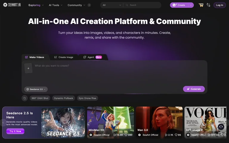
A dark creative start page presents a prompt composer, creation modes and a gallery of example content.
Useful for: Place creation controls above inspiration so discovery can feed the next action.
# Design reference: SeaArt — Creative start
Source: https://www.seaart.ai/
Swipefile reference: https://swipefile.design/ref/ai-next-seaart/
Captured: 2026-09-06. This is a dated reference, not a claim about the current live product.
Capture scope: one viewport. Do not infer unseen page sections or a complete user flow.

## Objective
Adapt the interaction and layout patterns below to my project. Use my own content and identity. Do not reproduce logos, proprietary copy, or brand assets.

## Reference notes
- surface: A dark creative start page presents a prompt composer, creation modes and a gallery of example content.
- nav: Top product navigation with image and video modes.
- layout: Large centered composer above visual discovery sections.
- density: Medium-high
- color: Charcoal, white and violet
- typography: Prominent central headline and small tool labels.
- pattern: Place creation controls above inspiration so discovery can feed the next action.
- states: Public creative entry screen with promotion dismissed; no generation or upload.
- dont: Adapt the layout to your own product and supported capabilities; write your own examples and keep important actions clearly labeled.

Useful for: Place creation controls above inspiration so discovery can feed the next action.

## Acceptance criteria
- Existing project conventions, design tokens, working functionality, and unrelated changes are preserved.
- Two or three reference principles clearly support the user's task; conflicts are resolved in favor of usability and the existing product.
- Reusable components and semantic HTML express the interface. Available licensed assets are used; important UI text is never rendered as a bitmap.
- Every visible control has a defined behavior. Loading, empty, error, success, disabled, and long-content states are specified where relevant. Demo data is clearly labeled.
- Navigation and content adapt at 375px, 768px, and 1440px without horizontal page overflow. Keyboard use, visible focus, labeled inputs, at least 44px touch targets, readable contrast, and reduced motion are supported.
- Verification distinguishes rendered behavior from proposals and identifies anything still requiring a backend or external service.

## Quality bar
Clear hierarchy, consistent spacing, restrained surfaces, and purposeful motion. Avoid decorative gradients, excessive cards, placeholder buttons, and invented metrics unless the project calls for them. Do not claim a feature is connected or tested without evidence.
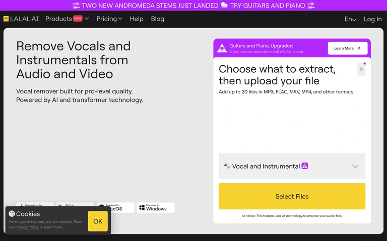
An audio-separation utility places a stem-type selector and file button beside a concise explanation.
Useful for: Ask for the desired output before the source file so the workflow is explicit.
# Design reference: LALAL.AI — Stem extraction
Source: https://www.lalal.ai/
Swipefile reference: https://swipefile.design/ref/ai-next-lalal/
Captured: 2026-09-06. This is a dated reference, not a claim about the current live product.
Capture scope: one viewport. Do not infer unseen page sections or a complete user flow.

## Objective
Adapt the interaction and layout patterns below to my project. Use my own content and identity. Do not reproduce logos, proprietary copy, or brand assets.

## Reference notes
- surface: An audio-separation utility places a stem-type selector and file button beside a concise explanation.
- nav: Small product navigation and account links.
- layout: Split explanation and tall extraction form.
- density: Medium
- color: White, gray, black and yellow
- typography: Large plain headline with compact option labels.
- pattern: Ask for the desired output before the source file so the workflow is explicit.
- states: Public extraction form; no audio uploaded. A compact cookie notice remains visible.
- dont: Adapt the layout to your own product and supported capabilities; write your own examples and keep important actions clearly labeled.

Useful for: Ask for the desired output before the source file so the workflow is explicit.

## Acceptance criteria
- Existing project conventions, design tokens, working functionality, and unrelated changes are preserved.
- Two or three reference principles clearly support the user's task; conflicts are resolved in favor of usability and the existing product.
- Reusable components and semantic HTML express the interface. Available licensed assets are used; important UI text is never rendered as a bitmap.
- Every visible control has a defined behavior. Loading, empty, error, success, disabled, and long-content states are specified where relevant. Demo data is clearly labeled.
- Navigation and content adapt at 375px, 768px, and 1440px without horizontal page overflow. Keyboard use, visible focus, labeled inputs, at least 44px touch targets, readable contrast, and reduced motion are supported.
- Verification distinguishes rendered behavior from proposals and identifies anything still requiring a backend or external service.

## Quality bar
Clear hierarchy, consistent spacing, restrained surfaces, and purposeful motion. Avoid decorative gradients, excessive cards, placeholder buttons, and invented metrics unless the project calls for them. Do not claim a feature is connected or tested without evidence.
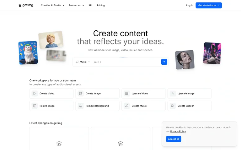
A public creative-tool launcher groups image and video actions beneath a light illustrated introduction.
Useful for: Organize a multi-tool product around clear actions users can recognize.
# Design reference: getimg.ai — Tool launcher
Source: https://getimg.ai/
Swipefile reference: https://swipefile.design/ref/ai-next-getimg/
Captured: 2026-09-06. This is a dated reference, not a claim about the current live product.
Capture scope: one viewport. Do not infer unseen page sections or a complete user flow.

## Objective
Adapt the interaction and layout patterns below to my project. Use my own content and identity. Do not reproduce logos, proprietary copy, or brand assets.

## Reference notes
- surface: A public creative-tool launcher groups image and video actions beneath a light illustrated introduction.
- nav: Compact tool navigation and account action.
- layout: Centered introduction followed by a grid of labeled creation tools.
- density: Medium
- color: White, gray and blue
- typography: Light headline and compact action labels.
- pattern: Organize a multi-tool product around clear actions users can recognize.
- states: Public tool-selection entry page; no authenticated editor or generated result is shown. A compact privacy notice remains.
- dont: Adapt the layout to your own product and supported capabilities; write your own examples and keep important actions clearly labeled.

Useful for: Organize a multi-tool product around clear actions users can recognize.

## Acceptance criteria
- Existing project conventions, design tokens, working functionality, and unrelated changes are preserved.
- Two or three reference principles clearly support the user's task; conflicts are resolved in favor of usability and the existing product.
- Reusable components and semantic HTML express the interface. Available licensed assets are used; important UI text is never rendered as a bitmap.
- Every visible control has a defined behavior. Loading, empty, error, success, disabled, and long-content states are specified where relevant. Demo data is clearly labeled.
- Navigation and content adapt at 375px, 768px, and 1440px without horizontal page overflow. Keyboard use, visible focus, labeled inputs, at least 44px touch targets, readable contrast, and reduced motion are supported.
- Verification distinguishes rendered behavior from proposals and identifies anything still requiring a backend or external service.

## Quality bar
Clear hierarchy, consistent spacing, restrained surfaces, and purposeful motion. Avoid decorative gradients, excessive cards, placeholder buttons, and invented metrics unless the project calls for them. Do not claim a feature is connected or tested without evidence.
Allow basic usage counts to help us understand what is useful. Your board contents stay out of analytics. Details
Your browser’s privacy preference keeps analytics off.