Commerce
CURATED COLLECTION · 5 REFERENCES
Discovery, product choices, and the cart.
Copy the reference notes below and paste them into Claude, ChatGPT, or your coding assistant. Add what you want to build.
Includes design notes, original sources, and preview links. An assistant that supports browsing can also read the public board link.
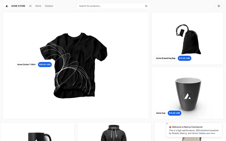
One tile is deliberately doubled in width and height while its neighbours stay unit-size, and every tile carries its name and price as a pill floating on top of the photo — not a caption stacked below it.
Useful for: Steal the floating price pill: a white rounded pill holding the product name, fused edge-to-edge to a blue rounded price chip, anchored over the open space in the photo rather than living in a caption row underneath. It reads as a tag pinned to the object, not an ecommerce label, and it lets the photo run uninterrupted to the tile's edge. Also take the asymmetric bento move itself — give exactly one hero product a 2x-size tile in an otherwise uniform grid so there's a single obvious entry point before the eye starts scanning.
# Design reference: Next.js Commerce — Storefront
Source: https://demo.vercel.store/
Swipefile reference: https://swipefile.design/ref/vercel-commerce/
Captured: 2026-08-01. This is a dated reference, not a claim about the current live product.
Capture scope: a page excerpt. Do not infer unseen sections or interactions.

## Objective
Adapt the interaction and layout patterns below to my project. Use my own content and identity. Do not reproduce logos, proprietary copy, or brand assets.

## Reference notes
- surface: Storefront home/product grid of a Next.js Commerce demo store, logged out, promo toast still open
- nav: One flat tier: a logo mark plus wordmark left, three text links (All, Shirts, Stickers), a centred search input, and a bordered square cart-icon button right. No secondary or tertiary nav — this is a single storefront page, not a console.
- layout: Fluid bento grid. One tile spans roughly double the width and double the height of a standard tile; two unit tiles stack beside it at equal combined height, and a uniform row of unit tiles continues below. Gutters stay the same width regardless of tile size.
- density: Loose. Product photography fills nearly the whole tile at every size; there's no caption row competing for space, so the only text on any tile is the one floating pill.
- color: Near-white page, white tiles, black photography and type. Blue is spent on exactly one element — the price chip — and nowhere else: not the nav, not the buttons, not the cart icon.
- typography: One sans throughout. Product name in the pill is medium-weight black; price is bold white on the blue chip, the only bold white-on-colour text on the page. There's no separate heading scale in view — hierarchy is tile size, not type size.
- pattern: The floating price pill placed in whatever negative space the product photo leaves open — low and left when the object sits high in frame, more central when it doesn't — instead of a fixed corner or a caption underneath. It's built to look laid on the object, not applied as UI chrome.
- states: Logged out, and it shows: a dismissable promo toast sits over the grid bottom-right ('Welcome to Next.js Commerce... Deploy your own'), meaning the first-visit unauthenticated state is rendered by default here, not hidden behind an edge case.
- dont: Don't pin the pill to one fixed corner regardless of composition — on the hero tile it sits mid-left specifically to dodge the product's graphic, not because 'hero tiles get a different corner.' Hard-coding pill position independent of what's actually in the photo is what breaks this the moment art direction changes.

Useful for: Steal the floating price pill: a white rounded pill holding the product name, fused edge-to-edge to a blue rounded price chip, anchored over the open space in the photo rather than living in a caption row underneath. It reads as a tag pinned to the object, not an ecommerce label, and it lets the photo run uninterrupted to the tile's edge. Also take the asymmetric bento move itself — give exactly one hero product a 2x-size tile in an otherwise uniform grid so there's a single obvious entry point before the eye starts scanning.

## Acceptance criteria
- Existing project conventions, design tokens, working functionality, and unrelated changes are preserved.
- Two or three reference principles clearly support the user's task; conflicts are resolved in favor of usability and the existing product.
- Reusable components and semantic HTML express the interface. Available licensed assets are used; important UI text is never rendered as a bitmap.
- Every visible control has a defined behavior. Loading, empty, error, success, disabled, and long-content states are specified where relevant. Demo data is clearly labeled.
- Navigation and content adapt at 375px, 768px, and 1440px without horizontal page overflow. Keyboard use, visible focus, labeled inputs, at least 44px touch targets, readable contrast, and reduced motion are supported.
- Verification distinguishes rendered behavior from proposals and identifies anything still requiring a backend or external service.

## Quality bar
Clear hierarchy, consistent spacing, restrained surfaces, and purposeful motion. Avoid decorative gradients, excessive cards, placeholder buttons, and invented metrics unless the project calls for them. Do not claim a feature is connected or tested without evidence.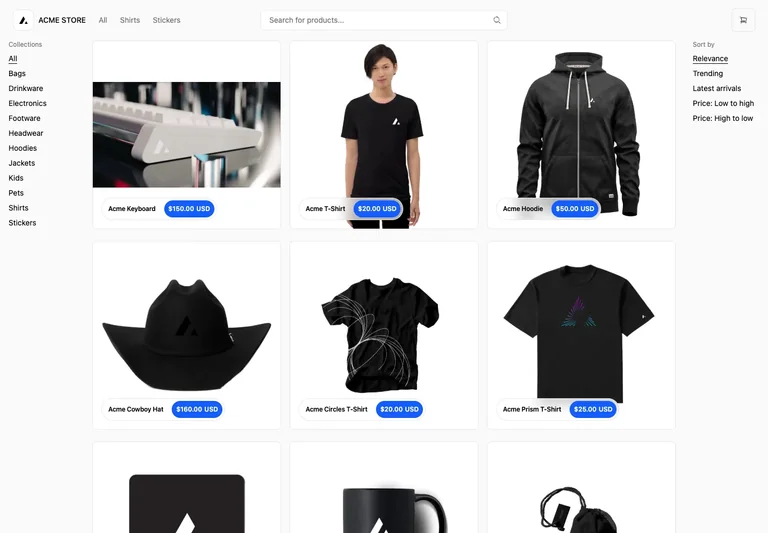
A product grid sits between category navigation and sorting, keeping the merchandise as the main visual focus.
Useful for: Keep category choices and sorting close to results while leaving most of the screen for product imagery.
# Design reference: Next.js Commerce — Product search
Source: https://demo.vercel.store/search
Swipefile reference: https://swipefile.design/ref/commerce-search/
Captured: 2026-09-04. This is a dated reference, not a claim about the current live product.
Capture scope: a page excerpt. Do not infer unseen sections or interactions.

## Objective
Adapt the interaction and layout patterns below to my project. Use my own content and identity. Do not reproduce logos, proprietary copy, or brand assets.

## Reference notes
- surface: Product search and category browse
- nav: Global navigation and search above; collections at left and sort order at right.
- layout: Three-column product grid between two narrow text rails.
- density: Open spacing around large product images; small compact category links.
- color: Near-white base with black typography and a blue price badge.
- typography: Product names use short, medium-weight labels; prices are contained in small high-contrast pills.
- pattern: Separate the shopper’s category choice from sort order so each has a predictable place.
- states: Populated sample catalog. Search-empty and loading states are not shown.
- dont: Do not let filters compete visually with products, and preserve selected filters on back navigation.

Useful for: Keep category choices and sorting close to results while leaving most of the screen for product imagery.

## Acceptance criteria
- Existing project conventions, design tokens, working functionality, and unrelated changes are preserved.
- Two or three reference principles clearly support the user's task; conflicts are resolved in favor of usability and the existing product.
- Reusable components and semantic HTML express the interface. Available licensed assets are used; important UI text is never rendered as a bitmap.
- Every visible control has a defined behavior. Loading, empty, error, success, disabled, and long-content states are specified where relevant. Demo data is clearly labeled.
- Navigation and content adapt at 375px, 768px, and 1440px without horizontal page overflow. Keyboard use, visible focus, labeled inputs, at least 44px touch targets, readable contrast, and reduced motion are supported.
- Verification distinguishes rendered behavior from proposals and identifies anything still requiring a backend or external service.

## Quality bar
Clear hierarchy, consistent spacing, restrained surfaces, and purposeful motion. Avoid decorative gradients, excessive cards, placeholder buttons, and invented metrics unless the project calls for them. Do not claim a feature is connected or tested without evidence.
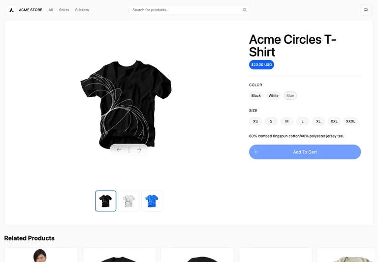
A large product image shares the screen with a compact buying panel: price, variants, and one add-to-cart action.
Useful for: Use a stable product gallery next to explicit variant controls. Show unavailable choices and keep the purchase action close to the selected options.
# Design reference: Next.js Commerce — Product details
Source: https://demo.vercel.store/product/acme-geometric-circles-t-shirt
Swipefile reference: https://swipefile.design/ref/commerce-product/
Captured: 2026-09-04. This is a dated reference, not a claim about the current live product.
Capture scope: a page excerpt. Do not infer unseen sections or interactions.

## Objective
Adapt the interaction and layout patterns below to my project. Use my own content and identity. Do not reproduce logos, proprietary copy, or brand assets.

## Reference notes
- surface: Product detail with color and size options
- nav: Shared store navigation and search with cart entry at the top.
- layout: Large image gallery occupies the left two-thirds; title, price, variant controls, and action occupy the right.
- density: Generous gallery; compact aligned option groups.
- color: White background, black text, blue price and call to action.
- typography: Large product title; compact uppercase group labels and readable pill options.
- pattern: Make option selection visible and show why the action is unavailable before valid choices are made.
- states: Unselected size with a subdued add-to-cart control; unavailable color is visibly muted.
- dont: Do not preselect unavailable variants or present a disabled action without explaining what the shopper needs to choose.

Useful for: Use a stable product gallery next to explicit variant controls. Show unavailable choices and keep the purchase action close to the selected options.

## Acceptance criteria
- Existing project conventions, design tokens, working functionality, and unrelated changes are preserved.
- Two or three reference principles clearly support the user's task; conflicts are resolved in favor of usability and the existing product.
- Reusable components and semantic HTML express the interface. Available licensed assets are used; important UI text is never rendered as a bitmap.
- Every visible control has a defined behavior. Loading, empty, error, success, disabled, and long-content states are specified where relevant. Demo data is clearly labeled.
- Navigation and content adapt at 375px, 768px, and 1440px without horizontal page overflow. Keyboard use, visible focus, labeled inputs, at least 44px touch targets, readable contrast, and reduced motion are supported.
- Verification distinguishes rendered behavior from proposals and identifies anything still requiring a backend or external service.

## Quality bar
Clear hierarchy, consistent spacing, restrained surfaces, and purposeful motion. Avoid decorative gradients, excessive cards, placeholder buttons, and invented metrics unless the project calls for them. Do not claim a feature is connected or tested without evidence.
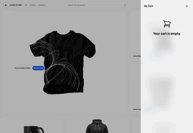
An empty cart opens as a right-hand drawer, preserving the shopper’s place in the store behind a dimmed backdrop.
Useful for: Use a closeable drawer for a reversible side task, with a concise empty state rather than an empty table.
# Design reference: Next.js Commerce — Empty cart
Source: https://demo.vercel.store/
Swipefile reference: https://swipefile.design/ref/commerce-cart/
Captured: 2026-09-04. This is a dated reference, not a claim about the current live product.
Capture scope: a page excerpt. Do not infer unseen sections or interactions.

## Objective
Adapt the interaction and layout patterns below to my project. Use my own content and identity. Do not reproduce logos, proprietary copy, or brand assets.

## Reference notes
- surface: Empty cart drawer opened from the storefront
- nav: Explicit close icon in the top-right of the drawer. The store remains visible behind it.
- layout: A full-height narrow drawer on the right; centered cart icon and empty-state text.
- density: Sparse empty state with ample whitespace.
- color: Neutral drawer, black icon and heading, gray scrim behind.
- typography: Short bold empty-state heading with a small cart title above.
- pattern: Retain browsing context while showing cart state in a focused overlay.
- states: Cart is empty. This is a separate empty-state branch, not a completed checkout.
- dont: Do not trap the user in an empty cart; close must work with Escape and keyboard focus must return to its trigger.

Useful for: Use a closeable drawer for a reversible side task, with a concise empty state rather than an empty table.

## Acceptance criteria
- Existing project conventions, design tokens, working functionality, and unrelated changes are preserved.
- Two or three reference principles clearly support the user's task; conflicts are resolved in favor of usability and the existing product.
- Reusable components and semantic HTML express the interface. Available licensed assets are used; important UI text is never rendered as a bitmap.
- Every visible control has a defined behavior. Loading, empty, error, success, disabled, and long-content states are specified where relevant. Demo data is clearly labeled.
- Navigation and content adapt at 375px, 768px, and 1440px without horizontal page overflow. Keyboard use, visible focus, labeled inputs, at least 44px touch targets, readable contrast, and reduced motion are supported.
- Verification distinguishes rendered behavior from proposals and identifies anything still requiring a backend or external service.

## Quality bar
Clear hierarchy, consistent spacing, restrained surfaces, and purposeful motion. Avoid decorative gradients, excessive cards, placeholder buttons, and invented metrics unless the project calls for them. Do not claim a feature is connected or tested without evidence.
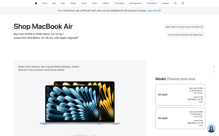
The page splits into two panes on two different clocks — a fixed product photo on the left, a pricing decision on the right — so comparing sizes never costs you the product shot. Every price lives in small right-aligned type inside a thin-bordered card, never announced in the headline.
Useful for: Steal the asymmetric split itself: a wide image pane paired with a narrower, independently-scrolling option column, so the product stays in frame no matter how many variants you're weighing. Inside that column, steal the option-card anatomy — model name bold and left-aligned, the full price stack (buy price, monthly financing, lease price) right-aligned in small type on its own lines. It lets one card hold four numbers without ever looking like a spreadsheet.
# Design reference: Apple — Product configurator
Source: https://www.apple.com/shop/buy-mac/macbook-air
Swipefile reference: https://swipefile.design/ref/apple-configurator/
Captured: 2026-08-01. This is a dated reference, not a claim about the current live product.
Capture scope: a page excerpt. Do not infer unseen sections or interactions.

## Objective
Adapt the interaction and layout patterns below to my project. Use my own content and identity. Do not reproduce logos, proprietary copy, or brand assets.

## Reference notes
- surface: Buy MacBook Air configurator, model-size step
- nav: One flat global nav — Store, Mac, iPad, iPhone, Watch, Vision, AirPods, TV & Home, Entertainment, Accessories, Support — centered at ~12px, no dropdowns visible, search and bag icons closing the row. A full-width grey promo strip runs directly under it with one merchandising line and a single blue text link. Two tiers, but the second is a banner, not a menu.
- layout: Below the promo strip, two panes that scroll independently: a ~870px light-grey rounded-corner panel on the left holding the product photo (pagination dots along its base imply it advances on its own), and a ~340px white column on the right holding the size-picker cards, sitting beside it.
- density: Low-density, high-stakes. One headline, one product photo, two option cards — every element gets room precisely because there are only a handful of them.
- color: White page, one grey banner strip, one grey product-photo panel, two grey informational pills. The only saturated color is the product render itself (a blue laptop lid and a gold one) and a single blue text link — nav, borders and price text all stay black, white or grey.
- typography: One sans (SF Pro). 'Shop MacBook Air' is the sole large moment at ~40px bold; financing copy, nav and both option cards sit in a tight 12-17px band. Hierarchy comes from one oversized headline against a field of uniform small text, not a multi-step type scale.
- pattern: The option card: a thin grey-bordered white rectangle with the model name bold and left-aligned, and the full price stack — buy price, 12-month financing, 36-month lease — right-aligned in small type, each on its own line. It's a comparison table disguised as two simple boxes.
- states: Logged out: a floating circular support-chat avatar sits bottom-right as the only account-adjacent element; no cart badge or sign-in state shown. Both size cards render fully even though neither is selected yet.
- dont: Don't merge the image pane and the option list into a single scroll region — the split exists so evaluating 13-inch against 15-inch never pushes the product photo off-screen.

Useful for: Steal the asymmetric split itself: a wide image pane paired with a narrower, independently-scrolling option column, so the product stays in frame no matter how many variants you're weighing. Inside that column, steal the option-card anatomy — model name bold and left-aligned, the full price stack (buy price, monthly financing, lease price) right-aligned in small type on its own lines. It lets one card hold four numbers without ever looking like a spreadsheet.

## Acceptance criteria
- Existing project conventions, design tokens, working functionality, and unrelated changes are preserved.
- Two or three reference principles clearly support the user's task; conflicts are resolved in favor of usability and the existing product.
- Reusable components and semantic HTML express the interface. Available licensed assets are used; important UI text is never rendered as a bitmap.
- Every visible control has a defined behavior. Loading, empty, error, success, disabled, and long-content states are specified where relevant. Demo data is clearly labeled.
- Navigation and content adapt at 375px, 768px, and 1440px without horizontal page overflow. Keyboard use, visible focus, labeled inputs, at least 44px touch targets, readable contrast, and reduced motion are supported.
- Verification distinguishes rendered behavior from proposals and identifies anything still requiring a backend or external service.

## Quality bar
Clear hierarchy, consistent spacing, restrained surfaces, and purposeful motion. Avoid decorative gradients, excessive cards, placeholder buttons, and invented metrics unless the project calls for them. Do not claim a feature is connected or tested without evidence.
Allow basic usage counts to help us understand what is useful. Your board contents stay out of analytics. Details
Your browser’s privacy preference keeps analytics off.