Editorial Grid
CURATED COLLECTION · 14 REFERENCES
Search, storefronts, media discovery, and account entry from widely used web brands.
Copy the reference notes below and paste them into Claude, ChatGPT, or your coding assistant. Add what you want to build.
Includes design notes, original sources, and preview links. An assistant that supports browsing can also read the public board link.
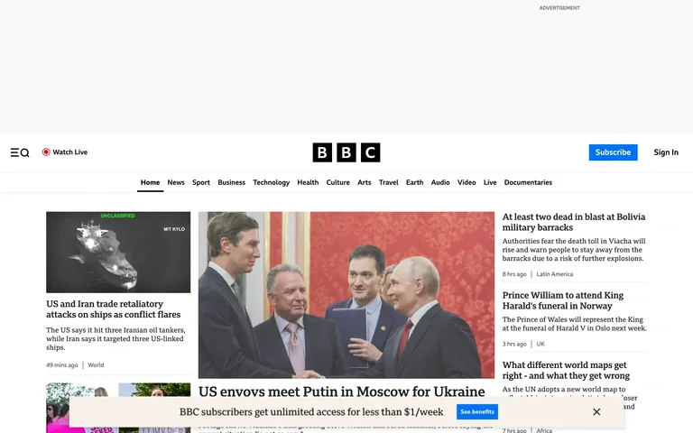
A centered masthead and compact section navigation introduce a dense news grid, with image-led stories balanced by smaller headline columns.
Useful for: News and content hubs that need to prioritize several stories without losing section navigation.
# Design reference: BBC
Source: https://www.bbc.com/
Swipefile reference: https://swipefile.design/ref/popular-bbc/
Captured: 2026-09-05. This is a dated reference, not a claim about the current live product.
Capture scope: one viewport. Do not infer unseen page sections or a complete user flow.

## Objective
Adapt the visual principles below to my project. Use my own content and identity. Do not reproduce logos, proprietary copy, or brand assets.

## Reference notes
- mood: Editorial and information-rich
- colors: White, black, gray, varied story photography
- typography: Strong serif story headlines with compact sans navigation
- layout: Centered masthead above a multi-column hierarchy of lead and supporting stories
- motion: Static opening-screen capture. Visit the source to study transitions and interactive behavior.
- texture: Fine rules and documentary photography
- dont: Adapt the hierarchy to your own product and content; use your own identity and imagery.

Useful for: News and content hubs that need to prioritize several stories without losing section navigation.

## Acceptance criteria
- Existing project conventions, design tokens, working functionality, and unrelated changes are preserved.
- Two or three reference principles clearly support the user's task; conflicts are resolved in favor of usability and the existing product.
- Reusable components and semantic HTML express the interface. Available licensed assets are used; important UI text is never rendered as a bitmap.
- Every visible control has a defined behavior. Loading, empty, error, success, disabled, and long-content states are specified where relevant. Demo data is clearly labeled.
- Navigation and content adapt at 375px, 768px, and 1440px without horizontal page overflow. Keyboard use, visible focus, labeled inputs, at least 44px touch targets, readable contrast, and reduced motion are supported.
- Verification distinguishes rendered behavior from proposals and identifies anything still requiring a backend or external service.

## Quality bar
Clear hierarchy, consistent spacing, restrained surfaces, and purposeful motion. Avoid decorative gradients, excessive cards, placeholder buttons, and invented metrics unless the project calls for them. Do not claim a feature is connected or tested without evidence.
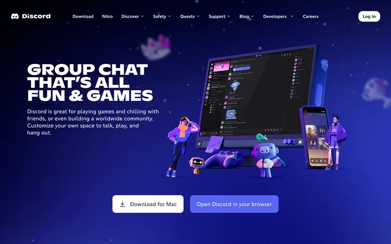
A bright blue world frames an angled product preview and character illustrations, with direct download and browser-entry choices beneath the headline.
Useful for: Community products explaining both the social experience and how to start using it.
# Design reference: Discord
Source: https://discord.com/
Swipefile reference: https://swipefile.design/ref/popular-discord/
Captured: 2026-09-05. This is a dated reference, not a claim about the current live product.
Capture scope: one viewport. Do not infer unseen page sections or a complete user flow.

## Objective
Adapt the visual principles below to my project. Use my own content and identity. Do not reproduce logos, proprietary copy, or brand assets.

## Reference notes
- mood: Playful and social
- colors: Electric blue, purple, white
- typography: Heavy uppercase display with short sans supporting text
- layout: Left-aligned statement beside a large illustrated interface scene, followed by two access actions
- motion: Static opening-screen capture. Visit the source to study transitions and interactive behavior.
- texture: Glossy cartoon objects and a real-looking product preview
- dont: Adapt the hierarchy to your own product and content; use your own identity and imagery.

Useful for: Community products explaining both the social experience and how to start using it.

## Acceptance criteria
- Existing project conventions, design tokens, working functionality, and unrelated changes are preserved.
- Two or three reference principles clearly support the user's task; conflicts are resolved in favor of usability and the existing product.
- Reusable components and semantic HTML express the interface. Available licensed assets are used; important UI text is never rendered as a bitmap.
- Every visible control has a defined behavior. Loading, empty, error, success, disabled, and long-content states are specified where relevant. Demo data is clearly labeled.
- Navigation and content adapt at 375px, 768px, and 1440px without horizontal page overflow. Keyboard use, visible focus, labeled inputs, at least 44px touch targets, readable contrast, and reduced motion are supported.
- Verification distinguishes rendered behavior from proposals and identifies anything still requiring a backend or external service.

## Quality bar
Clear hierarchy, consistent spacing, restrained surfaces, and purposeful motion. Avoid decorative gradients, excessive cards, placeholder buttons, and invented metrics unless the project calls for them. Do not claim a feature is connected or tested without evidence.
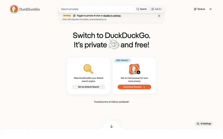
Search stays at the top while the main page explains two privacy choices through a pair of simple panels: search and the browser.
Useful for: Products offering related tools that need an easy comparison at the first visit.
# Design reference: DuckDuckGo — Privacy browser homepage
Source: https://duckduckgo.com/
Swipefile reference: https://swipefile.design/ref/popular-duckduckgo-search-start/
Captured: 2026-09-05. This is a dated reference, not a claim about the current live product.
Capture scope: one viewport. Do not infer unseen page sections or a complete user flow.

## Objective
Adapt the visual principles below to my project. Use my own content and identity. Do not reproduce logos, proprietary copy, or brand assets.

## Reference notes
- mood: Reassuring and simple
- colors: Warm white, orange, pale cream, black
- typography: Plain sans headline and compact utility labels
- layout: Narrow top search bar, centered statement, two side-by-side product choices
- motion: Static opening-screen capture. Visit the source to study transitions and interactive behavior.
- texture: Flat white space with small friendly product illustrations
- dont: Adapt the hierarchy to your own product and content; use your own identity and imagery.

Useful for: Products offering related tools that need an easy comparison at the first visit.

## Acceptance criteria
- Existing project conventions, design tokens, working functionality, and unrelated changes are preserved.
- Two or three reference principles clearly support the user's task; conflicts are resolved in favor of usability and the existing product.
- Reusable components and semantic HTML express the interface. Available licensed assets are used; important UI text is never rendered as a bitmap.
- Every visible control has a defined behavior. Loading, empty, error, success, disabled, and long-content states are specified where relevant. Demo data is clearly labeled.
- Navigation and content adapt at 375px, 768px, and 1440px without horizontal page overflow. Keyboard use, visible focus, labeled inputs, at least 44px touch targets, readable contrast, and reduced motion are supported.
- Verification distinguishes rendered behavior from proposals and identifies anything still requiring a backend or external service.

## Quality bar
Clear hierarchy, consistent spacing, restrained surfaces, and purposeful motion. Avoid decorative gradients, excessive cards, placeholder buttons, and invented metrics unless the project calls for them. Do not claim a feature is connected or tested without evidence.
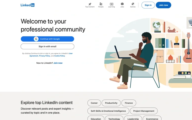
A professional-network introduction pairs account-entry choices with a large people-focused illustration, while topic chips begin content discovery below.
Useful for: Professional platforms that need both a membership path and a preview of the topics available.
# Design reference: LinkedIn
Source: https://www.linkedin.com/
Swipefile reference: https://swipefile.design/ref/popular-linkedin/
Captured: 2026-09-05. This is a dated reference, not a claim about the current live product.
Capture scope: one viewport. Do not infer unseen page sections or a complete user flow.

## Objective
Adapt the visual principles below to my project. Use my own content and identity. Do not reproduce logos, proprietary copy, or brand assets.

## Reference notes
- mood: Professional and welcoming
- colors: White, LinkedIn blue, muted illustration colors
- typography: Large light sans headline and compact navigation labels
- layout: Two-column introduction with account actions on the left and illustration on the right
- motion: Static opening-screen capture. Visit the source to study transitions and interactive behavior.
- texture: Flat vector illustration and pill-shaped topic controls
- dont: Adapt the hierarchy to your own product and content; use your own identity and imagery.

Useful for: Professional platforms that need both a membership path and a preview of the topics available.

## Acceptance criteria
- Existing project conventions, design tokens, working functionality, and unrelated changes are preserved.
- Two or three reference principles clearly support the user's task; conflicts are resolved in favor of usability and the existing product.
- Reusable components and semantic HTML express the interface. Available licensed assets are used; important UI text is never rendered as a bitmap.
- Every visible control has a defined behavior. Loading, empty, error, success, disabled, and long-content states are specified where relevant. Demo data is clearly labeled.
- Navigation and content adapt at 375px, 768px, and 1440px without horizontal page overflow. Keyboard use, visible focus, labeled inputs, at least 44px touch targets, readable contrast, and reduced motion are supported.
- Verification distinguishes rendered behavior from proposals and identifies anything still requiring a backend or external service.

## Quality bar
Clear hierarchy, consistent spacing, restrained surfaces, and purposeful motion. Avoid decorative gradients, excessive cards, placeholder buttons, and invented metrics unless the project calls for them. Do not claim a feature is connected or tested without evidence.
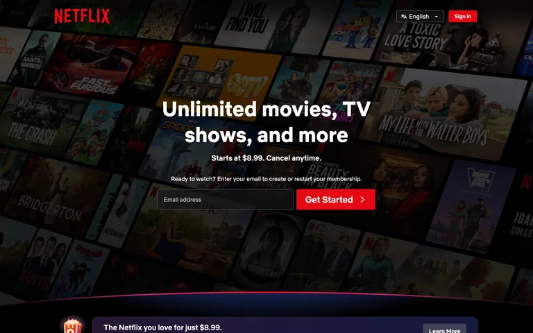
A darkened collage of entertainment artwork supports a centered subscription pitch and a single email-entry step with a red primary action.
Useful for: Membership products that can show the available content while keeping the first signup step simple.
# Design reference: Netflix
Source: https://www.netflix.com/
Swipefile reference: https://swipefile.design/ref/popular-netflix/
Captured: 2026-09-05. This is a dated reference, not a claim about the current live product.
Capture scope: one viewport. Do not infer unseen page sections or a complete user flow.

## Objective
Adapt the visual principles below to my project. Use my own content and identity. Do not reproduce logos, proprietary copy, or brand assets.

## Reference notes
- mood: Cinematic and direct
- colors: Near-black, white, saturated red
- typography: Bold centered sans display with short supporting lines
- layout: Centered headline, reassurance, and inline email field over a full-width poster collage
- motion: Static opening-screen capture. Visit the source to study transitions and interactive behavior.
- texture: Entertainment artwork under a dark overlay
- dont: Adapt the hierarchy to your own product and content; use your own identity and imagery.

Useful for: Membership products that can show the available content while keeping the first signup step simple.

## Acceptance criteria
- Existing project conventions, design tokens, working functionality, and unrelated changes are preserved.
- Two or three reference principles clearly support the user's task; conflicts are resolved in favor of usability and the existing product.
- Reusable components and semantic HTML express the interface. Available licensed assets are used; important UI text is never rendered as a bitmap.
- Every visible control has a defined behavior. Loading, empty, error, success, disabled, and long-content states are specified where relevant. Demo data is clearly labeled.
- Navigation and content adapt at 375px, 768px, and 1440px without horizontal page overflow. Keyboard use, visible focus, labeled inputs, at least 44px touch targets, readable contrast, and reduced motion are supported.
- Verification distinguishes rendered behavior from proposals and identifies anything still requiring a backend or external service.

## Quality bar
Clear hierarchy, consistent spacing, restrained surfaces, and purposeful motion. Avoid decorative gradients, excessive cards, placeholder buttons, and invented metrics unless the project calls for them. Do not claim a feature is connected or tested without evidence.
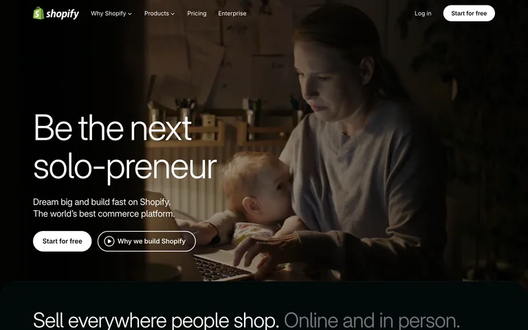
A merchant at work fills the background behind a short business-building message, with separate trial and explanatory-video actions.
Useful for: Platforms that sell an outcome and can show the person or business behind it.
# Design reference: Shopify
Source: https://www.shopify.com/
Swipefile reference: https://swipefile.design/ref/popular-shopify/
Captured: 2026-09-05. This is a dated reference, not a claim about the current live product.
Capture scope: one viewport. Do not infer unseen page sections or a complete user flow.

## Objective
Adapt the visual principles below to my project. Use my own content and identity. Do not reproduce logos, proprietary copy, or brand assets.

## Reference notes
- mood: Entrepreneurial and practical
- colors: Deep warm photography, white, muted green
- typography: Large lightweight sans headline with compact product navigation
- layout: Full-bleed merchant scene, lower-left statement, adjacent trial and explainer actions
- motion: Static opening-screen capture. Visit the source to study transitions and interactive behavior.
- texture: Real-world photography rather than abstract dashboard ornament
- dont: Adapt the hierarchy to your own product and content; use your own identity and imagery.

Useful for: Platforms that sell an outcome and can show the person or business behind it.

## Acceptance criteria
- Existing project conventions, design tokens, working functionality, and unrelated changes are preserved.
- Two or three reference principles clearly support the user's task; conflicts are resolved in favor of usability and the existing product.
- Reusable components and semantic HTML express the interface. Available licensed assets are used; important UI text is never rendered as a bitmap.
- Every visible control has a defined behavior. Loading, empty, error, success, disabled, and long-content states are specified where relevant. Demo data is clearly labeled.
- Navigation and content adapt at 375px, 768px, and 1440px without horizontal page overflow. Keyboard use, visible focus, labeled inputs, at least 44px touch targets, readable contrast, and reduced motion are supported.
- Verification distinguishes rendered behavior from proposals and identifies anything still requiring a backend or external service.

## Quality bar
Clear hierarchy, consistent spacing, restrained surfaces, and purposeful motion. Avoid decorative gradients, excessive cards, placeholder buttons, and invented metrics unless the project calls for them. Do not claim a feature is connected or tested without evidence.
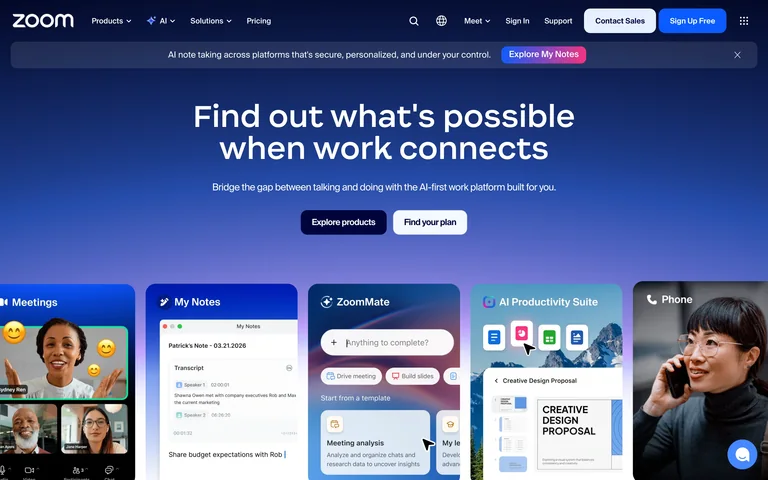
A blue gradient unifies the main message and a row of product panels, with distinct routes to explore the platform or find a plan.
Useful for: Multi-product SaaS brands that need an umbrella message and recognizable product entry points.
# Design reference: Zoom
Source: https://www.zoom.com/
Swipefile reference: https://swipefile.design/ref/popular-zoom/
Captured: 2026-09-05. This is a dated reference, not a claim about the current live product.
Capture scope: one viewport. Do not infer unseen page sections or a complete user flow.

## Objective
Adapt the visual principles below to my project. Use my own content and identity. Do not reproduce logos, proprietary copy, or brand assets.

## Reference notes
- mood: Bright and connected
- colors: Deep blue, purple, white
- typography: Bold centered sans headline and compact navigation
- layout: Centered introduction above a broad row of product cards
- motion: Static opening-screen capture. Visit the source to study transitions and interactive behavior.
- texture: Blue gradients, rounded panels, product and people imagery
- dont: Adapt the hierarchy to your own product and content; use your own identity and imagery.

Useful for: Multi-product SaaS brands that need an umbrella message and recognizable product entry points.

## Acceptance criteria
- Existing project conventions, design tokens, working functionality, and unrelated changes are preserved.
- Two or three reference principles clearly support the user's task; conflicts are resolved in favor of usability and the existing product.
- Reusable components and semantic HTML express the interface. Available licensed assets are used; important UI text is never rendered as a bitmap.
- Every visible control has a defined behavior. Loading, empty, error, success, disabled, and long-content states are specified where relevant. Demo data is clearly labeled.
- Navigation and content adapt at 375px, 768px, and 1440px without horizontal page overflow. Keyboard use, visible focus, labeled inputs, at least 44px touch targets, readable contrast, and reduced motion are supported.
- Verification distinguishes rendered behavior from proposals and identifies anything still requiring a backend or external service.

## Quality bar
Clear hierarchy, consistent spacing, restrained surfaces, and purposeful motion. Avoid decorative gradients, excessive cards, placeholder buttons, and invented metrics unless the project calls for them. Do not claim a feature is connected or tested without evidence.
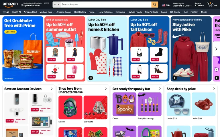
A search-first storefront packs department shortcuts and themed product panels into a dense first screen.
Useful for: Retail homepages that need to combine direct product search with guided browsing.
# Design reference: Amazon — Storefront
Source: https://www.amazon.com/
Swipefile reference: https://swipefile.design/ref/popular-amazon-storefront/
Captured: 2026-09-05. This is a dated reference, not a claim about the current live product.
Capture scope: one viewport. Do not infer unseen page sections or a complete user flow.

## Objective
Adapt the interaction and layout patterns below to my project. Use my own content and identity. Do not reproduce logos, proprietary copy, or brand assets.

## Reference notes
- surface: Amazon public storefront, signed out.
- nav: Two stacked header rows separate account and search utilities from department browsing.
- layout: Full-width promotional scene above tightly packed category panels.
- density: High, with compact labels and multiple discovery paths.
- color: Dark navy navigation, white panels, warm promotional accents.
- typography: Compact sans labels with larger category headings.
- pattern: Keep search prominent while offering category-led entry points for visitors without a specific query.
- states: Signed-out storefront with region-dependent offers; no cart or checkout state was captured.
- dont: Avoid stacking promotions until the primary search action becomes hard to find.

Useful for: Retail homepages that need to combine direct product search with guided browsing.

## Acceptance criteria
- Existing project conventions, design tokens, working functionality, and unrelated changes are preserved.
- Two or three reference principles clearly support the user's task; conflicts are resolved in favor of usability and the existing product.
- Reusable components and semantic HTML express the interface. Available licensed assets are used; important UI text is never rendered as a bitmap.
- Every visible control has a defined behavior. Loading, empty, error, success, disabled, and long-content states are specified where relevant. Demo data is clearly labeled.
- Navigation and content adapt at 375px, 768px, and 1440px without horizontal page overflow. Keyboard use, visible focus, labeled inputs, at least 44px touch targets, readable contrast, and reduced motion are supported.
- Verification distinguishes rendered behavior from proposals and identifies anything still requiring a backend or external service.

## Quality bar
Clear hierarchy, consistent spacing, restrained surfaces, and purposeful motion. Avoid decorative gradients, excessive cards, placeholder buttons, and invented metrics unless the project calls for them. Do not claim a feature is connected or tested without evidence.
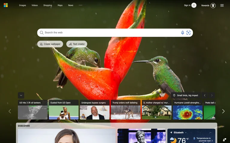
A large search field sits over full-screen photography, with lightweight utilities and smaller discovery links around it.
Useful for: Search start pages that need a strong primary input and optional exploration.
# Design reference: Bing — Search start
Source: https://www.bing.com/
Swipefile reference: https://swipefile.design/ref/popular-bing-search-start/
Captured: 2026-09-05. This is a dated reference, not a claim about the current live product.
Capture scope: one viewport. Do not infer unseen page sections or a complete user flow.

## Objective
Adapt the interaction and layout patterns below to my project. Use my own content and identity. Do not reproduce logos, proprietary copy, or brand assets.

## Reference notes
- surface: Bing public search homepage.
- nav: Small service links at the top with account utilities on the opposite side.
- layout: Prominent search input over a photographic canvas, with supplemental discovery content below.
- density: Low around the search input; more compact near discovery links.
- color: Photography supplies the palette, supported by white controls and dark overlays.
- typography: Clean sans utility labels.
- pattern: Protect an uncluttered input zone while letting secondary content occupy the edges.
- states: Unsigned homepage; search results and suggestions are not shown.
- dont: Do not let a detailed background reduce input contrast or distract from typing.

Useful for: Search start pages that need a strong primary input and optional exploration.

## Acceptance criteria
- Existing project conventions, design tokens, working functionality, and unrelated changes are preserved.
- Two or three reference principles clearly support the user's task; conflicts are resolved in favor of usability and the existing product.
- Reusable components and semantic HTML express the interface. Available licensed assets are used; important UI text is never rendered as a bitmap.
- Every visible control has a defined behavior. Loading, empty, error, success, disabled, and long-content states are specified where relevant. Demo data is clearly labeled.
- Navigation and content adapt at 375px, 768px, and 1440px without horizontal page overflow. Keyboard use, visible focus, labeled inputs, at least 44px touch targets, readable contrast, and reduced motion are supported.
- Verification distinguishes rendered behavior from proposals and identifies anything still requiring a backend or external service.

## Quality bar
Clear hierarchy, consistent spacing, restrained surfaces, and purposeful motion. Avoid decorative gradients, excessive cards, placeholder buttons, and invented metrics unless the project calls for them. Do not claim a feature is connected or tested without evidence.
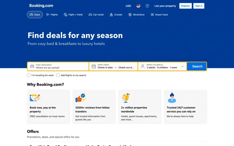
Destination, dates, and travelers form one prominent search bar beneath a clear stays headline and travel-category navigation.
Useful for: Multi-field searches that must explain the required inputs before showing results.
# Design reference: Booking.com — Stay search
Source: https://www.booking.com/
Swipefile reference: https://swipefile.design/ref/popular-booking-com-stay-search/
Captured: 2026-09-05. This is a dated reference, not a claim about the current live product.
Capture scope: one viewport. Do not infer unseen page sections or a complete user flow.

## Objective
Adapt the interaction and layout patterns below to my project. Use my own content and identity. Do not reproduce logos, proprietary copy, or brand assets.

## Reference notes
- surface: Booking.com public stays search homepage; sign-in promotion dismissed.
- nav: Account utilities above a row of travel-product tabs.
- layout: Blue header and introduction, yellow-framed search row, supporting benefit panels below.
- density: Moderate, with the required search fields grouped tightly.
- color: Deep blue, white, and yellow search emphasis.
- typography: Bold sans headline, small form labels, clear primary-button text.
- pattern: Group related search constraints into one continuous form with a single submit action.
- states: Initial unsigned search state; date selection, validation, and search results are not captured.
- dont: Do not rely on placeholder text as the only accessible field label.

Useful for: Multi-field searches that must explain the required inputs before showing results.

## Acceptance criteria
- Existing project conventions, design tokens, working functionality, and unrelated changes are preserved.
- Two or three reference principles clearly support the user's task; conflicts are resolved in favor of usability and the existing product.
- Reusable components and semantic HTML express the interface. Available licensed assets are used; important UI text is never rendered as a bitmap.
- Every visible control has a defined behavior. Loading, empty, error, success, disabled, and long-content states are specified where relevant. Demo data is clearly labeled.
- Navigation and content adapt at 375px, 768px, and 1440px without horizontal page overflow. Keyboard use, visible focus, labeled inputs, at least 44px touch targets, readable contrast, and reduced motion are supported.
- Verification distinguishes rendered behavior from proposals and identifies anything still requiring a backend or external service.

## Quality bar
Clear hierarchy, consistent spacing, restrained surfaces, and purposeful motion. Avoid decorative gradients, excessive cards, placeholder buttons, and invented metrics unless the project calls for them. Do not claim a feature is connected or tested without evidence.
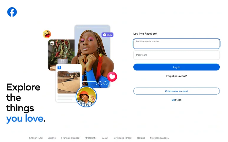
A visual introduction occupies the left side while a compact sign-in form and account-creation route sit on the right.
Useful for: Consumer account entry that needs to explain the product alongside authentication.
# Design reference: Facebook — Sign in
Source: https://www.facebook.com/
Swipefile reference: https://swipefile.design/ref/popular-facebook-sign-in/
Captured: 2026-09-05. This is a dated reference, not a claim about the current live product.
Capture scope: one viewport. Do not infer unseen page sections or a complete user flow.

## Objective
Adapt the interaction and layout patterns below to my project. Use my own content and identity. Do not reproduce logos, proprietary copy, or brand assets.

## Reference notes
- surface: Facebook public sign-in page.
- nav: Minimal product navigation; recovery and account creation stay near the form.
- layout: Wide split screen with imagery and a headline on the left and stacked fields on the right.
- density: Low, with clear spacing between authentication choices.
- color: White, dark text, blue primary action, colorful content imagery.
- typography: Large sans introductory message with compact form labels.
- pattern: Separate the product promise from the task-focused form while keeping both visible.
- states: Signed-out state with recovery and new-account links; no login was attempted.
- dont: Keep recovery and alternative account paths visible rather than burying them in a footer.

Useful for: Consumer account entry that needs to explain the product alongside authentication.

## Acceptance criteria
- Existing project conventions, design tokens, working functionality, and unrelated changes are preserved.
- Two or three reference principles clearly support the user's task; conflicts are resolved in favor of usability and the existing product.
- Reusable components and semantic HTML express the interface. Available licensed assets are used; important UI text is never rendered as a bitmap.
- Every visible control has a defined behavior. Loading, empty, error, success, disabled, and long-content states are specified where relevant. Demo data is clearly labeled.
- Navigation and content adapt at 375px, 768px, and 1440px without horizontal page overflow. Keyboard use, visible focus, labeled inputs, at least 44px touch targets, readable contrast, and reduced motion are supported.
- Verification distinguishes rendered behavior from proposals and identifies anything still requiring a backend or external service.

## Quality bar
Clear hierarchy, consistent spacing, restrained surfaces, and purposeful motion. Avoid decorative gradients, excessive cards, placeholder buttons, and invented metrics unless the project calls for them. Do not claim a feature is connected or tested without evidence.
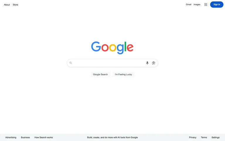
A centered logo and rounded search field dominate a deliberately sparse page, with utilities moved to the corners and footer.
Useful for: Single-purpose search tools where the input itself should be the main interface.
# Design reference: Google — Search start
Source: https://www.google.com/
Swipefile reference: https://swipefile.design/ref/popular-google-search-start/
Captured: 2026-09-05. This is a dated reference, not a claim about the current live product.
Capture scope: one viewport. Do not infer unseen page sections or a complete user flow.

## Objective
Adapt the interaction and layout patterns below to my project. Use my own content and identity. Do not reproduce logos, proprietary copy, or brand assets.

## Reference notes
- surface: Google public search homepage.
- nav: Sparse top-corner links and a compact footer.
- layout: Centered search cluster surrounded by extensive white space.
- density: Very low, concentrating attention on one input.
- color: White, gray controls, small multicolor brand accents.
- typography: Small neutral sans utilities beneath the large brand mark.
- pattern: Give the dominant task more visual space by moving secondary links to the perimeter.
- states: Initial unsigned search state, before typing or results.
- dont: Minimalism still needs visible keyboard focus, accessible input names, and clear submission behavior.

Useful for: Single-purpose search tools where the input itself should be the main interface.

## Acceptance criteria
- Existing project conventions, design tokens, working functionality, and unrelated changes are preserved.
- Two or three reference principles clearly support the user's task; conflicts are resolved in favor of usability and the existing product.
- Reusable components and semantic HTML express the interface. Available licensed assets are used; important UI text is never rendered as a bitmap.
- Every visible control has a defined behavior. Loading, empty, error, success, disabled, and long-content states are specified where relevant. Demo data is clearly labeled.
- Navigation and content adapt at 375px, 768px, and 1440px without horizontal page overflow. Keyboard use, visible focus, labeled inputs, at least 44px touch targets, readable contrast, and reduced motion are supported.
- Verification distinguishes rendered behavior from proposals and identifies anything still requiring a backend or external service.

## Quality bar
Clear hierarchy, consistent spacing, restrained surfaces, and purposeful motion. Avoid decorative gradients, excessive cards, placeholder buttons, and invented metrics unless the project calls for them. Do not claim a feature is connected or tested without evidence.
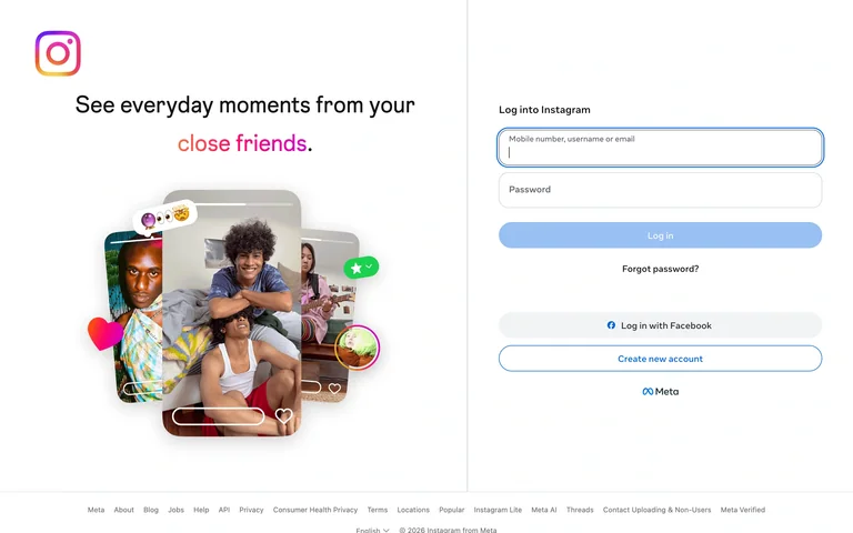
A collage of personal moments introduces the service beside a simple sign-in form, with recovery and alternate account routes underneath.
Useful for: Image-led consumer products that want account entry to retain a sense of the product experience.
# Design reference: Instagram — Sign in
Source: https://www.instagram.com/
Swipefile reference: https://swipefile.design/ref/popular-instagram-sign-in/
Captured: 2026-09-05. This is a dated reference, not a claim about the current live product.
Capture scope: one viewport. Do not infer unseen page sections or a complete user flow.

## Objective
Adapt the interaction and layout patterns below to my project. Use my own content and identity. Do not reproduce logos, proprietary copy, or brand assets.

## Reference notes
- surface: Instagram public sign-in page.
- nav: Recovery, Facebook login, and account creation are close to the form; corporate links sit below.
- layout: Two-column composition with photography on the left and stacked credentials on the right.
- density: Low in the form, visually richer in the adjacent collage.
- color: White, black, blue controls, warm personal photography.
- typography: Large introductory sans text with compact form and utility labels.
- pattern: Use product-relevant imagery to provide context without inserting extra steps into authentication.
- states: Signed-out page; no account information was entered.
- dont: Do not sacrifice field contrast or make the alternative account route look like another primary action.

Useful for: Image-led consumer products that want account entry to retain a sense of the product experience.

## Acceptance criteria
- Existing project conventions, design tokens, working functionality, and unrelated changes are preserved.
- Two or three reference principles clearly support the user's task; conflicts are resolved in favor of usability and the existing product.
- Reusable components and semantic HTML express the interface. Available licensed assets are used; important UI text is never rendered as a bitmap.
- Every visible control has a defined behavior. Loading, empty, error, success, disabled, and long-content states are specified where relevant. Demo data is clearly labeled.
- Navigation and content adapt at 375px, 768px, and 1440px without horizontal page overflow. Keyboard use, visible focus, labeled inputs, at least 44px touch targets, readable contrast, and reduced motion are supported.
- Verification distinguishes rendered behavior from proposals and identifies anything still requiring a backend or external service.

## Quality bar
Clear hierarchy, consistent spacing, restrained surfaces, and purposeful motion. Avoid decorative gradients, excessive cards, placeholder buttons, and invented metrics unless the project calls for them. Do not claim a feature is connected or tested without evidence.
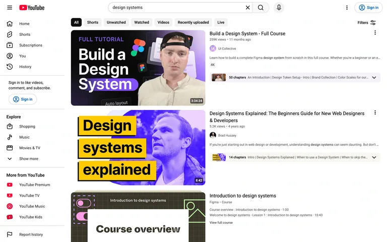
Video results pair large thumbnails with titles and metadata, while a persistent search bar, filters, and side navigation support refinement.
Useful for: Media search results where viewers compare content visually before opening an item.
# Design reference: YouTube — Search results
Source: https://www.youtube.com/results?search_query=design+systems
Swipefile reference: https://swipefile.design/ref/popular-youtube-video-discovery/
Captured: 2026-09-05. This is a dated reference, not a claim about the current live product.
Capture scope: one viewport. Do not infer unseen page sections or a complete user flow.

## Objective
Adapt the interaction and layout patterns below to my project. Use my own content and identity. Do not reproduce logos, proprietary copy, or brand assets.

## Reference notes
- surface: YouTube public results for “design systems,” signed out.
- nav: Persistent left navigation and top search, with filtering controls above the results.
- layout: Vertical result rows place thumbnails beside a title, channel, and supporting metadata.
- density: Moderate to high, with clear repetition across results.
- color: White, black, gray dividers and metadata, varied thumbnail imagery.
- typography: Prominent video titles above smaller channel and view information.
- pattern: Make each result scannable as one image-and-metadata unit and keep the active query available.
- states: Populated public search results; recommendations and rankings may vary over time.
- dont: Avoid copying individual thumbnails or treating the observed result order as a stable ranking.

Useful for: Media search results where viewers compare content visually before opening an item.

## Acceptance criteria
- Existing project conventions, design tokens, working functionality, and unrelated changes are preserved.
- Two or three reference principles clearly support the user's task; conflicts are resolved in favor of usability and the existing product.
- Reusable components and semantic HTML express the interface. Available licensed assets are used; important UI text is never rendered as a bitmap.
- Every visible control has a defined behavior. Loading, empty, error, success, disabled, and long-content states are specified where relevant. Demo data is clearly labeled.
- Navigation and content adapt at 375px, 768px, and 1440px without horizontal page overflow. Keyboard use, visible focus, labeled inputs, at least 44px touch targets, readable contrast, and reduced motion are supported.
- Verification distinguishes rendered behavior from proposals and identifies anything still requiring a backend or external service.

## Quality bar
Clear hierarchy, consistent spacing, restrained surfaces, and purposeful motion. Avoid decorative gradients, excessive cards, placeholder buttons, and invented metrics unless the project calls for them. Do not claim a feature is connected or tested without evidence.
Allow basic usage counts to help us understand what is useful. Your board contents stay out of analytics. Details
Your browser’s privacy preference keeps analytics off.