Forms & Onboarding
CURATED COLLECTION · 5 REFERENCES
Account entry is a decision about routes, not just a form layout. Compare email, identity providers, enterprise access, and recovery paths while keeping the most likely next step obvious.
Copy the reference notes below and paste them into Claude, ChatGPT, or your coding assistant. Add what you want to build.
Includes design notes, original sources, and preview links. An assistant that supports browsing can also read the public board link.
Selected from public entry screens with different authentication choices. A screenshot shows hierarchy; it cannot prove validation, recovery, security, or completion behavior.
Study three account-creation methods in a compact centered stack. Keep the ranking clear rather than giving every provider a competing visual treatment.
Compare an email-first route with a compact grid of alternatives. Labels need to remain understandable when icons are unfamiliar.
Examine how the email step leads while providers and workspace recovery stay secondary. Recovery should remain visible without competing with the primary action.
Implement only authentication methods your backend actually supports. Test invalid email, provider cancellation, loading, unavailable service, and keyboard focus. Let password managers work. Preserve the destination a user was trying to reach, and never present a signup success state before the account exists.
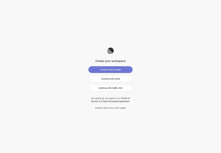
A quiet workspace entry screen ranks three account-creation methods in a compact centered stack.
Useful for: Compare provider-first entry with email and enterprise alternatives without crowding the first step.
# Design reference: Linear — Create account
Source: https://linear.app/signup
Swipefile reference: https://swipefile.design/ref/linear-signup/
Captured: 2026-09-05. This is a dated reference, not a claim about the current live product.
Capture scope: one viewport. Do not infer unseen page sections or a complete user flow.

## Objective
Adapt the interaction and layout patterns below to my project. Use my own content and identity. Do not reproduce logos, proprietary copy, or brand assets.

## Reference notes
- surface: Create account
- nav: Sign-in recovery sits below the creation choices.
- layout: A narrow form stack sits in open space with a small product mark above and legal guidance below.
- density: A constrained form column leaves room between groups while keeping labels and controls together.
- color: Pale gray canvas, white secondary controls, and a soft violet primary button.
- typography: Small sans-serif labels and a short medium-weight heading keep the form understated.
- pattern: Compare provider-first entry with email and enterprise alternatives without crowding the first step.
- states: Initial account-method selection; authentication outcomes are not shown.
- dont: Adapt the interaction pattern to your own product. Do not copy brand assets, sample identities, proprietary text, or assume unseen states. Specify keyboard behavior, loading, empty, error, and narrow-screen layouts for your implementation.

Useful for: Compare provider-first entry with email and enterprise alternatives without crowding the first step.

## Acceptance criteria
- Existing project conventions, design tokens, working functionality, and unrelated changes are preserved.
- Two or three reference principles clearly support the user's task; conflicts are resolved in favor of usability and the existing product.
- Reusable components and semantic HTML express the interface. Available licensed assets are used; important UI text is never rendered as a bitmap.
- Every visible control has a defined behavior. Loading, empty, error, success, disabled, and long-content states are specified where relevant. Demo data is clearly labeled.
- Navigation and content adapt at 375px, 768px, and 1440px without horizontal page overflow. Keyboard use, visible focus, labeled inputs, at least 44px touch targets, readable contrast, and reduced motion are supported.
- Verification distinguishes rendered behavior from proposals and identifies anything still requiring a backend or external service.

## Quality bar
Clear hierarchy, consistent spacing, restrained surfaces, and purposeful motion. Avoid decorative gradients, excessive cards, placeholder buttons, and invented metrics unless the project calls for them. Do not claim a feature is connected or tested without evidence.
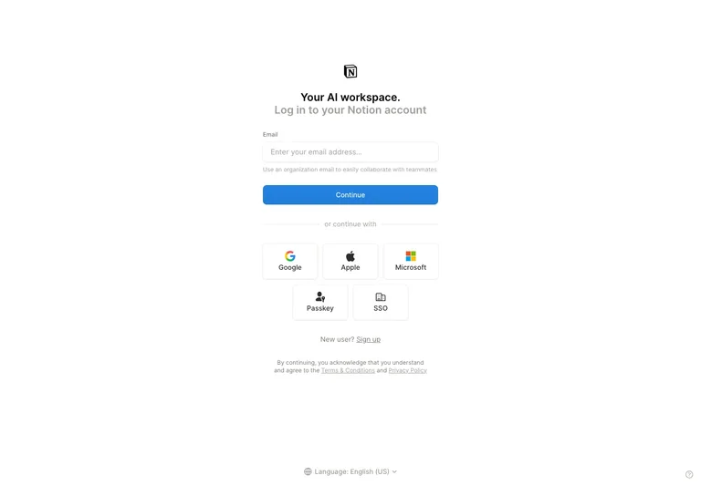
An email-first sign-in screen organizes five alternative methods in a compact icon grid.
Useful for: Offer several authentication methods while keeping the email path visually first.
# Design reference: Notion — Sign in
Source: https://app.notion.com/login
Swipefile reference: https://swipefile.design/ref/notion-login/
Captured: 2026-09-05. This is a dated reference, not a claim about the current live product.
Capture scope: one viewport. Do not infer unseen page sections or a complete user flow.

## Objective
Adapt the interaction and layout patterns below to my project. Use my own content and identity. Do not reproduce logos, proprietary copy, or brand assets.

## Reference notes
- surface: Sign in
- nav: Language selection is separated at the bottom of the page.
- layout: A centered email form is followed by a divider, provider grid, and account-creation link.
- density: A constrained form column leaves room between groups while keeping labels and controls together.
- color: White background, dark text, a blue continue action, and colored provider icons.
- typography: Compact labels, a short bold heading, and muted legal text establish a clear reading order.
- pattern: Offer several authentication methods while keeping the email path visually first.
- states: Empty email field and visible alternate sign-in methods.
- dont: Adapt the interaction pattern to your own product. Do not copy brand assets, sample identities, proprietary text, or assume unseen states. Specify keyboard behavior, loading, empty, error, and narrow-screen layouts for your implementation.

Useful for: Offer several authentication methods while keeping the email path visually first.

## Acceptance criteria
- Existing project conventions, design tokens, working functionality, and unrelated changes are preserved.
- Two or three reference principles clearly support the user's task; conflicts are resolved in favor of usability and the existing product.
- Reusable components and semantic HTML express the interface. Available licensed assets are used; important UI text is never rendered as a bitmap.
- Every visible control has a defined behavior. Loading, empty, error, success, disabled, and long-content states are specified where relevant. Demo data is clearly labeled.
- Navigation and content adapt at 375px, 768px, and 1440px without horizontal page overflow. Keyboard use, visible focus, labeled inputs, at least 44px touch targets, readable contrast, and reduced motion are supported.
- Verification distinguishes rendered behavior from proposals and identifies anything still requiring a backend or external service.

## Quality bar
Clear hierarchy, consistent spacing, restrained surfaces, and purposeful motion. Avoid decorative gradients, excessive cards, placeholder buttons, and invented metrics unless the project calls for them. Do not claim a feature is connected or tested without evidence.
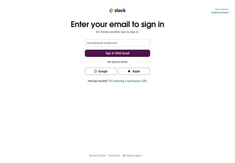
A direct email sign-in step gives social providers and workspace recovery secondary positions.
Useful for: Keep team-account recovery discoverable without competing with the primary sign-in step.
# Design reference: Slack — Sign in
Source: https://slack.com/signin#/signin
Swipefile reference: https://swipefile.design/ref/slack-signin/
Captured: 2026-09-05. This is a dated reference, not a claim about the current live product.
Capture scope: one viewport. Do not infer unseen page sections or a complete user flow.

## Objective
Adapt the interaction and layout patterns below to my project. Use my own content and identity. Do not reproduce logos, proprietary copy, or brand assets.

## Reference notes
- surface: Sign in
- nav: Account creation is in the upper corner; workspace URL recovery stays next to the form.
- layout: A narrow top-centered form places two provider buttons side by side below the primary action.
- density: A constrained form column leaves room between groups while keeping labels and controls together.
- color: White surface with a deep purple primary action and thin gray outlines.
- typography: A prominent bold heading explains the immediate action; helper text and footer links are smaller.
- pattern: Keep team-account recovery discoverable without competing with the primary sign-in step.
- states: Initial email entry with alternate provider and workspace URL paths.
- dont: Adapt the interaction pattern to your own product. Do not copy brand assets, sample identities, proprietary text, or assume unseen states. Specify keyboard behavior, loading, empty, error, and narrow-screen layouts for your implementation.

Useful for: Keep team-account recovery discoverable without competing with the primary sign-in step.

## Acceptance criteria
- Existing project conventions, design tokens, working functionality, and unrelated changes are preserved.
- Two or three reference principles clearly support the user's task; conflicts are resolved in favor of usability and the existing product.
- Reusable components and semantic HTML express the interface. Available licensed assets are used; important UI text is never rendered as a bitmap.
- Every visible control has a defined behavior. Loading, empty, error, success, disabled, and long-content states are specified where relevant. Demo data is clearly labeled.
- Navigation and content adapt at 375px, 768px, and 1440px without horizontal page overflow. Keyboard use, visible focus, labeled inputs, at least 44px touch targets, readable contrast, and reduced motion are supported.
- Verification distinguishes rendered behavior from proposals and identifies anything still requiring a backend or external service.

## Quality bar
Clear hierarchy, consistent spacing, restrained surfaces, and purposeful motion. Avoid decorative gradients, excessive cards, placeholder buttons, and invented metrics unless the project calls for them. Do not claim a feature is connected or tested without evidence.
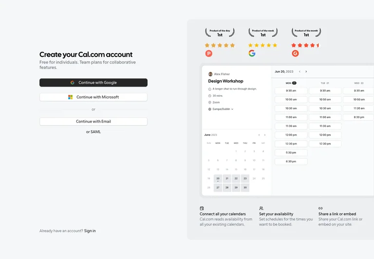
A split account-entry layout pairs sign-up choices with a concrete scheduling preview.
Useful for: Give new users product context while keeping account entry a short, obvious task.
# Design reference: Cal.com — Create account
Source: https://app.cal.com/signup
Swipefile reference: https://swipefile.design/ref/calcom-signup/
Captured: 2026-09-05. This is a dated reference, not a claim about the current live product.
Capture scope: one viewport. Do not infer unseen page sections or a complete user flow.

## Objective
Adapt the interaction and layout patterns below to my project. Use my own content and identity. Do not reproduce logos, proprietary copy, or brand assets.

## Reference notes
- surface: Create account
- nav: An existing-account link stays at the bottom of the form column.
- layout: The left column holds account actions; the right column demonstrates a booking interface with supporting proof.
- density: A constrained form column leaves room between groups while keeping labels and controls together.
- color: Soft gray page, black primary action, white controls, and a pale product-preview panel.
- typography: A bold compact heading leads the form; preview labels are denser than the surrounding copy.
- pattern: Give new users product context while keeping account entry a short, obvious task.
- states: Initial provider or email selection alongside a static product preview.
- dont: Adapt the interaction pattern to your own product. Do not copy brand assets, sample identities, proprietary text, or assume unseen states. Specify keyboard behavior, loading, empty, error, and narrow-screen layouts for your implementation.

Useful for: Give new users product context while keeping account entry a short, obvious task.

## Acceptance criteria
- Existing project conventions, design tokens, working functionality, and unrelated changes are preserved.
- Two or three reference principles clearly support the user's task; conflicts are resolved in favor of usability and the existing product.
- Reusable components and semantic HTML express the interface. Available licensed assets are used; important UI text is never rendered as a bitmap.
- Every visible control has a defined behavior. Loading, empty, error, success, disabled, and long-content states are specified where relevant. Demo data is clearly labeled.
- Navigation and content adapt at 375px, 768px, and 1440px without horizontal page overflow. Keyboard use, visible focus, labeled inputs, at least 44px touch targets, readable contrast, and reduced motion are supported.
- Verification distinguishes rendered behavior from proposals and identifies anything still requiring a backend or external service.

## Quality bar
Clear hierarchy, consistent spacing, restrained surfaces, and purposeful motion. Avoid decorative gradients, excessive cards, placeholder buttons, and invented metrics unless the project calls for them. Do not claim a feature is connected or tested without evidence.
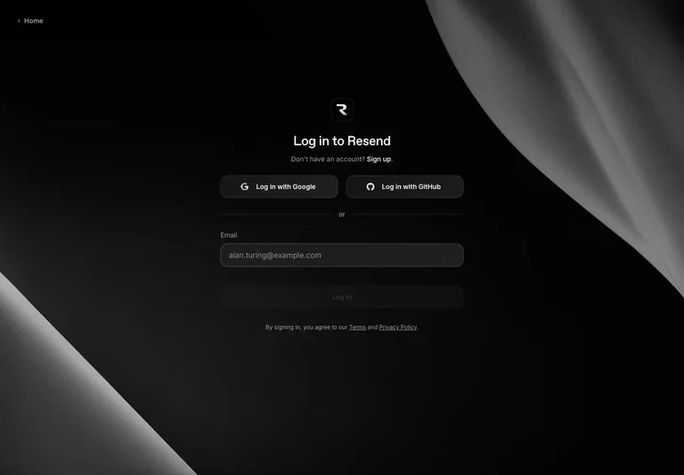
A dark sign-in screen places provider choices above an email fallback on a restrained central surface.
Useful for: Explore a dark authentication surface with distinct control boundaries and a compact fallback path.
# Design reference: Resend — Sign in
Source: https://resend.com/login
Swipefile reference: https://swipefile.design/ref/resend-login/
Captured: 2026-09-05. This is a dated reference, not a claim about the current live product.
Capture scope: one viewport. Do not infer unseen page sections or a complete user flow.

## Objective
Adapt the interaction and layout patterns below to my project. Use my own content and identity. Do not reproduce logos, proprietary copy, or brand assets.

## Reference notes
- surface: Sign in
- nav: A home link sits in the top-left, with account creation near the heading.
- layout: Two provider buttons share a row; a divider separates the email field and continuation action.
- density: A constrained form column leaves room between groups while keeping labels and controls together.
- color: Black and charcoal layers, subtle gray control boundaries, and sculptural monochrome background artwork.
- typography: Bright headings and muted supporting labels create hierarchy on the dark background.
- pattern: Explore a dark authentication surface with distinct control boundaries and a compact fallback path.
- states: Empty email form and visible provider choices; no authenticated state.
- dont: Adapt the interaction pattern to your own product. Do not copy brand assets, sample identities, proprietary text, or assume unseen states. Specify keyboard behavior, loading, empty, error, and narrow-screen layouts for your implementation.

Useful for: Explore a dark authentication surface with distinct control boundaries and a compact fallback path.

## Acceptance criteria
- Existing project conventions, design tokens, working functionality, and unrelated changes are preserved.
- Two or three reference principles clearly support the user's task; conflicts are resolved in favor of usability and the existing product.
- Reusable components and semantic HTML express the interface. Available licensed assets are used; important UI text is never rendered as a bitmap.
- Every visible control has a defined behavior. Loading, empty, error, success, disabled, and long-content states are specified where relevant. Demo data is clearly labeled.
- Navigation and content adapt at 375px, 768px, and 1440px without horizontal page overflow. Keyboard use, visible focus, labeled inputs, at least 44px touch targets, readable contrast, and reduced motion are supported.
- Verification distinguishes rendered behavior from proposals and identifies anything still requiring a backend or external service.

## Quality bar
Clear hierarchy, consistent spacing, restrained surfaces, and purposeful motion. Avoid decorative gradients, excessive cards, placeholder buttons, and invented metrics unless the project calls for them. Do not claim a feature is connected or tested without evidence.
Allow basic usage counts to help us understand what is useful. Your board contents stay out of analytics. Details
Your browser’s privacy preference keeps analytics off.