Finance
CURATED COLLECTION · 99 REFERENCES
100 identities with logos, typography, color systems, packaging, and applications. Credited case-study imagery from Pentagram and COLLINS, with notes for developing an original brand.
Copy the reference notes below and paste them into Claude, ChatGPT, or your coding assistant. Add what you want to build.
Includes design notes, original sources, and preview links. An assistant that supports browsing can also read the public board link.
1 references are no longer public and are omitted.
Two overlapping circles carry recognition before the name is read. Simple geometry connects the mark to large physical applications.
Useful for: Compare symbol-only, horizontal, and environmental use.
# Branding reference: Mastercard
Source: https://www.pentagram.com/work/mastercard
Design credit: Pentagram
Swipefile reference: https://swipefile.design/ref/brand-mastercard/
Reviewed: 2026-09-09. Selected designer-published case-study images, not current official brand guidelines or a reusable asset license.

## Objective
Develop an original visual identity for my brief. Study the relationships between logo, type, color, and applications in this reference. Do not reproduce the referenced logo, name, distinctive artwork, or proprietary assets.

## Design observations
- logo: Two overlapping circles carry recognition before the name is read.
- color: Red and yellow create an orange overlap.
- typography: A quiet lowercase sans serif supports the symbol.
- system: Simple geometry connects the mark to large physical applications.
- applications: Compare symbol-only, horizontal, and environmental use.
- dont: Study the principles and develop an original identity. Do not copy these logos, proprietary typefaces, illustrations, or claims. These are selected images from a published case study; current brand guidelines, asset licenses, and real-world performance have not been verified.

## Deliverables and checks
- Begin with the audience, positioning, personality, and required applications in my brief. Label assumptions.
- Explain two or three distinct identity directions before selecting one. Connect each decision to the brand's purpose.
- Define an original logo concept, wordmark and symbol relationships, typographic hierarchy, palette roles, and a consistent graphic system.
- Show how the system works on the relevant touchpoints: packaging, stationery, signage, social, or digital products.
- Draft practical guidelines for clear space, minimum size, background contrast, one-color and reversed marks, type usage, and layout. Validate proposed measurements in the actual artwork.
- Use appropriately licensed fonts and original or licensed imagery. Supply editable vector artwork when the tools support it; distinguish a concept from finished production files.
- Check small-size legibility, color accessibility for text, visual consistency, and print versus screen requirements. State what was reviewed and what still needs testing.
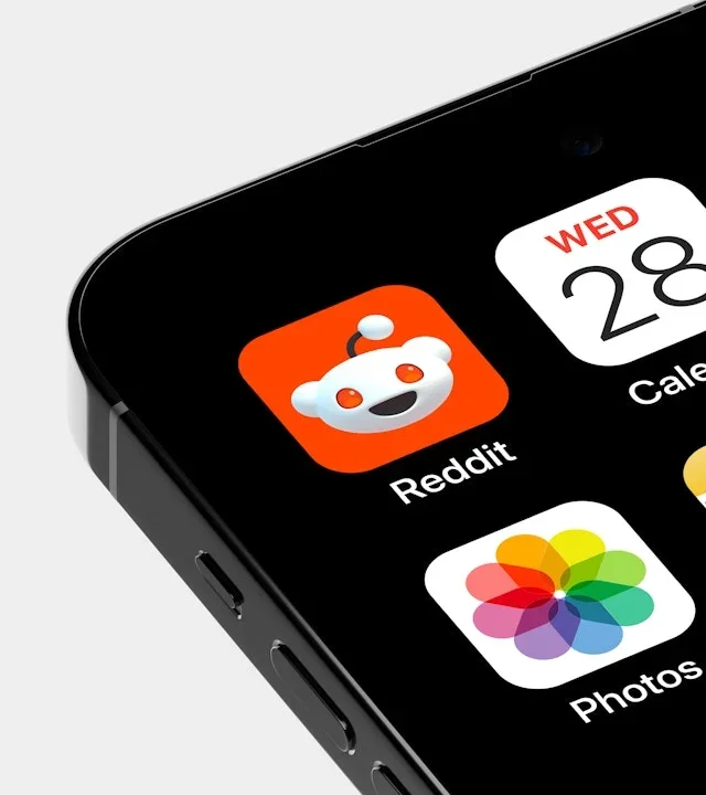
The Snoo character anchors a compact app icon and dimensional merchandise. A character and community naming system extend beyond the core wordmark.
Useful for: Study app icons, patches, and collectible objects.
# Branding reference: Reddit
Source: https://www.pentagram.com/work/reddit
Design credit: Pentagram
Swipefile reference: https://swipefile.design/ref/brand-reddit/
Reviewed: 2026-09-09. Selected designer-published case-study images, not current official brand guidelines or a reusable asset license.

## Objective
Develop an original visual identity for my brief. Study the relationships between logo, type, color, and applications in this reference. Do not reproduce the referenced logo, name, distinctive artwork, or proprietary assets.

## Design observations
- logo: The Snoo character anchors a compact app icon and dimensional merchandise.
- color: Orange, black, and white keep the character recognizable.
- typography: Heavy rounded lettering appears on community labels.
- system: A character and community naming system extend beyond the core wordmark.
- applications: Study app icons, patches, and collectible objects.
- dont: Study the principles and develop an original identity. Do not copy these logos, proprietary typefaces, illustrations, or claims. These are selected images from a published case study; current brand guidelines, asset licenses, and real-world performance have not been verified.

## Deliverables and checks
- Begin with the audience, positioning, personality, and required applications in my brief. Label assumptions.
- Explain two or three distinct identity directions before selecting one. Connect each decision to the brand's purpose.
- Define an original logo concept, wordmark and symbol relationships, typographic hierarchy, palette roles, and a consistent graphic system.
- Show how the system works on the relevant touchpoints: packaging, stationery, signage, social, or digital products.
- Draft practical guidelines for clear space, minimum size, background contrast, one-color and reversed marks, type usage, and layout. Validate proposed measurements in the actual artwork.
- Use appropriately licensed fonts and original or licensed imagery. Supply editable vector artwork when the tools support it; distinguish a concept from finished production files.
- Check small-size legibility, color accessibility for text, visual consistency, and print versus screen requirements. State what was reviewed and what still needs testing.
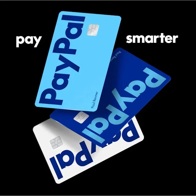
The overlapping P symbol is paired with a direct wordmark. The same compact shapes appear on payment cards and large posters.
Useful for: Compare cards, logo variants, and outdoor communication.
# Branding reference: PayPal
Source: https://www.pentagram.com/work/paypal
Design credit: Pentagram
Swipefile reference: https://swipefile.design/ref/brand-paypal/
Reviewed: 2026-09-09. Selected designer-published case-study images, not current official brand guidelines or a reusable asset license.

## Objective
Develop an original visual identity for my brief. Study the relationships between logo, type, color, and applications in this reference. Do not reproduce the referenced logo, name, distinctive artwork, or proprietary assets.

## Design observations
- logo: The overlapping P symbol is paired with a direct wordmark.
- color: Several blues contrast with black and white.
- typography: Heavy sans-serif text scales into campaign headlines.
- system: The same compact shapes appear on payment cards and large posters.
- applications: Compare cards, logo variants, and outdoor communication.
- dont: Study the principles and develop an original identity. Do not copy these logos, proprietary typefaces, illustrations, or claims. These are selected images from a published case study; current brand guidelines, asset licenses, and real-world performance have not been verified.

## Deliverables and checks
- Begin with the audience, positioning, personality, and required applications in my brief. Label assumptions.
- Explain two or three distinct identity directions before selecting one. Connect each decision to the brand's purpose.
- Define an original logo concept, wordmark and symbol relationships, typographic hierarchy, palette roles, and a consistent graphic system.
- Show how the system works on the relevant touchpoints: packaging, stationery, signage, social, or digital products.
- Draft practical guidelines for clear space, minimum size, background contrast, one-color and reversed marks, type usage, and layout. Validate proposed measurements in the actual artwork.
- Use appropriately licensed fonts and original or licensed imagery. Supply editable vector artwork when the tools support it; distinguish a concept from finished production files.
- Check small-size legibility, color accessibility for text, visual consistency, and print versus screen requirements. State what was reviewed and what still needs testing.

A small clustered symbol sits beside the lowercase name. Organic forms soften technical content without hiding its structure.
Useful for: Study editorial cards, type details, and expressive compositions.
# Branding reference: Cohere
Source: https://www.pentagram.com/work/cohere
Design credit: Pentagram
Swipefile reference: https://swipefile.design/ref/brand-cohere/
Reviewed: 2026-09-09. Selected designer-published case-study images, not current official brand guidelines or a reusable asset license.

## Objective
Develop an original visual identity for my brief. Study the relationships between logo, type, color, and applications in this reference. Do not reproduce the referenced logo, name, distinctive artwork, or proprietary assets.

## Design observations
- logo: A small clustered symbol sits beside the lowercase name.
- color: Muted greens, lilac, peach, and soft gradients.
- typography: Fine geometric letterforms meet modular text panels.
- system: Organic forms soften technical content without hiding its structure.
- applications: Study editorial cards, type details, and expressive compositions.
- dont: Study the principles and develop an original identity. Do not copy these logos, proprietary typefaces, illustrations, or claims. These are selected images from a published case study; current brand guidelines, asset licenses, and real-world performance have not been verified.

## Deliverables and checks
- Begin with the audience, positioning, personality, and required applications in my brief. Label assumptions.
- Explain two or three distinct identity directions before selecting one. Connect each decision to the brand's purpose.
- Define an original logo concept, wordmark and symbol relationships, typographic hierarchy, palette roles, and a consistent graphic system.
- Show how the system works on the relevant touchpoints: packaging, stationery, signage, social, or digital products.
- Draft practical guidelines for clear space, minimum size, background contrast, one-color and reversed marks, type usage, and layout. Validate proposed measurements in the actual artwork.
- Use appropriately licensed fonts and original or licensed imagery. Supply editable vector artwork when the tools support it; distinguish a concept from finished production files.
- Check small-size legibility, color accessibility for text, visual consistency, and print versus screen requirements. State what was reviewed and what still needs testing.
A circular W symbol provides a consistent heritage anchor. The circle becomes a framework for a family of graphic variations.
Useful for: Compare the formal logo, playful variations, and typography.
# Branding reference: Westinghouse
Source: https://www.pentagram.com/work/westinghouse
Design credit: Pentagram
Swipefile reference: https://swipefile.design/ref/brand-westinghouse/
Reviewed: 2026-09-09. Selected designer-published case-study images, not current official brand guidelines or a reusable asset license.

## Objective
Develop an original visual identity for my brief. Study the relationships between logo, type, color, and applications in this reference. Do not reproduce the referenced logo, name, distinctive artwork, or proprietary assets.

## Design observations
- logo: A circular W symbol provides a consistent heritage anchor.
- color: Black and white carry the mark; red accents the type specimen.
- typography: Compact sans-serif lettering and a narrow display face.
- system: The circle becomes a framework for a family of graphic variations.
- applications: Compare the formal logo, playful variations, and typography.
- dont: Study the principles and develop an original identity. Do not copy these logos, proprietary typefaces, illustrations, or claims. These are selected images from a published case study; current brand guidelines, asset licenses, and real-world performance have not been verified.

## Deliverables and checks
- Begin with the audience, positioning, personality, and required applications in my brief. Label assumptions.
- Explain two or three distinct identity directions before selecting one. Connect each decision to the brand's purpose.
- Define an original logo concept, wordmark and symbol relationships, typographic hierarchy, palette roles, and a consistent graphic system.
- Show how the system works on the relevant touchpoints: packaging, stationery, signage, social, or digital products.
- Draft practical guidelines for clear space, minimum size, background contrast, one-color and reversed marks, type usage, and layout. Validate proposed measurements in the actual artwork.
- Use appropriately licensed fonts and original or licensed imagery. Supply editable vector artwork when the tools support it; distinguish a concept from finished production files.
- Check small-size legibility, color accessibility for text, visual consistency, and print versus screen requirements. State what was reviewed and what still needs testing.
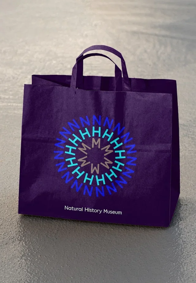
A radiating circular motif produces a distinctive focal point. A repeated circular device connects signage, posters, and merchandise.
Useful for: Study how one motif scales across different viewing distances.
# Branding reference: Natural History Museum
Source: https://www.pentagram.com/work/natural-history-museum
Design credit: Pentagram
Swipefile reference: https://swipefile.design/ref/brand-natural-history-museum/
Reviewed: 2026-09-09. Selected designer-published case-study images, not current official brand guidelines or a reusable asset license.

## Objective
Develop an original visual identity for my brief. Study the relationships between logo, type, color, and applications in this reference. Do not reproduce the referenced logo, name, distinctive artwork, or proprietary assets.

## Design observations
- logo: A radiating circular motif produces a distinctive focal point.
- color: Vivid lime and pink contrast with deep purple.
- typography: Clear sans-serif text leaves room for the radial graphic.
- system: A repeated circular device connects signage, posters, and merchandise.
- applications: Study how one motif scales across different viewing distances.
- dont: Study the principles and develop an original identity. Do not copy these logos, proprietary typefaces, illustrations, or claims. These are selected images from a published case study; current brand guidelines, asset licenses, and real-world performance have not been verified.

## Deliverables and checks
- Begin with the audience, positioning, personality, and required applications in my brief. Label assumptions.
- Explain two or three distinct identity directions before selecting one. Connect each decision to the brand's purpose.
- Define an original logo concept, wordmark and symbol relationships, typographic hierarchy, palette roles, and a consistent graphic system.
- Show how the system works on the relevant touchpoints: packaging, stationery, signage, social, or digital products.
- Draft practical guidelines for clear space, minimum size, background contrast, one-color and reversed marks, type usage, and layout. Validate proposed measurements in the actual artwork.
- Use appropriately licensed fonts and original or licensed imagery. Supply editable vector artwork when the tools support it; distinguish a concept from finished production files.
- Check small-size legibility, color accessibility for text, visual consistency, and print versus screen requirements. State what was reviewed and what still needs testing.
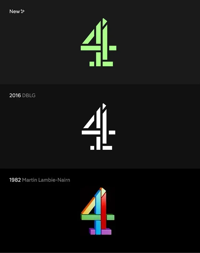
The segmented 4 retains recognition in a simplified treatment. A strong symbol links broadcast identity to everyday digital surfaces.
Useful for: Compare logo treatment, app-icon scale, and poster hierarchy.
# Branding reference: Channel 4
Source: https://www.pentagram.com/work/channel-4
Design credit: Pentagram
Swipefile reference: https://swipefile.design/ref/brand-channel-4/
Reviewed: 2026-09-09. Selected designer-published case-study images, not current official brand guidelines or a reusable asset license.

## Objective
Develop an original visual identity for my brief. Study the relationships between logo, type, color, and applications in this reference. Do not reproduce the referenced logo, name, distinctive artwork, or proprietary assets.

## Design observations
- logo: The segmented 4 retains recognition in a simplified treatment.
- color: Lime green stands out against black and white.
- typography: Direct sans-serif headlines sit beside the geometric mark.
- system: A strong symbol links broadcast identity to everyday digital surfaces.
- applications: Compare logo treatment, app-icon scale, and poster hierarchy.
- dont: Study the principles and develop an original identity. Do not copy these logos, proprietary typefaces, illustrations, or claims. These are selected images from a published case study; current brand guidelines, asset licenses, and real-world performance have not been verified.

## Deliverables and checks
- Begin with the audience, positioning, personality, and required applications in my brief. Label assumptions.
- Explain two or three distinct identity directions before selecting one. Connect each decision to the brand's purpose.
- Define an original logo concept, wordmark and symbol relationships, typographic hierarchy, palette roles, and a consistent graphic system.
- Show how the system works on the relevant touchpoints: packaging, stationery, signage, social, or digital products.
- Draft practical guidelines for clear space, minimum size, background contrast, one-color and reversed marks, type usage, and layout. Validate proposed measurements in the actual artwork.
- Use appropriately licensed fonts and original or licensed imagery. Supply editable vector artwork when the tools support it; distinguish a concept from finished production files.
- Check small-size legibility, color accessibility for text, visual consistency, and print versus screen requirements. State what was reviewed and what still needs testing.
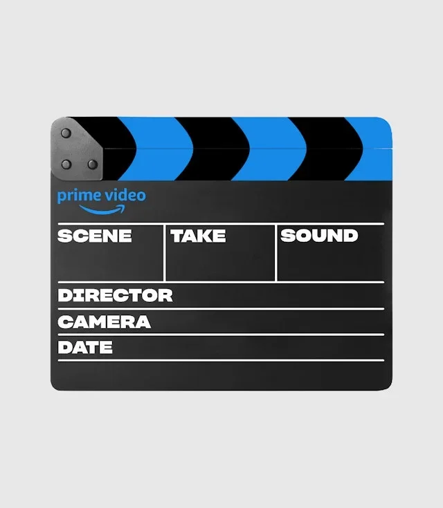
The smile-arrow and wordmark act as a compact signature. A consistent brand frame lets many entertainment titles coexist.
Useful for: Study a working object, a portrait poster, and a wide billboard.
# Branding reference: Prime Video
Source: https://www.pentagram.com/work/prime-video
Design credit: Pentagram
Swipefile reference: https://swipefile.design/ref/brand-prime-video/
Reviewed: 2026-09-09. Selected designer-published case-study images, not current official brand guidelines or a reusable asset license.

## Objective
Develop an original visual identity for my brief. Study the relationships between logo, type, color, and applications in this reference. Do not reproduce the referenced logo, name, distinctive artwork, or proprietary assets.

## Design observations
- logo: The smile-arrow and wordmark act as a compact signature.
- color: Bright blue connects otherwise varied program imagery.
- typography: Bold sans-serif headlines contrast with photographic content.
- system: A consistent brand frame lets many entertainment titles coexist.
- applications: Study a working object, a portrait poster, and a wide billboard.
- dont: Study the principles and develop an original identity. Do not copy these logos, proprietary typefaces, illustrations, or claims. These are selected images from a published case study; current brand guidelines, asset licenses, and real-world performance have not been verified.

## Deliverables and checks
- Begin with the audience, positioning, personality, and required applications in my brief. Label assumptions.
- Explain two or three distinct identity directions before selecting one. Connect each decision to the brand's purpose.
- Define an original logo concept, wordmark and symbol relationships, typographic hierarchy, palette roles, and a consistent graphic system.
- Show how the system works on the relevant touchpoints: packaging, stationery, signage, social, or digital products.
- Draft practical guidelines for clear space, minimum size, background contrast, one-color and reversed marks, type usage, and layout. Validate proposed measurements in the actual artwork.
- Use appropriately licensed fonts and original or licensed imagery. Supply editable vector artwork when the tools support it; distinguish a concept from finished production files.
- Check small-size legibility, color accessibility for text, visual consistency, and print versus screen requirements. State what was reviewed and what still needs testing.
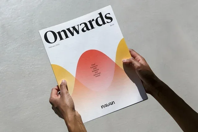
A compact lowercase wordmark supports expressive campaign layouts. Sweeping shapes connect travel imagery with practical expense messaging.
Useful for: Compare print, outdoor, and travel-context applications.
# Branding reference: Navan
Source: https://www.pentagram.com/work/navan
Design credit: Pentagram
Swipefile reference: https://swipefile.design/ref/brand-navan/
Reviewed: 2026-09-09. Selected designer-published case-study images, not current official brand guidelines or a reusable asset license.

## Objective
Develop an original visual identity for my brief. Study the relationships between logo, type, color, and applications in this reference. Do not reproduce the referenced logo, name, distinctive artwork, or proprietary assets.

## Design observations
- logo: A compact lowercase wordmark supports expressive campaign layouts.
- color: Purple, blue, coral, and yellow appear in soft curved fields.
- typography: Large serif headlines create an editorial voice.
- system: Sweeping shapes connect travel imagery with practical expense messaging.
- applications: Compare print, outdoor, and travel-context applications.
- dont: Study the principles and develop an original identity. Do not copy these logos, proprietary typefaces, illustrations, or claims. These are selected images from a published case study; current brand guidelines, asset licenses, and real-world performance have not been verified.

## Deliverables and checks
- Begin with the audience, positioning, personality, and required applications in my brief. Label assumptions.
- Explain two or three distinct identity directions before selecting one. Connect each decision to the brand's purpose.
- Define an original logo concept, wordmark and symbol relationships, typographic hierarchy, palette roles, and a consistent graphic system.
- Show how the system works on the relevant touchpoints: packaging, stationery, signage, social, or digital products.
- Draft practical guidelines for clear space, minimum size, background contrast, one-color and reversed marks, type usage, and layout. Validate proposed measurements in the actual artwork.
- Use appropriately licensed fonts and original or licensed imagery. Supply editable vector artwork when the tools support it; distinguish a concept from finished production files.
- Check small-size legibility, color accessibility for text, visual consistency, and print versus screen requirements. State what was reviewed and what still needs testing.
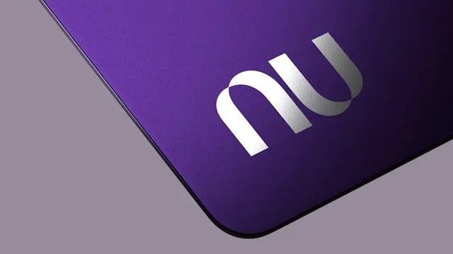
A continuous curved nu monogram remains legible at different sizes. A distinctive color and monogram work on both tiny and oversized surfaces.
Useful for: Compare a payment card, merchandise, and a billboard.
# Branding reference: Nubank
Source: https://www.pentagram.com/work/nubank
Design credit: Pentagram
Swipefile reference: https://swipefile.design/ref/brand-nubank/
Reviewed: 2026-09-09. Selected designer-published case-study images, not current official brand guidelines or a reusable asset license.

## Objective
Develop an original visual identity for my brief. Study the relationships between logo, type, color, and applications in this reference. Do not reproduce the referenced logo, name, distinctive artwork, or proprietary assets.

## Design observations
- logo: A continuous curved nu monogram remains legible at different sizes.
- color: Purple is the strongest recurring recognition cue.
- typography: Rounded forms in the mark contrast with simple supporting text.
- system: A distinctive color and monogram work on both tiny and oversized surfaces.
- applications: Compare a payment card, merchandise, and a billboard.
- dont: Study the principles and develop an original identity. Do not copy these logos, proprietary typefaces, illustrations, or claims. These are selected images from a published case study; current brand guidelines, asset licenses, and real-world performance have not been verified.

## Deliverables and checks
- Begin with the audience, positioning, personality, and required applications in my brief. Label assumptions.
- Explain two or three distinct identity directions before selecting one. Connect each decision to the brand's purpose.
- Define an original logo concept, wordmark and symbol relationships, typographic hierarchy, palette roles, and a consistent graphic system.
- Show how the system works on the relevant touchpoints: packaging, stationery, signage, social, or digital products.
- Draft practical guidelines for clear space, minimum size, background contrast, one-color and reversed marks, type usage, and layout. Validate proposed measurements in the actual artwork.
- Use appropriately licensed fonts and original or licensed imagery. Supply editable vector artwork when the tools support it; distinguish a concept from finished production files.
- Check small-size legibility, color accessibility for text, visual consistency, and print versus screen requirements. State what was reviewed and what still needs testing.

Slanted, connected lettering suggests forward movement. The identity keeps its silhouette across broadcast, track, and app contexts.
Useful for: Study large signage and the much smaller digital icon.
# Branding reference: MotoGP
Source: https://www.pentagram.com/work/motogp
Design credit: Pentagram
Swipefile reference: https://swipefile.design/ref/brand-motogp/
Reviewed: 2026-09-09. Selected designer-published case-study images, not current official brand guidelines or a reusable asset license.

## Objective
Develop an original visual identity for my brief. Study the relationships between logo, type, color, and applications in this reference. Do not reproduce the referenced logo, name, distinctive artwork, or proprietary assets.

## Design observations
- logo: Slanted, connected lettering suggests forward movement.
- color: Black and white let racing photography supply additional color.
- typography: A custom italic wordmark combines filled and outlined forms.
- system: The identity keeps its silhouette across broadcast, track, and app contexts.
- applications: Study large signage and the much smaller digital icon.
- dont: Study the principles and develop an original identity. Do not copy these logos, proprietary typefaces, illustrations, or claims. These are selected images from a published case study; current brand guidelines, asset licenses, and real-world performance have not been verified.

## Deliverables and checks
- Begin with the audience, positioning, personality, and required applications in my brief. Label assumptions.
- Explain two or three distinct identity directions before selecting one. Connect each decision to the brand's purpose.
- Define an original logo concept, wordmark and symbol relationships, typographic hierarchy, palette roles, and a consistent graphic system.
- Show how the system works on the relevant touchpoints: packaging, stationery, signage, social, or digital products.
- Draft practical guidelines for clear space, minimum size, background contrast, one-color and reversed marks, type usage, and layout. Validate proposed measurements in the actual artwork.
- Use appropriately licensed fonts and original or licensed imagery. Supply editable vector artwork when the tools support it; distinguish a concept from finished production files.
- Check small-size legibility, color accessibility for text, visual consistency, and print versus screen requirements. State what was reviewed and what still needs testing.
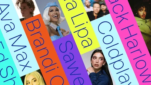
The compact Warner symbol signs a larger artist-led system. Modular color panels organize varied artists under one parent brand.
Useful for: Compare campaign photography, artist labels, and corporate collateral.
# Branding reference: Warner Music Group
Source: https://www.pentagram.com/work/warner-music-group
Design credit: Pentagram
Swipefile reference: https://swipefile.design/ref/brand-warner-music-group/
Reviewed: 2026-09-09. Selected designer-published case-study images, not current official brand guidelines or a reusable asset license.

## Objective
Develop an original visual identity for my brief. Study the relationships between logo, type, color, and applications in this reference. Do not reproduce the referenced logo, name, distinctive artwork, or proprietary assets.

## Design observations
- logo: The compact Warner symbol signs a larger artist-led system.
- color: Electric yellow, blue, orange, and pink provide sharp contrasts.
- typography: Tall light letterforms become graphic strips and oversized headings.
- system: Modular color panels organize varied artists under one parent brand.
- applications: Compare campaign photography, artist labels, and corporate collateral.
- dont: Study the principles and develop an original identity. Do not copy these logos, proprietary typefaces, illustrations, or claims. These are selected images from a published case study; current brand guidelines, asset licenses, and real-world performance have not been verified.

## Deliverables and checks
- Begin with the audience, positioning, personality, and required applications in my brief. Label assumptions.
- Explain two or three distinct identity directions before selecting one. Connect each decision to the brand's purpose.
- Define an original logo concept, wordmark and symbol relationships, typographic hierarchy, palette roles, and a consistent graphic system.
- Show how the system works on the relevant touchpoints: packaging, stationery, signage, social, or digital products.
- Draft practical guidelines for clear space, minimum size, background contrast, one-color and reversed marks, type usage, and layout. Validate proposed measurements in the actual artwork.
- Use appropriately licensed fonts and original or licensed imagery. Supply editable vector artwork when the tools support it; distinguish a concept from finished production files.
- Check small-size legibility, color accessibility for text, visual consistency, and print versus screen requirements. State what was reviewed and what still needs testing.
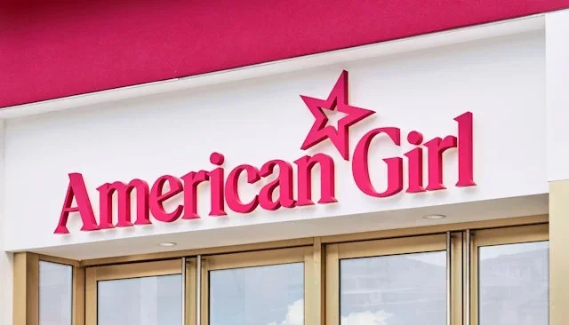
A star sits above the established serif wordmark. The star and color connect emotional photography with physical retail.
Useful for: Study signage, shopping bags, and campaign lockups.
# Branding reference: American Girl
Source: https://www.pentagram.com/work/american-girl
Design credit: Pentagram
Swipefile reference: https://swipefile.design/ref/brand-american-girl/
Reviewed: 2026-09-09. Selected designer-published case-study images, not current official brand guidelines or a reusable asset license.

## Objective
Develop an original visual identity for my brief. Study the relationships between logo, type, color, and applications in this reference. Do not reproduce the referenced logo, name, distinctive artwork, or proprietary assets.

## Design observations
- logo: A star sits above the established serif wordmark.
- color: A saturated berry pink links retail and packaging.
- typography: High-contrast serif lettering gives the name a clear signature.
- system: The star and color connect emotional photography with physical retail.
- applications: Study signage, shopping bags, and campaign lockups.
- dont: Study the principles and develop an original identity. Do not copy these logos, proprietary typefaces, illustrations, or claims. These are selected images from a published case study; current brand guidelines, asset licenses, and real-world performance have not been verified.

## Deliverables and checks
- Begin with the audience, positioning, personality, and required applications in my brief. Label assumptions.
- Explain two or three distinct identity directions before selecting one. Connect each decision to the brand's purpose.
- Define an original logo concept, wordmark and symbol relationships, typographic hierarchy, palette roles, and a consistent graphic system.
- Show how the system works on the relevant touchpoints: packaging, stationery, signage, social, or digital products.
- Draft practical guidelines for clear space, minimum size, background contrast, one-color and reversed marks, type usage, and layout. Validate proposed measurements in the actual artwork.
- Use appropriately licensed fonts and original or licensed imagery. Supply editable vector artwork when the tools support it; distinguish a concept from finished production files.
- Check small-size legibility, color accessibility for text, visual consistency, and print versus screen requirements. State what was reviewed and what still needs testing.
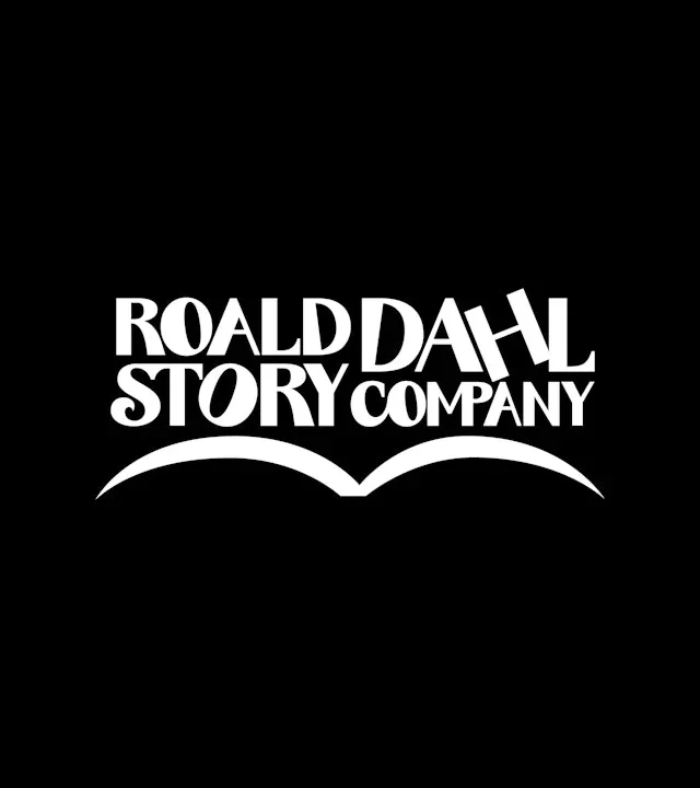
Unevenly arranged letters and an open-book shape create a playful mark. The typography itself carries the storytelling personality.
Useful for: Compare full-name and initials versions before studying the alphabet.
# Branding reference: The Roald Dahl Story Company
Source: https://www.pentagram.com/work/the-roald-dahl-story-company
Design credit: Pentagram
Swipefile reference: https://swipefile.design/ref/brand-the-roald-dahl-story-company/
Reviewed: 2026-09-09. Selected designer-published case-study images, not current official brand guidelines or a reusable asset license.

## Objective
Develop an original visual identity for my brief. Study the relationships between logo, type, color, and applications in this reference. Do not reproduce the referenced logo, name, distinctive artwork, or proprietary assets.

## Design observations
- logo: Unevenly arranged letters and an open-book shape create a playful mark.
- color: Black and white emphasize the letterforms.
- typography: A custom serif alphabet varies size and proportion.
- system: The typography itself carries the storytelling personality.
- applications: Compare full-name and initials versions before studying the alphabet.
- dont: Study the principles and develop an original identity. Do not copy these logos, proprietary typefaces, illustrations, or claims. These are selected images from a published case study; current brand guidelines, asset licenses, and real-world performance have not been verified.

## Deliverables and checks
- Begin with the audience, positioning, personality, and required applications in my brief. Label assumptions.
- Explain two or three distinct identity directions before selecting one. Connect each decision to the brand's purpose.
- Define an original logo concept, wordmark and symbol relationships, typographic hierarchy, palette roles, and a consistent graphic system.
- Show how the system works on the relevant touchpoints: packaging, stationery, signage, social, or digital products.
- Draft practical guidelines for clear space, minimum size, background contrast, one-color and reversed marks, type usage, and layout. Validate proposed measurements in the actual artwork.
- Use appropriately licensed fonts and original or licensed imagery. Supply editable vector artwork when the tools support it; distinguish a concept from finished production files.
- Check small-size legibility, color accessibility for text, visual consistency, and print versus screen requirements. State what was reviewed and what still needs testing.
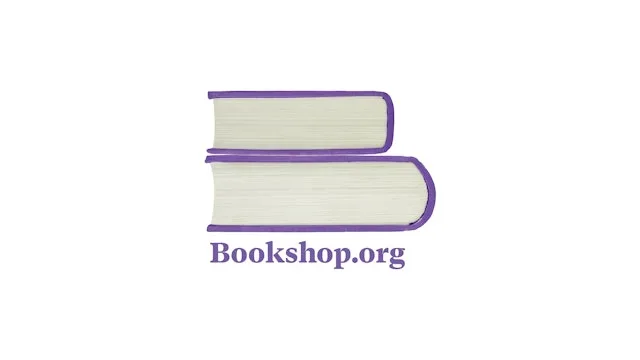
Stacked book forms create a recognizable letter-like device. The identity draws its graphic vocabulary directly from books.
Useful for: Study the mark, tote bags, and a library of book arrangements.
# Branding reference: Bookshop.org
Source: https://www.pentagram.com/work/bookshop-org
Design credit: Pentagram
Swipefile reference: https://swipefile.design/ref/brand-bookshop-org/
Reviewed: 2026-09-09. Selected designer-published case-study images, not current official brand guidelines or a reusable asset license.

## Objective
Develop an original visual identity for my brief. Study the relationships between logo, type, color, and applications in this reference. Do not reproduce the referenced logo, name, distinctive artwork, or proprietary assets.

## Design observations
- logo: Stacked book forms create a recognizable letter-like device.
- color: Purple is paired with warm paper and book-spine colors.
- typography: A small serif wordmark echoes the literary context.
- system: The identity draws its graphic vocabulary directly from books.
- applications: Study the mark, tote bags, and a library of book arrangements.
- dont: Study the principles and develop an original identity. Do not copy these logos, proprietary typefaces, illustrations, or claims. These are selected images from a published case study; current brand guidelines, asset licenses, and real-world performance have not been verified.

## Deliverables and checks
- Begin with the audience, positioning, personality, and required applications in my brief. Label assumptions.
- Explain two or three distinct identity directions before selecting one. Connect each decision to the brand's purpose.
- Define an original logo concept, wordmark and symbol relationships, typographic hierarchy, palette roles, and a consistent graphic system.
- Show how the system works on the relevant touchpoints: packaging, stationery, signage, social, or digital products.
- Draft practical guidelines for clear space, minimum size, background contrast, one-color and reversed marks, type usage, and layout. Validate proposed measurements in the actual artwork.
- Use appropriately licensed fonts and original or licensed imagery. Supply editable vector artwork when the tools support it; distinguish a concept from finished production files.
- Check small-size legibility, color accessibility for text, visual consistency, and print versus screen requirements. State what was reviewed and what still needs testing.
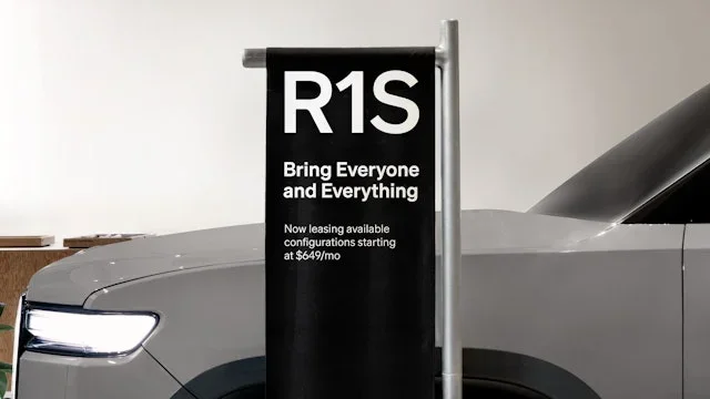
Large product names and model identifiers lead the examples. A typographic system carries product information across physical and digital contexts.
Useful for: Compare signage, numeral construction, and a street-facing campaign.
# Branding reference: Rivian
Source: https://www.pentagram.com/work/rivian
Design credit: Pentagram
Swipefile reference: https://swipefile.design/ref/brand-rivian/
Reviewed: 2026-09-09. Selected designer-published case-study images, not current official brand guidelines or a reusable asset license.

## Objective
Develop an original visual identity for my brief. Study the relationships between logo, type, color, and applications in this reference. Do not reproduce the referenced logo, name, distinctive artwork, or proprietary assets.

## Design observations
- logo: Large product names and model identifiers lead the examples.
- color: Neutral typography lets vehicles and natural surroundings provide color.
- typography: Clear sans-serif letters and outlined numerals emphasize precision.
- system: A typographic system carries product information across physical and digital contexts.
- applications: Compare signage, numeral construction, and a street-facing campaign.
- dont: Study the principles and develop an original identity. Do not copy these logos, proprietary typefaces, illustrations, or claims. These are selected images from a published case study; current brand guidelines, asset licenses, and real-world performance have not been verified.

## Deliverables and checks
- Begin with the audience, positioning, personality, and required applications in my brief. Label assumptions.
- Explain two or three distinct identity directions before selecting one. Connect each decision to the brand's purpose.
- Define an original logo concept, wordmark and symbol relationships, typographic hierarchy, palette roles, and a consistent graphic system.
- Show how the system works on the relevant touchpoints: packaging, stationery, signage, social, or digital products.
- Draft practical guidelines for clear space, minimum size, background contrast, one-color and reversed marks, type usage, and layout. Validate proposed measurements in the actual artwork.
- Use appropriately licensed fonts and original or licensed imagery. Supply editable vector artwork when the tools support it; distinguish a concept from finished production files.
- Check small-size legibility, color accessibility for text, visual consistency, and print versus screen requirements. State what was reviewed and what still needs testing.
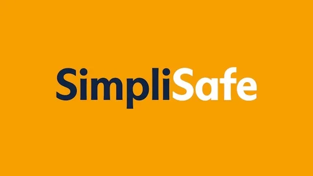
The name is separated into two color roles within one wordmark. Product silhouettes, line icons, and repeated color keep the identity coherent.
Useful for: Study the wordmark, campaign hierarchy, and supporting icons.
# Branding reference: SimpliSafe
Source: https://www.pentagram.com/work/simplisafe
Design credit: Pentagram
Swipefile reference: https://swipefile.design/ref/brand-simplisafe/
Reviewed: 2026-09-09. Selected designer-published case-study images, not current official brand guidelines or a reusable asset license.

## Objective
Develop an original visual identity for my brief. Study the relationships between logo, type, color, and applications in this reference. Do not reproduce the referenced logo, name, distinctive artwork, or proprietary assets.

## Design observations
- logo: The name is separated into two color roles within one wordmark.
- color: Warm yellow contrasts with dark navy.
- typography: Sturdy sans-serif lettering remains clear beside hardware photography.
- system: Product silhouettes, line icons, and repeated color keep the identity coherent.
- applications: Study the wordmark, campaign hierarchy, and supporting icons.
- dont: Study the principles and develop an original identity. Do not copy these logos, proprietary typefaces, illustrations, or claims. These are selected images from a published case study; current brand guidelines, asset licenses, and real-world performance have not been verified.

## Deliverables and checks
- Begin with the audience, positioning, personality, and required applications in my brief. Label assumptions.
- Explain two or three distinct identity directions before selecting one. Connect each decision to the brand's purpose.
- Define an original logo concept, wordmark and symbol relationships, typographic hierarchy, palette roles, and a consistent graphic system.
- Show how the system works on the relevant touchpoints: packaging, stationery, signage, social, or digital products.
- Draft practical guidelines for clear space, minimum size, background contrast, one-color and reversed marks, type usage, and layout. Validate proposed measurements in the actual artwork.
- Use appropriately licensed fonts and original or licensed imagery. Supply editable vector artwork when the tools support it; distinguish a concept from finished production files.
- Check small-size legibility, color accessibility for text, visual consistency, and print versus screen requirements. State what was reviewed and what still needs testing.
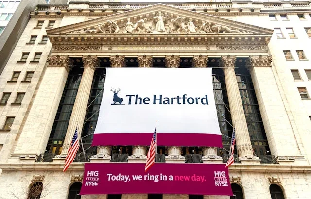
A small stag emblem and wordmark anchor the corporate application. The case connects an established identity with charts and iconography.
Useful for: Study how corporate recognition carries into practical information design.
# Branding reference: The Hartford
Source: https://www.pentagram.com/work/the-hartford
Design credit: Pentagram
Swipefile reference: https://swipefile.design/ref/brand-the-hartford/
Reviewed: 2026-09-09. Selected designer-published case-study images, not current official brand guidelines or a reusable asset license.

## Objective
Develop an original visual identity for my brief. Study the relationships between logo, type, color, and applications in this reference. Do not reproduce the referenced logo, name, distinctive artwork, or proprietary assets.

## Design observations
- logo: A small stag emblem and wordmark anchor the corporate application.
- color: Pink, orange, and deep burgundy extend the palette into data.
- typography: Compact interface type supports dense business information.
- system: The case connects an established identity with charts and iconography.
- applications: Study how corporate recognition carries into practical information design.
- dont: Study the principles and develop an original identity. Do not copy these logos, proprietary typefaces, illustrations, or claims. These are selected images from a published case study; current brand guidelines, asset licenses, and real-world performance have not been verified.

## Deliverables and checks
- Begin with the audience, positioning, personality, and required applications in my brief. Label assumptions.
- Explain two or three distinct identity directions before selecting one. Connect each decision to the brand's purpose.
- Define an original logo concept, wordmark and symbol relationships, typographic hierarchy, palette roles, and a consistent graphic system.
- Show how the system works on the relevant touchpoints: packaging, stationery, signage, social, or digital products.
- Draft practical guidelines for clear space, minimum size, background contrast, one-color and reversed marks, type usage, and layout. Validate proposed measurements in the actual artwork.
- Use appropriately licensed fonts and original or licensed imagery. Supply editable vector artwork when the tools support it; distinguish a concept from finished production files.
- Check small-size legibility, color accessibility for text, visual consistency, and print versus screen requirements. State what was reviewed and what still needs testing.
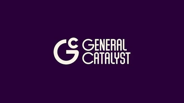
A circular G symbol sits beside a condensed wordmark. Expressive typography turns strategic messages into recognizable brand assets.
Useful for: Compare the signature, character set, and campaign statements.
# Branding reference: General Catalyst
Source: https://www.pentagram.com/work/general-catalyst
Design credit: Pentagram
Swipefile reference: https://swipefile.design/ref/brand-general-catalyst/
Reviewed: 2026-09-09. Selected designer-published case-study images, not current official brand guidelines or a reusable asset license.

## Objective
Develop an original visual identity for my brief. Study the relationships between logo, type, color, and applications in this reference. Do not reproduce the referenced logo, name, distinctive artwork, or proprietary assets.

## Design observations
- logo: A circular G symbol sits beside a condensed wordmark.
- color: Deep purple and cream expand into vivid gradient applications.
- typography: A narrow custom alphabet includes conspicuous graphic punctuation.
- system: Expressive typography turns strategic messages into recognizable brand assets.
- applications: Compare the signature, character set, and campaign statements.
- dont: Study the principles and develop an original identity. Do not copy these logos, proprietary typefaces, illustrations, or claims. These are selected images from a published case study; current brand guidelines, asset licenses, and real-world performance have not been verified.

## Deliverables and checks
- Begin with the audience, positioning, personality, and required applications in my brief. Label assumptions.
- Explain two or three distinct identity directions before selecting one. Connect each decision to the brand's purpose.
- Define an original logo concept, wordmark and symbol relationships, typographic hierarchy, palette roles, and a consistent graphic system.
- Show how the system works on the relevant touchpoints: packaging, stationery, signage, social, or digital products.
- Draft practical guidelines for clear space, minimum size, background contrast, one-color and reversed marks, type usage, and layout. Validate proposed measurements in the actual artwork.
- Use appropriately licensed fonts and original or licensed imagery. Supply editable vector artwork when the tools support it; distinguish a concept from finished production files.
- Check small-size legibility, color accessibility for text, visual consistency, and print versus screen requirements. State what was reviewed and what still needs testing.
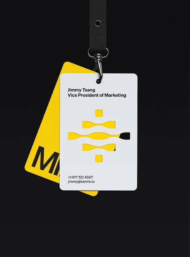
A small geometric mark supports a concise uppercase name. The identity uses a stable palette and strong type across security-focused materials.
Useful for: Compare an event badge, message panel, and annual report.
# Branding reference: MIND
Source: https://www.pentagram.com/work/mind
Design credit: Pentagram
Swipefile reference: https://swipefile.design/ref/brand-mind/
Reviewed: 2026-09-09. Selected designer-published case-study images, not current official brand guidelines or a reusable asset license.

## Objective
Develop an original visual identity for my brief. Study the relationships between logo, type, color, and applications in this reference. Do not reproduce the referenced logo, name, distinctive artwork, or proprietary assets.

## Design observations
- logo: A small geometric mark supports a concise uppercase name.
- color: Yellow, black, and pale gray create a consistent contrast structure.
- typography: Heavy stacked sans-serif headings make messages direct.
- system: The identity uses a stable palette and strong type across security-focused materials.
- applications: Compare an event badge, message panel, and annual report.
- dont: Study the principles and develop an original identity. Do not copy these logos, proprietary typefaces, illustrations, or claims. These are selected images from a published case study; current brand guidelines, asset licenses, and real-world performance have not been verified.

## Deliverables and checks
- Begin with the audience, positioning, personality, and required applications in my brief. Label assumptions.
- Explain two or three distinct identity directions before selecting one. Connect each decision to the brand's purpose.
- Define an original logo concept, wordmark and symbol relationships, typographic hierarchy, palette roles, and a consistent graphic system.
- Show how the system works on the relevant touchpoints: packaging, stationery, signage, social, or digital products.
- Draft practical guidelines for clear space, minimum size, background contrast, one-color and reversed marks, type usage, and layout. Validate proposed measurements in the actual artwork.
- Use appropriately licensed fonts and original or licensed imagery. Supply editable vector artwork when the tools support it; distinguish a concept from finished production files.
- Check small-size legibility, color accessibility for text, visual consistency, and print versus screen requirements. State what was reviewed and what still needs testing.
A restrained serif wordmark has a compact GF companion. The identity can shift from formal correspondence to concise recognition.
Useful for: Study the full name, monogram, and printed stationery.
# Branding reference: Gates Foundation
Source: https://www.pentagram.com/work/gates-foundation
Design credit: Pentagram
Swipefile reference: https://swipefile.design/ref/brand-gates-foundation/
Reviewed: 2026-09-09. Selected designer-published case-study images, not current official brand guidelines or a reusable asset license.

## Objective
Develop an original visual identity for my brief. Study the relationships between logo, type, color, and applications in this reference. Do not reproduce the referenced logo, name, distinctive artwork, or proprietary assets.

## Design observations
- logo: A restrained serif wordmark has a compact GF companion.
- color: Deep gray, warm white, and yellow form the core contrast.
- typography: A refined serif name is balanced by direct supporting sans-serif text.
- system: The identity can shift from formal correspondence to concise recognition.
- applications: Study the full name, monogram, and printed stationery.
- dont: Study the principles and develop an original identity. Do not copy these logos, proprietary typefaces, illustrations, or claims. These are selected images from a published case study; current brand guidelines, asset licenses, and real-world performance have not been verified.

## Deliverables and checks
- Begin with the audience, positioning, personality, and required applications in my brief. Label assumptions.
- Explain two or three distinct identity directions before selecting one. Connect each decision to the brand's purpose.
- Define an original logo concept, wordmark and symbol relationships, typographic hierarchy, palette roles, and a consistent graphic system.
- Show how the system works on the relevant touchpoints: packaging, stationery, signage, social, or digital products.
- Draft practical guidelines for clear space, minimum size, background contrast, one-color and reversed marks, type usage, and layout. Validate proposed measurements in the actual artwork.
- Use appropriately licensed fonts and original or licensed imagery. Supply editable vector artwork when the tools support it; distinguish a concept from finished production files.
- Check small-size legibility, color accessibility for text, visual consistency, and print versus screen requirements. State what was reviewed and what still needs testing.
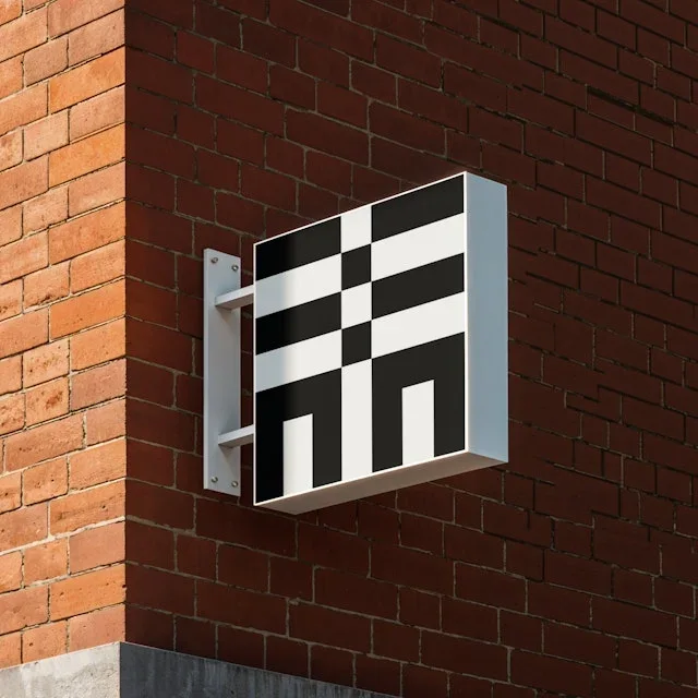
A modular square symbol uses a grid of solid and open cells. A consistent modular grammar connects symbol, lettering, and layouts.
Useful for: Compare a physical sign with identity variants and application rules.
# Branding reference: Chiba Tech
Source: https://www.pentagram.com/work/chiba-tech
Design credit: Pentagram
Swipefile reference: https://swipefile.design/ref/brand-chiba-tech/
Reviewed: 2026-09-09. Selected designer-published case-study images, not current official brand guidelines or a reusable asset license.

## Objective
Develop an original visual identity for my brief. Study the relationships between logo, type, color, and applications in this reference. Do not reproduce the referenced logo, name, distinctive artwork, or proprietary assets.

## Design observations
- logo: A modular square symbol uses a grid of solid and open cells.
- color: Black and white provide the clearest structural expression.
- typography: Grid-built Latin lettering relates to the Japanese identity.
- system: A consistent modular grammar connects symbol, lettering, and layouts.
- applications: Compare a physical sign with identity variants and application rules.
- dont: Study the principles and develop an original identity. Do not copy these logos, proprietary typefaces, illustrations, or claims. These are selected images from a published case study; current brand guidelines, asset licenses, and real-world performance have not been verified.

## Deliverables and checks
- Begin with the audience, positioning, personality, and required applications in my brief. Label assumptions.
- Explain two or three distinct identity directions before selecting one. Connect each decision to the brand's purpose.
- Define an original logo concept, wordmark and symbol relationships, typographic hierarchy, palette roles, and a consistent graphic system.
- Show how the system works on the relevant touchpoints: packaging, stationery, signage, social, or digital products.
- Draft practical guidelines for clear space, minimum size, background contrast, one-color and reversed marks, type usage, and layout. Validate proposed measurements in the actual artwork.
- Use appropriately licensed fonts and original or licensed imagery. Supply editable vector artwork when the tools support it; distinguish a concept from finished production files.
- Check small-size legibility, color accessibility for text, visual consistency, and print versus screen requirements. State what was reviewed and what still needs testing.
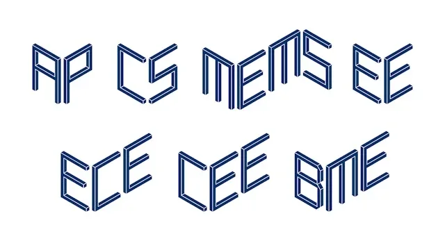
Angular paired-line initials distinguish the departments. Departments can have distinct marks while belonging to one engineering family.
Useful for: Study the monogram set, matching icons, and human imagery.
# Branding reference: Yale Engineering
Source: https://www.pentagram.com/work/yale-engineering
Design credit: Pentagram
Swipefile reference: https://swipefile.design/ref/brand-yale-engineering/
Reviewed: 2026-09-09. Selected designer-published case-study images, not current official brand guidelines or a reusable asset license.

## Objective
Develop an original visual identity for my brief. Study the relationships between logo, type, color, and applications in this reference. Do not reproduce the referenced logo, name, distinctive artwork, or proprietary assets.

## Design observations
- logo: Angular paired-line initials distinguish the departments.
- color: A restrained blue keeps the graphic family cohesive.
- typography: Letter-like constructions follow a shared dimensional grammar.
- system: Departments can have distinct marks while belonging to one engineering family.
- applications: Study the monogram set, matching icons, and human imagery.
- dont: Study the principles and develop an original identity. Do not copy these logos, proprietary typefaces, illustrations, or claims. These are selected images from a published case study; current brand guidelines, asset licenses, and real-world performance have not been verified.

## Deliverables and checks
- Begin with the audience, positioning, personality, and required applications in my brief. Label assumptions.
- Explain two or three distinct identity directions before selecting one. Connect each decision to the brand's purpose.
- Define an original logo concept, wordmark and symbol relationships, typographic hierarchy, palette roles, and a consistent graphic system.
- Show how the system works on the relevant touchpoints: packaging, stationery, signage, social, or digital products.
- Draft practical guidelines for clear space, minimum size, background contrast, one-color and reversed marks, type usage, and layout. Validate proposed measurements in the actual artwork.
- Use appropriately licensed fonts and original or licensed imagery. Supply editable vector artwork when the tools support it; distinguish a concept from finished production files.
- Check small-size legibility, color accessibility for text, visual consistency, and print versus screen requirements. State what was reviewed and what still needs testing.
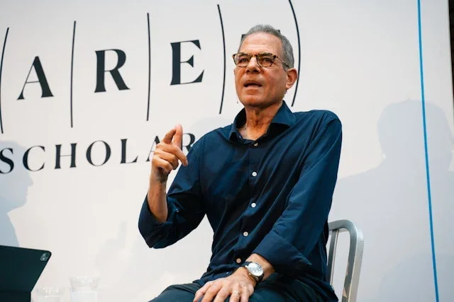
Widely spaced letters give the name an open, expansive character. The identity travels across apparel, events, and social communication.
Useful for: Compare large backdrop lettering with small garment and mobile applications.
# Branding reference: Baret Scholars
Source: https://www.pentagram.com/work/baret-scholars
Design credit: Pentagram
Swipefile reference: https://swipefile.design/ref/brand-baret-scholars/
Reviewed: 2026-09-09. Selected designer-published case-study images, not current official brand guidelines or a reusable asset license.

## Objective
Develop an original visual identity for my brief. Study the relationships between logo, type, color, and applications in this reference. Do not reproduce the referenced logo, name, distinctive artwork, or proprietary assets.

## Design observations
- logo: Widely spaced letters give the name an open, expansive character.
- color: Navy and white remain recognizable against travel imagery.
- typography: High-contrast serif letters and fine vertical elements.
- system: The identity travels across apparel, events, and social communication.
- applications: Compare large backdrop lettering with small garment and mobile applications.
- dont: Study the principles and develop an original identity. Do not copy these logos, proprietary typefaces, illustrations, or claims. These are selected images from a published case study; current brand guidelines, asset licenses, and real-world performance have not been verified.

## Deliverables and checks
- Begin with the audience, positioning, personality, and required applications in my brief. Label assumptions.
- Explain two or three distinct identity directions before selecting one. Connect each decision to the brand's purpose.
- Define an original logo concept, wordmark and symbol relationships, typographic hierarchy, palette roles, and a consistent graphic system.
- Show how the system works on the relevant touchpoints: packaging, stationery, signage, social, or digital products.
- Draft practical guidelines for clear space, minimum size, background contrast, one-color and reversed marks, type usage, and layout. Validate proposed measurements in the actual artwork.
- Use appropriately licensed fonts and original or licensed imagery. Supply editable vector artwork when the tools support it; distinguish a concept from finished production files.
- Check small-size legibility, color accessibility for text, visual consistency, and print versus screen requirements. State what was reviewed and what still needs testing.
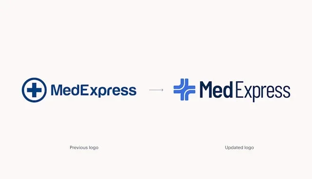
A segmented cross refreshes a familiar healthcare cue. A consistent geometric mark and color system connect service and product touchpoints.
Useful for: Study the revised lockup, palette roles, and dimensional mark.
# Branding reference: MedExpress
Source: https://www.pentagram.com/work/medexpress
Design credit: Pentagram
Swipefile reference: https://swipefile.design/ref/brand-medexpress/
Reviewed: 2026-09-09. Selected designer-published case-study images, not current official brand guidelines or a reusable asset license.

## Objective
Develop an original visual identity for my brief. Study the relationships between logo, type, color, and applications in this reference. Do not reproduce the referenced logo, name, distinctive artwork, or proprietary assets.

## Design observations
- logo: A segmented cross refreshes a familiar healthcare cue.
- color: A range of blues is balanced by a bright lime accent.
- typography: Clear sans-serif lettering supports the medical symbol.
- system: A consistent geometric mark and color system connect service and product touchpoints.
- applications: Study the revised lockup, palette roles, and dimensional mark.
- dont: Study the principles and develop an original identity. Do not copy these logos, proprietary typefaces, illustrations, or claims. These are selected images from a published case study; current brand guidelines, asset licenses, and real-world performance have not been verified.

## Deliverables and checks
- Begin with the audience, positioning, personality, and required applications in my brief. Label assumptions.
- Explain two or three distinct identity directions before selecting one. Connect each decision to the brand's purpose.
- Define an original logo concept, wordmark and symbol relationships, typographic hierarchy, palette roles, and a consistent graphic system.
- Show how the system works on the relevant touchpoints: packaging, stationery, signage, social, or digital products.
- Draft practical guidelines for clear space, minimum size, background contrast, one-color and reversed marks, type usage, and layout. Validate proposed measurements in the actual artwork.
- Use appropriately licensed fonts and original or licensed imagery. Supply editable vector artwork when the tools support it; distinguish a concept from finished production files.
- Check small-size legibility, color accessibility for text, visual consistency, and print versus screen requirements. State what was reviewed and what still needs testing.
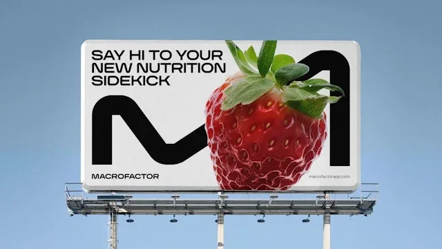
A bold M-like device and compact stacked name provide two signatures. The system transfers a digital nutrition product into everyday physical objects.
Useful for: Compare large advertising with embroidery and bottle printing.
# Branding reference: MacroFactor
Source: https://www.pentagram.com/work/macrofactor
Design credit: Pentagram
Swipefile reference: https://swipefile.design/ref/brand-macrofactor/
Reviewed: 2026-09-09. Selected designer-published case-study images, not current official brand guidelines or a reusable asset license.

## Objective
Develop an original visual identity for my brief. Study the relationships between logo, type, color, and applications in this reference. Do not reproduce the referenced logo, name, distinctive artwork, or proprietary assets.

## Design observations
- logo: A bold M-like device and compact stacked name provide two signatures.
- color: Black and white leave room for bright food imagery.
- typography: Heavy tightly arranged sans-serif lettering.
- system: The system transfers a digital nutrition product into everyday physical objects.
- applications: Compare large advertising with embroidery and bottle printing.
- dont: Study the principles and develop an original identity. Do not copy these logos, proprietary typefaces, illustrations, or claims. These are selected images from a published case study; current brand guidelines, asset licenses, and real-world performance have not been verified.

## Deliverables and checks
- Begin with the audience, positioning, personality, and required applications in my brief. Label assumptions.
- Explain two or three distinct identity directions before selecting one. Connect each decision to the brand's purpose.
- Define an original logo concept, wordmark and symbol relationships, typographic hierarchy, palette roles, and a consistent graphic system.
- Show how the system works on the relevant touchpoints: packaging, stationery, signage, social, or digital products.
- Draft practical guidelines for clear space, minimum size, background contrast, one-color and reversed marks, type usage, and layout. Validate proposed measurements in the actual artwork.
- Use appropriately licensed fonts and original or licensed imagery. Supply editable vector artwork when the tools support it; distinguish a concept from finished production files.
- Check small-size legibility, color accessibility for text, visual consistency, and print versus screen requirements. State what was reviewed and what still needs testing.
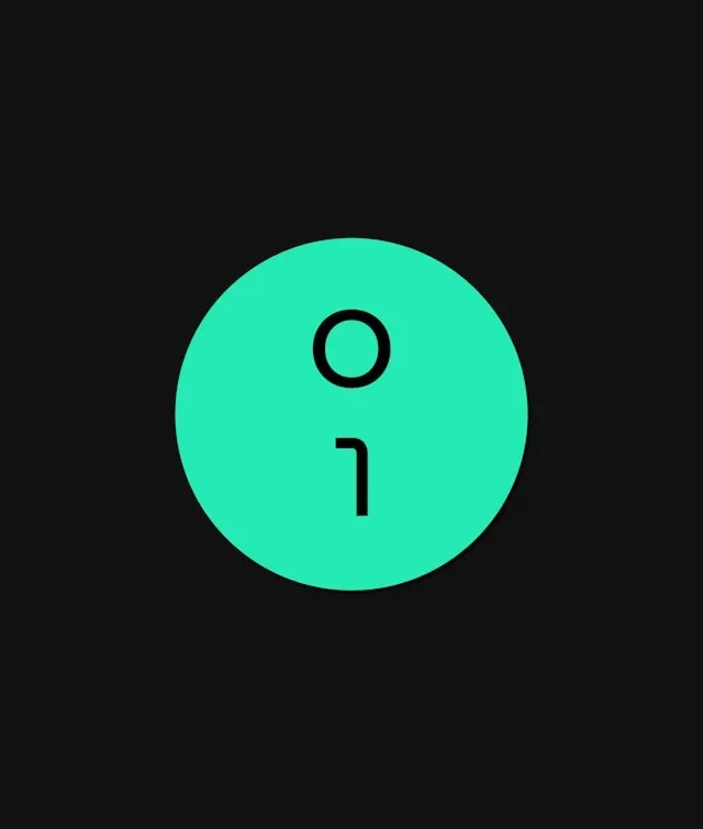
A circular device combines simple binary-like forms. A minimal symbol and a defined palette scale across infrastructure contexts.
Useful for: Study the standalone mark, wordmark over photography, and palette system.
# Branding reference: Global Switch
Source: https://www.pentagram.com/work/global-switch
Design credit: Pentagram
Swipefile reference: https://swipefile.design/ref/brand-global-switch/
Reviewed: 2026-09-09. Selected designer-published case-study images, not current official brand guidelines or a reusable asset license.

## Objective
Develop an original visual identity for my brief. Study the relationships between logo, type, color, and applications in this reference. Do not reproduce the referenced logo, name, distinctive artwork, or proprietary assets.

## Design observations
- logo: A circular device combines simple binary-like forms.
- color: Bright green and black anchor a range of cooler greens.
- typography: Open sans-serif text keeps the technical identity approachable.
- system: A minimal symbol and a defined palette scale across infrastructure contexts.
- applications: Study the standalone mark, wordmark over photography, and palette system.
- dont: Study the principles and develop an original identity. Do not copy these logos, proprietary typefaces, illustrations, or claims. These are selected images from a published case study; current brand guidelines, asset licenses, and real-world performance have not been verified.

## Deliverables and checks
- Begin with the audience, positioning, personality, and required applications in my brief. Label assumptions.
- Explain two or three distinct identity directions before selecting one. Connect each decision to the brand's purpose.
- Define an original logo concept, wordmark and symbol relationships, typographic hierarchy, palette roles, and a consistent graphic system.
- Show how the system works on the relevant touchpoints: packaging, stationery, signage, social, or digital products.
- Draft practical guidelines for clear space, minimum size, background contrast, one-color and reversed marks, type usage, and layout. Validate proposed measurements in the actual artwork.
- Use appropriately licensed fonts and original or licensed imagery. Supply editable vector artwork when the tools support it; distinguish a concept from finished production files.
- Check small-size legibility, color accessibility for text, visual consistency, and print versus screen requirements. State what was reviewed and what still needs testing.
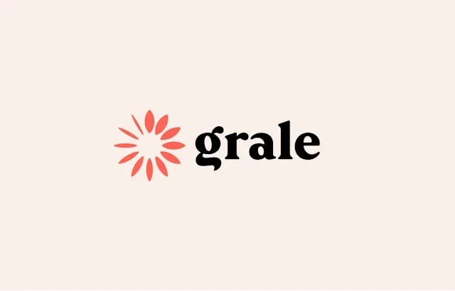
A petal-like circular symbol sits beside a sturdy serif wordmark. The organic motif links formal identity with everyday packaging information.
Useful for: Compare the primary logo, stationery, and small printed symbols.
# Branding reference: Grale
Source: https://www.pentagram.com/work/grale
Design credit: Pentagram
Swipefile reference: https://swipefile.design/ref/brand-grale/
Reviewed: 2026-09-09. Selected designer-published case-study images, not current official brand guidelines or a reusable asset license.

## Objective
Develop an original visual identity for my brief. Study the relationships between logo, type, color, and applications in this reference. Do not reproduce the referenced logo, name, distinctive artwork, or proprietary assets.

## Design observations
- logo: A petal-like circular symbol sits beside a sturdy serif wordmark.
- color: Coral, warm white, and paper brown create a material-aware palette.
- typography: Rounded serif lettering gives the name warmth.
- system: The organic motif links formal identity with everyday packaging information.
- applications: Compare the primary logo, stationery, and small printed symbols.
- dont: Study the principles and develop an original identity. Do not copy these logos, proprietary typefaces, illustrations, or claims. These are selected images from a published case study; current brand guidelines, asset licenses, and real-world performance have not been verified.

## Deliverables and checks
- Begin with the audience, positioning, personality, and required applications in my brief. Label assumptions.
- Explain two or three distinct identity directions before selecting one. Connect each decision to the brand's purpose.
- Define an original logo concept, wordmark and symbol relationships, typographic hierarchy, palette roles, and a consistent graphic system.
- Show how the system works on the relevant touchpoints: packaging, stationery, signage, social, or digital products.
- Draft practical guidelines for clear space, minimum size, background contrast, one-color and reversed marks, type usage, and layout. Validate proposed measurements in the actual artwork.
- Use appropriately licensed fonts and original or licensed imagery. Supply editable vector artwork when the tools support it; distinguish a concept from finished production files.
- Check small-size legibility, color accessibility for text, visual consistency, and print versus screen requirements. State what was reviewed and what still needs testing.
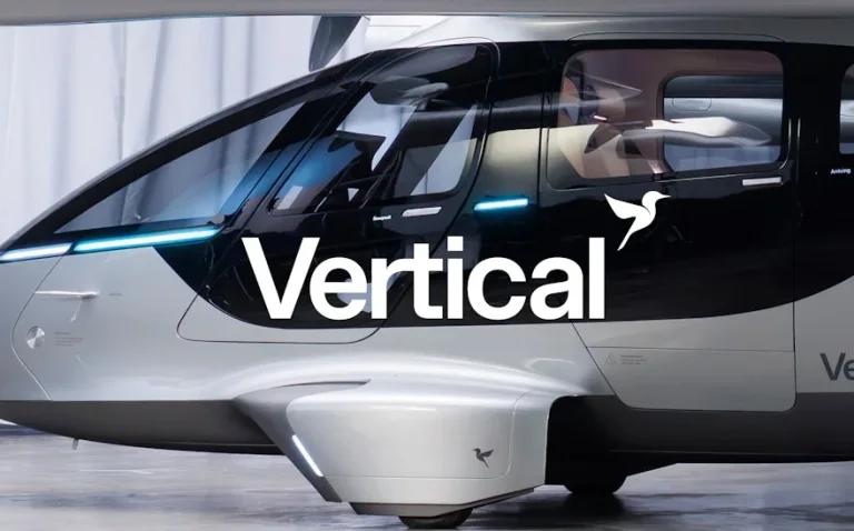
A bird-like symbol is built within an angular geometric frame. The mark is designed to coexist with the aircraft rather than cover it.
Useful for: Study the logo treatment, geometry, and real vehicle placement.
# Branding reference: Vertical
Source: https://www.pentagram.com/work/vertical
Design credit: Pentagram
Swipefile reference: https://swipefile.design/ref/brand-vertical/
Reviewed: 2026-09-09. Selected designer-published case-study images, not current official brand guidelines or a reusable asset license.

## Objective
Develop an original visual identity for my brief. Study the relationships between logo, type, color, and applications in this reference. Do not reproduce the referenced logo, name, distinctive artwork, or proprietary assets.

## Design observations
- logo: A bird-like symbol is built within an angular geometric frame.
- color: Black, white, and metallic neutrals suit the vehicle surfaces.
- typography: A clean sans-serif name remains legible on complex forms.
- system: The mark is designed to coexist with the aircraft rather than cover it.
- applications: Study the logo treatment, geometry, and real vehicle placement.
- dont: Study the principles and develop an original identity. Do not copy these logos, proprietary typefaces, illustrations, or claims. These are selected images from a published case study; current brand guidelines, asset licenses, and real-world performance have not been verified.

## Deliverables and checks
- Begin with the audience, positioning, personality, and required applications in my brief. Label assumptions.
- Explain two or three distinct identity directions before selecting one. Connect each decision to the brand's purpose.
- Define an original logo concept, wordmark and symbol relationships, typographic hierarchy, palette roles, and a consistent graphic system.
- Show how the system works on the relevant touchpoints: packaging, stationery, signage, social, or digital products.
- Draft practical guidelines for clear space, minimum size, background contrast, one-color and reversed marks, type usage, and layout. Validate proposed measurements in the actual artwork.
- Use appropriately licensed fonts and original or licensed imagery. Supply editable vector artwork when the tools support it; distinguish a concept from finished production files.
- Check small-size legibility, color accessibility for text, visual consistency, and print versus screen requirements. State what was reviewed and what still needs testing.
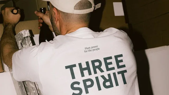
A compact stacked wordmark pairs with simple geometric bottle graphics. The identity changes mood across products while retaining common structure.
Useful for: Compare merchandise, a bottle, and the wider campaign family.
# Branding reference: Three Spirit
Source: https://www.pentagram.com/work/three-spirit
Design credit: Pentagram
Swipefile reference: https://swipefile.design/ref/brand-three-spirit/
Reviewed: 2026-09-09. Selected designer-published case-study images, not current official brand guidelines or a reusable asset license.

## Objective
Develop an original visual identity for my brief. Study the relationships between logo, type, color, and applications in this reference. Do not reproduce the referenced logo, name, distinctive artwork, or proprietary assets.

## Design observations
- logo: A compact stacked wordmark pairs with simple geometric bottle graphics.
- color: Dark bottles contrast with bright green, orange, and pale tones.
- typography: Dense uppercase letters offer a strong shelf signature.
- system: The identity changes mood across products while retaining common structure.
- applications: Compare merchandise, a bottle, and the wider campaign family.
- dont: Study the principles and develop an original identity. Do not copy these logos, proprietary typefaces, illustrations, or claims. These are selected images from a published case study; current brand guidelines, asset licenses, and real-world performance have not been verified.

## Deliverables and checks
- Begin with the audience, positioning, personality, and required applications in my brief. Label assumptions.
- Explain two or three distinct identity directions before selecting one. Connect each decision to the brand's purpose.
- Define an original logo concept, wordmark and symbol relationships, typographic hierarchy, palette roles, and a consistent graphic system.
- Show how the system works on the relevant touchpoints: packaging, stationery, signage, social, or digital products.
- Draft practical guidelines for clear space, minimum size, background contrast, one-color and reversed marks, type usage, and layout. Validate proposed measurements in the actual artwork.
- Use appropriately licensed fonts and original or licensed imagery. Supply editable vector artwork when the tools support it; distinguish a concept from finished production files.
- Check small-size legibility, color accessibility for text, visual consistency, and print versus screen requirements. State what was reviewed and what still needs testing.
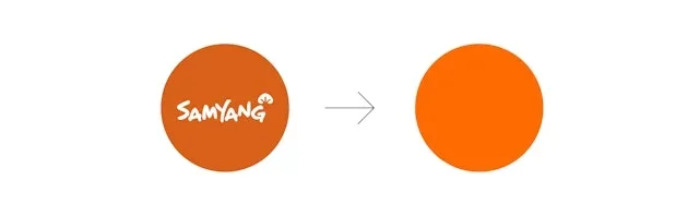
A simple orange circle acts as a recognizable parent-brand device. A stable parent identity supports a lively family of food packaging.
Useful for: Study the symbol, brand-system overview, and retail packs.
# Branding reference: Samyang
Source: https://www.pentagram.com/work/samyang
Design credit: Pentagram
Swipefile reference: https://swipefile.design/ref/brand-samyang/
Reviewed: 2026-09-09. Selected designer-published case-study images, not current official brand guidelines or a reusable asset license.

## Objective
Develop an original visual identity for my brief. Study the relationships between logo, type, color, and applications in this reference. Do not reproduce the referenced logo, name, distinctive artwork, or proprietary assets.

## Design observations
- logo: A simple orange circle acts as a recognizable parent-brand device.
- color: Orange dominates, supported by warm yellow, cream, and darker tones.
- typography: The system accommodates different product names and language treatments.
- system: A stable parent identity supports a lively family of food packaging.
- applications: Study the symbol, brand-system overview, and retail packs.
- dont: Study the principles and develop an original identity. Do not copy these logos, proprietary typefaces, illustrations, or claims. These are selected images from a published case study; current brand guidelines, asset licenses, and real-world performance have not been verified.

## Deliverables and checks
- Begin with the audience, positioning, personality, and required applications in my brief. Label assumptions.
- Explain two or three distinct identity directions before selecting one. Connect each decision to the brand's purpose.
- Define an original logo concept, wordmark and symbol relationships, typographic hierarchy, palette roles, and a consistent graphic system.
- Show how the system works on the relevant touchpoints: packaging, stationery, signage, social, or digital products.
- Draft practical guidelines for clear space, minimum size, background contrast, one-color and reversed marks, type usage, and layout. Validate proposed measurements in the actual artwork.
- Use appropriately licensed fonts and original or licensed imagery. Supply editable vector artwork when the tools support it; distinguish a concept from finished production files.
- Check small-size legibility, color accessibility for text, visual consistency, and print versus screen requirements. State what was reviewed and what still needs testing.
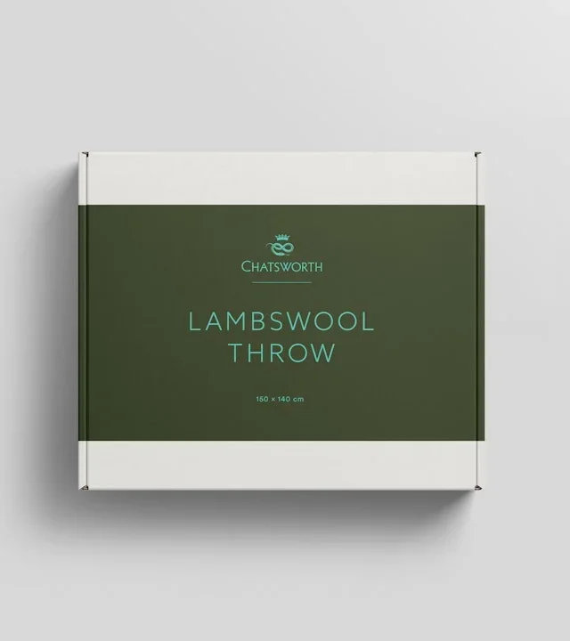
A small emblem and widely spaced name keep the identity understated. A quiet identity links products, food retail, and visitor experiences.
Useful for: Study labels, bags, and freestanding signage.
# Branding reference: Chatsworth
Source: https://www.pentagram.com/work/chatsworth
Design credit: Pentagram
Swipefile reference: https://swipefile.design/ref/brand-chatsworth/
Reviewed: 2026-09-09. Selected designer-published case-study images, not current official brand guidelines or a reusable asset license.

## Objective
Develop an original visual identity for my brief. Study the relationships between logo, type, color, and applications in this reference. Do not reproduce the referenced logo, name, distinctive artwork, or proprietary assets.

## Design observations
- logo: A small emblem and widely spaced name keep the identity understated.
- color: Deep green, navy, and natural paper tones.
- typography: Refined serif lettering works with generous surrounding space.
- system: A quiet identity links products, food retail, and visitor experiences.
- applications: Study labels, bags, and freestanding signage.
- dont: Study the principles and develop an original identity. Do not copy these logos, proprietary typefaces, illustrations, or claims. These are selected images from a published case study; current brand guidelines, asset licenses, and real-world performance have not been verified.

## Deliverables and checks
- Begin with the audience, positioning, personality, and required applications in my brief. Label assumptions.
- Explain two or three distinct identity directions before selecting one. Connect each decision to the brand's purpose.
- Define an original logo concept, wordmark and symbol relationships, typographic hierarchy, palette roles, and a consistent graphic system.
- Show how the system works on the relevant touchpoints: packaging, stationery, signage, social, or digital products.
- Draft practical guidelines for clear space, minimum size, background contrast, one-color and reversed marks, type usage, and layout. Validate proposed measurements in the actual artwork.
- Use appropriately licensed fonts and original or licensed imagery. Supply editable vector artwork when the tools support it; distinguish a concept from finished production files.
- Check small-size legibility, color accessibility for text, visual consistency, and print versus screen requirements. State what was reviewed and what still needs testing.
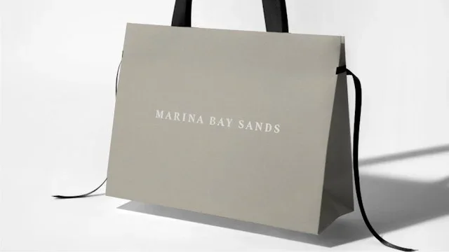
A small widely spaced wordmark provides a discreet signature. The identity relies on controlled spacing across hospitality and cultural materials.
Useful for: Compare packaging, invitations, and a printed feature.
# Branding reference: Marina Bay Sands
Source: https://www.pentagram.com/work/marina-bay-sands
Design credit: Pentagram
Swipefile reference: https://swipefile.design/ref/brand-marina-bay-sands/
Reviewed: 2026-09-09. Selected designer-published case-study images, not current official brand guidelines or a reusable asset license.

## Objective
Develop an original visual identity for my brief. Study the relationships between logo, type, color, and applications in this reference. Do not reproduce the referenced logo, name, distinctive artwork, or proprietary assets.

## Design observations
- logo: A small widely spaced wordmark provides a discreet signature.
- color: Muted stone and warm neutrals support richer photography.
- typography: Elegant serif headlines contrast with small supporting information.
- system: The identity relies on controlled spacing across hospitality and cultural materials.
- applications: Compare packaging, invitations, and a printed feature.
- dont: Study the principles and develop an original identity. Do not copy these logos, proprietary typefaces, illustrations, or claims. These are selected images from a published case study; current brand guidelines, asset licenses, and real-world performance have not been verified.

## Deliverables and checks
- Begin with the audience, positioning, personality, and required applications in my brief. Label assumptions.
- Explain two or three distinct identity directions before selecting one. Connect each decision to the brand's purpose.
- Define an original logo concept, wordmark and symbol relationships, typographic hierarchy, palette roles, and a consistent graphic system.
- Show how the system works on the relevant touchpoints: packaging, stationery, signage, social, or digital products.
- Draft practical guidelines for clear space, minimum size, background contrast, one-color and reversed marks, type usage, and layout. Validate proposed measurements in the actual artwork.
- Use appropriately licensed fonts and original or licensed imagery. Supply editable vector artwork when the tools support it; distinguish a concept from finished production files.
- Check small-size legibility, color accessibility for text, visual consistency, and print versus screen requirements. State what was reviewed and what still needs testing.
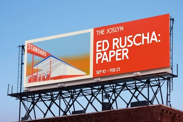
A small institutional name yields space to a distinctive display alphabet. A custom type voice lets changing exhibition content remain visibly connected.
Useful for: Study outdoor legibility, repeated headlines, and the extended character set.
# Branding reference: The Joslyn
Source: https://www.pentagram.com/work/the-joslyn
Design credit: Pentagram
Swipefile reference: https://swipefile.design/ref/brand-the-joslyn/
Reviewed: 2026-09-09. Selected designer-published case-study images, not current official brand guidelines or a reusable asset license.

## Objective
Develop an original visual identity for my brief. Study the relationships between logo, type, color, and applications in this reference. Do not reproduce the referenced logo, name, distinctive artwork, or proprietary assets.

## Design observations
- logo: A small institutional name yields space to a distinctive display alphabet.
- color: Unexpected pink, blue, green, and orange combinations distinguish messages.
- typography: Angular details and unusual accents make the type recognizable.
- system: A custom type voice lets changing exhibition content remain visibly connected.
- applications: Study outdoor legibility, repeated headlines, and the extended character set.
- dont: Study the principles and develop an original identity. Do not copy these logos, proprietary typefaces, illustrations, or claims. These are selected images from a published case study; current brand guidelines, asset licenses, and real-world performance have not been verified.

## Deliverables and checks
- Begin with the audience, positioning, personality, and required applications in my brief. Label assumptions.
- Explain two or three distinct identity directions before selecting one. Connect each decision to the brand's purpose.
- Define an original logo concept, wordmark and symbol relationships, typographic hierarchy, palette roles, and a consistent graphic system.
- Show how the system works on the relevant touchpoints: packaging, stationery, signage, social, or digital products.
- Draft practical guidelines for clear space, minimum size, background contrast, one-color and reversed marks, type usage, and layout. Validate proposed measurements in the actual artwork.
- Use appropriately licensed fonts and original or licensed imagery. Supply editable vector artwork when the tools support it; distinguish a concept from finished production files.
- Check small-size legibility, color accessibility for text, visual consistency, and print versus screen requirements. State what was reviewed and what still needs testing.
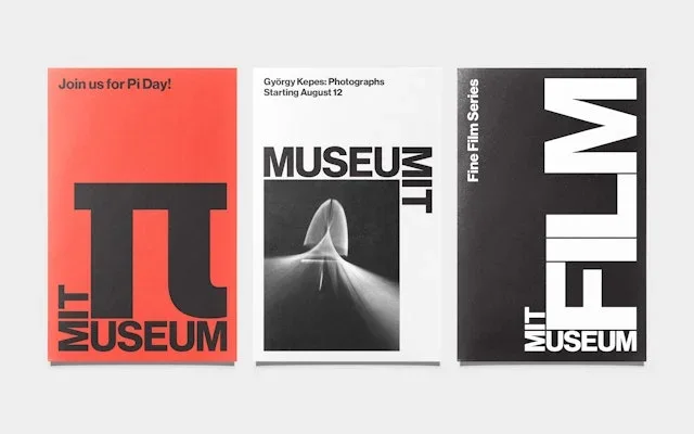
Rotated and stacked letterforms turn the name into a modular device. The wordmark can expand into the graphic structure of a poster.
Useful for: Compare full posters, the reduced mark, and color variations.
# Branding reference: MIT Museum
Source: https://www.pentagram.com/work/mit-museum
Design credit: Pentagram
Swipefile reference: https://swipefile.design/ref/brand-mit-museum/
Reviewed: 2026-09-09. Selected designer-published case-study images, not current official brand guidelines or a reusable asset license.

## Objective
Develop an original visual identity for my brief. Study the relationships between logo, type, color, and applications in this reference. Do not reproduce the referenced logo, name, distinctive artwork, or proprietary assets.

## Design observations
- logo: Rotated and stacked letterforms turn the name into a modular device.
- color: Black and white combine with sharp red and bright accent colors.
- typography: Heavy uppercase typography is treated as a compositional element.
- system: The wordmark can expand into the graphic structure of a poster.
- applications: Compare full posters, the reduced mark, and color variations.
- dont: Study the principles and develop an original identity. Do not copy these logos, proprietary typefaces, illustrations, or claims. These are selected images from a published case study; current brand guidelines, asset licenses, and real-world performance have not been verified.

## Deliverables and checks
- Begin with the audience, positioning, personality, and required applications in my brief. Label assumptions.
- Explain two or three distinct identity directions before selecting one. Connect each decision to the brand's purpose.
- Define an original logo concept, wordmark and symbol relationships, typographic hierarchy, palette roles, and a consistent graphic system.
- Show how the system works on the relevant touchpoints: packaging, stationery, signage, social, or digital products.
- Draft practical guidelines for clear space, minimum size, background contrast, one-color and reversed marks, type usage, and layout. Validate proposed measurements in the actual artwork.
- Use appropriately licensed fonts and original or licensed imagery. Supply editable vector artwork when the tools support it; distinguish a concept from finished production files.
- Check small-size legibility, color accessibility for text, visual consistency, and print versus screen requirements. State what was reviewed and what still needs testing.
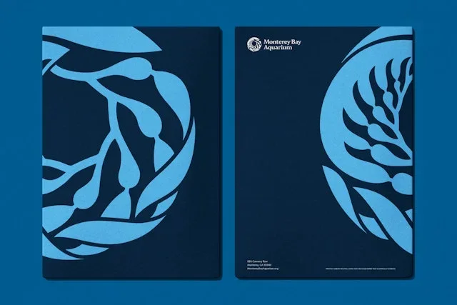
A circular kelp-like emblem connects the identity to marine life. The emblem expands into patterns without losing its connection to the logo.
Useful for: Study printed folders, visitor information, and an enlarged pattern.
# Branding reference: Monterey Bay Aquarium
Source: https://www.pentagram.com/work/monterey-bay-aquarium
Design credit: Pentagram
Swipefile reference: https://swipefile.design/ref/brand-monterey-bay-aquarium/
Reviewed: 2026-09-09. Selected designer-published case-study images, not current official brand guidelines or a reusable asset license.

## Objective
Develop an original visual identity for my brief. Study the relationships between logo, type, color, and applications in this reference. Do not reproduce the referenced logo, name, distinctive artwork, or proprietary assets.

## Design observations
- logo: A circular kelp-like emblem connects the identity to marine life.
- color: Layered blues build a clear ocean association.
- typography: Direct information type is paired with a more formal institutional name.
- system: The emblem expands into patterns without losing its connection to the logo.
- applications: Study printed folders, visitor information, and an enlarged pattern.
- dont: Study the principles and develop an original identity. Do not copy these logos, proprietary typefaces, illustrations, or claims. These are selected images from a published case study; current brand guidelines, asset licenses, and real-world performance have not been verified.

## Deliverables and checks
- Begin with the audience, positioning, personality, and required applications in my brief. Label assumptions.
- Explain two or three distinct identity directions before selecting one. Connect each decision to the brand's purpose.
- Define an original logo concept, wordmark and symbol relationships, typographic hierarchy, palette roles, and a consistent graphic system.
- Show how the system works on the relevant touchpoints: packaging, stationery, signage, social, or digital products.
- Draft practical guidelines for clear space, minimum size, background contrast, one-color and reversed marks, type usage, and layout. Validate proposed measurements in the actual artwork.
- Use appropriately licensed fonts and original or licensed imagery. Supply editable vector artwork when the tools support it; distinguish a concept from finished production files.
- Check small-size legibility, color accessibility for text, visual consistency, and print versus screen requirements. State what was reviewed and what still needs testing.
Three rounded architectural forms produce a compact symbol. Repeating the symbol's curves creates a flexible pattern language.
Useful for: Compare the logo, a printed piece, and merchandise variations.
# Branding reference: Chrysler Museum of Art
Source: https://www.pentagram.com/work/chrysler-museum-of-art
Design credit: Pentagram
Swipefile reference: https://swipefile.design/ref/brand-chrysler-museum-of-art/
Reviewed: 2026-09-09. Selected designer-published case-study images, not current official brand guidelines or a reusable asset license.

## Objective
Develop an original visual identity for my brief. Study the relationships between logo, type, color, and applications in this reference. Do not reproduce the referenced logo, name, distinctive artwork, or proprietary assets.

## Design observations
- logo: Three rounded architectural forms produce a compact symbol.
- color: Black and white expand into blue and green applications.
- typography: A stacked sans-serif name gives the symbol a clear companion.
- system: Repeating the symbol's curves creates a flexible pattern language.
- applications: Compare the logo, a printed piece, and merchandise variations.
- dont: Study the principles and develop an original identity. Do not copy these logos, proprietary typefaces, illustrations, or claims. These are selected images from a published case study; current brand guidelines, asset licenses, and real-world performance have not been verified.

## Deliverables and checks
- Begin with the audience, positioning, personality, and required applications in my brief. Label assumptions.
- Explain two or three distinct identity directions before selecting one. Connect each decision to the brand's purpose.
- Define an original logo concept, wordmark and symbol relationships, typographic hierarchy, palette roles, and a consistent graphic system.
- Show how the system works on the relevant touchpoints: packaging, stationery, signage, social, or digital products.
- Draft practical guidelines for clear space, minimum size, background contrast, one-color and reversed marks, type usage, and layout. Validate proposed measurements in the actual artwork.
- Use appropriately licensed fonts and original or licensed imagery. Supply editable vector artwork when the tools support it; distinguish a concept from finished production files.
- Check small-size legibility, color accessibility for text, visual consistency, and print versus screen requirements. State what was reviewed and what still needs testing.
An interwoven SP monogram gives the cathedral a compact identifier. The monogram stays consistent while color and message change.
Useful for: Compare the mark, palette variations, and outdoor posters.
# Branding reference: St Paul’s Cathedral
Source: https://www.pentagram.com/work/st-paul-s-cathedral
Design credit: Pentagram
Swipefile reference: https://swipefile.design/ref/brand-st-paul-s-cathedral/
Reviewed: 2026-09-09. Selected designer-published case-study images, not current official brand guidelines or a reusable asset license.

## Objective
Develop an original visual identity for my brief. Study the relationships between logo, type, color, and applications in this reference. Do not reproduce the referenced logo, name, distinctive artwork, or proprietary assets.

## Design observations
- logo: An interwoven SP monogram gives the cathedral a compact identifier.
- color: Lime, blue, pink, and warm tones extend a neutral foundation.
- typography: Fine serif lettering brings an inscription-like quality to modern posters.
- system: The monogram stays consistent while color and message change.
- applications: Compare the mark, palette variations, and outdoor posters.
- dont: Study the principles and develop an original identity. Do not copy these logos, proprietary typefaces, illustrations, or claims. These are selected images from a published case study; current brand guidelines, asset licenses, and real-world performance have not been verified.

## Deliverables and checks
- Begin with the audience, positioning, personality, and required applications in my brief. Label assumptions.
- Explain two or three distinct identity directions before selecting one. Connect each decision to the brand's purpose.
- Define an original logo concept, wordmark and symbol relationships, typographic hierarchy, palette roles, and a consistent graphic system.
- Show how the system works on the relevant touchpoints: packaging, stationery, signage, social, or digital products.
- Draft practical guidelines for clear space, minimum size, background contrast, one-color and reversed marks, type usage, and layout. Validate proposed measurements in the actual artwork.
- Use appropriately licensed fonts and original or licensed imagery. Supply editable vector artwork when the tools support it; distinguish a concept from finished production files.
- Check small-size legibility, color accessibility for text, visual consistency, and print versus screen requirements. State what was reviewed and what still needs testing.

An oversized F becomes the central identifying shape. Strong new typography is presented alongside the institution's carved-letter heritage.
Useful for: Study the mark, typographic voice, and architectural lettering context.
# Branding reference: Folger Shakespeare Library
Source: https://www.pentagram.com/work/folger-shakespeare-library
Design credit: Pentagram
Swipefile reference: https://swipefile.design/ref/brand-folger-shakespeare-library/
Reviewed: 2026-09-09. Selected designer-published case-study images, not current official brand guidelines or a reusable asset license.

## Objective
Develop an original visual identity for my brief. Study the relationships between logo, type, color, and applications in this reference. Do not reproduce the referenced logo, name, distinctive artwork, or proprietary assets.

## Design observations
- logo: An oversized F becomes the central identifying shape.
- color: Vivid red contrasts with black, white, and stone neutrals.
- typography: Bold compact display letters give literary titles a physical presence.
- system: Strong new typography is presented alongside the institution's carved-letter heritage.
- applications: Study the mark, typographic voice, and architectural lettering context.
- dont: Study the principles and develop an original identity. Do not copy these logos, proprietary typefaces, illustrations, or claims. These are selected images from a published case study; current brand guidelines, asset licenses, and real-world performance have not been verified.

## Deliverables and checks
- Begin with the audience, positioning, personality, and required applications in my brief. Label assumptions.
- Explain two or three distinct identity directions before selecting one. Connect each decision to the brand's purpose.
- Define an original logo concept, wordmark and symbol relationships, typographic hierarchy, palette roles, and a consistent graphic system.
- Show how the system works on the relevant touchpoints: packaging, stationery, signage, social, or digital products.
- Draft practical guidelines for clear space, minimum size, background contrast, one-color and reversed marks, type usage, and layout. Validate proposed measurements in the actual artwork.
- Use appropriately licensed fonts and original or licensed imagery. Supply editable vector artwork when the tools support it; distinguish a concept from finished production files.
- Check small-size legibility, color accessibility for text, visual consistency, and print versus screen requirements. State what was reviewed and what still needs testing.
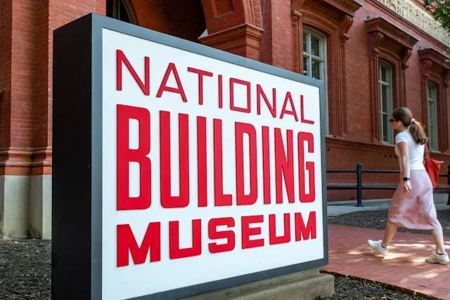
Tall stacked words create a logo with architectural proportions. The stacked name adapts to freestanding signs and printed cards.
Useful for: Study a large entrance sign, reception lettering, and stationery.
# Branding reference: National Building Museum
Source: https://www.pentagram.com/work/national-building-museum
Design credit: Pentagram
Swipefile reference: https://swipefile.design/ref/brand-national-building-museum/
Reviewed: 2026-09-09. Selected designer-published case-study images, not current official brand guidelines or a reusable asset license.

## Objective
Develop an original visual identity for my brief. Study the relationships between logo, type, color, and applications in this reference. Do not reproduce the referenced logo, name, distinctive artwork, or proprietary assets.

## Design observations
- logo: Tall stacked words create a logo with architectural proportions.
- color: Red, black, and white make the institutional name prominent.
- typography: Compressed uppercase letters contrast with fine supporting text.
- system: The stacked name adapts to freestanding signs and printed cards.
- applications: Study a large entrance sign, reception lettering, and stationery.
- dont: Study the principles and develop an original identity. Do not copy these logos, proprietary typefaces, illustrations, or claims. These are selected images from a published case study; current brand guidelines, asset licenses, and real-world performance have not been verified.

## Deliverables and checks
- Begin with the audience, positioning, personality, and required applications in my brief. Label assumptions.
- Explain two or three distinct identity directions before selecting one. Connect each decision to the brand's purpose.
- Define an original logo concept, wordmark and symbol relationships, typographic hierarchy, palette roles, and a consistent graphic system.
- Show how the system works on the relevant touchpoints: packaging, stationery, signage, social, or digital products.
- Draft practical guidelines for clear space, minimum size, background contrast, one-color and reversed marks, type usage, and layout. Validate proposed measurements in the actual artwork.
- Use appropriately licensed fonts and original or licensed imagery. Supply editable vector artwork when the tools support it; distinguish a concept from finished production files.
- Check small-size legibility, color accessibility for text, visual consistency, and print versus screen requirements. State what was reviewed and what still needs testing.
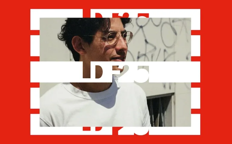
Large cut-out letters act as a recognizable festival signature. Consistent bands give different portraits a shared graphic structure.
Useful for: Study campaign posters and folded printed material.
# Branding reference: London Design Festival 2025
Source: https://www.pentagram.com/work/london-design-festival-2025
Design credit: Pentagram
Swipefile reference: https://swipefile.design/ref/brand-london-design-festival-2025/
Reviewed: 2026-09-09. Selected designer-published case-study images, not current official brand guidelines or a reusable asset license.

## Objective
Develop an original visual identity for my brief. Study the relationships between logo, type, color, and applications in this reference. Do not reproduce the referenced logo, name, distinctive artwork, or proprietary assets.

## Design observations
- logo: Large cut-out letters act as a recognizable festival signature.
- color: Red and white organize a varied photographic campaign.
- typography: Heavy display forms use horizontal interruptions as a recurring device.
- system: Consistent bands give different portraits a shared graphic structure.
- applications: Study campaign posters and folded printed material.
- dont: Study the principles and develop an original identity. Do not copy these logos, proprietary typefaces, illustrations, or claims. These are selected images from a published case study; current brand guidelines, asset licenses, and real-world performance have not been verified.

## Deliverables and checks
- Begin with the audience, positioning, personality, and required applications in my brief. Label assumptions.
- Explain two or three distinct identity directions before selecting one. Connect each decision to the brand's purpose.
- Define an original logo concept, wordmark and symbol relationships, typographic hierarchy, palette roles, and a consistent graphic system.
- Show how the system works on the relevant touchpoints: packaging, stationery, signage, social, or digital products.
- Draft practical guidelines for clear space, minimum size, background contrast, one-color and reversed marks, type usage, and layout. Validate proposed measurements in the actual artwork.
- Use appropriately licensed fonts and original or licensed imagery. Supply editable vector artwork when the tools support it; distinguish a concept from finished production files.
- Check small-size legibility, color accessibility for text, visual consistency, and print versus screen requirements. State what was reviewed and what still needs testing.
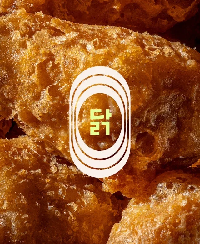
Nested oval rings create a compact restaurant emblem. The ring shape links imagery and service objects across different materials.
Useful for: Compare the emblem, food typography, and branded glassware.
# Branding reference: COQODAQ
Source: https://www.pentagram.com/work/coqodaq
Design credit: Pentagram
Swipefile reference: https://swipefile.design/ref/brand-coqodaq/
Reviewed: 2026-09-09. Selected designer-published case-study images, not current official brand guidelines or a reusable asset license.

## Objective
Develop an original visual identity for my brief. Study the relationships between logo, type, color, and applications in this reference. Do not reproduce the referenced logo, name, distinctive artwork, or proprietary assets.

## Design observations
- logo: Nested oval rings create a compact restaurant emblem.
- color: Deep green, cream, and warm food photography establish the palette.
- typography: Refined rounded letterforms give food names a distinctive voice.
- system: The ring shape links imagery and service objects across different materials.
- applications: Compare the emblem, food typography, and branded glassware.
- dont: Study the principles and develop an original identity. Do not copy these logos, proprietary typefaces, illustrations, or claims. These are selected images from a published case study; current brand guidelines, asset licenses, and real-world performance have not been verified.

## Deliverables and checks
- Begin with the audience, positioning, personality, and required applications in my brief. Label assumptions.
- Explain two or three distinct identity directions before selecting one. Connect each decision to the brand's purpose.
- Define an original logo concept, wordmark and symbol relationships, typographic hierarchy, palette roles, and a consistent graphic system.
- Show how the system works on the relevant touchpoints: packaging, stationery, signage, social, or digital products.
- Draft practical guidelines for clear space, minimum size, background contrast, one-color and reversed marks, type usage, and layout. Validate proposed measurements in the actual artwork.
- Use appropriately licensed fonts and original or licensed imagery. Supply editable vector artwork when the tools support it; distinguish a concept from finished production files.
- Check small-size legibility, color accessibility for text, visual consistency, and print versus screen requirements. State what was reviewed and what still needs testing.

Repeated upright forms make the short name visually rhythmic. Small geometric devices and generous margins connect brand stories with food imagery.
Useful for: Study the wordmark, tagline, and narrative layout.
# Branding reference: ilili
Source: https://www.pentagram.com/work/ilili
Design credit: Pentagram
Swipefile reference: https://swipefile.design/ref/brand-ilili/
Reviewed: 2026-09-09. Selected designer-published case-study images, not current official brand guidelines or a reusable asset license.

## Objective
Develop an original visual identity for my brief. Study the relationships between logo, type, color, and applications in this reference. Do not reproduce the referenced logo, name, distinctive artwork, or proprietary assets.

## Design observations
- logo: Repeated upright forms make the short name visually rhythmic.
- color: Cobalt blue, cream, and small gold accents carry the identity.
- typography: Expressive serif text complements the narrow wordmark.
- system: Small geometric devices and generous margins connect brand stories with food imagery.
- applications: Study the wordmark, tagline, and narrative layout.
- dont: Study the principles and develop an original identity. Do not copy these logos, proprietary typefaces, illustrations, or claims. These are selected images from a published case study; current brand guidelines, asset licenses, and real-world performance have not been verified.

## Deliverables and checks
- Begin with the audience, positioning, personality, and required applications in my brief. Label assumptions.
- Explain two or three distinct identity directions before selecting one. Connect each decision to the brand's purpose.
- Define an original logo concept, wordmark and symbol relationships, typographic hierarchy, palette roles, and a consistent graphic system.
- Show how the system works on the relevant touchpoints: packaging, stationery, signage, social, or digital products.
- Draft practical guidelines for clear space, minimum size, background contrast, one-color and reversed marks, type usage, and layout. Validate proposed measurements in the actual artwork.
- Use appropriately licensed fonts and original or licensed imagery. Supply editable vector artwork when the tools support it; distinguish a concept from finished production files.
- Check small-size legibility, color accessibility for text, visual consistency, and print versus screen requirements. State what was reviewed and what still needs testing.
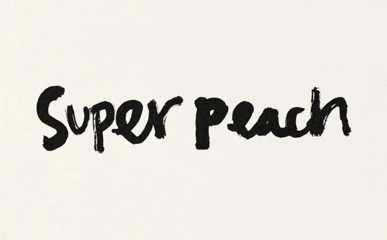
Loose hand lettering gives the restaurant name an informal voice. Illustrated characters and repeated lettering extend the logo's handmade quality.
Useful for: Compare the primary wordmark, a radial pattern, and a character illustration.
# Branding reference: Super Peach
Source: https://www.pentagram.com/work/super-peach
Design credit: Pentagram
Swipefile reference: https://swipefile.design/ref/brand-super-peach/
Reviewed: 2026-09-09. Selected designer-published case-study images, not current official brand guidelines or a reusable asset license.

## Objective
Develop an original visual identity for my brief. Study the relationships between logo, type, color, and applications in this reference. Do not reproduce the referenced logo, name, distinctive artwork, or proprietary assets.

## Design observations
- logo: Loose hand lettering gives the restaurant name an informal voice.
- color: Black and cream put the emphasis on expressive linework.
- typography: Brush-like letters vary in scale and rhythm.
- system: Illustrated characters and repeated lettering extend the logo's handmade quality.
- applications: Compare the primary wordmark, a radial pattern, and a character illustration.
- dont: Study the principles and develop an original identity. Do not copy these logos, proprietary typefaces, illustrations, or claims. These are selected images from a published case study; current brand guidelines, asset licenses, and real-world performance have not been verified.

## Deliverables and checks
- Begin with the audience, positioning, personality, and required applications in my brief. Label assumptions.
- Explain two or three distinct identity directions before selecting one. Connect each decision to the brand's purpose.
- Define an original logo concept, wordmark and symbol relationships, typographic hierarchy, palette roles, and a consistent graphic system.
- Show how the system works on the relevant touchpoints: packaging, stationery, signage, social, or digital products.
- Draft practical guidelines for clear space, minimum size, background contrast, one-color and reversed marks, type usage, and layout. Validate proposed measurements in the actual artwork.
- Use appropriately licensed fonts and original or licensed imagery. Supply editable vector artwork when the tools support it; distinguish a concept from finished production files.
- Check small-size legibility, color accessibility for text, visual consistency, and print versus screen requirements. State what was reviewed and what still needs testing.
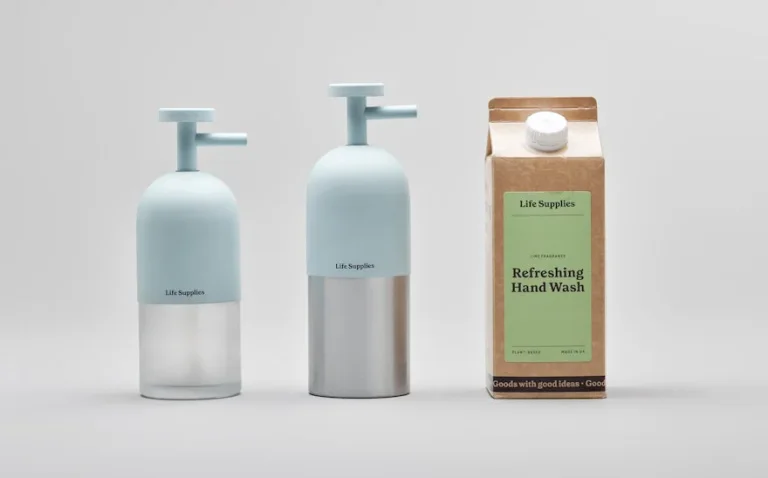
A quiet compact name leaves the container and contents in focus. Consistent bottle forms and color coding unite refillable products and cartons.
Useful for: Study packaging relationships and the visible refill presentation.
# Branding reference: Life Supplies
Source: https://www.pentagram.com/work/life-supplies
Design credit: Pentagram
Swipefile reference: https://swipefile.design/ref/brand-life-supplies/
Reviewed: 2026-09-09. Selected designer-published case-study images, not current official brand guidelines or a reusable asset license.

## Objective
Develop an original visual identity for my brief. Study the relationships between logo, type, color, and applications in this reference. Do not reproduce the referenced logo, name, distinctive artwork, or proprietary assets.

## Design observations
- logo: A quiet compact name leaves the container and contents in focus.
- color: Pale blue, mustard, and kraft packaging distinguish product families.
- typography: Small sans-serif labels maintain a restrained information hierarchy.
- system: Consistent bottle forms and color coding unite refillable products and cartons.
- applications: Study packaging relationships and the visible refill presentation.
- dont: Study the principles and develop an original identity. Do not copy these logos, proprietary typefaces, illustrations, or claims. These are selected images from a published case study; current brand guidelines, asset licenses, and real-world performance have not been verified.

## Deliverables and checks
- Begin with the audience, positioning, personality, and required applications in my brief. Label assumptions.
- Explain two or three distinct identity directions before selecting one. Connect each decision to the brand's purpose.
- Define an original logo concept, wordmark and symbol relationships, typographic hierarchy, palette roles, and a consistent graphic system.
- Show how the system works on the relevant touchpoints: packaging, stationery, signage, social, or digital products.
- Draft practical guidelines for clear space, minimum size, background contrast, one-color and reversed marks, type usage, and layout. Validate proposed measurements in the actual artwork.
- Use appropriately licensed fonts and original or licensed imagery. Supply editable vector artwork when the tools support it; distinguish a concept from finished production files.
- Check small-size legibility, color accessibility for text, visual consistency, and print versus screen requirements. State what was reviewed and what still needs testing.
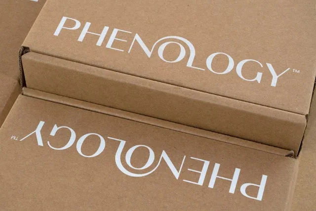
Curving letter details and a compact monogram connect packaging formats. Small monograms preserve recognition across lids, cartons, and editorial imagery.
Useful for: Compare outer boxes, lid details, and botanical communication.
# Branding reference: Phenology
Source: https://www.pentagram.com/work/phenology
Design credit: Pentagram
Swipefile reference: https://swipefile.design/ref/brand-phenology/
Reviewed: 2026-09-09. Selected designer-published case-study images, not current official brand guidelines or a reusable asset license.

## Objective
Develop an original visual identity for my brief. Study the relationships between logo, type, color, and applications in this reference. Do not reproduce the referenced logo, name, distinctive artwork, or proprietary assets.

## Design observations
- logo: Curving letter details and a compact monogram connect packaging formats.
- color: Black containers contrast with soft botanical and fruit-inspired accents.
- typography: A refined product name sits alongside stronger campaign headlines.
- system: Small monograms preserve recognition across lids, cartons, and editorial imagery.
- applications: Compare outer boxes, lid details, and botanical communication.
- dont: Study the principles and develop an original identity. Do not copy these logos, proprietary typefaces, illustrations, or claims. These are selected images from a published case study; current brand guidelines, asset licenses, and real-world performance have not been verified.

## Deliverables and checks
- Begin with the audience, positioning, personality, and required applications in my brief. Label assumptions.
- Explain two or three distinct identity directions before selecting one. Connect each decision to the brand's purpose.
- Define an original logo concept, wordmark and symbol relationships, typographic hierarchy, palette roles, and a consistent graphic system.
- Show how the system works on the relevant touchpoints: packaging, stationery, signage, social, or digital products.
- Draft practical guidelines for clear space, minimum size, background contrast, one-color and reversed marks, type usage, and layout. Validate proposed measurements in the actual artwork.
- Use appropriately licensed fonts and original or licensed imagery. Supply editable vector artwork when the tools support it; distinguish a concept from finished production files.
- Check small-size legibility, color accessibility for text, visual consistency, and print versus screen requirements. State what was reviewed and what still needs testing.
A bird assembled from simple geometric pieces becomes the central symbol. The mark moves from a flat graphic to an oversized restaurant feature.
Useful for: Study the logo lockup, single-color symbol, and interior installation.
# Branding reference: Summerbird
Source: https://www.pentagram.com/work/summerbird
Design credit: Pentagram
Swipefile reference: https://swipefile.design/ref/brand-summerbird/
Reviewed: 2026-09-09. Selected designer-published case-study images, not current official brand guidelines or a reusable asset license.

## Objective
Develop an original visual identity for my brief. Study the relationships between logo, type, color, and applications in this reference. Do not reproduce the referenced logo, name, distinctive artwork, or proprietary assets.

## Design observations
- logo: A bird assembled from simple geometric pieces becomes the central symbol.
- color: Orange and teal create a strong contrast against cream.
- typography: A wide uppercase wordmark balances the compact bird.
- system: The mark moves from a flat graphic to an oversized restaurant feature.
- applications: Study the logo lockup, single-color symbol, and interior installation.
- dont: Study the principles and develop an original identity. Do not copy these logos, proprietary typefaces, illustrations, or claims. These are selected images from a published case study; current brand guidelines, asset licenses, and real-world performance have not been verified.

## Deliverables and checks
- Begin with the audience, positioning, personality, and required applications in my brief. Label assumptions.
- Explain two or three distinct identity directions before selecting one. Connect each decision to the brand's purpose.
- Define an original logo concept, wordmark and symbol relationships, typographic hierarchy, palette roles, and a consistent graphic system.
- Show how the system works on the relevant touchpoints: packaging, stationery, signage, social, or digital products.
- Draft practical guidelines for clear space, minimum size, background contrast, one-color and reversed marks, type usage, and layout. Validate proposed measurements in the actual artwork.
- Use appropriately licensed fonts and original or licensed imagery. Supply editable vector artwork when the tools support it; distinguish a concept from finished production files.
- Check small-size legibility, color accessibility for text, visual consistency, and print versus screen requirements. State what was reviewed and what still needs testing.
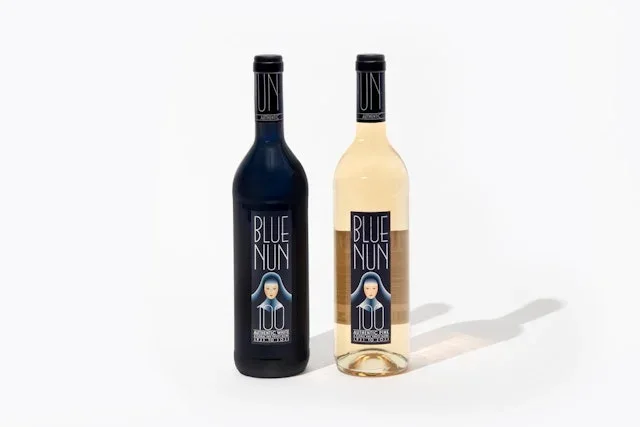
A stylized nun portrait gives the packaging a recurring identifying motif. Portrait variations organize the family without changing the basic package architecture.
Useful for: Compare bottles, individual cartons, and a long gift box.
# Branding reference: Blue Nun
Source: https://www.pentagram.com/work/blue-nun
Design credit: Pentagram
Swipefile reference: https://swipefile.design/ref/brand-blue-nun/
Reviewed: 2026-09-09. Selected designer-published case-study images, not current official brand guidelines or a reusable asset license.

## Objective
Develop an original visual identity for my brief. Study the relationships between logo, type, color, and applications in this reference. Do not reproduce the referenced logo, name, distinctive artwork, or proprietary assets.

## Design observations
- logo: A stylized nun portrait gives the packaging a recurring identifying motif.
- color: Deep blue and cream provide a consistent foundation.
- typography: Tall narrow letters leave room for the face illustration.
- system: Portrait variations organize the family without changing the basic package architecture.
- applications: Compare bottles, individual cartons, and a long gift box.
- dont: Study the principles and develop an original identity. Do not copy these logos, proprietary typefaces, illustrations, or claims. These are selected images from a published case study; current brand guidelines, asset licenses, and real-world performance have not been verified.

## Deliverables and checks
- Begin with the audience, positioning, personality, and required applications in my brief. Label assumptions.
- Explain two or three distinct identity directions before selecting one. Connect each decision to the brand's purpose.
- Define an original logo concept, wordmark and symbol relationships, typographic hierarchy, palette roles, and a consistent graphic system.
- Show how the system works on the relevant touchpoints: packaging, stationery, signage, social, or digital products.
- Draft practical guidelines for clear space, minimum size, background contrast, one-color and reversed marks, type usage, and layout. Validate proposed measurements in the actual artwork.
- Use appropriately licensed fonts and original or licensed imagery. Supply editable vector artwork when the tools support it; distinguish a concept from finished production files.
- Check small-size legibility, color accessibility for text, visual consistency, and print versus screen requirements. State what was reviewed and what still needs testing.
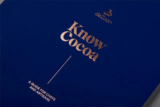
A small cocoa-inspired emblem accompanies the title. Consistent page hierarchy combines narrative text with detailed ingredient imagery.
Useful for: Study the cover and two illustrated book spreads.
# Branding reference: Know Cocoa
Source: https://www.pentagram.com/work/know-cocoa
Design credit: Pentagram
Swipefile reference: https://swipefile.design/ref/brand-know-cocoa/
Reviewed: 2026-09-09. Selected designer-published case-study images, not current official brand guidelines or a reusable asset license.

## Objective
Develop an original visual identity for my brief. Study the relationships between logo, type, color, and applications in this reference. Do not reproduce the referenced logo, name, distinctive artwork, or proprietary assets.

## Design observations
- logo: A small cocoa-inspired emblem accompanies the title.
- color: Deep blue and gold contrast with rich botanical illustrations.
- typography: Fine serif titles establish an editorial and educational tone.
- system: Consistent page hierarchy combines narrative text with detailed ingredient imagery.
- applications: Study the cover and two illustrated book spreads.
- dont: Study the principles and develop an original identity. Do not copy these logos, proprietary typefaces, illustrations, or claims. These are selected images from a published case study; current brand guidelines, asset licenses, and real-world performance have not been verified.

## Deliverables and checks
- Begin with the audience, positioning, personality, and required applications in my brief. Label assumptions.
- Explain two or three distinct identity directions before selecting one. Connect each decision to the brand's purpose.
- Define an original logo concept, wordmark and symbol relationships, typographic hierarchy, palette roles, and a consistent graphic system.
- Show how the system works on the relevant touchpoints: packaging, stationery, signage, social, or digital products.
- Draft practical guidelines for clear space, minimum size, background contrast, one-color and reversed marks, type usage, and layout. Validate proposed measurements in the actual artwork.
- Use appropriately licensed fonts and original or licensed imagery. Supply editable vector artwork when the tools support it; distinguish a concept from finished production files.
- Check small-size legibility, color accessibility for text, visual consistency, and print versus screen requirements. State what was reviewed and what still needs testing.
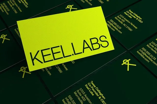
Thin geometric lettering forms an open, lightweight wordmark. Seaweed photography and repeated line structures carry the identity beyond the logo.
Useful for: Compare printed material and outdoor campaign variations.
# Branding reference: Keel Labs
Source: https://www.pentagram.com/work/keel-labs
Design credit: Pentagram
Swipefile reference: https://swipefile.design/ref/brand-keel-labs/
Reviewed: 2026-09-09. Selected designer-published case-study images, not current official brand guidelines or a reusable asset license.

## Objective
Develop an original visual identity for my brief. Study the relationships between logo, type, color, and applications in this reference. Do not reproduce the referenced logo, name, distinctive artwork, or proprietary assets.

## Design observations
- logo: Thin geometric lettering forms an open, lightweight wordmark.
- color: Acid yellow and deep green connect the system to its material imagery.
- typography: Technical-looking letters contrast with layered lists and large headlines.
- system: Seaweed photography and repeated line structures carry the identity beyond the logo.
- applications: Compare printed material and outdoor campaign variations.
- dont: Study the principles and develop an original identity. Do not copy these logos, proprietary typefaces, illustrations, or claims. These are selected images from a published case study; current brand guidelines, asset licenses, and real-world performance have not been verified.

## Deliverables and checks
- Begin with the audience, positioning, personality, and required applications in my brief. Label assumptions.
- Explain two or three distinct identity directions before selecting one. Connect each decision to the brand's purpose.
- Define an original logo concept, wordmark and symbol relationships, typographic hierarchy, palette roles, and a consistent graphic system.
- Show how the system works on the relevant touchpoints: packaging, stationery, signage, social, or digital products.
- Draft practical guidelines for clear space, minimum size, background contrast, one-color and reversed marks, type usage, and layout. Validate proposed measurements in the actual artwork.
- Use appropriately licensed fonts and original or licensed imagery. Supply editable vector artwork when the tools support it; distinguish a concept from finished production files.
- Check small-size legibility, color accessibility for text, visual consistency, and print versus screen requirements. State what was reviewed and what still needs testing.
Rounded bars and dots form a compact multicolored symbol. The symbol's component shapes expand into patterns while the app icon stays compact.
Useful for: Compare the primary logo, app icon, and outdoor pattern application.
# Branding reference: Slack
Source: https://www.pentagram.com/work/slack
Design credit: Pentagram
Swipefile reference: https://swipefile.design/ref/brand-slack/
Reviewed: 2026-09-09. Selected designer-published case-study images, not current official brand guidelines or a reusable asset license.

## Objective
Develop an original visual identity for my brief. Study the relationships between logo, type, color, and applications in this reference. Do not reproduce the referenced logo, name, distinctive artwork, or proprietary assets.

## Design observations
- logo: Rounded bars and dots form a compact multicolored symbol.
- color: Blue, green, yellow, and red sit against a deep purple field.
- typography: A bold lowercase wordmark balances the smaller geometric mark.
- system: The symbol's component shapes expand into patterns while the app icon stays compact.
- applications: Compare the primary logo, app icon, and outdoor pattern application.
- dont: Study the principles and develop an original identity. Do not copy these logos, proprietary typefaces, illustrations, or claims. These are selected images from a published case study; current brand guidelines, asset licenses, and real-world performance have not been verified.

## Deliverables and checks
- Begin with the audience, positioning, personality, and required applications in my brief. Label assumptions.
- Explain two or three distinct identity directions before selecting one. Connect each decision to the brand's purpose.
- Define an original logo concept, wordmark and symbol relationships, typographic hierarchy, palette roles, and a consistent graphic system.
- Show how the system works on the relevant touchpoints: packaging, stationery, signage, social, or digital products.
- Draft practical guidelines for clear space, minimum size, background contrast, one-color and reversed marks, type usage, and layout. Validate proposed measurements in the actual artwork.
- Use appropriately licensed fonts and original or licensed imagery. Supply editable vector artwork when the tools support it; distinguish a concept from finished production files.
- Check small-size legibility, color accessibility for text, visual consistency, and print versus screen requirements. State what was reviewed and what still needs testing.
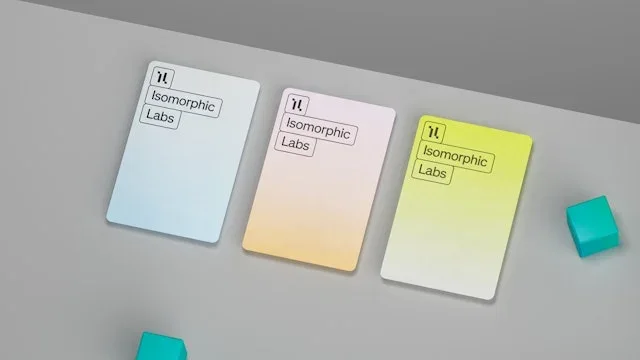
A compact framed letter motif anchors the document layouts. Scientific imagery and a shared grid connect print covers and digital screens.
Useful for: Study documents, research covers, and mobile brand compositions.
# Branding reference: Isomorphic Labs
Source: https://www.pentagram.com/work/isomorphic-labs
Design credit: Pentagram
Swipefile reference: https://swipefile.design/ref/brand-isomorphic-labs/
Reviewed: 2026-09-09. Selected designer-published case-study images, not current official brand guidelines or a reusable asset license.

## Objective
Develop an original visual identity for my brief. Study the relationships between logo, type, color, and applications in this reference. Do not reproduce the referenced logo, name, distinctive artwork, or proprietary assets.

## Design observations
- logo: A compact framed letter motif anchors the document layouts.
- color: Pale blue, pink, and yellow organize otherwise restrained compositions.
- typography: Small precise text contrasts with large research titles.
- system: Scientific imagery and a shared grid connect print covers and digital screens.
- applications: Study documents, research covers, and mobile brand compositions.
- dont: Study the principles and develop an original identity. Do not copy these logos, proprietary typefaces, illustrations, or claims. These are selected images from a published case study; current brand guidelines, asset licenses, and real-world performance have not been verified.

## Deliverables and checks
- Begin with the audience, positioning, personality, and required applications in my brief. Label assumptions.
- Explain two or three distinct identity directions before selecting one. Connect each decision to the brand's purpose.
- Define an original logo concept, wordmark and symbol relationships, typographic hierarchy, palette roles, and a consistent graphic system.
- Show how the system works on the relevant touchpoints: packaging, stationery, signage, social, or digital products.
- Draft practical guidelines for clear space, minimum size, background contrast, one-color and reversed marks, type usage, and layout. Validate proposed measurements in the actual artwork.
- Use appropriately licensed fonts and original or licensed imagery. Supply editable vector artwork when the tools support it; distinguish a concept from finished production files.
- Check small-size legibility, color accessibility for text, visual consistency, and print versus screen requirements. State what was reviewed and what still needs testing.
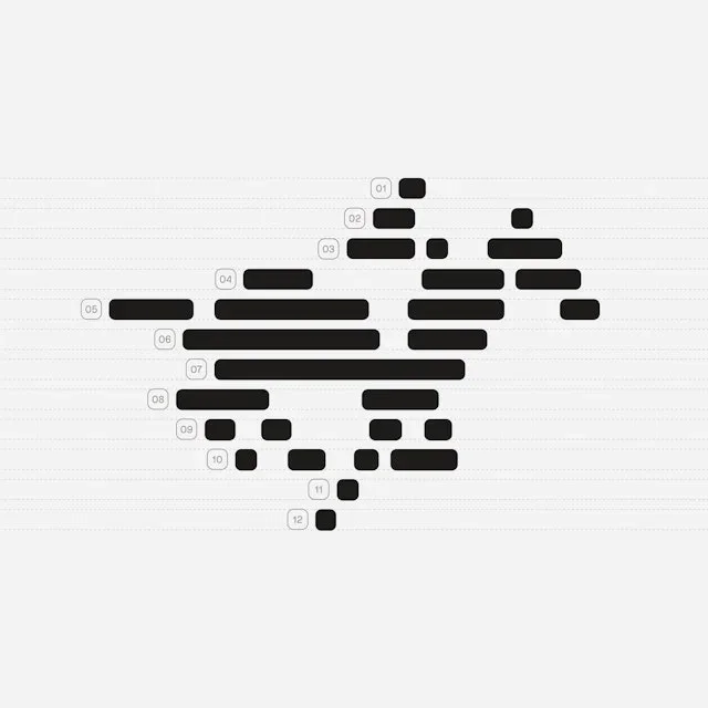
Stacked rounded bars form a compact graphic shape. Rounded containers repeat across the symbol and color presentation.
Useful for: Compare the symbol, palette, and typography construction sheet.
# Branding reference: TwelveLabs
Source: https://www.pentagram.com/work/twelvelabs
Design credit: Pentagram
Swipefile reference: https://swipefile.design/ref/brand-twelvelabs/
Reviewed: 2026-09-09. Selected designer-published case-study images, not current official brand guidelines or a reusable asset license.

## Objective
Develop an original visual identity for my brief. Study the relationships between logo, type, color, and applications in this reference. Do not reproduce the referenced logo, name, distinctive artwork, or proprietary assets.

## Design observations
- logo: Stacked rounded bars form a compact graphic shape.
- color: Bright green, yellow, peach, and pink extend a monochrome base.
- typography: Clear letter construction pairs with small technical labels.
- system: Rounded containers repeat across the symbol and color presentation.
- applications: Compare the symbol, palette, and typography construction sheet.
- dont: Study the principles and develop an original identity. Do not copy these logos, proprietary typefaces, illustrations, or claims. These are selected images from a published case study; current brand guidelines, asset licenses, and real-world performance have not been verified.

## Deliverables and checks
- Begin with the audience, positioning, personality, and required applications in my brief. Label assumptions.
- Explain two or three distinct identity directions before selecting one. Connect each decision to the brand's purpose.
- Define an original logo concept, wordmark and symbol relationships, typographic hierarchy, palette roles, and a consistent graphic system.
- Show how the system works on the relevant touchpoints: packaging, stationery, signage, social, or digital products.
- Draft practical guidelines for clear space, minimum size, background contrast, one-color and reversed marks, type usage, and layout. Validate proposed measurements in the actual artwork.
- Use appropriately licensed fonts and original or licensed imagery. Supply editable vector artwork when the tools support it; distinguish a concept from finished production files.
- Check small-size legibility, color accessibility for text, visual consistency, and print versus screen requirements. State what was reviewed and what still needs testing.
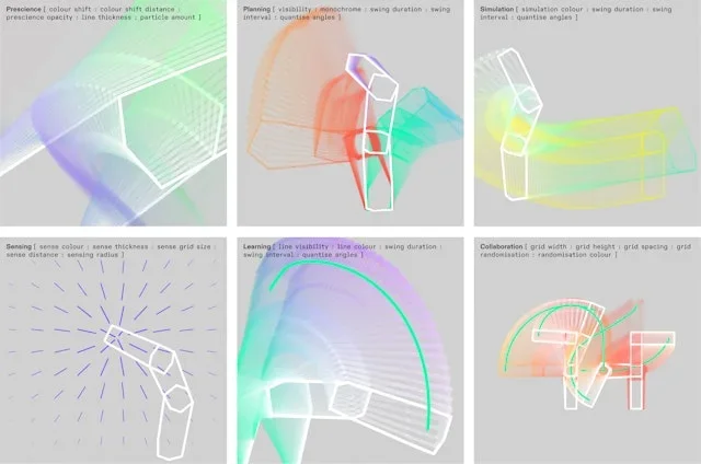
Translucent dimensional forms provide a recognizable visual motif. Fine lines and transparent volumes connect abstract graphics with a digital presence.
Useful for: Study the graphic family, a dimensional emblem, and social branding.
# Branding reference: Intrinsic
Source: https://www.pentagram.com/work/intrinsic
Design credit: Pentagram
Swipefile reference: https://swipefile.design/ref/brand-intrinsic/
Reviewed: 2026-09-09. Selected designer-published case-study images, not current official brand guidelines or a reusable asset license.

## Objective
Develop an original visual identity for my brief. Study the relationships between logo, type, color, and applications in this reference. Do not reproduce the referenced logo, name, distinctive artwork, or proprietary assets.

## Design observations
- logo: Translucent dimensional forms provide a recognizable visual motif.
- color: Mint, pink, purple, and warm gradients create luminous contrasts.
- typography: Compact sans-serif information leaves space for the graphic forms.
- system: Fine lines and transparent volumes connect abstract graphics with a digital presence.
- applications: Study the graphic family, a dimensional emblem, and social branding.
- dont: Study the principles and develop an original identity. Do not copy these logos, proprietary typefaces, illustrations, or claims. These are selected images from a published case study; current brand guidelines, asset licenses, and real-world performance have not been verified.

## Deliverables and checks
- Begin with the audience, positioning, personality, and required applications in my brief. Label assumptions.
- Explain two or three distinct identity directions before selecting one. Connect each decision to the brand's purpose.
- Define an original logo concept, wordmark and symbol relationships, typographic hierarchy, palette roles, and a consistent graphic system.
- Show how the system works on the relevant touchpoints: packaging, stationery, signage, social, or digital products.
- Draft practical guidelines for clear space, minimum size, background contrast, one-color and reversed marks, type usage, and layout. Validate proposed measurements in the actual artwork.
- Use appropriately licensed fonts and original or licensed imagery. Supply editable vector artwork when the tools support it; distinguish a concept from finished production files.
- Check small-size legibility, color accessibility for text, visual consistency, and print versus screen requirements. State what was reviewed and what still needs testing.
A tightly wound circular symbol sits beside a bold wordmark. The circular symbol remains identifiable when reduced to an app icon.
Useful for: Compare the logo lockup, icon scale, and type specimen from this published identity.
# Branding reference: Skiff
Source: https://www.pentagram.com/work/skiff
Design credit: Pentagram
Swipefile reference: https://swipefile.design/ref/brand-skiff/
Reviewed: 2026-09-09. Selected designer-published case-study images, not current official brand guidelines or a reusable asset license.

## Objective
Develop an original visual identity for my brief. Study the relationships between logo, type, color, and applications in this reference. Do not reproduce the referenced logo, name, distinctive artwork, or proprietary assets.

## Design observations
- logo: A tightly wound circular symbol sits beside a bold wordmark.
- color: Orange provides the main field for black logo elements.
- typography: A clear grotesk typeface supports the strong compact name.
- system: The circular symbol remains identifiable when reduced to an app icon.
- applications: Compare the logo lockup, icon scale, and type specimen from this published identity.
- dont: Study the principles and develop an original identity. Do not copy these logos, proprietary typefaces, illustrations, or claims. These are selected images from a published case study; current brand guidelines, asset licenses, and real-world performance have not been verified.

## Deliverables and checks
- Begin with the audience, positioning, personality, and required applications in my brief. Label assumptions.
- Explain two or three distinct identity directions before selecting one. Connect each decision to the brand's purpose.
- Define an original logo concept, wordmark and symbol relationships, typographic hierarchy, palette roles, and a consistent graphic system.
- Show how the system works on the relevant touchpoints: packaging, stationery, signage, social, or digital products.
- Draft practical guidelines for clear space, minimum size, background contrast, one-color and reversed marks, type usage, and layout. Validate proposed measurements in the actual artwork.
- Use appropriately licensed fonts and original or licensed imagery. Supply editable vector artwork when the tools support it; distinguish a concept from finished production files.
- Check small-size legibility, color accessibility for text, visual consistency, and print versus screen requirements. State what was reviewed and what still needs testing.

An open rounded lowercase wordmark gives the name a light structure. Color and oversized letter fragments extend the identity onto physical products.
Useful for: Study the wordmark and two wearable applications.
# Branding reference: Realme
Source: https://www.pentagram.com/work/realme
Design credit: Pentagram
Swipefile reference: https://swipefile.design/ref/brand-realme/
Reviewed: 2026-09-09. Selected designer-published case-study images, not current official brand guidelines or a reusable asset license.

## Objective
Develop an original visual identity for my brief. Study the relationships between logo, type, color, and applications in this reference. Do not reproduce the referenced logo, name, distinctive artwork, or proprietary assets.

## Design observations
- logo: An open rounded lowercase wordmark gives the name a light structure.
- color: Yellow and gray connect the logo with apparel and accessories.
- typography: Thin geometric lettering keeps the long name visually simple.
- system: Color and oversized letter fragments extend the identity onto physical products.
- applications: Study the wordmark and two wearable applications.
- dont: Study the principles and develop an original identity. Do not copy these logos, proprietary typefaces, illustrations, or claims. These are selected images from a published case study; current brand guidelines, asset licenses, and real-world performance have not been verified.

## Deliverables and checks
- Begin with the audience, positioning, personality, and required applications in my brief. Label assumptions.
- Explain two or three distinct identity directions before selecting one. Connect each decision to the brand's purpose.
- Define an original logo concept, wordmark and symbol relationships, typographic hierarchy, palette roles, and a consistent graphic system.
- Show how the system works on the relevant touchpoints: packaging, stationery, signage, social, or digital products.
- Draft practical guidelines for clear space, minimum size, background contrast, one-color and reversed marks, type usage, and layout. Validate proposed measurements in the actual artwork.
- Use appropriately licensed fonts and original or licensed imagery. Supply editable vector artwork when the tools support it; distinguish a concept from finished production files.
- Check small-size legibility, color accessibility for text, visual consistency, and print versus screen requirements. State what was reviewed and what still needs testing.

A small looped symbol accompanies a straightforward wordmark. Ribbon forms introduce depth while the compact logo anchors compositions.
Useful for: Compare the flat logo, a complete composition, and a graphic detail.
# Branding reference: Tractable
Source: https://www.pentagram.com/work/tractable
Design credit: Pentagram
Swipefile reference: https://swipefile.design/ref/brand-tractable/
Reviewed: 2026-09-09. Selected designer-published case-study images, not current official brand guidelines or a reusable asset license.

## Objective
Develop an original visual identity for my brief. Study the relationships between logo, type, color, and applications in this reference. Do not reproduce the referenced logo, name, distinctive artwork, or proprietary assets.

## Design observations
- logo: A small looped symbol accompanies a straightforward wordmark.
- color: Violet and dark teal support multicolored luminous ribbons.
- typography: Clean sans-serif text keeps the abstract graphics readable.
- system: Ribbon forms introduce depth while the compact logo anchors compositions.
- applications: Compare the flat logo, a complete composition, and a graphic detail.
- dont: Study the principles and develop an original identity. Do not copy these logos, proprietary typefaces, illustrations, or claims. These are selected images from a published case study; current brand guidelines, asset licenses, and real-world performance have not been verified.

## Deliverables and checks
- Begin with the audience, positioning, personality, and required applications in my brief. Label assumptions.
- Explain two or three distinct identity directions before selecting one. Connect each decision to the brand's purpose.
- Define an original logo concept, wordmark and symbol relationships, typographic hierarchy, palette roles, and a consistent graphic system.
- Show how the system works on the relevant touchpoints: packaging, stationery, signage, social, or digital products.
- Draft practical guidelines for clear space, minimum size, background contrast, one-color and reversed marks, type usage, and layout. Validate proposed measurements in the actual artwork.
- Use appropriately licensed fonts and original or licensed imagery. Supply editable vector artwork when the tools support it; distinguish a concept from finished production files.
- Check small-size legibility, color accessibility for text, visual consistency, and print versus screen requirements. State what was reviewed and what still needs testing.
Concentric circular lines form a bright compact symbol. The circular shape expands into large arcs for campaign and merchandise layouts.
Useful for: Study signage, apparel, and an outdoor brand message.
# Branding reference: EDP
Source: https://www.pentagram.com/work/edp
Design credit: Pentagram
Swipefile reference: https://swipefile.design/ref/brand-edp/
Reviewed: 2026-09-09. Selected designer-published case-study images, not current official brand guidelines or a reusable asset license.

## Objective
Develop an original visual identity for my brief. Study the relationships between logo, type, color, and applications in this reference. Do not reproduce the referenced logo, name, distinctive artwork, or proprietary assets.

## Design observations
- logo: Concentric circular lines form a bright compact symbol.
- color: Electric green, violet, and cyan stand out against dark backgrounds.
- typography: A rounded lowercase name echoes the symbol's soft geometry.
- system: The circular shape expands into large arcs for campaign and merchandise layouts.
- applications: Study signage, apparel, and an outdoor brand message.
- dont: Study the principles and develop an original identity. Do not copy these logos, proprietary typefaces, illustrations, or claims. These are selected images from a published case study; current brand guidelines, asset licenses, and real-world performance have not been verified.

## Deliverables and checks
- Begin with the audience, positioning, personality, and required applications in my brief. Label assumptions.
- Explain two or three distinct identity directions before selecting one. Connect each decision to the brand's purpose.
- Define an original logo concept, wordmark and symbol relationships, typographic hierarchy, palette roles, and a consistent graphic system.
- Show how the system works on the relevant touchpoints: packaging, stationery, signage, social, or digital products.
- Draft practical guidelines for clear space, minimum size, background contrast, one-color and reversed marks, type usage, and layout. Validate proposed measurements in the actual artwork.
- Use appropriately licensed fonts and original or licensed imagery. Supply editable vector artwork when the tools support it; distinguish a concept from finished production files.
- Check small-size legibility, color accessibility for text, visual consistency, and print versus screen requirements. State what was reviewed and what still needs testing.
Food-like letter details bring personality to a stacked wordmark. Colored letter shapes expand into badges and broad illustrated bands.
Useful for: Compare the identity, color variations, and apparel applications.
# Branding reference: Kids Eat in Color
Source: https://www.pentagram.com/work/kids-eat-in-color
Design credit: Pentagram
Swipefile reference: https://swipefile.design/ref/brand-kids-eat-in-color/
Reviewed: 2026-09-09. Selected designer-published case-study images, not current official brand guidelines or a reusable asset license.

## Objective
Develop an original visual identity for my brief. Study the relationships between logo, type, color, and applications in this reference. Do not reproduce the referenced logo, name, distinctive artwork, or proprietary assets.

## Design observations
- logo: Food-like letter details bring personality to a stacked wordmark.
- color: Green, orange, purple, and yellow connect the identity to varied foods.
- typography: Heavy friendly letters retain a clear readable structure.
- system: Colored letter shapes expand into badges and broad illustrated bands.
- applications: Compare the identity, color variations, and apparel applications.
- dont: Study the principles and develop an original identity. Do not copy these logos, proprietary typefaces, illustrations, or claims. These are selected images from a published case study; current brand guidelines, asset licenses, and real-world performance have not been verified.

## Deliverables and checks
- Begin with the audience, positioning, personality, and required applications in my brief. Label assumptions.
- Explain two or three distinct identity directions before selecting one. Connect each decision to the brand's purpose.
- Define an original logo concept, wordmark and symbol relationships, typographic hierarchy, palette roles, and a consistent graphic system.
- Show how the system works on the relevant touchpoints: packaging, stationery, signage, social, or digital products.
- Draft practical guidelines for clear space, minimum size, background contrast, one-color and reversed marks, type usage, and layout. Validate proposed measurements in the actual artwork.
- Use appropriately licensed fonts and original or licensed imagery. Supply editable vector artwork when the tools support it; distinguish a concept from finished production files.
- Check small-size legibility, color accessibility for text, visual consistency, and print versus screen requirements. State what was reviewed and what still needs testing.
Tall expressive letters turn the name into an active composition. Elastic typography carries across architecture, banners, and season announcements.
Useful for: Study a physical wordmark and two campaign applications.
# Branding reference: San Francisco Symphony
Source: https://www.wearecollins.com/case-studies/san-francisco-symphony
Design credit: COLLINS
Swipefile reference: https://swipefile.design/ref/brand-san-francisco-symphony/
Reviewed: 2026-09-09. Selected designer-published case-study images, not current official brand guidelines or a reusable asset license.

## Objective
Develop an original visual identity for my brief. Study the relationships between logo, type, color, and applications in this reference. Do not reproduce the referenced logo, name, distinctive artwork, or proprietary assets.

## Design observations
- logo: Tall expressive letters turn the name into an active composition.
- color: Black and cream maintain a strong typographic focus.
- typography: Dramatically changing letter widths create rhythm within the name.
- system: Elastic typography carries across architecture, banners, and season announcements.
- applications: Study a physical wordmark and two campaign applications.
- dont: Study the principles and develop an original identity. Do not copy these logos, proprietary typefaces, illustrations, or claims. These are selected images from a published case study; current brand guidelines, asset licenses, and real-world performance have not been verified.

## Deliverables and checks
- Begin with the audience, positioning, personality, and required applications in my brief. Label assumptions.
- Explain two or three distinct identity directions before selecting one. Connect each decision to the brand's purpose.
- Define an original logo concept, wordmark and symbol relationships, typographic hierarchy, palette roles, and a consistent graphic system.
- Show how the system works on the relevant touchpoints: packaging, stationery, signage, social, or digital products.
- Draft practical guidelines for clear space, minimum size, background contrast, one-color and reversed marks, type usage, and layout. Validate proposed measurements in the actual artwork.
- Use appropriately licensed fonts and original or licensed imagery. Supply editable vector artwork when the tools support it; distinguish a concept from finished production files.
- Check small-size legibility, color accessibility for text, visual consistency, and print versus screen requirements. State what was reviewed and what still needs testing.
The compact circular symbol stays recognizable across varied compositions. Flexible color and image treatments retain consistent logo placement and scale.
Useful for: Compare the identity grid, outdoor artist campaign, and mobile presentation.
# Branding reference: Spotify
Source: https://www.wearecollins.com/case-studies/spotify
Design credit: COLLINS
Swipefile reference: https://swipefile.design/ref/brand-spotify/
Reviewed: 2026-09-09. Selected designer-published case-study images, not current official brand guidelines or a reusable asset license.

## Objective
Develop an original visual identity for my brief. Study the relationships between logo, type, color, and applications in this reference. Do not reproduce the referenced logo, name, distinctive artwork, or proprietary assets.

## Design observations
- logo: The compact circular symbol stays recognizable across varied compositions.
- color: Highly contrasting saturated pairings energize artist-led imagery.
- typography: Bold direct headlines establish a clear campaign hierarchy.
- system: Flexible color and image treatments retain consistent logo placement and scale.
- applications: Compare the identity grid, outdoor artist campaign, and mobile presentation.
- dont: Study the principles and develop an original identity. Do not copy these logos, proprietary typefaces, illustrations, or claims. These are selected images from a published case study; current brand guidelines, asset licenses, and real-world performance have not been verified.

## Deliverables and checks
- Begin with the audience, positioning, personality, and required applications in my brief. Label assumptions.
- Explain two or three distinct identity directions before selecting one. Connect each decision to the brand's purpose.
- Define an original logo concept, wordmark and symbol relationships, typographic hierarchy, palette roles, and a consistent graphic system.
- Show how the system works on the relevant touchpoints: packaging, stationery, signage, social, or digital products.
- Draft practical guidelines for clear space, minimum size, background contrast, one-color and reversed marks, type usage, and layout. Validate proposed measurements in the actual artwork.
- Use appropriately licensed fonts and original or licensed imagery. Supply editable vector artwork when the tools support it; distinguish a concept from finished production files.
- Check small-size legibility, color accessibility for text, visual consistency, and print versus screen requirements. State what was reviewed and what still needs testing.

A black illustrated chimp creates an immediately recognizable focal point. A consistent hand-drawn voice connects the mascot with broader campaign imagery.
Useful for: Study the mascot at two scales and its relationship to editorial illustration.
# Branding reference: Mailchimp
Source: https://www.wearecollins.com/case-studies/mailchimp
Design credit: COLLINS
Swipefile reference: https://swipefile.design/ref/brand-mailchimp/
Reviewed: 2026-09-09. Selected designer-published case-study images, not current official brand guidelines or a reusable asset license.

## Objective
Develop an original visual identity for my brief. Study the relationships between logo, type, color, and applications in this reference. Do not reproduce the referenced logo, name, distinctive artwork, or proprietary assets.

## Design observations
- logo: A black illustrated chimp creates an immediately recognizable focal point.
- color: Strong yellow and black are balanced by white editorial space.
- typography: Serif headlines contrast with loose ink-like illustrations.
- system: A consistent hand-drawn voice connects the mascot with broader campaign imagery.
- applications: Study the mascot at two scales and its relationship to editorial illustration.
- dont: Study the principles and develop an original identity. Do not copy these logos, proprietary typefaces, illustrations, or claims. These are selected images from a published case study; current brand guidelines, asset licenses, and real-world performance have not been verified.

## Deliverables and checks
- Begin with the audience, positioning, personality, and required applications in my brief. Label assumptions.
- Explain two or three distinct identity directions before selecting one. Connect each decision to the brand's purpose.
- Define an original logo concept, wordmark and symbol relationships, typographic hierarchy, palette roles, and a consistent graphic system.
- Show how the system works on the relevant touchpoints: packaging, stationery, signage, social, or digital products.
- Draft practical guidelines for clear space, minimum size, background contrast, one-color and reversed marks, type usage, and layout. Validate proposed measurements in the actual artwork.
- Use appropriately licensed fonts and original or licensed imagery. Supply editable vector artwork when the tools support it; distinguish a concept from finished production files.
- Check small-size legibility, color accessibility for text, visual consistency, and print versus screen requirements. State what was reviewed and what still needs testing.
A geometric open-box symbol accompanies a direct wordmark. The identity provides structure for different artwork and color combinations.
Useful for: Compare the logo, a physical creative environment, and a published color spread.
# Branding reference: Dropbox
Source: https://www.wearecollins.com/case-studies/dropbox
Design credit: COLLINS
Swipefile reference: https://swipefile.design/ref/brand-dropbox/
Reviewed: 2026-09-09. Selected designer-published case-study images, not current official brand guidelines or a reusable asset license.

## Objective
Develop an original visual identity for my brief. Study the relationships between logo, type, color, and applications in this reference. Do not reproduce the referenced logo, name, distinctive artwork, or proprietary assets.

## Design observations
- logo: A geometric open-box symbol accompanies a direct wordmark.
- color: Blue provides a familiar anchor within a much broader color family.
- typography: A sturdy sans-serif name contrasts with varied expressive creative work.
- system: The identity provides structure for different artwork and color combinations.
- applications: Compare the logo, a physical creative environment, and a published color spread.
- dont: Study the principles and develop an original identity. Do not copy these logos, proprietary typefaces, illustrations, or claims. These are selected images from a published case study; current brand guidelines, asset licenses, and real-world performance have not been verified.

## Deliverables and checks
- Begin with the audience, positioning, personality, and required applications in my brief. Label assumptions.
- Explain two or three distinct identity directions before selecting one. Connect each decision to the brand's purpose.
- Define an original logo concept, wordmark and symbol relationships, typographic hierarchy, palette roles, and a consistent graphic system.
- Show how the system works on the relevant touchpoints: packaging, stationery, signage, social, or digital products.
- Draft practical guidelines for clear space, minimum size, background contrast, one-color and reversed marks, type usage, and layout. Validate proposed measurements in the actual artwork.
- Use appropriately licensed fonts and original or licensed imagery. Supply editable vector artwork when the tools support it; distinguish a concept from finished production files.
- Check small-size legibility, color accessibility for text, visual consistency, and print versus screen requirements. State what was reviewed and what still needs testing.
An angular outlined wordmark gains depth through colored extrusion. Consistent cards connect creator portraits, icons, and community expression.
Useful for: Study logo variations, typography, and a modular card family.
# Branding reference: Twitch
Source: https://www.wearecollins.com/case-studies/twitch
Design credit: COLLINS
Swipefile reference: https://swipefile.design/ref/brand-twitch/
Reviewed: 2026-09-09. Selected designer-published case-study images, not current official brand guidelines or a reusable asset license.

## Objective
Develop an original visual identity for my brief. Study the relationships between logo, type, color, and applications in this reference. Do not reproduce the referenced logo, name, distinctive artwork, or proprietary assets.

## Design observations
- logo: An angular outlined wordmark gains depth through colored extrusion.
- color: Violet leads a broader set of bright accent colors.
- typography: Large clear sans-serif typography balances the block-like logo.
- system: Consistent cards connect creator portraits, icons, and community expression.
- applications: Study logo variations, typography, and a modular card family.
- dont: Study the principles and develop an original identity. Do not copy these logos, proprietary typefaces, illustrations, or claims. These are selected images from a published case study; current brand guidelines, asset licenses, and real-world performance have not been verified.

## Deliverables and checks
- Begin with the audience, positioning, personality, and required applications in my brief. Label assumptions.
- Explain two or three distinct identity directions before selecting one. Connect each decision to the brand's purpose.
- Define an original logo concept, wordmark and symbol relationships, typographic hierarchy, palette roles, and a consistent graphic system.
- Show how the system works on the relevant touchpoints: packaging, stationery, signage, social, or digital products.
- Draft practical guidelines for clear space, minimum size, background contrast, one-color and reversed marks, type usage, and layout. Validate proposed measurements in the actual artwork.
- Use appropriately licensed fonts and original or licensed imagery. Supply editable vector artwork when the tools support it; distinguish a concept from finished production files.
- Check small-size legibility, color accessibility for text, visual consistency, and print versus screen requirements. State what was reviewed and what still needs testing.
This selection emphasizes the wider visual system around the brand name. Circular fields and agricultural photography connect ingredients with communication.
Useful for: Compare an ingredient message, a printed piece, and an outdoor scene treatment.
# Branding reference: Sweetgreen
Source: https://www.wearecollins.com/case-studies/sweetgreen
Design credit: COLLINS
Swipefile reference: https://swipefile.design/ref/brand-sweetgreen/
Reviewed: 2026-09-09. Selected designer-published case-study images, not current official brand guidelines or a reusable asset license.

## Objective
Develop an original visual identity for my brief. Study the relationships between logo, type, color, and applications in this reference. Do not reproduce the referenced logo, name, distinctive artwork, or proprietary assets.

## Design observations
- logo: This selection emphasizes the wider visual system around the brand name.
- color: Muted greens contrast with a sharp yellow-green accent.
- typography: Fine serif headlines mix with restrained supporting information.
- system: Circular fields and agricultural photography connect ingredients with communication.
- applications: Compare an ingredient message, a printed piece, and an outdoor scene treatment.
- dont: Study the principles and develop an original identity. Do not copy these logos, proprietary typefaces, illustrations, or claims. These are selected images from a published case study; current brand guidelines, asset licenses, and real-world performance have not been verified.

## Deliverables and checks
- Begin with the audience, positioning, personality, and required applications in my brief. Label assumptions.
- Explain two or three distinct identity directions before selecting one. Connect each decision to the brand's purpose.
- Define an original logo concept, wordmark and symbol relationships, typographic hierarchy, palette roles, and a consistent graphic system.
- Show how the system works on the relevant touchpoints: packaging, stationery, signage, social, or digital products.
- Draft practical guidelines for clear space, minimum size, background contrast, one-color and reversed marks, type usage, and layout. Validate proposed measurements in the actual artwork.
- Use appropriately licensed fonts and original or licensed imagery. Supply editable vector artwork when the tools support it; distinguish a concept from finished production files.
- Check small-size legibility, color accessibility for text, visual consistency, and print versus screen requirements. State what was reviewed and what still needs testing.
The slanted wordmark is tied into compositions by thin horizontal lines. A consistent line and logo treatment connects varied human and product imagery.
Useful for: Study three campaign treatments around the established wordmark.
# Branding reference: Bose
Source: https://www.wearecollins.com/case-studies/bose
Design credit: COLLINS
Swipefile reference: https://swipefile.design/ref/brand-bose/
Reviewed: 2026-09-09. Selected designer-published case-study images, not current official brand guidelines or a reusable asset license.

## Objective
Develop an original visual identity for my brief. Study the relationships between logo, type, color, and applications in this reference. Do not reproduce the referenced logo, name, distinctive artwork, or proprietary assets.

## Design observations
- logo: The slanted wordmark is tied into compositions by thin horizontal lines.
- color: Red, lime, and blue create vivid photographic environments.
- typography: Compact supporting text lets the wordmark and photography lead.
- system: A consistent line and logo treatment connects varied human and product imagery.
- applications: Study three campaign treatments around the established wordmark.
- dont: Study the principles and develop an original identity. Do not copy these logos, proprietary typefaces, illustrations, or claims. These are selected images from a published case study; current brand guidelines, asset licenses, and real-world performance have not been verified.

## Deliverables and checks
- Begin with the audience, positioning, personality, and required applications in my brief. Label assumptions.
- Explain two or three distinct identity directions before selecting one. Connect each decision to the brand's purpose.
- Define an original logo concept, wordmark and symbol relationships, typographic hierarchy, palette roles, and a consistent graphic system.
- Show how the system works on the relevant touchpoints: packaging, stationery, signage, social, or digital products.
- Draft practical guidelines for clear space, minimum size, background contrast, one-color and reversed marks, type usage, and layout. Validate proposed measurements in the actual artwork.
- Use appropriately licensed fonts and original or licensed imagery. Supply editable vector artwork when the tools support it; distinguish a concept from finished production files.
- Check small-size legibility, color accessibility for text, visual consistency, and print versus screen requirements. State what was reviewed and what still needs testing.
A small feather-like symbol accompanies the simple wordmark. Illustrated environments provide a narrative system that continues onto mobile screens.
Useful for: Compare the logo, an expansive illustration, and its digital application.
# Branding reference: Robinhood
Source: https://www.wearecollins.com/case-studies/robinhood
Design credit: COLLINS
Swipefile reference: https://swipefile.design/ref/brand-robinhood/
Reviewed: 2026-09-09. Selected designer-published case-study images, not current official brand guidelines or a reusable asset license.

## Objective
Develop an original visual identity for my brief. Study the relationships between logo, type, color, and applications in this reference. Do not reproduce the referenced logo, name, distinctive artwork, or proprietary assets.

## Design observations
- logo: A small feather-like symbol accompanies the simple wordmark.
- color: Bright green anchors a wider illustrative palette.
- typography: Quiet brand lettering allows detailed scenes to carry the story.
- system: Illustrated environments provide a narrative system that continues onto mobile screens.
- applications: Compare the logo, an expansive illustration, and its digital application.
- dont: Study the principles and develop an original identity. Do not copy these logos, proprietary typefaces, illustrations, or claims. These are selected images from a published case study; current brand guidelines, asset licenses, and real-world performance have not been verified.

## Deliverables and checks
- Begin with the audience, positioning, personality, and required applications in my brief. Label assumptions.
- Explain two or three distinct identity directions before selecting one. Connect each decision to the brand's purpose.
- Define an original logo concept, wordmark and symbol relationships, typographic hierarchy, palette roles, and a consistent graphic system.
- Show how the system works on the relevant touchpoints: packaging, stationery, signage, social, or digital products.
- Draft practical guidelines for clear space, minimum size, background contrast, one-color and reversed marks, type usage, and layout. Validate proposed measurements in the actual artwork.
- Use appropriately licensed fonts and original or licensed imagery. Supply editable vector artwork when the tools support it; distinguish a concept from finished production files.
- Check small-size legibility, color accessibility for text, visual consistency, and print versus screen requirements. State what was reviewed and what still needs testing.
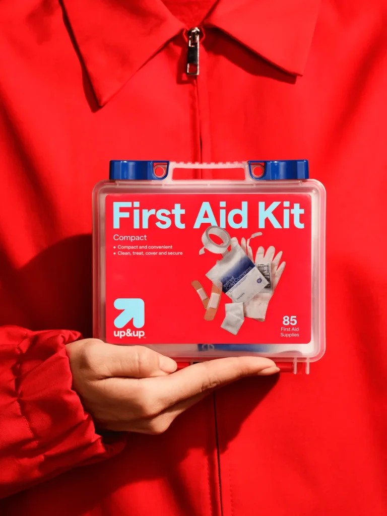
A small upward arrow provides a recurring identifier across products. Shared label hierarchy keeps many package formats visibly related.
Useful for: Compare two packaging categories and the wider product range.
# Branding reference: Target: up&up
Source: https://www.wearecollins.com/case-studies/up-and-up
Design credit: COLLINS
Swipefile reference: https://swipefile.design/ref/brand-up-and-up/
Reviewed: 2026-09-09. Selected designer-published case-study images, not current official brand guidelines or a reusable asset license.

## Objective
Develop an original visual identity for my brief. Study the relationships between logo, type, color, and applications in this reference. Do not reproduce the referenced logo, name, distinctive artwork, or proprietary assets.

## Design observations
- logo: A small upward arrow provides a recurring identifier across products.
- color: Strong color combinations distinguish everyday product categories.
- typography: Large product names take priority over the smaller brand symbol.
- system: Shared label hierarchy keeps many package formats visibly related.
- applications: Compare two packaging categories and the wider product range.
- dont: Study the principles and develop an original identity. Do not copy these logos, proprietary typefaces, illustrations, or claims. These are selected images from a published case study; current brand guidelines, asset licenses, and real-world performance have not been verified.

## Deliverables and checks
- Begin with the audience, positioning, personality, and required applications in my brief. Label assumptions.
- Explain two or three distinct identity directions before selecting one. Connect each decision to the brand's purpose.
- Define an original logo concept, wordmark and symbol relationships, typographic hierarchy, palette roles, and a consistent graphic system.
- Show how the system works on the relevant touchpoints: packaging, stationery, signage, social, or digital products.
- Draft practical guidelines for clear space, minimum size, background contrast, one-color and reversed marks, type usage, and layout. Validate proposed measurements in the actual artwork.
- Use appropriately licensed fonts and original or licensed imagery. Supply editable vector artwork when the tools support it; distinguish a concept from finished production files.
- Check small-size legibility, color accessibility for text, visual consistency, and print versus screen requirements. State what was reviewed and what still needs testing.
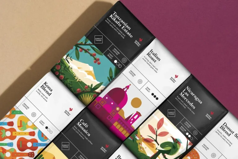
A small brand signature leaves room for illustrated ingredient and place stories. A common package structure accommodates varied illustrations across the range.
Useful for: Study coffee packages individually and as a coordinated family.
# Branding reference: Target: Archer Farms
Source: https://www.wearecollins.com/case-studies/target-archer-farms
Design credit: COLLINS
Swipefile reference: https://swipefile.design/ref/brand-target-archer-farms/
Reviewed: 2026-09-09. Selected designer-published case-study images, not current official brand guidelines or a reusable asset license.

## Objective
Develop an original visual identity for my brief. Study the relationships between logo, type, color, and applications in this reference. Do not reproduce the referenced logo, name, distinctive artwork, or proprietary assets.

## Design observations
- logo: A small brand signature leaves room for illustrated ingredient and place stories.
- color: Dark information panels contrast with colorful illustrations.
- typography: Clear product descriptors and supporting symbols organize practical details.
- system: A common package structure accommodates varied illustrations across the range.
- applications: Study coffee packages individually and as a coordinated family.
- dont: Study the principles and develop an original identity. Do not copy these logos, proprietary typefaces, illustrations, or claims. These are selected images from a published case study; current brand guidelines, asset licenses, and real-world performance have not been verified.

## Deliverables and checks
- Begin with the audience, positioning, personality, and required applications in my brief. Label assumptions.
- Explain two or three distinct identity directions before selecting one. Connect each decision to the brand's purpose.
- Define an original logo concept, wordmark and symbol relationships, typographic hierarchy, palette roles, and a consistent graphic system.
- Show how the system works on the relevant touchpoints: packaging, stationery, signage, social, or digital products.
- Draft practical guidelines for clear space, minimum size, background contrast, one-color and reversed marks, type usage, and layout. Validate proposed measurements in the actual artwork.
- Use appropriately licensed fonts and original or licensed imagery. Supply editable vector artwork when the tools support it; distinguish a concept from finished production files.
- Check small-size legibility, color accessibility for text, visual consistency, and print versus screen requirements. State what was reviewed and what still needs testing.
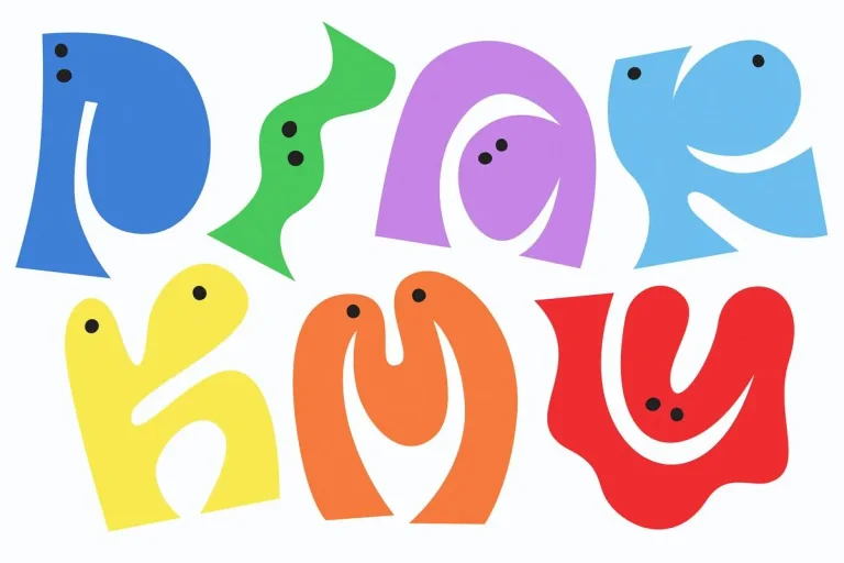
Playful letter-like characters make typography behave like illustration. Expressive shapes connect brand graphics, fabric patterns, and small accessories.
Useful for: Compare the graphic family, patterned clothing, and a compact pin.
# Branding reference: Primary
Source: https://www.wearecollins.com/case-studies/primary
Design credit: COLLINS
Swipefile reference: https://swipefile.design/ref/brand-primary/
Reviewed: 2026-09-09. Selected designer-published case-study images, not current official brand guidelines or a reusable asset license.

## Objective
Develop an original visual identity for my brief. Study the relationships between logo, type, color, and applications in this reference. Do not reproduce the referenced logo, name, distinctive artwork, or proprietary assets.

## Design observations
- logo: Playful letter-like characters make typography behave like illustration.
- color: A broad bright palette supports combinations across clothing.
- typography: Soft irregular forms introduce personality without a rigid single arrangement.
- system: Expressive shapes connect brand graphics, fabric patterns, and small accessories.
- applications: Compare the graphic family, patterned clothing, and a compact pin.
- dont: Study the principles and develop an original identity. Do not copy these logos, proprietary typefaces, illustrations, or claims. These are selected images from a published case study; current brand guidelines, asset licenses, and real-world performance have not been verified.

## Deliverables and checks
- Begin with the audience, positioning, personality, and required applications in my brief. Label assumptions.
- Explain two or three distinct identity directions before selecting one. Connect each decision to the brand's purpose.
- Define an original logo concept, wordmark and symbol relationships, typographic hierarchy, palette roles, and a consistent graphic system.
- Show how the system works on the relevant touchpoints: packaging, stationery, signage, social, or digital products.
- Draft practical guidelines for clear space, minimum size, background contrast, one-color and reversed marks, type usage, and layout. Validate proposed measurements in the actual artwork.
- Use appropriately licensed fonts and original or licensed imagery. Supply editable vector artwork when the tools support it; distinguish a concept from finished production files.
- Check small-size legibility, color accessibility for text, visual consistency, and print versus screen requirements. State what was reviewed and what still needs testing.
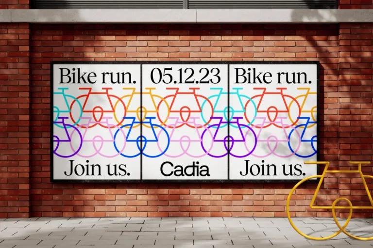
Fine continuous line shapes create a quiet identifying vocabulary. Simple line illustrations and generous margins connect posters and publications.
Useful for: Study the poster campaign, printed cover, and an interior spread.
# Branding reference: Cadia
Source: https://www.wearecollins.com/case-studies/cadia
Design credit: COLLINS
Swipefile reference: https://swipefile.design/ref/brand-cadia/
Reviewed: 2026-09-09. Selected designer-published case-study images, not current official brand guidelines or a reusable asset license.

## Objective
Develop an original visual identity for my brief. Study the relationships between logo, type, color, and applications in this reference. Do not reproduce the referenced logo, name, distinctive artwork, or proprietary assets.

## Design observations
- logo: Fine continuous line shapes create a quiet identifying vocabulary.
- color: Green and yellow contrast with warm neutral paper.
- typography: Elegant serif headlines give everyday messages an editorial quality.
- system: Simple line illustrations and generous margins connect posters and publications.
- applications: Study the poster campaign, printed cover, and an interior spread.
- dont: Study the principles and develop an original identity. Do not copy these logos, proprietary typefaces, illustrations, or claims. These are selected images from a published case study; current brand guidelines, asset licenses, and real-world performance have not been verified.

## Deliverables and checks
- Begin with the audience, positioning, personality, and required applications in my brief. Label assumptions.
- Explain two or three distinct identity directions before selecting one. Connect each decision to the brand's purpose.
- Define an original logo concept, wordmark and symbol relationships, typographic hierarchy, palette roles, and a consistent graphic system.
- Show how the system works on the relevant touchpoints: packaging, stationery, signage, social, or digital products.
- Draft practical guidelines for clear space, minimum size, background contrast, one-color and reversed marks, type usage, and layout. Validate proposed measurements in the actual artwork.
- Use appropriately licensed fonts and original or licensed imagery. Supply editable vector artwork when the tools support it; distinguish a concept from finished production files.
- Check small-size legibility, color accessibility for text, visual consistency, and print versus screen requirements. State what was reviewed and what still needs testing.
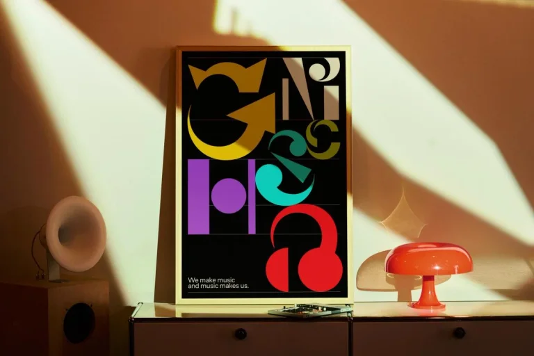
Interlocking expressive letterforms become the main identifying imagery. The system places playful typography in music-making environments.
Useful for: Compare the two available static publisher images: a poster and a printed music piece.
# Branding reference: Muse Group
Source: https://www.wearecollins.com/case-studies/musegroup
Design credit: COLLINS
Swipefile reference: https://swipefile.design/ref/brand-musegroup/
Reviewed: 2026-09-09. Selected designer-published case-study images, not current official brand guidelines or a reusable asset license.

## Objective
Develop an original visual identity for my brief. Study the relationships between logo, type, color, and applications in this reference. Do not reproduce the referenced logo, name, distinctive artwork, or proprietary assets.

## Design observations
- logo: Interlocking expressive letterforms become the main identifying imagery.
- color: Bright yellow, purple, green, and red stand out on dark compositions.
- typography: Large irregular display letters behave as graphic shapes.
- system: The system places playful typography in music-making environments.
- applications: Compare the two available static publisher images: a poster and a printed music piece.
- dont: Study the principles and develop an original identity. Do not copy these logos, proprietary typefaces, illustrations, or claims. These are selected images from a published case study; current brand guidelines, asset licenses, and real-world performance have not been verified.

## Deliverables and checks
- Begin with the audience, positioning, personality, and required applications in my brief. Label assumptions.
- Explain two or three distinct identity directions before selecting one. Connect each decision to the brand's purpose.
- Define an original logo concept, wordmark and symbol relationships, typographic hierarchy, palette roles, and a consistent graphic system.
- Show how the system works on the relevant touchpoints: packaging, stationery, signage, social, or digital products.
- Draft practical guidelines for clear space, minimum size, background contrast, one-color and reversed marks, type usage, and layout. Validate proposed measurements in the actual artwork.
- Use appropriately licensed fonts and original or licensed imagery. Supply editable vector artwork when the tools support it; distinguish a concept from finished production files.
- Check small-size legibility, color accessibility for text, visual consistency, and print versus screen requirements. State what was reviewed and what still needs testing.
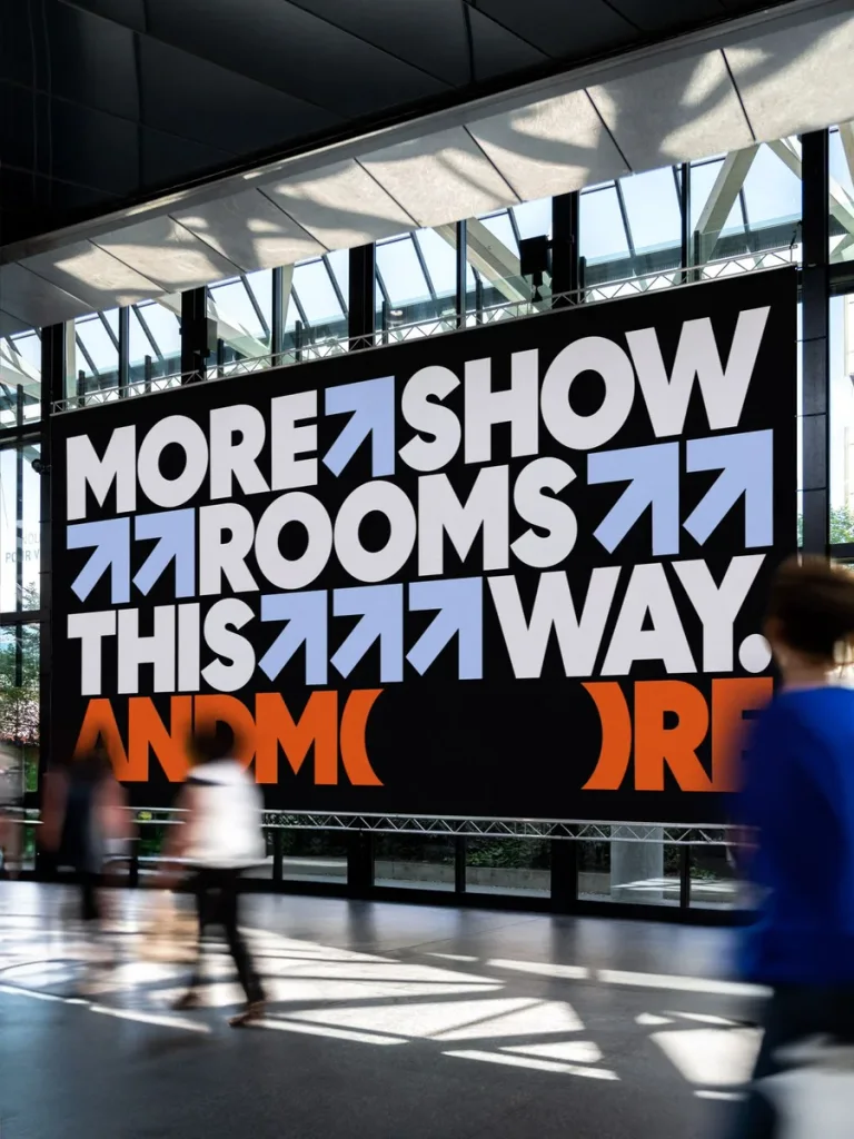
Heavy letters with curved cutouts create a distinctive long wordmark. The same letterforms work as names, oversized patterns, and wayfinding.
Useful for: Study entrance directions, an environmental logo, and registration graphics.
# Branding reference: Andmore
Source: https://www.wearecollins.com/case-studies/andmore
Design credit: COLLINS
Swipefile reference: https://swipefile.design/ref/brand-andmore/
Reviewed: 2026-09-09. Selected designer-published case-study images, not current official brand guidelines or a reusable asset license.

## Objective
Develop an original visual identity for my brief. Study the relationships between logo, type, color, and applications in this reference. Do not reproduce the referenced logo, name, distinctive artwork, or proprietary assets.

## Design observations
- logo: Heavy letters with curved cutouts create a distinctive long wordmark.
- color: Orange, dark blue, green, and pink define different physical settings.
- typography: Large dense lettering supports direct environmental messages.
- system: The same letterforms work as names, oversized patterns, and wayfinding.
- applications: Study entrance directions, an environmental logo, and registration graphics.
- dont: Study the principles and develop an original identity. Do not copy these logos, proprietary typefaces, illustrations, or claims. These are selected images from a published case study; current brand guidelines, asset licenses, and real-world performance have not been verified.

## Deliverables and checks
- Begin with the audience, positioning, personality, and required applications in my brief. Label assumptions.
- Explain two or three distinct identity directions before selecting one. Connect each decision to the brand's purpose.
- Define an original logo concept, wordmark and symbol relationships, typographic hierarchy, palette roles, and a consistent graphic system.
- Show how the system works on the relevant touchpoints: packaging, stationery, signage, social, or digital products.
- Draft practical guidelines for clear space, minimum size, background contrast, one-color and reversed marks, type usage, and layout. Validate proposed measurements in the actual artwork.
- Use appropriately licensed fonts and original or licensed imagery. Supply editable vector artwork when the tools support it; distinguish a concept from finished production files.
- Check small-size legibility, color accessibility for text, visual consistency, and print versus screen requirements. State what was reviewed and what still needs testing.
Nested rounded lines create a compact S-like symbol. The symbol expands into bold line patterns across architecture and print.
Useful for: Compare the logo, large environmental graphics, and a printed publication.
# Branding reference: Sustana
Source: https://www.wearecollins.com/case-studies/sustana
Design credit: COLLINS
Swipefile reference: https://swipefile.design/ref/brand-sustana/
Reviewed: 2026-09-09. Selected designer-published case-study images, not current official brand guidelines or a reusable asset license.

## Objective
Develop an original visual identity for my brief. Study the relationships between logo, type, color, and applications in this reference. Do not reproduce the referenced logo, name, distinctive artwork, or proprietary assets.

## Design observations
- logo: Nested rounded lines create a compact S-like symbol.
- color: Green and natural paper tones connect the core system with material applications.
- typography: A light lowercase name balances the denser circular mark.
- system: The symbol expands into bold line patterns across architecture and print.
- applications: Compare the logo, large environmental graphics, and a printed publication.
- dont: Study the principles and develop an original identity. Do not copy these logos, proprietary typefaces, illustrations, or claims. These are selected images from a published case study; current brand guidelines, asset licenses, and real-world performance have not been verified.

## Deliverables and checks
- Begin with the audience, positioning, personality, and required applications in my brief. Label assumptions.
- Explain two or three distinct identity directions before selecting one. Connect each decision to the brand's purpose.
- Define an original logo concept, wordmark and symbol relationships, typographic hierarchy, palette roles, and a consistent graphic system.
- Show how the system works on the relevant touchpoints: packaging, stationery, signage, social, or digital products.
- Draft practical guidelines for clear space, minimum size, background contrast, one-color and reversed marks, type usage, and layout. Validate proposed measurements in the actual artwork.
- Use appropriately licensed fonts and original or licensed imagery. Supply editable vector artwork when the tools support it; distinguish a concept from finished production files.
- Check small-size legibility, color accessibility for text, visual consistency, and print versus screen requirements. State what was reviewed and what still needs testing.
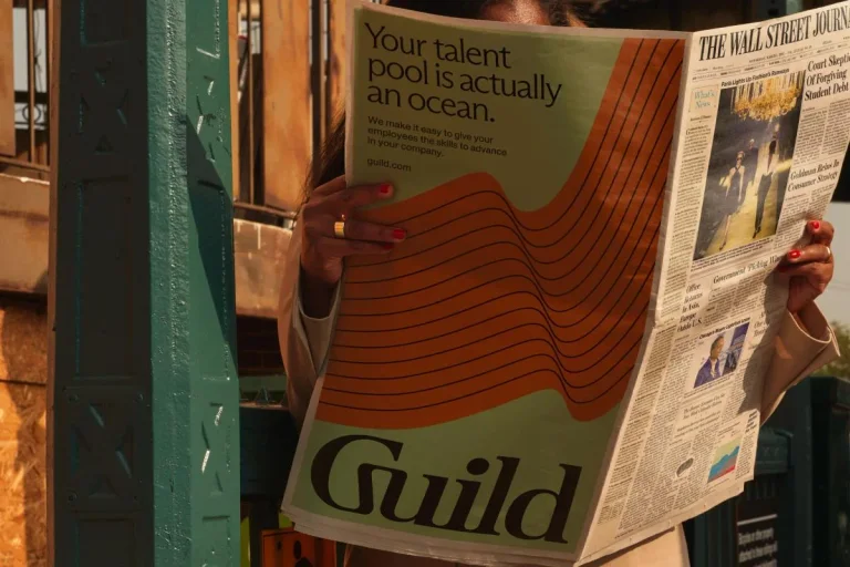
A compact G-like monogram supports a more expressive editorial wordmark. The compact symbol translates the editorial identity into small physical objects.
Useful for: Study the publication, keyring, and lapel detail.
# Branding reference: Guild
Source: https://www.wearecollins.com/case-studies/guild
Design credit: COLLINS
Swipefile reference: https://swipefile.design/ref/brand-guild/
Reviewed: 2026-09-09. Selected designer-published case-study images, not current official brand guidelines or a reusable asset license.

## Objective
Develop an original visual identity for my brief. Study the relationships between logo, type, color, and applications in this reference. Do not reproduce the referenced logo, name, distinctive artwork, or proprietary assets.

## Design observations
- logo: A compact G-like monogram supports a more expressive editorial wordmark.
- color: Warm orange, brown, and paper neutrals give the system a tactile character.
- typography: Large serif lettering adds emphasis to printed communication.
- system: The compact symbol translates the editorial identity into small physical objects.
- applications: Study the publication, keyring, and lapel detail.
- dont: Study the principles and develop an original identity. Do not copy these logos, proprietary typefaces, illustrations, or claims. These are selected images from a published case study; current brand guidelines, asset licenses, and real-world performance have not been verified.

## Deliverables and checks
- Begin with the audience, positioning, personality, and required applications in my brief. Label assumptions.
- Explain two or three distinct identity directions before selecting one. Connect each decision to the brand's purpose.
- Define an original logo concept, wordmark and symbol relationships, typographic hierarchy, palette roles, and a consistent graphic system.
- Show how the system works on the relevant touchpoints: packaging, stationery, signage, social, or digital products.
- Draft practical guidelines for clear space, minimum size, background contrast, one-color and reversed marks, type usage, and layout. Validate proposed measurements in the actual artwork.
- Use appropriately licensed fonts and original or licensed imagery. Supply editable vector artwork when the tools support it; distinguish a concept from finished production files.
- Check small-size legibility, color accessibility for text, visual consistency, and print versus screen requirements. State what was reviewed and what still needs testing.
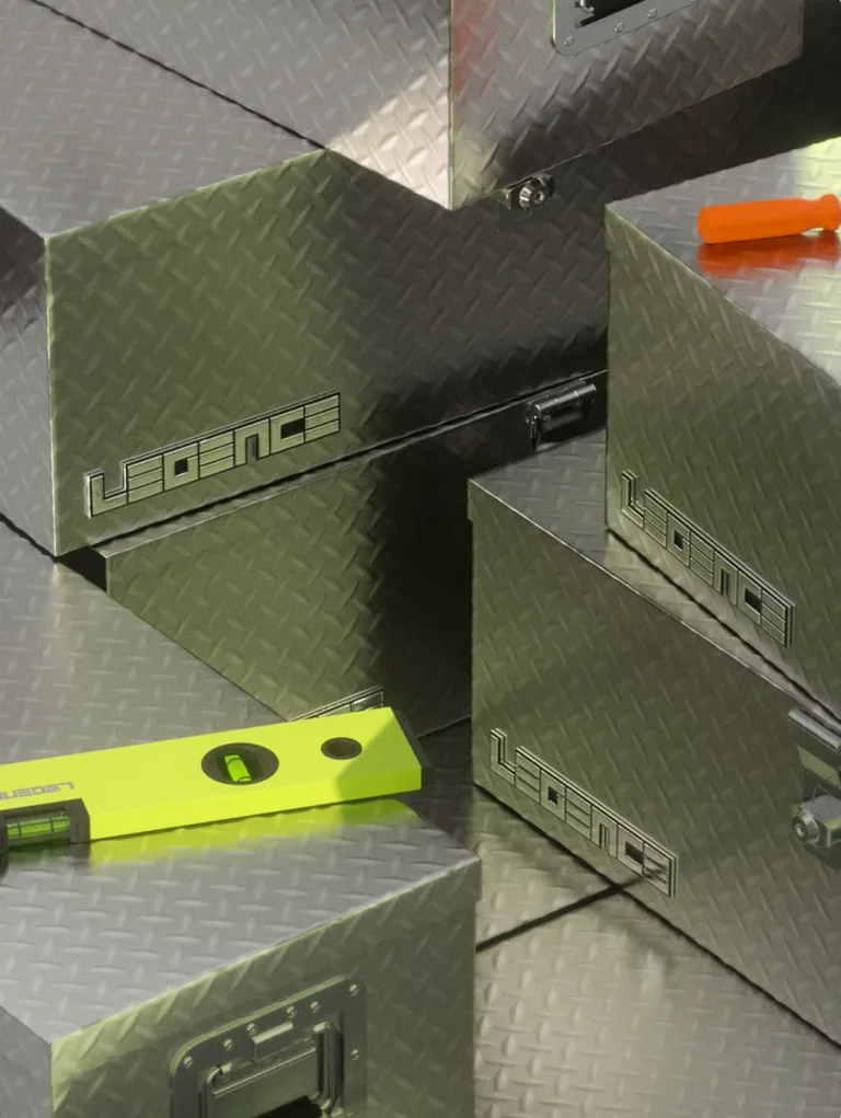
Squared letterforms give the wordmark an engineered appearance. The same typography links technical objects, printed material, and protective equipment.
Useful for: Compare material branding, a printed pattern, and a helmet application.
# Branding reference: Legence
Source: https://www.wearecollins.com/case-studies/legence
Design credit: COLLINS
Swipefile reference: https://swipefile.design/ref/brand-legence/
Reviewed: 2026-09-09. Selected designer-published case-study images, not current official brand guidelines or a reusable asset license.

## Objective
Develop an original visual identity for my brief. Study the relationships between logo, type, color, and applications in this reference. Do not reproduce the referenced logo, name, distinctive artwork, or proprietary assets.

## Design observations
- logo: Squared letterforms give the wordmark an engineered appearance.
- color: Lime contrasts with concrete gray and metallic surfaces.
- typography: Wide geometric uppercase forms extend into dense patterns.
- system: The same typography links technical objects, printed material, and protective equipment.
- applications: Compare material branding, a printed pattern, and a helmet application.
- dont: Study the principles and develop an original identity. Do not copy these logos, proprietary typefaces, illustrations, or claims. These are selected images from a published case study; current brand guidelines, asset licenses, and real-world performance have not been verified.

## Deliverables and checks
- Begin with the audience, positioning, personality, and required applications in my brief. Label assumptions.
- Explain two or three distinct identity directions before selecting one. Connect each decision to the brand's purpose.
- Define an original logo concept, wordmark and symbol relationships, typographic hierarchy, palette roles, and a consistent graphic system.
- Show how the system works on the relevant touchpoints: packaging, stationery, signage, social, or digital products.
- Draft practical guidelines for clear space, minimum size, background contrast, one-color and reversed marks, type usage, and layout. Validate proposed measurements in the actual artwork.
- Use appropriately licensed fonts and original or licensed imagery. Supply editable vector artwork when the tools support it; distinguish a concept from finished production files.
- Check small-size legibility, color accessibility for text, visual consistency, and print versus screen requirements. State what was reviewed and what still needs testing.
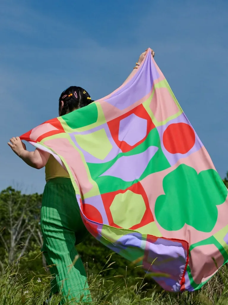
A familiar trefoil becomes both a compact emblem and an enlarged graphic. The trefoil repeats through patterns and signage while retaining its silhouette.
Useful for: Study a textile pattern, outdoor campaign, and camp entrance sign.
# Branding reference: Girl Scouts
Source: https://www.wearecollins.com/case-studies/girl-scouts
Design credit: COLLINS
Swipefile reference: https://swipefile.design/ref/brand-girl-scouts/
Reviewed: 2026-09-09. Selected designer-published case-study images, not current official brand guidelines or a reusable asset license.

## Objective
Develop an original visual identity for my brief. Study the relationships between logo, type, color, and applications in this reference. Do not reproduce the referenced logo, name, distinctive artwork, or proprietary assets.

## Design observations
- logo: A familiar trefoil becomes both a compact emblem and an enlarged graphic.
- color: Green anchors vivid pink, orange, and yellow combinations.
- typography: Clear supporting text shares space with expressive campaign headlines.
- system: The trefoil repeats through patterns and signage while retaining its silhouette.
- applications: Study a textile pattern, outdoor campaign, and camp entrance sign.
- dont: Study the principles and develop an original identity. Do not copy these logos, proprietary typefaces, illustrations, or claims. These are selected images from a published case study; current brand guidelines, asset licenses, and real-world performance have not been verified.

## Deliverables and checks
- Begin with the audience, positioning, personality, and required applications in my brief. Label assumptions.
- Explain two or three distinct identity directions before selecting one. Connect each decision to the brand's purpose.
- Define an original logo concept, wordmark and symbol relationships, typographic hierarchy, palette roles, and a consistent graphic system.
- Show how the system works on the relevant touchpoints: packaging, stationery, signage, social, or digital products.
- Draft practical guidelines for clear space, minimum size, background contrast, one-color and reversed marks, type usage, and layout. Validate proposed measurements in the actual artwork.
- Use appropriately licensed fonts and original or licensed imagery. Supply editable vector artwork when the tools support it; distinguish a concept from finished production files.
- Check small-size legibility, color accessibility for text, visual consistency, and print versus screen requirements. State what was reviewed and what still needs testing.
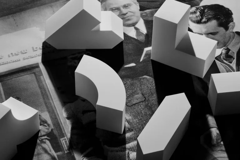
Large geometric letterforms act as architectural-scale identifiers. Physical form studies connect to oversized environmental lettering.
Useful for: Compare shape studies and two architectural applications.
# Branding reference: Institute of Design
Source: https://www.wearecollins.com/case-studies/institute-of-design
Design credit: COLLINS
Swipefile reference: https://swipefile.design/ref/brand-institute-of-design/
Reviewed: 2026-09-09. Selected designer-published case-study images, not current official brand guidelines or a reusable asset license.

## Objective
Develop an original visual identity for my brief. Study the relationships between logo, type, color, and applications in this reference. Do not reproduce the referenced logo, name, distinctive artwork, or proprietary assets.

## Design observations
- logo: Large geometric letterforms act as architectural-scale identifiers.
- color: Black and white keep attention on form and negative space.
- typography: Custom letter construction blurs the boundary between typography and symbol.
- system: Physical form studies connect to oversized environmental lettering.
- applications: Compare shape studies and two architectural applications.
- dont: Study the principles and develop an original identity. Do not copy these logos, proprietary typefaces, illustrations, or claims. These are selected images from a published case study; current brand guidelines, asset licenses, and real-world performance have not been verified.

## Deliverables and checks
- Begin with the audience, positioning, personality, and required applications in my brief. Label assumptions.
- Explain two or three distinct identity directions before selecting one. Connect each decision to the brand's purpose.
- Define an original logo concept, wordmark and symbol relationships, typographic hierarchy, palette roles, and a consistent graphic system.
- Show how the system works on the relevant touchpoints: packaging, stationery, signage, social, or digital products.
- Draft practical guidelines for clear space, minimum size, background contrast, one-color and reversed marks, type usage, and layout. Validate proposed measurements in the actual artwork.
- Use appropriately licensed fonts and original or licensed imagery. Supply editable vector artwork when the tools support it; distinguish a concept from finished production files.
- Check small-size legibility, color accessibility for text, visual consistency, and print versus screen requirements. State what was reviewed and what still needs testing.
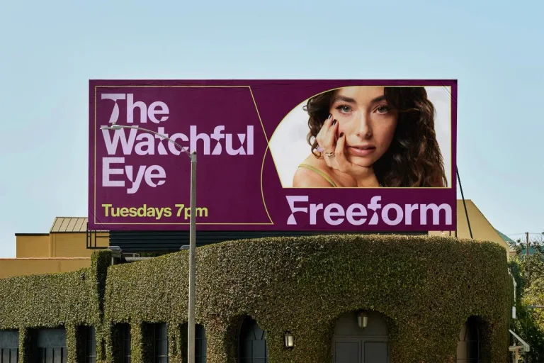
A distinctive serif wordmark anchors vivid entertainment messaging. The same type and color treatment carries across programs, merchandise, and buildings.
Useful for: Study a program billboard, tote, and environmental campaign.
# Branding reference: Freeform
Source: https://www.wearecollins.com/case-studies/freeform
Design credit: COLLINS
Swipefile reference: https://swipefile.design/ref/brand-freeform/
Reviewed: 2026-09-09. Selected designer-published case-study images, not current official brand guidelines or a reusable asset license.

## Objective
Develop an original visual identity for my brief. Study the relationships between logo, type, color, and applications in this reference. Do not reproduce the referenced logo, name, distinctive artwork, or proprietary assets.

## Design observations
- logo: A distinctive serif wordmark anchors vivid entertainment messaging.
- color: Purple and hot pink create a consistent campaign pairing.
- typography: Large serif headlines sit beside angular graphic fragments.
- system: The same type and color treatment carries across programs, merchandise, and buildings.
- applications: Study a program billboard, tote, and environmental campaign.
- dont: Study the principles and develop an original identity. Do not copy these logos, proprietary typefaces, illustrations, or claims. These are selected images from a published case study; current brand guidelines, asset licenses, and real-world performance have not been verified.

## Deliverables and checks
- Begin with the audience, positioning, personality, and required applications in my brief. Label assumptions.
- Explain two or three distinct identity directions before selecting one. Connect each decision to the brand's purpose.
- Define an original logo concept, wordmark and symbol relationships, typographic hierarchy, palette roles, and a consistent graphic system.
- Show how the system works on the relevant touchpoints: packaging, stationery, signage, social, or digital products.
- Draft practical guidelines for clear space, minimum size, background contrast, one-color and reversed marks, type usage, and layout. Validate proposed measurements in the actual artwork.
- Use appropriately licensed fonts and original or licensed imagery. Supply editable vector artwork when the tools support it; distinguish a concept from finished production files.
- Check small-size legibility, color accessibility for text, visual consistency, and print versus screen requirements. State what was reviewed and what still needs testing.

This selection focuses on the editorial system rather than an isolated logo. Repeated title, summary, and byline placement connects varied topics.
Useful for: Compare two editorial layouts and a short brand statement; depicted headlines are source artwork.
# Branding reference: CNET
Source: https://www.wearecollins.com/case-studies/cnet
Design credit: COLLINS
Swipefile reference: https://swipefile.design/ref/brand-cnet/
Reviewed: 2026-09-09. Selected designer-published case-study images, not current official brand guidelines or a reusable asset license.

## Objective
Develop an original visual identity for my brief. Study the relationships between logo, type, color, and applications in this reference. Do not reproduce the referenced logo, name, distinctive artwork, or proprietary assets.

## Design observations
- logo: This selection focuses on the editorial system rather than an isolated logo.
- color: Strong blue, orange, and red organize distinct story presentations.
- typography: Compact serif headlines and fine dividers create a publication-like hierarchy.
- system: Repeated title, summary, and byline placement connects varied topics.
- applications: Compare two editorial layouts and a short brand statement; depicted headlines are source artwork.
- dont: Study the principles and develop an original identity. Do not copy these logos, proprietary typefaces, illustrations, or claims. These are selected images from a published case study; current brand guidelines, asset licenses, and real-world performance have not been verified.

## Deliverables and checks
- Begin with the audience, positioning, personality, and required applications in my brief. Label assumptions.
- Explain two or three distinct identity directions before selecting one. Connect each decision to the brand's purpose.
- Define an original logo concept, wordmark and symbol relationships, typographic hierarchy, palette roles, and a consistent graphic system.
- Show how the system works on the relevant touchpoints: packaging, stationery, signage, social, or digital products.
- Draft practical guidelines for clear space, minimum size, background contrast, one-color and reversed marks, type usage, and layout. Validate proposed measurements in the actual artwork.
- Use appropriately licensed fonts and original or licensed imagery. Supply editable vector artwork when the tools support it; distinguish a concept from finished production files.
- Check small-size legibility, color accessibility for text, visual consistency, and print versus screen requirements. State what was reviewed and what still needs testing.
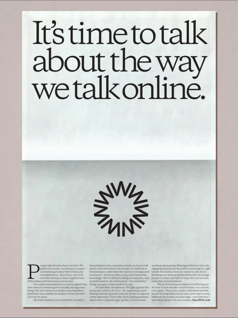
A radiating black emblem provides a strong counterpoint to fine text. A consistent balance of emblem, headline, and quiet margins spans formats.
Useful for: Study a printed statement, mobile layout, and outdoor communication.
# Branding reference: OpenWeb
Source: https://www.wearecollins.com/case-studies/open-web
Design credit: COLLINS
Swipefile reference: https://swipefile.design/ref/brand-open-web/
Reviewed: 2026-09-09. Selected designer-published case-study images, not current official brand guidelines or a reusable asset license.

## Objective
Develop an original visual identity for my brief. Study the relationships between logo, type, color, and applications in this reference. Do not reproduce the referenced logo, name, distinctive artwork, or proprietary assets.

## Design observations
- logo: A radiating black emblem provides a strong counterpoint to fine text.
- color: Warm off-white and black dominate the editorial compositions.
- typography: Large serif headlines give digital conversation a newspaper-like voice.
- system: A consistent balance of emblem, headline, and quiet margins spans formats.
- applications: Study a printed statement, mobile layout, and outdoor communication.
- dont: Study the principles and develop an original identity. Do not copy these logos, proprietary typefaces, illustrations, or claims. These are selected images from a published case study; current brand guidelines, asset licenses, and real-world performance have not been verified.

## Deliverables and checks
- Begin with the audience, positioning, personality, and required applications in my brief. Label assumptions.
- Explain two or three distinct identity directions before selecting one. Connect each decision to the brand's purpose.
- Define an original logo concept, wordmark and symbol relationships, typographic hierarchy, palette roles, and a consistent graphic system.
- Show how the system works on the relevant touchpoints: packaging, stationery, signage, social, or digital products.
- Draft practical guidelines for clear space, minimum size, background contrast, one-color and reversed marks, type usage, and layout. Validate proposed measurements in the actual artwork.
- Use appropriately licensed fonts and original or licensed imagery. Supply editable vector artwork when the tools support it; distinguish a concept from finished production files.
- Check small-size legibility, color accessibility for text, visual consistency, and print versus screen requirements. State what was reviewed and what still needs testing.
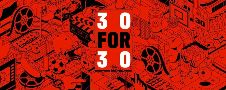
A stacked 30 for 30 lockup anchors this ESPN series identity. Loose sports illustrations balance the tightly packed typography.
Useful for: Study the series banner, type specimen, and a basketball illustration.
# Branding reference: ESPN
Source: https://www.wearecollins.com/case-studies/espn
Design credit: COLLINS
Swipefile reference: https://swipefile.design/ref/brand-espn/
Reviewed: 2026-09-09. Selected designer-published case-study images, not current official brand guidelines or a reusable asset license.

## Objective
Develop an original visual identity for my brief. Study the relationships between logo, type, color, and applications in this reference. Do not reproduce the referenced logo, name, distinctive artwork, or proprietary assets.

## Design observations
- logo: A stacked 30 for 30 lockup anchors this ESPN series identity.
- color: Intense red pairs with black linework and white lettering.
- typography: Heavy compressed uppercase type provides a forceful headline voice.
- system: Loose sports illustrations balance the tightly packed typography.
- applications: Study the series banner, type specimen, and a basketball illustration.
- dont: Study the principles and develop an original identity. Do not copy these logos, proprietary typefaces, illustrations, or claims. These are selected images from a published case study; current brand guidelines, asset licenses, and real-world performance have not been verified.

## Deliverables and checks
- Begin with the audience, positioning, personality, and required applications in my brief. Label assumptions.
- Explain two or three distinct identity directions before selecting one. Connect each decision to the brand's purpose.
- Define an original logo concept, wordmark and symbol relationships, typographic hierarchy, palette roles, and a consistent graphic system.
- Show how the system works on the relevant touchpoints: packaging, stationery, signage, social, or digital products.
- Draft practical guidelines for clear space, minimum size, background contrast, one-color and reversed marks, type usage, and layout. Validate proposed measurements in the actual artwork.
- Use appropriately licensed fonts and original or licensed imagery. Supply editable vector artwork when the tools support it; distinguish a concept from finished production files.
- Check small-size legibility, color accessibility for text, visual consistency, and print versus screen requirements. State what was reviewed and what still needs testing.
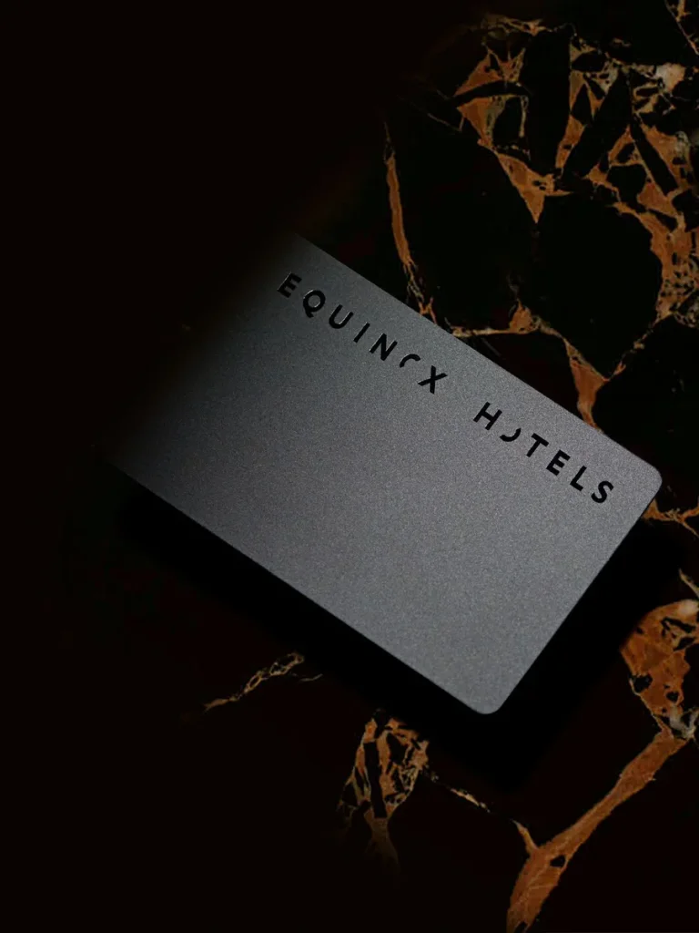
A widely spaced uppercase name creates a restrained identifying line. Quiet graphic details align printed communication with the hotel's interiors.
Useful for: Compare a printed brand detail, signage, and the surrounding interior context.
# Branding reference: Equinox Hotels
Source: https://www.wearecollins.com/case-studies/equinox-hotels
Design credit: COLLINS
Swipefile reference: https://swipefile.design/ref/brand-equinox-hotels/
Reviewed: 2026-09-09. Selected designer-published case-study images, not current official brand guidelines or a reusable asset license.

## Objective
Develop an original visual identity for my brief. Study the relationships between logo, type, color, and applications in this reference. Do not reproduce the referenced logo, name, distinctive artwork, or proprietary assets.

## Design observations
- logo: A widely spaced uppercase name creates a restrained identifying line.
- color: Black, warm metallic tones, and blue lighting define the selected applications.
- typography: Small clean uppercase lettering leaves materials and space in focus.
- system: Quiet graphic details align printed communication with the hotel's interiors.
- applications: Compare a printed brand detail, signage, and the surrounding interior context.
- dont: Study the principles and develop an original identity. Do not copy these logos, proprietary typefaces, illustrations, or claims. These are selected images from a published case study; current brand guidelines, asset licenses, and real-world performance have not been verified.

## Deliverables and checks
- Begin with the audience, positioning, personality, and required applications in my brief. Label assumptions.
- Explain two or three distinct identity directions before selecting one. Connect each decision to the brand's purpose.
- Define an original logo concept, wordmark and symbol relationships, typographic hierarchy, palette roles, and a consistent graphic system.
- Show how the system works on the relevant touchpoints: packaging, stationery, signage, social, or digital products.
- Draft practical guidelines for clear space, minimum size, background contrast, one-color and reversed marks, type usage, and layout. Validate proposed measurements in the actual artwork.
- Use appropriately licensed fonts and original or licensed imagery. Supply editable vector artwork when the tools support it; distinguish a concept from finished production files.
- Check small-size legibility, color accessibility for text, visual consistency, and print versus screen requirements. State what was reviewed and what still needs testing.
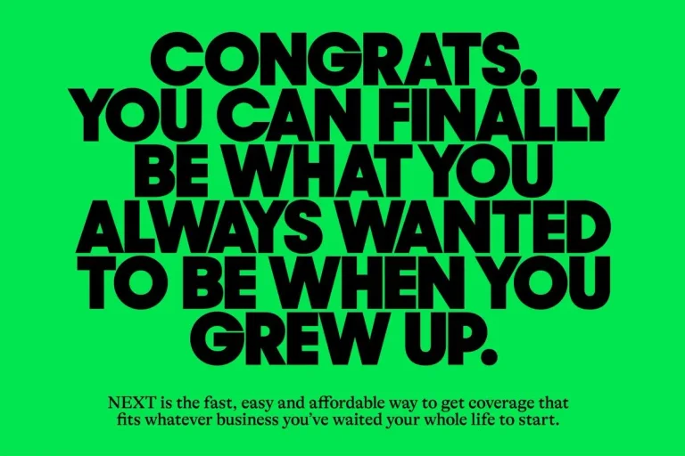
A large compact name is integrated directly into campaign messages. Exaggerated illustrated trade characters add personality to the headline system.
Useful for: Study a message layout, a contractor character, and a billboard.
# Branding reference: Next Insurance
Source: https://www.wearecollins.com/case-studies/next
Design credit: COLLINS
Swipefile reference: https://swipefile.design/ref/brand-next/
Reviewed: 2026-09-09. Selected designer-published case-study images, not current official brand guidelines or a reusable asset license.

## Objective
Develop an original visual identity for my brief. Study the relationships between logo, type, color, and applications in this reference. Do not reproduce the referenced logo, name, distinctive artwork, or proprietary assets.

## Design observations
- logo: A large compact name is integrated directly into campaign messages.
- color: Bright green, yellow, and cyan create conspicuous flat backgrounds.
- typography: Heavy tightly set uppercase text delivers short energetic statements.
- system: Exaggerated illustrated trade characters add personality to the headline system.
- applications: Study a message layout, a contractor character, and a billboard.
- dont: Study the principles and develop an original identity. Do not copy these logos, proprietary typefaces, illustrations, or claims. These are selected images from a published case study; current brand guidelines, asset licenses, and real-world performance have not been verified.

## Deliverables and checks
- Begin with the audience, positioning, personality, and required applications in my brief. Label assumptions.
- Explain two or three distinct identity directions before selecting one. Connect each decision to the brand's purpose.
- Define an original logo concept, wordmark and symbol relationships, typographic hierarchy, palette roles, and a consistent graphic system.
- Show how the system works on the relevant touchpoints: packaging, stationery, signage, social, or digital products.
- Draft practical guidelines for clear space, minimum size, background contrast, one-color and reversed marks, type usage, and layout. Validate proposed measurements in the actual artwork.
- Use appropriately licensed fonts and original or licensed imagery. Supply editable vector artwork when the tools support it; distinguish a concept from finished production files.
- Check small-size legibility, color accessibility for text, visual consistency, and print versus screen requirements. State what was reviewed and what still needs testing.

A small heart joins the wordmark and abbreviated m mark. The heart detail and oversized type connect portrait campaigns with print.
Useful for: Compare the primary campaign, monogram, and an editorial spread.
# Branding reference: Match
Source: https://www.wearecollins.com/case-studies/match
Design credit: COLLINS
Swipefile reference: https://swipefile.design/ref/brand-match/
Reviewed: 2026-09-09. Selected designer-published case-study images, not current official brand guidelines or a reusable asset license.

## Objective
Develop an original visual identity for my brief. Study the relationships between logo, type, color, and applications in this reference. Do not reproduce the referenced logo, name, distinctive artwork, or proprietary assets.

## Design observations
- logo: A small heart joins the wordmark and abbreviated m mark.
- color: Deep blue sits against warm neutrals and soft gradient backgrounds.
- typography: Expressive serif lettering creates a consistent intimate editorial voice.
- system: The heart detail and oversized type connect portrait campaigns with print.
- applications: Compare the primary campaign, monogram, and an editorial spread.
- dont: Study the principles and develop an original identity. Do not copy these logos, proprietary typefaces, illustrations, or claims. These are selected images from a published case study; current brand guidelines, asset licenses, and real-world performance have not been verified.

## Deliverables and checks
- Begin with the audience, positioning, personality, and required applications in my brief. Label assumptions.
- Explain two or three distinct identity directions before selecting one. Connect each decision to the brand's purpose.
- Define an original logo concept, wordmark and symbol relationships, typographic hierarchy, palette roles, and a consistent graphic system.
- Show how the system works on the relevant touchpoints: packaging, stationery, signage, social, or digital products.
- Draft practical guidelines for clear space, minimum size, background contrast, one-color and reversed marks, type usage, and layout. Validate proposed measurements in the actual artwork.
- Use appropriately licensed fonts and original or licensed imagery. Supply editable vector artwork when the tools support it; distinguish a concept from finished production files.
- Check small-size legibility, color accessibility for text, visual consistency, and print versus screen requirements. State what was reviewed and what still needs testing.
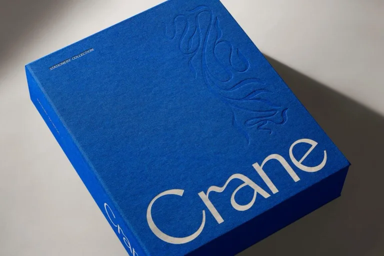
A fine flowing wordmark contrasts with the crisp edges of stationery. Embossing and restrained placement connect different paper products and boxes.
Useful for: Study a signature box, the wider family, and an embossed detail.
# Branding reference: Crane
Source: https://www.wearecollins.com/case-studies/crane
Design credit: COLLINS
Swipefile reference: https://swipefile.design/ref/brand-crane/
Reviewed: 2026-09-09. Selected designer-published case-study images, not current official brand guidelines or a reusable asset license.

## Objective
Develop an original visual identity for my brief. Study the relationships between logo, type, color, and applications in this reference. Do not reproduce the referenced logo, name, distinctive artwork, or proprietary assets.

## Design observations
- logo: A fine flowing wordmark contrasts with the crisp edges of stationery.
- color: Blue, red, yellow, and neutral paper tones define the range.
- typography: Delicate letterforms keep the name visually light.
- system: Embossing and restrained placement connect different paper products and boxes.
- applications: Study a signature box, the wider family, and an embossed detail.
- dont: Study the principles and develop an original identity. Do not copy these logos, proprietary typefaces, illustrations, or claims. These are selected images from a published case study; current brand guidelines, asset licenses, and real-world performance have not been verified.

## Deliverables and checks
- Begin with the audience, positioning, personality, and required applications in my brief. Label assumptions.
- Explain two or three distinct identity directions before selecting one. Connect each decision to the brand's purpose.
- Define an original logo concept, wordmark and symbol relationships, typographic hierarchy, palette roles, and a consistent graphic system.
- Show how the system works on the relevant touchpoints: packaging, stationery, signage, social, or digital products.
- Draft practical guidelines for clear space, minimum size, background contrast, one-color and reversed marks, type usage, and layout. Validate proposed measurements in the actual artwork.
- Use appropriately licensed fonts and original or licensed imagery. Supply editable vector artwork when the tools support it; distinguish a concept from finished production files.
- Check small-size legibility, color accessibility for text, visual consistency, and print versus screen requirements. State what was reviewed and what still needs testing.
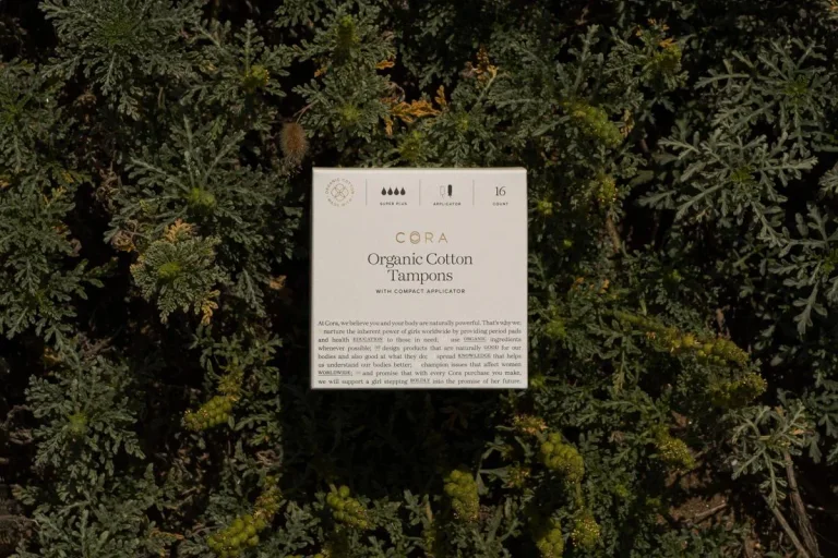
Small spaced lettering gives the packaging a quiet signature. Consistent neutral packaging is paired with botanical and human imagery.
Useful for: Study two packaging presentations and a paired editorial composition.
# Branding reference: Cora
Source: https://www.wearecollins.com/case-studies/cora
Design credit: COLLINS
Swipefile reference: https://swipefile.design/ref/brand-cora/
Reviewed: 2026-09-09. Selected designer-published case-study images, not current official brand guidelines or a reusable asset license.

## Objective
Develop an original visual identity for my brief. Study the relationships between logo, type, color, and applications in this reference. Do not reproduce the referenced logo, name, distinctive artwork, or proprietary assets.

## Design observations
- logo: Small spaced lettering gives the packaging a quiet signature.
- color: Cream and natural greens dominate the selected product presentation.
- typography: Fine text and restrained headings establish a compact information hierarchy.
- system: Consistent neutral packaging is paired with botanical and human imagery.
- applications: Study two packaging presentations and a paired editorial composition.
- dont: Study the principles and develop an original identity. Do not copy these logos, proprietary typefaces, illustrations, or claims. These are selected images from a published case study; current brand guidelines, asset licenses, and real-world performance have not been verified.

## Deliverables and checks
- Begin with the audience, positioning, personality, and required applications in my brief. Label assumptions.
- Explain two or three distinct identity directions before selecting one. Connect each decision to the brand's purpose.
- Define an original logo concept, wordmark and symbol relationships, typographic hierarchy, palette roles, and a consistent graphic system.
- Show how the system works on the relevant touchpoints: packaging, stationery, signage, social, or digital products.
- Draft practical guidelines for clear space, minimum size, background contrast, one-color and reversed marks, type usage, and layout. Validate proposed measurements in the actual artwork.
- Use appropriately licensed fonts and original or licensed imagery. Supply editable vector artwork when the tools support it; distinguish a concept from finished production files.
- Check small-size legibility, color accessibility for text, visual consistency, and print versus screen requirements. State what was reviewed and what still needs testing.
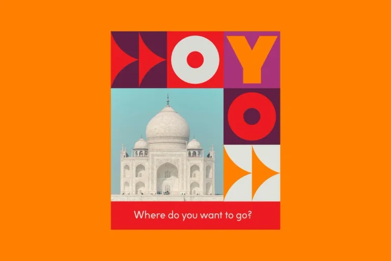
Large O and Y forms become modules within a square grid. A repeatable grid combines the name, destinations, and short messages.
Useful for: Compare a brand composition, exterior sign, and campaign variation.
# Branding reference: OYO
Source: https://www.wearecollins.com/case-studies/oyo
Design credit: COLLINS
Swipefile reference: https://swipefile.design/ref/brand-oyo/
Reviewed: 2026-09-09. Selected designer-published case-study images, not current official brand guidelines or a reusable asset license.

## Objective
Develop an original visual identity for my brief. Study the relationships between logo, type, color, and applications in this reference. Do not reproduce the referenced logo, name, distinctive artwork, or proprietary assets.

## Design observations
- logo: Large O and Y forms become modules within a square grid.
- color: Orange, red, pink, and deep plum create strong tile contrasts.
- typography: Heavy geometric letters share equal space with image tiles.
- system: A repeatable grid combines the name, destinations, and short messages.
- applications: Compare a brand composition, exterior sign, and campaign variation.
- dont: Study the principles and develop an original identity. Do not copy these logos, proprietary typefaces, illustrations, or claims. These are selected images from a published case study; current brand guidelines, asset licenses, and real-world performance have not been verified.

## Deliverables and checks
- Begin with the audience, positioning, personality, and required applications in my brief. Label assumptions.
- Explain two or three distinct identity directions before selecting one. Connect each decision to the brand's purpose.
- Define an original logo concept, wordmark and symbol relationships, typographic hierarchy, palette roles, and a consistent graphic system.
- Show how the system works on the relevant touchpoints: packaging, stationery, signage, social, or digital products.
- Draft practical guidelines for clear space, minimum size, background contrast, one-color and reversed marks, type usage, and layout. Validate proposed measurements in the actual artwork.
- Use appropriately licensed fonts and original or licensed imagery. Supply editable vector artwork when the tools support it; distinguish a concept from finished production files.
- Check small-size legibility, color accessibility for text, visual consistency, and print versus screen requirements. State what was reviewed and what still needs testing.
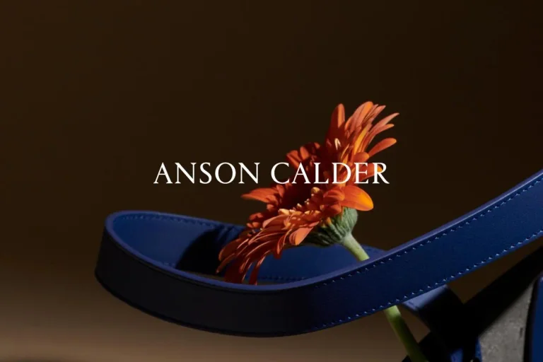
A fine uppercase wordmark acts as a restrained signature. Consistent lighting and product color link portraits with leather accessories.
Useful for: Study product and portrait campaigns alongside a physical bag application.
# Branding reference: Anson Calder
Source: https://www.wearecollins.com/case-studies/anson-calder
Design credit: COLLINS
Swipefile reference: https://swipefile.design/ref/brand-anson-calder/
Reviewed: 2026-09-09. Selected designer-published case-study images, not current official brand guidelines or a reusable asset license.

## Objective
Develop an original visual identity for my brief. Study the relationships between logo, type, color, and applications in this reference. Do not reproduce the referenced logo, name, distinctive artwork, or proprietary assets.

## Design observations
- logo: A fine uppercase wordmark acts as a restrained signature.
- color: Burnt orange, black, and dark brown establish the selected material palette.
- typography: Delicate widely spaced letters contrast with bold photographic silhouettes.
- system: Consistent lighting and product color link portraits with leather accessories.
- applications: Study product and portrait campaigns alongside a physical bag application.
- dont: Study the principles and develop an original identity. Do not copy these logos, proprietary typefaces, illustrations, or claims. These are selected images from a published case study; current brand guidelines, asset licenses, and real-world performance have not been verified.

## Deliverables and checks
- Begin with the audience, positioning, personality, and required applications in my brief. Label assumptions.
- Explain two or three distinct identity directions before selecting one. Connect each decision to the brand's purpose.
- Define an original logo concept, wordmark and symbol relationships, typographic hierarchy, palette roles, and a consistent graphic system.
- Show how the system works on the relevant touchpoints: packaging, stationery, signage, social, or digital products.
- Draft practical guidelines for clear space, minimum size, background contrast, one-color and reversed marks, type usage, and layout. Validate proposed measurements in the actual artwork.
- Use appropriately licensed fonts and original or licensed imagery. Supply editable vector artwork when the tools support it; distinguish a concept from finished production files.
- Check small-size legibility, color accessibility for text, visual consistency, and print versus screen requirements. State what was reviewed and what still needs testing.
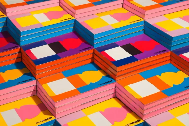
A simplified bottle silhouette becomes a recurring graphic identifier. Repeated bottle proportions connect colorful covers with the wider printed system.
Useful for: Compare the cover family, one bottle composition, and a brand book detail.
# Branding reference: Vitaminwater
Source: https://www.wearecollins.com/case-studies/vitaminwater
Design credit: COLLINS
Swipefile reference: https://swipefile.design/ref/brand-vitaminwater/
Reviewed: 2026-09-09. Selected designer-published case-study images, not current official brand guidelines or a reusable asset license.

## Objective
Develop an original visual identity for my brief. Study the relationships between logo, type, color, and applications in this reference. Do not reproduce the referenced logo, name, distinctive artwork, or proprietary assets.

## Design observations
- logo: A simplified bottle silhouette becomes a recurring graphic identifier.
- color: Vivid blocks of orange, pink, blue, and yellow create varied combinations.
- typography: Bold and light sans-serif weights distinguish parts of the name.
- system: Repeated bottle proportions connect colorful covers with the wider printed system.
- applications: Compare the cover family, one bottle composition, and a brand book detail.
- dont: Study the principles and develop an original identity. Do not copy these logos, proprietary typefaces, illustrations, or claims. These are selected images from a published case study; current brand guidelines, asset licenses, and real-world performance have not been verified.

## Deliverables and checks
- Begin with the audience, positioning, personality, and required applications in my brief. Label assumptions.
- Explain two or three distinct identity directions before selecting one. Connect each decision to the brand's purpose.
- Define an original logo concept, wordmark and symbol relationships, typographic hierarchy, palette roles, and a consistent graphic system.
- Show how the system works on the relevant touchpoints: packaging, stationery, signage, social, or digital products.
- Draft practical guidelines for clear space, minimum size, background contrast, one-color and reversed marks, type usage, and layout. Validate proposed measurements in the actual artwork.
- Use appropriately licensed fonts and original or licensed imagery. Supply editable vector artwork when the tools support it; distinguish a concept from finished production files.
- Check small-size legibility, color accessibility for text, visual consistency, and print versus screen requirements. State what was reviewed and what still needs testing.
A compact serif wordmark provides a familiar central signature. Consistent logo placement and editorial hierarchy organize different printed formats.
Useful for: Study the wordmark, publication spread, and stationery palette.
# Branding reference: Ogilvy
Source: https://www.wearecollins.com/case-studies/ogilvy
Design credit: COLLINS
Swipefile reference: https://swipefile.design/ref/brand-ogilvy/
Reviewed: 2026-09-09. Selected designer-published case-study images, not current official brand guidelines or a reusable asset license.

## Objective
Develop an original visual identity for my brief. Study the relationships between logo, type, color, and applications in this reference. Do not reproduce the referenced logo, name, distinctive artwork, or proprietary assets.

## Design observations
- logo: A compact serif wordmark provides a familiar central signature.
- color: Red anchors a wider family of colored stationery.
- typography: Strong serif display type contrasts with quiet structured body copy.
- system: Consistent logo placement and editorial hierarchy organize different printed formats.
- applications: Study the wordmark, publication spread, and stationery palette.
- dont: Study the principles and develop an original identity. Do not copy these logos, proprietary typefaces, illustrations, or claims. These are selected images from a published case study; current brand guidelines, asset licenses, and real-world performance have not been verified.

## Deliverables and checks
- Begin with the audience, positioning, personality, and required applications in my brief. Label assumptions.
- Explain two or three distinct identity directions before selecting one. Connect each decision to the brand's purpose.
- Define an original logo concept, wordmark and symbol relationships, typographic hierarchy, palette roles, and a consistent graphic system.
- Show how the system works on the relevant touchpoints: packaging, stationery, signage, social, or digital products.
- Draft practical guidelines for clear space, minimum size, background contrast, one-color and reversed marks, type usage, and layout. Validate proposed measurements in the actual artwork.
- Use appropriately licensed fonts and original or licensed imagery. Supply editable vector artwork when the tools support it; distinguish a concept from finished production files.
- Check small-size legibility, color accessibility for text, visual consistency, and print versus screen requirements. State what was reviewed and what still needs testing.
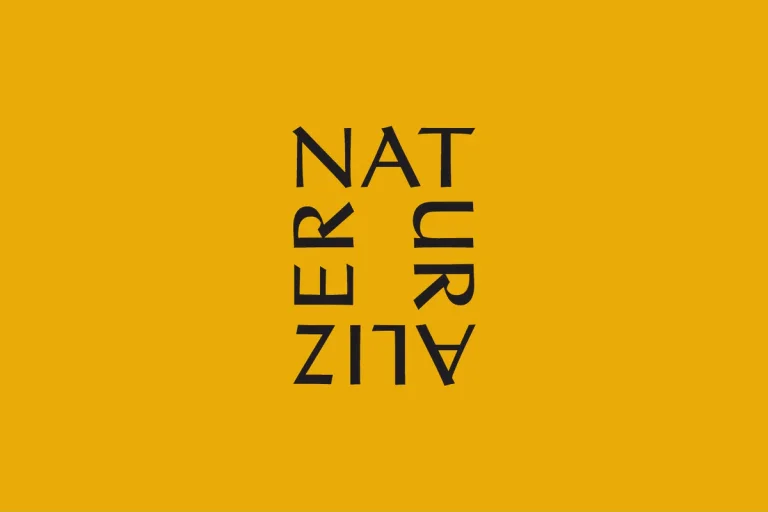
Rotated segments of the name form a compact rectangular mark. The same letter structure scales from a small signature to a portrait overlay.
Useful for: Compare the compact mark, enlarged typography, and campaign placement.
# Branding reference: Naturalizer
Source: https://www.wearecollins.com/case-studies/naturalizer
Design credit: COLLINS
Swipefile reference: https://swipefile.design/ref/brand-naturalizer/
Reviewed: 2026-09-09. Selected designer-published case-study images, not current official brand guidelines or a reusable asset license.

## Objective
Develop an original visual identity for my brief. Study the relationships between logo, type, color, and applications in this reference. Do not reproduce the referenced logo, name, distinctive artwork, or proprietary assets.

## Design observations
- logo: Rotated segments of the name form a compact rectangular mark.
- color: Mustard and black anchor otherwise warm photographic compositions.
- typography: Thin geometric uppercase letters work in both horizontal and rotated arrangements.
- system: The same letter structure scales from a small signature to a portrait overlay.
- applications: Compare the compact mark, enlarged typography, and campaign placement.
- dont: Study the principles and develop an original identity. Do not copy these logos, proprietary typefaces, illustrations, or claims. These are selected images from a published case study; current brand guidelines, asset licenses, and real-world performance have not been verified.

## Deliverables and checks
- Begin with the audience, positioning, personality, and required applications in my brief. Label assumptions.
- Explain two or three distinct identity directions before selecting one. Connect each decision to the brand's purpose.
- Define an original logo concept, wordmark and symbol relationships, typographic hierarchy, palette roles, and a consistent graphic system.
- Show how the system works on the relevant touchpoints: packaging, stationery, signage, social, or digital products.
- Draft practical guidelines for clear space, minimum size, background contrast, one-color and reversed marks, type usage, and layout. Validate proposed measurements in the actual artwork.
- Use appropriately licensed fonts and original or licensed imagery. Supply editable vector artwork when the tools support it; distinguish a concept from finished production files.
- Check small-size legibility, color accessibility for text, visual consistency, and print versus screen requirements. State what was reviewed and what still needs testing.

Overlapping circular lines form a compact dimensional symbol. Radiating line forms extend the symbol into flags and printed compositions.
Useful for: Study the logo, a flag, and a graphic publication cover.
# Branding reference: US Chamber of Commerce
Source: https://www.wearecollins.com/case-studies/us-chamber-of-commerce
Design credit: COLLINS
Swipefile reference: https://swipefile.design/ref/brand-us-chamber-of-commerce/
Reviewed: 2026-09-09. Selected designer-published case-study images, not current official brand guidelines or a reusable asset license.

## Objective
Develop an original visual identity for my brief. Study the relationships between logo, type, color, and applications in this reference. Do not reproduce the referenced logo, name, distinctive artwork, or proprietary assets.

## Design observations
- logo: Overlapping circular lines form a compact dimensional symbol.
- color: Deep blue supports bright blue, purple, and warm accent combinations.
- typography: A restrained sans-serif name gives complex graphics room to breathe.
- system: Radiating line forms extend the symbol into flags and printed compositions.
- applications: Study the logo, a flag, and a graphic publication cover.
- dont: Study the principles and develop an original identity. Do not copy these logos, proprietary typefaces, illustrations, or claims. These are selected images from a published case study; current brand guidelines, asset licenses, and real-world performance have not been verified.

## Deliverables and checks
- Begin with the audience, positioning, personality, and required applications in my brief. Label assumptions.
- Explain two or three distinct identity directions before selecting one. Connect each decision to the brand's purpose.
- Define an original logo concept, wordmark and symbol relationships, typographic hierarchy, palette roles, and a consistent graphic system.
- Show how the system works on the relevant touchpoints: packaging, stationery, signage, social, or digital products.
- Draft practical guidelines for clear space, minimum size, background contrast, one-color and reversed marks, type usage, and layout. Validate proposed measurements in the actual artwork.
- Use appropriately licensed fonts and original or licensed imagery. Supply editable vector artwork when the tools support it; distinguish a concept from finished production files.
- Check small-size legibility, color accessibility for text, visual consistency, and print versus screen requirements. State what was reviewed and what still needs testing.

Wide spaced geometric letters create a clean horizontal signature. Simple color fields and consistent spacing organize corporate printed material.
Useful for: Compare the wordmark, full stationery set, and business cards.
# Branding reference: Chubb
Source: https://www.wearecollins.com/case-studies/chubb
Design credit: COLLINS
Swipefile reference: https://swipefile.design/ref/brand-chubb/
Reviewed: 2026-09-09. Selected designer-published case-study images, not current official brand guidelines or a reusable asset license.

## Objective
Develop an original visual identity for my brief. Study the relationships between logo, type, color, and applications in this reference. Do not reproduce the referenced logo, name, distinctive artwork, or proprietary assets.

## Design observations
- logo: Wide spaced geometric letters create a clean horizontal signature.
- color: Black and white are extended by orange, violet, and other saturated fields.
- typography: The broad wordmark contrasts with small precise information text.
- system: Simple color fields and consistent spacing organize corporate printed material.
- applications: Compare the wordmark, full stationery set, and business cards.
- dont: Study the principles and develop an original identity. Do not copy these logos, proprietary typefaces, illustrations, or claims. These are selected images from a published case study; current brand guidelines, asset licenses, and real-world performance have not been verified.

## Deliverables and checks
- Begin with the audience, positioning, personality, and required applications in my brief. Label assumptions.
- Explain two or three distinct identity directions before selecting one. Connect each decision to the brand's purpose.
- Define an original logo concept, wordmark and symbol relationships, typographic hierarchy, palette roles, and a consistent graphic system.
- Show how the system works on the relevant touchpoints: packaging, stationery, signage, social, or digital products.
- Draft practical guidelines for clear space, minimum size, background contrast, one-color and reversed marks, type usage, and layout. Validate proposed measurements in the actual artwork.
- Use appropriately licensed fonts and original or licensed imagery. Supply editable vector artwork when the tools support it; distinguish a concept from finished production files.
- Check small-size legibility, color accessibility for text, visual consistency, and print versus screen requirements. State what was reviewed and what still needs testing.
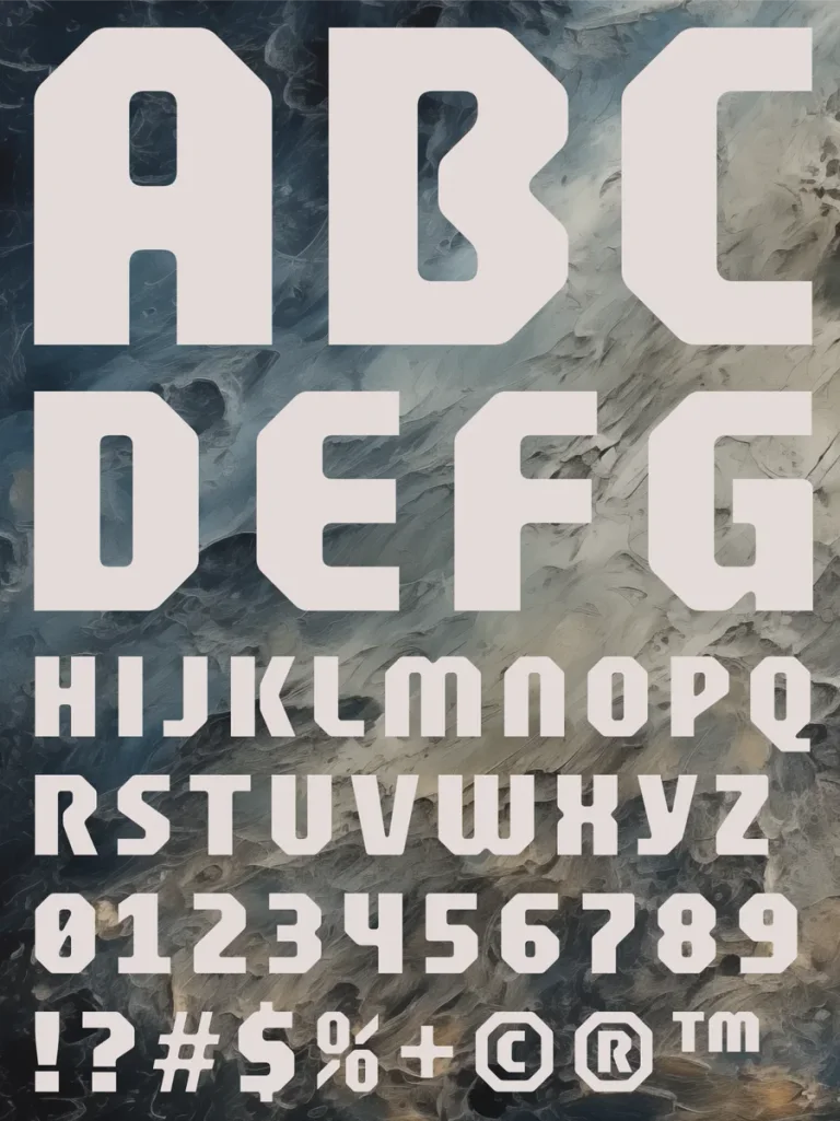
A compact symbol and vertical name appear on a bright dimensional object. Dimensional scenes and bold type link the brand concept with digital presentation.
Useful for: Study the alphabet, branded object, and website composition.
# Branding reference: Atera
Source: https://www.wearecollins.com/case-studies/atera
Design credit: COLLINS
Swipefile reference: https://swipefile.design/ref/brand-atera/
Reviewed: 2026-09-09. Selected designer-published case-study images, not current official brand guidelines or a reusable asset license.

## Objective
Develop an original visual identity for my brief. Study the relationships between logo, type, color, and applications in this reference. Do not reproduce the referenced logo, name, distinctive artwork, or proprietary assets.

## Design observations
- logo: A compact symbol and vertical name appear on a bright dimensional object.
- color: Hot pink contrasts with pale blue and metallic gray.
- typography: Heavy angular display letters create a game-like headline voice.
- system: Dimensional scenes and bold type link the brand concept with digital presentation.
- applications: Study the alphabet, branded object, and website composition.
- dont: Study the principles and develop an original identity. Do not copy these logos, proprietary typefaces, illustrations, or claims. These are selected images from a published case study; current brand guidelines, asset licenses, and real-world performance have not been verified.

## Deliverables and checks
- Begin with the audience, positioning, personality, and required applications in my brief. Label assumptions.
- Explain two or three distinct identity directions before selecting one. Connect each decision to the brand's purpose.
- Define an original logo concept, wordmark and symbol relationships, typographic hierarchy, palette roles, and a consistent graphic system.
- Show how the system works on the relevant touchpoints: packaging, stationery, signage, social, or digital products.
- Draft practical guidelines for clear space, minimum size, background contrast, one-color and reversed marks, type usage, and layout. Validate proposed measurements in the actual artwork.
- Use appropriately licensed fonts and original or licensed imagery. Supply editable vector artwork when the tools support it; distinguish a concept from finished production files.
- Check small-size legibility, color accessibility for text, visual consistency, and print versus screen requirements. State what was reviewed and what still needs testing.
A rounded lowercase wordmark complements a family of friendly characters. Small modular characters repeat across patterns and product labels.
Useful for: Compare the wordmark, illustration family, and bottle application.
# Branding reference: Babyganics
Source: https://www.wearecollins.com/case-studies/babyganics
Design credit: COLLINS
Swipefile reference: https://swipefile.design/ref/brand-babyganics/
Reviewed: 2026-09-09. Selected designer-published case-study images, not current official brand guidelines or a reusable asset license.

## Objective
Develop an original visual identity for my brief. Study the relationships between logo, type, color, and applications in this reference. Do not reproduce the referenced logo, name, distinctive artwork, or proprietary assets.

## Design observations
- logo: A rounded lowercase wordmark complements a family of friendly characters.
- color: Bright green anchors a warm multicolored illustration palette.
- typography: Soft simple letters retain a playful readable structure.
- system: Small modular characters repeat across patterns and product labels.
- applications: Compare the wordmark, illustration family, and bottle application.
- dont: Study the principles and develop an original identity. Do not copy these logos, proprietary typefaces, illustrations, or claims. These are selected images from a published case study; current brand guidelines, asset licenses, and real-world performance have not been verified.

## Deliverables and checks
- Begin with the audience, positioning, personality, and required applications in my brief. Label assumptions.
- Explain two or three distinct identity directions before selecting one. Connect each decision to the brand's purpose.
- Define an original logo concept, wordmark and symbol relationships, typographic hierarchy, palette roles, and a consistent graphic system.
- Show how the system works on the relevant touchpoints: packaging, stationery, signage, social, or digital products.
- Draft practical guidelines for clear space, minimum size, background contrast, one-color and reversed marks, type usage, and layout. Validate proposed measurements in the actual artwork.
- Use appropriately licensed fonts and original or licensed imagery. Supply editable vector artwork when the tools support it; distinguish a concept from finished production files.
- Check small-size legibility, color accessibility for text, visual consistency, and print versus screen requirements. State what was reviewed and what still needs testing.
A compact uppercase name remains recognizable as a subtle material detail. Restrained logo placement lets campaign photography carry the wider identity.
Useful for: Study embossing, storefront graphics, and a fashion editorial spread.
# Branding reference: Aldo
Source: https://www.wearecollins.com/case-studies/aldo
Design credit: COLLINS
Swipefile reference: https://swipefile.design/ref/brand-aldo/
Reviewed: 2026-09-09. Selected designer-published case-study images, not current official brand guidelines or a reusable asset license.

## Objective
Develop an original visual identity for my brief. Study the relationships between logo, type, color, and applications in this reference. Do not reproduce the referenced logo, name, distinctive artwork, or proprietary assets.

## Design observations
- logo: A compact uppercase name remains recognizable as a subtle material detail.
- color: Warm leather tones meet a varied fashion photography palette.
- typography: Quiet brand lettering contrasts with small editorial event information.
- system: Restrained logo placement lets campaign photography carry the wider identity.
- applications: Study embossing, storefront graphics, and a fashion editorial spread.
- dont: Study the principles and develop an original identity. Do not copy these logos, proprietary typefaces, illustrations, or claims. These are selected images from a published case study; current brand guidelines, asset licenses, and real-world performance have not been verified.

## Deliverables and checks
- Begin with the audience, positioning, personality, and required applications in my brief. Label assumptions.
- Explain two or three distinct identity directions before selecting one. Connect each decision to the brand's purpose.
- Define an original logo concept, wordmark and symbol relationships, typographic hierarchy, palette roles, and a consistent graphic system.
- Show how the system works on the relevant touchpoints: packaging, stationery, signage, social, or digital products.
- Draft practical guidelines for clear space, minimum size, background contrast, one-color and reversed marks, type usage, and layout. Validate proposed measurements in the actual artwork.
- Use appropriately licensed fonts and original or licensed imagery. Supply editable vector artwork when the tools support it; distinguish a concept from finished production files.
- Check small-size legibility, color accessibility for text, visual consistency, and print versus screen requirements. State what was reviewed and what still needs testing.
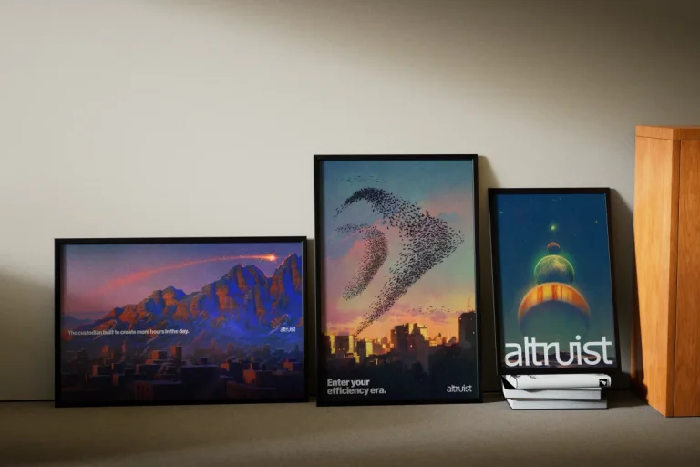
A narrow lowercase wordmark supplies a simple consistent signature. The name links illustrated prints, physical merchandise, and a quiet reception environment.
Useful for: Compare the three available static publisher images.
# Branding reference: Altruist
Source: https://www.wearecollins.com/case-studies/altruist
Design credit: COLLINS
Swipefile reference: https://swipefile.design/ref/brand-altruist/
Reviewed: 2026-09-09. Selected designer-published case-study images, not current official brand guidelines or a reusable asset license.

## Objective
Develop an original visual identity for my brief. Study the relationships between logo, type, color, and applications in this reference. Do not reproduce the referenced logo, name, distinctive artwork, or proprietary assets.

## Design observations
- logo: A narrow lowercase wordmark supplies a simple consistent signature.
- color: Natural wood, dark neutrals, and landscape colors shape the selected applications.
- typography: Tall clean letterforms adapt to both compact and oversized placement.
- system: The name links illustrated prints, physical merchandise, and a quiet reception environment.
- applications: Compare the three available static publisher images.
- dont: Study the principles and develop an original identity. Do not copy these logos, proprietary typefaces, illustrations, or claims. These are selected images from a published case study; current brand guidelines, asset licenses, and real-world performance have not been verified.

## Deliverables and checks
- Begin with the audience, positioning, personality, and required applications in my brief. Label assumptions.
- Explain two or three distinct identity directions before selecting one. Connect each decision to the brand's purpose.
- Define an original logo concept, wordmark and symbol relationships, typographic hierarchy, palette roles, and a consistent graphic system.
- Show how the system works on the relevant touchpoints: packaging, stationery, signage, social, or digital products.
- Draft practical guidelines for clear space, minimum size, background contrast, one-color and reversed marks, type usage, and layout. Validate proposed measurements in the actual artwork.
- Use appropriately licensed fonts and original or licensed imagery. Supply editable vector artwork when the tools support it; distinguish a concept from finished production files.
- Check small-size legibility, color accessibility for text, visual consistency, and print versus screen requirements. State what was reviewed and what still needs testing.
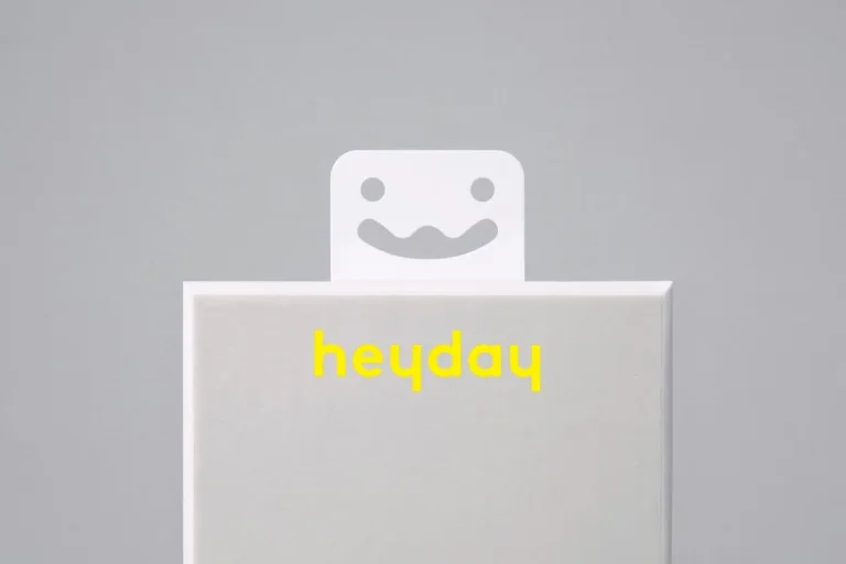
A friendly face and small lowercase name create a compact retail signature. Consistent transparent package structures let product color distinguish the range.
Useful for: Study the brand character, packaging family, and a close product detail.
# Branding reference: Target: Heyday
Source: https://www.wearecollins.com/case-studies/heyday
Design credit: COLLINS
Swipefile reference: https://swipefile.design/ref/brand-heyday/
Reviewed: 2026-09-09. Selected designer-published case-study images, not current official brand guidelines or a reusable asset license.

## Objective
Develop an original visual identity for my brief. Study the relationships between logo, type, color, and applications in this reference. Do not reproduce the referenced logo, name, distinctive artwork, or proprietary assets.

## Design observations
- logo: A friendly face and small lowercase name create a compact retail signature.
- color: Pale packaging frames brighter yellow, mint, blue, and red products.
- typography: Rounded letters and simple labels keep the product hierarchy approachable.
- system: Consistent transparent package structures let product color distinguish the range.
- applications: Study the brand character, packaging family, and a close product detail.
- dont: Study the principles and develop an original identity. Do not copy these logos, proprietary typefaces, illustrations, or claims. These are selected images from a published case study; current brand guidelines, asset licenses, and real-world performance have not been verified.

## Deliverables and checks
- Begin with the audience, positioning, personality, and required applications in my brief. Label assumptions.
- Explain two or three distinct identity directions before selecting one. Connect each decision to the brand's purpose.
- Define an original logo concept, wordmark and symbol relationships, typographic hierarchy, palette roles, and a consistent graphic system.
- Show how the system works on the relevant touchpoints: packaging, stationery, signage, social, or digital products.
- Draft practical guidelines for clear space, minimum size, background contrast, one-color and reversed marks, type usage, and layout. Validate proposed measurements in the actual artwork.
- Use appropriately licensed fonts and original or licensed imagery. Supply editable vector artwork when the tools support it; distinguish a concept from finished production files.
- Check small-size legibility, color accessibility for text, visual consistency, and print versus screen requirements. State what was reviewed and what still needs testing.
Allow basic usage counts to help us understand what is useful. Your board contents stay out of analytics. Details
Your browser’s privacy preference keeps analytics off.