Documents & Knowledge
CURATED COLLECTION · 17 REFERENCES
Real analytics, feedback, roadmap, documentation, editing, and account-entry screens. Public demo and unsigned states are explicitly identified.
Copy the reference notes below and paste them into Claude, ChatGPT, or your coding assistant. Add what you want to build.
Includes design notes, original sources, and preview links. An assistant that supports browsing can also read the public board link.
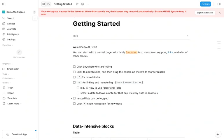
An unsigned workspace opens a getting-started document beside a compact navigation rail, with a visible notice that the content is stored locally.
Useful for: Document editors that introduce features inside an editable workspace.
# Design reference: AFFiNE — Local document workspace
Source: https://app.affine.pro/
Swipefile reference: https://swipefile.design/ref/saas-ui-affine-workspace/
Captured: 2026-09-05. This is a dated reference, not a claim about the current live product.
Capture scope: one viewport. Do not infer unseen page sections or a complete user flow.

## Objective
Adapt the interaction and layout patterns below to my project. Use my own content and identity. Do not reproduce logos, proprietary copy, or brand assets.

## Reference notes
- surface: AFFiNE unsigned local workspace and Getting Started document.
- nav: Left rail includes search, all documents, journals, settings, and organization tools.
- layout: Persistent sidebar beside a spacious document canvas and narrow document toolbar.
- density: Low in the document, compact in the navigation.
- color: White and soft gray with a pale red local-storage notice.
- typography: Bold document title, readable body copy, small sidebar labels.
- pattern: Teach the editor through a starter document while keeping the same navigation as the working product.
- states: Local browser storage is explicitly disclosed; this is not a signed-in cloud workspace.
- dont: Do not hide the distinction between local storage and synchronized data.

Useful for: Document editors that introduce features inside an editable workspace.

## Acceptance criteria
- Existing project conventions, design tokens, working functionality, and unrelated changes are preserved.
- Two or three reference principles clearly support the user's task; conflicts are resolved in favor of usability and the existing product.
- Reusable components and semantic HTML express the interface. Available licensed assets are used; important UI text is never rendered as a bitmap.
- Every visible control has a defined behavior. Loading, empty, error, success, disabled, and long-content states are specified where relevant. Demo data is clearly labeled.
- Navigation and content adapt at 375px, 768px, and 1440px without horizontal page overflow. Keyboard use, visible focus, labeled inputs, at least 44px touch targets, readable contrast, and reduced motion are supported.
- Verification distinguishes rendered behavior from proposals and identifies anything still requiring a backend or external service.

## Quality bar
Clear hierarchy, consistent spacing, restrained surfaces, and purposeful motion. Avoid decorative gradients, excessive cards, placeholder buttons, and invented metrics unless the project calls for them. Do not claim a feature is connected or tested without evidence.
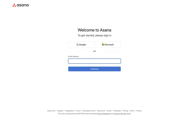
A centered account-entry panel offers Google and Microsoft before a clearly separated email path.
Useful for: Work software that supports both company identity providers and email entry.
# Design reference: Asana — Account entry
Source: https://app.asana.com/-/login
Swipefile reference: https://swipefile.design/ref/saas-ui-asana-create-account/
Captured: 2026-09-05. This is a dated reference, not a claim about the current live product.
Capture scope: one viewport. Do not infer unseen page sections or a complete user flow.

## Objective
Adapt the interaction and layout patterns below to my project. Use my own content and identity. Do not reproduce logos, proprietary copy, or brand assets.

## Reference notes
- surface: Asana public sign-in screen reached from its signup route.
- nav: Minimal entry screen with corporate and support links in the footer.
- layout: Narrow centered form with provider buttons, divider, email field, and Continue.
- density: Low and task-focused.
- color: White, dark text, pale gray boundaries, small brand accents.
- typography: Simple sans heading with clear provider and field labels.
- pattern: Present provider-based access and email as distinct, understandable routes.
- states: Initial sign-in state, not an authenticated dashboard or completed signup.
- dont: Do not imply that clicking Continue immediately creates an account when the next step may identify an existing one.

Useful for: Work software that supports both company identity providers and email entry.

## Acceptance criteria
- Existing project conventions, design tokens, working functionality, and unrelated changes are preserved.
- Two or three reference principles clearly support the user's task; conflicts are resolved in favor of usability and the existing product.
- Reusable components and semantic HTML express the interface. Available licensed assets are used; important UI text is never rendered as a bitmap.
- Every visible control has a defined behavior. Loading, empty, error, success, disabled, and long-content states are specified where relevant. Demo data is clearly labeled.
- Navigation and content adapt at 375px, 768px, and 1440px without horizontal page overflow. Keyboard use, visible focus, labeled inputs, at least 44px touch targets, readable contrast, and reduced motion are supported.
- Verification distinguishes rendered behavior from proposals and identifies anything still requiring a backend or external service.

## Quality bar
Clear hierarchy, consistent spacing, restrained surfaces, and purposeful motion. Avoid decorative gradients, excessive cards, placeholder buttons, and invented metrics unless the project calls for them. Do not claim a feature is connected or tested without evidence.
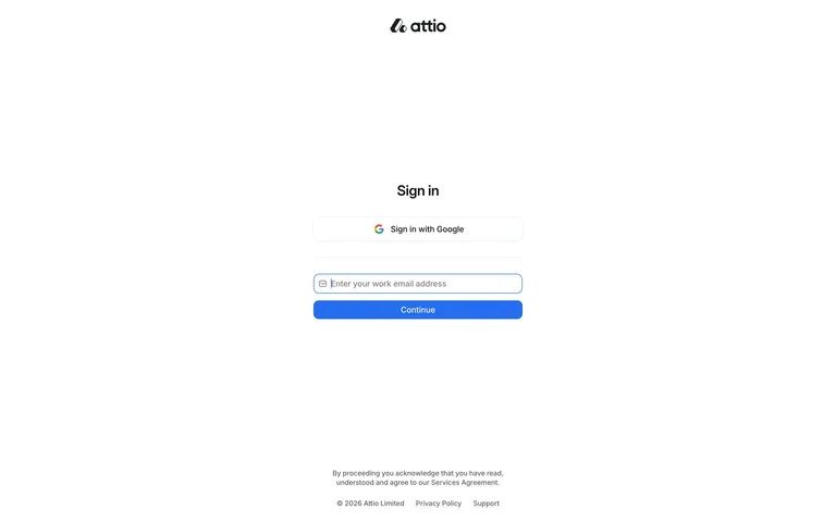
A very restrained sign-in screen puts Google access and an email field in a narrow centered column beneath the wordmark.
Useful for: Business software that needs an uncluttered entry point.
# Design reference: Attio — Sign in
Source: https://app.attio.com/auth/sign-in
Swipefile reference: https://swipefile.design/ref/saas-ui-attio-sign-in/
Captured: 2026-09-05. This is a dated reference, not a claim about the current live product.
Capture scope: one viewport. Do not infer unseen page sections or a complete user flow.

## Objective
Adapt the interaction and layout patterns below to my project. Use my own content and identity. Do not reproduce logos, proprietary copy, or brand assets.

## Reference notes
- surface: Attio public sign-in page.
- nav: Only essential legal and support links accompany the form.
- layout: Wordmark above a small central authentication cluster with substantial white space.
- density: Very low.
- color: White, dark text, blue Continue button, light field border.
- typography: Compact sans interface labels and a small sign-in heading.
- pattern: Reduce account entry to the available identity paths and a clear next action.
- states: Unsigned account entry; no CRM workspace was accessed.
- dont: Preserve clear labels and recovery behavior even when the visual presentation is minimal.

Useful for: Business software that needs an uncluttered entry point.

## Acceptance criteria
- Existing project conventions, design tokens, working functionality, and unrelated changes are preserved.
- Two or three reference principles clearly support the user's task; conflicts are resolved in favor of usability and the existing product.
- Reusable components and semantic HTML express the interface. Available licensed assets are used; important UI text is never rendered as a bitmap.
- Every visible control has a defined behavior. Loading, empty, error, success, disabled, and long-content states are specified where relevant. Demo data is clearly labeled.
- Navigation and content adapt at 375px, 768px, and 1440px without horizontal page overflow. Keyboard use, visible focus, labeled inputs, at least 44px touch targets, readable contrast, and reduced motion are supported.
- Verification distinguishes rendered behavior from proposals and identifies anything still requiring a backend or external service.

## Quality bar
Clear hierarchy, consistent spacing, restrained surfaces, and purposeful motion. Avoid decorative gradients, excessive cards, placeholder buttons, and invented metrics unless the project calls for them. Do not claim a feature is connected or tested without evidence.
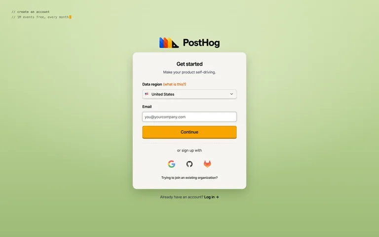
A cream signup panel on a green backdrop places a data-region choice before email entry and three identity-provider options.
Useful for: Infrastructure and analytics signup flows where data location is an early decision.
# Design reference: PostHog — Create account
Source: https://us.posthog.com/signup
Swipefile reference: https://swipefile.design/ref/saas-ui-posthog-create-account/
Captured: 2026-09-05. This is a dated reference, not a claim about the current live product.
Capture scope: one viewport. Do not infer unseen page sections or a complete user flow.

## Objective
Adapt the interaction and layout patterns below to my project. Use my own content and identity. Do not reproduce logos, proprietary copy, or brand assets.

## Reference notes
- surface: PostHog public account-creation screen.
- nav: Single account card with an existing-account link below.
- layout: Centered stacked region selector, email field, Continue action, and provider icons.
- density: Low with short, clearly grouped form sections.
- color: Soft green background, warm cream panel, orange primary action.
- typography: Plain sans labels with small monospaced introductory text.
- pattern: Expose a consequential setup choice before account creation and explain it beside the field.
- states: Initial signup, with region selection visible; no account was created.
- dont: Do not use unlabeled provider icons or bury the meaning of the region choice.

Useful for: Infrastructure and analytics signup flows where data location is an early decision.

## Acceptance criteria
- Existing project conventions, design tokens, working functionality, and unrelated changes are preserved.
- Two or three reference principles clearly support the user's task; conflicts are resolved in favor of usability and the existing product.
- Reusable components and semantic HTML express the interface. Available licensed assets are used; important UI text is never rendered as a bitmap.
- Every visible control has a defined behavior. Loading, empty, error, success, disabled, and long-content states are specified where relevant. Demo data is clearly labeled.
- Navigation and content adapt at 375px, 768px, and 1440px without horizontal page overflow. Keyboard use, visible focus, labeled inputs, at least 44px touch targets, readable contrast, and reduced motion are supported.
- Verification distinguishes rendered behavior from proposals and identifies anything still requiring a backend or external service.

## Quality bar
Clear hierarchy, consistent spacing, restrained surfaces, and purposeful motion. Avoid decorative gradients, excessive cards, placeholder buttons, and invented metrics unless the project calls for them. Do not claim a feature is connected or tested without evidence.
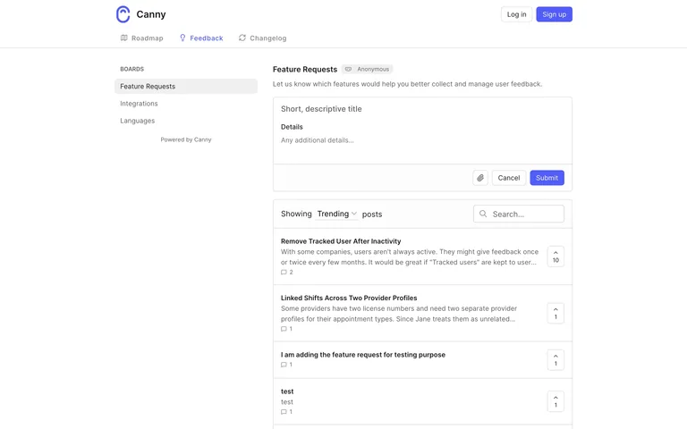
Board navigation and a compact suggestion form sit beside a ranked feature list with vote counts, search, and sorting.
Useful for: Public feedback portals that combine discovery of existing ideas with an obvious submission route.
# Design reference: Canny — Feature requests
Source: https://feedback.canny.io/feature-requests
Swipefile reference: https://swipefile.design/ref/saas-ui-canny-feature-requests/
Captured: 2026-09-05. This is a dated reference, not a claim about the current live product.
Capture scope: one viewport. Do not infer unseen page sections or a complete user flow.

## Objective
Adapt the interaction and layout patterns below to my project. Use my own content and identity. Do not reproduce logos, proprietary copy, or brand assets.

## Reference notes
- surface: Canny public Feature Requests board.
- nav: Top tabs for roadmap, feedback, and changelog; a left list switches feedback boards.
- layout: Left context and submission area beside a broader list of request rows.
- density: Moderate, using compact vote counters and concise request summaries.
- color: White, pale gray boundaries, muted text, restrained accent controls.
- typography: Bold request titles with smaller metadata and board labels.
- pattern: Put existing requests beside the new-request path so visitors can check for duplicates first.
- states: Populated public board, signed out; no suggestion or vote was submitted.
- dont: Do not present votes as delivery commitments or hide the distinction between requested and planned work.

Useful for: Public feedback portals that combine discovery of existing ideas with an obvious submission route.

## Acceptance criteria
- Existing project conventions, design tokens, working functionality, and unrelated changes are preserved.
- Two or three reference principles clearly support the user's task; conflicts are resolved in favor of usability and the existing product.
- Reusable components and semantic HTML express the interface. Available licensed assets are used; important UI text is never rendered as a bitmap.
- Every visible control has a defined behavior. Loading, empty, error, success, disabled, and long-content states are specified where relevant. Demo data is clearly labeled.
- Navigation and content adapt at 375px, 768px, and 1440px without horizontal page overflow. Keyboard use, visible focus, labeled inputs, at least 44px touch targets, readable contrast, and reduced motion are supported.
- Verification distinguishes rendered behavior from proposals and identifies anything still requiring a backend or external service.

## Quality bar
Clear hierarchy, consistent spacing, restrained surfaces, and purposeful motion. Avoid decorative gradients, excessive cards, placeholder buttons, and invented metrics unless the project calls for them. Do not claim a feature is connected or tested without evidence.
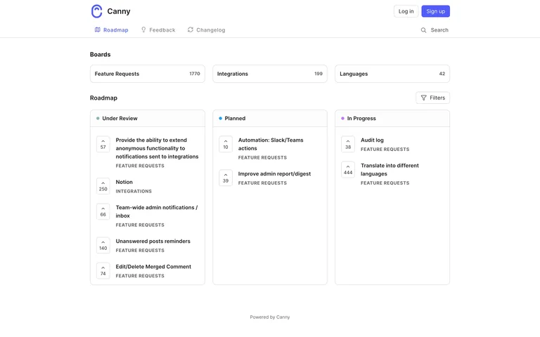
A public roadmap groups requests into status columns, with vote counts and a board summary supporting scanning.
Useful for: Product roadmaps communicating work status without exposing a full internal project tool.
# Design reference: Canny — Roadmap
Source: https://feedback.canny.io/
Swipefile reference: https://swipefile.design/ref/saas-ui-canny-roadmap/
Captured: 2026-09-05. This is a dated reference, not a claim about the current live product.
Capture scope: one viewport. Do not infer unseen page sections or a complete user flow.

## Objective
Adapt the interaction and layout patterns below to my project. Use my own content and identity. Do not reproduce logos, proprietary copy, or brand assets.

## Reference notes
- surface: Canny public roadmap.
- nav: Top-level roadmap, feedback, and changelog tabs with board links alongside.
- layout: Status columns contain compact request cards beneath a shared roadmap header.
- density: Moderate to high where columns contain many requests.
- color: White background, gray borders, subtle status accents.
- typography: Small status headings and clear request titles.
- pattern: Use status columns to show progress while keeping each request connected to its supporting detail.
- states: Published roadmap state; statuses and request counts can change.
- dont: Do not imply dates or commitments that are not actually stated.

Useful for: Product roadmaps communicating work status without exposing a full internal project tool.

## Acceptance criteria
- Existing project conventions, design tokens, working functionality, and unrelated changes are preserved.
- Two or three reference principles clearly support the user's task; conflicts are resolved in favor of usability and the existing product.
- Reusable components and semantic HTML express the interface. Available licensed assets are used; important UI text is never rendered as a bitmap.
- Every visible control has a defined behavior. Loading, empty, error, success, disabled, and long-content states are specified where relevant. Demo data is clearly labeled.
- Navigation and content adapt at 375px, 768px, and 1440px without horizontal page overflow. Keyboard use, visible focus, labeled inputs, at least 44px touch targets, readable contrast, and reduced motion are supported.
- Verification distinguishes rendered behavior from proposals and identifies anything still requiring a backend or external service.

## Quality bar
Clear hierarchy, consistent spacing, restrained surfaces, and purposeful motion. Avoid decorative gradients, excessive cards, placeholder buttons, and invented metrics unless the project calls for them. Do not claim a feature is connected or tested without evidence.
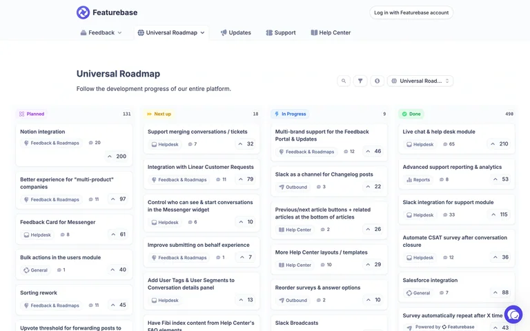
A wide public roadmap distributes requests across four status columns, with votes and comments visible on compact cards.
Useful for: Multi-product public planning boards that need a quick status overview.
# Design reference: Featurebase — Roadmap
Source: https://feedback.featurebase.app/roadmap
Swipefile reference: https://swipefile.design/ref/saas-ui-featurebase-roadmap/
Captured: 2026-09-05. This is a dated reference, not a claim about the current live product.
Capture scope: one viewport. Do not infer unseen page sections or a complete user flow.

## Objective
Adapt the interaction and layout patterns below to my project. Use my own content and identity. Do not reproduce logos, proprietary copy, or brand assets.

## Reference notes
- surface: Featurebase public Universal Roadmap.
- nav: Shared feedback, roadmap, updates, support, and help-center navigation.
- layout: Wide column board beneath a title, short explanation, and scope controls.
- density: Moderate, balancing card counts with readable titles.
- color: White and light gray with restrained colored status markers.
- typography: Strong page title, compact column labels, clear card text.
- pattern: Keep progress status visible at the column level and supporting engagement on each card.
- states: Public populated roadmap; no account or editing access used.
- dont: Avoid relying on status color alone or treating vote totals as promised priority.

Useful for: Multi-product public planning boards that need a quick status overview.

## Acceptance criteria
- Existing project conventions, design tokens, working functionality, and unrelated changes are preserved.
- Two or three reference principles clearly support the user's task; conflicts are resolved in favor of usability and the existing product.
- Reusable components and semantic HTML express the interface. Available licensed assets are used; important UI text is never rendered as a bitmap.
- Every visible control has a defined behavior. Loading, empty, error, success, disabled, and long-content states are specified where relevant. Demo data is clearly labeled.
- Navigation and content adapt at 375px, 768px, and 1440px without horizontal page overflow. Keyboard use, visible focus, labeled inputs, at least 44px touch targets, readable contrast, and reduced motion are supported.
- Verification distinguishes rendered behavior from proposals and identifies anything still requiring a backend or external service.

## Quality bar
Clear hierarchy, consistent spacing, restrained surfaces, and purposeful motion. Avoid decorative gradients, excessive cards, placeholder buttons, and invented metrics unless the project calls for them. Do not claim a feature is connected or tested without evidence.
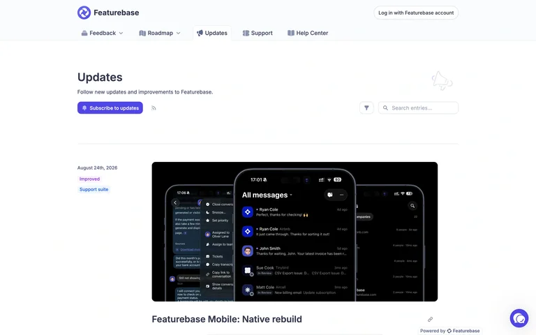
Product updates use a narrow date rail and large visual posts, with subscription and search options near the feed heading.
Useful for: Release feeds that need to explain changes with more context than a compact notification list.
# Design reference: Featurebase — Changelog
Source: https://feedback.featurebase.app/changelog
Swipefile reference: https://swipefile.design/ref/saas-ui-featurebase-changelog/
Captured: 2026-09-05. This is a dated reference, not a claim about the current live product.
Capture scope: one viewport. Do not infer unseen page sections or a complete user flow.

## Objective
Adapt the interaction and layout patterns below to my project. Use my own content and identity. Do not reproduce logos, proprietary copy, or brand assets.

## Reference notes
- surface: Featurebase public product Updates feed.
- nav: Shared portal navigation keeps feedback, roadmap, updates, and support adjacent.
- layout: Chronological posts pair dates with large image-led update content.
- density: Low to moderate; generous space separates releases.
- color: White canvas, muted dates, varied product imagery.
- typography: Large post titles, readable summaries, small date metadata.
- pattern: Give release content room for explanation while preserving a predictable chronological structure.
- states: Published public feed; subscription was not activated.
- dont: Do not make visitors subscribe before they can understand what changed.

Useful for: Release feeds that need to explain changes with more context than a compact notification list.

## Acceptance criteria
- Existing project conventions, design tokens, working functionality, and unrelated changes are preserved.
- Two or three reference principles clearly support the user's task; conflicts are resolved in favor of usability and the existing product.
- Reusable components and semantic HTML express the interface. Available licensed assets are used; important UI text is never rendered as a bitmap.
- Every visible control has a defined behavior. Loading, empty, error, success, disabled, and long-content states are specified where relevant. Demo data is clearly labeled.
- Navigation and content adapt at 375px, 768px, and 1440px without horizontal page overflow. Keyboard use, visible focus, labeled inputs, at least 44px touch targets, readable contrast, and reduced motion are supported.
- Verification distinguishes rendered behavior from proposals and identifies anything still requiring a backend or external service.

## Quality bar
Clear hierarchy, consistent spacing, restrained surfaces, and purposeful motion. Avoid decorative gradients, excessive cards, placeholder buttons, and invented metrics unless the project calls for them. Do not claim a feature is connected or tested without evidence.
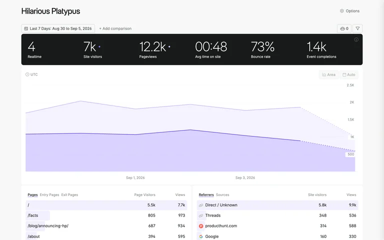
A dark metric strip anchors a light analytics dashboard with a broad purple trend chart and paired breakdown tables.
Useful for: Web analytics dashboards that need an immediate summary and a clear path into supporting dimensions.
# Design reference: Fathom — Analytics dashboard
Source: https://app.usefathom.com/demo
Swipefile reference: https://swipefile.design/ref/saas-ui-fathom-analytics-dashboard/
Captured: 2026-09-05. This is a dated reference, not a claim about the current live product.
Capture scope: one viewport. Do not infer unseen page sections or a complete user flow.

## Objective
Adapt the interaction and layout patterns below to my project. Use my own content and identity. Do not reproduce logos, proprietary copy, or brand assets.

## Reference notes
- surface: Fathom public Hilarious Platypus analytics demo.
- nav: Site name and options at the top; date range and comparison controls above the data.
- layout: Summary strip, full-width time series, then side-by-side breakdown tables.
- density: Moderate to high in tables, spacious around headline metrics.
- color: Black metric band, white surface, purple chart and highlights.
- typography: Large numeric summaries above compact descriptive labels.
- pattern: Arrange summary, time trend, and breakdowns in the order a reader asks questions.
- states: Populated public demo; displayed metrics are example data, not Swipe analytics.
- dont: Do not present demo metrics as evidence of actual business performance.

Useful for: Web analytics dashboards that need an immediate summary and a clear path into supporting dimensions.

## Acceptance criteria
- Existing project conventions, design tokens, working functionality, and unrelated changes are preserved.
- Two or three reference principles clearly support the user's task; conflicts are resolved in favor of usability and the existing product.
- Reusable components and semantic HTML express the interface. Available licensed assets are used; important UI text is never rendered as a bitmap.
- Every visible control has a defined behavior. Loading, empty, error, success, disabled, and long-content states are specified where relevant. Demo data is clearly labeled.
- Navigation and content adapt at 375px, 768px, and 1440px without horizontal page overflow. Keyboard use, visible focus, labeled inputs, at least 44px touch targets, readable contrast, and reduced motion are supported.
- Verification distinguishes rendered behavior from proposals and identifies anything still requiring a backend or external service.

## Quality bar
Clear hierarchy, consistent spacing, restrained surfaces, and purposeful motion. Avoid decorative gradients, excessive cards, placeholder buttons, and invented metrics unless the project calls for them. Do not claim a feature is connected or tested without evidence.
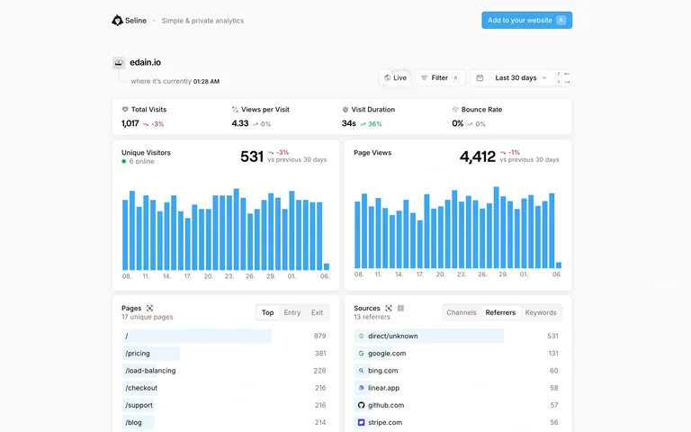
A shared analytics page combines headline metrics, blue traffic charts, and compact source and page breakdowns with lightweight filtering.
Useful for: Shareable analytics views that should remain readable without the full product navigation.
# Design reference: Seline — Shared analytics
Source: https://app.seline.com/share/edain.io
Swipefile reference: https://swipefile.design/ref/saas-ui-seline-shared-analytics/
Captured: 2026-09-05. This is a dated reference, not a claim about the current live product.
Capture scope: one viewport. Do not infer unseen page sections or a complete user flow.

## Objective
Adapt the interaction and layout patterns below to my project. Use my own content and identity. Do not reproduce logos, proprietary copy, or brand assets.

## Reference notes
- surface: Seline public analytics share for edain.io.
- nav: Small site identity and date/filter controls; no full account sidebar.
- layout: Headline summaries above paired chart panels and tabular breakdowns.
- density: Moderate, with aligned values and restrained boundaries.
- color: White, pale gray, blue charts and small change indicators.
- typography: Prominent metric values and compact sans labels.
- pattern: Keep shared reports focused on data context, date selection, and the main comparisons.
- states: Public populated share; values can change and belong to the source website.
- dont: Keep the site identity and date range visible when sharing or exporting the view.

Useful for: Shareable analytics views that should remain readable without the full product navigation.

## Acceptance criteria
- Existing project conventions, design tokens, working functionality, and unrelated changes are preserved.
- Two or three reference principles clearly support the user's task; conflicts are resolved in favor of usability and the existing product.
- Reusable components and semantic HTML express the interface. Available licensed assets are used; important UI text is never rendered as a bitmap.
- Every visible control has a defined behavior. Loading, empty, error, success, disabled, and long-content states are specified where relevant. Demo data is clearly labeled.
- Navigation and content adapt at 375px, 768px, and 1440px without horizontal page overflow. Keyboard use, visible focus, labeled inputs, at least 44px touch targets, readable contrast, and reduced motion are supported.
- Verification distinguishes rendered behavior from proposals and identifies anything still requiring a backend or external service.

## Quality bar
Clear hierarchy, consistent spacing, restrained surfaces, and purposeful motion. Avoid decorative gradients, excessive cards, placeholder buttons, and invented metrics unless the project calls for them. Do not claim a feature is connected or tested without evidence.
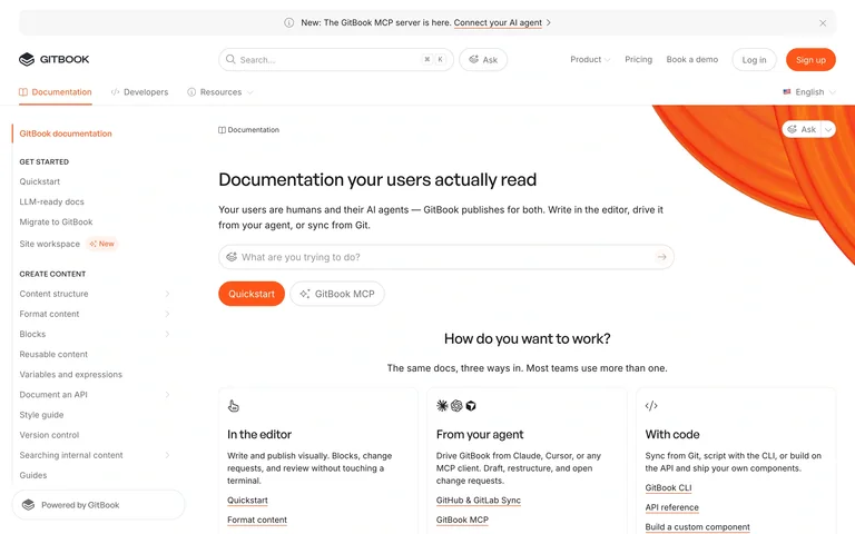
Documentation combines a persistent content tree, top search and assistant access, and a spacious introduction with clear next-step choices.
Useful for: Product documentation that needs to serve both first-time readers and people locating a specific answer.
# Design reference: GitBook — Documentation
Source: https://gitbook.com/docs/
Swipefile reference: https://swipefile.design/ref/saas-ui-gitbook-documentation/
Captured: 2026-09-05. This is a dated reference, not a claim about the current live product.
Capture scope: one viewport. Do not infer unseen page sections or a complete user flow.

## Objective
Adapt the interaction and layout patterns below to my project. Use my own content and identity. Do not reproduce logos, proprietary copy, or brand assets.

## Reference notes
- surface: GitBook public product documentation homepage.
- nav: Hierarchical left contents plus top-level documentation and developer sections.
- layout: Fixed content navigation beside a broad readable document area with introductory cards.
- density: Compact in navigation, low in the main reading area.
- color: White and soft gray with a warm orange introductory illustration.
- typography: Strong page title, readable body text, compact tree labels.
- pattern: Let readers browse the structure or search directly without switching to a different interface.
- states: Public documentation entry page; no private knowledge base was accessed.
- dont: Do not let assistant entry replace a visible navigation tree and readable source material.

Useful for: Product documentation that needs to serve both first-time readers and people locating a specific answer.

## Acceptance criteria
- Existing project conventions, design tokens, working functionality, and unrelated changes are preserved.
- Two or three reference principles clearly support the user's task; conflicts are resolved in favor of usability and the existing product.
- Reusable components and semantic HTML express the interface. Available licensed assets are used; important UI text is never rendered as a bitmap.
- Every visible control has a defined behavior. Loading, empty, error, success, disabled, and long-content states are specified where relevant. Demo data is clearly labeled.
- Navigation and content adapt at 375px, 768px, and 1440px without horizontal page overflow. Keyboard use, visible focus, labeled inputs, at least 44px touch targets, readable contrast, and reduced motion are supported.
- Verification distinguishes rendered behavior from proposals and identifies anything still requiring a backend or external service.

## Quality bar
Clear hierarchy, consistent spacing, restrained surfaces, and purposeful motion. Avoid decorative gradients, excessive cards, placeholder buttons, and invented metrics unless the project calls for them. Do not claim a feature is connected or tested without evidence.
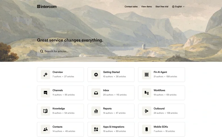
A landscape hero carries a prominent help search, followed by a grid of knowledge categories with article and author counts.
Useful for: Help centers that offer both direct search and a browsable knowledge structure.
# Design reference: Intercom — Help center
Source: https://www.intercom.com/help/en/
Swipefile reference: https://swipefile.design/ref/saas-ui-intercom-help-center/
Captured: 2026-09-05. This is a dated reference, not a claim about the current live product.
Capture scope: one viewport. Do not infer unseen page sections or a complete user flow.

## Objective
Adapt the interaction and layout patterns below to my project. Use my own content and identity. Do not reproduce logos, proprietary copy, or brand assets.

## Reference notes
- surface: Intercom public English help center.
- nav: Small product and language utilities above a large knowledge search.
- layout: Illustrated search hero followed by a consistent grid of topic cards.
- density: Low in the hero, moderate across the category grid.
- color: Muted landscape colors, white cards, dark text and fine gray borders.
- typography: Clear search and topic labels with small metadata.
- pattern: Pair prominent search with category cards that communicate the breadth of each topic.
- states: Public help-center index; search results and support conversations are not shown.
- dont: Avoid making visitors open every category just to understand what it contains.

Useful for: Help centers that offer both direct search and a browsable knowledge structure.

## Acceptance criteria
- Existing project conventions, design tokens, working functionality, and unrelated changes are preserved.
- Two or three reference principles clearly support the user's task; conflicts are resolved in favor of usability and the existing product.
- Reusable components and semantic HTML express the interface. Available licensed assets are used; important UI text is never rendered as a bitmap.
- Every visible control has a defined behavior. Loading, empty, error, success, disabled, and long-content states are specified where relevant. Demo data is clearly labeled.
- Navigation and content adapt at 375px, 768px, and 1440px without horizontal page overflow. Keyboard use, visible focus, labeled inputs, at least 44px touch targets, readable contrast, and reduced motion are supported.
- Verification distinguishes rendered behavior from proposals and identifies anything still requiring a backend or external service.

## Quality bar
Clear hierarchy, consistent spacing, restrained surfaces, and purposeful motion. Avoid decorative gradients, excessive cards, placeholder buttons, and invented metrics unless the project calls for them. Do not claim a feature is connected or tested without evidence.
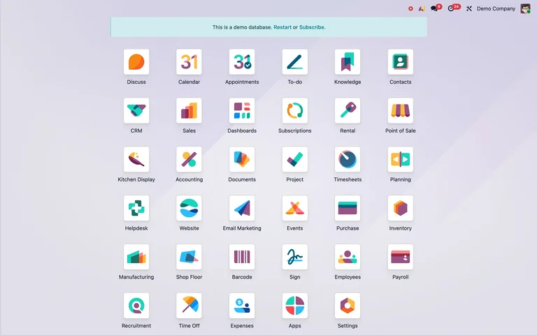
A public demo launcher presents business modules as a spacious icon grid, with a clear banner identifying the demo database.
Useful for: Multi-module business suites that need a simple starting point across many tools.
# Design reference: Odoo — Public demo
Source: https://demo6.odoo.com/odoo
Swipefile reference: https://swipefile.design/ref/saas-ui-odoo-public-demo/
Captured: 2026-09-05. This is a dated reference, not a claim about the current live product.
Capture scope: one viewport. Do not infer unseen page sections or a complete user flow.

## Objective
Adapt the interaction and layout patterns below to my project. Use my own content and identity. Do not reproduce logos, proprietary copy, or brand assets.

## Reference notes
- surface: Odoo public Demo Company application launcher.
- nav: Compact global toolbar above the module grid.
- layout: Centered rows of labeled application icons on a soft gradient canvas.
- density: Moderate, with generous spacing between equal-sized targets.
- color: Pastel background, white icon tiles, varied module symbols.
- typography: Small uniform application labels.
- pattern: Use a consistent icon-and-label grid to make a broad suite navigable without a crowded menu.
- states: Public demo database, explicitly labeled as a demo; no records were changed.
- dont: Do not rely on unfamiliar icons without text labels or hide the demo state.

Useful for: Multi-module business suites that need a simple starting point across many tools.

## Acceptance criteria
- Existing project conventions, design tokens, working functionality, and unrelated changes are preserved.
- Two or three reference principles clearly support the user's task; conflicts are resolved in favor of usability and the existing product.
- Reusable components and semantic HTML express the interface. Available licensed assets are used; important UI text is never rendered as a bitmap.
- Every visible control has a defined behavior. Loading, empty, error, success, disabled, and long-content states are specified where relevant. Demo data is clearly labeled.
- Navigation and content adapt at 375px, 768px, and 1440px without horizontal page overflow. Keyboard use, visible focus, labeled inputs, at least 44px touch targets, readable contrast, and reduced motion are supported.
- Verification distinguishes rendered behavior from proposals and identifies anything still requiring a backend or external service.

## Quality bar
Clear hierarchy, consistent spacing, restrained surfaces, and purposeful motion. Avoid decorative gradients, excessive cards, placeholder buttons, and invented metrics unless the project calls for them. Do not claim a feature is connected or tested without evidence.
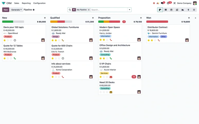
A CRM pipeline groups opportunities by stage, with stage totals and compact cards showing value, customer, tags, and ownership.
Useful for: Sales pipelines that need to connect deal status with value and the next operational context.
# Design reference: Odoo — CRM demo
Source: https://demo5.odoo.com/odoo/crm
Swipefile reference: https://swipefile.design/ref/saas-ui-odoo-crm/
Captured: 2026-09-05. This is a dated reference, not a claim about the current live product.
Capture scope: one viewport. Do not infer unseen page sections or a complete user flow.

## Objective
Adapt the interaction and layout patterns below to my project. Use my own content and identity. Do not reproduce logos, proprietary copy, or brand assets.

## Reference notes
- surface: Odoo public Demo Company CRM Pipeline.
- nav: CRM module links above a shared search, filters, and view switcher.
- layout: Four status columns with summarized value above opportunity cards.
- density: High on cards, balanced by clear columns and whitespace between stages.
- color: Light gray canvas, white cards, restrained status colors and tags.
- typography: Compact sans deal titles and metadata with stronger currency values.
- pattern: Show stage totals and card-level context together so the board supports both overview and action.
- states: Populated sample pipeline in a public demo; no deals were edited or moved.
- dont: Do not overload cards with every CRM field or communicate stage exclusively through color.

Useful for: Sales pipelines that need to connect deal status with value and the next operational context.

## Acceptance criteria
- Existing project conventions, design tokens, working functionality, and unrelated changes are preserved.
- Two or three reference principles clearly support the user's task; conflicts are resolved in favor of usability and the existing product.
- Reusable components and semantic HTML express the interface. Available licensed assets are used; important UI text is never rendered as a bitmap.
- Every visible control has a defined behavior. Loading, empty, error, success, disabled, and long-content states are specified where relevant. Demo data is clearly labeled.
- Navigation and content adapt at 375px, 768px, and 1440px without horizontal page overflow. Keyboard use, visible focus, labeled inputs, at least 44px touch targets, readable contrast, and reduced motion are supported.
- Verification distinguishes rendered behavior from proposals and identifies anything still requiring a backend or external service.

## Quality bar
Clear hierarchy, consistent spacing, restrained surfaces, and purposeful motion. Avoid decorative gradients, excessive cards, placeholder buttons, and invented metrics unless the project calls for them. Do not claim a feature is connected or tested without evidence.
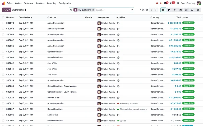
A dense quotations table aligns customer, owner, activities, amount, and status under a compact search and view toolbar.
Useful for: Business tables where users compare many records and scan financial values quickly.
# Design reference: Odoo — Sales demo
Source: https://demo5.odoo.com/odoo/sales
Swipefile reference: https://swipefile.design/ref/saas-ui-odoo-sales/
Captured: 2026-09-05. This is a dated reference, not a claim about the current live product.
Capture scope: one viewport. Do not infer unseen page sections or a complete user flow.

## Objective
Adapt the interaction and layout patterns below to my project. Use my own content and identity. Do not reproduce logos, proprietary copy, or brand assets.

## Reference notes
- surface: Odoo public Demo Company Sales quotations list.
- nav: Sales module navigation above filter chips, search, pagination, and view controls.
- layout: Full-width table with checkboxes, aligned columns, and narrow row spacing.
- density: High, designed for record scanning.
- color: White and pale gray rows, green status pills, restrained purple action.
- typography: Small sans data labels with aligned numeric amounts.
- pattern: Combine a broad table with persistent filtering and visible record counts.
- states: Populated sample records in the public demo; no quotation was created or changed.
- dont: Do not reduce row spacing so far that selection and status become difficult to distinguish.

Useful for: Business tables where users compare many records and scan financial values quickly.

## Acceptance criteria
- Existing project conventions, design tokens, working functionality, and unrelated changes are preserved.
- Two or three reference principles clearly support the user's task; conflicts are resolved in favor of usability and the existing product.
- Reusable components and semantic HTML express the interface. Available licensed assets are used; important UI text is never rendered as a bitmap.
- Every visible control has a defined behavior. Loading, empty, error, success, disabled, and long-content states are specified where relevant. Demo data is clearly labeled.
- Navigation and content adapt at 375px, 768px, and 1440px without horizontal page overflow. Keyboard use, visible focus, labeled inputs, at least 44px touch targets, readable contrast, and reduced motion are supported.
- Verification distinguishes rendered behavior from proposals and identifies anything still requiring a backend or external service.

## Quality bar
Clear hierarchy, consistent spacing, restrained surfaces, and purposeful motion. Avoid decorative gradients, excessive cards, placeholder buttons, and invented metrics unless the project calls for them. Do not claim a feature is connected or tested without evidence.
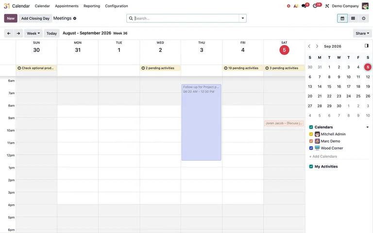
A weekly time grid places all-day items above hourly appointments, with a mini calendar and calendar-owner filters in a right rail.
Useful for: Team calendars that need both precise scheduling and quick navigation between dates.
# Design reference: Odoo — Calendar demo
Source: https://demo5.odoo.com/odoo/calendar
Swipefile reference: https://swipefile.design/ref/saas-ui-odoo-calendar/
Captured: 2026-09-05. This is a dated reference, not a claim about the current live product.
Capture scope: one viewport. Do not infer unseen page sections or a complete user flow.

## Objective
Adapt the interaction and layout patterns below to my project. Use my own content and identity. Do not reproduce logos, proprietary copy, or brand assets.

## Reference notes
- surface: Odoo public Demo Company Calendar, week view.
- nav: Calendar module links above Today, date navigation, view selection, and search.
- layout: Seven-day time grid with an all-day row and a narrow right sidebar.
- density: Moderate, keeping time slots readable and sidebar controls compact.
- color: White and gray grid, pale colored event blocks, small calendar-color markers.
- typography: Compact day/date labels and small event text.
- pattern: Separate all-day and timed events while keeping date navigation and calendar visibility close by.
- states: Public demo with sample meetings; no event was opened, added, or edited.
- dont: Use more than color to distinguish calendars and preserve readable event text in narrow cells.

Useful for: Team calendars that need both precise scheduling and quick navigation between dates.

## Acceptance criteria
- Existing project conventions, design tokens, working functionality, and unrelated changes are preserved.
- Two or three reference principles clearly support the user's task; conflicts are resolved in favor of usability and the existing product.
- Reusable components and semantic HTML express the interface. Available licensed assets are used; important UI text is never rendered as a bitmap.
- Every visible control has a defined behavior. Loading, empty, error, success, disabled, and long-content states are specified where relevant. Demo data is clearly labeled.
- Navigation and content adapt at 375px, 768px, and 1440px without horizontal page overflow. Keyboard use, visible focus, labeled inputs, at least 44px touch targets, readable contrast, and reduced motion are supported.
- Verification distinguishes rendered behavior from proposals and identifies anything still requiring a backend or external service.

## Quality bar
Clear hierarchy, consistent spacing, restrained surfaces, and purposeful motion. Avoid decorative gradients, excessive cards, placeholder buttons, and invented metrics unless the project calls for them. Do not claim a feature is connected or tested without evidence.
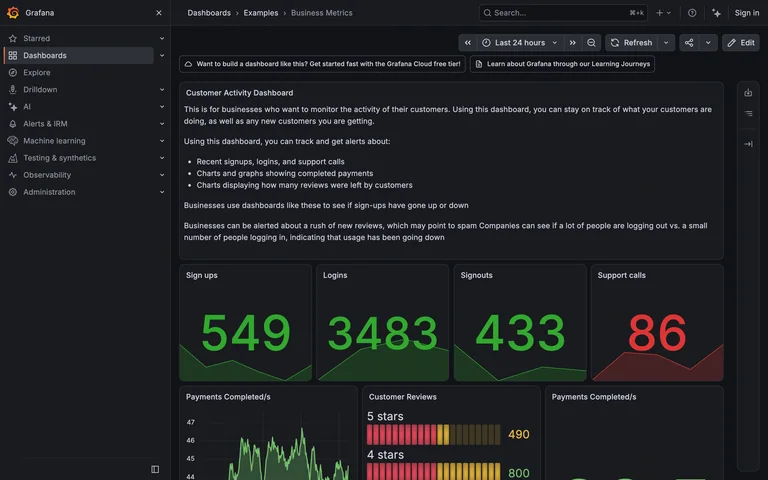
A dark public demo dashboard combines an explanatory panel, oversized activity metrics, and supporting time-series and review charts.
Useful for: Operational dashboards that need context alongside several distinct metric types.
# Design reference: Grafana — Business metrics
Source: https://play.grafana.org/d/000000110/business-metrics
Swipefile reference: https://swipefile.design/ref/saas-ui-grafana-business-metrics/
Captured: 2026-09-05. This is a dated reference, not a claim about the current live product.
Capture scope: one viewport. Do not infer unseen page sections or a complete user flow.

## Objective
Adapt the interaction and layout patterns below to my project. Use my own content and identity. Do not reproduce logos, proprietary copy, or brand assets.

## Reference notes
- surface: Grafana Play public Business Metrics demo dashboard.
- nav: Persistent product sidebar with breadcrumbs and a shared time-range and refresh toolbar.
- layout: Introductory panel above a row of large statistics and smaller chart panels.
- density: High, organized into clearly bounded panels.
- color: Charcoal surfaces, subtle gray borders, green metrics, red exception value, multicolor chart accents.
- typography: Compact interface labels and oversized numerical indicators.
- pattern: Apply one date context to a grid of metrics while using text panels to explain how to interpret them.
- states: Populated public demo; sample values and time windows can change.
- dont: Do not rely only on red and green or display large numbers without context and units.

Useful for: Operational dashboards that need context alongside several distinct metric types.

## Acceptance criteria
- Existing project conventions, design tokens, working functionality, and unrelated changes are preserved.
- Two or three reference principles clearly support the user's task; conflicts are resolved in favor of usability and the existing product.
- Reusable components and semantic HTML express the interface. Available licensed assets are used; important UI text is never rendered as a bitmap.
- Every visible control has a defined behavior. Loading, empty, error, success, disabled, and long-content states are specified where relevant. Demo data is clearly labeled.
- Navigation and content adapt at 375px, 768px, and 1440px without horizontal page overflow. Keyboard use, visible focus, labeled inputs, at least 44px touch targets, readable contrast, and reduced motion are supported.
- Verification distinguishes rendered behavior from proposals and identifies anything still requiring a backend or external service.

## Quality bar
Clear hierarchy, consistent spacing, restrained surfaces, and purposeful motion. Avoid decorative gradients, excessive cards, placeholder buttons, and invented metrics unless the project calls for them. Do not claim a feature is connected or tested without evidence.
Allow basic usage counts to help us understand what is useful. Your board contents stay out of analytics. Details
Your browser’s privacy preference keeps analytics off.